[…] post originale di Tom Kuhlmann sul “Rapid E-Learning Blog”. Il post originale è disponibile qui jQuery(document).ready(function($) { […]
Here Are the 3 Building Blocks for Interactive E-Learning
October 23rd, 2012
Many elearning courses are linear and not very interactive. Sometimes a linear course is the right solution. However, often linear is the default solution because of a lack of resources or because the developer isn’t quite sure how to get started with interactive content.
In today’s post, we’ll break interactivity down to three simple building blocks which are the essential types of interactivity in most courses.
There’s Only So Much You Can Do to a Screen
Simply stated, an interactive course presents content that allows the user to make decisions and interact with the screen. And from that perspective, there’s only so much you can do with the screen. You can click, hover, and drag. Almost all interactivity is built on these three elements.
The first step is learning to build the three types of interactions with your elearning application and then determine when to use them. As a way to practice, I like to build simple interaction in all three modes. This way I learn to use the software and I get to experiment with screen interactions and get a feel for what works and what doesn’t.
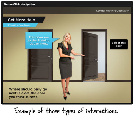
For example, here’s a simple demo where you have to make a choice between one of two offices. The same demo is repeated using all three forms of interactivity. Take note of how the interaction feels and some of the additional instructions required for each interaction.

*You can also access the links via an iPad. This gives you a sense of how the three interaction types work on a touch device.
Which Type of Interaction is Best?
As you can see, the end result is the same regardless of the type of interactivity. This means there’s a lot of latitude in how the interaction is designed. But it doesn’t mean each type of interactivity is equally effective. Which type did you like best from the demo above?
I like the clicking because it’s more of what I’d expect from this type of interaction. However, the drag and drop version is kind of fun and novel. The hover or rollover effect seems a bit slippery to me. In some ways it moves too fast and it’s the type of thing that could move me through a course before I’m really sure where I am expecting to go.
There’s no right or wrong way to use these interactive building blocks. But there are some ways that make more sense than others. Here are a few considerations when building interactive elearning:
- The best “interaction” is relevant content. If it’s relevant, people are less apt to require interactivity. Often we try to mask the lack of relevance with interactive elements or decision-making scenarios. But the novelty expires and interactive decision-making scenarios can be frustrating if not tied to real performance goals.
- There’s a place for the cool interactions. You can do some neat stuff in your courses that grab the user’s attention which may help get them engaged with the content. But any novel interactivity you add to the course can quickly wear off. And what was once novel becomes a hassle.
- Minimize interactivity by getting rid of unnecessary clicks, dragging, and mouse overs.
Learn About User Experience Design
The three interactive building blocks combined let us build all sorts of elearning courses. The key is learning to build good user experiences. A great place to start is by reading more on user experience design. Here are a few of the blogs I follow:
- Useit.com: Jakob Nielsen writes a lot about usability and design. You’re sure to learn a lot by following this site.
- UXMag.com: an online magazine dedicated to user experience and interactivity
- UXdesign.com: a good collection of user experience design
- UXMatters: an assortment of articles on understanding & designing user experiences
- Smashing Magazine: all posts tagged with “user experience”
- Pinterest UX board: various examples of UI and UX designs. It’s good to look at all sorts of design to inspire your own.
The links above are good for those just getting started. I have them in my RSS reader so that I’m always exposed to new ideas and discussions around designing user interfaces and interactive experiences. They’re not elearning-specific, but a screen’s a screen and whether it’s a web site or elearning course, how you interact with it is very similar.
Recommended books:
There are many good books on designing effective user experiences. Most of them are focused on web sites, but the principles are generally the same for elearning courses. The key is to understand how to design user experiences. And then from there learn to choose the appropriate interactive building block. Here are a few books that I like. If you have another good recommendation, be sure to share it in the comments section.

- Don’t Make Me Think
- Seductive Interaction Design: Creating Playful, Fun, and Effective User Experiences
- About Face 3: The Essentials of Interaction Design
- Rocket Surgery Made Easy: The Do-It-Yourself Guide to Finding and Fixing Usability Problems
- The Elements of User Experience: User-Centered Design for the Web and Beyond
If you can only get get one of these, I’d probably start with one of the Steve Krug books. He shows good before and after examples.
Interactive elearning is more than drag
and drops and mouse rollovers. However, if the user is going to interact with the content, then they’re going to interact with the screen which means they’re probably clicking, hovering, or dragging something across the screen. This allows them to move through the course, collect information, or make decisions.
By learning more about how and when to interact with the screen you’ll be on your way to effective interactive elearning. Of course there are a lot of considerations when building interactive elearning. And it’s not something you’ll get perfect the first time you build a course. But that’s OK. We all have to start somewhere.
Events
- Everyday. Check out the weekly training webinars to learn more about Rise, Storyline, and instructional design.
Free E-Learning Resources
 |
 |
 |
|
Want to learn more? Check out these articles and free resources in the community. |
Here’s a great job board for e-learning, instructional design, and training jobs |
Participate in the weekly e-learning challenges to sharpen your skills |
 |
 |
 |
|
Get your free PowerPoint templates and free graphics & stock images. |
Lots of cool e-learning examples to check out and find inspiration. |
Getting Started? This e-learning 101 series and the free e-books will help. |
20 responses to “Here Are the 3 Building Blocks for Interactive E-Learning”
Leggi la traduzione autorizzata in italiano del post qui:
[…] See original here: Here Are the 3 Building Blocks for Interactive E-Learning: Many elearning courses are linear and not… […]
Great read Tom! Just wondering how you created the “drag” navigation example.
The first videos open as empty black boxes no matter what browser i opened them in. I suppose they were in HTML5. I have had nothing but trouble using html5 in native storyline.
@Tom S.
We have a Screenr tutorial on the DragDrop doors interaction: http://www.screenr.com/Epm8 If you have any specific questions, please post in the forums and we’ll post the source files.
I am currently working on the content of a multilingual elearning program.
With the courses I want to include tests to be taken by trainees.
It will be either a Drag & drop or a click & click.
The question is the following:
Clients will pay for a 6 months subscription with unlimited access on courses & on tests for a small fixed amount (18$).
If I include tests built with your D&D or C&C,how is the software managed ?
Can I have it hosted on my website with unlimited access
or do I need to use a online downloading on your site with a fee per visit by clients .?
@jaswerl – The demo files should be loading in Flash if you’re viewing from your desktop. Since you’re seeing part of the movie, this could be a Flash player issue.
To better support you, can you post some specifics in our forums: http://community.articulate.com
David
In the hover example, it would be a lot more natural to *click* on the open door instead of hovering on the “select this door” sign. I mean: hover to open the door, click to enter. It’s natural, I tried it and works very well.
What platform did you use to create these three examples?
[…] les réunions dans l'industrie de la construction National Gallery of Art | NGAkids home page Here Are the 3 Building Blocks for Interactive E-Learning 5 tutoriels The Gimp par l’EPN Cyberguérande (44) La conjugaison du verbe tweeter – conjuguer […]
Tom, you said in the video that you would post the source files for the 3 Building Blocks for Interactive E-Learning. Or, am I mistaken, or haven’t found it yet??
Hi Tom, just wanted to take this opportunity to let you know how much I appreciate the advise, tips, and creative inspiration you provide in your blog. I have been following you for a few years now and you are my go-to for everything e-learning. I love the product and learn more and more each day. Keep it coming!
[…] Here Are the 3 Building Blocks for Interactive E-Learning […]
[…] on http://www.articulate.com Share this:TwitterFacebookLike this:LikeBe the first to like this. Published: November 8, 2012 […]
[…] Essentially you have three types of onscreen interactions: click, hover, and drag. We discussed that in the previous post on interactive building blocks. […]
Thank you for the recommended books.
I’m reading Steve Krug’s ‘Don’t make me think’ and it’s really helpful.


0
comments