Your graphic designer may have made a spelling error?
millennial, right?
Here’s a Simple PowerPoint Hack to Help with Course Design
July 5th, 2017
Like many of you, I’m no graphic designer. I do have enough skill to get what I need or know enough to modify existing templates. The good thing is that today, it’s not that big of a deal because you get media assets like Articulate’s Content Library. So you have plenty of quality templates and stock images to help guide your design.
However, there are times when you may be stuck with a specific image and need to figure out how to create different (but matching) layouts without doing a bunch of edits in a different program. Here are some tips based on a presentation I gave recently on creating a professional portfolio. I had three images and used those to create different looks. And I did it all in PowerPoint.
I’ll show you what I look for and a few simple hacks to free up space and create different layouts.
Here’s a PowerPoint tutorial with more detail.
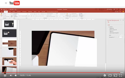
The tutorial below reviews what I’m sharing with more detail so that you can see how to choose and manipulate stock images for your courses and presentations.
Click here to view the tutorial video.
- How to create more whitespace and get rid of extra content.
- How to create matching backgrounds.
- How to create content areas.
PowerPoint Hack: Start with Matching Graphics
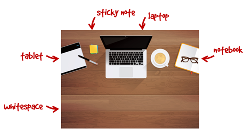
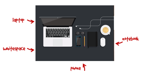
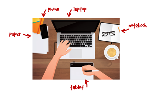
Whenever I find a stock image that works for my project, I try to find more from the same artist. And if that’s not possible, I try to find images that are very similar in style. This allows me to mix and match elements. In the case of my presentation, I started with these three images:

And with those three images, I was able to create various distinct slides.

PowerPoint Hack: Identify Content Buckets
By themselves, the stock images look fine and really don’t require any edits. However, when it comes to adding custom content, then the stock images have some constraints especially when it comes to adding content.
Identify places where you can add content (like images and text). If you start with a large enough stock image, you’ll be able to scale it and still maintain visual quality.
Here are a few areas from the images that can be modified to become content buckets.
PowerPoint Hack: Create Whitespace
After identifying places to put content, I look for ways to declutter the image and create more white space. There are a few ways to do that:
- Cover up part of the stock image to get rid of clutter.
- Zoom in and focus on clean flat areas.
- Crop and reposition the image.
- Create your own white space using image elements.
Here are just a few looks taken from a single image. In the first batch, I created three iterations of the one image.

And in the second, I replicated the background to give me enough whitespace and room to create my own matching images. In the presentation, I added a few white boxes to represent pages.

To learn more, watch the tutorial video. It provides the detailed step-by-step process.
The key point is that all of this is done right inside of PowerPoint and doesn’t require special skills or advanced features. What’s nice about this is that it only takes a few minutes and this approach provides an easy way to create professional quality layouts that are consistent in how they look.
Events
- Everyday. Check out the weekly training webinars to learn more about Rise, Storyline, and instructional design.
Free E-Learning Resources
 |
 |
 |
|
Want to learn more? Check out these articles and free resources in the community. |
Here’s a great job board for e-learning, instructional design, and training jobs |
Participate in the weekly e-learning challenges to sharpen your skills |
 |
 |
 |
|
Get your free PowerPoint templates and free graphics & stock images. |
Lots of cool e-learning examples to check out and find inspiration. |
Getting Started? This e-learning 101 series and the free e-books will help. |
6 responses to “Here’s a Simple PowerPoint Hack to Help with Course Design”
Thanks, Tom, for sharing this.
Having read this I believed it was extremely enlightening.
I appreciate you spending some time and effort to put this
short article together. I once again find myself personally spending way too much time
both reading and posting comments. But so what, it was still
worth it!
Tom,
This information was very helpful. I am currently a graduate student in an Instructional Design program. Although I’ve had previous experience with Powerpoint, this aspect of design was very useful in terms of learning how to manipulate and/or scale the various backgrounds, along with isolating (“cropping”) the specific items in the picture as well. Thank you so much, for this quick tutorial!
Thank you so much for sharing this 🙂


0
comments