Great idea! There is also a range of iPad apps that can be used together to create more of a story-like feel to your course. You can create characters using apps like WeeMee. Use Strip Designer to creat cartoons. Pic Collage to combine different graphics in a really quick and basic way. Sometimes I will use characters to introduce new topics or to encourage students to do something. Obviously you can also use the Adobe apps if you are really serious and have lots of time.
Here’s a Simple Way to Convert Your Course to an Interactive Story
March 18th, 2014
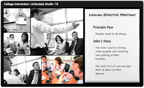
The other day I was doing a search for business meeting images and ran into this collage image. It kind of looks like a comic book layout. I played around with some ways to use this image in an elearning course.

Here’s a quick demo of the image converted into an interactive slide. I just added some place holder content since the images are not contextual. But in your case, you’d create a collage where the images work together to tell a story.
Click here to view the interactive story demo.
Tips & Tricks for Creating an Interactive Story
Here are a few ideas on how you could approach this type of interaction:
- Create a story. Many courses tend to be heavy on the information and light on relevant context. Rework your content and frame it like a mini story or scenario. In this case, it’s not about a long branched interaction. It’s more like a quick scenario where the course content is framed in a relevant context. People love stories so why not build a story around your information? Plus, the comic-book style layout is kind of popular.
- Get rid of bullet points. A lot of elearning is linear and the screens are loaded with bullet points. Get rid of those bullet points! Why not use a panel for each bullet point? I’d use the large panel to represent the essential point of the slide. And the smaller panels would represent the bullet points or supporting information.
- Feel free to take your own photos. You don’t need to be a pro to create your own stock photos. Besides many of the smart phones have those cool filters that convert your images and give them a pro feel. So outline a story and then storyboard the photos you’d need to support that story.
- Create a few panel layouts so that you can rotate through your screens and make them visually a bit different. This post on comic book layouts will help come up with some ideas.
This is a simple technique but and an easy way to convert bullet point slides into something a bit more visually engaging. And with a little effort you can frame the information into something more story-like and interactive. It’s a step away from a content dump and a step into meaningful content.
What do you think? Would this work with any of your elearning courses?
Events
- Everyday. Check out the weekly training webinars to learn more about Rise, Storyline, and instructional design.
Free E-Learning Resources
 |
 |
 |
|
Want to learn more? Check out these articles and free resources in the community. |
Here’s a great job board for e-learning, instructional design, and training jobs |
Participate in the weekly e-learning challenges to sharpen your skills |
 |
 |
 |
|
Get your free PowerPoint templates and free graphics & stock images. |
Lots of cool e-learning examples to check out and find inspiration. |
Getting Started? This e-learning 101 series and the free e-books will help. |
18 responses to “Here’s a Simple Way to Convert Your Course to an Interactive Story”
Nice! Visually simple, clean, attractive – and so easy to build. Great way to build in some (always-helpful) context. Thanks for the great idea, Tom!
This is a great tip. I especially like the idea of converting bullet point info into this format. Images are also more likely to be remembered. Thank you.
OMG! Tom, Your blogs are always helpful and often entertaining, but your demo on this one was down right funny. I laughed out loud. Thank you for all you do. My eLearnings are significantly better because of all the information you provide!
Hi Tom,
Love your articles!!
I create e-learning that teaches how to use our software. I am struggling to think of comic-book layouts that would suit our content. I have introduced scenarios into our training to make it more interesting and effective. But I really like the comic-book layout idea, but I am a loss for ideas of how it would work with software training. I love that you empower us to take our own stock photos (Duh! So obvious! Why didn’t I think of that before?!), but I’m not sure photos would be appropriate for software training…
I’d appreciate your ideas or examples you might have to show!
Thanks,
Marilyn
Cool! I can see this beinbg used to create a step by step instructional course on a process or procedure. Far and away more engaging than bullet points. Would love to see the .story file to see how you structured it.
Lovely ideas as always, but today am truly grateful for the laughs as I read the demo. Your missives are always a delight.
Its beautiful Tom, clean simple layout with the images telling the story..love it! Agree with Ed it would be really nice to see the story file 🙂
thanks
Kate
“The real win is if you can get them to chew on their glasses.”
Too funny!
Great tip! I like the idea of converting the boring bullet points of a course into an interactive story.
Yes, more story, fewer bullet points. The question is, can I do it with my modern Japanese lit course?
The demo for the collage shows it was built in Studio 13. Is this an Engage interaction or just a series of PowerPoint slides built with Hyperlinks and shown with Presenter? Would love to see how this was built!
I suspect this would work in Storyline…what a great approach to a scenario! I’m going to try it for my next course!
You crack me up, Tom! The example is great, thanks for the idea.
Thanks, Tom. And thanks for making me laugh as I began my day.
leggi qui la traduzione in italiano autorizzata:
This is amazing. Do you have a more complex demo presentation?





0
comments