E-learning templates are a great way to save time. This is especially true for those of us who work with repetitive content and courses. And it’s even more true for those of us who aren’t graphic designers since the e-learning templates provide nice looking visual design.
However, working with templates can be a challenge. Sometimes they present too many choices (which can debilitate). Another challenge is that to modify templates often requires a more involved understanding of the authoring tools. This isn’t easy for the person just getting started.
Here are a few ideas to help simplify working with templates.
E-Learning Templates Are the Second Step
Figure out what you need before you build first. A big time waster is not knowing what you want in the course but building it, anyway. Then realizing it’s not what you want, you tear down and rebuild. Or worse, you move forward with a bad idea and let it dictate the rest of what you’re doing because of the time already invested.
I like the weekly e-learning challenges to play around with ideas and to see what others do. The challenges help develop fluency with the software and build awareness around ideas that can be implemented before you work on a project.
ACTION ITEM
Let the Content Determine the Right Template
Templates are great, but don’t let the template dictate your content. This is one of the biggest issues with templates. We like a template because it has sixty cool layouts and then we force our content to the template. Or we think we have to use all sixty layouts so we have similar types of content but it all looks different throughout the course because we mix and match the layouts.
ACTION ITEM
- Review your templates and the various layout options. Then determine when you use them and why. Even if you have a lot of great layouts, it’s a good idea to reduce the layouts you actually use. This provides visual consistency; and repetition is key to good visual communication.
Keep E-Learning Templates Simple
Templates don’t always need to be big all inclusive files with dozens of layouts. It helps to have single purpose templates like just one tabs interaction. The more single purpose the template is, the better you can use it. It’s also easier to customize one slide to match your course than it is to customize an entire template.
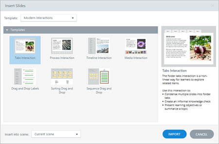
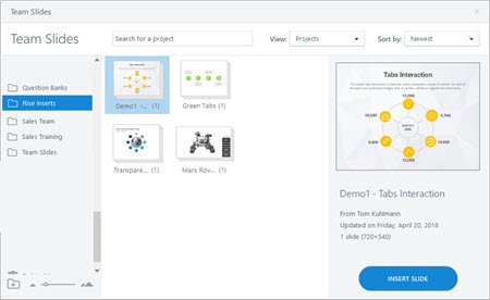
One of the most under used features in Storyline is saving the files as templates. This makes the slides available for the next course. You can insert a single slide(s) or the entire file. The new teams feature in Storyline 360 makes it even better because the slides can be shared with the team and easily inserted in other courses.
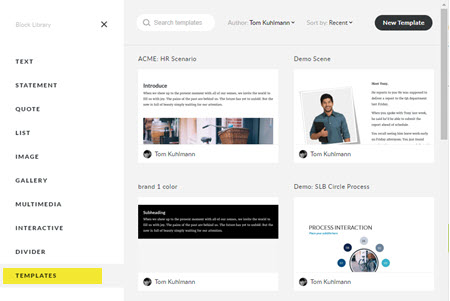
In Rise, you can build lessons and save them as templates. Once inserted, they can be modified to meet the course objectives. And they don’t need to be big lessons, you may just want to customize some blocks for easy re-use. This is especially helpful if you want to use a multiple colors or change the text sizes.
ACTION ITEM
- Create single slide templates in Storyline and save them as templates. If you’re on a team account, share them with your team.
- Learn to create and save templates in Rise. I like to create branded blocks where I add different colors and text sizes.
Learn to Edit the E-Learning Templates
Inevitably you’ll need to modify the template. There are some things you should learn about the software so that when you need to change the template it doesn’t take forever (otherwise you lose the time-saving benefit of the template).
ACTION ITEM
Templates are a real time-saver. But to really save time with them, plan ahead so you’re content is prepped; and then learn to use the authoring software used to build e-elearning courses.
Events
Free E-Learning Resources








0
comments