Social comments and analytics for this post…
This post was mentioned on Twitter by ciberajuda: Inspiring Designs to Keep Your E-Learning Courses Looking Fresh http://bit.ly/9qC7SS…

Just got back from the Learning Solutions Conference in Orlando. It was a great time. By nature, I’m a little introverted, but I can tell you that I am truly energized when I get to meet the blog readers. I love the excitement people have for what they’re doing and glad that we can help. I also like hearing about the different projects and learning how people with limited resources get their jobs done. So for all of you who attended the sessions or came by the booth, it was great meeting you and thanks for the encouragement.
One of the questions I get asked a lot is about graphics and visual design. Most of the elearning developers I meet have to wear multiple hats. So they’re doing all of the instructional design and graphic design, too. And they have to work with limited resources. Which means if they can’t create it, it won’t get done.
Here’s what I shared with those who came by the booth and asked about improving their graphic design skills. I also built a couple of mock ups. I’ve included the PowerPoint templates for you to download and use as you wish.
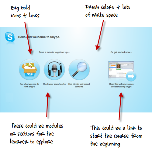
When I find something I like, I do a screen capture and save the image to a “design ideas” folder. For example, I recently installed Skype and came across their welcome screen. I liked the layout and colors. There’s a lot on that screen that could be used in an elearning course template.

The best way to learn about design is to recreate the design you like. But your focus isn’t really on a literal recreation. You don’t want to copy the design. Instead, you want to think through what it is that you like about it and why. Then try to use those things you identified and build out your own design. Doing this has a few benefits:

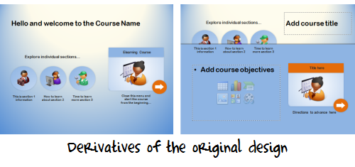
Once you build out a prototype based on the original, feel free to play around with the colors and layouts. I usually move the various elements around to create my own ideas.
For example, in the images of my prototype below you can see how the first image looked close to the original design. Then I moved the icon circles around to create a different look.

I created a quick screencast that walks through the process of how I built the prototype and some of my considerations when I work in PowerPoint.
Since I had time on the flight from Orlando to Seattle, I played around with the prototype template a bit more and came up with the design you see below. I added some course content to it so you can see how it might work in a real course.
Since this is a bit more complete of a design, I created a second screencast to walk through how it’s built and what you might need to do if you wanted to customize it yourself. I’ve also included the PowerPoint templates for you to download.
Click here to view the PowerPoint template tutorial.
The reality for many who design elearning courses is that they have to wear multiple hats, and one of those is graphic designer. It’s hard to be great at everything. But by following the techniques above, you can develop skills that will be good enough.
You’ll have fresh designs, learn new production techniques, and approach your courses a different way each time.
If you want to download the templates, you can do so here. If you use the template design and can share them, feel free to add a link to the comments section. Or better yet, create your own template and share it with the rest of us via the comments link.
 |
 |
 |
|
Want to learn more? Check out these articles and free resources in the community. |
Here’s a great job board for e-learning, instructional design, and training jobs |
Participate in the weekly e-learning challenges to sharpen your skills |
 |
 |
 |
|
Get your free PowerPoint templates and free graphics & stock images. |
Lots of cool e-learning examples to check out and find inspiration. |
Getting Started? This e-learning 101 series and the free e-books will help. |
Social comments and analytics for this post…
This post was mentioned on Twitter by ciberajuda: Inspiring Designs to Keep Your E-Learning Courses Looking Fresh http://bit.ly/9qC7SS…
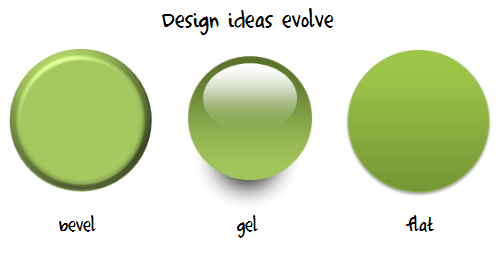
Really interesting, especially the part about the evolution of design ideas.
Personally, one of my favorite inspiration is… watching the news. It provides a lot of good ideas: apparition effects, how to illustrate something when you do not have a lot of media, animated schemes,…
Thanks for all the useful tips.
I do something similar: I have a PPT presentation where I paste design ideas.
Your “bevel-gel-flat” comment is also interesting.
What is a good source for learning about design trends?
Tom, Great post. I find it’s so useful to keep track of interesting designs that you see out in realm of the internet! There is so much out there that you have to keep track of. One thing I like to use that’s built into Windows Vista/7 is the Snipping Tool to take a screenshot of what I’m looking at!
It was also a pleasure to meet you at the Advanced Articulate session with Ron at Learning Solutions 10! Keep ’em coming!
Thanks Tom. Your screenshot idea is a reminder for me. I used to write down or draw a picture when I see something interesting,instead of saving it. Sometime later, I will forget. Right now, I will start to save the ideas or inspirations.
I think what youi have been doing with multilpe templates to keep the backgrounds dynamic yet consistent have had a nice visual impact. I look forward to using them in my next production and sharing them.
A thrill to meet you last week
Tom,
I have to say you constantly give out solid information and it’s appreciated. Thanks for all the help.
Personally I use sites like http://psd.tutsplus.com/ and http://vector.tutsplus.com/ for inspiration and instruction.
Best of all the tutorials are free.
Anyway, keep up the good work!
to much interesting, evolution of design ideas and more…I’ll try it. EJRibeiro – RJ-BR
The posts are a great help, but I’m stumped about how you link the two arrows to turn the pages.
Learning from other designers is key. Great technique with the screenshots. That’s a good habit to get into. Too often I try to “remember” what sites I like, but don’t document them.
One place I go for both design and interactivity inspiration is:
http://elearningexamples.com/
Also, I saw that Janet Clarey recently launched a site to show examples of instructional design. It’ pretty new, but as this gets more posts I think it will be a great resource
http://instructionaldesignbyexample.com/
Wow, thanks so much for all of the valuable tips. At my agency we have to load all of our courses onto Evolution LMS and then the courses are accessed through a virtual learning center (vlc). The vlc manages the way the courses is viewed. I would love to be able to use some of the navigation ideas you present, but my programmers and I have yet to figure out how. Thanks again.
Nice post, Tom! Like you, I have an “ideas” folder on my hard drive. Plus, I have a PPT “ideas library” PPTX where I save my draft recreations of the ideas I discover.
@Alessandra – You can also find design ideas by attending an AIGA meeting in your area; if there isn’t a local chapter, visit their Web site:
In addition, visit the Web sites of design colleges. One that is near me is Laguna College of Art and Design:
I also like to get ideas from the HOW Design conference Web site:
http://www.howconference.com/GeneralMenu/
And, from the Webby Awards (my personal favorite):
Last but not least, once a year I find out what the Pantone colors are for the next four seasons:
http://www.pantone.com/pages/pantone/index.aspx
No special reason; I’m married to a graphic artist, and he introduced me to the Pantone color palette awhile ago.
@jenisecook on Twitter.
Please–please proof the finals! Atomic click?
That little “surface error” has cost people their jobs when we lost the client.
Although, I am prepping to use Articulate Presenter for a grad course project, so looking forward to your instruction throughout this very rich blog.
So far, this is the only “readable” blog I’ve found, i.e., we’re not talking theory here– this is the stuff on the road.
Thanx and keep up the teaching so I can learn, then I can teach so someone else can learn, and so on, and so on,…
Really enjoyed the conference. I’ve been looking around here for the rapid development theory you were discussing. Can you point me in the right direction, or possibly email me your ideas. I’d like to pitch both you and Dave’s ideas, it could really speed up our process.
Hey Tom, this is my first time here but I’m already liking your stuffs! There’s a lot of great information here and I really love the idea of designing an e-learning course that actually looks good. Thumbs up!
P.S. Just tweeted and followed you on Twitter 🙂
Hi Tom, What tools do you use for creating these good looking designs. Is it just powerpoint? or some other tools as well. Thanks for teaching.
Tom,
Your blog is one of my favorites. I am an aspiring instructional designer looking for the right opportunity to put my ideas and skills to work. I graduated not to long ago in Instructional Design and Technology and landed a job as an Educational Technologist at a local university. Have not had an opportunity to use or practice my design skills, but still like to read up and stay informed on the latest in this profession. Just waiting until I can find a good fit. Anyway, I want ask you where are what you are using to do the voice overs in your prototype? Do you recommend any text to speech softwares that can be used for this? Is this what you used? Thanks for your advice!! -jenn
[…] maandelijkse nieuwsbrief met daarin een mooi voorbeeld van hoe je PowerPoint kunt inzetten om een heldere basis te maken voor schermen. Tom Kuhlman heeft er met Screenr een video van […]
Thanks for the practical advise, I often go to http://www.aialex.com, it’s my ‘one stop’ design inspiration area.
I use Evernote to grab ideas that I stumble on from Websites. The software allows you to save pages or just content and to categorize them or add keywords. It is free and really great tool.
[…] Tom Werner on March 31, 2010 Wonderful post by Tom Kuhlmann about graphic design in e-learning […]
Tom, you often encourage paying attention to good web design. I also started paying attention to print layout as well. I know it transfers differently, but if i see a layout that I like, I just rip it out and file it away (well, after I buy the magazine).
I also look at media shows for how they present info. I really love how ‘Hungry Beast’ present their info and the graphic design of the overall show.
Check out these two videos:
Drug usage in Australia
http://hungrybeast.abc.net.au/stories/drug-survey-results
History of Cane Toads
http://hungrybeast.abc.net.au/stories/beast-file-cane-toads
[…] […]
Thanks for the great tips. We are using some of these ideas for a few modules we are building! I look forward to sharing them when we are finished.
Question: Where did you get those graphics of the instructor, business man, tool man, etc? Thanks!
At the company I work for all courses are presented via the eCollege LMS, which creates considerable constraints on design. The overall look can feel uninspiring, and flexibility to make changes is wanting. To counter this, we try to make engaging media content (video, interactive, podcasts, audio, PowerPoints) that can be embedded within the individual content/assignment pages of the course (though it does not change how the navigation bars and other elements look). A potpourri of styles can then result when a flashy media player appears inside a very Web 1.0-looking course, but it goes a long way toward engaging students.
I hope that if we continue to use eCollege, the upgrade to the .NExT version of their platform will enhance our ability to create inspiring designs. It is my understanding that this new version allows for more choice in visual templates and flexibility for style sheets. It also has enhanced features for uploading and displaying packages of files (like zipped Flash files) directly in the course, without dealing with complicated file managers or code. Lastly, I think it offers data-mining capabilities so that analytical reports can be run on individual students, courses, or instructors. (The last point does not directly relate to design, I realize, but might indirectly through the feedback received on courses.) Hopefully those of us who are feeling hamstrung by our LMSs will get some design relief soon!
[…] Inspiring Designs to Keep Your E-Learning Courses Looking Fresh […]
Great stuff Tom! Is there any chance that you would be able to create a screenr showing how to build and use Master Slides from scratch? I’m not sure of the proper method of doing it. Thank you!
Quick question for you, I feel like I’ve seen this in you blog before but can’t recall where. If you choose to use the navigation arrows and put in your master slide template…then how do you navigate in the presentation? Do you have to manually insert hyperlink for every arrow to go forward or backward one slide? If so, wow that’s a lot of work and secondly, I can’t figure out how to do it unless you take it out of the master slide and insert onto each slide.
Thanks for all the useful tips tom..
Are you using handwrite font or you use tablet to write in your hand 🙂
[…] Inspiring Designs to Keep Your E-Learning Courses Looking Fresh […]
[…] Inspiring Designs to Keep Your E-Learning Courses Looking Fresh […]
You’ve inspired my recent Twitter presentation: http://leahmacvieblog.leah-marie.com/2011/02/take-on-twitter/
I developed it myself to look like the old Twitter interface.
[…] control over how they gather information. Inspired by the course design that Tom Kuhlmann shared in this blog post, Russ went with a clean slide-only view in his Articulate Presenter player, and he incorporated all […]
Undubtedly, that is a great lesson I found in my life. I think, It will remain as a best tutor in my life. Thanks at all.
0
comments