My team and I and currently working to “de-mouse-ify” many of our elearning trainings, to be more ADA & 508 compliant, so this article hit close to home! While we don’t need to worry (yet!) about mobile, it’s something we should be preparing for as well. As we’ve come to learn, the courses we build today could still be in use 11 years from now. In that time, will our employees all be using mobile touch-screen devices, with onscreen keyboards? So good to hear our issues being discussed! Thanks!
There are three primary forms of onscreen interaction used in e-learning courses: clicking, mouseovering and dragging. If desired, user input interactions such as data entry or text input with variables can also be added. However, the majority of interactivity is based on the three aforementioned types.
Recently, I was experimenting with a mouseover interaction concept which was mainly a gimmick, and wouldn’t be feasible as a real e-learning course. This nonetheless made me ponder the various uses of mouseover interactions and the current state of e-learning.
How Are Mouseover Interactions Used
There are all sorts of reasons and ways people build mouseover interactions. Here are three of the most common:
- Indicate a selected or current location: you see this often on a button. As you mouseover, the button changes to indicate where you’re at, or that it’s an active button. In the example below, there’s a hover state to indicate the mouse is over the button.

- Expose additional information: many people use the mouseover to expand the screen real estate. Slide over an object to get access to quick information. Slide away from the object to hide the information. In the example below, the mouseover interaction allows the learner to explore human anatomy.
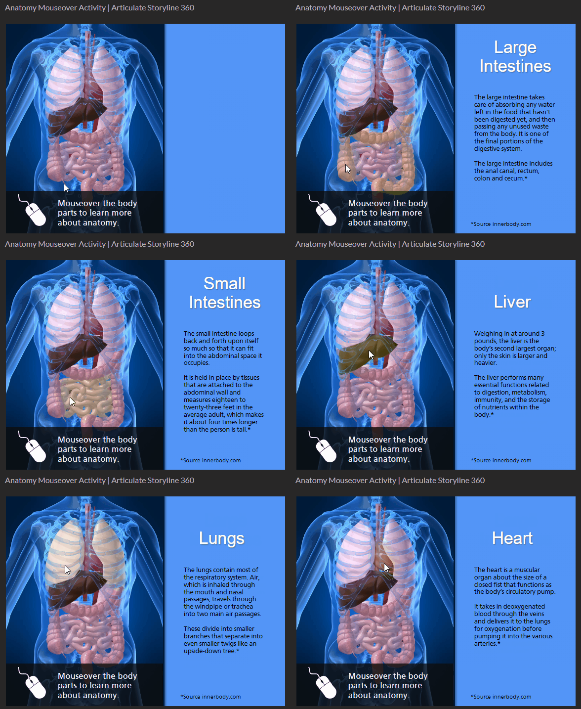
- Provide quick tool tips: the mouseover interaction may provide information or hints. Sometimes it’s used to describe or explain the button or clickable object. In the example below, the tool tips provide quick access to hints on where to learn more.

What is the Current State of Mouseover Interactions
Mouseover interactions are fine and are also often used for creative ideas or to provide a certain type of aesthetic. However, a lot has changed over the past few years.
- Mobile Devices. Many courses are consumed on mobile devices which require touch-based interactivity. The concept of a mouseover doesn’t really exist when using a finger to navigate the content. Technically, you can press and hold to expose a hover state, but that’s not really practical for mobile training.
- Accessibility. Ideally, all courses are built with accessibility in mind, but that hasn’t always been the case. Accessible compliance is more of a concern for course builders today than it was a few years ago. The market has changed and with that comes more awareness and desire to build accessible e-learning. Mouseover interactions are a bit problematic especially for those using keyboard navigation.
It appears that it may be time to say goodbye to mouseover interactions in e-learning. Creating a click alternative to the mouseover is an extra effort that may not be necessary. Therefore, I propose that we accept the reality of changing technology and choose to forgo this type of interaction in most cases.
What is your opinion? What are the use cases that support the mouseover? How would you tackle the problem if you decide to keep it?
Events
- Everyday. Check out the weekly training webinars to learn more about Rise, Storyline, and instructional design.
Free E-Learning Resources
 |
 |
 |
|
Want to learn more? Check out these articles and free resources in the community. |
Here’s a great job board for e-learning, instructional design, and training jobs |
Participate in the weekly e-learning challenges to sharpen your skills |
 |
 |
 |
|
Get your free PowerPoint templates and free graphics & stock images. |
Lots of cool e-learning examples to check out and find inspiration. |
Getting Started? This e-learning 101 series and the free e-books will help. |
5 responses to “Is It Time to Say Goodbye to Mouseover Interactions in E-Learning?”
I agree – when my finger is on the screen and something pops up underneath it, what is my first reaction? To lift my finger, which then causes the image to disappear – unless there is a way to turn it off when on a mobile device, which would be a handy feature/alternative.
NOOOOOOOOOOOOOOOOOOOOOOO!!!!!!
I want my mouse hover interactions!
I don’t think I have built a mouse interaction for at least 5 years. Accessibility is a nightmare and small popups get hidden by the users finger on phones. I still do nice mosur over effects just no meaningful interactions.
I recently had a client that wanted industry terminology turned into mouseover hotspots for the definitions. I brought up the complications with mobile and they said they were not pushing the material for mobile users so it was fine to use mouseovers. Something to consider when in the instructional design stage. I’ve been toying with the idea of writing some code to utilize the json created by storyline’s glossary to dynamically generate hotspots for the terms.





0
comments