Leggi la traduzione autorizzata in italiano del post qui:
The Guiding Principle for all Rapid E-Learners
June 12th, 2012
Typically elearning courses start from existing content. And often that content dictates how the course is structured and how it looks. And that may not always be best.
The guiding principle for rapid elearning design is to be intentional. Everything you do while developing your course should be planned and exist for a reason. You don’t want existing content to dictate the design of your course. This seems obvious but often isn’t the case.
Getting to Intentional Design
Many elearning courses start as classroom content that needs to be converted and put online. Or subject matter experts hand you a bunch of PowerPoint slides that they want to turn into elearning courses.
This type of content already has some instructional consideration, albeit for a classroom. And it has some visual design that usually comes from a template with specific colors, schemes, and fonts.
Instead of being intentional about the instructional and visual design of the course we allow the existing content to determine how we build it. What we should do is take a step back, think about general course design, and then map our content to the design that’s appropriate to the course objectives.

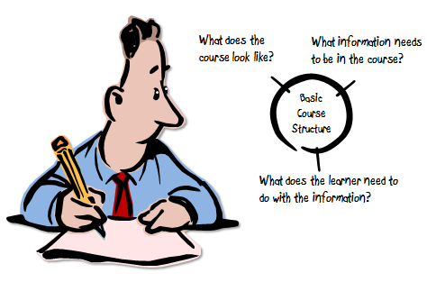
As I’ve mentioned in the past, elearning courses have three essential elements. I like to frame them as questions.
- What will the course look like?
- What content needs to be in the course?
- What will the learner do with this content?
These three questions help to drive the intentionality of your course design.
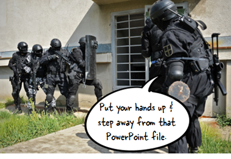
Put Your Hands Up & Step Away from that PowerPoint File
Here’s a typical scenario. You’re handed a PowerPoint file and some other documents. The subject matter expert has been using that content for years in a successful classroom setting and now wants that converted to elearning.
Easy enough.

In this scenario, we typically open up the existing PowerPoint file and make decision on a slide-by-slide basis. We start on slide one, make some adjustments, and then move on to slide 2. Make a few more adjustments, and then move on to the next slide.
The challenge with this approach is that you’re letting the existing content and instructional structure drive how you build the course. That may work on some occasions but for the most part it’s not ideal.
Be Intentional about the Course Design
Even if the existing content looks right, don’t start there. Take a step back and start with a blank screen. Then determine how the course needs to be built and what content you need.
If the existing content you have works, great. If not, then you’re not letting it dictate your course design. In either case, you want to be intentional in how the course is designed. This will ensure that you’re moving in the right direction.
Let’s revisit the three essential questions.
What will the course look like?
The course is going to look like something. Even if you are in a hurry and decide to do nothing but a simple conversion, the course is still going to look like something.
Most likely the look that isn’t right for the course is the one that comes from the existing content. But, there is a look that is right for the course. It’s just a matter of finding it.
Be intentional about the visual design of your elearning course.
What content needs to be in the course?
Subject matter experts tend to think everything’s important. And it probably is in the proper context. But “important” content is not the same as the “right” content that is appropriate to the goals of the elearning course.
Not all of the information about a given topic needs to be in an elearning course. I prefer a backwards design approach. At the end of the course, what change should I expect from the learner? What does it look like if I see it? Then build the course so the learner can practice and demonstrate that desired change.
Be intentional about the aligning the course content to the course objectives.
What will the learner do with this content?
This question builds off of the second one. The content in the course is structured to meet specific objectives. As the learner goes through the course, what is she supposed to do? This question helps focus on the interactive component of the course.
Do you want her reading and reflecting on content? Is there a place for her to do something, to make some decisions? Once she’s exposed to the course content, what s she supposed to do?
Sometimes the course content is simple refresher material and doesn’t require a lot if interactivity. But often the content is new and is tied to some sort of performance expectation. What can you do to get the learner to practice using the information in a setting similar to what they’d do in the real world?
Be intentional about aligning the course’s interactivity to meeting the course’s objectives.
As I mentioned earlier, the capabilities of the authoring software has evolved. This has opened the doors to do more with elearning. But easy course creation is not going to replace being intentional about how you design your courses. It just makes it easier to build what you intend to build.
The trick is to intend to build the right type of course. It requires that you answer those three essential questions: What will the course look like? What content needs to be part of it? And what is the learner supposed to do with this course?
If you can answer those questions you’re on your way to building effective elearning.
Events
- Everyday. Check out the weekly training webinars to learn more about Rise, Storyline, and instructional design.
Free E-Learning Resources
 |
 |
 |
|
Want to learn more? Check out these articles and free resources in the community. |
Here’s a great job board for e-learning, instructional design, and training jobs |
Participate in the weekly e-learning challenges to sharpen your skills |
 |
 |
 |
|
Get your free PowerPoint templates and free graphics & stock images. |
Lots of cool e-learning examples to check out and find inspiration. |
Getting Started? This e-learning 101 series and the free e-books will help. |
22 responses to “The Guiding Principle for all Rapid E-Learners”
[…] Read the rest here: The Guiding Principle for all Rapid E-Learners » The Rapid eLearning Blog […]
Step Away from the PowerPoint is one of my favorite quotes about starting an eLearning project. Sometimes easier said than done, but it’s the only chance at really designing something different than just a Lecture + Q&A.
I especially love the speech bubble on the first photo. I tell people bullets kill and they roll their eyes. This says it another way! My job is pretty crazy right now and I’m not smiling much…this really made me smile, so THANKS!
It would be great if your fourth “essential” was:
“How the heck will we measure if anybody actually LEARNED anything from our e-learning course.”
Even after doing this for many years, sometimes just being reminded of the “Guiding Principles” is a very necessary jolt and re-calibration of what the heck I’m doing!
Hi all,
I’m not sure if anyone already asked, but is there any easy way to add the E-learning blog to Flipboard on my iPad?
Thanks.
Frank
Tom,
I agree with your premise and 3 questions. I wonder if the sequencing might be tweaked a bit to help focus the SMEs as well as the course.
Q1) What does the learner need to do?
Q2) What is the minimum information they need to get started?
Q3) What does the course look like?
By asking the DO first it may help to avoid the content dump that usually happens. The follow up to the DO is can this “doing” be done online? If not what is the plan for practice? OJT, coaching, classroom?
[…] 10 Tips on Using Tables in Your E-Learning Courses Are You Qualified to Build E-Learning Courses? The Guiding Principle for all Rapid E-Learners A Dozen Handpicked E-Learning Resources How to Create Color Schemes in PowerPoint to Match Your […]
[…] The Guiding Principle for all Rapid E-Learners Typically elearning courses start from existing content. […]
[…] time, how should you be thinking about your e-learning content? You may find a possible answer in The Guiding Principle for all Rapid E-Learners….. or maybe Scenarios: What are they good for? relates more to your training context. […]
[…] found Tom Kuhlmann guiding principles inspiring today in an attempt to get all of us designers intentional about our course designs. Sounds like a no brainier… would we not be intentional? Here is what he […]
[…] a previous post we looked at how to be intentional in the course design. This is probably the single biggest way to avoid the Frankencourse. Be intentional about what goes […]
[…] a previous post we looked at how to be intentional in the course design. This is probably the single biggest way to avoid the Frankencourse. Be intentional about what goes […]
[…] Another great post from Tom at the Rapid eLearning Blog Like this:LikeBe the first to like this. Leave a Comment […]
[…] designers must be very intentional about designing their courses. (Tom also addressed this in a recent blog post). They should be realistic about what they want the learners to know, and more importantly, what […]
[…] The Guiding Principle for all Rapid E-Learners. Share this:TwitterFacebookLike this:LikeBe the first to like this. […]
[…] I get a lot of questions about how to move past the PowerPoint look when building rapid elearning courses. My first suggestion if you’re working with PowerPoint is to step away from the original content. Start with a blank screen and then based on the context of the course, build the look and feel that’s appropriate for the content. […]
[…] Article original : http://www.articulate.com/rapid-elearning/the-guiding-principle-for-all-rapid-e-learners/ […]


0
comments