The Rapid Elearning Blog

Last week I told you to stop using templates for e-learning that were designed for presentations.  Presentation templates are designed for a different purpose.  Sure, you’re using PowerPoint to author the course, but you’re not building a presentation. You’re building an elearning course. So, different rules apply.

You had some lively feedback in the comments section and I also got a ton of email from you.  I didn’t realize how passionate people are about this issue.  Because of the comments, I thought it best to do a follow up.

The Branding Issue

A big issue with the presentation template is that they’re branded with logos or company brand elements.  They might work fine for a presentation, but they cause problems for elearning.

The logos and brand elements take up valuable screen real estate.  This leaves less room for your course content.  They have nothing to do with the learning and, in fact, are disruptive because they add irrelevant information.  They can even move the elearning towards a dry and formal tone.  But for best results, you usually want your courses to have a personal and conversational tone.

Templates keep you in a box and inhibit creativity.  While using this type of template might be easy for the organization to control its content, ultimately, it inhibits creative innovation.  And like a vampire, it sucks the life force out of all enterprising instructional designers. 🙂

THE SOLUTION

  • You’re building an elearning course.  You’re not building a presentation, even if you are using PowerPoint to author the course.  Think like an instructional designer and focus on learning goals and not template design.  Form should follow function.
  • Step away from the presentation mind set of building a bullet-point structure.  View the slide area as a blank screen.  Your ultimate goal is to motivate and influence performance.  Is the template helping you do that?
  • Create a branded elearning player.  Some of you have to work within the confines of a template.  Talk to the template gatekeepers and see if they can arrange a meeting for you with the Illuminati (or whomever it is that creates these rules).  At the meeting discuss moving the logos and branding elements to the elearning player to create a "branded elearning player."
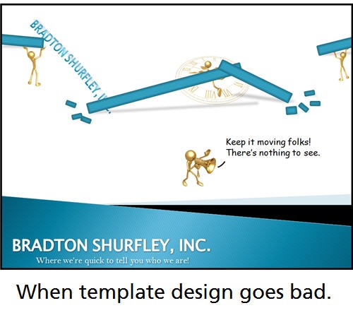
The Rapid E-Learning Blog - Template collapses and leaves 1 dead!

Effective Use of Templates

There’s certainly a place for templates.  A good template can help guide the instructional design process.  So the goal is not to completely discount templates.  Instead, it’s to determine if and when a template should be used.

Separating effective from non-effective templates is a matter of identifying the template’s objectives.  If the template is just about colors, designs, and logos, then I’ll put it in the non-effective bucket.  However, if the template is designed to help someone structure their content or pull a course together, it goes in the effective bucket.

Another consideration is the experience of the instructional designer.  At this point in my career, I don’t rely on templates.  However, when I first got started, that wasn’t the case.  I was looking for any type of template or guidance I could get.  And that’s the case for many of my readers.

You have good software, but you’re short on experience.  Using a well designed template probably will help.  However, I’d consider such a template more like training wheels on a bike and work hard to be weaned from it.

As I review my early projects, I see templates as a Catch-22.  Sure they helped me get started and provided some guidance.  However, they were also my least creative and most boring courses.

THE SOLUTION

  • The template guides the development process.  It is not about the design or brand.  Instead, focus on structuring the course content for effective learning.
  • Templates are better for beginners.  Because they provide guidance and a framework for the course design, templates can be effective.  The danger is relying too much on the template and not developing sound instructional design skills.
  • Templates represent principles and not rules.  I think this statement is at the heart of the issue for so many.  Having some guiding principles is good.  Because the learner needs to understand what the course is about and where it’s going, having clear objectives is critical.   And, this can be designed in a number of ways.  However, often the principle becomes a steadfast and unbreakable rule.  And now, it’s mandated that all courses have five detailed learning objectives listed in bullet points at the front of the course.

Moving Away From Templates

While I have issues with templates that are forced on me or that serve no real purpose other than to be the "official" template, I am not against the use of templates.  As I stated above, there is a place for them in elearning design.

My main concern is that templates inhibit the design of effective learning.  However, the reality is that many of you have to deal with this issue.  I hope that this series of posts spurs some talk in your organization about your templates and how they’re used in your elearning courses.

I also know that many of you are just getting started and looking for any type of help possible and a good template is just the right thing.  If it works for you, that’s great.

The trend with elearning is moving away from the presentation mindset that created the templates in the first place.  Initially we shifted our instruction techniques from classroom and lecture to online.  And the templates worked well.  However, we have new technologies and different thoughts about how to deliver information and craft better elearning.

We’re becoming less information-centered and more focused on performance.  Instead of asking what you need to know, we’re asking what you need to do.  This is leading us to focus more on crafting a story-like process and creating more real-world scenarios.  I’m not sure where the branded template fits in that world.

As a final thought, my perspective is that it’s not an either/or situation.  You have to do what works best for you, your learners, and you customer.  I just put out information to stimulate your thinking and give you some tips and tricks to build good elearning.

I’d love to hear your thoughts and look forward to your comments.

Events

Free E-Learning Resources

Want to learn more? Check out these articles and free resources in the community.

Here’s a great job board for e-learning, instructional design, and training jobs

Participate in the weekly e-learning challenges to sharpen your skills

Get your free PowerPoint templates and free graphics & stock images.

Lots of cool e-learning examples to check out and find inspiration.

Getting Started? This e-learning 101 series and the free e-books will help.


36 responses to “The Real Purpose of the E-Learning Template”

Tom–

Again, thank you. I am now more determined than ever to rid myself of the branded template design. I was reading this post as I worked on a course on my other monitor, and I kept reading a few lines and looking back at my course, and it all became so obvious: If I want to break out of the bullet point, “here’s what you need to know” courses and begin building “here’s what you need to do” courses, the branded template has to go.

You are absolutely right when you say that we are creating online courses, NOT presentations, and my biggest annoyance being boxed into the templates has been that the courses end up LOOKING just like a PowerPoint, and the audience recognizes it, too.

I’m looking forward to stripping away the template, starting with a blank screen, and letting the as-yet untapped creativity start to flow.

Thanks, Tom!

–Marisa

I know we’re trying to get away from the “online course is a PowerPoint presentation” idea, but when you boil everything down to the bare elements, an eLearning course really *is* a presentation (one with some interactive elements, but a presentation nonetheless). Just as a classroom-based course is a presentation. I suppose the term “presentation” has become something to avoid because we’ve all experienced so many horrible PowerPoint presentations, but a really good presentation and a really good eLearning course can be very similar in nature.

I’d recommend reading Cliff Atkinson’s book Beyond Bullet Points. It focuses on PowerPoint presentations, obviously, but I’ve found that many of the ideas Cliff shares can be effectively applied to eLearning course development as well. As an eLearning reference, I’d rank this book much higher than many of the eLearning development-specific books I’ve read.

http://www.beyondbulletpoints.com/

Tom,

Once more, you have enlighted my worn-out brain!! I’m just going through the case you talk about this time, and your solutions seems just like THE way to go!!

thanks and keep on !!

Mariana

June 10th, 2008

All,

I agree: (PowerPoint presentation-like) templates should not guide the design of an e-learning offering.

However, templates do help standardize the look and feel of e-learning offerings and should be made available for developers to ensure consistency.

In our group, we have a .ppt ‘template’ with sample title, module title, and lesson title pages, as well as an almost-blank content slide. We also have standards for fonts, colors, and tables.

We’re striving to make our self-offerings more engaging and have been incorporating more and more Engage interactions, Quizmaker quizzes, and include links to Captivate simulations. For consistency, we have defined standard properties settings (fonts, colors, navigation, etc) for learning objects developed with these tools.

For our virtual classroom deliveries, we’re using more of presentation-style template; however, as we move our materials from traditional classroom to virtual classroom, we’ll be incorporating more slides that encourage interaction between the virtual instructor and students.

This is a great forum! Keep those ideas and discussions flowing : )

Janet

June 10th, 2008

Tom,

I have not yet started writing online case studies but feel that the course should be student oriented not instructor, thus I was drawn to your type of development. Can you give us more ideas on how to develop our own case study type course? Do you use other software than PowerPoint?

By the way, there is lots of research that support your type of instruction.

Chris Babowal

June 10th, 2008

Thanks. I am looking for ways to be more creative and move beyond the basic template. Your article has given me a new perspective on this topic.

I have lectured regularily on the national / international medical scene for over 20 years and have produced just over 100 e-learning sessions primarily with Articulate. I have some limited experience of HTML based e-learning as well. I would suggest that templates and in particular the “Default” bullet point layout in PowerPoint are the scourge of both presentations and e-learning sesssions. How many presentations have you been to when you thought “Wow those were really good text slides!”

Images, cartoons and drawings and a first class speaker clearly get the message across much more effectively. Abandoning templates, if you can, makes people look at the whole slide each time it changes, building the argument visually in time with the voiceover is very effective.

People do like something to read and scribble on though, I put a reasonable version of the voiceover in the notes section and print this to pdf as a downloadable. I have experimented with “stitching” the voice files together as a podcast to be used with the handout (this is a pain with Articulate’s file labelling system though)

For me good images combined with a first class voiceover is the real key here, we can, with a reasonable outlay on sound kit, produce voice tracks that are much, much better than any of the demo’s I hae tried

Tom – wonderful post!

I agree with Chris – I just picked up the BBP book and I have to tell you – it is an eye opener, especially coming from someone who used to provide stale, boring PowerPoint training BASED on the icky templates included…I found your past articles on PowerPoint, your ideas and those from the BBP book to be very helpful in rekindling my once lost love of PowerPoint.

well—2007 PowerPoint doesn’t hurt either! 🙂

Tom, I like a template approach to things like topic dividers (dark color instead of light with a 3 second music clip). A 3 second screen that is a different color with music alerts the possibly wandering mind that a new topic is starting.

I have other contributing authors and provide a template with about five backgrounds…a welcome slide, meet the instructor, topic dividers, summary, certificate and three blanks. These are loosely based on the template Articulate came with.

That said, I know my presentations are getting more free-form, story and picture based as I go. And they have the ‘handouts’ for the written stuff they need.

Thanks for your ideas. This is one blog I keep reading!

Tom, I can’t begin tell you how you hit that nail on the head!
Just last week I got into a heated argument about branding vs. creativity. Thank you for writing my thoughts out in plain terms! I also started reading BBP online.
Once again, thank you!

Great post! And very timely. I had just finished up creating an e-learning “Style and Standards” guide at the request of a long-time client, and I took the same position about losing the branded presentation slide template. It’s nice to know that you and some others have similar viewpoints.

Tom:

I thought the previous posting would create a significant increase in your responses. I happen to agree with the concept and I am glad you brought it up.
Thanks for making the “blog” a great place for new (and some revisited) ideas. Keep up the great work.

Jack

Good Blog as usual. A couple of things:

I’m an a professions SME with 40+ years experience that’s learning to do elarning from choice.

1. How does the gen-X, gen-Y issue play with the ideas of templates?

2. One of the comments noted templates foster consistency. Why is consistency (inconsistency within reason) important?

3. How can we translate interactivity (in the sense that we use branching scenarios) to the classroom?

Just some things I’ve been thinking about.

Jim

“Why is consistency (inconsistency within reason) important?” – Jim

I’m with you, Jim. I also ask myself this question. I understand the importance of visual consistency within a course (style, fonts, colors, images) but I don’t understand the importance of one course looking like the next course. Frankly, as a learner I see that becoming a mental turnoff in short order.

Are corporate trainers in the classroom told to wear the same thing when they instruct? Is there a corporate “trainer’s uniform?” Red bow tie, blue oxford, khaki pants, black wing-tips? I seriously doubt it (and if your company has such a silly policy, I’d love to hear about it).

So why must e-learning wear a uniform?

I guess I just don’t understand the insistence of a corporate identity being stamped on e-learning like it’s stamped on a letterhead. Does not compute.

Learning is not an automated process and should not be treated as such.

June 10th, 2008

Totally agree with your comments in regards to the current trend ie mindsets shifting away from presentations. I do believe we are moving away from ‘telling’ people what we think they need to know, and are progressing to designs which make the information ‘relevant’ to the learner by using scenario based learning etc. In some parts of our business, admittedly, I believe we still hold some old mindsets however I am confident that we are getting there – slowly but surely. Another great post, thanks Tom.

June 10th, 2008

As always- thoughtful and helpful advice.

One of my key tricks in developing “templates” is to truly think of designing “interaction” templates moreso than content (text) templates.

Yes, the “frontmatter” (course intro, objectives, etc…) and “endmatter” (summary, conclusion) and other instructional text (i.e. how to access, system requirements) are formulatic for consistency, but other than that, form follows function.

The team sat down and tried to determine standards we see reusing for interactions. If we have a drag and drop with multiple items, do we give feedback per item, or wait until all matches are made and use a “submit” trigger… or both? When is each used, and why? With multiple-choice questions with more than one correct answer- how is it scored? All or nothing? Partial credit?

We really invest a good amount of time trying to really predict stable, reusable, sensible interactions and provide guidance when each is to be used (and yes, consistent instructional text on how to use the interaction).

We also do use a set of graphic styles and standards (standards, not mandates, not gospel- they can be violated if it forwards the goals of the learning program).

I completely agree with your concept of branding the “player” and leaving all other instructional matter “lean and clean” for it’s purpose of instruction. Actually, as I have seen a lot of consolidations, restructuring, buyouts, etc… in the industries in which I have worked, putting branding in more than one place (the player) can quickly become an unnecessary and avoidable maintenance issue.

I find that many folks spend far too much time worrying about text formatting, stealing time from really thinking about how to design engaging learning. Certainly, both are needed, but I think the time investment needs evaluation and adjustment if the ratios are off.

Okay…I did it! I went into the presentation I was working on and switched all but the welcome, the topic divider slides, and the summary slides to blank.

Tom, I like it! More real estate. Especially when I realized there was absolutely no reason to have the title on the slide (like the Rapid ELearning Template does) when the slide list is just to the left.

I even got rid of my beloved blue wave at the bottom. And it does feel cleaner.

Thanks!

This issue is not whether or not to use templates, the issue is the analysis – who is the audience, what should the tone of the training be, what is the best learning strategy for the audience and content. The format should be creative and appropriate.

June 10th, 2008

I agree with Chris that elearning course is also a “presentation”. Is a logo on the screen will distract a learner? Only thing is that the logo should not be too big to occupy the screen space at the loss of space for the content. The “logo” provides authenticity to the content and if the courses are well developed, perhaps the learners may be attracted to the learning resources of a particular organization. The logo could be in the “Player”, but is it necessary to have a “Player” (how many could afford for such software?). My point is that the content and how the content is presented in the online course should be given more attention than the template etc.

Tom,

I’ve found your regular blog quite useful and it’s good to keep in touch with what is going on in your world. However, I do find that it takes some time to get to the ‘juicy bits’. This last post really took the bisuit. So many words to say so little?

Kind regards,

Amanda

June 11th, 2008

I always find your comments helpful; Thanks! My department is moving in the direction of elearning. I have been asked to help due to our first module will be build on emergency preparedness and emergency response and this is my area of responsibility. I am not an IT person, but I am working along side them. This subject can be very exciding, but if build wrong can be very boring. My question is what initiatives should one look for when the subject matter is so large?

Hi Tom,

Great post! I totally agree. What really matters is making the course “relevant” to the learner’s needs. And, I found by adding your own flavor and creativity to the course works better. This also keeps the learner engaged by giving he/she something new to look at.

June 11th, 2008

Hi Tom:
First, I wanted to respond to Chris.
________________________

Are corporate trainers in the classroom told to wear the same thing when they instruct? Is there a corporate “trainer’s uniform?” Red bow tie, blue oxford, khaki pants, black wing-tips? I seriously doubt it (and if your company has such a silly policy, I’d love to hear about it).
__________________

I work at a company where the classroom trainers DO dress in a ‘uniform’ of sorts. They have a standard shirt (they can switch off between 3 colors)that they wear, with the company name/logo on it. Why? It sets them apart from the learners so that they are easily spottted, and they do represent the company as instructors. Also our classes are made up of customers, not just employees. Thirdly, our employees are site technicians who also–wear a company shirt at a customer site–so the instructors model that. So yes, corporate trainers do sometimes wear some kind of ‘uniform.’ In our environment, I wouldn’t call it a ‘silly’ policy.

As for templates, our training group does use a standard e-Lea rningshell/template for much of our e-learning–but by choice. It creates consistency in look and feel, makes developmemt faster, and it seems to work for learners. We actually have a second template we use as well.

I’m not saying the templates are perfect–or that they don’t diminish creativty a bit (they do), but if it works for now, why re-invent the wheel?

Thanks Tom.
Anne

June 11th, 2008

[I’m going to avoid using the word ‘template’ because it brings up negative thoughts.]

I think ‘standards’ help the designer/developer, the learner, and the company who is offering the training.

Definition of a ‘Standard’
My definition of ‘standards’ is “The elements of an e-learning offering that define the look/feel and navigation of the offering. For example, the Articulate player colors, logo, navigation, plus a color palette for use in the page content.”

Standards Help the Developer
I’m all for creativity and have been known to ‘color outside the lines’ (often); however, standards help provide structure for those developers who are better writers than graphic designers. Standards also allow us to concentrate our time on what’s most important, developing instructional sound content.

Standards Help the Learner
When our customers take multiple e-learning courses from us, they can just concentrate on learning the content; not trying to figure out how to navigate each tutorial.

Standards Help the Company
Standards help to build a certain look/feel (brand) for our e-learning offerings.

Why should we care about branding?

Colors and graphics help companies like McDonalds, Nike, Target, Starbuck, Dunkin Donuts, and Apple get recognized. Training companies are no different, they need to get/be recognized and having a similar look/feel to their e-learning offerings helps them achieve the necessary branding that is required to have a successful business.

In summary, standards provide the necessary company branding; however, the designers and developers should be given the freedom to be creative with the content so we can build training that is instructional sound and fun for the learner.

p.s. I agree that the bulleted slide should be avoided whenever possible.

June 11th, 2008

I would like to respond to the professor. I remember being told, years ago, that I should wear clothing that would blend in with what my homeless students’wore. I found out quickly that I did not even have clothes like theirs and that most of the staff wore clothes they would waer in any other teaching position. Now that our clothing are the slides, shouldn’t these slides represent our personality and the material being presented? I believe that the lack of personality is also a turn off as the slides become very dry without some of the instructor in it.

I too, have been in classroom settings (pre-school, k-12, college, and workplace) for over 20 years and have been designing listening and speaking tests, now for over 15 years. When developing a listening and speaking tests, I incorporate a variety of methods and lots of varied stimuli including differing colors, style of language, multimedia, etc. The one thing that is important is to provide the rubric that makes the slide easy to use. I often use the same style of rubric throughout the test. I also always tell the test-taker what I am testing for in each of the components. This way the test-taker is fully aware of what is going on.

When developing a test, you have to field-test it. One of the first things that you look at when reviewing the results of a field-test is, did the item you presented get the result that you wanted. Maybe one of the things missing in developing course-ware is field-testing. I am sure you do not have to field-test the course-ware the same way tests are field-tested but a sampling could help make your courses more effective. It could also help you determine what types of slides has to be developed for what types of populations.

I find that when the population being tested is at a very low language and literacy level, then consistency is very important. However, creativity is also very important. This population tends to need stimuli more than the average. So, I would think the style of courses would also depend on the population being served.

I personally feel that second language learners at low second language levels and unknown educational backgrounds should not be taught solely or maybe at all with computers. It has been my experience that the learning process in these situations are not enhanced with the use of computers. Also, there has been a lot of research on drills. Research finds that drills are not very effective. So, I do not recommend using computers for drills. If you have authentic situations that provide ways of dealing with problem-solving etc., then these maybe okay, if they are presented in their first language at the trainee’s language level. Using the second language will be beyond their abilities. Keep in mind, that some population use a mixture of two languages in their native dialect. These individuals may not have a good foundation of concrete cognitive concepts in any language and will be difficult to train. The use of pictures and other stimuli will be essential.

I also find that very well educated individuals can also be very hard to train, especially when the subject matter seems to be something they already know. These individuals have lots on their plates and do not want to waste time. It is important to give these individuals the material they need to know without repeating lots of the material they know well. It is more important to these individuals that the material provides the exact changes or improvements without providing every detail. This is also a challenge, as every individual could have differing needs. I recommend support information that learner can click on if they do not know it. This seems to be the most effective way of dealing with knowledge bases. The style for these guys should be varied and use plenty of stimuli to help them remember where they left off if the training is self paced.

For those in between, I find that knowing the population and the target information is the most important aspect in developing the course-ware.

In closing, the style and presentation of learning components often depends on the population. The way you present materials should always have some of your personality. One size does not fit all. The fit has to do with you and who you are working with.

Just my thought for what ever they are worth.

Chris B

Tom,

In my company instructional designer capacity is very limited. We therefore have to work with subject matter experts doing most of the content creation.

Although they are experts in a certain discipline, most of them have never teached and don’t have a clue what effective ID means. Although they are not always completely happy with the “ID-based templates” we provide, they defenitely do experience the benefits of a good template.

I personally think a template based proces is a good way to capture more or less the tacit expertise we want from them. They are not yet ready for any “beyond the template creative ID proces” but – thinking about what I just wrote – we might underestimate our SME’s and we might – with some additional effort – ultimately get them there.

Kind regards,

Marcel van Holstein
Edudocum
The Netherlands

Great discussion. I think that the diversity of opinion represents the different circumstances that many face. In an ideal world, you’d have complete freedom to do as you see best, but that’s not the case for many. It would be great to focus just on the learning part and less on the template issue.

However, as some have noted, there is a legitimate need to consider some quality standards and those issues. And ultimately, you are being paid by the customer who commissions the course and not the learner.

The key is to find the right balance. I think if you do use a templated approach, it has to be designed for elearning and not for a presentation.

In an upcoming post, I’ll show an example of an organization that actually builds elearning templates that are more like storyboards that guide the learning design, rather than just a static template. They do a great job of creating a branded design, with some standardization, good content development, and still leave a lot of room for the instructional design. In that case, their approach is more about structure and support and less about control.

Thanks Tom.

If possible, please suggest some effective template structures for short on-line synchronous learning solutions.

June 17th, 2008

Templates. Standard styles. Pah!

We did start out with a standard look to each of our e-learning modules but we soon realised that although the learning worked the environment was becoming monotonous. The content was different but the interface was tiresome after a while.

Now everything we create is fresh and new. The colours and the interface/navigation are all designed to compliment the content. We feel it helps, maybe not to improve engagement, but to stop the opposite.

PS As a classroom trainer I dress casually/comfortably. If I need a uniform so delegates know I am the trainer then I really do need to brush up my training skills.

Tom: Thanks for pulling us all out of our ruts – I have actively sought to ignore my corporate mandated PPT template. First off, it isn’t even effective for PowerPoint, forget asking whether or not it works with elearning.

More to your point, I look at my elearning as a course, not a presentation, and since I always look at it that way, no one has ever asked why we don’t use the standard template. I think that if I had started with it, it would have given away my Articulate courses as being built inside PowerPoint – but since I never started that way, most folks have no idea.

June 27th, 2008

I’ve spent the past week avoiding working on project that is so template driven we spend more time trying to figure out and use the templates than being able to design effective learning. The end results are so bad the client came back and told the project leaders they had to add a “Wow” step so the end products wouldn’t be so boring. Argh. You enforce the use of templates that make everything look boring and the same and then you also want creative, interactive learning that won’t bore folks out of their minds.

The biggest issue I find is fighting the fight against the over use of templates. The branding issue huge b/c most large corporations have separate, sometimes even legal, offices that insist on a logo of a certain size on every bloody thing they create. If you don’t follow their rules, then it won’t be released. They’re more concerned about following rules than their end users/workers. I’m pretty sure the users/workers know this product was for use by Company X and having Company X’s logo on every screen does nothing to add to learning.

I love templates/style guides for the basic like navigation and front matter but after almost 15 years of eLearning development I want the content to be King, not the template.

Having witnessed more bad ppt presentations then I care to recount, the lack of (brand) standards usually results in a disparate collection of (fill in your own explicative here). And now, the same thing is happening with elearning development. Standards have a purpose, even if the end result is to guarantee some level of quality.

Good standards don’t get in the way of creativity. I like to use the restaurant table as a design metaphor when preaching standards. Five friends meet for dinner at a popular eatery. They all come in the same door, see the same decor, and are eventually seated at the same table. The table is set with the same silverware, napkins and dishes. That’s the brand experience. Dinner is served and no two people have ordered the same food, and yet the branding hasn’t suffered. If you’re serving the right food (elearning that’s fresh, creative and targeted to the audience) no one will even be thinking about the plate it’s sitting on.

If you let the template ensure that certain brand and consistency expectations are met, you’ll free up more time to enhance the actual learning module. Good templates keep people from repeating unnecessary steps (read Janet Clifford’s post in this blog).

@Mike G: good comment

September 15th, 2010

great luck for end users

December 18th, 2012

Personally, I’m a firm believer in a solid branded template. Here’s why:

1) Initially, a lot of the courses may have originally been created in PowerPoint which, to be honest, isn’t eLearning. It’s powerpoint and meant for a totally different audience – a live classroom.

2) By creating a standardized look/feel, you’re letting people get comfortable with how folks can navigate through a course and not how to have to relearn how to do so again in Course B. Using the same placement for all your nav, logos, font sizes, etc… makes them feel all warm and cuddly inside.

OK, that last part was a stretch, but you get my meaning.

3) Use professional-grade images graphics. No gifs if you can help it. Sites such as everystockphoto.com (which shows you free images across the web from various sites) as well as iconfinder.com (which show you great free vector .pngs which will prove invaluable for charts, for example) are fantastic to spice up your eLearning.

4) When people go into eLearning, branding allows you to reinforce to the learner that, “Hey, you’re in eLearning now, not on your desktop with a canned PowerPoint presentation.” “You need to pay close attention because you’re going to get graded at the end of this course.”

So I guess what I’m saying is, branding is really important. It is secondary to the content contained therein, but I believe any kind of visual elements you can bring to your eLearning will keep their attention focused, and their foreheads won’t slam to their keyboards in boredom.

Just my .02.

@kstagg