There is a third option, to have a set of templates fully tailored to meet your and your organisations needs. Often template sets are five in one design and 8 in another. This makes them difficult to use together without a lot of redesigning. It would be better to buy one large set of templates that offer a full range of slide types and have them designed to meet your branding and requirements. We offer corporate large sets of Articulate Storyline templates that can be tailored for the organisation.
Understanding E-Learning Templates
September 1st, 2020
Templates offer a lot of value and power in your e-learning course design. They help keep things consistent, provide a good starting structure, and they make it easy to swap and replace theme elements.
The main benefit of a template is saving time. But templates come with constraints and when attempting to customize them you may be robbed of the time saved. This is something I see all the time when working with e-learning developers.
To keep things simple, I like to consider templates from two perspectives.
Option 1: The E-Learning Template is Plug and Play
Use a template where the layout and all its features are pre-determined. The goal here is to select a templated screen and expect to make minimal changes. The value of the template is that everything is there and all you need to do is add your content.
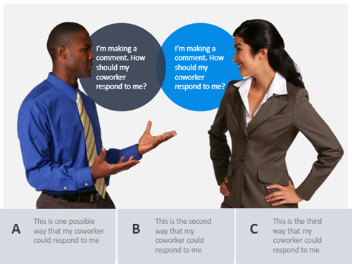
All you want is a slide with a specific look and swap out the placeholders for your course content. You don’t want to change layouts, redesign the slide, add new elements, or customize colors.
The core value is that the template is pre-designed and all you do is add content. This is great for quick authoring and for the person who has limited graphic design experience.
Option 2: The E-Learning Template is Customizable
Use a template where all the features are themed. This usually consists of layouts, colors, and fonts. The value of this type of template is that you can easily modify it by making universal changes to the theme elements. And those changes are applied across all the slides in the course.
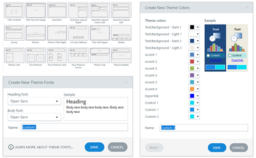
This second perspective requires a bit more forethought and restraint in using the features. For example, all the text and colors on the slide need to use theme text and colors. Also, all layouts need to be mapped to the same placeholders, otherwise, they’re not interchangeable.
Avoid the Mushy Middle
Think of these two perspectives as two ends of a spectrum. On one end you have the convenience of a pre-built screen that only requires content. Select it and add the content.
On the other is a screen that is built to be modified. It’s not tied to content but the theme elements.
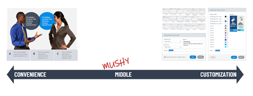
Realistically, you can do both by making a designed slide with themed elements. But…and this is a big but (cue Pee Wee Herman) most of the issues I see when people work with templates is that they want the convenience of plug and play and then they want to customize, too. Inevitably this leads to a lot of time wasted trying to make things work.
So, I usually recommend this: if you use a template you didn’t create, accept the fact that what you select is what you get and all you need to do is add your content. Don’t expect to import it and then begin to make too many edits. At that point you lose the power of what the template gives you.
Or…
Create your own templates. Design specific layouts and multiple versions of them. For example, if you build a tabs interaction, design a 3-tab, 4-tab, and 5-tab version. Don’t just design a 3-tab and expect to modify it.
When you build the slide template, only use theme elements.
- That means you use create placeholder layouts and use them consistently on the various slides.
- Determine your theme colors and only use colors from your theme. And use them consistently.
- Set your theme fonts (usually a heading and body). And all text on the screen uses the theme font. You don’t insert that one cute curly font to make your course engaging. One, it isn’t engaging. And two, it’s not a theme font.
- Before using a template like that, you determine a new theme font and color scheme. And then insert the slide and apply the new theme elements.
Notice how the first option is just plug and play and the second requires a lot more intention and more production? That’s the big consideration. The template should provide some time-saving guidance. If you need to make a bunch of tweaks or mess things up because you didn’t plan on the theme elements, have you really saved any time? Did the template offer real value?
There you have it: two perspectives on when to use a template. Use it as is for quick authoring with minimal changes. Or use templates where you can make universal changes to the themes and quickly create new looks.
Events
- Everyday. Check out the weekly training webinars to learn more about Rise, Storyline, and instructional design.
Free E-Learning Resources
 |
 |
 |
|
Want to learn more? Check out these articles and free resources in the community. |
Here’s a great job board for e-learning, instructional design, and training jobs |
Participate in the weekly e-learning challenges to sharpen your skills |
 |
 |
 |
|
Get your free PowerPoint templates and free graphics & stock images. |
Lots of cool e-learning examples to check out and find inspiration. |
Getting Started? This e-learning 101 series and the free e-books will help. |
2 responses to “Understanding E-Learning Templates”
That’s some very sensible advice. I agree, going for a ready-made template and then trying to customize it completely serves no purpose other than increasing course development time. If used right, templates can speed up eLearning development and reduce the cost of your eLearning project as well.





0
comments