


I think that in addition to this, if you use an LMS, you should also always take into account the way your LMS displays courses. For example, most LMSs (with the notable exception of SCORM Cloud) use a “pop-up” window. This can change the way your course behaves in numerous ways, for example, currently in Chrome this means that many links embedded in your course, once clicked, will open in another tab behind the pop-up window. This can be quite confusing and should be accounted for during testing.
How to Use a Browser to Preview Responsive Courses
May 22nd, 2018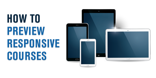
Here’s a simple way to test your published courses when building responsive mobile learning. While each browser is a bit different, most have some sort of emulation features.
Preview Your Published Responsive Courses
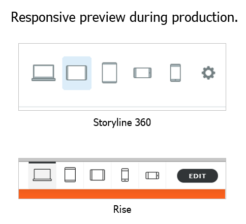
During your course production you can preview the course using one of the responsive preview options. This gives you a very good approximation of how the course will respond to different devices whether they’re in portrait or landscape orientation.
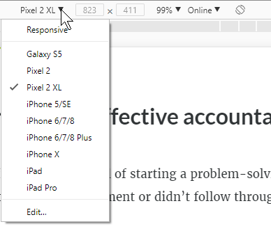
After you publish the course and upload it to your LMS (or web server) you can also preview it via the browser. Open the course and right click to access the developer tools (see tutorials below). From there you can access the device emulator to test how the course will respond to different devices or screen resolutions.
For example, here’s a responsive e-learning course I published in Rise. I want to see how it responds to other devices after it’s published. Some people scale their browsers to do this, but it makes more sense to use the browser’s feature instead.
Get the Aspect Ratio of Popular Devices for Responsive Courses
One side benefit is that in Chrome and Firefox they expose the resolutions for different mobile devices. Even if you don’t use the responsive emulators, it’s still an easy way to get the aspect ratios and resolutions of the popular mobile devices. I use these to to set the story size dimensions for my mobile Storyline courses when I build for specific devices.
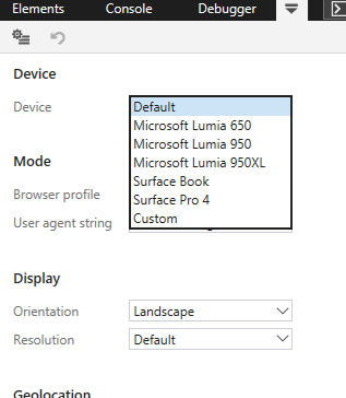
Unfortunately, Microsoft’s Edge is a bit myopic and behind the times as they assume that people only use their devices. Of course, it doesn’t really matter because you can choose the orientation and customize the resolution.
How to View Responsive Courses Tutorials
Here are some quick tutorials where I go through this feature in the following browsers:
- Chrome
- Firefox
- Edge
- Internet Explorer 11 (Why bother?)
Each browser is a little different, but it is a handy feature to access when building responsive mobile learning. One thing to keep in mind is that what you get via the browser is an emulation and may not be an exact representation of how your course will really behave, but for the most part it should be fine.
Events
- Everyday. Check out the weekly training webinars to learn more about Rise, Storyline, and instructional design.
Free E-Learning Resources
 |
 |
 |
|
Want to learn more? Check out these articles and free resources in the community. |
Here’s a great job board for e-learning, instructional design, and training jobs |
Participate in the weekly e-learning challenges to sharpen your skills |
 |
 |
 |
|
Get your free PowerPoint templates and free graphics & stock images. |
Lots of cool e-learning examples to check out and find inspiration. |
Getting Started? This e-learning 101 series and the free e-books will help. |
You might also like:
3 responses to “How to Use a Browser to Preview Responsive Courses”
The user interface of the LMS, in addition to this should also be user friendly to enable learners to navigate through the contents in the LMS. That is great information


0
comments