


I work at a teaching hospital and created a Storyline course on reporting patient safety events. The “committee” wanted the course to be branded. So I used our central colors and logos (only on the intro screen). What really worked was taking photos around our campus and using those on the slides to help teach the key points. Users felt it really spoke to them vs. some generic medical course. I even used cut-out medical people graphics and placed them against the background campus photos. Sounds cheesy, but it ended up looking pretty good. It was easy to take my own photos, not have to ask our Marketing dept’s permission, and didn’t have to worry about copyright.
How to Add Company Branding to Your E-Learning Courses
May 11th, 2021
One of the big challenges when building courses is having to deal with organization’s brand and visual identity and figuring out how to work it into the course. And to do it in a way so the course doesn’t look like a billboard or race car.
Here are some quick tips on how to incorporate the company’s brand into your courses without being overly intrusive on the learning objectives and actual course content.
Get Rid of the Branding
Before we get started, here’s a question worthy of debate: do you really need to brand your courses? What does it accomplish? Does it make a better learning experience? I understand the need for good looking design and meeting the organization’s need that way. But how does all of that branding fit into meeting the learning objectives (assuming there are some)?
I’ve built plenty of courses over the years and have spent more than enough hours with the customers and marketing folks. So I know all the reasons we have for adding the brand content to our courses. I just wonder if it really matters and what value it adds.
What do you think?
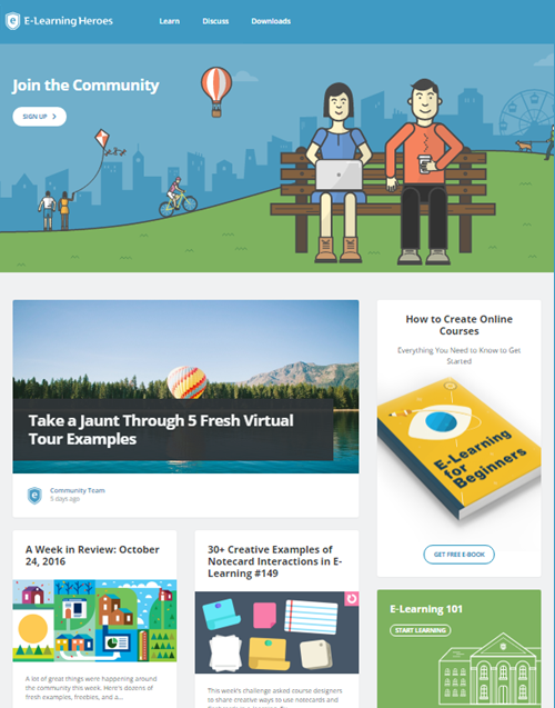
With that said here are a few ways to work your brand into the course that avoids some of the internal bickering and doesn’t get you fired. For this post, I’m going to use the E-learning Heroes community for my examples.
Create a Landing Page
Instead of a course that features a logo and design on each screen, create a single-entry point that provides the branding info at the beginning of the course. After that, reserve the rest of the course for the learning part of the e-learning.
You can do this by creating a landing page or gate screen. The branding is offered upfront, and the rest of the course is mostly devoid of it.
- Landing Pages. Do a search for landing pages to get some ideas on design and layout. And then build one for your organization. Use it at the beginning of all your courses.
- Gate Screens. Build a gate screen. You can use one at the beginning or use them between sections or modules.
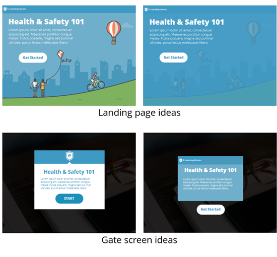
Above are some quick mockups based on the community page. I know a few companies that do this. I think it’s a workable solution because it adds the branding info that marketing and management requests. But it also reserves the rest of the screen space for the learning content and interactions.
Optimize the Player
Most e-learning courses include a player; and that player can be customized to some extent. What are the main brand elements for you to consider and how can they be incorporated into the player?
Generally, the visual part of the brand deals with some images like a logos and backgrounds, color schemes, typography, visual design, and screen layouts.
- Incorporate the organization’s brand by colorizing the template to match the color schemes.
- Leverage the logo or presenter panels for the company logo. Those can remain persistent which helps with the clients that want the logo on every screen.
- Use the same (or similar fonts). Few corporate fonts are standard system fonts. Ask for the “official” font or try to find a similar one using What the Font. Often you can find comparable fonts that are free via Google Web Fonts. Most people won’t notice the subtle difference. And if they do, just tell them you’re using the “official” font for e-learning courses.
Mimic the Organization’s Web Site
Changing player colors and adding logos is easy enough. The more challenging issue is capturing the right visual design, especially if the organization’s made an investment to project a specific look and feel for the brand. And this is critical if what you build is presented outside the organization.
Ideally, you get the organization to help you brand the courses. But the reality is most of us won’t get access to a graphic designer to help. Considering this, here are a few ways you can glean the organization’s branding from the web site where they did hire a graphic designer.
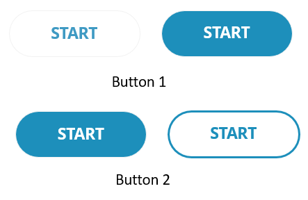
- Buttons are common. Each site has some sort of button or tab. Recreate those by copying their different states such as normal, hover, down, and selected.
- Identify a few core screen layouts based on the web site. Make note of the way the items are arranged, especially things like white space and margins.
- Look for potential content holders. I look for those individual elements like boxes and side panels that could become content holders or interactive items.
- Where are the interactive elements? There are three things we do to interact with the screen: click, hover, and drag. How are those used in the website? Try to recreate them in your e-learning application. And if there aren’t interactive elements, what can you make interactive? For example, instead of static box, it has a hover state when moused over.
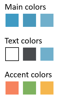
- Colors are key. The company website already has an official brand. Mimic the general layout and use the correct colors. Here’s a more detailed post on how you can color pick colors or upload a screenshot of the site and have one of those color scheming sites pick colors for you.
If you need to brand your courses, these three suggestions should help. Start simple with a landing page and work your brand into the player and course screens by mimicking the organization’s web site and color schemes.
What do you do to incorporate the company’s brand into your courses?
Events
- Everyday. Check out the weekly training webinars to learn more about Rise, Storyline, and instructional design.
Free E-Learning Resources
 |
 |
 |
|
Want to learn more? Check out these articles and free resources in the community. |
Here’s a great job board for e-learning, instructional design, and training jobs |
Participate in the weekly e-learning challenges to sharpen your skills |
 |
 |
 |
|
Get your free PowerPoint templates and free graphics & stock images. |
Lots of cool e-learning examples to check out and find inspiration. |
Getting Started? This e-learning 101 series and the free e-books will help. |
You might also like:
4 responses to “How to Add Company Branding to Your E-Learning Courses”
La traduzione in italiano (autorizzata) è disponibile qui: http://www.mosaicoelearning.it/blog/come-incorporare-il-brand-aziendale-nei-corsi-e-learning-prima-parte/
Similar to Lisa, I too have used photos of the work environment. Taking pictures of empty office locations and then using Articulate’s ‘cartoon’ people to populate them.
Very timely and helpful!
I just put something together for my team that will save us all time.
We gathered up the marketing PowerPoint files and imported the best one in to Storyline. This gave us a good starting point for layouts, themes and company colors. No color picking needed!


0
comments