These weekly challenges are a great idea. I don’t usually do them, but I do like to see the results. I agree they’re great to inspire ideas.
Build Better Online Training Courses By Taking Up This Challenge
October 22nd, 2013
A lot of teaching and elearning focuses on sharing information and pushing it out. Sure, that’s part of what’s required. But learning is more than acquisition of information. Learning involves processing the information and applying it. Then seeing what happens and making adjustments.
So when building your online courses, consider how the learner can apply what’s being shared. But let’s shift the focus to our own development. What do we do to develop our own skills? How do we learn new things?
Today I’d like to offer a simple way to help you improve your skills.
A Simple Way to Develop Your Skills
For the past few weeks, David’s been running small challenge activities to help people practice their skills. We try to keep the challenges simple and short enough so that they’re something you can do without a big time commitment.
The objective of the challenge isn’t to build the fanciest demo or module. Although, it is a great way to show off your skills. Instead the goal is to learn new techniques and practice using the tools. It’s also a way to inspire ideas and help others think through their own projects.
Here are a couple of things I learned from the recent challenges:
- Diverse ideas expand our horizons. Three different people will come up with three different ideas even if they’re looking at the same thing. It’s a reminder that there’s not only one way to do things. It also shows the benefit of getting different perspectives. That’s why the elearning community is such a value especially if you work by yourself and don’t get a lot of feedback.
- Production tips abound. I can’t list them all, but many of the demos had me open up Storyline to see if I could replicate the effect. I was an engaged learner as practiced some new techniques and played around with my own ideas. This interactive squares demo is one example that got me thinking.
Below are a few examples from a couple of recent challenges. One was on how to create some comparisons between images. And the other was on creating a tabs interaction.
E-Learning Challenge: Show Meaningful Comparisons
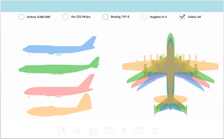
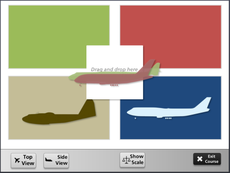
The objective of this challenge was to compare one object to another. David used this airplane graphic from Wikipedia as the starting asset. Here are some of the submissions from the community:
Click here to view the elearning example.
- Montse Posner Anderson showed a nice clean design which makes it easy to distinguish the differences when doing the comparison. The top and side views are on a single screen.
Click here to view the elearning example.
- Blair Parkin’s example lets me isolate the planes and then I can compare one to another or multiples. And at any point I can clear the screen to start over.
Click here to view the elearning example.
- Tricia Ransom has a slightly different take. In her example, you drag and drop the planes to compare them. People like dragging interactions so the novelty can pull them into the module better than the standard click.
What I love about these demos is that each is a bit different. It shows that there’s not a single approach for most problems. Can you imagine the results if they teamed together and had more time?
E-Learning Challenge: Create a Tabs Interaction
In a recent post I shared a number of free PowerPoint elearning templates to download. They were different types of tabs interactions which are common to many online training courses.
David used that post as inspiration to practice building your own tabs interaction. Below are some of the demos. You can click here for more details on the weekly elearning challenge.
Click here to view the elearning example.
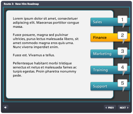
- Heather Steckley offers up a right-side tabs interaction built for a new hire road map.
Click here to view the elearning example.
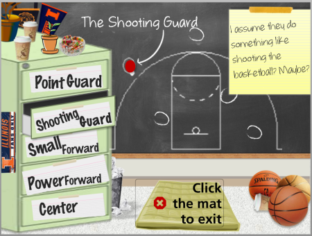
- Tricia Ransom went for a less orthodox tabs interaction. In her example, the tabs are on a file cabinet and the drawers open when clicked.
Click here to view the elearning example.
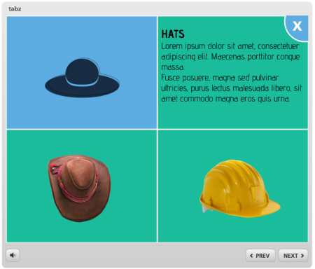
- Przemysław Hubisz offers up a quadrant tabs interac
tion. I love this design.
Click here to view the elearning example.
- Kevin Thorn cleaned out one of his recent client projects and then made his tabs interaction available as a download, too.
Click here to view the elearning example.
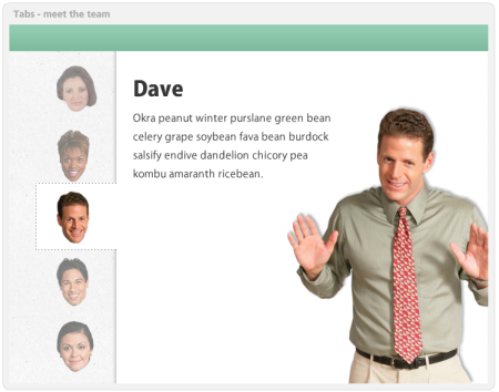
- Montse Posner Anderson opted to decapitate the office team and put their heads on the tabs. Salome and Henry would be proud. This is a good reminder that tabs don’t always need to be text-based.
Click here to view the elearning example.
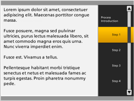
- Heather Steckley shows another variation of the side-tabs interaction. Her demo has to examples. I love the faux scrollbar look. Very clever.
Click here to view the elearning example.
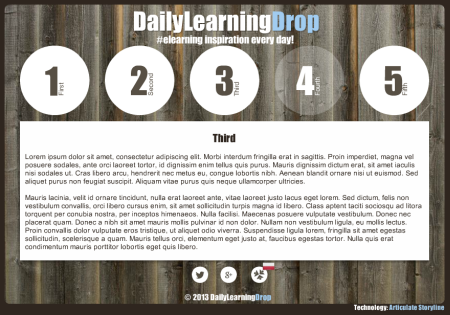
- Andrej Rudnik uses circles as tabs (we can be a bit loose on these demos). I like the transparent circles with the sliding pages. Pretty cool design.
Click here to view the elearning example.
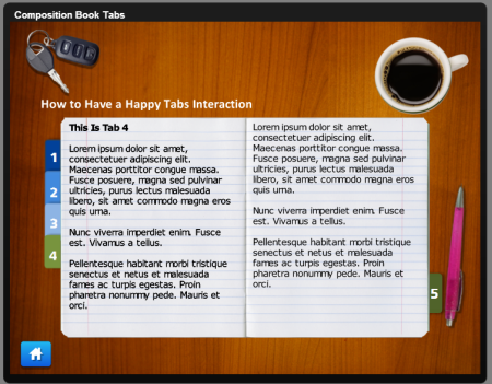
- Jenise Cook leveraged some of the free downloads in the community to create her overhead desktop tabbed notebook. She also shares her template for you to use.
I love seeing what other people create and how they do it. I also find that when I review these demos they prompt my own ideas on how I’d approach the same thing. Sometimes it’s easier to learn when deconstructing someone else’s work than it is to start your own.
Like any profession, building expertise requires practice. These weekly challenges are a great way to connect with the elearning community and a great way to practice building your skills.
Are you ready to take up the challenge?
If you want to learn to build better courses, connect with the elearning community, or practice using your authoring tools, then take up the challenge. It’s not too late.
These challenges are fun and simple enough to do. And you don’t need to worry about things being perfect. They’re just quick hit prototypes.
This week’s challenge is creating an elearning template based on a single clip art style.
Events
- Everyday. Check out the weekly training webinars to learn more about Rise, Storyline, and instructional design.
Free E-Learning Resources
 |
 |
 |
|
Want to learn more? Check out these articles and free resources in the community. |
Here’s a great job board for e-learning, instructional design, and training jobs |
Participate in the weekly e-learning challenges to sharpen your skills |
 |
 |
 |
|
Get your free PowerPoint templates and free graphics & stock images. |
Lots of cool e-learning examples to check out and find inspiration. |
Getting Started? This e-learning 101 series and the free e-books will help. |
13 responses to “Build Better Online Training Courses By Taking Up This Challenge”
Love the examples. Will try one of the challenges myself.
Love your tips. Will take this to the team.
Great post as usual. Are you going to be at Devlearn this week?
Tom, I believe the second airplane comparison link is pointing to th econtent of the first example… Thanks, James
Great post!!
Thanks for the shout out Tom. I really like the idea of the weekly challenge. It gets my creative juices flowing. It really helps you to think outside of the box.
Tom,
Thank you for including my example. The Community’s
support is Best in Class, something I know from using Articulate’s products since version 5. 🙂
I hope others will begin to participate in the Weekly Challenges, as their time allows. These Challenges not only stir up our creative juices, they also provide ideas and opportunities for those new to rapid e-learning to create samples for their portfolios.
Once again, much gratitude for including me in your post, and I thank you, Tom, for all the support you and your team have provided our business over the years!
On Twitter: @jenisecook
Very good! When possible, I follow your blog. The articles are interesting. Congratulations!
Great post! Along with comparisons, easy to understand analogies can be of great help too while teaching.



0
comments