I use Style 1568 a lot.
15 Interesting Clip Art Styles for Your E-Learning Courses
October 6th, 2009If you’re like many of us, you don’t have a lot of money to buy stock images or hire a graphics designer. So that means you’re stuck using the free resources that come with PowerPoint. In previous posts, I’ve discussed ways to ungroup your clip art and create your own clip art. It only takes a few clicks to get from one image to the next.
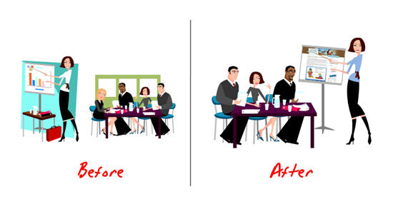
Even with those free resources available, it’s still time-consuming to find the right clip art to use. So what I’m doing today is helping you get started by listing fifteen of my favorite clip art styles. These are the ones that I commonly use for my elearning courses.
About Clip Art Styles
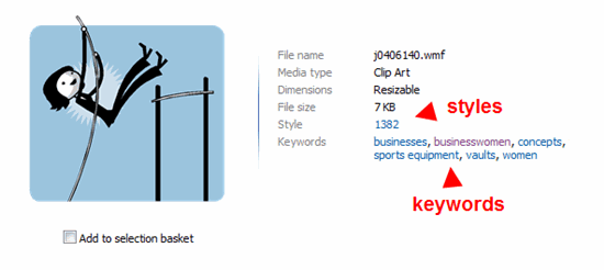
As you search, you’ll notice that not all of the clip art belongs to a “style.” The reason I like to use clip art from the same style is because I can mix and match them and they’ll look like they belong together. It gives your course a much more professional and polished look.
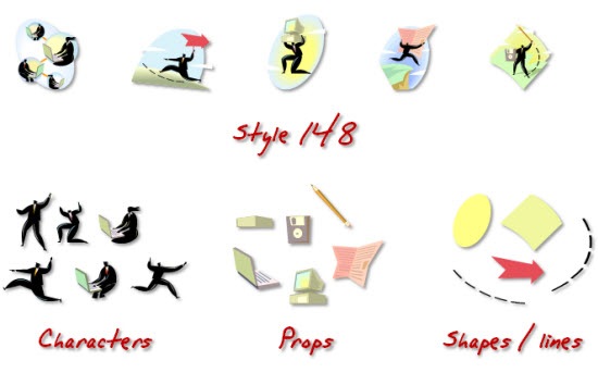
I like to find styles that have a lot of variety. For example, I may not be interested in all of the clip art images in a particular style. However, by ungrouping them, I can create an assortment of assets like characters, props, and shapes. And since they’re all from the same style they’ll look like they go together.
In the example below, you can see how images from “style 148” provide characters, various props, and some shapes that I can use in my elearning courses.
Tips on Finding the Right Clip Art
Here’s a post that shows you how to create a consistent look for your courses. It covers some of what I’m talking about today. I also created a video that shares a few tips about how to search clip art. Those might come in handy.
Click here to view the Screenr video.
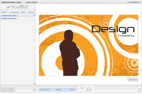
Below are some of my favorite clip art styles. I’m fond of some because of the characters. However, some I like only because of their colors and shapes. For example, “style 1592” doesn’t have a lot of images, but here’s an example where I ungrouped one and used parts of the clip art to create a Flash intro screen demo in Quizmaker ‘09.
Click here to view the intro screen demo.
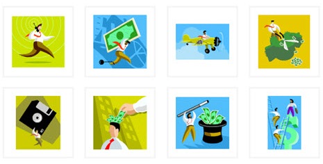
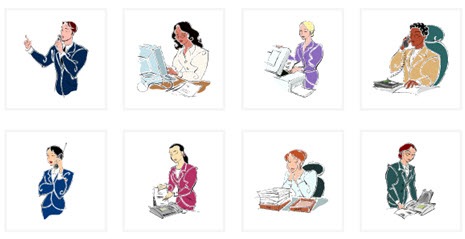
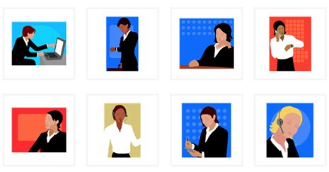
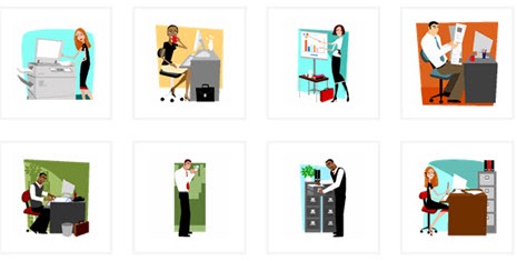
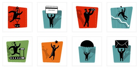
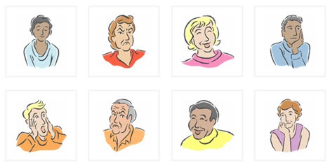
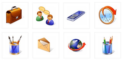
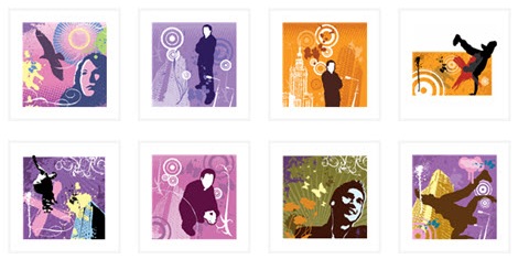
15 of My Favorite Clip Art Styles
Style 1366 (no longer available)
Style 1423 (no longer available)
Style 1426 (no longer available)
Style 1441 (no longer available)
Style 1445 (no longer available)
Update (6/8/10): Apparently some of the styles are no longer available. Here are some additional ones to replace the ones missing.
Sometimes it’s fun to just type in a style and see what comes up. For example, the clip art images in “Style 13” turned out to be lucky. :) They’ll work great in a future elearning course. Do you have any favorite clip art styles that you’d like to share? Add them to the comments section.
Events
- Everyday. Check out the weekly training webinars to learn more about Rise, Storyline, and instructional design.
Free E-Learning Resources
 |
 |
 |
|
Want to learn more? Check out these articles and free resources in the community. |
Here’s a great job board for e-learning, instructional design, and training jobs |
Participate in the weekly e-learning challenges to sharpen your skills |
 |
 |
 |
|
Get your free PowerPoint templates and free graphics & stock images. |
Lots of cool e-learning examples to check out and find inspiration. |
Getting Started? This e-learning 101 series and the free e-books will help. |
60 responses to “15 Interesting Clip Art Styles for Your E-Learning Courses”
Tom – Your suggestion for finding clip art by style came at a perfect time. I was browsing through the Microsoft website looking for similar graphics by keyword or tag. Your topics always seem to come at the right time! Thanks so much.
1280 and 1368 can be interchanged if you play your cards right. I have also had good luck with mixing some 1366 into that mix and keeping a consistent look but you’ve really got to do a lot to play up the faces.
BTW – the Joseph in the Holy Family clip in 1280 looks a lot like Gerard Depardieu once you remove the beard. Just saying.
I did not even realize you could search by style, this will save tons o’ time. Looking at the above examples of styles, I am also seeing that certain styles appear to be focused on certain themes, industries, and metaphors, not just artistic style. Since I am conitually looking for business people at work for my course, styles like 1366 and 1568 above are the types I can use.
Thanks!
I use style 1368 fairly frequently. Although I’ve been trying to stay away from clip art lately unless I’m really under the gun.
Great post.
Great clip art tips and tricks!
They’re a great resource for online learning activities in the education/academia and in-house corporate sectors.
If the clip art is used in a paying client’s course, and the client is going to resell the course to customers, it’s important to first read all of the legal disclaimers on the free clip art site.
Some free clip art sites prohibit use for profit. They make the clip art available for teachers and others in academia.
Just an FYI.
Tom,
How did you create that animation “Design Company” in Quizmaker? I like the fact that it is full screen and has no bar at the top.
Style 1359 has some nice isolated objects, and 1538, 1539, 1540 and 1547 are quite useful too. After several years of being asked to use only photos in developing courses, I’m finding that certain styles of clip art are becoming acceptable again. Some of the early Microsoft styles look a bit dated now (we went through a phase of pointy-feet people at one time, and I still can’t look at them without cringing now!), but many of the later ones are great. Thanks for a great post as always, Tom!
Great blog. I learned a lot! Thank you.
I have the same question as Mike on creating the splash screen for Articulate. Nice! I would love to mimic for my Articulate course. I’m not a flash developer — any quick way to make this, maybe with some free graphic software?
We used 1280 and 1368 for a recent course. Sometimes we dont use Powerpoint to ungroup the image. For other projects you can copy the clipart directly into Illustrator as a vector graphic. Then ungroup, change colors, etc. This is helpful if you are building something outside of elearning or want more advanced control over your design.
Hey Neighbor – Thank you for all of the valuable info! Now I am looking to your blog as a great example for maintaining interest for years! I am exploring ways to use social media for learning.
Marlynn from Tacoma, WA
I am working in PowerPoint 2002 (and the corresponding clipart files)… I am not seeing the “style” listed when I look at the properties of a clipart. Is this specific to a specific version of PowerPoint? (I’m not seeing it either when I look at clips online… what am I not doing correctly?)
Great post. And timely – I had just logged a few hours chasing down styles, and several scribbled post-notes later, I see you’ve tackled it for me! Woo hoo! I shall merge my list with yours and pray that others chime in with their favorites too. One of mine is style #876. Like Mark, I’ve also used 1280 and 1368. Thanks
One more comment about ungrouping clip art and regrouping to fit your purposes – if you’re doing this on every slide, and you have, say, 90 slides, you’re looking at a HUGE file that takes forever to publish.
If you’re playing with them directly in PowerPoint and you don’t have Illustrator, when you like what you have, you can group the image, copy, and paste into Paint, then save it and import it back into your PowerPoint. This won’t preserve transparency but it does keep your file size down, which is important in larger presentations. If you need smaller file size + transparency, you’ll need to use Illustrator or some other graphics program.
Great collection choices! Thoughts…
Downloading to ppt is best(one-by-one by copying and pasting I guess, since the MS downloader won’t let you specify where the download will go or add a Style keyword and I can’t figure out a way to select batches of images to copy at one time from the online gallery). I use XP and 2003.
You could, I suppose, slowly make yourself a sample gallery by style number by creating a new folder in your clip organizer and pasting in a sample of the styles you like for your own visual reference (adding the style number as a keyword). But that’s essentially creating a database–wouldn’t do that on a shared drive, for sure! I tried copying a few samples to a Clip organizer folder, adding the keyword, searching for them on my stand-alone machine, and that worked.
You could create a separate non-Organizer folder, perhaps, and have the Organizer catalogue the images–it might do that for the ppt files you get if you follow Tom’s strategy–haven’t tried that, as the cataloging utility wanted to catalog all the images on the whole hard drive, and I couldn’t be bothered to uncheck all the folders that had copyrighted images that I did NOT want added to the clip organizer.
Storing in a ppt file named with the style a la Tom seems best, but whichever way you do it it gives you an appreciation for the “housekeeping” time behind the scenes in elearning!
[…] 15 Interesting Clip Art Styles for Your E-Learning Courses » The Rapid eLearning Blog – If you’re like many of us, you don’t have a lot of money to buy stock images or hire a graphics designer. So that means you’re stuck using the free resources that come with PowerPoint. In previous posts, I’ve discussed ways to ungroup your clip art and create your own clip art. It only takes a few clicks to get from one image to the next. […]
Excellent tips and tricks – thanks Tom, I was please to see that you provided the steps on how you create your course intro using quizmaker.
I also was taken by the music – very catchy! was it a freebie (are you able to share this too!!)
thanks again Tom – I have learnt alot over the past 6 months – its a great community to be apart of!
cheers Kate
Thank you for great ideas about clip art. I am creating a Russian 2 course. Using your suggestions I found all the images I need. However, they are all .wmf format. I need them in .gif, or .png, or jpeg, any format that can be opened and edited in Fireworks.Do you have a suggestion how to change .wmf to .gif?
Tom- Your clipart posts are always great. I love using characters in e-Learning. I think it lets you tell a story and create a more interesting learning experience. Nice choice of themes too. I ended up using something similar to 1541 in a recent series of courses. If you use illustrations, the course looks way better when you keep a consistent theme. I’ll keep an eye on the comments of this blog to see other themes people like.
I also have a cartoon theme that I use (and for full disclosure… I also sell). These are built in flash and then exported as .pngs with transparent backgrounds. You can see it in the mockup I posted below. The other thing I’m fired up about is a concept I’ve been working on for a few months: pre-built animations where the characters do simple movements. You’ll see these on the first and last slides of the demo. Can you guys give me some feedback on what you think of this? I put together a 30 second articulate course as a mockup on the link below. Thanks 🙂
http://www.elearningart.com/v/vspfiles/files/flash_demo/player.html
Very nice! I truly appreciate your blog posts! They are of great help for my work as a web developer. The main problem with developing the website is the proper design, and your website gives very useful tips and tricks about this matter! Thanks!!!
I have a question: I’ve noticed that some clip art images you are unable to ungroup. Is there any way around this??
I can’t seem to make this work. When I insert the clip art and ungroup everything, it still acts as one image. If I select a section of it and cut it, it cuts the whole image. If I make one section bigger, it makes the whole image bigger. If I select a section and “bring to front,” nothing changes. What am I doing wrong?
[…] 15 Interesting Clip Art Styles for Your E-Learning Courses, October 6, 2009 – The Rapid E-learning blog lists fifteen of favorite clip art styles as well as tips to create a uniform style in your presentation. These days I’m using photographs more and more and moving away from the clip art (blame hours spent on SlideShare), but this is still a useful post to bookmark. […]
Great post again Tom, even more so with the added Screenr demo for creating Flash animations in QM.
@md and anyone else interested in ungrouping/editing clipart, you can download and use Inkscape for free. It’s better than I expected;)
Great styles. Thanks.
[…] — idtlearner @ 6:16 am I learned about how to ungroup PPT clipart from a post on Articulate.com, Rapid e-Learning. Thanks to my classmate, Meredith, for pointing out this resource to me on her […]
[…] then you want to keep these 15 clip art styles close at hand. You can learn more in this post 15 Interesting Clip Art Styles for Your E-Learning Courses via the Rapid E-Learning […]
[…] 15 Interesting Clip Art Styles for Your E-Learning Courses » The Rapid eLearning Blog […]
[…] you’re struggling to find themed images of a particular style, Tom Kuhlmann wrote a helpful blog post last fall about finding styles of clip art in the Microsoft clip art library. And here’s a […]
Our organization has banned the use of clip art. Is there any research out there that I could use to convince our organization that clip art is acceptable and can enhance a user’s learning experience?
Thanks!
Does anyone have handy info about use of clip art vs actual images saving big space in files that are uploaded into an LMS? We do a LOT of training materials for sites that log in using a dial up connection. Throw in audio, and users could possibly crash their system trying to download from an LMS. Also, what is the best file type to save a vector image without losing quality or transparency?
[…] a link to some clip art styles that might work for this. What clip art style do you think work best? Add your favorite by clicking on […]
Tom, I keep coming back to this post to get ideas for art for my courses. One question that I have is how do you identify what type of style is what (if that makes sense. There are so many images in the Microsoft Clip Art gallary it’s hard sometimes to find what you are looking for. Do you have any tips on searching the gallary?
I was using the Clip Art feature inside of PowerPoint. After watching your demo on “Tips for Finding the Right Clip Art,” I’ll now be utilizing Clip Art Online. It seems there are 2 differences while online; 1). you can specify the number of thumbnails to make visible at a time and 2). you can access the “styles” option. If I am wrong, and someone knows how to utilize these two features while inside of PowerPoint, I’d love to know how!
Tom: Always learning more from you and I know I am missign some opportunities with Engage and Quizmaker. I was wondering why you used Quizmaker for the branding splash screen (10/6/09) rather that just do it all in ppt.
Wow the Microsoft clipart page is totally redesigned. It’s pretty cool the way images appear kind of like a bulletin board and then fall away when you select one.
I had fun with it, I didn’t see the style # on any of the items I selected. Hopefully they haven’t done away with that.
[…] 15 Interesting Clip Art Styles for Your E-Learning Courses » The Rapid eLearning Blog (tags: clipart elearning resources images) […]
Tom, When I want to edit a PP clip art, sometimes I want to delete the edit points. How can you delete multiple edit point at one time?
[…] […]
Great list of styles!!
I also found style 1280:
http://office.microsoft.com/en-us/images/results.aspx?qu=Style%201280#
@John Poe – I struggled with it as well, with the new design. If you reach an image from the similar page – the style does not appear, you have to search it by keyword, and then the style number will appear.
Seems like I copied the wrong style… Tom already mentioned 1280.
Take a look at Style 1268 (currently working with it):
http://office.microsoft.com/en-us/images/results.aspx?qu=style+1268
Style 1253 also looks promising.
I also used 1255 – a bit childish in look, but in a Sherlock Holmes themed scenario, I used the detective (no pony tail, and a bit slimmer), and additions and changes from others in that style.
Style 1269 is simple black and white
And finally 1266 is good for accessories/props.
Hi Tom,
I need to learn how to create a splash page and tried accessing your demo (the example where you used parts of clip art to create a Flash intro screen demo in Quizmaker ‘09 http://www.articulate.com/rapid-elearning/15-interesting-clip-art-styles-for-your-e-learning-courses/. The demo is not working. Any idea when it will be working again?
Thanks.
[…] with those free resources available, it’s still time-consuming to find the right clip art to use. 15 Interesting Clip Art Styles for Your E-Learning Courses » The Rapid eLearning Blog Présentations & Conversions Animation et Sons Prezi Prezi eLearning Tools The Current […]
[…] 15 Interesting Clip Art Styles for Your E-Learning Courses » The I’m hitting the road in a few days. Here are some of the places I’ll be. If you happen to be at these conferences, swing by the Articulate booth and say “Hi.” Tidbits: […]
[…] 15 Interesting Clip Art Styles for Your E-Learning Courses […]
[…] 15 Interesting Clip Art Styles for Your E-Learning Courses […]








0
comments