The Rapid Elearning Blog

Archive for October, 2008


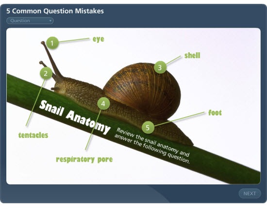
The Rapid E-Learning Blog: quiz question 

Assessing the learner’s progress is important.  How else can we provide the best feedback or certify that the learner’s met a certain level of understanding?  That’s why we need to ask the right questions.  Avoid the following mistakes and you’ll create a more effective learning experience.

Here’s a simple quiz that demonstrates some of the mistakes I discuss below.

The Rapid E-Learning Blog: common mistakes demo

Click here to view quiz demo.

The questions are either too easy or downright stupid.

We’ve all seen them.  You take a quiz and there’s one good answer choice and all of the rest are obviously not right (or plain silly).  It’s like the course designer just went through the motions.  This type of quiz question does nothing to measure the learner.  What’s the point of the quiz?  Why’s it even there?  Put some thought into the quiz and make it meaningful.

  • Get better wrong choices from your subject matter expert.  Sometimes the reason these types of questions exist is because you don’t get enough viable wrong answers from your subject matter expert.  So you make up stuff as filler.
  • Use fewer choices.  Instead of a four or five multiple choices, just use three.  Or better yet, make it a true or false.  That means a little less work and you’re less likely to have to come up with a wasted choice.
  • You don’t always need a quiz to end your course.  Not all courses require a quiz.  If you have no interest or reason to assess the learner, create an easier way to end the course.

    The questions are set up as "gotcha" questions. 

    I worked on a project once where the customer gave me a list of questions and half of them were trick questions.  His rationale for the trick questions was that if the learner really understood the content, they’d pick up on the nuances of the questions.  That’s nonsense!

    • Don’t be an elearning fascist.  The goal’s not to make your learners look stupid or to trick them.
    • Align your questions to your objectives.  Start with clear learning objectives.  Then determine how you will know that the learner has met them.  Now you can create quiz questions based on that criterion.
    • Sometimes a quiz question is not the right way to measure understanding.  Don’t assume that the learner can work through all of the nuances of the new content.  If you really want them to learn the nuances, use simple scenarios or case studies instead of quiz questions. 

    Questions ask about content that’s not covered in the course. 

    Sometimes there’s a tendency to pack more teaching into the question.  We figure that we only have access to the learner for a short period of time, why not just add more content as we ask a question.

    • Keep it simple and direct.  Use the question to assess where the learner is at that moment.  Don’t confuse the learner by adding more course content in the question.
    • If the content is important, put it in the course.  Going back to the first point, if the content is critical to the learner’s understanding, then put it into the course prior to the quiz.  If you can’t find a place for it, perhaps that’s a good indication of whether or not it should be in the course in the first place.
    • Use the answer feedback to build a little more understanding.  Based on the learner’s response, you’re in a position to provide more information.  If you want to give more to the learner, this is a better place than in the question.

    The questions are way too wordy and make it difficult to understand. 

    This is a common issue with policy training or courses that deal with regulations.  Questions that could be simple look like they were written for someone taking a bar exam.

    • Limit the question to one sentence.  Try to keep the questions simple and concise.  Avoid paragraphs and adding a bunch of fluff.
    • Use standard question prompts to start the question.  Who?  What?  Where?  When?  Why?  How?
    • Don’t try to show off your fancy vocabulary.  Your learners come to the course at various levels of expertise and understanding.  Unless you teach certain words or concepts in the course, understand that not all of the learners will know the "fancy words."  Your best bet is to use simple or common words when possible.

    The learner doesn’t know what to do to answer the question.

    This issue is less to do with the question and more about providing enough direction to the learner.  Think about what you put on the screen and the directions you give the users. 

    • Be consistent in how the learner interacts with the screen.  I’ve made the mistake in the past where some of my text boxes look exactly like my buttons.  This confused the learners.  Make sure that those parts of the screen used for navigation and buttons are distinct and easily recognized.
    • Get rid of the junk.  The rapid elearning software gives you a lot of options and features.  If you don’t need them, get rid of the noise.  For example, if there’s no need to have a drop down list of questions, then consider turning it off.  There’s no reason to have your learners clicking around the interface when you want them focused on the question.
    • Tell the learner what to do.  The user interface might seem obvious to you, but I’ve seen plenty of people get frustrated because they’re not sure what to do.  For example, if you have a drag and drop question, let the user know that they need to drag the answer to a specific location.

    The goal is to assess your learner’s understanding of the course content.  By avoiding some of these common mistakes, you’ll create better quiz questions.  What are some mistakes that you’ve seen in the quizzes you’ve had to take?  Share them with the rest of us by clicking on the comments sections.

    Events

    Free E-Learning Resources

    Want to learn more? Check out these articles and free resources in the community.

    Here’s a great job board for e-learning, instructional design, and training jobs

    Participate in the weekly e-learning challenges to sharpen your skills

    Get your free PowerPoint templates and free graphics & stock images.

    Lots of cool e-learning examples to check out and find inspiration.

    Getting Started? This e-learning 101 series and the free e-books will help.


    It never fails.  Fill a room with instructional designers and you’ll always have someone ask, ‘How do you measure your return on investment."  To which I respond, "What are you? An accountant?"  As the great elearning pioneer, Dr. Werner Oppelbaumer says, "If you want better ROI, hire smarter people who don’t need training." 

    Here’s the deal with return on investment (ROI).  It’s tricky.  I find that the concern is really less about ROI and more about how instructional designers can promote their value to the organization.  And considering our economic climate, that’s not a bad idea.

    Here are three easy ways to help you determine your ROI and promote the value you bring to your organization.

    Customer Satisfaction = Success 

    I hired a neighborhood boy to mow my lawn.  I didn’t hear the mower running, so I looked outside.  He was sitting on my porch with his laptop entering data into a spreadsheet.  I asked why he wasn’t mowing my lawn.  He told me that he was trying to figure out the ROI.

    "Look! I know the ROI.  I am paying you $20 to mow my lawn.  If you mow the lawn to my satisfaction, you’ll prove your value.  I don’t need you to create a bunch of charts and spreadsheets."

    The same goes for elearning. Assume that the customers know what they want.  If you do what you agree to do and the customer’s happy, you have your ROI.

    ACTION ITEMS

    • Make a detailed agreement on what you’ll deliver.  A common problem is that we use the same words but we don’t always mean the same thing.  When working with your clients, set clear expectations and measures of success. 
    • Establish a timeline that is realistic.  From my experience, this is an area that trips up a lot of projects.  The timeline is fuzzy and with that so are expectations.  Fuzzy expectations lead to a less than stellar end result, which ultimately leads to an unhappy customer.  Assume that when all is said and done, you’re to blame.  So it’s in your best interest to set a clear timeline and work to meet it or beat it.
    • Do a post project debrief with your client to measure their level of satisfaction.  If you wait until the end of the year, their enthusiasm will wane and they’ll be bombarded by other people looking for end-of-year feedback.  I make it a habit to follow up right after the project is complete.  I want to know what went well and where I can make improvements for the next project.

    Align the Course Outcome to a Measurable Goal 

    The challenge for a lot of courses is that they aren’t tied to real performance goals.  They might have value to the organization, but it’s not always clear how.  So you end up with a lot of information-dumping and no focused performance improvements.  Your job is to get the course focused on performance.

    How do you measure the ROI of a new hire training course?  If it’s an information dump, that’s hard.  However, if you tie the information to a performance goal then you have a metric to hang your hat on.  For example, new employees need more hand holding for initial IT support.  Suppose your course teaches them how to self-serve their IT issues. You can measure a drop in call frequency or IT help requests.  That is a measurable improvement and shows the impact of your course.

    Ideally your course is built around a real performance goal.  If you’re not quite sure what that is, help the customer sort through their expectations.  The key question here is, "How will you know you’re successful?"  You’re looking for some metric that they use as proof of success.  Then you want to build your course to change that number.

    ACTION ITEMS

    • Find a metric you can use.  There’s always something.  Even if it’s taking a 30 minute course down to 15 minutes. That’s a 50% decrease in time.  Multiply that over 10 people and you’ve saved 150 minutes. :) 
    • Make sure the metric is meaningful.  As you can see by the example above, percentages can be deceiving.  No one cares if you save 150 minutes.  Besides, you have to save a lot more than that if you want your CEO to get his bonus.
    • Learn to be a performance consultant so you’re better able to help your clients focus on the right things.  Robinson’s book, Performance Consulting, is a good place to start.

    Lower Your Production Costs 

    Sometimes you have no access to the metrics that measure success.  And even if you did, trying to prove your ROI becomes too costly.  Instead of focusing on what you can’t control, focus on what you can, such as your production time and the resources needed to create a course.

    I’ll benchmark my courses.  For example, a simple elearning course can cost anywhere from $5,000 to $15,000 depending on what you do.  I just split the difference and set my baseline cost at $8,000.  My goal is to bring my simple courses in under that cost.   It’s not a completely accurate number but it is a good place to start.  Your ultimate goal is to cost less than your competition.  In these tough economic times, you want to demonstrate that you are a cost-effective solution to meet the organization’s needs.

    ACTION ITEMS

    • Find out what your courses cost.  You don’t need to be an accountant.  Ball park the figures.  If someone challenges your numbers, let them do the math for you.  The main goal is to know what you cost the organization.  Without that number you won’t be able to prove your value.
    • Benchmark your courses.  Low-end courses are usually less than $10,000.  Many of the high-end courses can costs hundreds of thousands.  It makes sense to figure out where you fit in comparison.  In tough times, training is usually an early casualty.  You want to demonstrate that you are a cost-effective solution.
    • Cut production costs.  Make one of your performance goals to cut your production costs by 20%.  You’ll save money and probably find ways to become more efficient as a team.  In an earlier post, I outlined my production strategy.  I start with rapid elearning software and move up from there.  It saves time and money and frees up my more expensive multimedia programmers to do what the software can’t. 

    When it comes to return on investment, you have two goals.  You want to bring value to the organization and you want show that YOU bring value to the organization.  You can do this by meeting your customer’s expectations, aligning your projects to real measurable objectives, and controlling your production costs.

    I look forward to your feedback and comments.  Feel free to share them by clicking on the comments sections.

    Events

    Free E-Learning Resources

    Want to learn more? Check out these articles and free resources in the community.

    Here’s a great job board for e-learning, instructional design, and training jobs

    Participate in the weekly e-learning challenges to sharpen your skills

    Get your free PowerPoint templates and free graphics & stock images.

    Lots of cool e-learning examples to check out and find inspiration.

    Getting Started? This e-learning 101 series and the free e-books will help.


    At a recent conference, we were asked what typically held up the production process for elearning courses.  The number one response was working with the subject matter expert.  This makes sense since they play such a critical role in the course’s success.

    The subject matter experts know the content and understand the work environment.  Because of this, much of your project hinges on their time and the commitment they make to the project. The challenge is that our subject matter experts are like the rest of us and just don’t have a lot of time to spare.

    Since it is so critical to your success, now’s a good time to look at some ways to manage the relationship with your subject matter expert (SME).

    Don’t expect your SME to be an expert at learning theory.

    I’ve been in meetings where the elearning design team goes round and round with the SME about "real learning."  They’ll throw out names like Gagne and Bloom.  A brave one might even slip in learning theorist, Mihaly Csikszentmihalyi.  That’s not going to work.  We don’t want to come off as elitist know-it-alls.  Instead, we want to create great elearning.  Skip the name dropping.

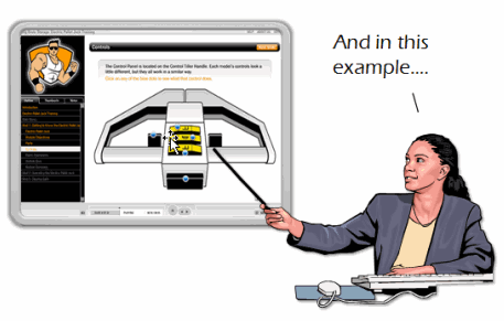
    The Rapid E-Learning Blog: telling subject matter experts about learning theory

    Most likely your subject matter experts’ understanding of elearning is driven by two things:  their gut and a course structure they’re familiar with.

    The biggest issue isn’t their gut instincts.  They might not know all of the ins and outs of learning theory, but they’ll have a general sense of what works and what doesn’t.   The challenge for you is that most people copy what they’re familiar with.  So you’ll get a SME who probably wants a course that looks and feels like all of the other elearning courses they’ve taken. 

    Considering that a lot of elearning courses are basic click-and-read they might not be expecting more than that.  So the odds are that the course they envision is heavy on information and light on interaction.  The good thing is that most people don’t like that type of elearning, even the SME.  They just don’t know the difference.  That’s where you come in.

    Present some good examples of what you think will work.

    Most likely what they know about elearning is based on the elearning they’ve taken.  By showing them examples of different types of elearning, you’ll be able to shape their understanding and help create expectations for a different approach.  If you want more than a click-and-read course, you have to show them an example of something different.

    The Rapid E-Learning Blog: showing subject matter experts examples of interactive learning

    Ideally you want them to focus less on the information and more on making the information meaningful.  So, don’t focus on the multimedia bells and whistles.  Instead focus on relevant interactivity.  Show them examples that demonstrate how the learner learns more through the interaction. 

    But don’t expect them to sit through a 30 minute course.  Instead, point them to what you like and why you think it will be good for their course.  Also, don’t bombard them with 20 things.  A good rule of thumb is to present three treatments so that they can get their heads around the ideas and not feel overwhelmed.

    Everyone is working for the organization’s success. 

    The organization defines success by reaching it’s goals in a cost effective and efficient manner.  You can contribute to this.

    Fundamentally, instructional design is about crafting a learning environment that produces successful results.    This means more than just converting a PowerPoint slideshow to Flash.  Success comes when you can connect the course content to the learner’s world so that the learner is able to do something new or better.

    One of the best ways to save time and money on your projects is to establish clear expectations.  Like you, the SME typically doesn’t have a lot of time.  Many times, they’re not even part of the project team; they’re just told to give you information.  So working with you is an excursion away from their normal responsibilities and a drain on their limited time.  You can control the time requirements by setting clear expectations that include agreed upon timelines and action items

    People like to be recognized.  A great way to get the SME attention and support is to send a glowing email to the person’s manager and CC the SME.  This has never failed me.  Doing this will help you when you need some of the extra time from the SME for reviews or follow up.  

           The Rapid E-Learning Blog: partnering with subject matter experts for success

    Make sure that your efforts make sense.  Early in my career I was working on a course in a production environment.  As I was wowing them on the production floor with all of my fancy ideas about learning, one of the senior technicians facetiously asked, "You’re one of those college educated people, huh?"

    I got it.  I over-engineered the elearning.  I tried too hard to make it "fancy" and not hard enough to make it a good course that met their needs.  Ultimately this impacts how people view your contribution.  Instead of being seen as a valued partner, you’re seen as someone they have to tolerate or worst case, a nuisance because you don’t bring real value and waste time.

    A critical facet in managing your elearning project is managing the relationships with people who support it.  If you want your project to be successful, you need to establish a good working relationship with your subject matter experts.  They play a key role in the content you need, how you design your course, and whether the course succeeds or not.

    What are some things you’ve done to help manage the relationship with your subject matter experts?  Leave a comment here.

    Events

    Free E-Learning Resources

    Want to learn more? Check out these articles and free resources in the community.

    Here’s a great job board for e-learning, instructional design, and training jobs

    Participate in the weekly e-learning challenges to sharpen your skills

    Get your free PowerPoint templates and free graphics & stock images.

    Lots of cool e-learning examples to check out and find inspiration.

    Getting Started? This e-learning 101 series and the free e-books will help.


    Tools like Articulate Presenter are great for creating elearning courses.  However, a lot of what you do depends less on the rapid elearning tool and more on your PowerPoint skills.  In fact, I get so many emails asking about how to do this or that in PowerPoint, I decided to do a quick series on some essential PowerPoint tips and tricks. 

    So far we’ve looked at:

    In today’s post, I am going to show some time-saving tips to use when working with PowerPoint shapes.  You’ll learn to apply various formatting features, make custom edits, and create the shapes you want.

    Sizing Shapes

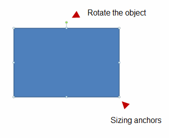
    When you click on a shape, you get anchor points on the sides and in the corners.  You can click and drag these anchors to resize your objects. 

    The Rapid E-Learning Blog: sizing shapes

    • Scale object: If you want to resize the image or object (and not mess up the aspect ratio), then press SHIFT and drag from the corners.  You’ll see that the shape resizes, but the aspect ratio stays the same.
    • Resize from all sides: Holding CTRL down and dragging the mouse, resizes the shape equally from the opposite side.  Go ahead, try it.
    • Perfect circle or square: If you want a perfect circle or square, select the oval/rectangle object, press SHIFT and then drag the object onto the screen.

    Moving Shapes

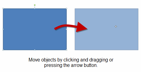
    You can move shapes on the screen with the mouse or keyboard. 

    The Rapid E-Learning Blog: moving shapes

    • Maintain alignment: What if you want to keep the shape in the same alignment?  Click and drag the shape while pressing SHIFT.  This allows you to move the shape up/down or left/right aligned to its current position. 
    • Copy and align shapes: I use this feature a lot when I make quick duplicates of a shape.  I press CTRL + SHIFT and drag the shape to make a copy that is already aligned to the current shape. 
    • Nudge objects: Instead of using your mouse, use the arrow keys.  Select your shape and then press the arrow key.  However, if you want to just nudge the shape a little, press CTRL and then the arrow.  To get more precise, zoom in and do your nudging.

    Format Painter

    There are a number of formatting options in PowerPoint.  For example, you can change the fill color, line color, and line style.  I won’t cover those because they’re fairly straightforward.  However, what I will cover is the format painter.

    The Rapid E-Learning Blog: use format painter

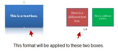
    The format painter is a handy tool because it allows you to copy the formatting of one object and apply it to another.  This will save a lot of time because you can create just the right formatting for one object and with a few clicks apply it to all of the others.

    The Rapid E-Learning Blog: format painter example

    format2 

    Filling Shapes

    When filling shapes you have a number of options.  You can fill with color, a texture, pattern, or picture.  In addition to filling the shape, you can change its level of transparency.  Today, I want to focus on two fill elements.

    • Use gradient fills to create depth and visual interest.  Instead of sticking with a solid color, use a gradient fill.  This can add depth to your screen which creates more visual interest.

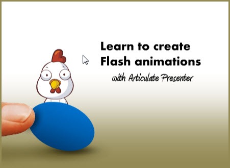
    The Rapid E-Learning Blog: gradient fill example

    The image above is from a tutorial I did earlier this year.  I used a gradient fill on the brown background.  It’s a rectangle that goes from brown to white.  I also used a fill on the egg shape to give it some depth. 

    • Fill shapes with pictures.  Filling shapes with pictures opens up all sorts of possibilities.  Here are some before and after images.

    The Rapid E-Learning Blog: fill shapes with pictures 

    Create Custom Shapes

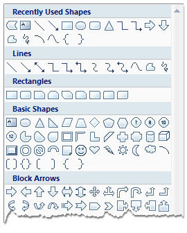
    PowerPoint gives you quite a few options when it comes to shapes.  Most of the time, those are plenty.  However, there are times when you want a certain type of shape and it’s just not available.

    The Rapid E-Learning Blog: PowerPoint shape feature

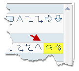
    If you want a custom shape, you can draw one using the freeform tools.  Just click on the tool and then start drawing.

    The Rapid E-Learning Blog: freeform tool

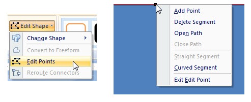
    Another option is to use the edit points.  It works a little different in PowerPoint 2003 than it does in 2007.  However, the basics are generally the same.  Create a shape and then modify the edit points.  You can create straight or curved edges and make as many points as you need.  It takes a little practice, but you’ll find that you’ll never lack for shapes again.

    The Rapid E-Learning Blog: custom edit paths

    Here’s a simple example to show how you could use a custom-made object.  In this case, I wanted to add a simple curved border.  So I just converted a rectangle to a freeform object and edited the points. 

    The Rapid E-Learning Blog: custom shape example 


    There are a lot of things you can do with the PowerPoint shapes.  The more you practice using some of these techniques the more creative you ca
    n be.  In addition, you’ll find that it speeds up your production time because you’ll be able to quickly make edits right inside of PowerPoint.

    If you have some tips and tricks feel free to share them in the comments section.

    Events

    Free E-Learning Resources

    Want to learn more? Check out these articles and free resources in the community.

    Here’s a great job board for e-learning, instructional design, and training jobs

    Participate in the weekly e-learning challenges to sharpen your skills

    Get your free PowerPoint templates and free graphics & stock images.

    Lots of cool e-learning examples to check out and find inspiration.

    Getting Started? This e-learning 101 series and the free e-books will help.