The Rapid Elearning Blog

Archive for November, 2011


The Rapid E-Learning Blog - desert island reading for the stranded elearning developer

Back in the ‘80s there was a music magazine that published a list of desert island discs.  People would write in and share the ten records they’d bring if they were stranded on an island.  I used that list to find people who had similar tastes and then checked out the bands they’d recommend.  That’s how found a lot of new bands like Milli Vanilli.

I get a lot of questions about book recommendations from people just getting started with elearning.  So for today’s post I’d like to do something similar to the desert island discs.

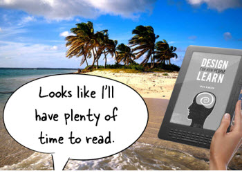
Let’s suppose you are on a desert island and in between catching fish and talking to volleyballs you have a deep desire to learn more about elearning. You can only bring three books. Which books are they and why?  I’ll get it started.

Elearning 101

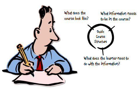
Here is what I see as the three core elements of a successful elearning course.  I shared a little about this in this post on mapping out elearning courses.

  • Visual design: Is the course visually appealing and use effective visual communication?
  • Content: What content needs to be in the course?
  • Learning activities: What will the learner do with the content?The Rapid E-Learning Blog - three core elements of course design

If we broke those into three areas of expertise they would probably be something like this:

  • Visual design & communication
  • Instructional design
  • Interaction design

Here are the books I’d recommend to those stranded elearning developers who are just getting started and want to build their elearning skills so they’ll be prepared when rescued from the island.
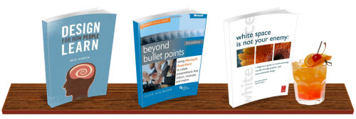
The Rapid E-Learning Blog - desert island elearning book recommendations

  • Design for How People Learn. It’s important to understand how people learn because it will help you build better learning experiences. Unfortunately most people I talk to don’t have a formal education in instructional design. This book is probably the single best book for the person who’s just getting started and wants to know more about instructional design and how people learn.
  • White Space is Not Your Enemy: A Beginner’s Guide to Communicating Visually through Graphic, Web and Multimedia Design.  Good visual design combines courses that look great with good visual communication.  Unfortunately there’s not enough focus on that for elearning.  Anything you can do to help you get there is a win.  This book is a good start.
  • Beyond Bullet Points.  Many elearning developers overlook this book because it’s about presentations.  But here’s why I think it’s a must-have elearning book.  Most elearning courses are closer to online presentations than structured learning activities.  This book is great at helping you craft a message that has meaning and impact.  In addition, it also introduces the same cognitive load stuff that you’d find in Multimedia Learning and E-Learning & the Science of Instruction (both good books, by the way).

The links to Amazon books may produce a slight commission.

Obviously there are many good books from which to choose, but for now, these are the three I’d recommend.  Which three books would you take and why?  Feel free to share your recommendations in the comments section.

Events

Free E-Learning Resources

Want to learn more? Check out these articles and free resources in the community.

Here’s a great job board for e-learning, instructional design, and training jobs

Participate in the weekly e-learning challenges to sharpen your skills

Get your free PowerPoint templates and free graphics & stock images.

Lots of cool e-learning examples to check out and find inspiration.

Getting Started? This e-learning 101 series and the free e-books will help.


The Rapid E-Learning Blog - 3 elearning lessons learned

I’m coming off of back-to-back-to-back conference sessions and elearning workshops.  While the travel gets old, I really enjoy getting to connect with so many of the blog readers.

What I like best is that I run across so many different questions and elearning use cases and examples.  I’m always amazed at the creativity in our industry.  In addition, I get lots of time to reflect on things as I fly across the country. 

Following are three things that stood out to me during my recent travels.

It’s important to connect with people.

I stopped in one of those airport shops to pick up a couple of knickknacks for my kids. The young woman who processed my sale really stood out.  It was one of the best customer service experiences that I‘ve had in recent years.

As I was sitting in the lobby I thought more about it.  What’s funny is that she really didn’t do anything out of the ordinary.  As a matter of fact she did exactly what others would have done when it comes to processing the purchase.  Yet, the experience with her really stood out.  Why?

The Rapid E-Learning Blog - connect with real people

It’s because she connected with me in a real way.  She had a welcoming disposition, warm smile, and actually engaged me.  As a busy traveler, I felt less like a sales order being processed and more like a real person.  What she did was connect with me as a person and not as a requirement to complete her job.  And it stood out.

There’s a lesson here for those of us who build courses.  Learning is a very personal experience.  Yet so often, we treat those who take the courses like cattle being processed rather than real learners.  Here are a few ways that we make elearning impersonal:

Things to ponder:

What’s the equivalent to a warm smile and personal greeting in your course?  Are your elearning courses lacking personality?  Are there better ways for you to connect with those who have to take the course? 

Where am I and where am I going?

Maps and traveling go hand in hand.  A map lets you chart where you need to go and then provides a way for you to assess how far you’ve gone and where you’re currently at.  In the same sense, your course needs a map.

The Rapid E-Learning Blog - help learners know where they are going and where they are at

When I do workshops on interactive elearning, one of the first points I make about engaging people is that they need to know what’s expected and how long it will take.  People want to know what type of commitment they have to make before starting a course.

When someone sends me a YouTube video link, the first thing I do is look at how long it is.  If it’s 90 seconds, I’ll probably watch it.  But if it’s 6 minutes long, odds are that I won’t.  Knowing the requirements to view the video plays a role in how engaged I’ll be in the process.  The same can be said of your elearning courses.

When you deliver an elearning course, the expectations of the learner should be clear.  They need to know how long it is.  Also, during the course they should be able to assess their progress and how well they’re doing.

Things to ponder:

Are you making the expectations clear in your course?  And are you providing a way for them to assess their progress?

Engage learners by letting them create content

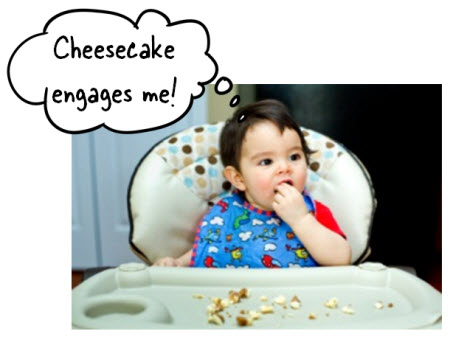
Whenever I travel I try to set some time aside for informal Articulate jam sessions.  It’s a great way to connect with blog readers and answer questions.  The most recent jam session was hosted by the Cheesecake Factory at their headquarters location.  You can’t go wrong when you mix elearning chit chat with delicious Cheesecake.

The Rapid E-Learning Blog - let learners create content

During the jam session, they shared one way they use videos in their training program.  In a recent activity, they had all of the restaurant greeters videotape their best customer greeting and then upload the videos to their internal video site.  The videos were made available to others in the organization and they ran a contest to go with them.

Here’s the value in this approach to training:

  • The goal is to get the employees to learn the proper way to greet.  Normally, we’d push out a ten slide elearning course that shows how to greet.  With the videotape challenge, you get the learners focused on the best approach to greeting.  How many times do you think they’d practice the right type of greeting before they submitted their tape?  So you get the learner engaged and practicing real activities in a fun way.
  • The employee videos were highlighted creating an environment where people were looking for videos and the recognition their team or site would get.  It’s a great way to build a motivating and engaging training program.
  • Instead of the elearning team having to create greeting videos, they were created by people who actually do the greeting.  It’s a time saver and authentic for the others who will learn from them.

Things to ponder:

Is there a way for you to integrate user content with your more formal elearning development?  Perhaps you can have someone create Screenr videos where they show how to do something.  This lets them demonstrate their understanding and also gives you content to use to teach others.

There are all sorts of sites where your learners can create content and then provide you with an embed link that you can insert it into your elearning courses using the web object feature.

What all three of these points have in common is that in some way the approach is learner-centric.  Most elearning courses I see are focused on the content and how to deliver it.  Unfortunately, many times the learner is lost in the process.

One of the best things you can do to make your elearning courses effective is to shift the focus away from content delivery and place it on how the learner will use the content.  This lets you deliver a course that is engaging and relevant to the learner’s needs.

Events

Free E-Learning Resources

Want to learn more? Check out these articles and free resources in the community.

Here’s a great job board for e-learning, instructional design, and training jobs

Participate in the weekly e-learning challenges to sharpen your skills

Get your free PowerPoint templates and free graphics & stock images.

Lots of cool e-learning examples to check out and find inspiration.

Getting Started? This e-learning 101 series and the free e-books will help.


The Rapid E-Learning Blog - ask questions to build effective elearning

How we view effective elearning is somewhat subjective.  For some it requires that all elearning center on performance.  If it’s not, then how can it be effective?  However, many elearning courses are less “learning” and more marketing.  They’re about sharing information using elearning tools.  I see those more as multimedia marketing campaigns than traditional training programs.

For example, the human resources department is introducing a new bonus program and they want to have an “elearning course.” While they may call it elearning, it’s really more about creating awareness and not setting performance goals.  At least not immediately.

Ultimately the efficacy of elearning centers on the original course objectives and whether or not the course meets them.  Performance-based courses need to prove that the learner can meet the performance goals.  Information-based courses need to demonstrate a greater awareness of the content.

Both types of courses have their place in the elearning landscape.  Following are some keys to effective elearning.

The Rapid E-Learning Blog - is the course building awareness

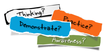
Is the course building greater awareness?

I worked on a project once where it was taking too long for new hires to get up-to-speed in a production environment. The training program successfully taught the new hires everything they needed to DO.  But after doing some analysis, we recognized that it wasn’t that they didn’t know how to do the work, it was that they weren’t completely aware of how their work fit in the grand scheme of things.

So we added a few modules that taught them more about the overall production process and how they supported the organization.  There were no performance goals in these modules other than to share additional information.  Once they were made aware of this, the teams started meeting their production goals.

Our initial mistake was that we only focused on the performance goals.  They were able to perform their tasks.  But because they were new, they lacked awareness of the bigger picture.  While we want to focus on performance, there’s always a place for building context and framing the learning activities around that.

The Rapid E-Learning Blog - is the course causing the learner to think

Is the course causing the learners to think?

Elearning should promote thinking.  Find ways to challenge their assumptions or their existing understanding of the content.  This can be wrapped in activities that mimic the learner’s world or information that causes reflection.  In either case, step away from an information dump and let the learner process the information.

Create activities or scenarios that offer contrast to the way they may normally see the content.  Provide fresh perspective.  I had a project once where the client wouldn’t budge from doing an information dump…and it was a lot of information.

Our solution was to build a learning journal to go with the information.  Then we presented a few case studies for the person to reflect on and document in the journal.  This allowed them to wade through the information and identify the content relevant to them and their reflections.

With today’s social media, it’s easy enough to transition the learning journal concept to a wiki or other collaborative forum.

The Rapid E-Learning Blog - does the learner get to practice

Is the course giving them opportunities to practice?

Ultimately elearning courses exist to change understanding that impacts behavior.  Knowing the right information is proven in relevant activities.  We don’t just share information. We share information that allows someone to assess a situation and make appropriate decisions that produce real consequences.

Are you building activities in your courses that allow the learners to practice making the types of decisions they need to make in the real world? Or the types of decisions that let them build competencies that they may need?

The Rapid E-Learning Blog - is the learner allowed to demonstrate understanding

Is the course allowing the learners to demonstrate their understanding?

Decision-making activities let the learners practice and build on existing knowledge.  They find ways to integrate what they’re learning in the course with what they already know.  Somewhere in the process you get to the point where you need to assess their understanding.  Are they able to meet the course’s objectives?

Typically we use simple multiple choice or true false type questions; probably because it’s what we’re used to and because they’re easy to create.  However that type of assessment only demonstrates whether a person knows the facts or not.  Measuring understanding is more about how they apply those facts to make decisions.

As you determine your course objectives, also determine how to assess them.  Then build your course around that.  We used to ask “What will it look like when I see it?”  This helped us focus on tangible results.

The Rapid E-Learning Blog - Understanding By Design

If this is new to you, I like the book Understanding by Design (an Amazon referral link).  The author does a good job of helping walk through the process of building objectives framed around understanding.  It’s worth adding to your bookshelf.

Obviously there’s a lot more to building effective elearning than these four questions.  But asking these questions is a good start and hopefully they help transition your course development away from information dumps to meaningful and effective learning.

What questions would you ask?  Feel free to leave a comment by clicking on the comments link.

Events

Free E-Learning Resources

Want to learn more? Check out these articles and free resources in the community.

Here’s a great job board for e-learning, instructional design, and training jobs

Participate in the weekly e-learning challenges to sharpen your skills

Get your free PowerPoint templates and free graphics & stock images.

Lots of cool e-learning examples to check out and find inspiration.

Getting Started? This e-learning 101 series and the free e-books will help.


The Rapid E-Learning Blog - Here's a free PowerPoint template

The other day I ran across the website of How It Works Media.  They produce those clever marketing videos.  What caught my eye was the way they used their vector character with the projection screen especially since I had just done a couple of posts on display graphics which included some some projection screens.

The Rapid E-Learning Blog - How it Works Media screenshot

The general layout of their site would make a great elearning template.  Here’s why:

  • Simple, but rich background.
  • Bold title colors.
  • Lots of white space.
  • Dedicated content areas.

As you know, I like to use sites like this as inspiration to show how easy it is to create PowerPoint elearning templates.  So I thought I’d make a template inspired by their site and then share a few tips.

Free PowerPoint Template

The Rapid E-Learning Blog - example of the free PowerPoint template

The template has six different layouts.  I tried to cover the most common layout types.  I also included a projection screen layout based on their screen design.  Of course, you may want to add some of the free displays from the previous post.

As far as the text placement, you can move it anywhere you want.  Also, feel free to modify the template as you wish.

Here are a few tips:

  • I liked the blue mesh gradient on the website.  To create it in PowerPoint I combined two shapes.  The first shape is filled with cross pattern.  The second shape is filled with the color gradients.  I set the gradients to 10% transparent and placed the shape on top of the pattern shape.
  • I always use the generic “office” color scheme in PowerPoint.  This way I can quickly apply a new theme and not have to do a lot of tweaking.  Below are three examples of how the different colors schemes look with the template.

The Rapid E-Learning Blog - the free PowerPoint template using different colors

  • I like the bold font that How it Works Media used on their site.  For this template I used Bevan which is a free font available via the Google Web Fonts site. You can learn more about the site and get more free fonts via this post.

The Rapid E-Learning Blog - download the free PowerPoint template here

Here’s the link to download the free PowerPoint template.  Feel free to take it apart to see how it was constructed.

I hope you enjoy the free template. If you use it in a course let me know. I’d like see how it turns out.

Events

Free E-Learning Resources

Want to learn more? Check out these articles and free resources in the community.

Here’s a great job board for e-learning, instructional design, and training jobs

Participate in the weekly e-learning challenges to sharpen your skills

Get your free PowerPoint templates and free graphics & stock images.

Lots of cool e-learning examples to check out and find inspiration.

Getting Started? This e-learning 101 series and the free e-books will help.


The Rapid E-Learning Blog - boring elearning courses

I get a lot of questions about number of slides or screen count per hour of instruction.  My answer is that screen count is usually irrelevant.  Let me explain.

First, to the elearner screen count means nothing.  For example, I can make ten points on a single screen or have ten screens, each with a single point.  The time it takes to get through each point may be the same.  More screens don’t make it longer and fewer screens don’t make it shorter.

The Rapid E-Learning Blog - slide count in elearning courses is irrelevant

Screen count becomes even more irrelevant when you introduce interactive elements like branched navigation which could be made up of dozens of screens.  The time it takes to go through them depends on how fast the person can review the content and make decisions (and then react to feedback).

Ask the Right Question

Screen count is the wrong question.  People typically ask the question because they are tasked to build an hour of learning and want a better sense of how much content creation that means.

Instead of asking about screen count (which is driven more by dumping information) focus on how to create meaningful elearning that will make the hour more productive for the learner.  In the long run it costs less and will save time.

Following are some simple tips to help build more productive elearning.

Don’t Auto-Advance Slides

Screens have information.  Adding text or narration to them isn’t a problem.  Not every screen is going to be interactive.  With that said, how the user controls the information is something to consider.  Many developers will lock the screen and set it to auto advance. The problem with this is that if the person is a fast reader, it’s frustrating to wait for the slide to catch up. If the person is a slow reader, they won’t get everything they need before the slide advances.

The Rapid E-Learning Blog - how to create boring elearning courses

Screens that have text and no audio should advance based on the viewer’s reading speed. The length of time on the slide is determined by how fast the person can read (or interact with the screen) and not by some arbitrary average reading speed.

The same can be said for slides with narration.  Ideally, the screen text and slide narration aren’t verbatim.  But if you have narration and text, it’s a good idea to let the learner choose when to advance.  I usually just set it to advance by user.  When they’re ready they can go to the next screen.

I’ll also add that if they have to read a lot on the screens, then they’re probably going to fall asleep during the course.  So you’ll want to do something to jar them awake.

Give the Learner Control

Even though they’re looking at the same screen, people will focus on different things.  Some are really fast and will quickly scan the screen looking for visual cues.  Others are more deliberate.  Many lose track during the session and will want to pause and restart the content at various points.

If you really want them to learn, then give them the freedom to navigate the content as they need to.  One of the great benefits of elearning is that it’s asynchronous.  Take advantage of this.  Free up the course navigation.  Let them explore.

“But I can’t do that, my customer wants to be sure they see all of the content!”

We’ll address that below.

Build Productive E-Learning

How many slides per hour is the wrong focus.  It’s better to consider how to create the best course given a certain time limit.  Here are three simple tips:

Break the content into bite-size chunks.  Regardless of how you design the course, people can only digest so much information.  Instead of an hour long course, you may consider 5 ten-minute courses where you can tackle smaller topics that are easier to process.

The Rapid E-Learning Blog - coursels are bite size elearning morsels

I like to call these coursels (as in course morsels).  They’re small, bite-size chunks of the course content.  Give them some information and then a quick way for them to apply it.  Then space it over time.  Spacing the information over a period of time will help them retain what they’re learning.

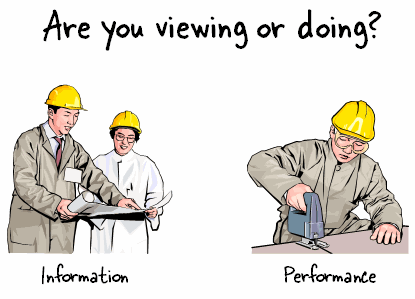
Are you viewing or doing?  Some courses are only about sharing information.  In fact, they’re probably not really elearning.  I like to think of them more as multimedia ebooks.  The goal is to share information that is of interest or use to the learner, but not necessarily tied to performance goals.

The Rapid E-Learning Blog - are your elearning courses about doing or viewing

In those cases, it’s all about efficiently creating and sharing the information.  It’s also a good idea to link the information to other performance support outside of the course.  This way you get the most value out of it.

If you do have performance expectations, then you want to turn the focus from the information to one that is learner-centric.

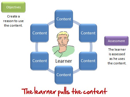
Are you pushing or pulling?  Info-centric courses push content out to the learner.  The focus is not on performance.  Instead it’s on how much information can be pushed out.  Hence the questions about slide count. “How much content can I push out in an hour?”

Wikipedia has more than 10,000 pages of information. If I asked you a question and let you search Wikipedia for an answer, odds are that you won’t need all 10,000 pages. You’ll only need what you need to answer the question.  Based on how I ask it or what I do to follow up your answers, I can get you to research and review all sorts of content.

The same applies to elearning. We can create a course that has all sorts of information and content available to the learner.  But people aren’t successful because they have information.  They’re successful because they know how to use it.

The Rapid E-Learning Blog - get the learner to pull the content

Create pull interactions where the learner has to make decisions.  And if they don’t know what to do, provide a way for them to pull the information they need.  If they’re new to the topic, they’ll need more supporting information. But a more experienced person may need less. Thus, there’s a lot of info
rmation (or screens of content) but the number of screens is not relevant to completing the course.  What’s relevant is that they can make the right decisions.

Building good elearning is more than just providing information.  The key is figuring out how they’ll use the information.  And then create ways for them to make decisions using the information.  How you structure the decision-making and tap into the learner’s motivation is where the course is productive.

With all that said, if all you want to do is push out some screens of content, then 30 screens per hour is a good figure.  How many screens per hour do you recommend?  You can share your thoughts by clicking on the comments link.

Events

Free E-Learning Resources

Want to learn more? Check out these articles and free resources in the community.

Here’s a great job board for e-learning, instructional design, and training jobs

Participate in the weekly e-learning challenges to sharpen your skills

Get your free PowerPoint templates and free graphics & stock images.

Lots of cool e-learning examples to check out and find inspiration.

Getting Started? This e-learning 101 series and the free e-books will help.