The Rapid Elearning Blog

Archive for December, 2011


It’s that time of year to share gifts, so here’s an elearning template that you’re free to use as you wish.  It’s inspired by a Christmas tree with the green background and colored bulbs.

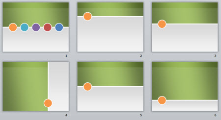
The template comes with a few layouts and they’re easy enough to modify, which you’ll see in the tutorials.

The Rapid E-Learning Blog - layouts of the free PowerPoint elearning template

I see the color bulbs as a way to feature different sections.  If you want additional layouts to accommodate the different colors, just go into the slide master, duplicate the layout and change the color of the bulb.

As always, I use the default template colors, so you’re free to easily modify the colors using PowerPoint’s color themes.

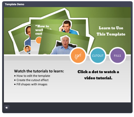
The Rapid E-Learning Blog - demo of the free PowerPoint elearning template

Click here to view the template in action.

You’ll notice in the demo above that I added characters to the bulbs.  This is a simple way to create a more human looking course.  It’s also a neat way to transition to scenarios.

Another thing you’ll notice is the cutout character.  It’s kind of trendy right now and pretty easy to do.  I like this look because it helps get away from the PowerPoint look and it adds a sense of informality to the course which may help make the content seem less rigid.

If you want to learn more about using the template and how to create the cutouts and character fills, be sure to check out the tutorials below.

The Rapid E-Learning Blog - tutorial for the free PowerPoint elearning template

Click here to view the tutorials.

Here’s a link to the free PowerPoint template.  Feel free to use it as you wish.  Also, take advantage of the other free downloads in the elearning community.

Hope you enjoy the template and have a great 2012!

Events

Free E-Learning Resources

Want to learn more? Check out these articles and free resources in the community.

Here’s a great job board for e-learning, instructional design, and training jobs

Participate in the weekly e-learning challenges to sharpen your skills

Get your free PowerPoint templates and free graphics & stock images.

Lots of cool e-learning examples to check out and find inspiration.

Getting Started? This e-learning 101 series and the free e-books will help.


The Rapid E-Learning Blog - three main parts to a course

There are three core questions that help guide the development of an elearning course.  I discussed this a bit in the post on building a roadmap for elearning.

  • What is the look and feel of the course?
  • What information needs to be in the course?
  • What will the learner do with the information?

For many rapid elearning developers the most challenging part is the first question because it requires a skill set different than training or instructional design.  So what typically happens is that we create elearning courses that either all look the same or have a discordant look where the images and typography are a hodgepodge of whatever we have available.

In today’s post I’ll share a simple way to get a nice look for your course that will give it a rich feel.  It’s not a substitute for good instructional design, but it is a simple way to make your course look good and take the pressure off of the rapid elearning developer who has limited access to graphic designers.

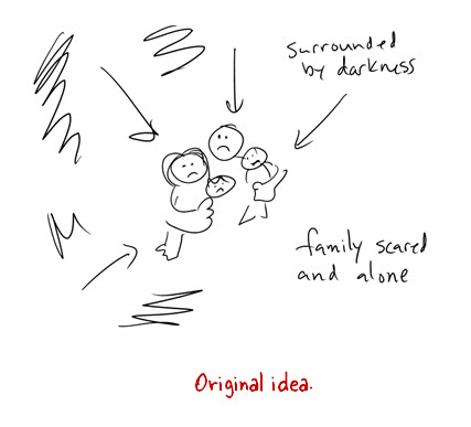
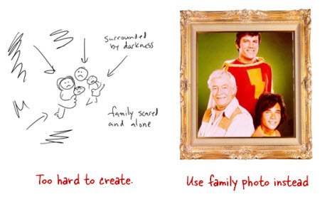
In a recent post I shared some ideas on how to craft more engaging objectives.  For the demo, I wanted my earthquake intro to feature a family huddled in the dark.  And as the information was shared a family member would disappear.

The Rapid E-Learning Blog - original idea for the elearning course

Like most of you, I am pressed for time.  Since I had no time to build the graphics I wanted, I decided to change the huddled family image to a framed photo of a family.  This would be a lot easier to do since all I needed was an image of a picture frame and a family.

The Rapid E-Learning Blog - idea evolution for elearning course

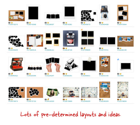
As I was looking for picture frames on iStockphoto I saw a few Polaroid-like images.  So I decided to switch from a single picture frame to Polaroid photos of each family member.  Doing a search for “Polaroid” revealed a lot of cool layouts.  What I like about them is that they offer some structure that I could easily use in my elearning course.

The Rapid E-Learning Blog - stock image search for elearning course

Searching through the Polaroid images lead me to an artist who had a series of images that I could use.  The artist provided a background, title and section screens, and then various layout options.  The added bonus is that since they came from the same artist they all looked like they belonged together.

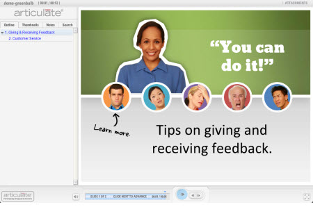
The Rapid E-Learning Blog - consistent image theme for elearning course

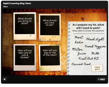
Here’s a quick demo of these images used in an elearning course.  As you can see, I didn’t have to do much work because I used the default layouts for my slide backgrounds.

The Rapid E-Learning Blog - example of images used in an elearning course

Click here to view the demo.

I look for images that come from the same style so I can get a consistent look and avoid a discordant style.  And then I look for “buckets” where I can add content.  In this case the Polaroid images are perfect.  I can use them to add pictures, as menu choices, or even as a way to display text that may have previously been a bullet point.

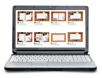
The secret is to find an artist who provides a lot of images that come from the same style.  This way you have a lot to work with.  Here are a few sets that I think would work well in an elearning course:

The Rapid E-Learning Blog - find good image portfolios

Desktop themes (same artist):

This isn’t a replacement for good instructional design.  You’ll still need to do that.  But for the elearning developer who has no graphic design background and wants to create a visually appealing course, it’s an easy and simple solution.

Are there any similar styles in the stock image sites that you like?  Feel free to share them in the comments link.

Events

Free E-Learning Resources

Want to learn more? Check out these articles and free resources in the community.

Here’s a great job board for e-learning, instructional design, and training jobs

Participate in the weekly e-learning challenges to sharpen your skills

Get your free PowerPoint templates and free graphics & stock images.

Lots of cool e-learning examples to check out and find inspiration.

Getting Started? This e-learning 101 series and the free e-books will help.


The Rapid E-Learning Blog - creating interesting course objectives

I’ve been working on a few demos for some upcoming blog posts and conference presentations.  One demo is a module on having an emergency preparedness kit in case of a disaster.

In the past I’ve built similar elearning courses for organizations that taught their employees about having these disaster kits.  In most cases they started the courses with the standard objectives screen like the image below.
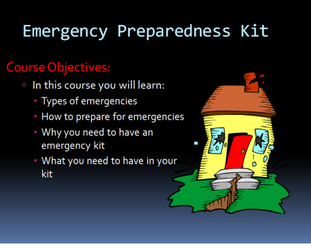
The Rapid E-Learning Blog - standard learning objectives

While there’s nothing wrong with creating a list to state learning objectives, there’s probably a better way to engage the learner emotionally.  And this is important if you want to connect with the learner and motivate them to change their behavior.

Understanding Objectives

When I first learned to build elearning courses the rule was that you HAD to have a page that stated the learning objectives.  Today that still seems to be standard.  On top of that many organizations require that each course have an objective screen that has an explicit list of learning objectives. If that’s the case, then that’s what you have to do. But let’s step away from that for a second.

In a simple sense the purpose of the objective is to communicate why the learner needs the course and what they’ll learn or be able to do afterwards.  We start at point A and at the end of the course want to be at point B.
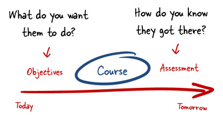
  The Rapid E-Learning Blog - course basics

The easiest thing to do is create an objectives screen like one above where you tell the learner what the objective is and what they should learn.  But that’s not the only way to present the objectives of the course.  It also may not be the most effective way.  And, it’s definitely not the most interesting way.

Crafting a Meaningful Objective

It doesn’t matter where you live; odds are that you’re in an area that at some point during your lifetime will experience a disaster.  In the Pacific Northwest the most likely disaster that I’ll experience is a major earthquake.
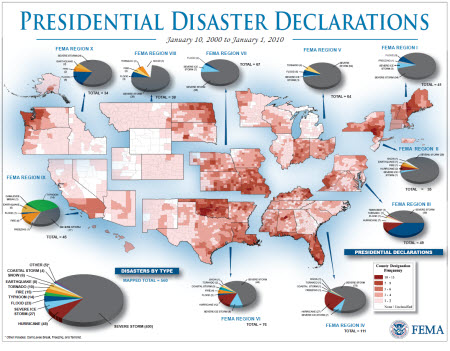
The Rapid E-Learning Blog - disaster preparedness and presidential declarations

I say this because everywhere I’ve worked part of our annual safety training was the need to have an emergency kit.  We were told that it was just a matter of time before we had an emergency and to plan on being on our own for a while.  They said we needed an emergency kit that could sustain us for at least 72 hours.

Know what? I always passed the safety training; yet I never had an emergency kit.  Why is that?

While I KNEW that the kit was important, I was never MOTIVATED to actually have a kit.  Outside of my natural proclivity to procrastinate, I think the elearning course was positioned as just one of many boring elearning courses that I had to take every year.  All the organization cared about was making sure I had a check mark next to my name come December 31.

Essentially they did a poor job convincing me that the kit was essential.  They could have done a better job by appealing to my emotions rather than provide a bunch of information.

Often we focus on the cognitive part of learning which is all about the knowing.  But we don’t focus enough on the affective part which is more about the emotions.  What motivates someone is subjective and tied to their emotional awareness.  So creating an emotional connection to the content may be better than just a cognitive connection, especially at the forefront where we want to hook them.

Reworked Learning Objective

In the demo below I want to get away from the standard list of objectives. Instead I want something more emotional that matters to the person taking the course. I want them to know that this isn’t just information; instead it’s a matter of life and death.

Instead of creating the standard list of what you’ll learn I ask them to consider the ramifications of not having a kit.  I also stepped away from work and made it more personal.  This isn’t about some check mark to indicate completion.  This is about taking care of your family.
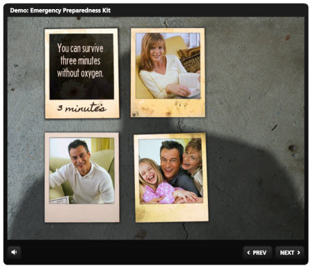
The Rapid E-Learning Blog - example of emergency preparedness elearning course objectives

Click here to view the demo.

There’s a lot more I could have done to flesh out the scenario, but I kept it simple on purpose.  I want to show that even if you have limited resources and time you can build something like this.  As you can see the demo is not very interactive—just a few images, text, and some audio.

Learning is a complex process and part of it is to connect with the learners in a meaningful way.  Appealing to them emotionally is one way to do that.  So the next time you build an elearning course, see if you can replace the bullet point objective screen with something different.  Even if you can’t replace it, you can still do something like this to capture their attention.

Have some creative ideas? Share them by clicking on the comments link.  Not sure how to rework the learning objectives in the elearning course you’re building?  Jump into this forum thread that I started in the elearning community to get some feedback from others.

Events

Free E-Learning Resources

Want to learn more? Check out these articles and free resources in the community.

Here’s a great job board for e-learning, instructional design, and training jobs

Participate in the weekly e-learning challenges to sharpen your skills

Get your free PowerPoint templates and free graphics & stock images.

Lots of cool e-learning examples to check out and find inspiration.

Getting Started? This e-learning 101 series and the free e-books will help.


The Rapid E-Learning Blog - let's make a daily deal

Over the years elearning software has become easier to use.  But with that comes some challenges.  In the past you had an instructional designer who designed the course.  Then there was a programmer who did the programming of the course.  And a graphics designer built the course’s graphics.

Today, things have changed a bit.  With the ease of authoring, it’s placed the burden to do all of it on the shoulders of the rapid elearning developer.  This can be a challenge because the skills to design graphics are different than the ones required to design instruction.

In an ideal world you’d have all the resources you need to build your elearning courses, but for many of you that’s not going to happen.  So anything you can do to find inexpensive assets that you can be used for elearning helps.

Here’s a Simple Solution

Most people have heard of sites like Groupon or Living Social.  They’re social buying sites that have some sort of “deal of the day” where you can make discounted purchases as you recommend them to others.  It’s really not much different than the desert island disks I mentioned in last week’s post.

Did you know that there are similar sites for technology and web design?  And many of them offer low cost or even free access to the types of assets you can use in your elearning courses.

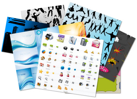
The Rapid E-Learning Blog - example of multimedia assets

The Way It Works

Here are a couple of the sites I subscribe to.  I’m sure there are others.

Subscribe to the site and then you’ll get an email with the daily deals.  I find that most of them are not relevant to my needs so I just delete them.  But many times there are some good deals that would work great for elearning, similar to the images below.

The Rapid E-Learning Blog - example of template backgrounds

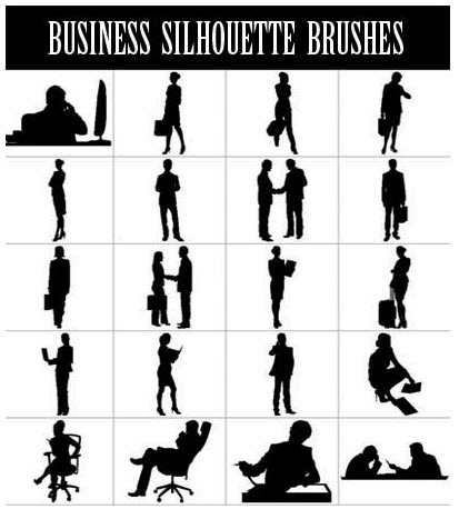
The Rapid E-Learning Blog - example of silhouette images

The Rapid E-Learning Blog - example of icons

What I Find Valuable

I’m not interested in most of what these services offer.  I don’t care that much about the tutorials or SEO type solutions.  I’m looking for tangible media assets, things I can use in my elearning courses.

Here’s a list of what I’ve found in previous offers that I believe have value:

  • Icons
  • Fonts
  • Backgrounds
  • Textures
  • Templates (usually WordPress)
  • Audio & video assets

Look for any type of multimedia asset that you think could be used in an elearning course.  They may not always fill an immediate need, but if the assets look good, get them.  Over time, you’ll build a large portfolio of assets.

Take a close look at the blog templates even if you don’t need them for blogging.  What I like about them is that they come with a “look” and all of the graphics to get it.  Instead of using the template for a blog site, pull out all of the graphics and use them to build your own elearning template.

I have no vested interest in any of these sites so I can freely share the pros as well as cons.

The pros:

  • Good value: The daily deals usually offer an abundance of resources at a very good price.  Most of them will save you time and money as you develop your elearning courses. 
  • Free stuff: It’s a cost-effective way to build a portfolio of resources.  Sometimes you’ll even get free stuff.

The cons:

  • Email Noise: If you’ve ever subscribed to these types of sites then you know there’s a certain type of spaminess that goes with them.  Not bad spam, but just lots of noise. 
  • Stuff you don’t need: You’ll get daily deals, but most of them probably aren’t relevant to your needs.  Odds are you’ll be enticed to buy stuff because of the deal it offers and not the value you’ll get out of it.  So beware!

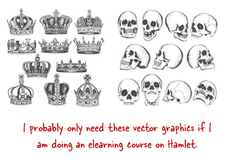
The Rapid E-Learning Blog - great graphics for Hamlet course

Having assets that you can use for elearning courses is a challenge when you don’t have access to a graphics designer.  Using sites like these where you can take advantage of the daily deals is a good way to get the assets you need.  You just have to be patient and wiling to click the delete button every day until you get an offer that makes sense for you.  Clicking delete’s not a bad price to pay for inexpensive assets.

Have you ever used any of the assets from these offers for your course design?  If so, which ones?  Feel free to share your thoughts by clicking on the comments link.

Events

Free E-Learning Resources

Want to learn more? Check out these articles and free resources in the community.

Here’s a great job board for e-learning, instructional design, and training jobs

Participate in the weekly e-learning challenges to sharpen your skills

Get your free PowerPoint templates and free graphics & stock images.

Lots of cool e-learning examples to check out and find inspiration.

Getting Started? This e-learning 101 series and the free e-books will help.