The Rapid Elearning Blog

Archive for May, 2012


The Rapid E-Learning Blog - powerpoint templates debate

I have mixed feelings about templates. On one hand templates are great because they help guide the production process and maintain consistency. This is good for the beginner or the organization that desires a defined look and experience.

On the other hand, it’s easy to become too reliant on templates. Often this forces us to use templates that don’t fit the context of the course content. And then many organizations force draconian template rules on all elearning courses, regardless of their purpose. I worked for a multi-billion dollar company that had one official PowerPoint template that had to be used for all things PowerPoint regardless of what was being built. Of course this was disastrous when it came to some of our elearning courses.

I tend to see templates less as rules for course structure and more as guiding principles. When you first start building courses they help with developing a consistent design and course structure. A good template can fill in the gaps for the novice elearning developer.

But as you gain experience, you really should start to lean less on templates. At some point your expertise should kick in and override your reliance on templates. Ideally, each course that you build dictates a unique design.

But of course, that’s not the reality for many of you and templates are part of the production process. In that case, it’s good to know what to look for and where to find templates that you can use.

Microsoft’s Online Office site is a great resource for free PowerPoint templates. They have thousands. But there are some challenges. The first is that there may be a thousand templates, but that’s not the same as a thousand good templates.

And then the other challenge is weeding through thousands of templates. Even if they were all great templates, it takes a lot of time to get through them all.

What I Look for in Free Templates

I want a template free to use for commercial use. Personally, when I share a template I make it available for you to use as you wish. I can’t stand to find a free resource only to find it’s free for personal use only. I’m not sure about you, but I don’t do too many family PowerPoint presentations.

Since many of you are using PowerPoint and the resources on the Microsoft site here’s a link to the Microsoft EULA. I’m no lawyer so it’s up to you to read and interpret the EULA. However here are two things I’ll point out when it comes to using the:

  • On resources shared: “…When you give others access to your content on the service, you grant them free, nonexclusive permission to use, reproduce, distribute, display, transmit, and communicate to the public the content solely in connection with the service and other products and services made available by Microsoft. If you don’t want others to have those rights, don’t use the service to share your content.”
  • On media elements & templates: “…You may copy and use the media elements in projects and documents. You may not: (i) sell, license, or distribute copies of the media elements by themselves or as a product if the primary value of the product is the media elements…”

My first inclination is to look for a clean design with lots of open space so I have room to add my own content. I also like variations on the slide layouts.
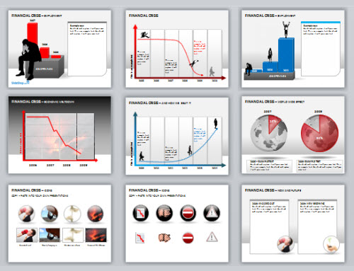
The Rapid E-Learning Blog - free PowerPoint templates with multiple layouts

I prefer designs that use the default color schemes in PowerPoint so that I can quickly add my own color schemes. It doesn’t help to find a slick PowerPoint template and then realize that I can’t make it work with my organization’s colors.
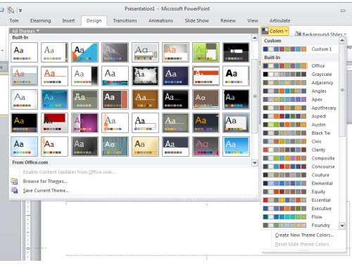
The Rapid E-Learning Blog - free PowerPoint templates that work with the design color schemes

Think like a crow. I was sitting outside a Starbucks once watching some crows pick through a garbage dumpster. It made me think that in some ways we need to be like that when it comes to elearning assets.

The Rapid E-Learning Blog - think like a crow

If you’re a rapid elearning developer with a limited budget, then it’s time to train your eyes to look for the jewels mixed with the junk. We looked at this previously in the post on finding resources for your elearning courses.

Learn to look for the assets that make up the template. While you may not be able to use the template, you may be able to use some of the assets in it.

5 Free PowerPoint Templates to Get You Started

To save you some time, I dug through the PowerPoint templates on the Microsoft site. I think that they could be the starting point for some nice elearning templates.

  • Chalkboard: you can’t go wrong with a chalkboard template especially when it has a bunch of layouts.
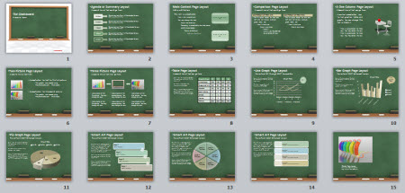
The Rapid E-Learning Blog - example chalkboard free template

  • Theme Gallery: simple, yet clean layout with a few different slides from which to choose. Good way to learn to use the PowerPoint shapes to create templates. This also works great when you want to apply your own color scheming.
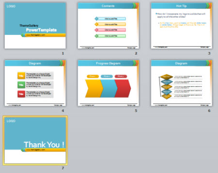
The Rapid E-Learning Blog - example free PowerPoint template

  • Interactive Progress Meter: the template is designed to measure fund raising progress but could easily be adapted to some sort of course progress meter or as a simple game-like measure.
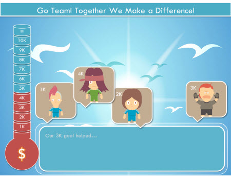
The Rapid E-Learning Blog - example of interactive free PowerPoint template

  • Retro TV: the retro television is a great asset. Put your own pictures or videos behind the image of the television set.

The Rapid E-Learning Blog - example of free PowerPoint template

  • Bull’s Eye: nothing real fancy about this template, but I like the bright colors. Plus, there are so many applications for bull’s eye targets in elearning it doesn’t hurt to have at least one stand by template, even if it is real simple.
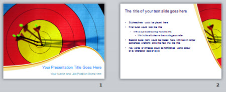
The Rapid E-Learning Blog - example of free PowerPoint bulls eye target template

    • 10 Question Pop Quiz: comes with a classroom background slide and the pop quiz structure’s a good way to learn to use the selection pane and click and reveal triggers in PowerPoint. Probably works better for PowerPoint than rapid elearning, though.
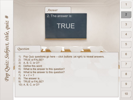
    The Rapid E-Learning Blog - example of interactive quiz template made in PowerPoint

Obviously these are simple templates and they won’t work with every course. But for those of you looking for some free assets these templates may help. Each one is a bit different. So even if you don’t use the template, look at how it’s designed so that you can learn more about using PowerPoint. The quiz and progress meter templates are good examples of how to use the selection pane and interactive elements in PowerPoint.

Also, don’t forget to take advantage of the free PowerPoint and Storyline templates in the Elearning Heroes community.

Events

Free E-Learning Resources

Want to learn more? Check out these articles and free resources in the community.

Here’s a great job board for e-learning, instructional design, and training jobs

Participate in the weekly e-learning challenges to sharpen your skills

Get your free PowerPoint templates and free graphics & stock images.

Lots of cool e-learning examples to check out and find inspiration.

Getting Started? This e-learning 101 series and the free e-books will help.


The Rapid E-Learning Blog - compliance training gone wrong

I always joke about how many times I’ve had to take a course on how not to receive bribes, yet I’ve never been in a job where I was important enough to be bribed. The reason I had to take the course was because somewhere in the organization it was determined that everyone had to learn how not to get bribed whether or not it was relevant.

Most likely you’ve also had to take similar types of compliance courses. You know the drill. In November you get an email reminding you to take a list of courses before the end of the year. The subject matter may be important, but when it comes to what you do it’s usually not very relevant.

In an ideal world all elearning would be completely relevant to your job and compliance courses like this wouldn’t exist. But they do; and that’s not going to change any time soon.

So if they’re not going away, what are some things we can do to make the courses better and add more value to you and the organization?

Recognize that a compliance course isn’t usually a performance-based course.

Typically compliance courses are more like certification programs. They’re not interested in changed performance as much as they are in certifying a specific level of understanding. In that case, the process to certify can be a lot simpler than the process to teach new skills.

The Rapid E-Learning Blog - bored elearning student

Do you need an elaborate role playing scenario if you just need to be reminded where to locate the fire extinguisher and emergency exits?

Don’t create a course.

Many times the compliance courses share information that is already available in other formats in the organization. If that’s the case, do you need a full multimedia product to share that information? Perhaps all you need to do is distribute a .PDF or other type of document to remind people.

If you need to do some tracking, build a simple quiz. Make the .PDF available to the elearners and then let them go online to take the quiz. The production process is a lot simpler and my guess is those who take the courses will appreciate a simpler approach.

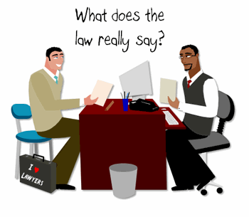
What does the law really say?

Most compliance courses come with all sorts of constraints that aren’t conducive to good learning. For example, the course navigation is locked or there’s way too much information. When you challenge that approach to the course design, usually someone will whip out “the law says…” card.

The Rapid E-Learning Blog - what does the law really say about compliance training

True, there are some legal or regulatory guidelines that dictate how to build the courses for certain subject matter. But I’d spend some time to really look at what the requirements are, especially if the alternative is to build a boring and cumbersome elearning product.

In the end, you’ll still have to do what the law says. But from my experience the requirements aren’t always as draconian as first believed. And if they are, then that’s good to know.

Keep it simple.

Let’s face it; for many people compliance training is a waste of time. In those cases, make the course structure as simple as possible. Making an elearning course interactive doesn’t make it more meaningful, but it does make it more time-consuming. Sometimes all you need is five bullet points.

Interactivity is good when it fits the learner context and needs. But interactivity at the expensive of a simpler linear solution is a waste of time for the learner and the organization. So build a course that’s appropriate to the objective. If the objective is merely to have checked completion on December 31, then a linear course probably suffices and you can commit your resources to more meaningful elearning courses.

Let them test out.

I delivered an annual safety program once that had over 20 modules. Each module took 10-15 minutes. That’s up to 300 minutes of information. Multiply that by 15,000 people who had to take the course and you have over 75,000 hours of training. What does that cost the organization in lost productivity?

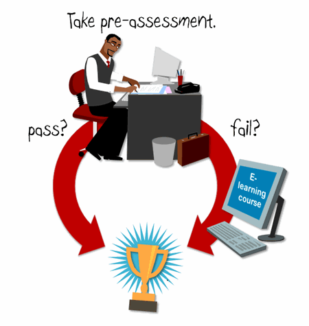
The Rapid E-Learning Blog - let the learners test out of the elearning course

If you want to certify that they know the information, create a way for them to test out. Put an assessment up front to determine their level of understanding. If they can demonstrate that they know the information, why force them through the course?

Most likely you’ll still meet your compliance requirement and you’ll save the organization valuable time and resources.

Don’t lock the navigation?

The most frustrating experience in an elearning course is when the navigation is locked. I equate it to gluing all of the pages of a book together. Usually the reason we lock navigation is because we’re worried that they “won’t get all of the information.”

If you need to make sure they “got the information” then build in a mechanism so they can prove their understanding of the it. The only thing you can make sure of with locked navigation is that they visited a screen and clicked the next button when allowed to.

Reframe it so it is relevant.

While there are many compliance courses that aren’t relevant, most likely the information in the course is relevant in some way to the learner. The key is to find out how and then frame the content in a perspective that makes sense to the learner.

If you’re not quite sure how to do that, go talk to a few of them and ask how they’d use the information or where it applies to what they do. Then use their feedback as a way to reframe the content. Move it away from general compliance information and into a product that is meaningful and pertinent.

We don’t want to be cynical about compliance courses because in most cases the information is important to the organization. In an ideal world, you’ll be able to build targeted courses that are meaningful and meet the organization’s goals.

But the reality is that often the goal is an end-of-year record of completion. In those cases, it may make more sense to do a simple course to meet that goal. It’ll free up your resources and the time of the people who have to take the courses.

By the way if you do want to bribe me, I’ve been known to enjoy the Haribo Happy Colas.

Events

Free E-Learning Resources

Want to learn more? Check out these articles and free resources in the community.

Here’s a great job board for e-learning, instructional design, and training jobs

Participate in the weekly e-learning challenges to sharpen your skills

Get your free PowerPoint templates and free graphics & stock images.

Lots of cool e-learning examples to check out and find inspiration.

Getting Started? This e-learning 101 series and the free e-books will help.


In a recent post I made this comment about rapid elearning tools:

Rapid elearning played a role in the evolution of elearning mostly because it took course creation out of the hands of a few programmers and placed it into the hands of anyone who wanted to create a course.

Someone asked if that’s a good thing to place the tools in the hands of anyone who wanted to create a course. It’s a good question. But is it the right question?

Technology Should Be Easy to Use

It’s a good thing when technology gets easier to use. It empowers people to do more and it creates opportunity for the ones using the tools.

A few years ago only a programmer could build even simple drag & drop interactions. If you didn’t have the skills you couldn’t use them in your courses. So that level of interactivity wasn’t even a consideration in course design. Today, a drag & drop interaction can be built in seconds.

Does it mean that I am a better instructional designer? No. Does it mean that having a drag & drop interaction is going to make my course better? Not necessarily. But it does mean that I am able to do something I couldn’t do before. And that only creates more opportunity for my course design. And that’s good.

When is a Course Not a Course?

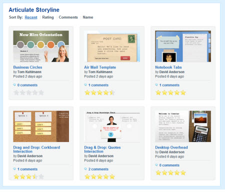
We may say “elearning course” but it’s a term used loosely. The rapid elearning tools create all sorts of interactive multimedia that are not exclusively “elearning courses.” I see the tools used in various industries for more than course design.

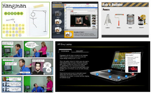
Here are some examples created in Articulate Storyline:

As you can see, each example is a bit different and not all are what we’d call “elearning.” Thus the qualifications to use the tool aren’t always about instructional design.

A Tool’s Just a Tool

Whenever this topic of elearning tools comes up someone pulls out a tool metaphor (pick your tool, but it’s usually a hammer, saw or wrench).

  • Because you have a hammer/saw doesn’t make you a carpenter.
  • When you have a hammer everything looks like a nail.
  • I keep pounding nails with my [insert tool] because it’s the only tool I have.

You get the idea. They’re fun metaphors and do illustrate some truth; but they fall apart quickly.

I have a hammer and I use it even though I’m not a licensed carpenter. Sometimes I just need to hang a photo or do some light carpentry. I don’t need to wait until I have to build a house to use a hammer. The one tool can meet the needs of people at many levels. The same goes for elearning. There are all sorts of reasons why people use rapid elearning applications.

I’d hate to think that there’s some elitist blocking my entry into Home Depot because she’s deciding if I’m qualified or not to use a hammer. Do you know who’ll decide my qualifications? The person that sends me a paycheck, not someone standing on her soapbox.

Operating at the Speed of Business

Just today I was talking to a friend of mine who’s an executive recruiter and teaches interviewing skills. He’s a great subject matter expert and has some really good content that he’d like to turn into elearning courses. The problem is that some of the bids he’s gotten are outlandish.

Years ago getting his product to market wouldn’t happen. But today he has the option to build his own course or hire part of it out. He may not build a course that rivals what a pro shop would do, but he can build a course that will find an audience.

Here are some other examples I’ve seen where organizations benefit from having the rapid elearning applications available to more than just “qualified” people:

  • A dentist who creates his own videos on tooth care and then uses Articulate Engage to offer some information to his patients. He can do that all on his own. In the past, that would have cost him thousands of dollars.
  • A car dealership creates simple tutorials on car maintenance and makes them available to their customers. This helps educate the customer on what happens when the car’s being repaired. The tutorials are created by the staff mechanics.
  • An organization had a couple of workplace deaths. To understand what happened, a team flew to the location to investigate. All of the accidents involved people taking safety shortcuts. So they shot some video, did interviews, and created a quick refresher course on safety. It was assembled and delivered in just a few hours. This was unheard of a few years ago.

Those are some simple examples of how organizations are able to use the rapid elearning tools to create the products they needed when they needed them. They worked at the speed of business and within the constraints that existed and delivered viable solutions.

Should Everyone Build Courses?

To be fair the essence of the question really isn’t about the tools. It’s more about the courses that are being created and who should be creating them. It’s fair to say that just because you have the tools doesn’t mean you’re going to build good courses.

At the same time, just because you don’t have any formal qualifications doesn’t mean you can’t build good courses. I’ve been around this industry long enough to see plenty of bad courses created by “qualified” people and good courses create by the layman.

I prefer to focus on helping people get better. So if you’re one of those unqualified souls and want to learn more about building elearning courses, here are five recent posts that move in the right direction:

On top of that connect with your peers in the elearning community and read some good books. And of course you can always go to school to get more formal education and then volunteer to gain more experience.

The argument about the tools and who should use them will continue. Personally I lean on the side of empowering people and prefer to leave the debates to conference panel discussions. Sure some people won’t build good courses. That’s OK. It creates an opportunity for trainers, consultants, freelancers, and anyone else that can fill the gaps.

What do you think? Feel free to share your thoughts using the comments link.

Events

Free E-Learning Resources

Want to learn more? Check out these articles and free resources in the community.

Here’s a great job board for e-learning, instructional design, and training jobs

Participate in the weekly e-learning challenges to sharpen your skills

Get your free PowerPoint templates and free graphics & stock images.

Lots of cool e-learning examples to check out and find inspiration.

Getting Started? This e-learning 101 series and the free e-books will help.


The Rapid E-Learning Blog - next generation elearning evolves

Rapid elearning played a role in the evolution of elearning mostly because it took course creation out of the hands of a few programmers and placed it into the hands of anyone who wanted to create a course.

I see this as the democratization of elearning. And it runs parallel to how digital media’s empowered people all over the world to create and deliver content using a host of online tools and social media applications.

Some people lament this democratization. They think that only they should be able to create and deliver courses because they apparently have some sort of special training. But that’s all just nonsense.

It’s a good thing when people are empowered. In fact, the industry used to spend a lot of time talking about the programming part of elearning. But now we’re spending that time discussing instructional design and effectiveness of elearning. And that’s good. What people lack in terms of instructional design skills they can surely learn just as well as any of the lamenters did.

Speaking of evolution, last week was a hallmark week for me. It was my fifth year working at Articulate and we also released Articulate Storyline. I’ve been blessed to work with a great group of people and have spent the past five years getting to meet so many passionate elearning developers.

I am really excited about Storyline because it falls right into the evolution of our industry. The tool is easy to use and at the same time it’s empowering because it offers a level of capability that didn’t exist years ago without requiring some programming know-how.

My Favorite Features

In today’s post I want to show off a few of my favorite features. While I’ve been in this industry for a while, I’m still like many of you. For the most part I work by myself, I’m not a programmer, and I have to make do with the tools I have…and I have no budget. So when our developers gave me a copy of Storyline I was giddy with excitement. Finally, I could create a lot of the interactivity that I wanted to do but couldn’t because I didn’t have the Flash programming skills.

Build Drag & Drop Interactions in Seconds

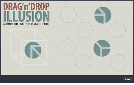
Who doesn’t want to use drag & drop interactions? The challenge for many of us is knowing how to build them. Storyline makes it super easy.

Any slide you create in Storyline (or import from PowerPoint) can be quickly converted to a drag & drop interaction. It literally only takes seconds to do the conversion. That’s pretty powerful.

The Rapid E-Learning Blog - create elearning drag and drop interactions

Click here to view a drag & drop interaction.

Now instead of spending time on programming, you can spend your time determining the best way to use drag & drop interactions in your elearning courses.

Tutorial: How to build drag & drop interactions. Learn how easy it is to convert any slide to a drag & drop interaction.

Use Interactive Characters to Enhance Feedback

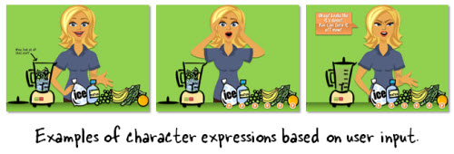
The challenge for many people is having the assets to build elearning courses. Storyline comes with 40 illustrated and photographic characters so that you’ll always have a consistent set of characters to use in your courses.

The Rapid E-Learning Blog - characters allow for interactive elearning feedback

The illustrated characters are tied to Storyline’s triggers so you can change the character’s expressions based on user actions. This is great for giving feedback to the learners.

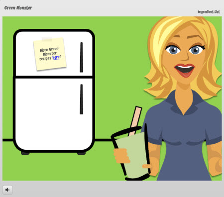
Here’s a demo that Jeanette and her daughter created on how to make a Green Monster drink. It’s fun and shows an effective use of the character set.

The Rapid E-Learning Blog - example of interactive elearning course

Click here to view the Green Monster demo.

Tutorial: Create interactive feedback with Storyline characters. Watch how I build a quick call center scenario in just a few minutes.

Easily Customize the Course Player

Rapid elearning is great because it simplifies a lot of the production process. But with that simplification you give up some customization. This is really evident in the course player. It reminds me of the old Henry Ford line, “You can have any color you want as long as it’s black.”

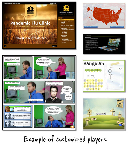
Storyline makes player customization super simple. Take a look at some of the demos from the showcase. As you can see they all look a little different. That’s because you have more control over the player.

The Rapid E-Learning Blog - examples of custom elearning players

You’re not tied to a specific look or size of the course player. You can easily move things around, turn them on or off, and change the dimensions of your elearning course to meet your needs. And you’re always free to create your own controls within the slide. That’s what DFLearning did in this example.

Tutorial: How to customize the elearning course player. I walk through the player customization. Check out the lightbox feature for the player.

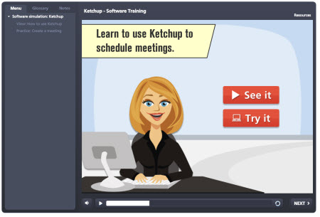
Easily Edit Screencasts & Software Simulations

At a previous company I had to build a lot of interactive software simulations. I really didn’t enjoy it because the editing process was always so cumbersome. I hated having to edit screens or do multiple takes of the recording, especially when it required resetting all of the screens and activities.

The Rapid E-Learning Blog - example of interactive software simulation

Click here to view screencast demo.

One of the things I truly enjoy about Storyline’s software simulation is the way editing works. First, you record your software demo. Then you decide if you want to insert just the video or an interactive simulation. And here’s the best part. At any time you can go back and change it.

For example: you insert a video, but the client wants to convert that to a simulated software interaction. In the past, you’d have to recapture everything. Now, you just go to the video and switch modes. It’s
as easy as that.

Same with editing. If I get an artifact or something on the screen I don’t want, I just right-click to access the fine tuning feature and select a frame without the issue. Editing only takes a few seconds. That sure beats all of the time I spent doing recaptures in the past.

Tutorial: Quickly make edits to software simulations. Learn to make quick edits and change modes without having to recapture the video.

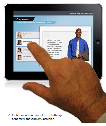
Create Courses that Look Great on the iPad

I really love the way the content looks on the iPad. I’ve probably showed it off to all of my friends and neighbors. It just looks good. And it works great, too.

All of the demos and showcase examples work on the iPad. Download the free mobile player and you’ll see that you get a really rich experience. Much better than what you get with HTML5 which has some limitations when it comes to interactive content.

The Rapid E-Learning Blog - interactive elearning on the ipad and for m-learning

You’ll notice that with the mobile player all of the interactivity works the way it was designed to work. I like to pinch the slides out so they play full screen. The content just looks like it belongs there. It doesn’t look like a clunky web page.

Easy Sharing of Storyline Files

My focus is always on how to give away assets and content to help people build their courses. One of the best things about Storyline is the ability to share slides and templates with other Storyline authors. It’s about as easy as sharing slides in PowerPoint.

The Rapid E-Learning Blog - free interactive elearning templates & PowerPoint templates

We’ve already added some content to the downloads section that are free for you to use. I’ve even converted a few of the free PowerPoint templates to Storyline templates.

You may recognize these two:

Over time there will be all sorts of free interactive content that will save you money and time.

There’s really a lot more to Articulate Storyline, but those are some of my favorite features. As I said earlier, like many of you I’m not a programmer so I’m really excited about the tool and all of the stuff I’ll be able to do with it.

If you want to learn more, checkout these videos. And feel free to download the trial and use the free templates to test it out.  I look forward to your feedback.

Events

Free E-Learning Resources

Want to learn more? Check out these articles and free resources in the community.

Here’s a great job board for e-learning, instructional design, and training jobs

Participate in the weekly e-learning challenges to sharpen your skills

Get your free PowerPoint templates and free graphics & stock images.

Lots of cool e-learning examples to check out and find inspiration.

Getting Started? This e-learning 101 series and the free e-books will help.


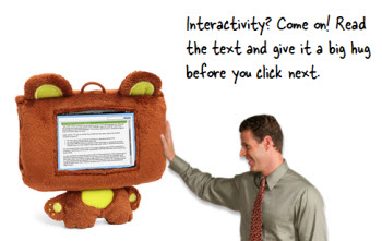
The Rapid E-Learning Blog - create huggable interactivity

I get a lot of questions about interactivity from those who are just getting started. Typically they begin with a lot of subject matter content and they’re not quite sure how to make the course interactive.

There’s a lot to consider when it comes to building interactive elearning. But if someone’s just getting started here are the three tips that I usually share:

Make it Relevant

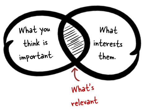
The first step to interactivity is relevance. The worst thing is having to take an elearning course that is completely meaningless. I’ve never had a job where I’m in a position to be bribed. Yet in many of the organizations I’ve worked, I’ve had to take courses on how not to receive bribes. What a waste of time!

The Rapid E-Learning Blog - create relevant content for interactive elearning

And many of us experience this type of irrelevant elearning. We’ll get an email in November reminding us to complete a bunch of courses by the end of the year. When that happens, I contact the HR person to see if I can get around those requirements. But unfortunately the person’s already taken the course on how not to get bribed. So I’m usually out of luck.

While relevance doesn’t equate to interactivity, it does equate to an engaged learner. And an engaged learner is more apt to learn and not be dependent on interactive gimmicks (which is what we usually start with when we try to make the course interactive). So before you look to build interactive elements in your course, determine how to make the content relevant to the learner.

Tips:

  • Talk to your potential audience and let them share ideas on how they’d use the content. Their ideas are a good resource for scenarios.
  • Interview new people who may have recently experienced the training to get feedback on what worked and what didn’t and how they feel the course relates to the real world.

Let the Learner Explore

A large part of learning is about forming a hypothesis and then testing it out. Often we fail, but the process of reflecting on an idea and then testing it is how we learn, whether we’re right or not.

There’s a lot of opportunity in elearning to let the person explore the course content and provide places for them to reflect and test ideas—“What happens if I make this choice and click here?”

Another value in exploration is that it allows the learner to determine what information is relevant or not. For example, if I know how to do something I can skip over that content and get to the content that I’m not sure about.

Unfortunately most of the elearning courses I see are linear and not very interactive. Linear isn’t bad on its own. Sometimes it’s preferable to get the information in a simple linear process. But what tends to make the linear course unbearable is when the course navigation is locked. And we tend to lock it because we’re worried that the “learner will not get all of the information.”

That’s faulty thinking which we’ll cover in the next section. For now, look at your content and determine how you can craft an environment where the learner can explore and get to the information she needs.

Tips:

  • Instead of creating a linear path of information, look for ways to let the learner find information or access it in different ways. At a minimum, give them some control over how they choose to get the information.
  • Get the learner to “touch the screen.” It’s interactive because it engages a different sense and it forces YOU to find new ways to present information.

Here are a couple of simple examples:

In this first example, we could just create four screens and have the learner go through them in order. But instead we give them the freedom to select a tab. This does two things: it lets them touch the screen and they get to choose what they want to review. It’s simple, but it’s an easy way to convert your click-and-read content to something more interactive.

The Rapid E-Learning Blog - example of an interactive elearning demo

Click here to view the demo.

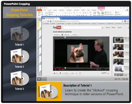
In the next example, you’re required to view three tutorial videos. Like the example above, I could have had the learners click on each video link and go through it in linear order.

But instead I freed up the navigation by letting the learners choose a video and then drag it to be played. By having them drag the video I get them to touch the screen. And I also give them the freedom to choose the video they want to watch. If this were a real software course, the learners may not need all of the tutorials. So why would I want to lock them into a linear path?

The Rapid E-Learning Blog - example of an interactive software tutorial

Click here to view the demo.

The two examples above are simple, but if you couple this type of interactivity with relevant content, you’ll be on your way to building an interactive elearning course.

Get the Learner to Pull Content

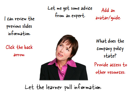
Relevant content is good and mixing it with screens that allows people to click and explore helps. But probably the single biggest thing you can do to transition from non-interactive to interactive elearning is craft an environment where the learner has to pull information in rather than us push information out.

The easiest way to do this is to craft decision points in the course. Force the learner to make decisions and then give them a way to collect the resources they need.

Some people won’t collect anything. They’ll jump in and make some educated guesses. Sometimes they’ll be right and sometimes not. That’s OK. They’re fine getting feedback and making adjustments. Others will not make any decisions until they’ve done an exhaustive search of every piece of information. That’s OK, too. In both cases you’re engaging the learner and giving them the freedom to make decisions and learn in a way that engages them.

The Rapid E-Learning Blog - get the learner to pull information for interactive elearning

The key to this approach is in how you structure access to the content. There are a number of ways you can get the information to the learner (which addresses the argument for locking slides).

  • Set the stage by providing some contextual information.
  • Create decision points where the learner is challenged to demonstrate their understanding. We don’t want them just reading or listening. We want them to reflect and process. Getting them to make decisions is a good way to get them there.
  • Provide a means for them to collect information (this is where exploration comes in handy).
  • Give them feedback based on the decisions they make.

As you can see, in all four instances you have an opportunity to provide the information that would normally be part
of your linear click-and-read content. They get information when you set the stage. They can get more information as you force them to a decision. They get even more information as they explore and try to fill in the gaps prior to making a decision. And then of course you can provide information in the feedback process.

Normally we push content out, but if we think about how to get the learner to pull the content in it forces us to craft relevant scenarios and decisions. And we have to move our course design away from linear and towards more open exploration and interactivity.

And at that point you’ll have a much more engaging and interactive elearning experience.

Countering the Locked Navigation Argument

To those who have to deal with the locked navigation argument, you can still lock the course. The ultimate goal isn’t locking navigation and making sure people look at slides. The goal is that they’re able to do or understand something.

The Rapid E-Learning Blog - get rid of locked navigation

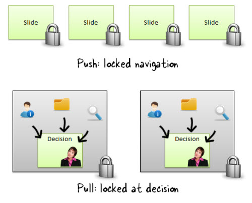
So you counter the argument by showing that a course that has decision points allows the learner to demonstrate their understanding of the content more so than forcing them to view a slide. Plus, you can still lock the course at the decision points. The learner is free to move around within the decision, but can’t advance until he’s demonstrated his understanding.

These three tips will help you move your content away from linear, click-and-read content and towards something more interactive and engaging. The next time you get some course content, ask how you can create a pull situation rather than pushing it out. And you’ll find that gives you a lot of ideas on making the course interactive.

Events

Free E-Learning Resources

Want to learn more? Check out these articles and free resources in the community.

Here’s a great job board for e-learning, instructional design, and training jobs

Participate in the weekly e-learning challenges to sharpen your skills

Get your free PowerPoint templates and free graphics & stock images.

Lots of cool e-learning examples to check out and find inspiration.

Getting Started? This e-learning 101 series and the free e-books will help.