The Rapid Elearning Blog

Archive for November, 2013


Articulate Rapid E-Learning Blog - free templates for online course design

At a recent workshop I was showing some tips on creating elearning templates. I decided to finish up the template I started in that session and make it available for you to use as you wish. There’s a version created in PowerPoint and published with Articulate Studio ‘13 and a version created for Articulate Storyline.

General Structure of the Free E-Learning Template

There are three main sections: objectives, modules, and resources. There are five modules so I created a unique layout for each module giving you five layouts from which to start. From there you can make all sorts of iterations.
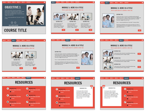
Articulate Rapid E-Learning Blog - layout options of free powerpoint templates

Free Fonts

For this template I used a couple of free fonts from Google. You can learn more about Google Web Fonts here.

You can use your own fonts but you’ll need to make some adjustments to their alignment since the fonts will be a bit different.

Free PowerPoint Template

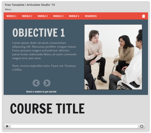
Here’s a published version of the free template created in PowerPoint. While it’s published in Studio’13 it will work fine in older versions, too.

Articulate Rapid E-Learning Blog - elearning example of free PowerPoint template in HTML5 for elearning

Click here to view the elearning demo.

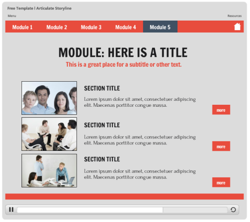
Free Storyline Template

Articulate Rapid E-Learning Blog - example of free elearning template published in Flash and HTML5

Click here to view the elearning demo.

Free Downloads

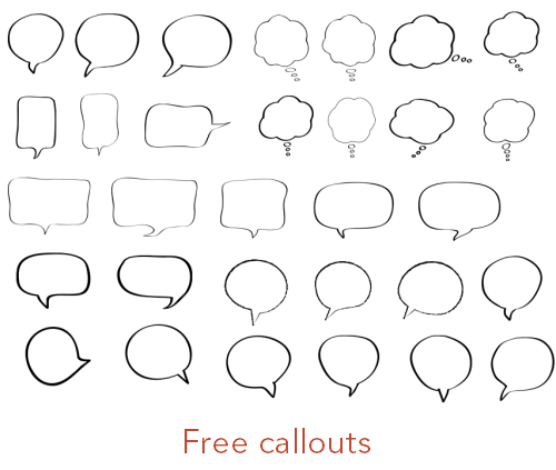
Here are the free elearning templates and a bonus download:

Articulate Rapid E-Learning Blog - free callout graphics

Bonus Tips

Here are a few bonus tips regarding the free elearning templates:

  • The pictures in the layouts are filled shapes. To adjust them you’ll need to modify the fill settings.
  • The objective slide shape is filled with a pattern.
  • The resource icons are from clip art style 1307.
  • Many of the slide objects are on the master slide, so if you want to edit them, go there.

This week is Thanksgiving for those in the U.S. It’s often a time where we reflect on those things for which we’re thankful.

I am thankful for the blog readers, community members, and all of the great people I get to meet at the workshops each year. I am always inspired by the creativity and willingness to share by so many.

Hope you all have a great week.

Events

Free E-Learning Resources

Want to learn more? Check out these articles and free resources in the community.

Here’s a great job board for e-learning, instructional design, and training jobs

Participate in the weekly e-learning challenges to sharpen your skills

Get your free PowerPoint templates and free graphics & stock images.

Lots of cool e-learning examples to check out and find inspiration.

Getting Started? This e-learning 101 series and the free e-books will help.


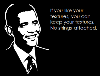
Articulate Rapid E-Learning Blog - keep your free textures

Recently I was looking for some free textures. While it’s easy to find “free” textures it’s not easy to find free textures that are really free.

A lot of sites that give things away for free often have stipulations that they’re only free for personal use. Yeah, right! Like I need those free stock images for the elearning courses I’m building at home.

Today I am sharing some sites where you can find free textures (and other assets) that can be used for commercial work. Since the licensing terms may change, be sure to read them before using for commercial projects. However, at the time this post was published all of the sites allow free commercial use.

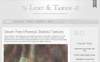
Lost & Taken: lots of cool textures. I really like the quality of what they share.

Articulate Rapid E-Learning Blog - free textures at lost & taken

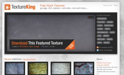
Texture King: not a massive selection, but they’re high quality.

Articulate Rapid E-Learning Blog - free textures at texture king

Design Instruct: another great collection of free textures. Also has some good articles on design.

Articulate Rapid E-Learning Blog - free textrure at design instruct

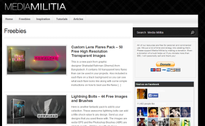
Media Militia: all sorts of cool free assets to go with the free textures.

Articulate Rapid E-Learning Blog - free texture ate media militia

Deviant Art is also a good resource. They have a lot of members who give away free assets. But you’ll have to look over their agreements individually.

If you search, you’ll find all sorts of other sites to find free textures. What I found though is that most of them pull from the four sites above. So why not go to the source? The sites above are vetted and should be good to go for your next elearning course.

If you’re a user of free textures (or other free online assets) be sure to give props to the person who provided the resources. Share the love via a blog post. Or perhaps you can tweet the link or make a comment on Facebook.

How do you find free textures that are free for commercial use? Share your comments here.

Events

Free E-Learning Resources

Want to learn more? Check out these articles and free resources in the community.

Here’s a great job board for e-learning, instructional design, and training jobs

Participate in the weekly e-learning challenges to sharpen your skills

Get your free PowerPoint templates and free graphics & stock images.

Lots of cool e-learning examples to check out and find inspiration.

Getting Started? This e-learning 101 series and the free e-books will help.


Articulate Rapid E-Learning Blog - lessons learned from usability study

I read a blog post recently on website usability. The author mentioned five usability issues from navigation to engaging the site’s visitors. While the post specifically deals with website design there is a lot in there that’s relevant to the design of elearning courses, too.

After reading the post I reflected on a few issues I see quite a bit.

Are you intentional in how the course is designed?

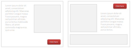
One issue is what I call the bouncy button where the button to navigate changes location. Often this happens because of the way content is laid out on the screen. Each screen is a bit different, so the developer moves the button to accommodate the screen’s content. This makes it confusing when trying to interact with the screen.

Articulate Rapid E-Learning Blog - example of moving navigation

The fix is to be consistent in how the course is designed and how the user is to interact with the content. For basic courses, the authoring tools already provide consistent navigation. But when creating custom navigation, make sure to be consistent so that navigating the screen is as intuitive as possible.

Is your software creating usability issues?

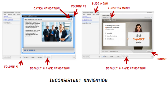
One common problem with rapid elearning courses is that they’re built with multiple tools. When they’re added together they look cobbled together. It’s what I call the Frankencourse.

As you can see in the image below, by inserting outside content, the navigation starts to get a bit confusing. You’ll also notice duplicate volume controls, two sets of navigation, and two menu lists.

Articulate Rapid E-Learning Blog - inconsistent navigation

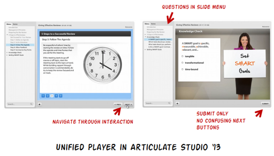
If you’re an Articulate customer you’ll be glad to know that this isn’t an issue now that Studio ‘13 has a unified player. Compare the image below with the image above and you can clearly see the difference between the older cobbled look and the new unified player.

Articulate Rapid E-Learning Blog - improved unified player in Articulate Studio '13

Are you providing clear instructions?

In an ideal world the user experience is intuitive. If you have to explain how to navigate the course, then there’s probably more that can be done to make the course more user friendly.

However, that’s not always the case. As noted above, sometimes the software creates a few issues. Other times, there may be an interaction or something else you want to add to the course where the navigation is different than the default. In those cases you need to add additional instructions.

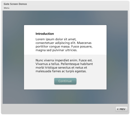
Articulate Rapid E-Learning Blog - example of how to pause the learner

I like to use gate screens because they pause the course and allow me to redirect the person’s attention. You can learn more about gate screens in this post and find some free ones to download here.

Are you getting feedback from your users?

It’s important to pilot test your course design to make sure that there are no blind spots. As I mentioned earlier, most of the software already provides a user-friendly player. That covers the basic navigation. However there may be other ways the person is supposed to interact with the course such as during a decision-making scenario.

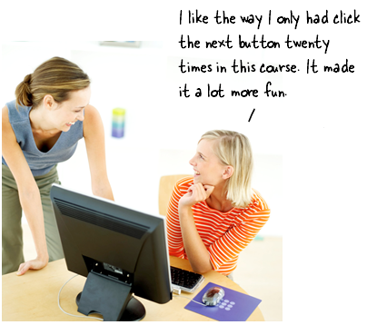
Articulate Rapid E-Learning Blog - get feedback from the person who takes online training

In those cases it’s good to get some feedback from those who take the courses. You don’t need a big pilot group. Just find a few people who don’t normally take elearning courses and watch how they interact with the screen.

Usually I find that my instructions aren’t clear and the user’s not quite sure what’s expected. It’s also good to do this before you spend too much time designing the course. Use an iterative approach where you can quickly test ideas and make adjustments before you spend a lot of time and resources.

Those are a few of the issues I’ve run into. What usability issues have you identified in your course design? Share your thoughts here.

Events

Free E-Learning Resources

Want to learn more? Check out these articles and free resources in the community.

Here’s a great job board for e-learning, instructional design, and training jobs

Participate in the weekly e-learning challenges to sharpen your skills

Get your free PowerPoint templates and free graphics & stock images.

Lots of cool e-learning examples to check out and find inspiration.

Getting Started? This e-learning 101 series and the free e-books will help.


Articulate Rapid E-Learning Blog - create free callouts in PowerPoint

In an earlier post I shared over 100 free callouts for you to use with your online training courses. Who doesn’t like free?

There are plenty of free callouts from which to choose. However sometimes the free ones just don’t work and you’ll need to create your own. So today I am going to show you how to create your own callouts.

How to Create Your Own Free Callouts in PowerPoint

One of my favorite features in PowerPoint 2010 is combining shapes. In fact, I have it as a tab in my PowerPoint ribbon so I always have quick access to that feature. Being able to create shapes in PowerPoint means I can create my own callouts. Here’s how:

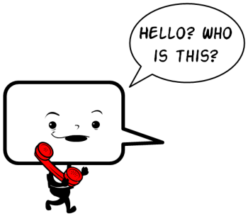
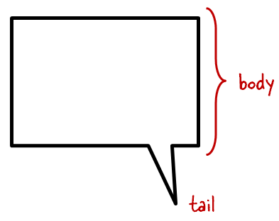
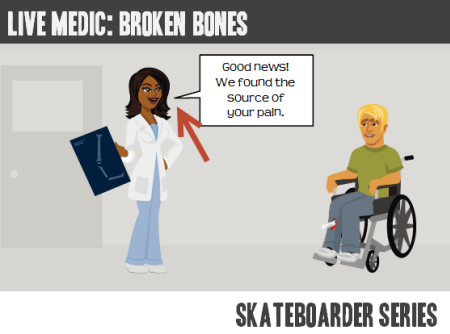
  • What is a callout? The callout is made of the body where we add text. And then it has the tail that points in the direction of the talking character. So it’s basically just two shapes. We’ll combine those in PowerPoint.

Articulate Rapid E-Learning Blog - the anatomy of a callout

  • Add a shape to the slide. I like rounded rectangles because they’re a bit more organic. Ovals are nice, too.
  • Add a tail shape. I like to use the lightning bolt. Some people use the crescent or triangles. It really doesn’t matter as long as you can get the look you want.
  • Position the callout so that it aligns with the speaker. This is where creating your own comes in handy. You can position the body and tail before creating the final shape.

Articulate Rapid E-Learning Blog - example of a callout in PowerPoint

  • Combine shapes in PowerPoint to create a single shape.
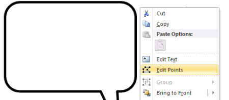
  • Edit points to create more customization. If you want to get fancy, use the Bezier curve. Right click on the shape and select edit points to access this feature.

Articulate Rapid E-Learning Blog - edit points in PowerPoint shapes

Tutorial: How to Create Callouts in PowerPoint

Here’s a quick video to show how to create your own callouts using PowerPoint.

Click here to view the video.

Tutorial: How to Create a Callout Template

This tutorial shows you how to create a template for callouts that you can use to quickly change the shape of the callouts you create.

Click here to view the tutorial.

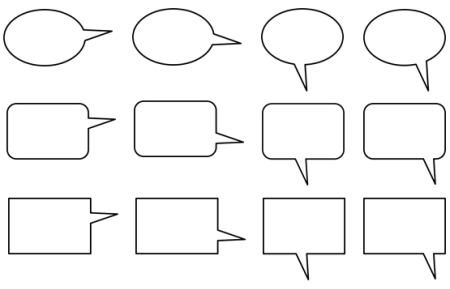
A Dozen Free Callouts

To help you out, I created a few callouts. But I encourage you to create your own.

Articulate Rapid E-Learning Blog - free callout graphics

Click here to download the free callout graphics.

Take advantage of the free downloads. But also learn to build your own callouts. That way you’ll always have what you need when you need it.

If you do create some and want to share them, send me an email and I’ll make them available to the rest of the community.

Events

Free E-Learning Resources

Want to learn more? Check out these articles and free resources in the community.

Here’s a great job board for e-learning, instructional design, and training jobs

Participate in the weekly e-learning challenges to sharpen your skills

Get your free PowerPoint templates and free graphics & stock images.

Lots of cool e-learning examples to check out and find inspiration.

Getting Started? This e-learning 101 series and the free e-books will help.