Very useful advice Tom. I can see the aesthetics of choosing the right fonts and using font families but can you point me in the direction of any research that tells us which fonts promote easy reading and aid understanding (and which to avoid)? The only research I have come across is Colin Wheildon’s “Type and Layout” which may be a bit dated now.
3 Rules When Selecting Fonts for Your Online Training Course
June 25th, 2013
Are the fonts you select for your elearning courses equivalent to your older uncle’s leisure suit? Sure, it’s clothing. But is it what you want to be seen in?
In a previous post, we explored how to create a style guide for your online course design. The style guide helps with consistency, but it doesn’t dictate which font styles to select.
In today’s post we’ll review some simple rules when selecting and pairing fonts.
Rule #1: Select contrasting fonts.
As a simple rule of thumb, I look for fonts that contrast by weight or serif with san serif.
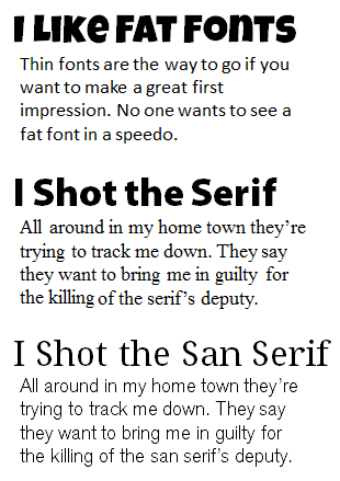
However there are other ways the fonts can contrast such as style or form. Changing size or color is another way to create contrast. When using informal or script-like fonts, those typically work better as heading fonts rather than body text because they’re not as easy to read.
Rule #2: Use the same font family.
Many fonts are part of a font family. And those families tend to have enough diversity and variety to make appropriate parings.
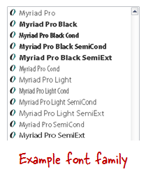
The benefit of the same font family is that they’re designed to work together. If you look through the fonts on your system, odds are that you’ll find a few families already.
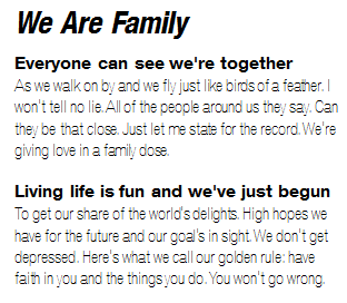
Rule #3: Avoid fonts that look the same.
The last rule is to avoid pairing fonts that look the same or very similar. Fonts have a lot of subtle differences. By selecting contrasting fonts, you can play off of the differences. However, if you select fonts that look too much alike, then you introduce a discordant look.
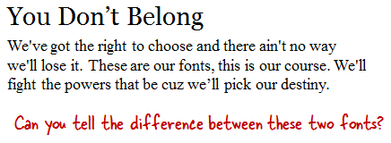
Usually people select similar fonts because they want one that’s specifically a certain size, bold, or italicized. If that’s the case, then stick with a single font and use the bold and italics to make it a little different. It’ll look more elegant that way.
Bonus Rule: If You’re Not Sure, Go with What Looks Right
You may not be a trained fontologist but you probably can tell when something looks right or wrong. So go with your gut. Unless you’re the one building the Frankencourses. In that case, go with rule #2.
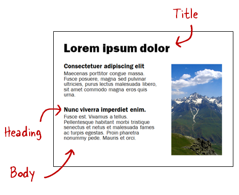
To practice pairing fonts, build a simple PowerPoint slide. And then assign different font types to see what they look like. When you find a font pair you like, make note of it so the next time you’ll spend less time trying to match pairs.
Another option is to practice pairing fonts with this typographic dating game.
Use the right font type and your course is refined. Use the wrong one and things won’t look right. Take some time to learn how to pair fonts and then make a list of font pairs so that you’re ready for the next course.
Events
- Everyday. Check out the weekly training webinars to learn more about Rise, Storyline, and instructional design.
Free E-Learning Resources
 |
 |
 |
|
Want to learn more? Check out these articles and free resources in the community. |
Here’s a great job board for e-learning, instructional design, and training jobs |
Participate in the weekly e-learning challenges to sharpen your skills |
 |
 |
 |
|
Get your free PowerPoint templates and free graphics & stock images. |
Lots of cool e-learning examples to check out and find inspiration. |
Getting Started? This e-learning 101 series and the free e-books will help. |
8 responses to “3 Rules When Selecting Fonts for Your Online Training Course”
Surely readability is an important issue when we choose our fonts even for short amounts of text? I’m fairly new to thinking about all this as my work has been about the content not the design, so maybe I am asking something very obvious. For example, if I look at the body text of ‘We are Family’ above, the text seems to jump a bit and interfere with my reading. That could affect how someone interacts with a course before they even get to the content.
Bonus rule is been ruling the media design recently. But, Metro has been my inspiration for a while now. Such a clean typography and quite simple to adapt. They do not follow contrasting fonts though. But, they are from same font family.
Thanks Tom. I’ll go away and experiment!
Hi,
nice one. got to know that there are these many font styles that can be used in online training course. this will be really helpful to who ever are searching for font styles. helps to know the usage of those styles in online training course.
I did know that selecting the right font would
mean a lot in an elearning course, but pairing fonts is something which i have not heard of. This is very interesting.Thanks for sharing 🙂





0
comments