Tom-
Thanks for these great tips. I’ll be sure to use them in my courses.
5 Easy Ways to Add a Glossary to Your E-Learning Course
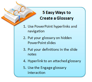
February 24th, 2009In today’s post, I’m going to show you five easy ways to build a glossary for your rapid elearning courses. You can use these tips to define words, footnote information, or as a way to add additional content to your courses. This helps keep your course content light and still gives you a way to share more with your learners. It also gives your learners control to choose what additional information they want or need when they need it.
1. Use PowerPoint hyperlinks and navigation
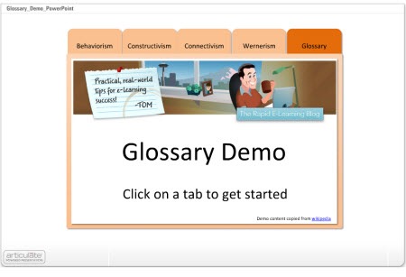
In the demo below, I disabled the default player navigation and created my own via the notebook tabs. This approach is very easy to do and works well for a shorter course with limited navigation needs.
- The tabs are built in PowerPoint and I use hyperlinks to get from one slide to the next. I disabled the published player navigation so there’s no concern over the learner clicking back/forward buttons and ending up on the wrong slides.
- The glossary tab contains links to all of the definitions that are on separate slides.
- To make the definition slides, I duplicated the glossary tab slide and added the definitions. When you click on the glossary, you get the main tab. If you click on a word, you get a duplicate slide where I added the information specific to that word.
2. Put Your Glossary on Hidden PowerPoint Slides
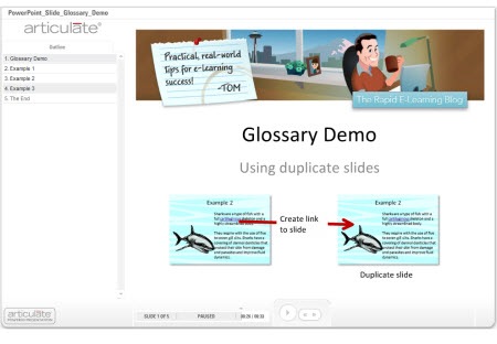
In this example, everything is still built with PowerPoint. If you want to define a word, create a duplicate slide and then hyperlink from the word to the duplicate slide. On the duplicate slide, you add additional content like the definition. The demo shows three ways to approach this.
- When you hide slides, you need to use the hide slides feature in the rapid elearning application and NOT the hidden slides in PowerPoint itself. Hidden slides in PowerPoint will not publish.
- The secret here is to duplicate the slide with the defined word. When the learner clicks on the word they link to the duplicate slide which gives the appearance of being on the same slide.
- What you do on the duplicate slide is up to you. You can add animations or just have the definitions appear on the slide. So it can be as media rich as you want it.
- Since you’re linking away from the actual slide, you need to find a clear way to get the learner back on track. I used “close” buttons and made them prominent. If you’re using Presenter ’09, you don’t need to do this because you can use the slide branching feature as well.
3. Put Your Definitions in the Slide Notes
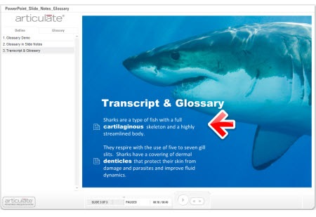
In an earlier post I discussed ways to get more out of your slide notes. One of the tips was to use it as a glossary. In the example below, you’ll notice that I changed the notes tab to read “glossary.” Whenever there’s a term that is defined or footnoted, I can add that to the PowerPoint notes section and make it available to the learner.
- The previous techniques required a link away from the slide. In this one, the learner stays on the slide and clicks the glossary tab. So there’s no concern about the learner having to navigate away from the slide.
- You do need to inform the learner when they can find more information in the glossary. This is easily done by changing the font or adding some sort of visual clue like an icon.
- I like this glossary technique because the glossary is slide-specific and not part of a larger glossary that I have to maintain. I just add the content as I need it.
4. Hyperlink to an Attached Glossary
Here are three ways you can use the attachment feature to add a glossary.
- Rename the attachments link to “glossary.” Then add each term as a link via an attached document or URL. This probably works better for short courses with just a few terms.

- Add a glossary as an attached document or URL. You put all of the terms together in one document. When the learner clicks on the link, they can access that document and look up terms. This approach probably works well if you have a lot of extra information but don’t expect the learner to look up terms throughout the course. Using the URL option is nice because you can update the web page without republishing the course.
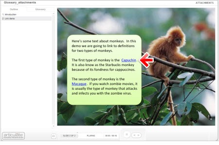
- Create a glossary and save as an html page. Add named anchors that point to the text on the page. You can learn more about doing that here under “name attribute.” Attach the glossary.html and use PowerPoint hyperlinks to link words on the slide to anchored text on the html page. Check out the demo below.
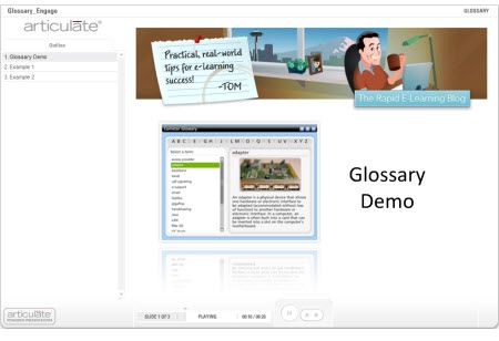
5. Use the Engage Glossary Interaction
Not all of you have Engage, but if you do, there’s a really nice Glossary interaction. I find it to be the easiest way since all of the programming is done and all I have to do is add the terms and definitions. I also like that I am not limited to just text. I can add audio, images, and all sorts of multimedia like video and Flash animations.
- You can insert the glossary on a slide, but I prefer to use it as a drop down tab. If the learner wants to look up a term or definition, they can click on the glossary tab and when finished go right back to where they were. This is good to help maintain the flow of the course.
- Make sure to let the learner know when a term is defined so that they know what to expect in the glossary.
These are simple yet effective ways to add a glossary to your elearning course and they don’t require a lot of programming and maintenance. If you have some ideas or suggestions, feel free to share them with the rest of us by clicking on the comments link.
*Demo content copied from Wikipedia. Shark music is the theme to Jaws by John Williams.
Events
- Everyday. Check out the weekly training webinars to learn more about Rise, Storyline, and instructional design.
Free E-Learning Resources
 |
 |
 |
|
Want to learn more? Check out these articles and free resources in the community. |
Here’s a great job board for e-learning, instructional design, and training jobs |
Participate in the weekly e-learning challenges to sharpen your skills |
 |
 |
 |
|
Get your free PowerPoint templates and free graphics & stock images. |
Lots of cool e-learning examples to check out and find inspiration. |
Getting Started? This e-learning 101 series and the free e-books will help. |
42 responses to “5 Easy Ways to Add a Glossary to Your E-Learning Course”
Another great post, Tom!
Like you, I prefer using the Engage Glossary interaction as a drop-down Tab. (I’ve also used the FAQ interaction the same way.)
The Engage Glossary interaction is an easy-to-use feature, and flexible with design elements. If appropriate, I’ve imported a SWF to a term’s definition if it helps the learner to understand it.
Jenise Cook
http://www.RidgeViewMedia.com
Hi Tom,
This is a great blog. I’ve been watching your blogs every Tuesday. As you know. I am now at Kaplan University with the Curriculum Design team. I was really pleased to know that my department knew about and honors your blogs. BTW: the 4th idea is one that I’d like to use in my next project if possible.
Thanks a lot!
Kathie
When making your decision, it is also good to note that the current Engage Glossary interaction has a limit of 500 entries.
Tom,
Once again this week’s tip is right on the mark. Great job! Thanks
Clearly for lots of terms (less than 500) an engage glossary is the way to go. For the time you might spend to “program” the other methods you will have paid for Engage several times over.
For large glossaries, I prefer to use the tab interaction making each tab a letter or group of letters. Then I can copy and paste the glossary terms and definitions. This is more efficient if you have hundreds of terms.
Umm, didn’t *John* Williams write the Jaws score?
Hmmm…. Gail, Greg, and Sean have caused me to pause and ponder.
If I had a Glossary of over 50 terms, I’d probably go the route of #4, per Tom, and link to a file or a URL.
Adobe’s RoboHelp WebHelp or MadCap’s Flare work well for Web-based glossaries. (And, I believe both can single source output to PDF.)
Hi Tom,
this blog is what makes Articulate really valuable!
Thanks so much!
Christian
If you look up – awesome blog with amazing, useful tips in the glossary, I think you’ll see a picture of our beloved Rapid E-Learning Blog author. Thanks Tom. You always seems to make our most pressing challenges seem so easily solvable.
Thanks for another great tip. Your weekly blogs are fantastic. They are always motivating me to try new things and give me wonderful ideas. You make everything seem so simple.
Love your blog, Tom. Great ideas well presented, as usual. Cool shark stuff too! Thank you.
I had a question on the 2nd example. On clicking the “Close” button the voiceover replays, giving the impression that the slide replays. What can we do to avoid this?
Hi Tom,
I really like the way you present the courseware! Thanks, this newsletter has always been inspiration for me!
One thing that I have been wondering for a while, how did you make the powerpoint graphics so clear and sharp in the published project?
Whenever I used a graphic in PPT, they get compressed and the image quality in published SWF was really bad. If I convert the graphics into SWF, I can’t easily create hyperlinks in PPT!
I hope you can shade some light here.
Regards,
Joanne
Hi Tom,
thanks a lot for your work, that helps very much to use the possibilities of Articulate.
Very useful information with easy-to-follow demos. I used the first technique in PowerPoint though the slides are not very sophistically designed as shown in the demos. I learned about that also.
Again, thanks for the helpful tips.
Diwakar
Hi Tom, thank you for your good and very usefull work.
I am tryng to do the glossary on power point following the exaple 2 but I have a problem, when I create a copy of the main slide, it appear on the navigation panel how I can hide it from the navigation panel?
For instance if the main slide the number 3 and the glossary definition is slide 4 in the navigation panel I have both displayed
best regards, Mauro
Thank you for today’s blog, it is FANTASTIC!!!
Can you please tell me how you got your training presentation to look like the various tabs?
@Tom @Shazia: “If I had narration on the slide and didn’t want it repeated, I’d do this: create a duplicate slide with no narration. The close button links to that slide. Add a replay button on the screen that links to the slide with narration.”
Brilliant! 🙂
Great blog! I always look forward to reading your weekly blogs. They are so informative and I learn new things all the time. I saw your answer regarding an upcoming post on building tabbed interface plus the three templates you’re giving away… I can’t wait to read this blog. I really like that tabbed interface look. It will look awesome on a current project I’m working on so I’ll be waiting for that!
Thanks so much for sharing your expertise… 🙂
T
[…] Blog: The Rapid eLearning Blog tagged with: education Post: http://www.articulate.com/rapid-elearning/5-easy-ways-to-add-a-glossary-to-your-e-learning-cou… […]
I liked your tip about duplicating slides and using hyperlinks for embedded glossary terms. It was easy to do and works well, except … how do you stop learners from navigating forward when they reach what should be the last slide, so they don’t see the duplicate slides at the end? How do you keep them from navigating backward from the duplicate slide if they should do that instead of clicking the “Close” button?
[…] 5 Easy Ways to Add a Glossary to Your E-Learning Course (February 24, 2009) […]
thank you .they were very usefull tips
azza
[…] 5 Easy Ways to Add a Glossary to Your E-Learning Course […]
this is a great post – so many creative ideas! One question – in example 2 how do you place the video, on the PowerPoint box with and make it the right size?
The glossary is great but I can’t figure out how to get it to appear in the heading along with attachments.
We have a HUGE glossary (100+ pages), so using the separate HTML option seems to be the best way. One thing… I can’t seem to get the anchor links to work once the PPt is published. And now I notice that the example shown above doesn’t work either. This is in the monkey example. Click on Macaque and you’ll see what I mean. Anyone know how to make the anchor links work? Thx!
Wait… Concerning my previous question about the anchor links, could it be my browser? I’m using Internet Explorer 7. Should I be using something else? Thx.
hello, i just found you minutes ago. Im from mexico. This information is just what i need to finish some research about e-learning as an option for students here in my city (doing a tesis on it too). Thank you!
[…] At another conference, someone wanted to know how to create an assembly line concept. That’s where I quickly prototyped the moving box. And the glossary post came as a result of someone asking about different ways to add a glossary to a rapid elearning course. […]
Tom, your example #2, “Put Your Glossary on Hidden PowerPoint Slides” looks like it works for you. I can get it to work if the slide is not hidden—once I hide it—the link doesn’t work.
After looking on the Articulate site I came upon this link http://www.articulate.com/support/presenter09/kb/?p=618, which says, “Slides you have hidden in PowerPoint will not display in your published output. Any hyperlinks you create that go to a hidden slide, therefore, will not work.
BTW, I’m using Studio 09.
Thanks Tom. Got it—works great
I love your posts and have learned so much from them! Great job! I would like to know how you achieved the effect highlighting an object and fading the background. Ex. the glossary demo and the word call signaling. I would like to use the same effect for my products when I’m explaining how to navigate using the player controls.
We have a new solution that makes it easy to add links from any word or pic to glossary terms!
http://www.screenr.com/icWs
http://elearningenhanced.com/products/articulate-glossary-magic





0
comments