You’ve gotta fight, for your right, to… illustrate? Man, I feel old.
Four Essential Tips for the Rapid E-Learning Pro
June 7th, 2011
PowerPoint’s a great authoring environment for elearning. If you can step away from the “bullet point” mindset and all of the complaints, you’ll see that PowerPoint’s got a lot to offer those who build elearning courses.
- Blank screen. Your screen can look any way you want it to. It doesn’t need to have that PowerPoint look.
- Animations. PowerPoint offers a pretty good selection of animations that let you mimic a lot of what you see in Flash.
- Multimedia. Record and sync audio to animations. Also insert an assortment of video and multimedia files.
- Illustrations. With a little practice, you can quickly build your own illustrations.
With a rapid elearning tool, you’re using PowerPoint’s easy authoring environment to create Flash movies. Essentially, you’re creating Flash content without the requirement of learning to program Flash.
The challenge is learning to get more out of PowerPoint. The more you can do, the better you can make your courses.
In last week’s post I shared a simple elearning template that I built in PowerPoint. I got a lot of questions about how to work with the template and make customizations. Many of the questions dealt with fundamental production techniques when working with PowerPoint. So in today’s post I’m going to offer a few tips that will not only help you customize the template, but also get you thinking about some new production techniques.
Layers not linear.
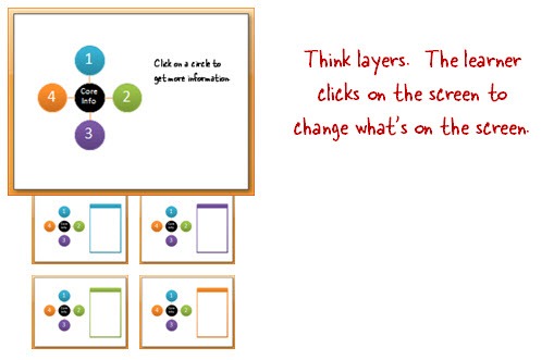
PowerPoint’s designed mostly as a linear presentation tool; which is fine. There’s nothing wrong with linear. However, when you want to use PowerPoint for elearning you kind of have to step away from linear.

A key is to see each slide (which becomes a Flash movie) as a piece of information. Your job is to assemble to information. You can do so using the default linear structure or use PowerPoint’s hyperlinking feature to direct the user’s access to the next piece of information. Couple that with the branching features in your rapid elearning tool and you can create some pretty sophisticated multimedia.
Masters make it easy.
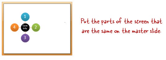
Many of the slides have the same core content because usually only a few things change over a series of slides. So instead of making copies of slides with the same stuff on them, put as much as you can on the master slide.

The benefit is that you’ll save time in production (especially when making changes) and publishing from PowerPoint to Flash will be much faster. Also, you can have more than one slide master.
You have a license to illustrate.
PowerPoint’s illustration capabilities are pretty amazing. As I’ve shown in previous posts, you can easily create your own illustrated assets. A good way to learn more is to find some illustrated images that come with tutorials. Practice creating them in PowerPoint. You may not really need the asset, but you’ll definitely increase your expertise using PowerPoint’s drawing features.

When I create the templates for the blog, I usually use the default “Office” color scheme to keep things simple. This lets you apply your own custom theme colors. But you’re not limited to theme colors. Why not fill the shapes with textures or images?
Below is an example of a template I gave away in the blog previously. As you can see, it has the default color scheme. However, in the second example, you can see that the template looks much more dynamic when the fill option is changed from color to picture. The depth and richness makes the template seem much more sophisticated and less PowerPointy.

Now that I covered some of the basics, let’s look at how this works with the template I gave away last week.
Tutorials
- Working with the master slides (5 min)
- Working with hyperlinks (5 min)
- How to create icons (4 min)
- Finding clip art styles (4 min)
- Workshop: Rapid E-Learning Essentials (24 min) – this workshop covers many essential rapid elearning tips when working with PowerPoint
If you more questions about the template or creating rapid elearning course, feel free to ask.
Events
- Everyday. Check out the weekly training webinars to learn more about Rise, Storyline, and instructional design.
Free E-Learning Resources
 |
 |
 |
|
Want to learn more? Check out these articles and free resources in the community. |
Here’s a great job board for e-learning, instructional design, and training jobs |
Participate in the weekly e-learning challenges to sharpen your skills |
 |
 |
 |
|
Get your free PowerPoint templates and free graphics & stock images. |
Lots of cool e-learning examples to check out and find inspiration. |
Getting Started? This e-learning 101 series and the free e-books will help. |
13 responses to “Four Essential Tips for the Rapid E-Learning Pro”
[…] Read the original here: Four Essential Tips for the Rapid E-Learning Pro » The Rapid eLearning Blog […]
Wonderful tips, again !!
Thanks for sharing !
Ronald,
The Netherlands
I can’t view your screenrs anymore. I click on the links, and it shows the screenr title, but no image at all. It just has the comment area for the screenr. Is this being blocked on the screenr site or is it something my organization is doing?
Leggi la traduzione (autorizzata) in italiano di questo post qui:
[…] Traduzione autorizzata tratta dal post originale di Tom Kuhlmann sul “Rapid E-Learning Blog”. Il post originale è disponibile qui […]
These are really great tips…especially the illustration ones.
Hi Tom,
Thanks for this huge post. There is so much in it to learn. Will keep be busy for quite a time. For someone DUMB like me it has a steep learning curve. Still it is interesting and challenging.
Kudos to you.
I really appreciate the Beastie Boys reference this Tuesday morning (and the great tips), but I agree with Kristan…I feel old!
I am curious to know if we can insert a spinning globe on powerpoint. Is it possible to have a full 3D rotation by using motion paths?
[…] Four Essential Tips for the Rapid E-Learning Pro […]
This is a great idea and a very good reading piece. Never thought of PowerPoint for eLearning.


0
comments