It still takes creativity and talented designers and developers to bend the templates and create engaging courses that don’t all look the same. As tools become easier to use and courses adopt a uniform look, the desire for uniquely designed and branded content increases.
Is This a Problem with E-Learning Today?
May 19th, 2020
I ran across two articles recently that made me wonder about the state of today’s e-learning courses.
The first article was on how websites are all starting to look the same. They did a study to confirm it. In the second article, the author makes some good points on how a lot of this new design is sterile and lacks personality.
While the two articles dealt with website design, there are a lot of parallels to e-learning course design.
Why Does Everything Look the Same?
There are a number of reasons why things look the same.
- There’s a commonality to design because of trends, but they come and go. A few years ago everything had bevels, then glossy buttons, then reflections, then skeuomorphic, then anti-skeuomorphic, then neuomorphism, and on and on. People design based on trends to look fresh and modern.
- A lot of design follows a templated structure with layouts, grids, and common understanding of user interface (UX) design. There’s all sorts of new understanding and rules for UX design based on research and an evolving industry. In addition, courses have technical requirements and need to be designed to accommodate mobile and accessibility needs.
- The technology is changing. If you want a nice-looking website, you don’t need to be a programmer. Just sign up for Wix or Squarespace. Same thing with e-learning courses. Gone are the days of specialized course developers. I addressed that in this post on the next generation e-learning tools. The tools like Rise 360 and Rise.com are becoming more prevalent. They offer easy, form-based construction. And with that is a consistent look and feel of the courses. You don’t need to know design, you assemble your learning content and pretty much plug and play.
Looking the Same Isn’t Bad Is It?
As noted above, there are a lot of legitimate reasons why things look the same. And those aren’t bad. And the reality is that things will evolve as the industry evolves and develops new norms. Plus, people will get tired of the way things look.
David Anderson shares a funny observation on how to be a consultant. If everything your client has is square, you tell them, what they need is a circle. And if all they have is circles, you tell them what they need is a square. There you go, consulting 101: if your design is skeuomorphic, you need flat. If your design is flat, try skeuomorphic.
Things change and what’s big today won’t be tomorrow.
Legitimate Concerns
“We are emotional and sentimental beings; we survive on self-expression.” – Tobias Van Schneider
I’ve met plenty of clients or “experts” on user experience design who follow a bunch of rules and won’t budge from them. Or marketing people with some ridiculous branding requirements for their courses. What happens is that the objective of learning is lost in the rules and requirements dictated by other objectives from people not concerned about teaching. Because of this, courses become boring and sterile. They lack life and are not very engaging for the learner. And it’s just as bad for the person tasked to build them.
An e-learning course is about teaching PEOPLE (at least in an ideal world). Regardless of current design trends, we should build learning experiences that are relevant and human. And for the course author, we yearn to be creative and want jobs that are more than just copying and pasting content from one medium to the next.
We have to work within the context of what we have. The person who possesses custom programming skills, has more options. But that’s not where most of us are at. However, just because we have constraints doesn’t mean we can’t be creative. In fact, I often find that constraints force more creativity than having none.
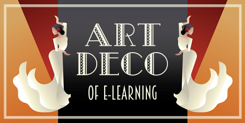
My big question for e-learning today: what is the Art Deco of e-learning design? Or better yet, what can we do to get away from sterile courses and make them more human-centered? How can we can exercise our creative skills and build courses that are both engaging and successful? Interested in your thoughts.
Events
- Everyday. Check out the weekly training webinars to learn more about Rise, Storyline, and instructional design.
Free E-Learning Resources
 |
 |
 |
|
Want to learn more? Check out these articles and free resources in the community. |
Here’s a great job board for e-learning, instructional design, and training jobs |
Participate in the weekly e-learning challenges to sharpen your skills |
 |
 |
 |
|
Get your free PowerPoint templates and free graphics & stock images. |
Lots of cool e-learning examples to check out and find inspiration. |
Getting Started? This e-learning 101 series and the free e-books will help. |
6 responses to “Is This a Problem with E-Learning Today?”
Hi Tom. When we use a company branded course template repeatedly, it’s hard to make courses “memorable.” Visually, they all blur together in memory. Engaging CONTENT can still make it memorable and effective but the visual aspect is important, too.
I believe we can have a branded template, with consistent navigation, while keeping it fresh with new UX trends and ID considerations.
Hey Tom. I just finished a project with a large organization to teach, guide, and template course development within the L&D group. I created templates for Storyline, Studio, and Rise and workflows within each linking to Teams and Review.
There was initial concern that everything would look the same but the reality is the templates offered enough variation that courses wouldn’t need to look identical. I demonstrated ways you could be creative while adhering to the new design principles (even for the non-designers) and the new tools.
I underscored that complexity is the enemy of execution and to keep it simple. We centered everything on design thinking (empathy for the learner)and explored methods, tools, and skills to address the following challenges (that I think applies to all e-learning):
1. Simplify the content to just what the learner needs
2. Focus the learner to limit distractions
3. Polish the look for appeal and ease of use
4. Involve the learner to create meaningful engagement
5. Relevance and reinforcement to increase retention
6. Sharing and teamwork to boost production and for continuous improvement
The Articulate suite worked wonderfully well in helping this large and diverse group of developers, designers, and SMEs streamline the production process and produce content consistently well from templates. The templates introduced a fresh and modern tone to their organizational learning without eliminating the unique expression needed to elevate the learning experience.
Today, E- Learning is the best way to learn. In this situation of panademic, E-learning is the one that connects the teacher with their Students.
When thinking about what we can do to make e-Learning more engaging, I want to start by responding to your legitimate concern comment that e-Learning is about teaching people – and that we should be building learning experiences that are relevant and human, regardless of current design trends.
From a learner engagement perspective, there’s only so much we can do within the constraints of visual design – and keeping up with design trends is exhausting.
A Google search just now on “creating engaging elearning” returned results with your post “Here are Ten Rules to Create Engaging Elearning” written back in 2010 at the top of this results list – and from my perspective there are no wiser words than what you communicate in your last rule, which is ‘focus on the learner’.
Yes, a visually appealing interface goes some way to engagement, and to be honest, this is what I’ve been focused on – up until recently.
You also have some great points in your posts on “How to Create Engaging E-Learning Courses” and “Build Effective Courses That Put the Learners in Charge”. Spot on is your comment that ‘the learner experience is more than just presenting information’. Incorporating meaningful and contextual decision-making opportunities (aka scenarios) is also great advice.
There is compelling evidence about using the power of storytelling for learning – too compelling for us to ignore.
This evidence suggests that to motivate or influence learners, we need to connect with them on an emotional level – stories do this. Not only this, but listening to stories helps learners stimulate critical thinking skills, capture complexities of situations and reshape knowledge into something meaningful.
If we look at combine storytelling with interaction – that is, presenting challenging real-life situations that are relevant to the learner – and asking them to think about and respond to these situations, now we’re getting closer to something that is potentially relevant, engaging and memorable.
I totally agree that we should be building learning experiences that are relevant and human, regardless of current design trends – and I truly believe that we should no longer be allowing the visual design of our courses to dictate how we engage learners.
So, yes – this is a problem with e-Learning today.
Great information. These problems can be resolved in the future. Thanks for sharing such valuable information.


0
comments