The Rapid Elearning Blog

Archive for the ‘E-learning’ Category


4 things to think about before building e-learning courses

It costs money to build e-learning courses and it costs money to take e-learning courses. Considering the cost, it’s important to ensure that you get the most value out of the courses you create.

One way to get value is to not create a course. Seriously. We don’t want to admit it, but many courses are pointless and a waste of time.

However, if you do need to create e-learning courses, then consider the following points below:

Create a Resource Hierarchy

You have limited resources and you want to make sure you use them wisely. In a recent post, I shared how I’d determine which e-learning application to use and when. This type of approach will save resources and help you get the most out of the e-learning software you use.

Move Content Offline

A lot of e-learning content is content that already exists in other formats. And most of that content is text-based. If the course is mostly reading and lots of text, why not take it offline and create PDFs or some other medium that’s easier to read? If you need a course, make it an abstract of the resource content with some activities to demonstrate understanding.

Teach How to Find & Use Resources

Since a lot of content already exists in other places, perhaps it’s better to teach them how to find and use those resources than it is to copy and paste that content into e-learning screens. Create real-world activities and then design the courses so that the learner is accessing resources and using that content to solve the activity.

Make the Courses Smaller

Do you need big courses? That seems like something from the 1990s and not the YoutTube generation. Instead of one big course, perhaps it makes sense to create a series of mini courses. They can always be bundled to create a cohesive learning path.

Events

Free E-Learning Resources

Want to learn more? Check out these articles and free resources in the community.

Here’s a great job board for e-learning, instructional design, and training jobs

Participate in the weekly e-learning challenges to sharpen your skills

Get your free PowerPoint templates and free graphics & stock images.

Lots of cool e-learning examples to check out and find inspiration.

Getting Started? This e-learning 101 series and the free e-books will help.


move past click and read e-learning

It’s easy to make a list of things one needs to know and create courses focused on that information. That’s why we have a lot of click and read content.

However, knowing information and understanding the information are two different things.

Most e-learning is designed to present information through a series of screens. Then the course ends with a simple quiz to confirm a rote understanding of the content. However, a good course develops understanding rather than merely present information.

Here are 4 ways to move past information sharing and create courses that present a deeper level of learning and understanding.

Present Clear Learning Objectives

What is the expected outcome of the learning? This seems so obvious, but most courses I see are a little weak on clear objectives. And with fuzzy objectives there’s no clear path for learning and then no way to measure success or prove understanding.

Learn to build meaningful objectives.

Prove Understanding

With clear objectives, the course can establish how to know they’ve been met. What evidence can the learner present that demonstrates how well they understand the content?

Create objectives that are measurable and prove understanding.

Provide Information within a Learning Experience

Build the course to provide content AND create a learning experience. Courses start with content. But learning and understanding is demonstrated not by consuming but by using the content. I like to craft the course around real-life activities. This allows the person to see the content in a real-world context and then demonstrate their understanding by using the content in that context.

How to build real-world interactions.

It’s All About E-Learning Emancipation

Every day I get questions on how to lock course navigation. I get why it’s a question. That’s what the client wants. But it still makes me cringe, because it has little to do with learning and more about controlling the experience.

Free up the course design and let the person navigate the content the way they choose. If you need to lock it, lock it at a point of decision where they need to demonstrate understanding before they advance. Don’t lock it thinking that’s how they’ll learn.

Find ways to move past the locked navigation.

Click and read content exists because we tend to focus on pushing information out. A good learning experience focuses on using the information to craft a desired level of understanding.

Events

Free E-Learning Resources

Want to learn more? Check out these articles and free resources in the community.

Here’s a great job board for e-learning, instructional design, and training jobs

Participate in the weekly e-learning challenges to sharpen your skills

Get your free PowerPoint templates and free graphics & stock images.

Lots of cool e-learning examples to check out and find inspiration.

Getting Started? This e-learning 101 series and the free e-books will help.


meaningful e-learning courses

We spend hours building courses that look great and have rich interactive elements, but often we’re missing the key component to an effective course: tapping into the learner’s motivation.

When you frame the e-learning content into a meaningful context, you’ll not only tap into the motivation of the learner, but there’s also a good chance you won’t be tempted to stuff the course with meaningless interactivity (that has the appearance of value).

When building courses, can you answer the following three learner questions?

Meaningful E-Learning: Why Am I Taking This Course?

Good e-learning courses start with solid, actionable learning objectives. The goal is to help the learner to see the value of the objectives. Sure you can start with a bullet point list of objectives and what they’ll learn.

But you really want to convince them that this course has value. And once they understand the value, their more motivated to succeed. And learner motivation is the foundation of a great learning experience.

Meaningful E-Learning: What Am I Supposed to Do with All of This Content?

There are three main parts of e-learning course construction:

  • What content needs to be in the course?
  • What does the course look like?
  • What does the learner do?

Not only does the course need clear objectives that convince the person of it’s value, it also needs clarity around the action required to use the content. What is the person to do with all of this new information?

A real challenge with e-learning is that we’re good at pushing content out. And the reality is most e-learning is rooted in some sort of compliance or regulatory training with little focus on more than a final quiz to certify course completion. But even those courses are rooted in performance expectations.

Help the learner to see the value in the course and then create a means for them to use the new information to improve or enhance their performance.

Meaningful E-Learning: How Can I Prove I Know it?

If you don’t answer the two questions above, the incentive is to click through the course to get to the final quiz and get back to work.

Quiz questions are fine for simple assessments, but do they really measure true understanding of the content and the ability to use it in real life?

Ultimately, the course mimics real world experiences and expectations. In that environment, the learner gets to learn meaningful content and practice using it in a way that demonstrates their understanding. That’s how they prove they learned the information.

It’s easy to build content heavy courses with simple quizzes at the end. That’s why there are so many. And maybe it’s not always wrong. Let people take a course, quick quiz, and get back to work. However, if we want course to be effective we need to engage the learner and create meaningful learning experiences. And that starts by answering the three questions above.

Events

Free E-Learning Resources

Want to learn more? Check out these articles and free resources in the community.

Here’s a great job board for e-learning, instructional design, and training jobs

Participate in the weekly e-learning challenges to sharpen your skills

Get your free PowerPoint templates and free graphics & stock images.

Lots of cool e-learning examples to check out and find inspiration.

Getting Started? This e-learning 101 series and the free e-books will help.


We all like to see good e-learning examples. That’s one reason I really enjoy the e-learning challenges. They’re little nuggets of creativity. They’re usually not full-fledged courses, but they often have some interesting elements.

In a recent challenge on course starter templates for leadership training, community member, Andrzej Jabłoński, shared a really nice example. Check it out below.

e-learning example leadership template

Click here to view the demo.

Here’s what stood out:

  • The visual design is fun and clean. I think often our e-learning courses look too formal or corporatey (if that’s a word). We think because it’s a serious topic that the visuals need to look serious. Maybe they do, maybe they don’t. I like this design because it doesn’t look like a typical corporate course. Yet it’s professional and engaging.

e-learning example

  • The subtle animations work well. They get your attention, but they’re not gratuitous. Break down the course and look at how he used the animations.
  • Leverages existing illustrations. He used an image from freepik to create the visual elements for his demo. As he says, “I mainly work on redesigning and adjusting images for my projects. It’s also a good way to learn how to design when you have to work on ready-made elements. I often try to add something more from myself to develop graphic skills.”
  • Andrzej also shared the source file so you can open it up to see how he created the animated effects and other slides. You can find it in the recap post.

Look at what he did, find an image, and see what you can do to apply similar effects for your own template design.

Events

Free E-Learning Resources

Want to learn more? Check out these articles and free resources in the community.

Here’s a great job board for e-learning, instructional design, and training jobs

Participate in the weekly e-learning challenges to sharpen your skills

Get your free PowerPoint templates and free graphics & stock images.

Lots of cool e-learning examples to check out and find inspiration.

Getting Started? This e-learning 101 series and the free e-books will help.


interactive scenarios for e-learning

Here’s some content that spans the past decade or so of rapid e-learning. Originally, the interactive scenario started as a PowerPoint file that was published with Articulate Studio to demonstrate how to create simple branched scenarios in PowerPoint.

Interactive Scenario: PowerPoint

interactive scenario in PowerPoint

Click to view the interactive scenario create with PowerPoint

Since PowerPoint is linear and doesn’t offer tracking logic, it requires a lot of slides to create the illusion of movement and branching complexity. The slide number increases exponentially with each additional choice and gets to a point where it’s not manageable.

In those cases, PowerPoint isn’t the best solution for interactive courses.

Interactive Scenario: Storyline

The same content goes from 154 slides in PowerPoint to just 18 slides in Storyline. That’s a dramatic decrease in slides and the production time required to create an interactive scenario. It really shows off the power of Storyline and why it’s so well received as a preferred authoring tool.

interactive scenario built in Storyline

Interactive Scenario: Rise 360 Content Blocks

When we launched the Rise 360, I wrote about the new approach to rapid e-learning. Rise 360 is form-based so the authoring process is different than PowerPoint or Storyline.

I played around with how to convert the PowerPoint scenario into Rise 360, a completely different type of tool. Here’s the first attempt using content blocks.

interactive scenario demo 2

Click here to view the interactive scenario using content blocks in Rise 360.

Interactive Scenario: Rise 360 Scenario Block

The content block scenario works, but with the scenario block in Rise, I am able to create something that is visually more in line with what I want and it’s a lot easier to build. Here’s an example of the same content in the Rise 360 scenario block.

interactive scenario Rise 360 scenario block

Click here to view the interactive scenario using the scenario block in Rise 360.

Interactive Scenario Resources

It really is interesting to see the evolution of rapid e-learning through this scenario content. It started with PowerPoint, passed through Storyline, and now it’s part of Rise 360.

Events

Free E-Learning Resources

Want to learn more? Check out these articles and free resources in the community.

Here’s a great job board for e-learning, instructional design, and training jobs

Participate in the weekly e-learning challenges to sharpen your skills

Get your free PowerPoint templates and free graphics & stock images.

Lots of cool e-learning examples to check out and find inspiration.

Getting Started? This e-learning 101 series and the free e-books will help.


create animated gif

Animated .gifs are great for e-learning. Often, I like to use them instead of videos for e-learning interactions, especially process interactions that go through a sequence of steps.

Here are a few previous posts on animated .gifs with some free resources:

Today I’ll show a simple way to convert a video of a process into smaller animated .gifs that you can insert into a slide, article, or process interaction.

Demo of the Animated Gifs in a Process Interaction

Here’s a demo I created using Rise and the Process Interaction.


animated gif example

Click here to view the example.

Animated Gifs Tutorials

Below are a couple of tutorials that go into it in more detail:

Animated Gifs: Create a Procedural Video

Record a video of the process. Don’t worry about the audio as it will be removed. To keep the edits to a minimum, make sure to be clear on the steps and to not waste a lot of movement. Get to the point quickly.

At our workshop in Milan, David and I quickly recorded the process to make an espresso with the machine in the back of the room. While we pretended to be working, it was really a way for us to sneak in a few more shots of espresso.

Here’s the original video.

Click to play the video on YouTube.

Animated Gifs: Convert the Video to Gif

There are a number of ways to convert video to animated .gifs. I like to use ScreenToGif because it’s free (which is always good) and it is really easy to use.

The conversion process is simple: import the video and convert it. However, there are some key considerations.

The original .MP4 video is 159 MB at 1920 x 1080 resolution. Animated .gifs can be large, really large.  Without any significant edits, the 159 MB video becomes a 470 MB animated .gif. That’s just not manageable.

There are a few things you can do to decrease the file size of the animated .gifs:

  • Scale the video down from it’s original resolution. There’s no need for an HD quality .gif. In this case 1920 x 1080 will be sized down to 500 x 281.
  • Crop the video to just the critical pieces of info. The fewer frames the smaller the file size. You can always duplicate frames to keep something on screen longer with minimal impact to size.
  • The less difference there is with the pixels from one frame to the next, the smaller the file will be. Unfortunately, video isn’t static and those millions of pixels are changing from frame to frame. You could try to shoot against a solid background and with a tripod. That may help, depending on your subject.
  • Video runs at about 30 frames per second (FPS). When you convert the video to .gif, you can modify the frame rate to something like 10 to 15. It just depends on how much motion is in the video. The less motion, the more you can lower the frame rate.

Animated Gifs: Edit to Individual Steps

Unless the steps are very short and can be shown in one file, it makes sense to break the steps up to individual parts. That helps reduce the file size and keeps the focus on very specific parts of the process.

  • You can import the entire video and then cut it down. Or cut the video into smaller videos first and work with them individually. It’s probably easier to edit the videos first and then import the smaller videos. This is more manageable and less strain on your system.
  • Get rid of what you don’t need, cut out extra frames.
  • The animated .gifs loop, so it may make sense to add a little buffer at the front or back end to let the user orient to the start and end of the process.

The original video was 1 minute long. Converted to an animated .gif without edits, it was 470 MB. After cutting it into pieces and creating four smaller gifs, the total ended up being about 15 MB. That’s a pretty significant difference and the output works well for the demo.

That’s basically it, shoot a video and then convert it to animated gif.

Events

Free E-Learning Resources

Want to learn more? Check out these articles and free resources in the community.

Here’s a great job board for e-learning, instructional design, and training jobs

Participate in the weekly e-learning challenges to sharpen your skills

Get your free PowerPoint templates and free graphics & stock images.

Lots of cool e-learning examples to check out and find inspiration.

Getting Started? This e-learning 101 series and the free e-books will help.


free subject matter expert handout

Recently, we explored how to manage the working relationship with subject matter experts. One of the key components is curating all of the existing resources. Here’s a free handout to help guide the conversation with subject matter experts and clients so that you get all of the resources you need to build the best courses possible.

What you need to curate is part of three core groups: existing training content, additional resources, and media assets.


Subject Matter Expert Checklist: Collect Existing Training Material

subject matter expert checklist training content

Make sure to get all of the existing training material. You’ll also need to figure out what to keep and what to discard. At some point you want to archive older material so there’s no conflict later when you need to update the course content.

Subject Matter Expert Checklist: Identify Additional Resources

subject matter expert checklist resources

There are all sorts of supporting resources such as product documentation, procedural manuals, and company policies. Not only do you want to identify what’s available, you want to make sure it’s up-to-date (get rid do old content), and find ways to integrate searching for and using the resources.

Subject Matter Expert Checklist: Pull Together All Media & Visual Assets

subject matter expert checklist media assets

The organization often has branding requirements that may include imagery, colors, and typography. You need those. You also need any images, videos, audio, and whatever other media exists to support the training. If none’s available, make a list of what you need.

Often you can find relevant assets in marketing collateral, web sites, or shareholder annual reports.

This checklist is a great way to collect what you need and also help steer some of the conversation you’ll have with your subject matter experts and content owners.

Events

Free E-Learning Resources

Want to learn more? Check out these articles and free resources in the community.

Here’s a great job board for e-learning, instructional design, and training jobs

Participate in the weekly e-learning challenges to sharpen your skills

Get your free PowerPoint templates and free graphics & stock images.

Lots of cool e-learning examples to check out and find inspiration.

Getting Started? This e-learning 101 series and the free e-books will help.


Three R's of subject matter experts

Subject matter experts often play a key role in the development of your e-learning courses. We’ve covered this quite a bit in previous posts and in a free e-book available to you through the e-learning community. You can find the links below.

A couple of weeks ago I did a workshop where we discussed working with subject matter experts and my computer crashed. Since I had to do the presentation again, I wanted to simplify the key points just in case I didn’t have the presentation file, so I came up with the three R’s when working with subject matter experts: relationship, role, and resources.

Establish the Relationship with Your Subject Matter Experts

  • Be prepared and respect their time. Often, they’re not as vested in the success of the project as you are.
  • Pull together a list of questions for them to review. Don’t give them 200 questions. Start with top five to ten questions so it’s manageable.
  • Get them to share their ideas about how they’d approach the training. You want to understand how they see things so you can anticipate potential conflicts.
  • Ask lots of questions and don’t make assumptions.

Define the Subject Matter Expert’s Role

  • You’re trying to get them to help you build an effective course. Use a backwards design to get them to think like instructional designers. What’s the appropriate action that demonstrates success? How do you measure that action? What do they need to practice to be successful? What information do they need to practice? The point is stepping away from information and focusing on actionable performance.
  • Establish clear expectations built around the project’s objectives. Who does what and when? What is does the subject matter expert deliver. What are their action items? Come to a documented agreement. Don’t schedule meetings with them unless there’s an action item.
  • Who is the final reviewer of the content and course? Is the subject matter expert the one who signs off on the course? Or is there someone else? Get that person involved at the forefront.

What Resources Can the Subject Matter Provide?

  • What existing training content exists?
  • Have the subject matter expert provide assessment questions and viable choices (or the framework for viable scenarios).
  • Identify supporting resources such as articles, intranet content, policies, etc.
  • Who will collect the metrics to track before and after accomplishments?

Obviously, there’s a lot more to working with the subject matter experts when building e-learning courses. Most of that is covered in the resources below. However, if you lean on the three R’s you’ll remember to cover the basics: maintain a good relationship, establish clarity around the role and expectations, and collect the appropriate resources.

Free Checklist

subject matter expert checklist media assets

Here’s a free checklist to help curate all of the appropriate content and resources.

Rapid E-Learning Blog Resources

Here is a list of relevant blog posts.

Free E-Book

Here is a free e-book with all sorts of tips to know when working with subject matter experts.

Events

Free E-Learning Resources

Want to learn more? Check out these articles and free resources in the community.

Here’s a great job board for e-learning, instructional design, and training jobs

Participate in the weekly e-learning challenges to sharpen your skills

Get your free PowerPoint templates and free graphics & stock images.

Lots of cool e-learning examples to check out and find inspiration.

Getting Started? This e-learning 101 series and the free e-books will help.


PowerPoint tip graphics

Here’s a PowerPoint tip: build your e-learning course graphics in PowerPoint. PowerPoint is great for simple graphic design projects. In fact, I use it quite a bit for this blog and some of the graphics I need in my e-learning demos.

In a previous post, I shared visual design tips for graphics I built in Rise 360 for an e-learning scenario. All of those graphics were built in PowerPoint.

PowerPoint for graphic design example 5

In this example, the images all need to be wide, but short rectangles so that I could get them about the same height as the text and squeeze them as close as possible to the button stacks in Rise 360.

I created a custom slide size 13 x 4 inches. When I save the PowerPoint slides as images that results in an image that is 1280 x 384 pixels.

Here’s a detailed tutorial that walks through the process of creating similar graphics in PowerPoint. I cover a lot of little PowerPoint tips.

Click here to view the PowerPoint tutorial on YouTube.

The links below take you to specific parts of the tutorial. The last two links show how to create the final pill shape with the character’s head extended outside of the image.

The tutorial above shows how I created the images. But here are a few key points to consider.

PowerPoint Tip: Step Away from PowerPoint as a Presentation Tool

If you’ve read much of this blog, you know that I’m a big advocate for using PowerPoint to build simple graphics. It’s easy to use, most people have it, and there’s not much you can’t create with PowerPoint once you learn a few things.

Is it Photoshop or Illustrator? No! And if you have expertise with those tools, then have at it. But for those who don’t have a graphics editor and need a simple solution, give PowerPoint a try.

PowerPoint tip for e-learning graphics

Here are some previous posts that show what you can do:

PowerPoint Tip: Save Slides as Images

Whatever you build in PowerPoint you can right-click and save as an image. I usually save as .PNG. This preserves the color clarity and any transparency. If you save as .JPG, the transparent areas fill with white.

PowerPoint tip right click save as image

For most cases (especially when working with Rise 360), I like to use the slide as my entire image. So I build what I need and then save the slide as image rather than PPTX. While there are a number of image options, like above, I stick with .PNG.

PowerPoint tip save slide as image

PowerPoint Tip: Create Custom Slide Sizes

The default PowerPoint slide is 16 x 9 aspect ratio. In most cases that is fine. It works great for Rise 360. However, there may be times when you want a custom slide. For example, if you want a square image, you need to change the slide size. I usually use 10 inches by 10 inches which gives me an image that is close to 1000 x 1000 pixels (give or take).

Go to the Design Tab and select Slide Size to change the settings.

PowerPoint tip slide size

PowerPoint Tips: Install Studio 360

Many of you are you are using Articulate 360 which comes with Rise 360 and Storyline 360. Those are obviously the go-to apps for building courses. Because of this, many people ignore Studio 360 which comes with Articulate 360.

PowerPoint tip Characters

Even if you don’t use Studio 360 to build courses (why would you when you have Rise 360), it’s still a good idea to install it. The main reason is that you get access to all of the assets including the characters from Content Library 360. And when you build graphics for your e-learning courses, especially as I did in Rise 360, it helps to have all of the characters in PowerPoint.

If you aren’t using a graphics editor or don’t know how, then PowerPoint is a really easy way to build graphics for you e-learning courses.

Events

Free E-Learning Resources

Want to learn more? Check out these articles and free resources in the community.

Here’s a great job board for e-learning, instructional design, and training jobs

Participate in the weekly e-learning challenges to sharpen your skills

Get your free PowerPoint templates and free graphics & stock images.

Lots of cool e-learning examples to check out and find inspiration.

Getting Started? This e-learning 101 series and the free e-books will help.


visual design for e-learning tips

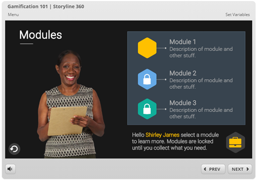
The other day I made some images for a course menu page in Rise 360. I spent some time playing around with different ideas. When I reviewed my final image, I realized that there were several iterations.

Today I’ll share some of the different ideas I considered and why I made changes.

Visual Design: The Set Up

I’ll start by stating that most of this is subjective, so there’s not a right or wrong.

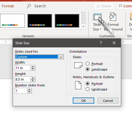
With this particular menu, I needed an image that had a 10:3 aspect ratio. In this case, the images are 1280 x 384. The aspect ratio calculator is a good resource if you ever need to figure out an aspect ratio or the resolution of images.

visual design for e-learning aspect ratio calculator

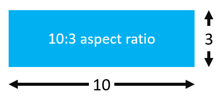
The short but wide aspect ratio creates a challenging constraint with what you can show. And that’s why I played around with different ideas.

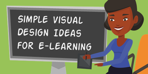
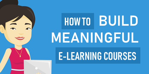
Visual Design for E-Learning: Example 1

PowerPoint for graphic design example 1 visual design for e-learning

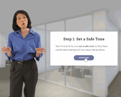
Because of the dimensional constraints, I started with just text. But the text looked empty and uninteresting. Since these images were part of an interactive scenario, I wanted to add a bit more personality.

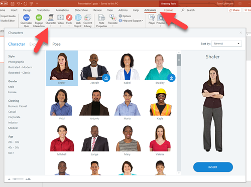
I added a character to the text. This creates a visual connection to the scenario. I also wanted some white space so it was easier for the eye to scan the screen. Generally, it looks good and the white space is nice as the Rise course responds to the mobile devices.

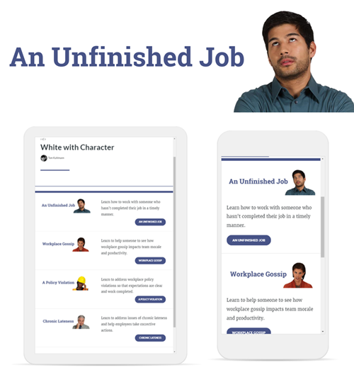
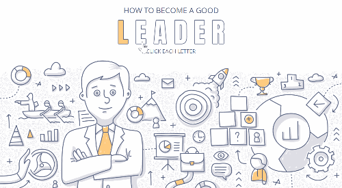
Visual Design for E-Learning: Example 2

PowerPoint for graphic design example 2 visual design for e-learning

I wasn’t keen on the smaller character but as noted before, the height of the image created some constraints. So I played around with making the character larger. This meant is had to go off screen.

I was also concerned that perhaps the larger image would be too busy if it remained in color. So I got rid of the color and then lighten up the image a bit.

I liked the gray image and text overlay. But it just didn’t feel right, especially in the mobile view with the top of the heads cut off.

The second design is OK. But it looks a bit unbalanced. The right side of the menu has text and a strong visual element with the button. It kind of fills the right side. But the left side just looks odds to me.

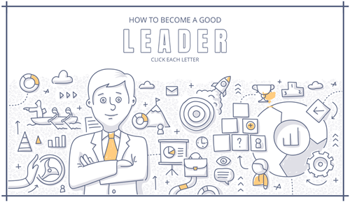
Visual Design for E-Learning: Example 3

PowerPoint for graphic design example 3 visual design for e-learning

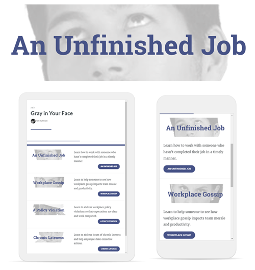
Sticking with the grayscale, I played around with making the character image a bit larger to fill that side of the menu. It does add some heft, but I wasn’t fond of the way the faces were cropped.

I do like it in the phone view because it fills the column and the lighter image with the darker buttons works.

Visual Design for E-Learning: Example 4

PowerPoint for graphic design example 6 visual design for e-learning

In a previous post, I shared an easy graphic design tip that I call the transparent echo technique. The idea is to add the same image twice. One is muted and serves as the background and the other is a focal point.

The image above was my first attempt. The examples in the blog post linked above look nice. But this one felt a bit busy and the eyes were too big. It feels a bit creepy.

So I added a color overlay that I color picked from the button. I also moved the image around and used his shirt and not the face. I like the texture that the echo creates. You can see part of the shirt so there’s some very slight visual context and the texture adds depth which I like better than just a solid color. But the echo isn’t distracting.

PowerPoint for graphic design example 4 visual design for e-learning

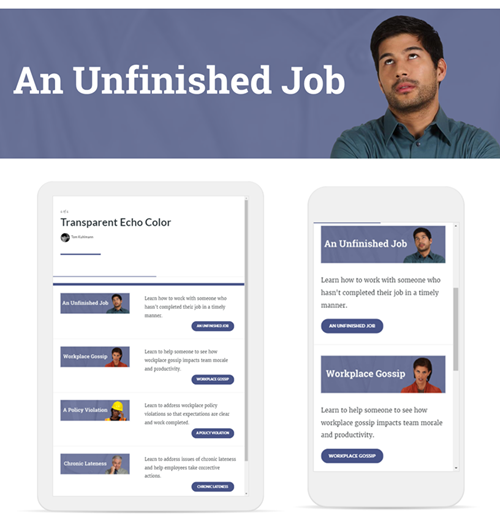
The design seems blocky and the buttons are heavy. My original goal was to have white space. Now I have an image design I kind of like, but it’s just too square and heavy.

Visual Design for E-Learning: Example 5

PowerPoint for graphic design example 5 visual design for e-learning

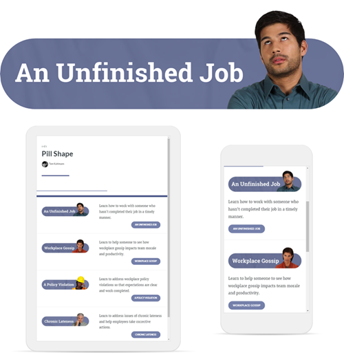
To gain white space and get rid of the block I decided to play off the pill shape of the buttons. That gives it some visual cohesion by tying in the header with the button.

By extending the heads outside the pill shape, it creates additional white space. And the round corners with the characters poking out of the shape feel a bit more organic and informal, which lends itself well to an interactive scenario course.

I also lightened the buttons so that they were a little more subdued and not as heavy. They’re just a bit lighter than the pill shape.

Visual Design Principles

Again, most of this is subjective. But I thought I’d give you some insight into my thought process as I created the graphics and made iterations. While the images are subjective, there are a few core principles to consider when creating the visuals for your courses.

  • Use white space to give your eyes a break. White space also helps to discern what content is there and how’s it related to other content on the screen.
  • Visual consistency between design elements. I like the final image and that it works with the pill shaped buttons. The colors also work to tie the objects together.
  • Play around with color. Remove colors from the images to neutralize them. Then add a few accent pieces or a single color to draw focus. It’s easy to do and a good basic tip for those of us who are visually challenged and opt to over work our images.

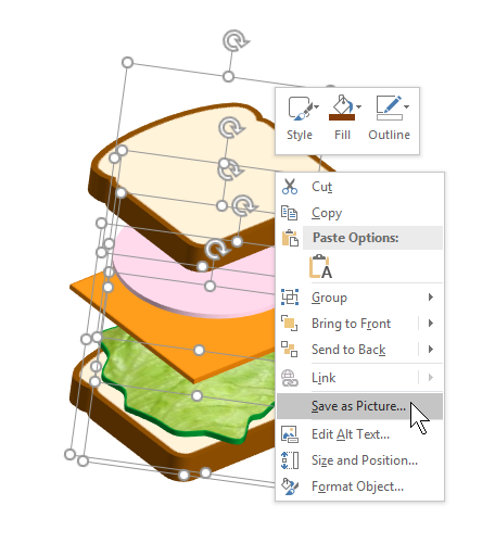
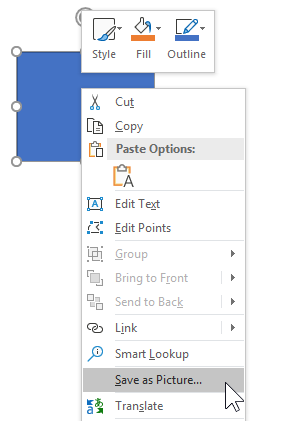
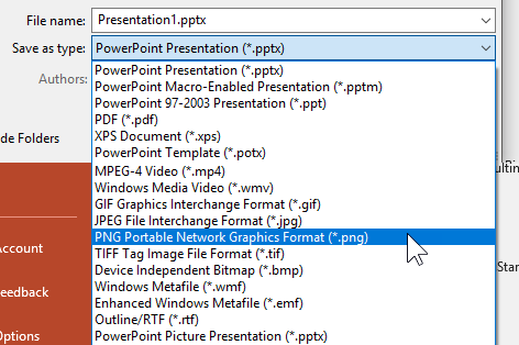
In the follow up post, I’ll show how I used PowerPoint to quickly create all of these images and make edits in seconds.

Which design do you like best? Is there something you would have done different?

Events

Free E-Learning Resources

Want to learn more? Check out these articles and free resources in the community.

Here’s a great job board for e-learning, instructional design, and training jobs

Participate in the weekly e-learning challenges to sharpen your skills

Get your free PowerPoint templates and free graphics & stock images.

Lots of cool e-learning examples to check out and find inspiration.

Getting Started? This e-learning 101 series and the free e-books will help.


e-learning tips

Even before I started working at Articulate, I made it a goal to answer five questions each week in the e-learning community. It’s a great way to connect with others, especially beginners, and offer some help as they’re learning.

However, for me, it’s a great way to stay on top of the tools as it forces me to think through the software in different contexts. It enables me to play around with different ideas and production techniques.

Here are three recent tutorials that I created to answer some questions in the community. The tutorials offer little bonus tips and focus on some production nuances that aren’t always apparent to new users. They’re good if you’re just getting started.

Here are the three files I used for the demos in case you want to look at them and follow along.

E-Learning Tip: Simulate Right-Click Interactions on Mobile Devices

In this tutorial, we review how to go through software training on a mobile device when the software simulation requires the user to right-click which isn’t possible on a mobile device.

Features demonstrated:

  • Setting True-False variables to indicate if the user is on a mobile device
  • Use variables to simulate right-clicking
  • Showing/hiding objects based on variable values

Click here to view the tutorial on YouTube.

E-Learning Tip: Combine Animations to Create Fast-Slow-Fast Animations

In this example, the question was how to make an object slow down when passing through another object and then speed up when it was done passing through.

Click here to view the tutorial on YouTube.

Features demonstrated:

  • Create motion paths
  • Set options
  • Apply relative start points
  • Relative animation
  • Alignment

E-Learning Tip: How to Keep Objects Persistent and as the Top Layer

In this tutorial, we look at how to ensure that the custom course navigation is always on the top layer and not hidden when going to other layers.

Features demonstrated:

  • Launch layer based on timeline
  • Create persistent layers on top of other layers
  • Use empty layers to trigger and redirect

Click here to view the tutorial on YouTube.

I usually do 5-10 of these tutorials every week. If they interest you and you want to see more, let me know.

Events

Free E-Learning Resources

Want to learn more? Check out these articles and free resources in the community.

Here’s a great job board for e-learning, instructional design, and training jobs

Participate in the weekly e-learning challenges to sharpen your skills

Get your free PowerPoint templates and free graphics & stock images.

Lots of cool e-learning examples to check out and find inspiration.

Getting Started? This e-learning 101 series and the free e-books will help.


E-Learning Variables 101

March 19th, 2019

Building e-learning courses is usually a matter of pulling together the appropriate content, visuals, and some level of interactivity. Most courses I see are linear with some simple interactions like tabs and labeled graphics.

However, there’s a way to make e-learning content and the learning experience more dynamic when using variables. Variables help create custom user experiences such as personalized visuals, conditional navigation, and adaptive learning paths.

The challenge for many e-learning developers (who aren’t experienced programmers) is learning more about variables and how to use them.

Today’s post is a recap of some previous getting started content that introduces the basics of working with variables, a few practice activities, and additional resources.

Also, be sure to check out our upcoming e-learning workshops below. I just added a bunch of new sessions.

Learn About Variables for E-Learning

Here are some previous blog posts that go through the basics of variables and how to use them.

Practice Activities to Learn About Variables for E-Learning

Here are some resources from previous workshops where we learn to use variables in a simple gamified context. There’s a published version with practice files and a series of tutorials that go through each slide individually. If you want to practice using variables and need some resources, this is a good place to start. You’ll only learn to use them when you use them.

variables 101 for e-learning example

See a published example.

Tutorials

E-Learning Community Activities to Practice Using Variables

Here some recent challenges to practice using variables in real-world contexts. Even if you can’t participate, look at some of the examples shared by community members.

Tutorials to Learn About Variables for E-Learning

variables 101 for e-learning

If you haven’t used variables before, now’s a good time to get started. If you do use variables, what do you find to be the most common use cases in your projects?

Events

Free E-Learning Resources

Want to learn more? Check out these articles and free resources in the community.

Here’s a great job board for e-learning, instructional design, and training jobs

Participate in the weekly e-learning challenges to sharpen your skills

Get your free PowerPoint templates and free graphics & stock images.

Lots of cool e-learning examples to check out and find inspiration.

Getting Started? This e-learning 101 series and the free e-books will help.