The Rapid Elearning Blog

Archive for the ‘E-learning’ Category


back-up course files

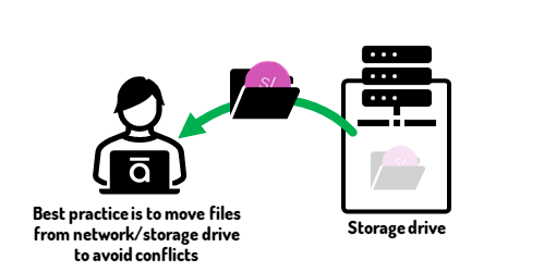
As a general rule, it’s good practice to edit files on your local drive and not a network drive (or online storage like Google Drive or Dropbox). For example, when I work with a .story file that’s on Dropbox, I’ll sometimes get some sort of syncing error or a series of duplicated or conflicted files. This makes sense because the drive is constantly monitoring changes in the file and updating the file. One tip for Dropbox is to pause syncing if you’re working from a Dropbox folder.
backup project files

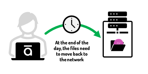
However, I like to move files from the network drive to my local drive to do production work and make the edits. However, that means what’s on the desktop is the most current and not backed up. If my computer crashed, I’d lose everything. Thus, I need to move things back to the storage drive when I’m done. The challenge is remembering to do that.
backup project files at night

I’ve had times where I work on a file and then go to eat and come back to find my computer crashed or maybe the app closed. Or every once in a while, there’s the quick power outage. Whatever it is, there’s always the chance you lose your work and because it wasn’t backed up, you can’t access the most recent one from your storage drive.
automatically backup project files

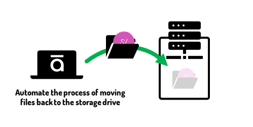
To avoid these issues, I use SyncToy, a free application from Microsoft to back-up my files at night. Here are the basic steps:

  • I work from an “active projects” folder on my desktop.
  • I create a duplicate folder on Dropbox (or any storage/network drive).
  • I set my folder on the desktop to automatically sync with the duplicate folder. This overwrites what’s in the storage drive folder, thus any changes I made during the day are preserved. An added benefit with some of the services like Dropbox is that there’s some versioning control, so that comes in handy, as well.

Using SyncToy

I wrote about this solution almost ten years ago. It’s still viable. Unfortunately, Microsoft doesn’t promote the application anymore, but you can still download SyncToy from here. I am on Windows 11 and as you see in the tutorials below, it still works fine.
Articulate Rapid E-Learning Blog - sync two folders using Microsoft SyncToy

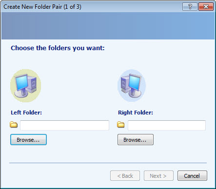
You select a “Left” and “Right” folder to sync, and then determine how and when you want to sync them.

The left folder is my “active projects” folder on the desktop. The right folder is my storage drive folder. I set it to sync every night at 8:00 PM. Here’s a tutorial that shows how to set up and sync two folders using Microsoft SyncToy.

To sync the folders, open SyncToy and select “Run.” Of course, that requires you remembering to do so, but that’s where the next step comes in.

View the SyncToy tutorial on YouTube.

Task Scheduler

Your Windows computer has a task scheduler that lets you schedule tasks to run at specific times. That’s why it has that fancy name.

In this case, I want to create a task to run SyncToy at 8:00 PM daily. The tutorial below walks through the basic steps of creating a new task and when to run it.
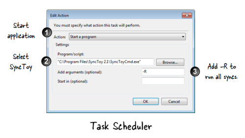
Articulate Rapid E-Learning Blog - how to set up task schedule to run SyncToy

What I am showing you is relatively simple. There’s a lot you can do with Task Scheduler and I’m sure you can find a ton of information on the Microsoft site or on YouTube.

Let’s review the process:

  • Create a folder on your local computer to manage your e-learning projects.
  • Create a duplicate folder on your storage drive.
  • Set up a folder pair to sync the two folders.
  • Create a task with Task Scheduler to automate syncing the two folders at a specified time.

View the Task Scheduler tutorial on YouTube.

Too bad SyncToy isn’t going to be around forever and perhaps one of you have a comparable solution to offer. In the meantime, you can still download the application and it’s still a viable process.

What do you do to manage files between your local and network drives?

Events

Free E-Learning Resources

Want to learn more? Check out these articles and free resources in the community.

Here’s a great job board for e-learning, instructional design, and training jobs

Participate in the weekly e-learning challenges to sharpen your skills

Get your free PowerPoint templates and free graphics & stock images.

Lots of cool e-learning examples to check out and find inspiration.

Getting Started? This e-learning 101 series and the free e-books will help.


presentation tips

I do a lot of presentations live and online. I also record a ton of tutorials. During those presentations I’m usually showing how to do something and attendees need to see the mouse movement and where it’s at. Here are a few simple tips to highlight your mouse when presenting or recording your tutorial.

Here’s a video tutorial that walks through the tips below if you want more detail.


Click here to view the tutorial on YouTube.

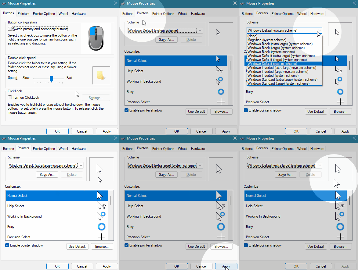
Make the Mouse Pointer Extra Large

change mouse pointer size

In a presentation or tutorial you are trying to direct the viewer’s eye. This is especially true for software demos where it’s easy to lose track of what’s going on and where the mouse is moving, more so if the viewer isn’t familiar with the user interface.

Go into the mouse properties and change the mouse point to extra large.

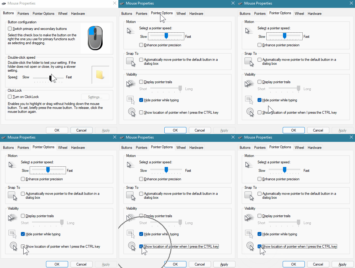
Use Keyboard Shortcut to Show Mouse Location

I use this quite a bit. In the Pointer Options of the mouse properties, set the mouse to show location when pressing the control key. Whenever you move the mouse to somewhere else, press the control key and you can direct the viewer to that part of the screen.

highlight mouse pointer location

Create a Spotlight Effect to Show Mouse Location

Microsoft PowerToys are little applications that add more functionality to Windows. In a previous post, we looked at how to install a simple color picker. That’s not all that comes with the PowerToys. There are three mouse related features that could come in handy. In fact, I use the spotlight effect instead of the control button feature above.

mouse pointer spotlight

Install PowerToys and then select the mouse features you want to enable. Play around with the settings and see what works best for you.

Highlight Onscreen Left and Right Clicks

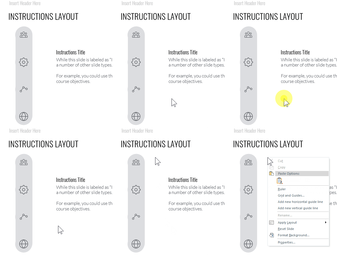
If you want to show where the mouse is when you click, set the left and right click to different colors and as you click it’s easy to see where the mouse is and you’re doing. Press Windows+Shift+H and that activates the mouse click highlighter.

mouse click highlighter

Highlight the Mouse Click with Crosshairs

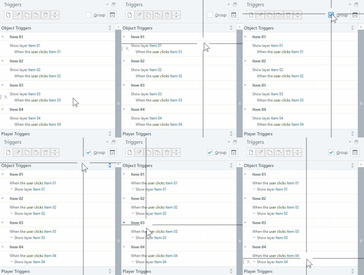
Press Control+Alt+P and that activates the crosshairs. Personally, I don’t find this one as useful, but it is an option. I’m kind curious who would use this type of highlighter and when. Feel free to share in the comments.

mouse crosshairs

The PowerToys are nice. I use the spotlight effect all the time. It looks elegant and easy on the eyes. I always found the mouse options with the control click circles to be a bit old looking and kind of herky jerky.

Hope these tips come in handy when you do your next webinar, presentation, or screencast tutorial.

Events

Free E-Learning Resources

Want to learn more? Check out these articles and free resources in the community.

Here’s a great job board for e-learning, instructional design, and training jobs

Participate in the weekly e-learning challenges to sharpen your skills

Get your free PowerPoint templates and free graphics & stock images.

Lots of cool e-learning examples to check out and find inspiration.

Getting Started? This e-learning 101 series and the free e-books will help.


color picker for e-learning

I’ve written about the Microsoft PowerToys in the past. They come with some handy applications. There’s an application that allows you to preview .SVG files. This is more important today than it was even a year ago as more and more courses are using .SVG. There’s also a feature to rename your files. This comes in handy if you want to convert a folder of images to match a project’s title.

I was looking at the updated PowerToys and thought I’d highlight the new color picker and how it has real practical value.

Color Picker for E-Learning

I use a color picker multiple times during the day. Many apps like Storyline and PowerPoint have color picking tools. However, they tend to be confined to working in the application. There are browser extensions for color picking websites. I use them sometimes when I work in Rise 360. I also use Color Cop (another free app).

However…

I think I’ve been able to consolidate all of my color picking needs in a single tool via the Color Picker in PowerToys. Three things I really like:

  • It’s simple and elegant.
  • I can pick colors from anywhere on my computer without being constrained by an app or browser.
  • I can edit the colors or get quick derivatives. For example, I could pick a fill color and use one of the derivatives for a border.

color picker for e-learning

Select Windows+Shift+C and it opens the color picker. From there you can pick any color. Using your mouse wheel to zoom in. And once you’re in the editor, you get the hex code and a range of tones within the color as an easy way to create a secondary color derivative.

Here’s a quick tutorial to show a little more detail.

Click to view the tutorial on YouTube.

If you need a color picker, you can’t beat the PowerToys. It works great and its price can’t be beat. 🙂

Events

Free E-Learning Resources

Want to learn more? Check out these articles and free resources in the community.

Here’s a great job board for e-learning, instructional design, and training jobs

Participate in the weekly e-learning challenges to sharpen your skills

Get your free PowerPoint templates and free graphics & stock images.

Lots of cool e-learning examples to check out and find inspiration.

Getting Started? This e-learning 101 series and the free e-books will help.


download images from website

Visually branding your e-learning courses is a common requirement. A great way to figure out how to brand the course is by mimicking what’s available publicly from the organization’s website (and intranet).

These sites tend to have all sorts of media assets that are already vetted to fit the organization’s brand and often work well for e-learning content. The challenge is how to get access to those assets.

Connect with the Marketing Team

Before you spend time scraping your sites for images, connect with the marketing (or web) team. In the past, I’ve found that the marketing team usually had access to more media assets than other teams.  Connect with that team (or the team that manages the website) and share what you want to do. Often, they can provide some guidance and give you access to the resources available to them.

Be prepared to dialogue about compliance to the company’s branding requirements. 🙂

Download Images from the Website

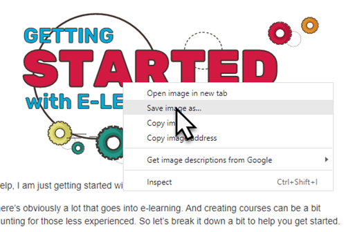
One option is to locate an image on the website, right-click and save to a folder.

media assets e-learning

That’s an easy and effective way. However, it’s also a bit cumbersome. And sometimes the sites are set up to not allow this.

Download Images via the Browser’s Site Inspection

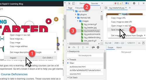
Another way to access the images on your site is via the browser’s ability to inspect the site.

  • Right-click on the page and select inspect
  • Click on the Sources tab
  • Locate the media in one of the folders
  • Access the source file and save it to your folder

e-learning inspect source

Download Images by Extracting from Your Website

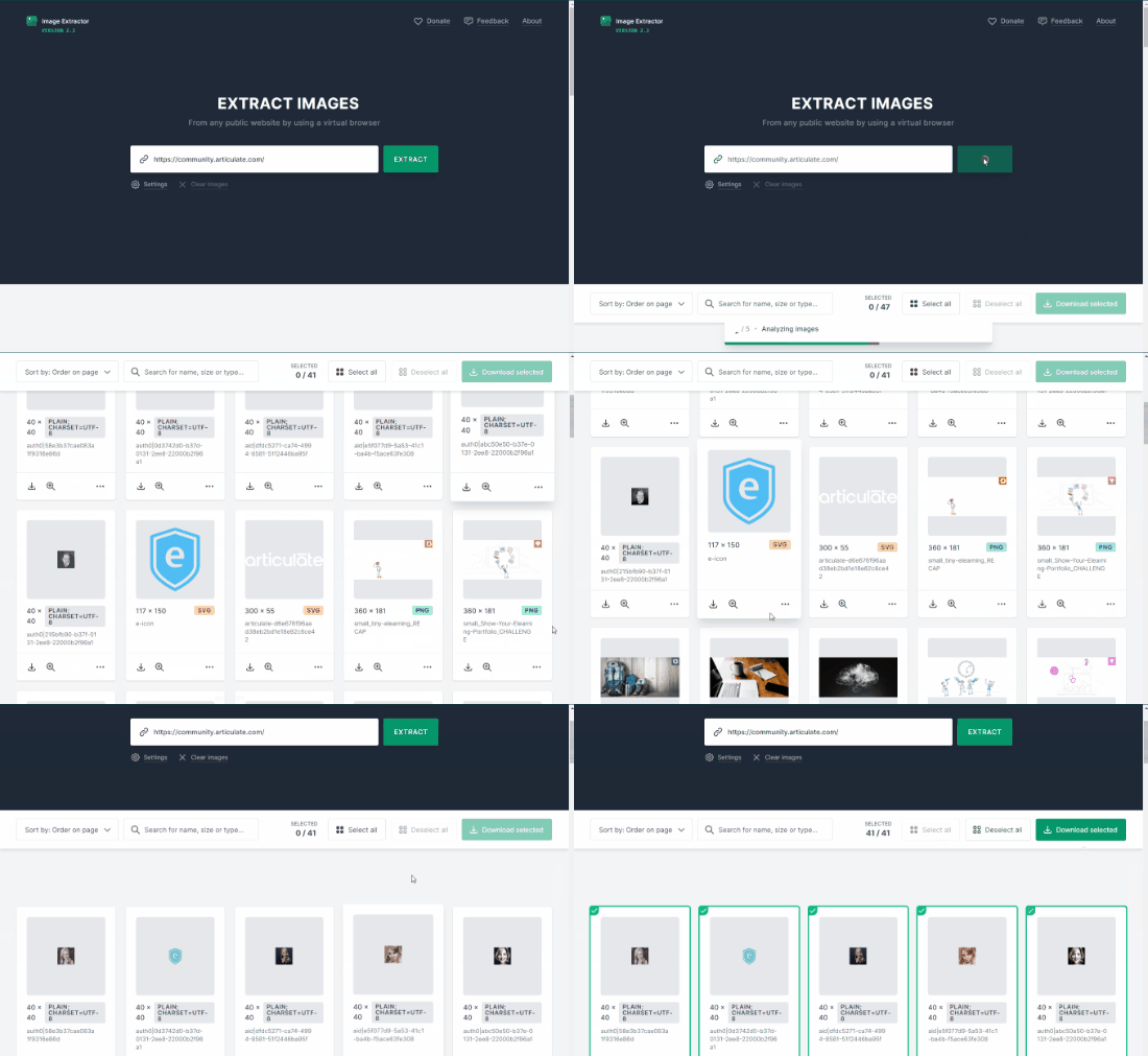
I covered this in a previous post, you can use a browser extension or this website to extract images. Basically, they isolate and just show the images on the site. I like using the Image Extractor site because I can do a batch download of images which saves some time.

download media

As with anything like this, be sure to properly credit sources.

Events

Free E-Learning Resources

Want to learn more? Check out these articles and free resources in the community.

Here’s a great job board for e-learning, instructional design, and training jobs

Participate in the weekly e-learning challenges to sharpen your skills

Get your free PowerPoint templates and free graphics & stock images.

Lots of cool e-learning examples to check out and find inspiration.

Getting Started? This e-learning 101 series and the free e-books will help.


compliance trainingI’m not sure what the number is, but my guess is that compliance/regulatory training makes up a large majority of the e-learning that gets created.

Most compliance training isn’t training to change performance. The focus is awareness and certifying that the learner understands and accepts those expectations. Or perhaps it’s some sort of annual refresher.

I used to work with a community healthcare group and the nursing staff did a week of annual training. They already knew the content. However, they had to review the content each year and be certified. But they weren’t really learning a lot of new things.

Another common example is ethics training. We don’t have organizations full of unethical people and then do training to make them ethical. Instead, we do the ethics training to state the organization’s position and expectations.

That doesn’t mean there’s no performance expectation. For example, a performance requirement may be to identify unethical behavior. Or perhaps, it’s knowing what to do when it’s witnessed.

In fact, one of the downfalls of compliance training is that the focus is usually only on the content and end-of-year certification. But what about how to apply the expectations in the real world:  learn how to identify unethical behavior and then what to do?

Because compliance training is usually only focused on disseminating content, the measure of understanding is usually a few simple multiple choice quiz questions and certificate of completion.

However, if the compliance training focused on how the organization’s expectations play out in a real-world environment, the course designer could use decision-making scenarios that mimic the real-world. This is a better way to assess the learner’s understanding of ethics and how they apply the training in a context that’s meaningful to themselves.

I get asked a lot about compliance training and here is my core advice:

  • If it’s merely to certify exposure to the content, create a simple course with a simple quiz so that people can get in and out of the course and back to productive work quickly.
  • If you want to build engaging and meaningful training, identify the performance angle and create decision-making opportunities so they can process the content in a relevant context.

What do you find to be the biggest challenges with compliance training?

Events

Free E-Learning Resources

Want to learn more? Check out these articles and free resources in the community.

Here’s a great job board for e-learning, instructional design, and training jobs

Participate in the weekly e-learning challenges to sharpen your skills

Get your free PowerPoint templates and free graphics & stock images.

Lots of cool e-learning examples to check out and find inspiration.

Getting Started? This e-learning 101 series and the free e-books will help.


share courses

If you’re not using Rise.com or a learning management system to manage your e-learning courses, then you’ll need another way to upload courses to a web server to share. This is especially true if you’re maintaining a professional portfolio in one of those simple website builders like Wix where you can’t upload your published course files.

In an earlier post we looked at using Amazon S3 to share courses and today we’ll look at using Google Cloud.

  • With Google Cloud, you create an account and add a project.
  • From there you create a bucket to hold the content folder.
  • You upload files and folders (or published e-learning courses).
  • Then you add permission to access them. This generates the URL you can share with others.

Google gives you 5 GB free, and odds are you will never have to pay for the service unless you have a lot of content. And even then, it’ll only cost a few dollars a year at most.

Share Courses Tutorial

Here’s a quick tutorial that walks through how to create the Google Cloud account and get it all set up to share courses. If you have questions or need help with this, the Google Cloud site has lots of handy tutorials to help.

View the tutorial on YouTube.

Resources

Events

Free E-Learning Resources

Want to learn more? Check out these articles and free resources in the community.

Here’s a great job board for e-learning, instructional design, and training jobs

Participate in the weekly e-learning challenges to sharpen your skills

Get your free PowerPoint templates and free graphics & stock images.

Lots of cool e-learning examples to check out and find inspiration.

Getting Started? This e-learning 101 series and the free e-books will help.


share courses Amazon S3

Ideally you have an LMS or using a product like Rise.com to share your e-learning courses. However, there are many times you don’t need a formal management system. For example, you may maintain a professional portfolio where you share courses and work samples.

Amazon S3 is an easy way to do this. And it’s relatively simple : create the account, upload your files, create a URL, and let people access the content. The cost is nominal. Odds are you won’t pay anything and if you do, it’s only a few dollars a year.

Share Courses with Amazon S3 Tutorial

Here’s a quick tutorial that walks through how to create the account and get it all set up. I also show how to use Cloudberry Explorer (another free product) to manage uploading and creating the URL.

View the tutorial on YouTube.

Resources

Events

Free E-Learning Resources

Want to learn more? Check out these articles and free resources in the community.

Here’s a great job board for e-learning, instructional design, and training jobs

Participate in the weekly e-learning challenges to sharpen your skills

Get your free PowerPoint templates and free graphics & stock images.

Lots of cool e-learning examples to check out and find inspiration.

Getting Started? This e-learning 101 series and the free e-books will help.


How to View Old Flash Courses

February 15th, 2022

view swf flash files

The death of Flash has created a mess for many e-learning developers who have to look for things in older e-learning courses that were published in Flash.

I run into that a lot in the community and with some of my old demos on this blog. It sure is a pain. Not being able to see the file makes it a challenge to recall what was in it or to even know what to look for to update it and republish.

The good news is that I found this thread in the community recently where Sarah shared a link to a Flash player that may help you view old courses. Below is a quick tutorial on how to use it.

Click to view the tutorial.

There’s no guarantee that these links will work forever, I’d download them now, so you have a copy.

Hope that helps those who need to view older Flash courses.

Events

Free E-Learning Resources

Want to learn more? Check out these articles and free resources in the community.

Here’s a great job board for e-learning, instructional design, and training jobs

Participate in the weekly e-learning challenges to sharpen your skills

Get your free PowerPoint templates and free graphics & stock images.

Lots of cool e-learning examples to check out and find inspiration.

Getting Started? This e-learning 101 series and the free e-books will help.


successful training program

Let’s be honest, a lot of training is useless. That’s because there’s a lot of demand to put content online and force feed it to the learners and call it training. Most of that demand comes from various regulatory or compliance requirements so that type of training will always exist.

Most learners take those courses begrudgingly and hope to get in and out and certified as fast as possible.

The training that isn’t useless is performance-based training that helps people do something new or better. Because there are performance expectations built into the course, the client is eager to craft a successful learning experience that is more than just information.

The key to a good learning experience is to influence the learner’s motivation and that starts by seeing the course from the learner’s perspective. This is different from the default starting position of most courses which is to focus on content structure.

Here’s what the learner wants to know.

Successful Training: Why am I taking this course?

“At the end of this course you should be able to do XYZ.”

What are the objectives of the course? Clarity around the course objectives is critical. The closer the course objective is to real-world expectations and requirements, the more motivated a person will be. It’s important that they quickly understand the value of the course and how it impacts them. Make it relevant.

Successful Training: What am I supposed to do with all of this content?

We ask people to commit X hours of their lives to the online training. It shouldn’t be wasted. One way to waste time is to put screen after screen of information in front of them with no expectation that they can apply that to anything that they do.

A good course couples information with application.

“Here are things you need to do and here’s the information that will help you do it.”

Successful Training: How can I prove I know this?

A performance-based course is built around expected activity. Identify that activity and then build the course from there. That helps you focus on key content. And the course activities that mirror the real-world expectations also become the basis for the assessment.

Passing a ten-question quiz is fine, but what does it really prove? If you are supposed to be able to do something, then you need to build that into the training process.

Ultimately, you craft a learning experience centered around relevant performance expectations and you build an assessment process where they can practice and demonstrate their learning and understanding.

It’s easier to package content and call it a course than to craft a good learning experience. That’s why a lot of courses are mostly nice-looking content. However, that may not be the right type of course, especially if you have performance expectations. And it’s definitely not the most motivating course.

Focus on the learner and how they use the content and you’ll build better e-learning and training programs.

Events

Free E-Learning Resources

Want to learn more? Check out these articles and free resources in the community.

Here’s a great job board for e-learning, instructional design, and training jobs

Participate in the weekly e-learning challenges to sharpen your skills

Get your free PowerPoint templates and free graphics & stock images.

Lots of cool e-learning examples to check out and find inspiration.

Getting Started? This e-learning 101 series and the free e-books will help.


Articulate Rapid E-Learning Blog - build better elearning courses

Are you tired of building the same courses over and over again? Sure, you may get to build a hundred courses, but they’re the same course built a hundred times. The result is that many of the courses look the same and they don’t provide the opportunity to expand your course design skills.

Today I’d like to offer a few tips on how you can get out of the hundred course rut.

Build Better E-Learning by Making Time to Do Something Different

Many organizations allow their employees to have some free time to hack together ideas or work on other types of projects. I spoke to one e-learning manager that lets his employees spend a few days each month on personal projects. His rationale is that it gives them “time to unwind and play around with ideas.”

Articulate Rapid E-Learning Blog - build better elearning courses by doing something new

Most organizations won’t make time for you to “mess around with ideas” so you need to find ways to get the time. We often used team meeting time to brainstorm ideas.

For example, one challenge was how to navigate a course if all you could do was drag and drop objects and couldn’t click anywhere on the screen. Another was to produce 100 analogies we could apply to our training programs: climbing stairs, climbing mountains, going down a road, entering a building’s lobby, etc. We then used some of the ideas as models for our course designs.

The main point in the activity was to think about things in a unique way and to prototype ideas. They may not always be used, but they will help develop your skills.

Build Better E-Learning Through Inspiration

As you know, I am a big fan of the weekly e-learning challenges because they do exactly what I’m talking about above. They’re a springboard to play with ideas. We present simple challenges to help nudge you a bit. They’re not intended to be big courses or even all that elaborate. Some people put together complete ideas and some just build quick prototypes. The main goal is to get you to try something different than what you normally do at work. Through that process you find innovative ideas and production techniques.

Articulate Rapid E-Learning Blog - build better elearning courses by finding inspiration

Even if you don’t participate in the weekly challenges, I still encourage you to look at what’s being done. They’re a great source of inspiration. You may pick up some neat ideas that can be applied in your own e-learning courses. All the participants get the same instructions, but the results are always different. It’s nice to see diverse ideas.

Build Better E-Learning Through Mimicry & Iteration

All the Articulate community managers do an excellent job building courses. However, if I were to look at the demos they build without knowing who built them, odds are that I’d be able to match the course author to the course because we all tend to have our own style.

That means our course screens tend to look similar. The layouts, colors, fonts, and object sizes all tend to be the same. That’s not a bad thing. But building the same type of course a hundred times the same way can cause some creative fatigue.

By stepping away from our own style and attempting to mimic the work of others we become better course designers. I recommend collecting e-learning courses, multimedia examples, or visual design ideas that you find inspiring and then setting some time to practice recreating them.

  • Step 1: Try to replicate what the content creator did. This helps you figure out what they did and how you’d do the same thing with your authoring tools. Don’t worry about copyright or anything like that. This isn’t for public consumption. Instead it’s for your personal development.
  • Step 2: Once you have decent replication, start to iterate. Pretend that a client told you they wanted this project redone. What would you do? From there you’ll be able to transform the idea that inspired you to something that’s uniquely yours. And most likely it’ll look a lot different than what you would have done on your own. I usually look for color themes, font pairings, and visual design ideas like how shapes and lines are used. I’ll create a few different layouts based on the original design.

Articulate Rapid E-Learning Blog - build better elearning courses practicing new techniques

Here are some of the places I go to find inspiration:

  • E-Learning Examples: a good collection of all sorts of e-learning and interactive multimedia examples that could inspire course design ideas.
  • Articulate demos: the e-learning challenges have produced over 1000 different examples. You can find a complete list here. But we also feature a few of the more popular ones and other demos in our examples section.
  • News multimedia: with every major news event there’s usually some multimedia composed to explain it. USA Today and NY Times (links to examples) usually have some good demos.
  • Museums: many of the large museums have interactive tours and demos. Here’s one from the Smithsonian on how to build a sod house (requires flash) and an interactive tour of the Louvre.
  • Design sites: I’m not a graphic artist but I can glean ideas from those who are. I like to look at some of the portfolios on sites like Dribbble. I often get ideas on layouts, colors, and UI.

If you don’t want to get stuck building the same course over and over again, challenge yourself to find inspiration in the work of your peers. Make some time to connect with others and if you have time, join one of the weekly challenges. I’d love to see what you do.

How do you find inspiration for your e-learning projects?

Events

Free E-Learning Resources

Want to learn more? Check out these articles and free resources in the community.

Here’s a great job board for e-learning, instructional design, and training jobs

Participate in the weekly e-learning challenges to sharpen your skills

Get your free PowerPoint templates and free graphics & stock images.

Lots of cool e-learning examples to check out and find inspiration.

Getting Started? This e-learning 101 series and the free e-books will help.


Articulate Rapid E-Learning Blog - knowing your online training and online learners

Many online training courses go by a one-size fits all model: build one course and everyone has to take it exactly the same way. I like to think of this as the e-learning gulag where there’s not a lot of freedom for online learners and little concern for their experience.

Who Are Your Online Learners?

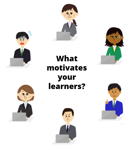
Regardless of how you design your online courses, it is important to understand your online learners, their needs, and what motivates them. In this post we’ll look at a few different types of online learners and some ways to create online training that meets their needs.

Articulate Rapid E-Learning Blog - what motivates your online learners

  • Get to the point: these learners have a pretty good idea of what the course covers. They’re not interested in a bunch anecdotal stories or case studies. They’re happy with a list of information, how it impacts them, and what they need to do.
  • Curious: these learner are motivated by new things; they’re really interested in the material and what’s in the course. They want opportunities to test ideas and see what happens.
  • Mandatory: these learners start out bored and not motivated because the course is mostly irrelevant to the job; however it’s mandatory. They’re going through the motions, looking for the next button, and waiting for the final quiz.
  • Tenured: these learners are experienced and already know the content. They’re interested in what’s new and how it changes what they do. They don’t want to waste time covering what they already know.
  • Skeptical: these learners are challenged by change because what they know is different and where they may be going isn’t always certain. They’ll embrace the learning but need a safe way to learn at their own pace.
  • Multitasker: these learners are a by-product of the Internet’s easy access to information. They like a lot of information, tend to jump around, and don’t have the patience to do more than bite-sized activities.

The key point is that while we build a single course, the reality is that it’s delivered to an audience that’s not homogenous. The online learners come from different backgrounds, levels of motivation, skill, and experience. This makes crafting a great learning experience a bit of a challenge.

How a Single Course Can Accommodate Multiple Online Learners

However, one thing online training does do well is that it offers a lot of flexibility. The key is to take advantage of what it offers to build an online training course that meets the needs of many online learners. Here are a few thoughts:

  • Let online learners test out. If the objective is that the person can demonstrate their understanding of the content, then give them an opportunity to do that at the forefront. Passing demonstrates their understanding so they’re done and can get back to work. If they don’t pass then they’re now aware of their deficiencies and prepared to learn.

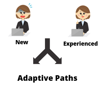
Articulate Rapid E-Learning Blog - knowing your online learners and adaptive paths

  • Create adaptive learning paths to accommodate the different needs of your online learners. This could be giving them the opportunity test out (as mentioned above) or taking them on a custom journey based on their learning needs. Essentially, the person with more experience doesn’t need the same course as a new person.
  • Package the online learning in relevant scenarios and let the learner make a lot of decisions. There’s all sorts of ways to present content and feedback that is engaging and fun. Here’s a post to help you get started.

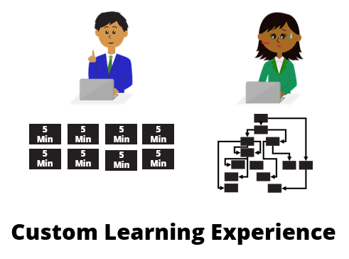
Articulate Rapid E-Learning Blog - knowing your online learners and custom online training experience

  •  Create bite-sized training modules. Instead of big, long courses, break the content into smaller and more palatable coursels. It’s a great way to make the training appear faster and it’s easier to package the smaller modules into custom training solutions to accommodate different audience needs. It also satisfies the needs of those who want quick access to just-in-time content.

There’s a lot you can do to create custom online learning experiences all inside the same course. But you’ll need to step away from the bullet points, free up the navigation, and give the learners more freedom.

The next time you build a course consider the different people taking it and how you can help meet their needs.

Events

Free E-Learning Resources

Want to learn more? Check out these articles and free resources in the community.

Here’s a great job board for e-learning, instructional design, and training jobs

Participate in the weekly e-learning challenges to sharpen your skills

Get your free PowerPoint templates and free graphics & stock images.

Lots of cool e-learning examples to check out and find inspiration.

Getting Started? This e-learning 101 series and the free e-books will help.


Articulate Rapid E-learning Blog - Build Better Online Training

There’s often a big disconnect between the training that is delivered and the training that has impact. It’s because training is commissioned by someone who doesn’t take the training like a manager or subject matter expert. What happens is that while the training has all the right information it doesn’t frame it in a perspective that is true or relevant to the learner; and that’s because the end-user usually doesn’t have a seat at the table when the training is being developed.

Here are a few ways to change that.

Build Better Online Training by Interviewing Your Learners

Someone asks you to build the training but it’s usually not the end-user. The client has all sorts of content and it’s your job to figure out what content is appropriate to meet the learning objectives. However, you also must craft a learning experience that is effective.

One way to do that is by spending some time with your learners. Share the content and objectives and then get their feedback. Ask them what content is most meaningful and useful to them. Ask how they’d structure the training.

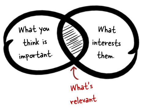
Articulate Rapid E-Learning Blog - Build Better Online Training by making content relevant

From the conversations with them you’ll get a better sense of what they do and how the course content is relevant to their performance needs. They’ll often give you some really good use cases that can be used for simulations and interactive scenarios.

Keep in mind that what the end-user thinks is important isn’t always the priority. Often the organization has regulatory requirements that may not be relevant from a performance perspective but still a requirement for delivered training. They key point is that you’re getting another perspective.

Build Better Online Training Through Observation

Course content doesn’t always address the nuances of real work. That’s why spending time with your learners and seeing how they perform in a real environment is critical for successful training. And you’ll learn things that aren’t addressed by the content.

For example, I once built training for a production facility. The new hires had to learn how to operate some large and complex machines. I spend some time on the floor and learned that many were intimidated by the machines. This made it hard for them to learn.

Articulate Rapid E-Learning Blog - Build Better Online Training by observing your learners

Because of this, the first part of their training was to learn the parts of the machine and focus on a lot of preventive maintenance. We wanted them to get their hands on the machine and feel comfortable with it. It worked because their familiarity with the machines helped them feel comfortable and the result was that they outperformed those who didn’t go through that part of the training.

We would never have even considered this part of the training had we not spent time on the floor observing how they did their jobs. There are additional tips in this post on how to avoid needs analysis paralysis.

Build Better Online Training with Rapid Prototypes

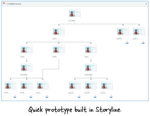
As you interview your learners build a quick prototype of how the course would work. It doesn’t have to be perfect. I used to use PowerPoint and hyperlinks to do this. It’s a quick way to get an idea of how to structure the course content especially for interactive scenarios.

Today it’s even easier than in the past. You can shoot digital photos or videos and insert them in slides. The e-learning software is getting so easy to use that rapid prototyping only take a few minutes. I do this all the time at conferences when I’m at the booth. People come up and ask how to do specific things and in minutes we can build a quick interactive scenario.

Articulate Rapid E-Learning Blog - Build Better Online Training by building prototypes

Don’t worry about everything being perfect. I’m famous for using stick people and blue boxes. The point is that a quick prototype helps you understand the flow and expose potential issues.

Build Better Online Training with Pilot Sessions to Get Feedback

The reality is that sometimes you don’t get access to the learners. This happened to me a few years back when I worked for a bank. I was building training for loan officers and wanted to talk to some to get a sense of how things worked in their work environment. The organization thought it would be a waste of time, so I didn’t get permission to spend time with them.

If that’s your situation then build the course and prior to final approval have some of the end-users take it. If you can, try to observe how they go through the course. Often this will expose some user experience issues like navigation or improper instructions. Try to solicit as much feedback as you can so that you can make adjustments prior to the launch date.

Articulate Rapid E-Learning Blog - Build Better Online Training by piloting your courses

It’s not ideal, but it’s better than launching a course that has issues. Plus, once you have something more complete, your client may not have an issue with you spending time with the end-user. Even if you can’t get a lot of people to pilot the course, try to get at least one person. I outlined some things to do in this post on what do to before your course goes live.

The main point in all of this is that the goal is to create a successful course and one way to do so is to spend some time with your learners to understand their needs and how to design a course that both meets your learning objectives and the needs of the learner.

What tips do you have when it comes interacting with your learners as you build the course?

Events

Free E-Learning Resources

Want to learn more? Check out these articles and free resources in the community.

Here’s a great job board for e-learning, instructional design, and training jobs

Participate in the weekly e-learning challenges to sharpen your skills

Get your free PowerPoint templates and free graphics & stock images.

Lots of cool e-learning examples to check out and find inspiration.

Getting Started? This e-learning 101 series and the free e-books will help.