Three Ways to Use Theme Colors in E-Learning Courses
September 15th, 2020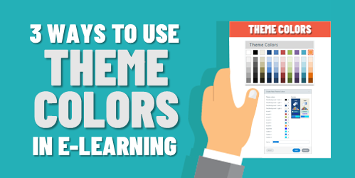
One way to speed up production in your e-learning course design is to use themed slides. You can create robust and visually varied templates like the ones you get in Content Library. The templates are a combination of layouts and two themed elements: fonts and colors. However, you don’t need to have a complex template to leverage theme colors.
Theme colors allow you to pre-determine the colors you’ll use in your course’s slides. There are several benefits and reasons when using theme colors.
Make Easy Updates to Theme Colors for E-Learning
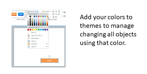
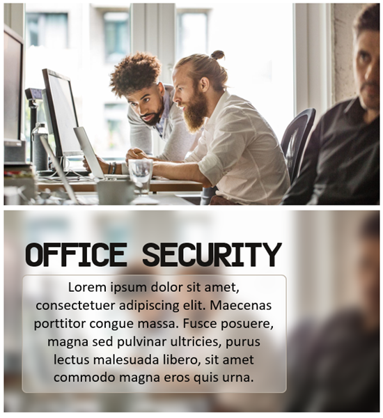
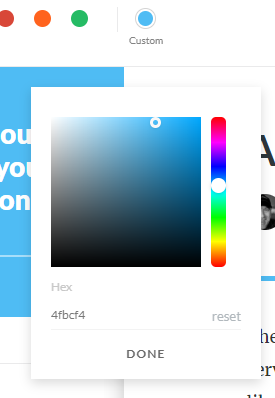
Here’s a common scenario: insert an image and then do a color pick of the image to pull a color to use for outlines or shapes in the course. Later someone suggest changing the color. The challenge is going through every slide and making changes where that color was used.
Use theme colors to quickly modify all the objects with that same theme color. This doesn’t require a lot of consistency in terms of how you use the colors. It just means that if you do a color pick, for example, you add that to one of the accent colors so you can apply that accent color through the course.
If you have red shapes and they need to be blue, if you used a theme color to fill the shape all you need to do is change the theme color.
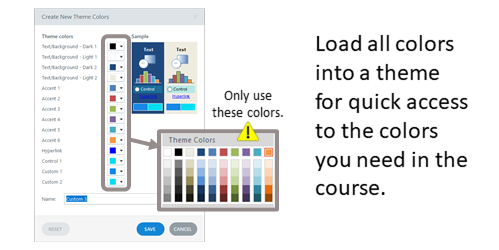
Create a Loaded Palette of Theme Colors for E-Learning
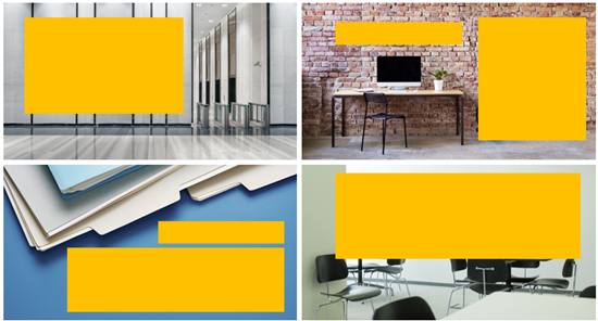
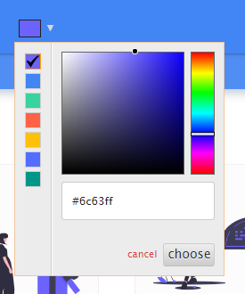
You get six accent colors, and each has five derivatives. You don’t need to have a real strategy when using theme colors. You get six slots. Figure out what six colors you need in your course and then create a palette, so you always have those six available to you.
You can use the colors willy nilly with no consideration to any real structure. The key advantage is having a palette of desired colors on hand.
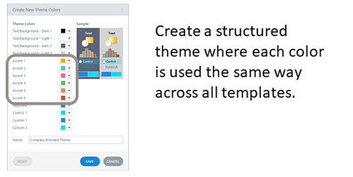
Develop a Strategy for Theme Colors for E-Learning
Assuming you build a lot of templates and you re-use them, then it makes sense to be strategic about how you use the theme colors. You get six slots. Use them the same way every time you create a theme color. That makes it easy to create a new theme and re-use templates because you know that the theme colors are applied the same way to the same objects.
Determine how you want to use the color slots and then use them that way consistently. This allows you to quickly apply new color themes knowing that the entire template will change, and the colors will make universal changes to the entire course.
Some people are very strategic an organized in how they use theme colors. And some just use them with no sense of structure. They just want a place to load some colors and have quick access. That’s fine, too.
What you want to avoid is using single colors outside the theme that can’t easily or quickly be updated later. Theme colors help prevent that and save time when building courses whether your strategic or just using a palette.
Events
- Everyday. Check out the weekly training webinars to learn more about Rise, Storyline, and instructional design.
Free E-Learning Resources
 |
 |
 |
|
Want to learn more? Check out these articles and free resources in the community. |
Here’s a great job board for e-learning, instructional design, and training jobs |
Participate in the weekly e-learning challenges to sharpen your skills |
 |
 |
 |
|
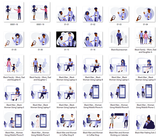
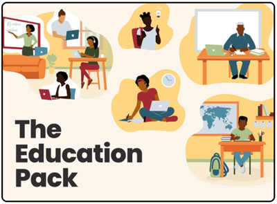
Get your free PowerPoint templates and free graphics & stock images. |
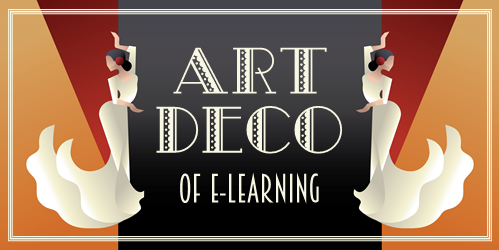
Lots of cool e-learning examples to check out and find inspiration. |
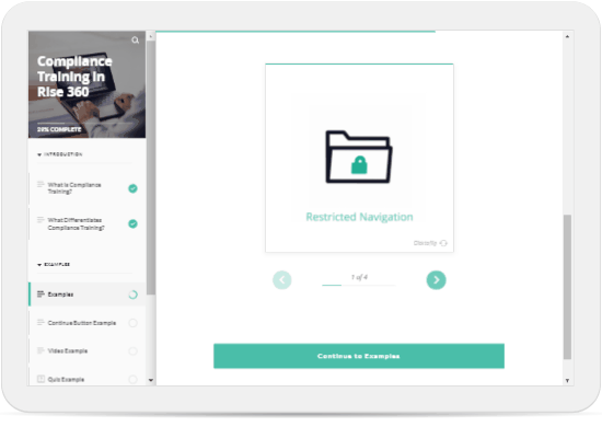
Getting Started? This e-learning 101 series and the free e-books will help. |


1
comment