The Rapid Elearning Blog

Archive for the ‘Rise’ Category


how to create animated gif

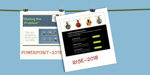
Some people asked how I created the animated .gifs similar to the ones I gave away for free in this recent blog post. So today I’ll share a simple way to create them.

Start with Animated .Gif Software

There are a number of tools to create animated .gifs. I’m going to focus on just one for this post.

ScreenToGif is free and you don’t need to install it. Just run the .EXE file. It’s a great product and I use it all the time for quick demos or some of the animations I use in the blog.

I’m not going to do an exhaustive overview, so I recommend downloading the app and playing with it a bit. It’s intuitive and easy to figure out. As a side note, if you do use it, I encourage supporting the developer.

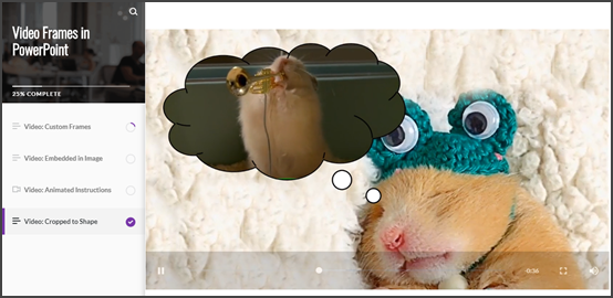
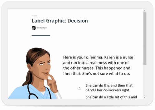
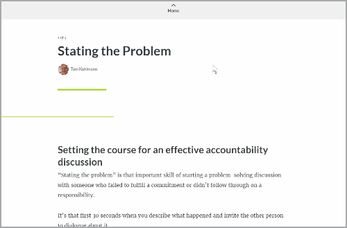
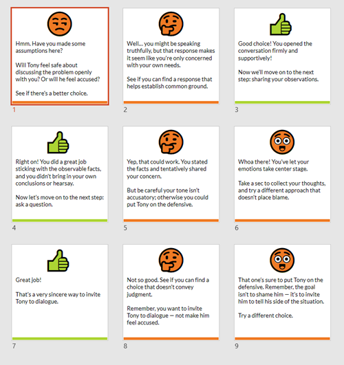
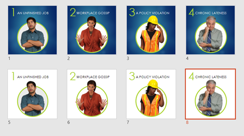
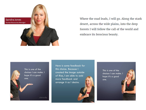
Understanding the Cover Image .Gifs

Cover images are mostly decorative. And because of the responsive nature of the Rise courses, the cover image gets cropped based on the screen’s aspect ratio. That means what you see in portrait won’t look the same in landscape.

animated .gif responsive design

The key is keep the cover images simple. Animated .gifs can become very large files. The more visual information on the screen, the larger the file size. And if the file is too large, it’ll take too long to download and ruin the effect and experience.

Stick with fewer colors. Solid backgrounds are good because you don’t get that blocky color striping that you get with pictures.

We’ll look at two ways to create the cover image animated .gifs. One way is by recording something onscreen and the other is to import a video.

Record Screen to Create Animated .Gif

The easiest thing it to play a video and record the screen. Then do some basic editing. Since the animated .gif is decorative, you just need something simple. The key is not to have a massive file. The more you record, the larger the file.

View the animated .gif tutorial on Youtube

Once you have a recording, figure out what you want and where to cut it. Again, I look for something simple that looks good looping. Subtle movements or repeating animations (like a spinning gear) work perfectly.

It does take some messing around. I usually do a basic edit and then save the file to see how large it is. Then I play around with more edits and image size to find the right balance between quality and file size.

You’ll have a lot more luck recording vector images that are solid versus photos. The less the screen has to change from one frame to the next, the better quality you’ll get and smaller file size.

For the .gifs where the quality doesn’t look as good, I set the cover images’s overlay color darker. This way the text really pops off the screen and the animation quality isn’t as much of an issue. That’s what I did in this example where there were so many colors it just didn’t look as good as I wanted.

Import a Video to Create Animated .Gif

ScreenToGif makes it really easy to import a video. It breaks down all the frames and from there it’s just a matter of editing it to what you want.

Just like above, play around with different settings to see what gives you the right balance between file size and quality. And keep in mind, they’re header images so subtle movement is fine. For this overhead desk video, I just focused on the pencil moving and cut out hundreds of frames.

View the animated .gif tutorial on Youtube

Bonus tips:

  • You won’t get crisp images because the file size needs to be manageable. I try not to go over 1.5 MB. That’s why you have to play around with settings that strike the right balance.
  • You need to test different dimensions, but I generally keep the images somewhere between a 16:9 and 2:1 aspect ratio. There’s no golden rule. It’s mostly based on what you are showing. The image is going to crop based on the screen, anyway. I make different versions and modify the image size to see what I get for file size and quality.

animated gifs from vector videos

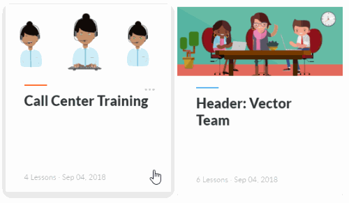
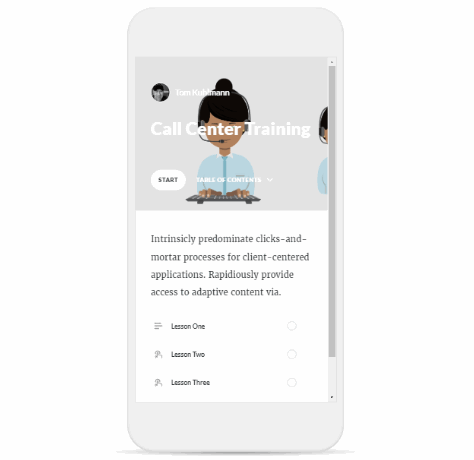
  • Solid and/or fewer colors is best. There are a lot of free or inexpensive ways to create simple vector-based animation videos. That’s what I did to create these two headers above which you can see in these two examples: Call Center and Team Meeting. I inserted some animated characters and published a video. Then I made the .gif from the video. Because I’m not building a big animated explainer video, this only took a few minutes to do and looks decent.

Animated .gifs add some flavor and visual novelty to your courses. And as you can see, they’re easy to create.

Events

Free E-Learning Resources

Want to learn more? Check out these articles and free resources in the community.

Here’s a great job board for e-learning, instructional design, and training jobs

Participate in the weekly e-learning challenges to sharpen your skills

Get your free PowerPoint templates and free graphics & stock images.

Lots of cool e-learning examples to check out and find inspiration.

Getting Started? This e-learning 101 series and the free e-books will help.


create videos in PowerPoint

One of my favorite features in PowerPoint is saving the PowerPoint slideshow as a video. That means anything you put on the PowerPoint slides (from animations to slide transitions) is output as video. With some creativity, you can pull together some pretty slick explainer-type presentations with a tool most of us already have.

Today, I want to show something simple that may give you some ideas for your own training videos.

Create Videos in PowerPoint: Examples

Before we get started, here’s a cool example from Duarte that Microsoft included in the PowerPoint 2010 template pack. The Duarte team created a great presentation that showed off what could be done with the new features back in PowerPoint 2010. And as you can see below, their presentation translates to video, as well.

Create Videos in PowerPoint: Slide or Slideshow?

While the example above was an entire slideshow that included some cool animations and effective transitions, you don’t need to create whole presentations. You can publish single slides, too.

And the slide doesn’t need to be normal slide content. It could be a single video. And that video can be formatted using the PowerPoint features.

That means you can insert video into a PowerPoint slide, make some simple edits, and then output that slide as a video. Pretty slick when you think about the possibilities.

And that’s the trick I want to share.

Customize Framed Videos in PowerPoint

Why do videos need to be rectangular? Why can’t they have frames or display as shapes? That’s all possible in PowerPoint.

Here are the basic steps to create framed videos in PowerPoint.

  • Insert a video on the slide.
  • Add whatever effect you want for the video.
  • Size the video to fit the slide.
  • Save the video as MP4.

Here’s a demo of some of the videos in a Rise.

Click here to view Rise demo.

As you can see, there are some neat things you can do, especially considering that you are doing all of this in PowerPoint and not required to use a more sophisticated video application.

Now it’s your turn.

Events

Free E-Learning Resources

Want to learn more? Check out these articles and free resources in the community.

Here’s a great job board for e-learning, instructional design, and training jobs

Participate in the weekly e-learning challenges to sharpen your skills

Get your free PowerPoint templates and free graphics & stock images.

Lots of cool e-learning examples to check out and find inspiration.

Getting Started? This e-learning 101 series and the free e-books will help.


free animated gifs

I did a workshop on simple ways to create animated .gifs for e-learning courses. In part of the workshop we play around with using them as header graphics for Rise courses.

Header graphics are mostly decorative so the trick is to get decent enough quality while keeping the file size down (which is a major challenge with animated .gifs). I created a number of .gifs from some generic videos and figured I’d share them here for those who may be interested in using them.

Examples of Headers Using Animated Gifs

Here are some nice example courses that use .gifs. I think the animations really work well because they add some visual novelty and interest.

animated .gif headers from Rise

Click through the course examples because there are some other really cool uses of animated .gifs throughout.

Examples of Free Animated Gif Headers

free downloads animated .gif headers for Rise

Here are a few demos to see what they look like as headers in Rise courses. Personally, I am more partial to the vector examples. Which do you prefer?

There are more in the folder. You can download the animated .gifs here.

Keep in mind that these were used for training activities, but I did keep the headers somewhat generic so that they may be used in other projects. Hopefully you can use them and get some ideas on how you could create your own.

Events

Free E-Learning Resources

Want to learn more? Check out these articles and free resources in the community.

Here’s a great job board for e-learning, instructional design, and training jobs

Participate in the weekly e-learning challenges to sharpen your skills

Get your free PowerPoint templates and free graphics & stock images.

Lots of cool e-learning examples to check out and find inspiration.

Getting Started? This e-learning 101 series and the free e-books will help.


interactive e-learning

I get a lot of questions about interactive e-learning. Often people are looking for specific “interactive” features in the software. However, the key isn’t specific features as much as it applying a few simple strategies and understanding what can be done with the e-learning software.

Part 1: Interactive E-Learning Strategies

Here’s a simple strategy I use when building interactive e-learning courses: focus on a few basic building blocks (which I’ve written about before).

  • Relevance: the first step is to make sure the content is relevant to the learner. Courses have content but often it’s not framed in a relevant context. That means it’s difficult to engage and motivate the learner.
  • Pull: most courses tend to push content out. It’s how we usually teach. We push content in learning docs, cheat sheets, videos, lectures, etc. One goal should be to get the learner to pull content in. Give them a reason to explore and consume content.

3C interactive e-learning model

I also try not to formally grade the interactions (especially decision-making activities) while they’re in the learning process. I want them to freely make decisions; and if they get things wrong, that’s just part of the learning experience. It’s also an opportunity to continue teaching. Formal grading tends to shut that down.

Part 2: Interactive E-Learning Features

I like to think of the e-learning software as a tool that creates multimedia. Most of the time that is used for training, but not all online multimedia needs to be training.

Most e-learning software has out-of-the box interactions like tabs, process, and labeled graphics. However, I try to step away from the intended interactivity and look for different use cases. I look for features that lets the person interact with the screen and then try to find ways for the person to interact with the content using the onscreen interactions.

Flash Card 3C Model

For example, in the simple scenario below, I created a 3C structure and used the Flash Card interaction as a means to review choices and get feedback. The Flash Cards aren’t technically designed for scenarios, but because one can click and reveal, they’re perfect to ask and answer questions in a scenario. And because the learner can click the other options, it lets them explore.

interactive e-learning flash card

Process Interaction Many Ways

Below is another example to show how to stretch the features to create all sorts of interactive content. I took the same general content which fits perfectly as a process interaction and applied it to different types of blocks to see how they’d work. Essentially they’re all a process interaction, it’s just that I used different features to package the content.

Click here to view the demo.

interactive e-learning 1

Obviously, some make more sense than others. But the point of the exercise is to review the features available and think of different ways to use the interactive parts. Today, it’s a simple process interaction, but next time it could be a decision-making scenario.

E-learning interaction alternative

3C Model: Labeled Graphic

Here’s an example, where I leveraged the Content Library characters with Studio 360 and PowerPoint to create a decision-making image with the labeled graphics.

interactive e-learning labeled graphic

3C Model: Combined Blocks & Accordion Interaction

And another example of a 3C model where I combined a few blocks to create the structure (which I can save as a reusable template) and leveraged the accordion interaction as the way to ask and answer questions in the scenario.

interactive e-learning scenario

As you can see, it’s easy to combine the basic building blocks with interactive features to create an assortment of interactive options that go beyond what the software gives you out-of-the-box. The secret is to start with a simple model and then leverage the interactive features (whether designed for decision-making or not).

Events

Free E-Learning Resources

Want to learn more? Check out these articles and free resources in the community.

Here’s a great job board for e-learning, instructional design, and training jobs

Participate in the weekly e-learning challenges to sharpen your skills

Get your free PowerPoint templates and free graphics & stock images.

Lots of cool e-learning examples to check out and find inspiration.

Getting Started? This e-learning 101 series and the free e-books will help.


no LMS

Generally, delivering e-learning courses is a two-step process: 1) create the course in your favorite e-learning software and 2) host the course in a learning management system.

There are many small organizations that don’t use formal learning management systems; however they want simple tracking of the courses. I had someone ask how they could track people in their organization who have taken a compliance course. He didn’t have a lot of learners and wanted something simple.

Here are two quick solutions that work well. They don’t require a lot of work to set up and they’re mostly free.

This solution assumes that the user gets a URL that links to the course. We have no identifying information so we need a simple way to collect who they are and track their completion.

Create a Form

Create a form using a hosted service. In these examples I am using Google Forms and Jot Form. However, you can use a different service if you want (or create your own form on a server). It doesn’t matter. The main thing is you have a way for the person to share info and send it your way.

form no LMS

Embed the Form

Once you have the form, you’ll embed it into the course. In these examples we’re using Rise’s embed block. If you use Storyline, the web object works perfectly for this.

Embed form no LMS

Create a Gate to the Form

The goal is to only expose the form when the course is complete. There are many ways to do this. For these demos, I’ll show two ways. In the first, I use a continue block that is locked until the learner affirms completion of the course and agreement with the content. In the second example, I use a quiz to serve as the gate.

no LMS two options

Examples of Embedded Forms

These are simple examples to show how the form looks embedded in the course and how you could create a gate to get to the form.

  • Jot Form Example: the course has free navigation and user affirms completion to unlock the the gate
  • Google Form Example: the course is locked and passing the final quiz unlocks the certificate of completion

Jot Form offers a bit more control and looks more integrated with the course. I colorized the block to match the form’s color.

JotForm example no LMS

On the other hand, Google Forms has that enormous header space and scrollbar. I removed the header image and filled it with white to avoid the Frankenform look but it still looks like something pasted into the course. It would be nice to have more control over the look, but it still works fine for what we need and it’s free. Also, the integration with Google Sheets saves a few steps later.

Google fomr example no LMS

Upload the Course

Since we’re not using an LMS, we need a place to upload the course. I use Amazon S3 which I showed how to set up in a previous post; but it could also be Google Storage. But it can be any web server.

no LMS Amazon S3 free

Track Course Completion

The form collects the data and sends it to the service. Jot Form displays a table with the option to download. Google Form sends the data to a Google Sheet.

Google Sheet no LMS

Of course, there are many other ways to do something similar to avoid using an LMS, especially if you have programming skills.

At a previous place, we used the course URL to drop a cookie on the person’s computer. At the end of the course, we inserted an .ASP file via a web object. The .ASP file collected the info from the cookie and sent it to the database. Thus we knew who took the course, when they completed it, and their minimum passing score.

Do you have any other ways you use to track the course without using an LMS or paid service? Please share in the comments.

Events

Free E-Learning Resources

Want to learn more? Check out these articles and free resources in the community.

Here’s a great job board for e-learning, instructional design, and training jobs

Participate in the weekly e-learning challenges to sharpen your skills

Get your free PowerPoint templates and free graphics & stock images.

Lots of cool e-learning examples to check out and find inspiration.

Getting Started? This e-learning 101 series and the free e-books will help.


e-learning templates made simple

E-learning templates are a great way to save time. This is especially true for those of us who work with repetitive content and courses. And it’s even more true for those of us who aren’t graphic designers since the e-learning templates provide nice looking visual design.

However, working with templates can be a challenge. Sometimes they present too many choices (which can debilitate). Another challenge is that to modify templates often requires a more involved understanding of the authoring tools. This isn’t easy for the person just getting started.

Here are a few ideas to help simplify working with templates.

E-Learning Templates Are the Second Step

Figure out what you need before you build first. A big time waster is not knowing what you want in the course but building it, anyway. Then realizing it’s not what you want, you tear down and rebuild. Or worse, you move forward with a bad idea and let it dictate the rest of what you’re doing because of the time already invested.

I like the weekly e-learning challenges to play around with ideas and to see what others do. The challenges help develop fluency with the software and build awareness around ideas that can be implemented before you work on a project.

ACTION ITEM

Let the Content Determine the Right Template

Templates are great, but don’t let the template dictate your content. This is one of the biggest issues with templates. We like a template because it has sixty cool layouts and then we force our content to the template. Or we think we have to use all sixty layouts so we have similar types of content but it all looks different throughout the course because we mix and match the layouts.

ACTION ITEM

  • Review your templates and the various layout options. Then determine when you use them and why. Even if you have a lot of great layouts, it’s a good idea to reduce the layouts you actually use. This provides visual consistency; and repetition is key to good visual communication.

Keep E-Learning Templates Simple

Templates don’t always need to be big all inclusive files with dozens of layouts. It helps to have single purpose templates like just one tabs interaction. The more single purpose the template is, the better you can use it. It’s also easier to customize one slide to match your course than it is to customize an entire template.

e-learning templates

One of the most under used features in Storyline is saving the files as templates. This makes the slides available for the next course. You can insert a single slide(s) or the entire file. The new teams feature in Storyline 360 makes it even better because the slides can be shared with the team and easily inserted in other courses.

In Rise, you can build lessons and save them as templates. Once inserted, they can be modified to meet the course objectives. And they don’t need to be big lessons, you may just want to customize some blocks for easy re-use.  This is especially helpful if you want to use a multiple colors or change the text sizes.

rise e-learning templates

ACTION ITEM

  • Create single slide templates in Storyline and save them as templates. If you’re on a team account, share them with your team.
  • Learn to create and save templates in Rise. I like to create branded blocks where I add different colors and text sizes.

Learn to Edit the E-Learning Templates

Inevitably you’ll need to modify the template. There are some things you should learn about the software so that when you need to change the template it doesn’t take forever (otherwise you lose the time-saving benefit of the template).

ACTION ITEM

Templates are a real time-saver. But to really save time with them, plan ahead so you’re content is prepped; and then learn to use the authoring software used to build e-elearning courses.

Events

Free E-Learning Resources

Want to learn more? Check out these articles and free resources in the community.

Here’s a great job board for e-learning, instructional design, and training jobs

Participate in the weekly e-learning challenges to sharpen your skills

Get your free PowerPoint templates and free graphics & stock images.

Lots of cool e-learning examples to check out and find inspiration.

Getting Started? This e-learning 101 series and the free e-books will help.


Years ago I developed a hierarchy for course design. I used it to help manage my team and allocate our limited resources.

Rapid E-Learning Ruled

Back then, most e-learning was custom-built in Flash. Those courses took more time, required special skills, and cost a lot more to produce. However, with Articulate Presenter and PowerPoint we could build about 80% of what we needed. It was fast and easy. So our default was Articulate Presenter unless we could justify why it didn’t meet our needs.


PowerPoint Meets Flash

PowerPoint had its limits. But when we needed custom interactivity, we‘d build just those pieces in Flash and insert them into our PowerPoint-based courses. That meant we got fast development and custom interactivity: a win-win.

Save Resources for Expensive Development

There were courses where PowerPoint or a hybrid approach just didn’t work. As a final option we custom built our courses in Flash. Because this was the most expensive and time-consuming option, we tried to limit this and do most of our custom development using the hybrid approach.

It made no sense, to custom build Flash when we could do the same thing faster and less expensive with PowerPoint. So we always started with rapid e-learning and only moved to more expensive development when we could justify doing so.

Today, we have a similar challenge. Let‘s revisit the hierarchy of course design for a new generation of rapid e-learning designers.

The Updated E-Learning Course Design Hierarchy

Both Rise and Storyline are part of Articulate 360. Often, I‘ll get questions about when to use Rise and when to use Storyline. To answer the question, I lean on the same strategic approach I used years ago.

Operate at the Speed of Business

A large part of e-learning content exists because of regulatory and compliance requirements. Those courses are more explainer content and less interactive. Thus, it makes sense to use the easiest tool and quickest production process possible.

And this tool is Rise. It‘s super easy to use and getting courses (especially simple ones) out the door is a breeze. On top of that, whatever you build can be saved as a template, saving even more time. And as far as interactive content, there are a number of interactive choices that come with Rise (and those get updated frequently). Rise is also fully responsive which is perfect for today’s mobile workforce.


Hybrid Development is a Win-Win

The reality is that not all content is explainer content and often there needs to be more custom interactivity than what you get out of the box in Rise. That’s OK.

When Rise doesn’t provide the content type you need, use Storyline. Build single slide interactions and then insert them into your Rise courses with the Storyline block.

With this approach, you get easy authoring for the majority of the content in Rise and custom interactivity when you need it in Storyline. It‘s a good balance between speed of production and providing the appropriate level of interactivity. That’s a win-win.

Manage Resources for Custom Interactivity

There are times when working directly in Storyline makes more sense than working in Rise. For example, if you need to build complex interactions, adaptive learning paths, variable-based navigation, or complex interactive scenarios then it makes sense to build them in Storyline. Although, Rise also offers an interactive scenario block, so that is still a better starting option. Storyline gives you a lot more flexibility because you start with a blank screen and build from there.

This doesn’t mean working with Storyline is complicated. It‘s still easy to learn. It means that for simple content, Rise is usually a better solution.

Want a tabs interaction? In Rise you select the tabs interaction block and add your content. You‘re done. Building the same thing in Storyline requires time to think about what it will look like and how it will function. Then the construction begins by adding the objects, layers, and triggers. It‘s easy enough to do, but just a bit more time-consuming to do it. And time is money.

So when people ask which tool to use, I suggest using the hierarchy. All things should start with Rise. If you can’t build it with Rise, explain why. If you need custom interactions, build the core content in Rise (you have a lot of options with the various blocks) and add Storyline interactions when necessary. And if your course requirements are more complex and they can’t be met with Rise, then by all means, use Storyline.

The main thing is you‘re managing your limited resources.  If you spend a week on something in Storyline when you could have built it in one day with Rise, you‘re not being a good steward of your resources. And when you need more time for custom work, you won’t have it because you spent it on simple content.

That’s where the content creation hierarchy comes in handy. It‘s all about managing resources and delivering a viable product on time and within budget.

Events

Free E-Learning Resources

Want to learn more? Check out these articles and free resources in the community.

Here’s a great job board for e-learning, instructional design, and training jobs

Participate in the weekly e-learning challenges to sharpen your skills

Get your free PowerPoint templates and free graphics & stock images.

Lots of cool e-learning examples to check out and find inspiration.

Getting Started? This e-learning 101 series and the free e-books will help.


how to preview responsive courses and mobile learning in your browser

Here’s a simple way to test your published courses when building responsive mobile learning. While each browser is a bit different, most have some sort of emulation features.

Preview Your Published Responsive Courses

During your course production you can preview the course using one of the responsive preview options. This gives you a very good approximation of how the course will respond to different devices whether they’re in portrait or landscape orientation.

After you publish the course and upload it to your LMS (or web server) you can also preview it via the browser. Open the course and right click to access the developer tools (see tutorials below). From there you can access the device emulator to test how the course will respond to different devices or screen resolutions.

For example, here’s a responsive e-learning course I published in Rise. I want to see how it responds to other devices after it’s published. Some people scale their browsers to do this, but it makes more sense to use the browser’s feature instead.

Responsive Courses mobile learning demo via Chrome browser

Get the Aspect Ratio of Popular Devices for Responsive Courses

One side benefit is that in Chrome and Firefox they expose the resolutions for different mobile devices. Even if you don’t use the responsive emulators, it’s still an easy way to get the aspect ratios and resolutions of the popular mobile devices. I use these to to set the story size dimensions for my mobile Storyline courses when I build for specific devices.

Responsive Courses mobile learning device aspect ratio

Unfortunately, Microsoft’s Edge is a bit myopic and behind the times as they assume that people only use their devices. Of course, it doesn’t really matter because you can choose the orientation and customize the resolution.

 Responsive Courses mobile learning aspect ratio emulator Edge browser

How to View Responsive Courses Tutorials

Here are some quick tutorials where I go through this feature in the following browsers:

Each browser is a little different, but it is a handy feature to access when building responsive mobile learning. One thing to keep in mind is that what you get via the browser is an emulation and may not be an exact representation of how your course will really behave, but for the most part it should be fine.

Events

Free E-Learning Resources

Want to learn more? Check out these articles and free resources in the community.

Here’s a great job board for e-learning, instructional design, and training jobs

Participate in the weekly e-learning challenges to sharpen your skills

Get your free PowerPoint templates and free graphics & stock images.

Lots of cool e-learning examples to check out and find inspiration.

Getting Started? This e-learning 101 series and the free e-books will help.


PowerPoint graphics

In a previous post, I shared how I built an interactive scenario in Rise. I’ve gotten lots of emails asking how I built the graphics like the headers and the flashcard interactions for the interactive scenario. So in today’s post, I’m going to show you a simple way to build graphics for your Rise e-learning courses.

PowerPoint graphics headers for Rise blocks

PowerPoint graphics flashcard interaction

Understanding the Image Blocks in Rise

Rise offers a number of blocks that support inserted images (such as image, gallery, and some of the interactions). Most them work perfectly in one of two aspect ratios:

  • 1:1 (square)
  • 16:9 (rectangle)

There are a few blocks that have text overlay where the image is scaled. Those are mostly decorative images so we won’t worry about them.

Understanding PowerPoint Slides

PowerPoint is easy-to-use screen and with some practice, you can build almost any type of visual. Because of this, I build my simple graphics in PowerPoint and save the slides as images.

In PowerPoint, we need to do two things: set slide size and then whatever we build we export as an image.

  • Go to Design>Slide Size and modify the slide size.
  • To save the slide as an image, go to Save As and choose an image format. You can save a single slide or all slides. I usually save in PNG format.

Create PowerPoint Graphics to Use in Rise

Since there are two aspect ratios, I create two PowerPoint files for my Rise graphics. One is 1:1 and the other is 16:9. You can see the PowerPoint files I created for the scenario demo.

PowerPoint graphics example of file

PowerPoint is a freeform slide. I can build virtually anything I need quickly. In the interactive scenario, I created 1:1 images for the flashcards. One side of the flashcard has the question text and the other has the feedback.

I used the various image editing features in PowerPoint to colorize the graphics. I also used the emjoi features to create some simple feedback graphics. While it’s easy enough to build these graphics with other tools I just find PowerPoint to be easy and fast. However you’re not confined to PowerPoint, you can use the tool of your choice.

PowerPoint graphics flashcard questions

PowerPoint graphics flashcard answers

The images above are relatively simple. The images below required a bit more work. I had to build it so the character extends out of the frame. You can see that I created a couple of versions. I opted for the lighter version because it made the Rise screen seem more open with more white space.

PowerPoint graphics header image

When you’re all done building your slides, save the slides as images rather than a .pptx file. Then you’ll have a folder of images that work with your Rise courses.

Bonus PowerPoint Graphics Tip

With Articulate 360, you get Studio 360 that includes Presenter and works with PowerPoint. That means you have access to all of the Content Library characters and templates. So if you want the same Content Library characters in Rise, use PowerPoint slides to build the graphics like I did above.

Here’s another example I mocked up for the blog post using the same techniques.

PowerPoint graphics interactive scenario 2

So there you have it. In the first, post we looked at how to build the interactive scenario in Rise. And in this one, we reviewed how to use PowerPoint to quickly build the graphics you need.

Events

Free E-Learning Resources

Want to learn more? Check out these articles and free resources in the community.

Here’s a great job board for e-learning, instructional design, and training jobs

Participate in the weekly e-learning challenges to sharpen your skills

Get your free PowerPoint templates and free graphics & stock images.

Lots of cool e-learning examples to check out and find inspiration.

Getting Started? This e-learning 101 series and the free e-books will help.


interactive scenarios

What happens when you convert an old PowerPoint course into a Rise course?

The other day I found an older interactive scenario that was built in PowerPoint. I wanted to see what it would take to rebuild something similar in Rise. This isn’t an uncommon situation for those who are trying to convert and update older courses with new technology.

Today, I’ll show what I did to convert the course and a few production tips that helped me.

The Original Interactive Scenario

Back in the day, this was a pretty cool example of what you could do with PowerPoint to create interactive scenarios. By design, PowerPoint is a linear presentation tool. However, with some creativity, one can create interactive content. And that’s exactly what Jeanette did.

interactive scenario demo 1

Click here to view the interactive scenario.

With that said, PowerPoint’s not the best authoring tool if you want to create interactive content. Once you add the interactive capabilities the slide count goes up quite a bit and it becomes a mess to manage. I highlighted this in the post on why PowerPoint isn’t the right tool for interactive e-learning.

The New & Improved Interactive Scenario

We looked at different types of authoring tools in this post. PowerPoint and Rise offer two different types of authoring. PowerPoint is freeform with a blank screen that allows placement of objects. Whereas, Rise is form-based where you assemble content blocks and build the course that way. Freeform gives you more freedom in where you place content, but a tool like Rise offers a better mobile experience because it’s fully responsive. And as you see, it’s a lot easier to work with, as well.

interactive scenario demo 2

Click here to view the interactive scenario.

Production Tips to Build the Interactive Scenario

I had three goals with this conversion:

  • How long would it take to move content from PowerPoint to Rise?
  • What are some production considerations?
  • How to work around constraints?

Design the Interaction

The first thing is to determine how you want to design the interaction. When it comes to interactive scenarios, I always follow my 3C model of challenge, choice, and consequence. If I can click on something, then I can make it part of a 3C interaction.

In this case, I used the Flashcards block as a way to show choices and consequences. The user is presented with a challenge and clicks on a card to get feedback. Since I’m not grading it, I can keep the other options available so that the learner can see what is shared if they had clicked something else. This gives them more control over the learning experience.

  • Mission: identify the different interactive blocks that allow for 3C type interactivity. For starters, there are tabs and accordions. But those are obvious choices. Look for other interactive elements.

Build a Branched Scenario

Branched scenarios are possible in Rise with some considerations. Here are a few production tips:

  • Build your branched interaction with the Button Stack block. The button stack lets you jumps from lesson to lesson.
  • Don’t let them see what’s under the hood. Turn off the Sidebar view so that users don’t see the menu and how the course jumps around between lessons.

interactive scenario tip 1

  • Create a faux navigational cul-de-sac. Since Rise is designed to follow a lesson-to-lesson flow I want to prevent the learner from advancing past the end of a scenario or the button stack. To do so, I added a lot of padding on the bottom and an extra Spacer block as a buffer.

interactive scenario tip 2

  • Create duplicate menus to deal with revisits. The introductory lesson has some initial content and below it are the choices to view the scenarios. When they complete a scenario and come back to the other choices, I didn’t want all of that introductory content visible. I just want them to go to a list of other buttons. So I made a duplicate menu lesson with just the button menu. That’s where they end up after they complete a lesson. They never go back to the original introductory lesson.

interactive scenario tip 3

  • Control how much they see. This makes the content smaller to consume. You don’t need to show everything at once. Keep people from scrolling by adding an interactive Continue button. This holds all the content below it until the learner clicks on the button. In a sense, they are affirming that they are ready and when they click, they get more info.

interactive scenario tip 4

  • Play around with the imagery. Rise courses don’t need to look the same. You can insert images in all sorts of ways. An image doesn’t need to be a picture. It could be a white box that fills in an area to create more white space. Be creative in how you use the blocks. Also, don’t stick with the defaults. Play around with filling the blocks with color. The key is to learn to see them in a different way.

interactive scenario tip 5

How long did it take?

Once I planned how to build the interaction, it only took about 15 minutes to copy and paste the content from PowerPoint to Rise.  I used different images, so I had to create those. And I had to play around with ideas to see what worked best. All-in-all it took about 2 hours to build the module as it is.

The nice thing is that once I build an interactive lesson, I can save it as a template an re-use it again. And to add additional modules is just a matter of duplicating a single lesson. To do so in PowerPoint would require another 20+ slides per module.

As you can see, working with Rise is so much easier than working with PowerPoint.

Events

Free E-Learning Resources

Want to learn more? Check out these articles and free resources in the community.

Here’s a great job board for e-learning, instructional design, and training jobs

Participate in the weekly e-learning challenges to sharpen your skills

Get your free PowerPoint templates and free graphics & stock images.

Lots of cool e-learning examples to check out and find inspiration.

Getting Started? This e-learning 101 series and the free e-books will help.


next generation rapid e-learning

Ten years ago, the e-learning industry was still mostly Flash-based. That meant organizations either had to buy e-learning courses, have them custom-built, or hire a Flash programmer to build them. The cost for doing so meant most organizations didn’t have access to the world of online training.

That all changed when the PowerPoint-to-Flash tools like Articulate Studio, emerged. It democratized the world of online training because it put e-learning into the hands of anyone who wanted to build a course. If you came from that world where building Flash courses took more time and cost more, everything was rapid. Thus, the term, rapid e-learning.

The Evolution of Rapid E-learning

Flash required special skills which made authoring in PowerPoint so attractive. With some creativity, one could build engaging and interactive e-learning courses in PowerPoint. However, the reality is that PowerPoint has a ceiling and doesn’t offer all of the interactive capabilities required for many e-learning courses. I outlined that in this post on why PowerPoint isn’t the right choice for interactive e-learning.

PowerPoint isn't the best for interactive rapid e-learning

  • Interactivity is mostly limited to click-and-reveal.
  • It requires a lot of redundant production which gets exponentially more complex.
  • You can’t use variables to create adaptive training or branched interactions.

When Storyline came out in 2012 it really changed the rapid e-learning industry. For the first time, one could build highly interactive content with PowerPoint comfort and without a background in programming. That was an exciting time for first-generation rapid e-learning developers.

Second Generation Rapid E-Learning

I’m often asked where is the rapid part of rapid e-learning? For those who are entering the industry today, it’s a bit different.

Storyline is still a killer application. However, there is an opportunity for those who want a new type of authoring, or what could be called rapid(er) e-learning. Welcome to the world of Rise.

In a sense, Rise is to Storyline what PowerPoint was to Flash. It offers even easier authoring that allows for quick development and delivery. It’s fully responsive and works great on mobile devices.

Comparing Rise to Storyline

Rise courses are constructed using pre-determined blocks. Choose a block, add content, and publish. Whereas, Storyline is a freeform slide that requires a bit more work.

new rapid e-learning example insert tabs interaction Rise

A great way to see the difference is by looking at how to insert a tabs interaction (one of the most common interaction types). In Rise, select a tabs interaction block and insert the content. That’s it.

In Storyline, it’s relatively easy to build a tabs interaction, but it requires more steps. Decide how it will look and work. And then from there build custom tabs, add layers, and then connect triggers.

As you can see, Rise is a whole lot faster and easier. It’s the new and improved rapid e-learning.

Combining Rise and Storyline for Powerful Rapid E-Learning

The cool thing is that when you want some custom interactions, build them in Storyline and add them to the Rise course. Thus you get the best of both worlds: fast, easy authoring in Rise combined with custom interactivity of Storyline.

rapid e-learning Articulate Rise example

Click here to view the Rise demo.

Above is a quick demo where I modified one of the Storyline templates in Content Library to work in Rise as a simple interaction.

Other Examples of Rapid E-Learning Courses in Rise

And for those wondering what you can do, here are few Rise demos:

other rapid e-learning examples in Rise

If you haven’t tried Rise, give it a go. Let me know what you think. Eventually, this e-learning stuff will get so easy we’ll just be sitting at home watching Netflix and eating bonbons.

Events

Free E-Learning Resources

Want to learn more? Check out these articles and free resources in the community.

Here’s a great job board for e-learning, instructional design, and training jobs

Participate in the weekly e-learning challenges to sharpen your skills

Get your free PowerPoint templates and free graphics & stock images.

Lots of cool e-learning examples to check out and find inspiration.

Getting Started? This e-learning 101 series and the free e-books will help.