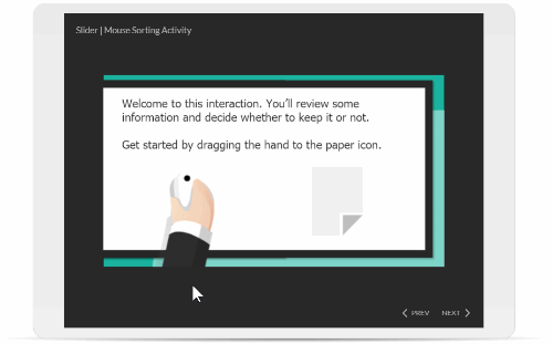
I built a simple sorting interaction to show how to work with sliders and variables for a workshop. It’s a fun and simple interaction so I cleaned out the data and made it so it can work as a template. It’s yours to use as you wish.
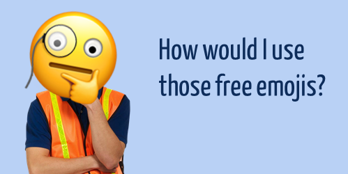
Here’s a site where you can create free custom emojis. The site is easy to use and you can create all sorts of fun emojis to provide feedback in your courses.
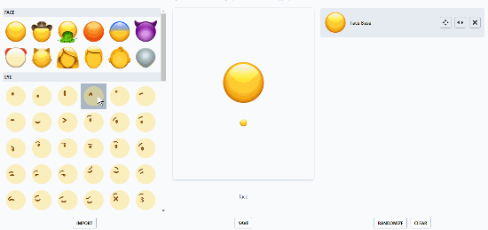
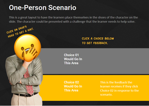
Here’s quick tutorial that shows how to use the free emoji site. And here are a couple of silly examples where I use the free emojis as a way to offer hints on a slide and as a way to provide right and wrong feedback.
Of course the example above is silly, but you could find more creative and appropriate ways to use these free assets in your e-learning content, especially if working with a younger audience. Since the image files you get are the same dimensions, they’re perfect for buttons with various states.
If you did create some free emojis, how would you use them in your courses?
The secret to all of this is screen capturing your old e-learning courses. You can do what I am going to show with a number of tools. For example, Storyline has a screen capture feature where you can bring in one screen at a time. That works fine for smaller courses.
Below are the basic steps. The video above has more detail. Essentially, we’re going to capture the old course screens, bring them into PowerPoint as images (because we can do a simple batch import), and then we’ll import the PowerPoint slides into Storyline.
Once inside of Storyline you can add interactive elements and additional content.
Basic Steps for Converting the Old Course
Determine the original course slide resolution. Don’t include the player; just the slide. Most courses are usually 4:3 or 16:9.
Create a PowerPoint file at the same resolution as the course images.
Create a Storyline file at the same resolution as the PowerPoint file.
Go through the course using a screen capture application. This will capture all of your course screens. If you have interactions, you’ll go through those as well. You want a copy of every possible screen. Just click on everything clickable. I’d even go through the quizzes, just so you have the screens. You can use that content later.
Review the screens you captured and get rid of duplicates.
Save the separate frames captured as image files.
Batch insert the screen capture images using the album feature in PowerPoint. I like to force them to fit the slide. That way I don’t need to do any adjustments. Things should be aligned.
Import the PowerPoint slides into Storyline.
From there, it’s a matter or making some edits and adding interactions, quizzes, and whatever else the course requires.
For example, you could take the screen for a tabs interaction and combine them into one slide with layers for each tab. Then add hotspot triggers to the layers.
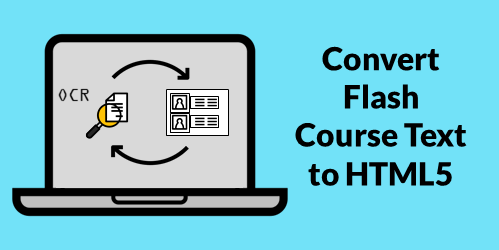
Example: Course Converted to HTML5
I created an example course using the steps I outlined above. For the demo, I copied the old course screens and created new slides Storyline. Then I published in HTML5. It only took about 10 minutes and considering the time spend, looks pretty decent.
It’s definitely a good solution for a lot of the old compliance training that needs to go from Flash to HTML5, or if you need to update a course and don’t have the source files.
Obviously, the best solution is to rebuild the course from scratch. That works fine if you have a handful of courses. But if you have dozens (or hundreds) that need to be converted to HTML5, then this is a viable solution for many of those courses.
I’ve been playing around with ideas to get old Flash course content into a new HTML5 course. There are tens of thousands of old Flash-based e-learning courses where people no longer have the source files. All they have are published versions of the course and need to convert to HTML5.
Grabbing the media like images, video, and audio is usually not as challenging. But moving all of the text can be a hassle.
In a previous post we discovered how to use screenshots and OCR to extract the text from the old course screens. Another way to get the text into your slide is by reading it out loud to transcribe it and insert into your slide. I like this approach because you it’s easy and you have to go through the content anyway. Reading it out loud may help you think through the tone and some script changes you’ll make in the new HTML5 course.
There are applications you can buy to do the recording and transcription, but I want to focus on tools you already have that won’t cost anything more.
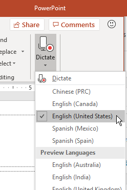
Use PowerPoint to Transcribe Text for HTML5 E-Learning
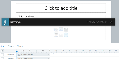
The new version of PowerPoint [this only works for Office 365 subscribers] has a dictate feature. All you do is press the button and start to read. PowerPoint transcribes the text and adds it to the slide. Then you make your edits. You can also send the file out to be verified and edited by others who use PowerPoint. Once it’s ready, import the slides into Storyline.
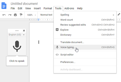
Use Google Docs to Transcribe Text for HTML5 E-Learning
Some of you use Google Docs instead of Microsoft Office. In Google Docs, under the Tools tab, you’ll find a Voice Typing feature. Just press it and it starts to record. If I speak clearly, I find it to be very accurate. Once the text is on the page, send it around to be verified and approved. And then copy and paste it into your HTML 5 course.
Use Windows to Transcribe Text for HTML5 E-Learning
Microsoft Windows 10 has a transcription feature that works to transcribe text right into Storyline. Press Windows + h keys to open the narration window. Start talking and it will do the transcription. It’s not quite as fast or accurate as the solutions above, but it makes up for it by recording right into the Storyline slide or Rise lesson. If you’re using Windows 7, you can leverage the speech recognition feature.
So, there you have it, three easy ways to read the text from old Flash-based courses to get them into your new HTML5 course that you can update and edit as needed. Then publish it for HTML5 and you are all set.
Many of you have to convert old Flash courses to HTML5. All you have is the published course but not the original source files. It’s easy enough to extract the media (like images and video) from the published output. But adding text from the old course isn’t as easy because most Flash courses don’t allow selecting text to copy and paste. And who wants to spend hours retyping the text?
Here are a couple of simple ways to copy the text from old Flash e-learning courses that you can add to updated HTML5 e-learning courses without having to retype everything. This works whether you’re using Storyline or Rise.
Use OneNote to Convert Text from Image for Flash to HTML5 Courses
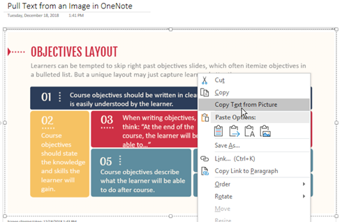
Many of you have OneNote. It’s a great application included in the Microsoft Office products. OneNote has a screen capture feature and the option to copy text from the captured image.
Play the old Flash-based course and capture screens using OneNote’s screen clipping feature (or insert an image captured from some other application).
Right-click on the image to copy text from the picture.
Once you have the text copied, paste into your new slide.
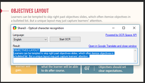
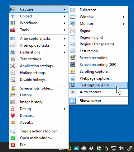
Use ShareX to Convert Text from Images for Flash to HTML5 Courses
ShareX is free and works great. I use it quite a bit to do screenshots for uploading to various image sites. It also has an OCR feature where it can pull text from an image that can be copied and pasted into a new slide.
Those are two free to low-cost options to quickly get the text from previous e-learning courses. Many of you already own OneNote, and if you don’t, you can always use the free ShareX application to do your screen grabs and OCR text conversion. Once you have the text, it’s easy enough to copy and paste it into your new course.
Obviously, this is still a bit tedious, but it is an easy way to get the text from your old e-learning courses when you no longer have the source files or original content.
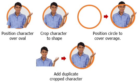
There’s a lot that goes into building interactive scenarios. Obviously content is king and critical to building a branched scenario that is both engaging and effective. One key part of the scenario construction is establishing context. The good thing is that a single image often suffices to establish the scenario context.
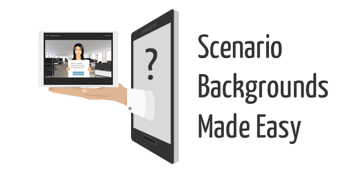
The free stock images I shared recently are perfect for building interactive scenarios and establishing visual context.
I’ve had a few questions on how to set up the slides using the scenario images, so I’ll show a couple of easy ways to use them.
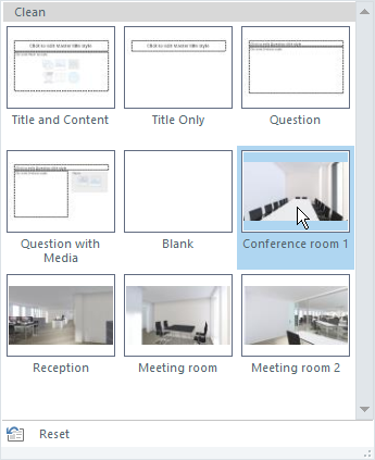
Interactive Scenarios: Create Multiple Layouts
You can create as many layouts as you like in the master slide. Thus you can create a scenario slide with dozens of layouts and save it as a template. Anytime you want to build a scenario, start with the scenario template and it saves you from looking for the images and inserting them into the slides. Everything’s already there and ready to go.
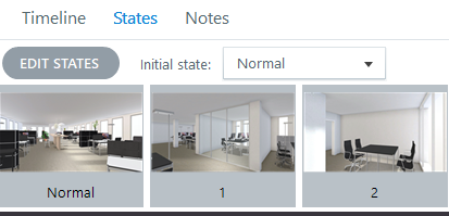
Another reusable option is to insert a background image and then establish a number of states for that image. You can set any state as the initial state and never have to access the other states. And if you want to be clever, you can use triggers to dynamically switch the background from one environment to another using a single image.
Here’s a quick tutorial that show how to set up the background states and dynamically change them with triggers.
Working from the master slide means that the background image can be applied universally to the layout and impact all of the slides that use the layout.
Working with image states on the slide level gives you more control over the background and how it’s used with triggers specific to that slide.
There’s no reason you couldn’t apply the image states to the layouts which would mean fewer layouts. The layouts can be swapped using triggers and variables.
Key Point: it’s easy to get lost in building complex scenarios which can consume a lot of production time. I always work from the perspective of keeping production simple and as reusable as possible. And with Storyline 360, you can share with your co-workers using the team slides feature.
Inserting the images into a file and saving it as a template will save you lots of time and means you won’t have to dig around looking for the images. They’ll always be right at your fingertips.
Some people asked how I created the animated .gifs similar to the ones I gave away for free in this recent blog post. So today I’ll share a simple way to create them.
Start with Animated .Gif Software
There are a number of tools to create animated .gifs. I’m going to focus on just one for this post.
ScreenToGif is free and you don’t need to install it. Just run the .EXE file. It’s a great product and I use it all the time for quick demos or some of the animations I use in the blog.
I’m not going to do an exhaustive overview, so I recommend downloading the app and playing with it a bit. It’s intuitive and easy to figure out. As a side note, if you do use it, I encourage supporting the developer.
Understanding the Cover Image .Gifs
Cover images are mostly decorative. And because of the responsive nature of the Rise courses, the cover image gets cropped based on the screen’s aspect ratio. That means what you see in portrait won’t look the same in landscape.
The key is keep the cover images simple. Animated .gifs can become very large files. The more visual information on the screen, the larger the file size. And if the file is too large, it’ll take too long to download and ruin the effect and experience.
Stick with fewer colors. Solid backgrounds are good because you don’t get that blocky color striping that you get with pictures.
We’ll look at two ways to create the cover image animated .gifs. One way is by recording something onscreen and the other is to import a video.
Record Screen to Create Animated .Gif
The easiest thing it to play a video and record the screen. Then do some basic editing. Since the animated .gif is decorative, you just need something simple. The key is not to have a massive file. The more you record, the larger the file.
Once you have a recording, figure out what you want and where to cut it. Again, I look for something simple that looks good looping. Subtle movements or repeating animations (like a spinning gear) work perfectly.
It does take some messing around. I usually do a basic edit and then save the file to see how large it is. Then I play around with more edits and image size to find the right balance between quality and file size.
You’ll have a lot more luck recording vector images that are solid versus photos. The less the screen has to change from one frame to the next, the better quality you’ll get and smaller file size.
For the .gifs where the quality doesn’t look as good, I set the cover images’s overlay color darker. This way the text really pops off the screen and the animation quality isn’t as much of an issue. That’s what I did in this example where there were so many colors it just didn’t look as good as I wanted.
Import a Video to Create Animated .Gif
ScreenToGif makes it really easy to import a video. It breaks down all the frames and from there it’s just a matter of editing it to what you want.
Just like above, play around with different settings to see what gives you the right balance between file size and quality. And keep in mind, they’re header images so subtle movement is fine. For this overhead desk video, I just focused on the pencil moving and cut out hundreds of frames.
You won’t get crisp images because the file size needs to be manageable. I try not to go over 1.5 MB. That’s why you have to play around with settings that strike the right balance.
You need to test different dimensions, but I generally keep the images somewhere between a 16:9 and 2:1 aspect ratio. There’s no golden rule. It’s mostly based on what you are showing. The image is going to crop based on the screen, anyway. I make different versions and modify the image size to see what I get for file size and quality.
Solid and/or fewer colors is best. There are a lot of free or inexpensive ways to create simple vector-based animation videos. That’s what I did to create these two headers above which you can see in these two examples: Call Center and Team Meeting. I inserted some animated characters and published a video. Then I made the .gif from the video. Because I’m not building a big animated explainer video, this only took a few minutes to do and looks decent.
Animated .gifs add some flavor and visual novelty to your courses. And as you can see, they’re easy to create.
Variables add all sorts of capability to the learning experiences you create. They allow to move past linear, click-and-read content to more complex interactions with branched scenarios and personalized, adaptive learning.
Today I’d like to share a tip that really comes in handy when working with variables. It’ll save time and really help when you use a bunch of variables that are interdependent.
The 1-2-3 of Variables
Working with variables is a three-step process:
Create the variable: which is a like a bucket waiting to have a value
Adjust the variable: some action or trigger changes the value of the variable
Use the value: once the variable has a value or new value, that information can be used to trigger a different action
Add a Reference to the Variable for Troubleshooting
When working with variables, there is some trial and error and continuous testing. I always recommend adding a variable reference to the screen so that when troubleshooting or testing you can see the current value of the variable. This really comes in handy. If triggers depends on the value of the variable, you want to see that the variable is actually changing. If not, then you know where to start looking.
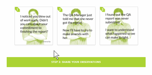
Here’s where it gets tricky. Some courses can have a ton of variables. For example, you may have a slide at the end of the course that requires dozens of interactions throughout the course. These interactions allow you to display personalized feedback. And each interaction is connected to interdependent variables.
Testing that everything works requires going through the course to activate triggers that adjust the values of the variables. This is really time-consuming. Unless you create a variables dashboard.
How to Create a Variables Dashboard
A variables dashboard allows you to be anywhere in the course and test how something would work depending on the value of certain variables.
However, with a variables dashboard you can manually adjust the variables and then go to that single slide to test it. That saves a ton of time and frustration.
Here are the basic steps to create a variables dashboard:
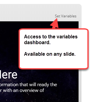
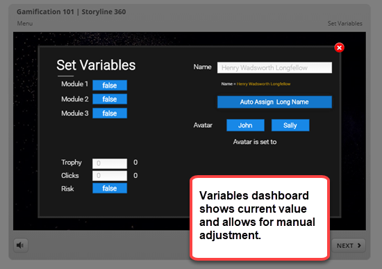
Create a slide that shows the current value of the variables and also allows you to manually adjust them. In the image below you can see I have buttons that let me change from true to false. There are text input boxes to add text-based values, and ways to adjust the numbers for variables that count specific activities.
Add this slide as a lightbox slide. I add it to the player so that it’s persistent and available throughout the course.
Prior to final publishing, get rid of the lightbox slide so that it’s not available to those who actually take the course.
Below is an example of a test module I used for a recent gamification webinar. You’ll notice the “Set Variables” link on the top right corner. Go ahead and test it.
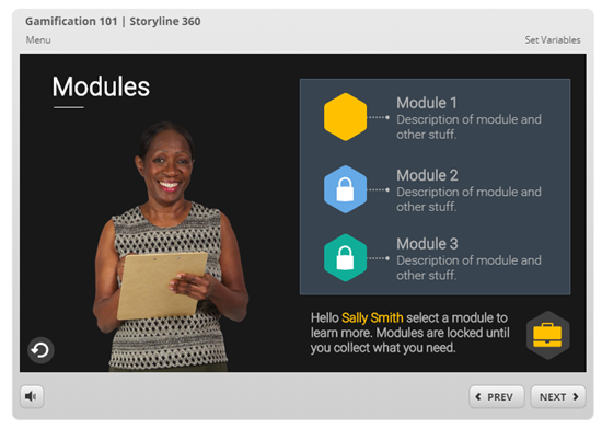
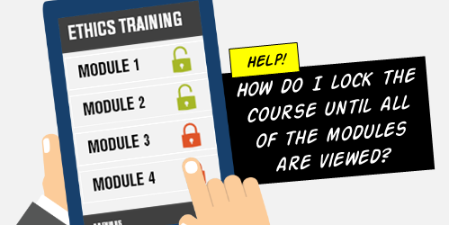
The question I see asked almost every day revolves around locking navigation until a user has completed a task. In the most common case, the first slide is a course menu. The user clicks a button, goes to a module, completes it, and comes back.
At that point, the module is marked complete and the user goes to another module and repeats the process until all of the modules are complete. Once that is satisfied, the user can continue.
There are a number of ways to approach this, but I’ll show the way that probably makes the most sense and is easiest to troubleshoot. In the process, I’ll offer a few bonus tips. Watch the tutorials for the details.
It Starts with Variables
Learn to use variables. The getting started tutorials show how and they offer some practice activities. In fact, the true false variable tutorials actually answer the top question asked.
For the novice, variables may seem intimidating, but once you understand them, they’re easy to use and give you a lot more control over the design of your course.
A variable is a piece of information. In this case, we use a variable to track if the person’s done something. We’ll use a true/false variable and start with an initial value of false (1. create variable). When the user completes a module, we create a trigger to change the value from false to true (2. adjust value). When all of the module variables are true, we can use a trigger to unlock the navigation (3. do something).
Create a trigger to disable the next button when the timeline starts. This prevents the user from clicking forward.
On the module buttons, add a custom “complete” state rather than using the “visited” state. You’ll use this to indicate the module is completed.
Add a trigger on the buttons to jump to the specific modules.
Add a trigger to change the state of the module button to complete when slide starts on the condition that the variable for that module is equal to true.
Add a trigger to change the state of the next button to normal when the slide timeline starts on the condition that all variables are true.
Module Slides
Create a true/false variable for each module that you’re tracking.
On each module, add a trigger that adjusts the variable from false to true. It doesn’t matter what you use to trigger the event. Some people use a button and some use the last slide’s timeline. It really doesn’t matter. The main point is to have a trigger that adjusts the variable from false to true.
Create a button that returns to the menu slide.
A few tips and common issues:
Trigger order matters. Often the button has two triggers. One jumps to a slide and the other adjusts the variable. If the user jumps to the slide first, it leaves before the variable can be adjusted. Change the trigger order so that the variable changes and then leave the slide.
“When timeline starts” is key when you visit the slide. Many people use a trigger to do something when the variable changes. However, when returning to the slide, the variable has already been changed. Thus nothing happens. You need to load the slide and then evaluate the value of the variables.
Create custom states and don’t use the built-in visited state. I like to create custom states so that there’s no conflict with pre-built states. The built-in visited state doesn’t require triggers. If a user clicks on the object, it is visited. I’ve seen dozens of examples where users create conflicts between their triggers and the built-in states. It’s good to create your own states for specific control.
Variables are best when leaving slides. A lot of people use states to trigger objects, such as change next button when the state of all buttons are visited. However, states are slide-specific and variables are available throughout the course. Variables also give you complete control. It just makes it easier to troubleshoot when using variables because you can see what’s going on.
Use text references for variables. They let you see that the values are set and what they need to be. It’s challenging to troubleshoot if you can’t be sure that the variables are changing.
While today’s tutorial is relatively simple and limited to locking navigation, once you understand the core concepts, you can use similar techniques to create branched scenarios and adaptive learning paths.
That’s a quick run down of the most commonly asked question. Be sure to watch the video tutorial to see all of the details and some bonus tips. And if you haven’t watched the getting started tutorials, make the investment to go through them. They do answer many of the the questions I see in the community.
PowerPoint’s one of my favorite multimedia applications. It’s easy to use, almost everyone has a copy so it’s easy to share what’s created, and it does more than create presentations.
As you can see, PowerPoint is great for all sorts of multimedia production especially when combined with great e-learning software.
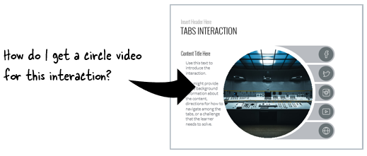
Create a Shaped Video
Recently someone in the community asked how to create a circle-shaped video for an e-learning interaction in Storyline.
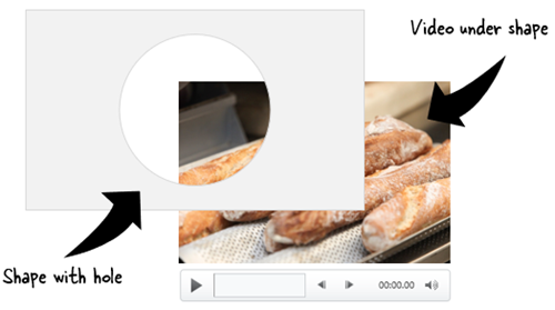
A real easy solution is to create an image with a circle hole in it and then place the video underneath only allowing the video to show through the circle hole. That’s fast and doesn’t require any editing of the video.
If you want a circle-shaped video, you can create one in a video editing application. However, this requires having a video-editing application that allows you to do that and also having the expertise to use the video editor (which most of us don’t have).
And this is where PowerPoint comes in handy. It’s a tool most of us have, and it can do exactly what you need with minimal effort.
Customize slide size. A circle has a 1:1 aspect ratio. Change the custom slide size to 1:1 (something like 10″ wide and 10″ high). That should give you a video that’s almost 1000×1000 pixels.
Insert a video. Choose your favorite video.
Crop video to 1:1. Most likely the video is 16:9 or 4:3. You’ll need to crop it to 1:1 to get a perfect circle.
Scale the video to fill the slide. You want the video to be as big as possible inside the slide.
Save the file as video. Select .mp4. If you have an older version of PowerPoint you may have to save as .WMV. That’s OK, you can still use it in Storyline and Rise. You won’t get a circle video. The video is still going to be rectangular. But inside the rectangle will be the custom-shaped video.
Bonus tips:
Play around with some of the video formatting options in PowerPoint. There are lots of neat things you can do.
Same thing with animations and transitions. Anything you create in your PowerPoint slides can be save as video.
The corners are not going to be transparent. You’ll want the video background to match the course background to get a seamless experience.
Hope that helps and is something you can use in an upcoming e-learning course.
Here’s a time saving tip when working with variables in your e-learning courses. This is helpful when testing your course as you work on it.
Create Reference Variables
During your production process when working with variables it’s always a good idea to create a reference to those variables. This is a text box that shows the current value of the variable. Thus when testing your course and making adjustments that change the value of the variable, you can see it displayed.
If you don’t use a reference of the variable how else will you know the variable value changed? You have to assume that the course is working correctly, which may not be the case. Being able to see the variable helps in troubleshooting issues you may have when using them. For example, if the variable changes then you know something else is the issue.
Where to Put Reference Variables
The reference variables are only visible during the construction and testing of the course. Once it’s ready to go live, they need to be removed from the slide.
Everyone has their own production method. Here are a few options:
Delete them when you’re ready to publish the course. This gets rid of them, but if you need to go back and edit the slide, you need to recreate the references.
Move them off the slide. This works, but then you have to move them back on when you do edits. Seems like a lot of extra work.
Keep them on the slide, but hide them on the timeline. This means they’re always there, and just require a simple click to make them visible.
Put them on the master slide. I like this approach. I can turn them off on the master slide and they’re off on all the slides. And then if I need them available, I only need to turn them back on once rather than doing it slide by slide.
Additional Variable Resources
Here are a few quick tutorials and previous articles on working with variables:
Here’s a simple way to test your published courses when building responsive mobile learning. While each browser is a bit different, most have some sort of emulation features.
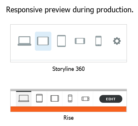
Preview Your Published Responsive Courses
During your course production you can preview the course using one of the responsive preview options. This gives you a very good approximation of how the course will respond to different devices whether they’re in portrait or landscape orientation.
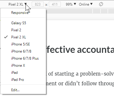
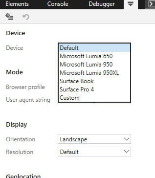
After you publish the course and upload it to your LMS (or web server) you can also preview it via the browser. Open the course and right click to access the developer tools (see tutorials below). From there you can access the device emulator to test how the course will respond to different devices or screen resolutions.
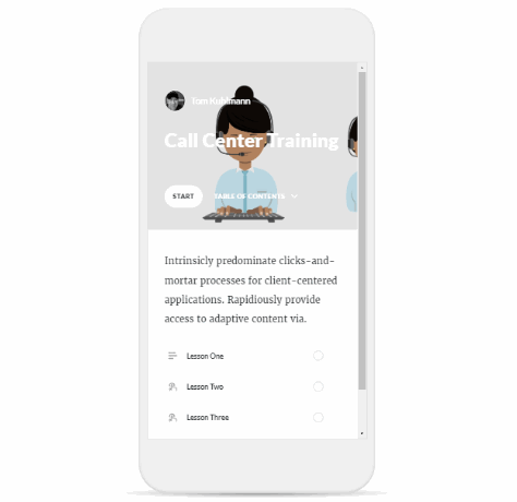
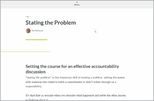
For example, here’s a responsive e-learning course I published in Rise. I want to see how it responds to other devices after it’s published. Some people scale their browsers to do this, but it makes more sense to use the browser’s feature instead.
Get the Aspect Ratio of Popular Devices for Responsive Courses
One side benefit is that in Chrome and Firefox they expose the resolutions for different mobile devices. Even if you don’t use the responsive emulators, it’s still an easy way to get the aspect ratios and resolutions of the popular mobile devices. I use these to to set the story size dimensions for my mobile Storyline courses when I build for specific devices.
Unfortunately, Microsoft’s Edge is a bit myopic and behind the times as they assume that people only use their devices. Of course, it doesn’t really matter because you can choose the orientation and customize the resolution.
How to View Responsive Courses Tutorials
Here are some quick tutorials where I go through this feature in the following browsers:
Each browser is a little different, but it is a handy feature to access when building responsive mobile learning. One thing to keep in mind is that what you get via the browser is an emulation and may not be an exact representation of how your course will really behave, but for the most part it should be fine.


2
comments