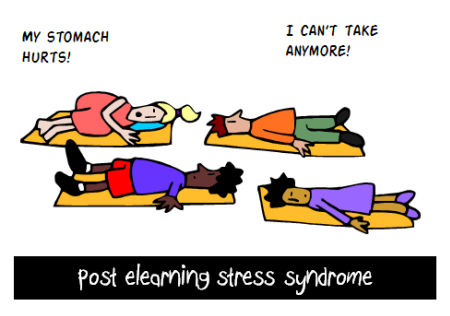
The Rapid Elearning Blog

Archive for the ‘Uncategorized’ Category


Articulate Rapid E-Learning Blog - how to build effective elearning and not boring courses

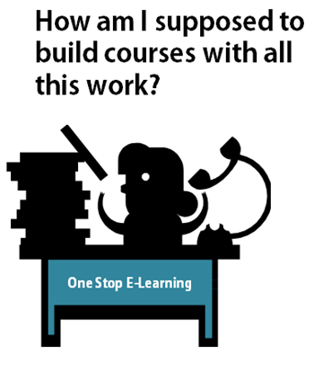
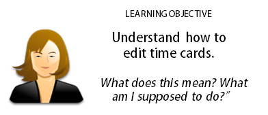
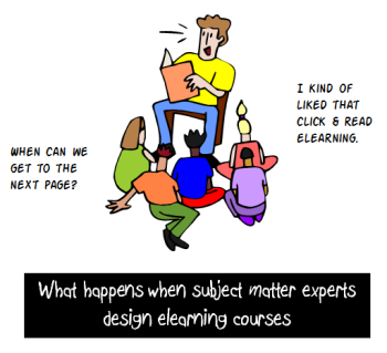
Linear, click-and-read courses are pretty common and usually held up as the worst of online training and cause of boring courses because they’re mostly information dumps with little focus on how the learner can actually use the course content.

They may be the worst of elearning. Or perhaps not. Let’s review some common reasons why these types of online courses exist and what we can do to fix them so that you’re not producing boring courses.

Boring Courses Exist Because They’re Pointless

Before we continue I’ll make the argument that not all click & read content is bad. And that often it’s an appropriate solution. But it has to be relevant to the training needs.

A lot of our online training programs are more like documentaries that share information to build awareness. In those cases, linear, click-and-read courses may be the best solution and they don’t fit in the boring course category.

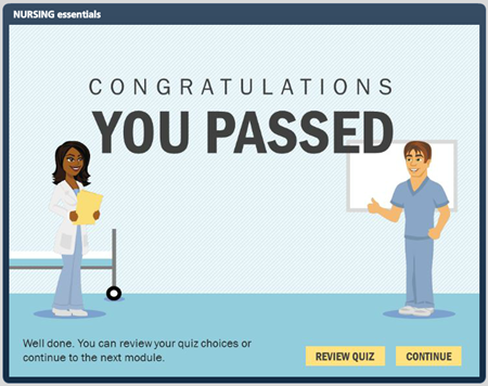
Keep in mind that linear doesn’t have to mean boring course. Bland, bullet point slides probably equate to boring courses. However linear courses don’t need to be boring or poorly designed. Videos are linear and so are books. And they’ve been successful learning tools for years. It’s not the mode of transmission that’s the problem. Instead it’s the quality of what’s being transmitted.

Articulate Rapid E-Learning Blog - courses need to be more than bullet points to avoid boring courses

In some blended training programs click-and-read courses are designed as a means to present content and they’re coupled with an interactive, hands-on process. In those cases the “course” may be linear but when blended with other activities the training program can actually be quite interactive and effective.

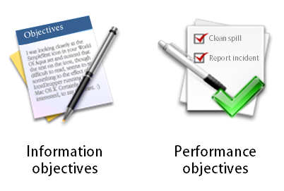
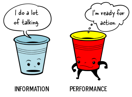
With all that said, many of the click-and-read courses could be more interactive but they aren’t. And courses that should focus on performance and decision-making are classic information dumps.

That can be changed. But we need to understand why those types of courses are built and look at some ways to get past them.

Boring Courses Are Easy to Build

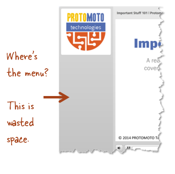
Let’s face it. Many of us are under severe time constraints and looking for ways to do our work faster. It’s easy to take an existing PowerPoint file, clean it up a bit, and publish it for online training. This is usually the cause of boring courses.

Articulate Rapid E-Learning Blog - it's easy to build simple courses but they can become boring courses

It’s a lot harder to build interactive, decision-making courses. They require more analysis and resources. So if everyone’s none the wiser and appears happy, why not do a simple conversion rather than invest the time to build something more complex?

Solution:

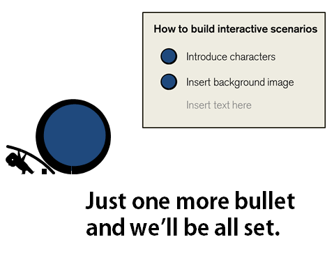
To maintain ease of production and yet offer more interactive content, go with some prebuilt interactive models. Create the interactive structure and save them as templates. And then instead of going with the linear approach, use one of the already created models where all you have to do is swap out your assets and content.

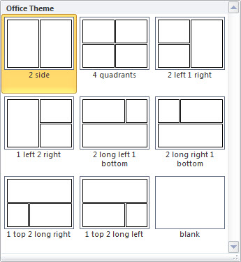
One of the things I like about Storyline is that I can build mini interactions and save them as templates. They can be inserted into other courses and shared with other Storyline users. All of the interactive components remain so I just have to add my own content. That’s a big time saver and will help you not build boring courses.

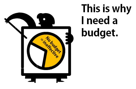
Boring Courses Cost Less to Produce

How many of you get a budget when building courses? My guess is that not many of you do. Not only does good elearning require time to build. It also requires money. Even if your organization doesn’t give you a budget, there’s a cost associated to building elearning that isn’t effective.

The reason consultants and elearning shops can complain about click-and-read courses is because they usually work with the part of the organization that’s willing to spend money for the appropriate training. But if you’re the one-person course design team, you don’t get a budget and often you’re not in a position to even influence the best way to build a course.

Articulate Rapid E-Learning Blog - get a budget to build better elearning and avoid boring courses

Solution:

Here are two quick tips to prevent boring courses caused by lack of a budget. First review the solution above. Save time & money by creating reusable models and templates. Take advantage of the free resources from the elearning community.

The second is to ask for a budget. It’s not outrageous to suggest a budget to build the appropriate course. Worst case, start small. “We need to purchase some stock images.” You’ll probably get some money and lets you build in the expectation for a budget on future projects.

Boring Courses Come from Lack of Experience

The authoring tools have made online training course construction a lot easier. That’s for sure. The challenge is that many people required to build courses don’t always have the depth of experience to build more than the presentation-style courses and that can lead to the classic boring courses.

And if all you see is presentation-style courses while you’re trying to learn, odds are that will inform your understanding of course design and you’ll build what you see and know.

Articulate Rapid E-Learning Blog - get some practice building better elearning so you don't build boring courses

Solution:

Make it a goal to build interactive courses and do what you can to get out of the click-and-read paradigm. Don’t get stuck building the same boring course one hundred times. Look at good examples for inspiration and if you’re just getting started participate in the weekly challenges.

If you wait until you need to build an interactive course, you may not have the time to trial and error your way through it. By making a habit of continual practice, you’ll develop some construction patterns and solutions that are more easily applied when it comes time to build an online training course.

Boring Courses Are Caused by the Customers

People only know what they know. Many customers only have experience with click-and-read type training. So that’s what they expect when they request a course be built.

I’ve worked on projects where I’ve shared ways to make the content more interactive and the customers would say. “That’s fine, but let’s do the interactive stuff after we’ve completed the real course design.” Their expectation was that a course was only a course if it was linear.

Articulate Rapid E-Learning Blog - learn to work with your customers so that they don't expect boring courses

I’ve also had customers specifically ask for click-and-read type courses so they could lock down the navigation and force the learner to look at each screen. Is this good? Obviously not. But it is a cause of some click-and-read content which leads to boring courses.

Solution:

Help the customer see elearning in a different way. Don’t expect that they’ll understand all of your instructional design mumbo jumbo. If you throw in words like pedagogy and didactic, you’ll lose them.

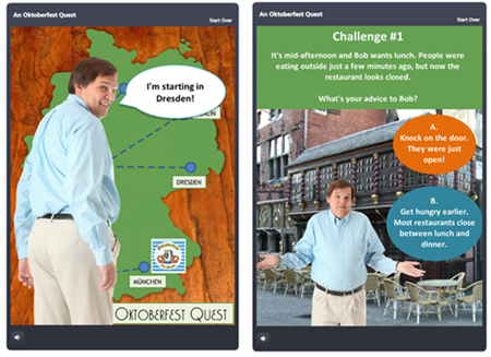
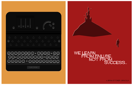
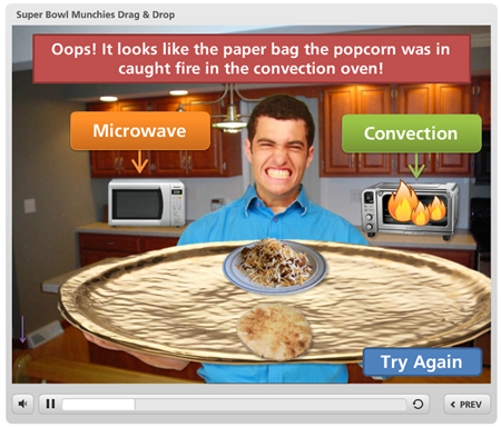
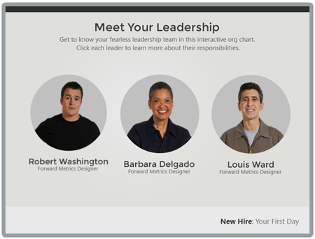
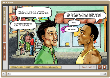
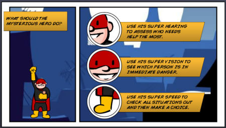
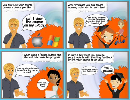
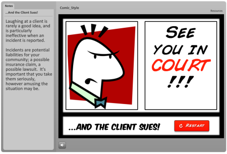
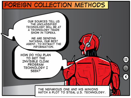
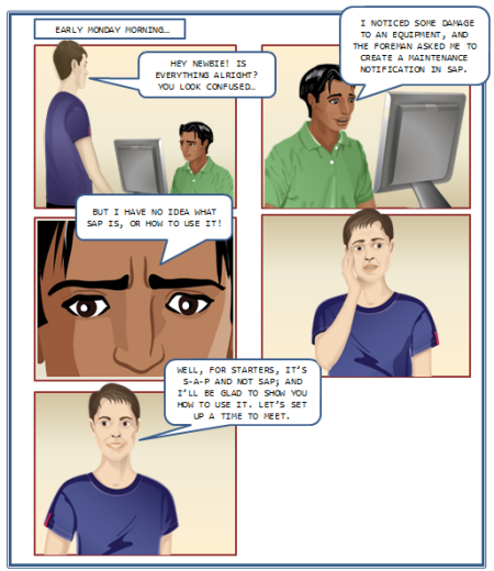
Instead, show them some examples of good elearning and how you’d like to approach their course. Come prepared with three before/after examples so that you can demonstrate the difference between linear and interactive elearning. When they see it, they usually get it.

If you need to lock the course navigation, do it at key decision points and not at the screen level. They can validate that the learner “got it” if they get past the decision and not merely looking at screens of information.

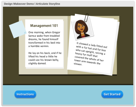
Again, there’s a place for linear click-and-read content. But that’s a decision you should make. Don’t let it be the default strategy for your course design. Otherwise you’ll suffer from the curse of the boring course.

What are some things you do to avoid the curse of boring click-and-read elearning?

Events

Free E-Learning Resources

Want to learn more? Check out these articles and free resources in the community.

Here’s a great job board for e-learning, instructional design, and training jobs

Participate in the weekly e-learning challenges to sharpen your skills

Get your free PowerPoint templates and free graphics & stock images.

Lots of cool e-learning examples to check out and find inspiration.

Getting Started? This e-learning 101 series and the free e-books will help.


Articulate Rapid E-Learning Blog - instructional designers united with the serious elearning manifesto

Had a great trip last week to Sydney and got to meet many of the blog readers I’ve corresponded with over the years. If you haven’t attended an iDesignX conference, I recommend doing so. You get to meet many of your peers and sit in on some good presentations.

As I was returning home I ran into Dr. Werner Oppelbaumer at the Los Angeles airport. We had a few moments to chat about the state of the industry and what’s new in his research.

Articulate Rapid E-Learning Blog - tom asks about the serious elearning manifesto

There’s a lot going on in our industry. What trends do you see when it comes to online training?


Articulate Rapid E-Learning Blog - dr werner oppelbaumer explains the serious elearning manifesto

There is a lot of talk about MOOCs. The idea is very interesting but many of the courses are like old-school lectures put online. Their biggest challenge is a lack of identity coupled with reaching the next generation who have grown up on games.

At Werner Labs we’ve come up with a solution for both. As all trainers know, good training starts with a good logo. Don’t waste time trying to teach anything without an appropriate logo. Besides, if you don’t have a logo what will you put on your slides?

Articulate Rapid E-Learning Blog - MOOC logo

Werner labs created a prototype logo to build the MOOC brand and reach young people. We created a gamified logo to attract the young generation who only know how to play games and complain that their Red Bulls are too warm.

Articulate Rapid E-Learning Blog - tom asks about the serious elearning manifesto again

That’s interesting. I am sure that the gamification angle will pay dividends. Speaking of MOOCs, I’ve read that they have a very high drop off after initial enrollment. Any thoughts on how that can be fixed?


Articulate Rapid E-Learning Blog - dr werner oppelbaumer explains the serious elearning manifesto

Yes. At Werner Labs we created a MOOC Collar™. When you enroll in a course we send a reminder collar which is connected to your course’s MOOC app. If participation drops, the instructor can send a friendly reminder. You can test the MOOC Collar™ app here

Articulate Rapid E-Learning Blog - MOOC iOS app

Click here to test the application.

Articulate Rapid E-Learning Blog - tom asks about the serious elearning manifesto and one more time

Speaking of courses, there’s been a lot of buzz in the elearning community concerning the elearning manifesto. It addresses some issues with the current state of elearning and seems to cover a lot of the key points you’ve been pushing the last 40 years. What are your thoughts?


Articulate Rapid E-Learning Blog - dr werner oppelbaumer explains the serious elearning manifesto

I actually just delivered a presentation concerning something similar. That’s why I was in Los Angeles. But here are a few quick thoughts. You can view my presentation below.

Impressive Logo. As I mentioned before, good training starts with a good logo. It looks like the manifesto team spent valuable time agreeing on a solid logo. I am sure that it was a challenge just getting to a consensus on the spelling of elearning eLearning.

Articulate Rapid E-Learning Blog - understanding the serious elearning manifesto

Great presentation. When I first heard the hoopla I was concerned that the elearning experts were going to take me through some sort of interactive asynchronous learning experience. But I was mistaken.

I’m glad they decided to go with the tried-and-true formula of a synchronous meeting where they lectured and read their slides. It was so refreshing. I just leaned back in the chair, closed my eyes, and soaked it all up.

Articulate Rapid E-Learning Blog - the serious elearning manifesto

I will add that they did miss a golden opportunity to create an acronym to help us better remember the principles.

Creative Commons. Since the manifesto is under a Creative Commons license we are free to use it as we wish, even for commercial purposes. As you know Werner Labs is a for-profit enterprise and we are already working on manifesto-licensed merchandise.

The first two products are a winter coat inspired by East German manifesto writers of the past and Manifesto Pesto, a nice tasty pasta sauce.

Articulate Rapid E-Learning Blog - the serious elearning manifesto gear

Articulate Rapid E-Learning Blog - tom asks about the serious elearning manifesto the last time

Interesting observations. As always, thanks for the time and letting me post your presentation below. I’m sure we’ll learn something new.

Articulate Rapid E-Learning Blog - dr werner oppelbaumer explains the serious elearning manifesto in this presentation

Click here to view Dr. Werner’s presentation.

Have a great day!

Events

Free E-Learning Resources

Want to learn more? Check out these articles and free resources in the community.

Here’s a great job board for e-learning, instructional design, and training jobs

Participate in the weekly e-learning challenges to sharpen your skills

Get your free PowerPoint templates and free graphics & stock images.

Lots of cool e-learning examples to check out and find inspiration.

Getting Started? This e-learning 101 series and the free e-books will help.


Articulate Rapid E-Learning Blog - build better courses with these tips

I facilitate a lot of elearning workshops and from my experience most of the people who attend are just getting started. Generally the transition to elearning happens like this. They’re good at explaining things and go from explainer to trainer. Then somewhere in the process the organization says that they’re switching to online learning.

Now the trainer has to make another transition as she goes from creating and facilitating workshops to building elearning courses. And as we know, building an online training course is different than creating a facilitated live session.

So the challenge is: How do I learn and get better at building online training especially when working with limited resources?

Build Better Courses: Don’t Worry, Be Happy

If you’re just getting started, don’t worry about being perfect. The first online course I ever built was a mess (as I look back on it today). I was teaching people who had never been online how to navigate this new thing called the “World Wide Web.” What should have been a fun course full of discovery was a long-winded, information-heavy course. I made learning about the Internet about as fun as doing taxes.

Articulate Rapid E-Learning Blog - don't worry, just get started with build better courses

But that’s OK. I received some good feedback and the next course was a little bit better. And with each one that followed I tried something new. Over time I learned to build better elearning. You only know what you know. Do the best you can, and then learn from it to get better at what you do.

  • Essential point: You’ve got to start somewhere. Do something with the expectation that the next time you’ll incorporate what you learned to build it a bit better.

Build Better Courses: Practice Your Craft

If you want to be good at something, you have to practice. Building courses is a job and we usually only commit to the job what’s required to get our paychecks. That means we work from 9 to 5 and at the end of the day, we’re done. The challenge is that during the 9 to 5 we only work on projects and have little time to practice.

Great athletes start with natural athletic skills. But what makes them great is that they start with their skills and practice, practice, practice to build on where they’re currently at. If they didn’t they’d never be exceptional.

Articulate Rapid E-Learning Blog - practice to build better courses

If you want to be good at your craft, you have to practice doing more than building the same type of course over and over again. Build practice activities into your routine as part of your on-the-job development. Tell your boos it’s cheaper than going to school.

  • Essential point: Take time to practice building something new. Practice new instructional ideas and production techniques you can add to your next course.

Build Better Courses: Reflect & Write about Your Learning

This part is a bit harder, but pays off big time. Start a blog or portfolio. The goal isn’t to become a recognized blogger with lots of subscribers (although that could be a goal). Instead it’s your public learning journal and a means to reflect on and share what you’re learning.

Articulate Rapid E-Learning Blog - reflect on how you build better courses

This will let you solicit feedback and get ideas to help build better courses. It also helps the person like you who wants to learn more. If we want better elearning, we need fewer blogs from thought leaders who throw out big picture ideas and more from practitioners who share practical tips and tricks.

  • Essential point: Writing about your learning experience will help you and those like you to become better developers. It’ll also add your voice to the community at large.

Super Duper Bonus Tip for Building Better Courses

Every week, David Anderson posts a simple elearning challenge. The idea is to promote exactly what I referenced above—practice doing something new to help build your skills.

It’s all about fleshing out some ideas, sharing them, and getting feedback. Most people develop simple prototypes but some put in a bit more polish. It doesn’t matter what you do, just do something to push your boundaries a bit. That’s the key.

  • Essential point: The weekly challenges are happening now and an easy way to get into the habit of trying new things. That saves time trying to come up with different ideas and helps establish a routine of practice.

Weekly Challenge E-Learning Examples

There are a few who take the challenge one step forward by including a write up of what they did. What I like about these posts is that the participants are at various levels of experience. Some are just getting started and some have quite a wealth of experience. Not only do they share some nice examples, they also often share good production tips and some even share their source files.

Create a Comic Book Inspired Course via Paul Anders

Articulate Rapid E-Learning Blog - elearning example of comic book design to build better courses

Gamify Your E-Learning via Jackie Van Nice

Articulate Rapid E-Learning Blog - elearning example of gamified course to build better courses

Typography Challenge: Create a Design Tip Poster via Gemma Henderson

Articulate Rapid E-Learning Blog - elearning example of tips posters to build better courses

Create a Drag & Drop Interaction via Dan Sweigert

Articulate Rapid E-Learning Blog - elearning example of drag and drop interactions to build better courses

Use Characters in Online Courses via Montse Anderson

Articulate Rapid E-Learning Blog - elearning example of characters in elearning to build better courses

Makeover a Quiz Results Slide via Jeff Kortenbosch

Articulate Rapid E-Learning Blog - elearning example of quiz results screen to build better courses

Build an Interactive Screenshot via Allison Nederveld

Articulate Rapid E-Learning Blog - elearning example of interactive map to build better courses

Build an Interactive Screenshot via Michael Hinze

Articulate Rapid E-Learning Blog - elearning example of interactive dashboard to build better courses

Odds are you’re building the same course over and over again. That won’t do. Want to build better courses? If so, commit the time to learn something new and apply what you learn.

What do you do to improve your skills? Share your thoughts here.

Events

Free E-Learning Resources

Want to learn more? Check out these articles and free resources in the community.

Here’s a great job board for e-learning, instructional design, and training jobs

Participate in the weekly e-learning challenges to sharpen your skills

Get your free PowerPoint templates and free graphics & stock images.

Lots of cool e-learning examples to check out and find inspiration.

Getting Started? This e-learning 101 series and the free e-books will help.


Articulate Rapid E-Learning Blog - accept the mission to create learning objectives

One of the biggest challenges in course design is creating a course consistent with the organization’s learning objectives. Often courses are built around fuzzy objectives where the expected outcome isn’t quite clear. Another issue is that the course doesn’t end up meeting the objectives.

Learning Objectives Require Clear Goals

Why is the course being built? What is expected after the person takes the course? Understanding this helps you create learning objectives to meet the course’s goals.

Often organizations don’t have clear goals or the goal isn’t based on immediate performance expectations. For example, many organizations require that employees take annual ethics training. It’s not like they hire a team of unethical employees who’ll take the course and all of a sudden be ethical. In that case, an immediate change in behavior isn’t the real goal. What they want to do is reinforce and remind the employees of the organization’s ethics policies and expected behavior.

That’s an information course. And often those types of courses only require end-of-year certification. So the objective is relatively simple: certify familiarity of the organization’s policies by December 31.

Articulate Rapid E-Learning Blog - some courses have informaton learning objectives and some have performance learning objectives


On the other hand, if the desire of the organization is to change behaviors or impact performance than the objectives are different. That’s a performance course where the learning objective is measurable change. They were at point A and after taking the course they’re at point B.

Learning Objectives Focus on Action

In a previous post we looked at a simple way to create learning objectives. The essence of creating a good objective is looking for the action required. We used to ask, ”What will it look like when I see it?”

Articulate Rapid E-Learning Blog - learning objectives focus on action

With an identified action you can measure the effectiveness of your course. On the other hand a fuzzy objective like “you will understand how to do something” it’s hard to measure and see it in action. Move a step close by detailing what “understanding” is and how you can see it in action.

If a person understands something what are the expected actions?

Break Your Learning Objectives into Sub Categories

Often we’ll list the learning objective as a larger goal. For example: the objective is to complete customer calls within 4 minutes. That’s a good, basic objective and it’s measurable.

I can start with how long it currently takes to complete calls and then track the improvement after the training.

However, to complete the calls in less than 4 minutes usually requires other actions. Perhaps it means that the call is manually sorted into a queue to speed up processing. Or perhaps the customer’s account information is visible prior to engaging the customer.

 Articulate Rapid E-Learning Blog - create measureable learning objectives and chunk them into smaller modules

Meet the larger learning objective is contingent on meeting a number of smaller, secondary objectives. The person who handles the customer calls actually will meet the 4 minute mark if they are successful with those other activities.

List your main learning objective. Then make a list of all of the required actions to accomplish the main learning objectives. These actions are your supporting learning objectives.

When building courses in the past, I would chunk the supporting learning objectives into smaller modules. They were faster to create and easier for the learners to digest since the modules were more specific and smaller.

However you go about creating learning objectives, the key is to really understand what the organization wants and then build objectives to meet those goals. This helps you spend your resources in the right place and ensures that you are moving things forward.

What do you think is the most challenging when identifying your course’s learning objectives?

Events

Free E-Learning Resources

Want to learn more? Check out these articles and free resources in the community.

Here’s a great job board for e-learning, instructional design, and training jobs

Participate in the weekly e-learning challenges to sharpen your skills

Get your free PowerPoint templates and free graphics & stock images.

Lots of cool e-learning examples to check out and find inspiration.

Getting Started? This e-learning 101 series and the free e-books will help.


Articulate Rapid E-Learning Blog - How to fail at elearning

In today’s world, elearning is an important part of learning and training employees. Some organizations use it exclusively and some blend it with other learning activities.

There are a lot of things you can do to create successful elearning, but here are some guaranteed ways to make sure that you don’t succeed and waste a lot of time and money in the process.

Build Courses Irrelevant to the Learner’s Needs

One the biggest complaints I hear from people who have to take elearning courses at work is that the course is completely irrelevant to their needs. This usually happens for a few reasons:

  • Shotgun approach to compliance training. We know the drill. The organization has a bunch of courses you need to take by the end of the year. It doesn’t matter if you’re already ethical or not a sexual harasser. You still need to take those courses regardless of your needs. And when you do have a need, the course isn’t tailored to it. It’s a one-size-fits-all approach that is largely irrelevant and not suited to your real needs.
  • Too much focus on information. If you want to learn to use your elearning software, I’ll show you some tutorials. Want to be a better instructional designer? Here are some good books. Want to learn more about elearning? Go to this conference. As an industry we’re good at pushing information out. But information is only part of the learning process.
  • No required action. Information is good, but real learning happens when that information is applied in a context relevant to the learner’s needs. Build courses that let people practice what they’re learning. And then give them the appropriate feedback.

Build Courses That Waste Time

I always divide my courses into two buckets: information or performance. I start by asking the client what they expect the learner to do after completing the course. In many cases, they don’t really have an expected outcome. If that’s the case, then I try to talk them out of building a course that accomplishes nothing.

Articulate Rapid E-Learning Blog - two types of elearning courses

However, that’s not always going to work. The client’s often still want a course (for other reasons). And a lot of compliance training doesn’t seek to change performance as much as certify understanding, where the only goal is to get a check mark next to your name at the end of the year.

If that’s what the client wants, then I’ll build the best course at the lowest possible cost. They’ll tend to be simple, linear courses that the person can get in and out of quickly. No need to waste even more time. If the client has clear performance-based objectives then I’ll build the course appropriate to meeting the client’s needs. Those types of courses tend to take more time and require more effort.

Here’s where we end up wasting a lot of time:

  • Build elaborate information-based courses. All the organization needs is a check mark at the end of the year, yet the elearning person builds a complex interactive scenario that provides no more value but takes more time to build and more time for the user to complete.
  • Build simple information-based courses when you’re really trying to change performance. On top of that, most of the information is already available to the learner in other places.

On one hand the course is overbuilt for a simple objective. And on the other, when we really need to help someone learn, the course is too simple.

The key is to understand the expectations and objectives so that you can build the best course and not waste your limited resources.

Build a Course That Looks Like Crap

When I was a kid, we’d go to the horse stable and shovel a truck load of horse manure. My dad would mix it with the compost so that we could have a fertile garden. When it comes to visual design in elearning, there are two types of crap.

The good kind of CRAP is from the acronym popularized by designer, Robin Williams.

  • Contrast: elements that aren’t the same stand out which enhances communication and makes it easier to see relationships between the various onscreen elements
  • Repetition: repeating onscreen elements and design helps define relationships, maintain consistency and cohesion
  • Alignment: when onscreen elements are aligned they’re connected together; how things are spaced allows for better comprehension and communication
  • Proximity: how close objects are to one another conveys meaning and relationship; the more they are apart indicates they’re different

This is the good stuff and critical to communication. Think of it like the compost for fertile development of course design. Then there’s the other type of crap. I won’t go into a bunch of details but we know it when we see it.

Articulate Rapid E-Learning Blog - visual design elements for elearning courses

We always say, “You can’t judge a book (or DVD) by its cover.” But you can entice people with a good cover. It engages their interest and can help set expectations. The same can be said for elearning design. Even if you’re building a basic course, you can still make it look good. Apply sound visual design techniques to build a look that matches your course context.

The reason we tend “not to judge the book by the cover” is because over time we’ve learned that most great looking covers make a promise that isn’t kept in the content. This happens with elearning, too. A good looking course will only get you so far. That’s why the first two points are important.

So if you want to fail, build irrelevant courses that waste time and look like crap. However, you can avoid failure by understanding the organization’s objectives, your learner’s needs, and building a great looking course that is appropriate to its learning objectives.

What are some of things we do to fail at course design and how would you correct it? Share your thoughts here.

Events

Free E-Learning Resources

Want to learn more? Check out these articles and free resources in the community.

Here’s a great job board for e-learning, instructional design, and training jobs

Participate in the weekly e-learning challenges to sharpen your skills

Get your free PowerPoint templates and free graphics & stock images.

Lots of cool e-learning examples to check out and find inspiration.

Getting Started? This e-learning 101 series and the free e-books will help.


Articulate Rapid E-Learning Blog - 9 examples of online software training

The other day someone asked for different ways to present simple screencast videos. They didn’t want an elaborate production process. Instead just a few ideas to help them change up the way they’re currently doing their screencasts for their online software training.

I regularly put together simple screencast videos. Sometimes I’ll play with different ways to present the information. Below are a few examples from the blog over the past couple of years. I highlight some of the things I did to mix it up a bit.

Not All Software Training Needs to Be Video

In the example below, I demonstrated how sometimes it’s easier to use static images to teach about software than creating a video. Some of the benefits of this approach are smaller file size, easier updating, and less production time.

This example was built in PowerPoint. So if you don’t have a different application, you can still create some simple interactivity that mirrors the software training.

Articulate Rapid E-learning Blog - 3 easy ways to demonstrate software in PowerPoint

Click here to view the demo.

Speed Up Production with a Form-based Software Training Application

Form-based tools are nice because they make production super simple. All you do is add your content to the form. This can be text, narration, images, or video. And then you hit publish. The software does the rest because it’s already designed to do something very specific. That means fewer decisions for you and a faster production time.

Articulate Rapid E-learning Blog - Use Articulate Engage to build simple softwarre training

Click here to view the simple software training demo.

In the demo above, I used an image of the software I was training (in this case Articulate Storyline). Then I inserted some labels on top of the image to highlight features of the software.

This demo has three labels to show what you can do:

  • Text only: the easiest to do
  • Image & narration: added a more detailed image to dig deeper and recorded some narration to explain more
  • Video screencast: which lets me chunk up the video part of the training into smaller and more targeted videos.

Below are a few tutorials that I’ve done in the past. They’re mostly video screencasts. But sometimes I like to mix up how I present them. This way I can play with ideas on the look and layouts. I also try to add some interactive elements if I can.

Software Training: How to Customize a Free PowerPoint Template

In this example, the main page mirrors the free PowerPoint template. I broke the tutorial into three chunks and used the circles as a menu.

Articulate Rapid E-learning Blog - how to build a custom elearning template in PowerPoint

Click here to view the software training example.

You’ll also notice that once complete, the circles indicate a visited state to show that the tutorial has been viewed.

Software Training: How to Crop Images in PowerPoint

Here is a somewhat different take on the tutorial page. I was playing around with some drag & drop ideas where the end user selects a video and drops it in a box which loads the video.

Articulate Rapid E-learning Blog - learn how to crop images in PowerPoint

Click here to view the software training example.

The tutorial below looks different but is similar in design. And here’s a follow up post on how to make the interactive tutorials more practical in their usability since the drag & drop interaction is novel, but maybe not always practical.

Articulate Rapid E-learning Blog - learn to create an interactive e-learning template in PowerPoint

Click here to view the software training example.

It’s easier to build a simple click interaction to play the video tutorials. But sometimes the contrast of doing something different (like a drag & drop) helps engage the person during the training.

Original posts:

Software Training: How to Build an E-Learning Template

In this example I start the tutorial with a simple page that explains the series of tutorials. The first tutorial just goes to just the video. For the second tutorial, I added a start image with the idea that you can quickly brand or describe the video prior to clicking.

Articulate Rapid E-learning Blog - how to build an elearning template

Click here to view the software training example.

You’ll also notice that in this demo I chose not to use the player controls so the profile of the course is a bit different.

Software Training: 3 Tools You Own to Take Screenshots

For this example I tried a different looking layout and some animations to make the menu screen less static. On each button there’s an animated icon and tutorial description.

Articulate Rapid E-learning Blog - three free screencast tools you may own

Click here to view the software training example.

Each video starts with a washed out screen and title bar graphic. This fades away as the video plays. I also added an interactive menu for quick access to the other tutorials.

Software Training: How to Customize Clip Art

Articulate Rapid E-learning Blog - how to customize clip art in PowerPoint

Click here to view the software training example.

This example is pretty generic because it just starts right with the screencast tutorial. I threw it in as a way to show some contrast compared to the examples above.

What I like about some of the other examples is that there’s more visual indication of what the tutorial covers. You don’t get that with just the video, unless you add some details to the screen like a starter image or title graphic.

Software Training: Create Custom Illustrations in PowerPoint

In this last example, the software training has links to four tutorials with descriptive titles. And the tutorials have a visited state to indicate that they’ve been viewed.

Articulate Rapid E-learning Blog - How to use PowerPoint to create your own custom illustrations

Click here to view the software training example.

So there you have it, simple examples of different ways to build your screencast tutorials. The easiest thing is to just record the screencast video and upload it to a server. But sometimes it helps to change things up. That’s what I showed with these examples.

My favorite demo is the last one. I like it because it’s a combination of tutorials with visited states. I also like the simple title graphic and that it is consistent across the other tutorials.

Hopefully these examples inspire your own ideas for your next screencast or online software training. Which of the examples above do you like best and why? Or what would you recommend for those just getting started? I look forward to your comments.

Events

Free E-Learning Resources

Want to learn more? Check out these articles and free resources in the community.

Here’s a great job board for e-learning, instructional design, and training jobs

Participate in the weekly e-learning challenges to sharpen your skills

Get your free PowerPoint templates and free graphics & stock images.

Lots of cool e-learning examples to check out and find inspiration.

Getting Started? This e-learning 101 series and the free e-books will help.


Articulate Rapid E-Learning Blog - visual design for e-learning

In a recent post, I discussed some issues that organizational branding introduces to course design. In today’s post we’ll review a few of the visual design issues I often see in some of the elearning courses I review.

Below is a demo course slide that represents a few common design issues. Look over the interactive slide and we’ll review it below.

Articulate Rapid E-Learning Blog - example course for elearning

Click here to view the interactive example.

Following are a few things that stood out to me and some ideas on how to fix them.

Elements Should Follow a Consistent Design

The first thing you’ll notice about this example is that the course has a flat visual design. However, the buttons I added use the default gradient and shadowing that comes out of the box. Normally, contrast is a great way to draw attention to the onscreen information. Having a contrasting button is good. But in this case, it probably makes sense to go with the flat design of the course rather than the default buttons.

Articulate Rapid E-Learning Blog - buttons should match the course design

My fix would be to drop the default button settings and create a flat button that matches the course design. Also use a matching color scheme. Rounding the button works since it is a button and you do want it to stand out. I’d go with a softer rounded edge rather than the pill shape.

Not All Onscreen Objects Are Equal

You’ll notice that the two buttons are equal in prominence. However, which button do you want the learner to click? My guess is that it’s not the “Instructions” button.

Seems to me that “Getting Started” is key. That’s what I want the person to do. The instruction button is important and exists for a reason, but give it less prominence.

An easy solution is to add the instructions to the top tool bar. That makes them available to the person who needs them, but doesn’t make them prominent.

Articulate Rapid E-Learning Blog - add course instructions to the player bar

Or you can replace the button with a simple text link in the instructions to get started.

Articulate Rapid E-Learning Blog - get rid of less prominent buttons

Either way, you give less prominence to the “Instructions” button and place more focus on the “Get Started” button.

How are You Revealing More Information?

Hover effects are great for elearning courses. They expand the screen’s real estate since the information is not available until the person activates the hover. Thus you don’t need to reserve space for that information on the main screen.

In this demo there are a few issues with the hover effect:

  • Do you need instructions when the instructions are so obvious? If the button says “Get Started” I probably don’t need an additional box that states that the button is for getting started. It’s redundant and seems like a waste of time and effort.
  • Assuming the call outs are necessary, don’t use the defaults. Instead, have them match the course’s visual design.
  • The call outs are different sizes, the tails are different, and the alignment is off. That needs to be fixed. They’ll look better and more polished if the alignment and sizing is consistent.
  • One of the callouts overlaps one of the other buttons. This is probably fine. But as a general rule, I try not to block other interactive objects on the screen if I don’t have to. Just something to consider.

Articulate Rapid E-Learning Blog - create consistent design elements in course design

A simple solution to some of these hover elements is to create a hover dock. This is a place on the slide, where all of the mouseover information is revealed. This way you ensure consistency and don’t have to deal with the box size, colors, or shapes.

In the image above, the space between the buttons could be used as an area to reveal information. Since this is a clean space, you could get rid of the call out boxes altogether. This lightens the design and offers more white space.

Articulate Rapid E-Learning Blog - create white space in e-learning course design

If you did want to have a call out, then do something like the image below were the call out is a bit more subtle, matches the design, and is connected to the button.

Articulate Rapid E-Learning Blog - make callouts more subtle

Here’s a made over demo, where I show a few different ways to modify the slides.

These types of issues are common to many of the courses I review. The good thing is that they’re really simple to fix. The key is that your design is intentional and that by fixing these simple issues you present something more polished and professional. This is really important if you have limited graphic design experience and have to do all that work by yourself.

The other point I’ll make is that a lot of this is subjective. Do what you feel works best, but be consistent in what you do.

How would approach some of these design issues? Please add your comments here.

Events

Free E-Learning Resources

Want to learn more? Check out these articles and free resources in the community.

Here’s a great job board for e-learning, instructional design, and training jobs

Participate in the weekly e-learning challenges to sharpen your skills

Get your free PowerPoint templates and free graphics & stock images.

Lots of cool e-learning examples to check out and find inspiration.

Getting Started? This e-learning 101 series and the free e-books will help.


Articulate Rapid E-Learning Blog - how can your learners help you build better elearning

One of the best ways to build good elearning is to get close to those who are going to take the courses. This is because they often understand the content in a different way than the organization does.

A few years ago I worked for a large financial institution and was hired to build training for loan officers. One of my first requests was to meet with some loan officers. I wanted to get a sense of how they did their jobs and the decisions they made as it related to the course material.

I was told by the senior level management that the loan officers didn’t have time to meet with me and that it was a waste of time because the organization already knew what they needed to teach. I just needed to focus on the content and not waste time meeting with people who didn’t determine what that content was.

As can be expected, the result was a long-winded training program full of information but largely irrelevant to what the loan officers needed to do. But it was compliant with the various financial regulations, so the organizations saw it as a win. However, they missed an opportunity to craft a program more valuable to those they were training.

Understand Your Training Objectives

The truth of the matter is that often the objective of the training program really isn’t training. Often it’s to have a legal check mark on a piece of paper come December 31. In that case, instructional design is not the primary concern. Thus trying to figure out how to make the course more than an information dump can be a challenge.

It’s important to distinguish between compliance courses with no real training objectives from those where you are required to help change behaviors or improve performance. One type of course can get away with a simple information dump, but the other can’t.

Following are some tips to leverage the expertise and perspective of your learners to help develop an elearning course that meets their performance goals.

A Second Set of Eyes Always Helps

We tend to have blind spots or are a bit myopic. So it’s easy to overlook things that may be obvious to those who are less vested in what we’re doing. In that sense, it’s a good thing to have someone add eyes to the project.

When I prototype a course, I like to have someone look over it and provide feedback. It always amazes me how the second set of eyes helps. Often they’ll pick up on ways to tighten the visual design and many times offer ideas on how to approach the content from a different angle.

I may not always use the feedback, but the second set of eyes usually exposes something that forces me to think more about what I am doing.

Make time to get feedback from those who will take your courses. Ideally it’s a mix of recent and experienced staff. And don’t wait until the end. Try to pull them into the process as soon as you can. Build a prototype and have them give you feedback right away.

Only Course Developers Care About E-Learning

Most likely those who have to take the elearning courses don’t care about the courses as much as you do. Usually that’s because the elearning courses they take are largely irrelevant to their needs. Much of the training they have to complete has little to do with their performance goals and more to do with regulatory compliance. If I’m not a sexual harasser, why am I taking a course on sexual harassment? And then why is that course so long?

Articulate Rapid E-Learning Blog - post elearning stress sydrome

With all that said, there usually is a relevant angle to most of the training we create. It’s just that we need to discover it. If you want a course that is relevant to your learners, here are a few simple tips:

  • Ask the learners to review the content and then frame it in a perspective that makes sense to them and works in their world. I often ask for scenarios where these issues may happen. What types of decisions do they need to make? How do they handle them? Those scenarios can find their way into your courses.
  • Don’t rely solely on your subject matter experts. They may know the content, but over time they lose perspective on how they acquired it. Connect with recent learners to get their perspective. Compare what they learned in the training program to what was actually required on the job. See if there’s an opportunity to make the training better and more like the world they’ll function in.
  • Recruit people who don’t know anything about the course and have them go through it. Observe what they did and how they interact with the course. If you can’t afford a formal usability testing process, that’s OK. I usually have my wife or someone in the family look over the course. I’m sure you can find someone at work who can provide some insight. One set of eyes is better than no set of eyes.
  • Don’t wait until the end. Many developers wait until the course is almost complete before they test it. That doesn’t leave a lot of time to make changes. Develop a quick prototype and test that. Get some feedback and then start building. Find a few places to test and adjust. Often you’ll get valuable feedback that could change the way you want to develop the course. But if you wait until the end, it’s not going to happen.

One of the biggest questions I get is how to make the courses more engaging and relevant to the end user. A first step is to connect to the end user. Get their perspective and feedback and you’ll build more meaningful elearning courses.

What do you do to connect with the end users during your course development?

Events

Free E-Learning Resources

Want to learn more? Check out these articles and free resources in the community.

Here’s a great job board for e-learning, instructional design, and training jobs

Participate in the weekly e-learning challenges to sharpen your skills

Get your free PowerPoint templates and free graphics & stock images.

Lots of cool e-learning examples to check out and find inspiration.

Getting Started? This e-learning 101 series and the free e-books will help.


Articulate Rapid E-Learning Blog - Are you making these mistakes with your online training program

I was in London last week attending the Learning Technologies conference. It was great to meet so many blog readers and Articulate customers. During an interview at the conference I was asked about the three most common issues I see with elearning. Here are a few of my thoughts concerning those issues.

Will You Get 100% With a 50% Commitment?

There’s a big push to move content online. Usually the organizations start by converting existing classroom content into an “elearning” course. They do that with one of those easy-to-use rapid elearning tools. That part is good. The challenge though is that elearning is more than converting existing content to create online content.

Articulate Rapid E-Learning Blog - there's a lot that goes into building an elearning course

Many elearning developers kind of stumbled into the field. That means they usually don’t have a lot of the skills and experience required for more than basic course design and development. Sure they get the tools to create content and put it online. However, the organizations often tend to expect a result that is greater than the investment they make to get there.

If you want a successful elearning program you have to make the appropriate investment. Purchasing software like that made by Articulate is a good first step. But the software doesn’t determine course objects and it surely doesn’t replace sound instructional design. In addition, there’s more to elearning than just instructional design. For example, where will it reside and how do users access the courses? Will it be tracked? Who analyzes the reports?

Articulate Rapid E-Learning Blog - elearning developers require a lot of divers skills

Here is a list of the types of skills required for successful elearning design and implementation. It’s not exhaustive but it does provide insight into what makes a course successful and that there are a lot of diverse requirements. This blog post on the skills you need to succeed will help flesh out some of those ideas.

Important E-Learning Skills

  • Project management: coordinate the design and delivery of the elearning course
  • Performance consulting: help the organization to identify the training need and recommend the best solution
  • Instructional design: craft a relevant learning experience to meet the course objectives
  • Graphic design: determine the visual design and develop the graphic assets
  • UX design: create the user experience
  • LMS/IT administrator: manage the course and access to it
  • Runner: order pizza and beer

Successful online training programs require people with these types of skills and understanding of technology. And the smaller the team, the more those expectations are placed on a single person. The organization needs to do those things that lead to success. Without the appropriate commitment, it’s guaranteed that the results will not be what they could be.

Do you Have Graphic & Visual Design Skills?

Articulate Rapid E-Learning Blog - visual design tips for elearning

Many people tend to be a one-stop solution for the organization. That means they’re doing most of what’s listed above. Outside of instructional design and fluency with the software, the single most important skill is graphic design. Considering the state of today’s elearning (where many courses are bland information dumps) it could be argued that perhaps graphic design may rank higher than instructional design. I’d rather have a good-looking bad course than a bad-looking bad course.

Here are a few posts that highlight key considerations for this type of design:

Does Your Online Training Impact the Organization?

Ideally every course we create is meaningful and provides a positive impact to the learner and the organization. However, the reality is that there are a lot of courses that only exist for the purpose of delivering information and tracking completion. In those cases, the courses aren’t designed to change behavior. Instead their objective is sharing information and marking it the course complete. With that said there are many courses that do require changed behavior where the learner is able to process and apply what the course teaches.

Articulate Rapid E-Learning Blog - performance consulting tips for elearning and online training design 

In the first example, the measure of success is course completion at the lowest cost to the organization. In the second example the measure of success is meeting performance expectations. It’s important to understand the distinctions between those two types of courses. Otherwise you’ll waste resources on courses that don’t really need them, and possibly not meet the goals of those courses that require improved performance.

The first step towards success is the quality of performance consulting and nailing down a clear objective and understanding of the organization’s goals. This helps you build the right course. It’s not always practical to build elaborate, scenario-driven courses when the only expectation is a check mark indicating completion. Build a simple course and save your resources for those that require them.

If you’re just getting started, here are some posts I’ve written in the past:

Ultimately the goal is to bring value to the organization. Sometimes value is found in performance improvement and sometimes it’s found in resource management. By understanding the types of course your need to build and the impact on the organization, you’ll be on the road to success.

Events

Free E-Learning Resources

Want to learn more? Check out these articles and free resources in the community.

Here’s a great job board for e-learning, instructional design, and training jobs

Participate in the weekly e-learning challenges to sharpen your skills

Get your free PowerPoint templates and free graphics & stock images.

Lots of cool e-learning examples to check out and find inspiration.

Getting Started? This e-learning 101 series and the free e-books will help.


Articulate Rapid E-Learning Blog - how to build a drag and drop interaction

A few years ago building a drag & drop interaction required some programming skills. Because of this, those who didn’t have programming skills often didn’t include drag & drop interactions as an option in their course design.

That’s no longer the case because building a drag & drop interaction is relatively easy. In fact, building an interaction with today’s software can take less than a few minutes; so the focus now is on how to use them and not whether or not you can build one.

Click here to view the tutorial.

Since building them is so easy there’s no reason why they shouldn’t be part of your interaction tool chest. But if you’ve never built a drag & drop interaction there are a few basic things to know.

Do You Need a Drop Target?

Generally there’s a reason why the person is required to drag an object on the screen. In most cases a decision is required which forces the learner to select an object and then drag it to a specific location. We call the location the drop target.

So when building your first interaction:

  • Understand what decision needs to be made
  • Which objects can be dragged
  • Where are the objects dropped

Common Types of Drag & Drop Interactions

There are a many creative ways to use drag & drop interactions. However here are the most common types:

  • One to one: a single drag object goes to a single drop target
  • One to many: a single drag object can be correctly dropped on multiple drop targets
  • Many to one: multiple drag objects go into a single drop target

Here is a simple example that shows those three common drag & drop interactions:

Articulate Rapid E-Learning Blog - drag and drop interaction

Click here to view the elearning example.

Distractions Are Good

Ideally the elearning course and its interactions are aligned with the types of real world decisions the person faces. Often the challenge in making good decisions means we’re faced with alternatives (some viable and some not so good). These alternatives can distract us from the best decisions.

When building drag & drop interactions it’s good to add in a few distractors. They can be used to provoke common misunderstandings or some of the nuances of the required decision-making.

Articulate Rapid E-Learning Blog - example of a drag and drop interaction

Click here to view the drag & drop demo.

Above is an example where more than the correct answer choices can be selected and dragged. By making more than just correct choices available the learner has to demonstrate a deeper understanding of the content and the decisions required.

I’ve seen many drag & drop interactions where only the correct options can be dragged. That makes it easier to guess through the decision. Distractors help remove some of the guessing.

There’s a lot more to crafting good drag & drop interactions. But the above tips are a good starting point.

Do you use drag & drop interactions in your courses? If so, what types?

Events

Free E-Learning Resources

Want to learn more? Check out these articles and free resources in the community.

Here’s a great job board for e-learning, instructional design, and training jobs

Participate in the weekly e-learning challenges to sharpen your skills

Get your free PowerPoint templates and free graphics & stock images.

Lots of cool e-learning examples to check out and find inspiration.

Getting Started? This e-learning 101 series and the free e-books will help.


Articulate  Rapid E-Learning Blog - elearning design branding your course

I probably review at least two hundred elearning courses each year. Most of them are designed by people just getting started so they then to look for feedback that can cover a broad range of topics.

Many of the courses I review have common design issues. Often it’s those little issues that make the difference between a course that looks like it’s built by a beginner and one that’s a bit more polished.

In a previous post I highlighted three common design issues and offered tips to fix them. Today’s tips are based on some things I see quite a bit related to the branding of courses.  

Draw attention to the subject of the course and not the brand.

While I don’t necessarily agree with all of the branding that happens in many online training courses, I understand why organizations do it. However, often the branding goes beyond common sense.

Articulate  Rapid E-Learning Blog - logo in course design

Look at the example above, how many times do you need to see the organization’s name or logo? It’s in the title, the logo panel, and on the screen at least three times.

What’s the point of this? Does all of this branding even do anything positive? I can’t imagine that it actually makes people feel better about taking courses or being part of the organization. What’s next, a company tattoo?

With all that said, the copyright is a good idea. Don’t want anyone to steal that design.

Limit branding to a single screen.

If you have to add the branded items to your course then try to limit when you do so. A few simple ideas may be to make the logos smaller or watermark them so they’re less obvious.

Something I’ve done in the past is create an animated splash screen that I can add to the beginning or end of a course. It’s a bit more elegant and consistent with the brand requirements, but it doesn’t interfere with the course content. By moving the branded elements off your content screens you’ll have more room for the important stuff.

Brand the player instead of the screen.

If you need to add branding to your course, then do it where it makes sense. Most authoring tools have a place for you to add a logo and you can also add brand colors to the template and player.

Articulate  Rapid E-Learning Blog - elearning example

Click here to view the elearning example.

In the example above, a course on social media guidelines, Hitachi customized the template (and course colors) to match the branding in the logo. This helps meet the organization’s guidelines and still gives more control over the content on the screen.

Get rid of production credits.

I’m sure this will upset some people, but one thing I can’t stand about going to a kid’s play is that the play may only be 45 minutes long, but then after they spend another 30 minutes thanking everyone who helped out. That’s all good and I truly appreciate those who volunteered, but come on! No one came to the play for the credits. Do all of the back patting at a cast party.

Articulate  Rapid E-Learning Blog - lots of branded screens

The same can be said for elearning courses. Seems like I’m seeing more and more courses that begin with a series of screens like the ones above that are more like commercials and production credits. They have little to do with the course content so it’s probably a good idea to drop them.

If you do need to add all of that information, then take it off of the course screen. A simple solution is to create an “About Me” tab to hold all of that type of information. It’s in the course for those who want it, but it’s not part of the content flow.

Also, here’s a bonus tip. If you create a live action video don’t use the outtakes to create a gag reel. Unless you’re a master comedian like Emo Philips odds are the gag reel isn’t as funny as you think it is.

Make good use of your screen space.

You don’t need to use all of the features in the player template that comes with your software. Here’s an example: many elearning templates offer a side menu. However, that feature can be turned off if it’s not needed.

In the example below, the only reason the side menu area exists is because the developer inserted the branded logo. Other than that, all of the space below the logo is wasted. It’s also confusing. If the learner is used to a side menu and then sees this example, she may think that something’s broken.

Articulate  Rapid E-Learning Blog - side menu and logo panel

If you’re not using the side menu, a more elegant solution may be to get rid of the logo panel. This gives you a different course profile that doesn’t have a big empty area.

Like it or not, branding requirements exist. The key is to work them into your course design so meeting them makes sense. What do you do to deal with branding requirements that may interfere with your course design?

Events

Free E-Learning Resources

Want to learn more? Check out these articles and free resources in the community.

Here’s a great job board for e-learning, instructional design, and training jobs

Participate in the weekly e-learning challenges to sharpen your skills

Get your free PowerPoint templates and free graphics & stock images.

Lots of cool e-learning examples to check out and find inspiration.

Getting Started? This e-learning 101 series and the free e-books will help.


Articulate Rapid E-Learning Blog - comic book elearning examples

At a recent workshop someone asked how to get better at designing elearning courses. My first response is to practice building courses. Which prompted the follow up question: “What should I practice?”

One way to practice is by becoming fluent with the tools you use and learning new techniques. A few weeks ago, David put out the challenge to create a comic book inspired design. These challenges help you learn the tools and think through different design ideas.

What I Like About Comic Book Designs

I’ve written about comic book designs in the past and showed a simple way to create a comic book template.

Articulate Rapid E-Learning Blog - comic book elearning examples templates

What I find most valuable about this type of design is that it forces the content to be restructured. You focus more on story. These courses also look different and that in itself can be engaging.

Comic Book E-Learning Examples

Prevention with Positives in Action by HIV PWP

Articulate Rapid E-Learning Blog - comic book elearning examples HIV sample

Click here to view the elearning example.

Here are some of the elearning examples from the weekly challenge. Keep in mind they’re not intended to be complete courses. The idea of the weekly challenge is to practice something new or different, so a lot of them are quick mock ups.

Jeff Kortenbosch shared a neat example. What I like about his example is that it shows you can create quite a bit with PowerPoint. And you may even recognize some of the clip art.

Articulate Rapid E-Learning Blog - comic book elearning examples using PowerPoint sample

Click here to view the elearning example

Paul Alders built a series of panels that zoom in and out. He explains his demo here.

Articulate Rapid E-Learning Blog - comic book elearning examples zooming sample

Click here to view the elearning example

Lawrence Williams shows off a comic style course. I like the idea of clicking on the panels to navigation.

Articulate Rapid E-Learning Blog - comic book elearning examples click navigation sample

Click here to view the elearning example.

Nancy Woinoski shares a comic style course that was actually the first project she built in Storyline.

Articulate Rapid E-Learning Blog - comic book elearning examples Storyline sample

Click here to view the elearning example.

Examples of Comic Book Templates & Layouts

Yewande Daniel-Ayoade shared a storyboard that she created. I also like the forum conversation and some suggestions from others in the community.

Articulate Rapid E-Learning Blog - comic book elearning examples storyboard sample

Ana Lucia Barguil shared some template layouts to help with the comic design. You can download the free template here.

Articulate Rapid E-Learning Blog - comic book elearning examples free template


Cary Glenn also shared a Manga style layout to use with your comic courses. He also provided a demo example so you can see how it looks with content in the layouts. You can download the files here.

If you’re stuck with click-and-read courses (or you want ideas to make them more engaging) then a comic book approach like this may come in handy. If so, these elearning examples should inspire some ideas.

*Comic-Con image via Kevin Dooley

Events

Free E-Learning Resources

Want to learn more? Check out these articles and free resources in the community.

Here’s a great job board for e-learning, instructional design, and training jobs

Participate in the weekly e-learning challenges to sharpen your skills

Get your free PowerPoint templates and free graphics & stock images.

Lots of cool e-learning examples to check out and find inspiration.

Getting Started? This e-learning 101 series and the free e-books will help.