The Rapid Elearning Blog

Archive for the ‘Uncategorized’ Category


The difference between effective and ineffective elearning is how you design the learning process.  In this post, I’ll do a quick run through of some ideas centered on instructional design and three things that you want to consider when building your courses.

Focus on meaning and not information

We tend to equate learning with sharing information.  Typically if there’s something we want to change, we think about how to get more information to people.  In fact, most of the elearning courses I see are focused exclusively on sharing information.  While sharing information is part of the learning process, it isn’t THE learning process.

If you’ve been reading this blog for a while, then the following point won’t come as a surprise.  To build better elearning courses, the solution is to focus on the learner and not just the information.  In fact, most disagreements we have with our subject matter experts and clients is usually because they tend to focus more on information and less on learning.
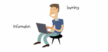
 The Rapid E-Learning Blog - sharing information is not the same as learning

We need to take the information and then package it in a way that allows the learner to use it.  That is when the learning happens.

When I was a young (and thin) video producer, I had to submit my projects for a peer review every Friday.  I wasn’t allowed to explain the intent of the project.  Instead, I had to play the video and then listen to what people got out of it.  One of the goals of this exercise was to see if those watching the videos got the message I intended.  In most cases they didn’t.  Usually, the reason was that my videos were designed for me and not my audience.

Through those peer reviews I learned that my job wasn’t to give people information.  Instead, it was to craft meaning out of the information.  This applies to instructional design, as well.

The e-learning course is just one part of a complex process

As humans, we’re always in learning mode.  We don’t turn learning on or off.  In a sense, learning is like an ecosystem.  We’re continually influenced by information, our social interactions, and experiences.  These shape who we are and what we know.  And this ultimately determines how we act.

We don’t learn just because someone gives us information or tells us that today we’re in a “course.”  We learn because that’s how we’re wired.  So when we do happen to take a course we fold it into our learning ecosystem and make it part of how we understand the world around us.
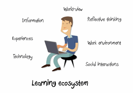
The Rapid E-Learning Blog - our courses fit into a larger learning ecosystem 

While we invest a lot of energy in building our elearning courses, those who take them aren’t as vested.  To them, the course only represents one part of a larger process.  How a person learns and builds understanding involves more than just taking a 30 minute elearning course.

Instructional designers are intentional

An instructional designer takes information and presents it to the learners so that they can develop context.  When it’s done right, it can expedite the learning process which can save time and resources.

Here are a few simple examples.  Look at the text below.  It’s information.  But what does it mean?  Is it in reference to a storage bin?  The sport of boxing?  A shape?

The Rapid E-Learning Blog - box

In the example above, the meaning of the information is up to the learner to decide.  But who knows what they’ll come up with?  Since you could have multiple meanings, you end up having to correct perceptions that run counter to what you are trying to teach.

Now, let’s look at the next image.

The Rapid E-Learning Blog - box image and box text

You see an image of a box and the word.  However, you’re not quite sure of the relationship, if there is one.  This again forces the learner to think through the information.  They might or might not see a relationship. And in turn, might draw the wrong types of conclusions.  Just like the first image, if they draw conclusions that are not consistent with what you are trying teach, you’ll have to spend additional time and resources bringing more clarity to the information.

In the image below, because the box and the word are close together, you have an implied relationship.  This brings clarity to the learner.  You don’t need to explain as much because of the way the image is designed.
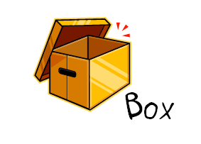
The Rapid E-Learning Blog - relationship between image and text

When it comes to instructional design, everything you put on the screen serves some purpose.  In the example above, we started with the word “box.” By itself it can mean many things.  Without some intentional design the learner can be distracted by irrelevant information or assumptions.  In some learning environments that might be fine and exactly what you want.  But in many it can be a waste of time and resources.

Adding the image of the box made it a little clearer.  However, the final example with the image and text together brought meaning to the word.  When you design your courses, think less about the information, and more about the relationship the pieces of information have to each other and most importantly to the learner.

While the above examples are simple, they do represent something essential to instructional design.  You take information and present it in such a manner that the learner is able to see its relationship and context.

As an instructional designer, you want to focus on meaning.  How is the information important to the learner?  In what context?  Considering that the elearning course is only one part of the learning process, what other ways can you support that learning happens?  Is there a way to leverage the learner’s already existing learning ecosystem?

Finally, can you expedite the learning process by building the right types of relationships between the pieces of information?  Are you using the right images, text, and multimedia?

These are just a few things to consider when building courses.  The key takeaway is that learning is complex and because you build an elearning course doesn’t mean that learning happens.  It involves an intentional act on your part and a commitment from the learner to apply what is learned.  The better you design the information, the more likely the learner is to commit to using it.

I’d love to hear your thoughts on this.  Feel free to share them by clicking on the comments link.

Also, if you liked this article, you might also find these previous posts useful:

Events

Free E-Learning Resources

Want to learn more? Check out these articles and free resources in the community.

Here’s a great job board for e-learning, instructional design, and training jobs

Participate in the weekly e-learning challenges to sharpen your skills

Get your free PowerPoint templates and free graphics & stock images.

Lots of cool e-learning examples to check out and find inspiration.

Getting Started? This e-learning 101 series and the free e-books will help.


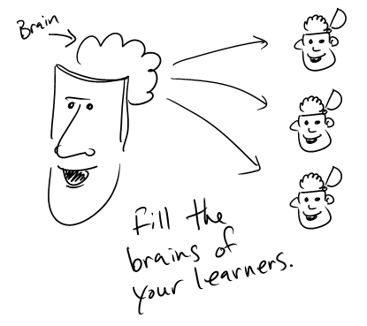
I’m a doodler.  It helps me think.  When I present or talk to people I like to use a whiteboard.  I feel like I’m better able to get my ideas across as I map them out visually.  Not only does this help me express my ideas, it kind of forces me to lay them out in a manner that’s easier to understand.

Dan Roam talks about this in his book The Back of the Napkin: Solving Problems and Selling Ideas with Pictures.  He shares his ideas on how to tell your story visually.  I heard him once summarize his book as “the ability to have someone else grasp what we see in our own minds, in their minds.”

The Rapid E-Learning Blog - full your learner's brain

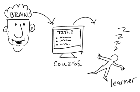
In many ways that’s what we do when we build our elearning courses.  We take information that’s in our minds and then try to package it so that the learner can “see” and use the information.

I get to review a lot of elearning courses and what strikes me is how often the courses are information heavy.  They can get the information out, but many fail at effectively getting the information in.  A lot of that has to do with not knowing how to represent the content visually.

The Rapid E-Learning Blog - how to get information into the brain

Applying Roam’s ideas to your elearning courses helps you structure the content and makes it more visually effective.  To learn more about his ideas, read the book or check out this video of a presentation he gave at the Commonwealth Club.  Of course it would have helped had the videographer actually shot video of what Roam was drawing.

Fortunately, Microsoft also invited him to speak at MIX09 and they did capture his audio and presentation.  As you can see if you watch both, the information makes much more sense when you see it explained visually. 🙂

That’s what I’d like to do.  However, I want to take Roam’s ideas one step further and instead of creating the visuals as static images, make them part of a presentation on a whiteboard and include them in my rapid elearning course.

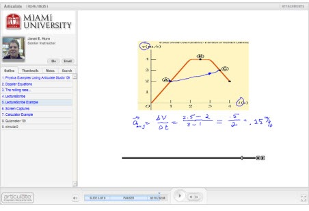
Thanks to Janet Hurn, I was introduced to LectureScribe.  She teaches physics at Miami University and uses it as part of her rapid elearning process.  You can see her demo below.

The Rapid E-Learning Blog - Janet Hurn example

Click here to view the demo.

LectureScribe was developed by Brian C. Dean at Clemson University.  It’s a simple tool that lets you write and capture your whiteboard lectures.  I’d also like to add that the tool is FREE.

The Rapid E-Learning Blog - LectureScribe menu

If you’re interested, Brian has a tutorial on his site that gives you a good overview of how to use the tool’s features.  LectureScribe outputs to Flash (SWF) so that means you can easily add it to a web site or insert it into your own elearning course.

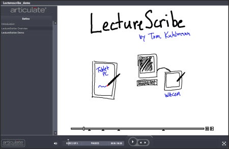
I put together a quick demo where I explain a little more about it.  This lets you see it in action.  In this case, you see the lecture inserted on a slide and I included a couple others and inserted them in a different elearning tool so you can see how they work.

The Rapid E-Learning Blog - LectureScribe demo

Click here to view the LectureScribe Overview.

This is pretty cool application and can be used in a number of ways.   If you teach subjects like math or chemistry, this tool comes in handy.  At a recent conference, I was talking to an engineer who was looking for a way to do something like this and then add the Flash files to an Engage process interaction.  This would work for him.

Since it’s free, it’s also a great tool to give to your learners.  For example, I had my children use it to explain something they learned.  Watching them do that helps me assess their understanding more so than having them take a test.  The cool thing is that if you were a teacher, you could take all of those SWF files from the students and then bring them into your rapid elearning course as a portfolio.  It’s a great way to show parents (or bosses) how well people are learning.

So if you need a whiteboard to share your information and build elearning courses, then LectureScribe is a good way to go.  If you use LectureScribe, I’d love to see some examples.  Also, if you have some ideas of how you could be using this, feel free to share them in the comments section.

Events

Free E-Learning Resources

Want to learn more? Check out these articles and free resources in the community.

Here’s a great job board for e-learning, instructional design, and training jobs

Participate in the weekly e-learning challenges to sharpen your skills

Get your free PowerPoint templates and free graphics & stock images.

Lots of cool e-learning examples to check out and find inspiration.

Getting Started? This e-learning 101 series and the free e-books will help.


Every few years it seems that there’s some hot new trend in the world of training.  Right now it appears that mobile learning is all the rage.  The world of mobile gadgets is converging with an always available wifi network.  This gives us instant access to all sorts of information which fits in well with on-demand training.

Since this part of the industry is so new to many of you, I thought it might be best to hook up with an expert in the industry to learn more.  So I called one of my mentors and a real pioneer in the elearning industry, Dr. Werner Oppelbaumer, to pick his brain.  I asked for his thoughts on mobile learning and where he thinks we should be focusing our attention.

It seems that every year or two the training industry hypes some sort of technology or trend.  Currently, it appears that mobile learning (or m-learning) is the hot thing.  However, we tend to over-promise and under-deliver.  Is this just a fad or is there more to it than that?

M-learning is not a fad.  We have been doing some very detailed studies and have discovered that many people are mobile.  In fact, every three seconds there is someone on this planet that is moving from one place to the next.

The Rapid E-Learning Blog - Startling statistic from the United Nations

We’re not quite sure how long this trend will last, but it definitely presents some opportunities and challenges for the industry.  At the same time, there is always an element of hype that surrounds these newly discovered trends.

So, considering that mobile learning is not a fad, how do we separate the hype from what’s of real value?

The Rapid E-Learning Blog - Dr. Werner Oppelbaumer answers a question

Good question.  We find that most people are distracted by the sexy technology and lose sight of how ineffective it actually is.  Take something like the iPhone for example.  Considering that the world’s population is approaching 7 billion people, only selling 17 million units can hardly be called a success.

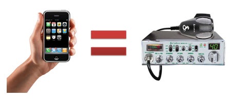
In fact, their sales dropped 24% in the last quarter.  The way I see it, the iPhone is just a fad.  My guess is that this time next year we’ll be talking about some other gadget and the iPhone will probably go the way of the CB radio.

The Rapid E-Learning Blog - Is the iPhone the next CB radio?

We feel the key is to get the most out of all of these technologies without focusing on any one specific one.  For example, all of the mobile devices have things in common, one of which is a small screen.  This presents a problem when trying to push out effective m-learning.

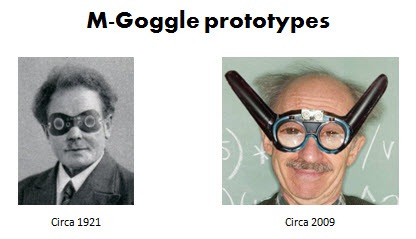
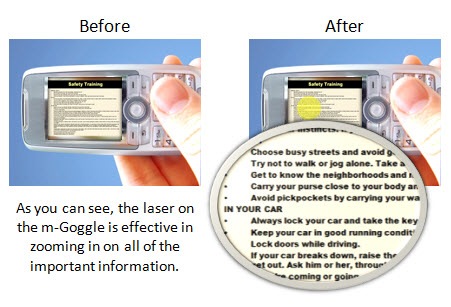
With the small screens you are limited to just a few bullet points.  To remedy this, we’ve developed the m-Goggle which will allow you to magnify the screen’s resolution.  It’s something we’ve been working on since the 1920’s.  We’ve had the solution for years, but had to be patient and let the rest of the industry catch up to us.

The Rapid E-Learning Blog - mGoggles prototype

These goggles give you the best of both worlds.  You can leverage the mobile devices that everyone has and still have room for the bullet points that are so critical for effective elearning.  Our studies have also indicated an additional side benefit.  We found that when men wear these goggles while traveling it is much easier for them to communicate to woman that they are single.

The Rapid E-Learning Blog - example of mGoggles in action

The Rapid E-Learning Blog - Tom Kuhlmann asks a question 

What advice would you give someone interested in learning more about this industry and m-learning?

The Rapid E-Learning Blog - Dr. Werner Oppelbaumer answers a question

I always advocate caution.  Don’t get caught up in the fads.  Instead focus on what’s important.  The best way to sort the important stuff from that which is trivial is to look for a letter before the word “learning.”

My motto is, “With a letter, learning’s better!”

For example, “e-learning” means it is important.  The same with “m-learning.”  Remember, if it has no letter, then it’s most likely a waste of time and not worth your energy.

If you can’t find a letter, then the next step is to look for a number.  Something like m-learning 2.0 is really important.  It has a letter and a number.  Be cautious of trends without numbers.  That means they’re not evolving.

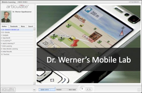
As far as the future of mobile learning, I put together a simple presentation of some of our forward thinking mobile learning technologies.  You are free to share them with the blog readers.  I am excited about where the industry is going and the opportunities it will present to all of us.

The Rapid E-Learning Blog - Dr. Werner Oppelbaumer explains the future of mobile learning

Click here to view Dr. Werner’s Presentation

I want to thank Dr. Oppelbaumer for his insight and sharing his time.  He agreed to monitor this blog post and answer any questions.  Feel free to share comments and questions for Dr. Oppelbaumer in the comments section.  Have a wonderful day!

Events

Free E-Learning Resources

Want to learn more? Check out these articles and free resources in the community.

Here’s a great job board for e-learning, instructional design, and training jobs

Participate in the weekly e-learning challenges to sharpen your skills

Get your free PowerPoint templates and free graphics & stock images.

Lots of cool e-learning examples to check out and find inspiration.

Getting Started? This e-learning 101 series and the free e-books will help.


As mentioned last week, I’m looking for someone to join the team.  I’m posting today since I heard that some almost missed the last week’s announcement because it was at the end of the post.

My goal is to help the community of elearning developers.  I do this by writing blog posts, building tutorials, and helping out in the community.  I’m looking for someone who shares the same passion.

Here’s how I’d describe the person who can do this job:

  • Loves the community of elearning developers and learners
  • Great visual design skills
  • Can write a practical and easy-to-read blog post
  • Knows a thing or two about building elearning courses…and willing to learn more
  • Passionate about great customer service
  • Good humored, thick skinned, and independent worker
  • Is a skilled, engaging public speaker
  • A bonus would be some Flash and web programming skills

If you love what we’re doing with the Rapid Elearning Blog and share a passion for helping people, then you might be the person we need. 

Job details:

  • 100% telecommuting (work from home full-time), offers generous perks, and you get to work for a cool company that is pushing the envelope of the next generation elearning tools and is passionate about customer service.

Here’s what you need to do:

  • Put together a portfolio of what elearning work you’ve done and some writing examples.  If you haven’t written a blog post before, then write a simple one on how to do something in PowerPoint.  Use my blog posts as a guide.
  • Send me your contact info and tell me why you’d be perfect for this job.  Include a link to your portfolio.

You have until Monday, April 6th to get your portfolio and writing samples to me.

Events

Free E-Learning Resources

Want to learn more? Check out these articles and free resources in the community.

Here’s a great job board for e-learning, instructional design, and training jobs

Participate in the weekly e-learning challenges to sharpen your skills

Get your free PowerPoint templates and free graphics & stock images.

Lots of cool e-learning examples to check out and find inspiration.

Getting Started? This e-learning 101 series and the free e-books will help.


Budgets are tight and stock photos cost money.  Because of this you end up using the same stock photos over and over again.  The stock characters are treated like a team of improv performers.  One day they’re all compliant managers and the next day they’re those dreaded sexual harassers from the cubicle down the hall.

One possible solution is to shoot your own photos, which I covered in a previous blog post on creating your own stock images.  However, you can run into issues with the image quality and who can and cannot be in the photos.  Stock photos also raise the issue of representing diversity.  It sure would be great if everyone looked the same. 🙂

There is an easy way around these issues.  And that is to use silhouette characters.  Plus, the silhouette look is kind of hot right now and it’s a good way to make your courses look a little different.

In today’s post, I’m going to show you some easy ways to create and use these characters in your elearning courses.

Microsoft Office Clip Art

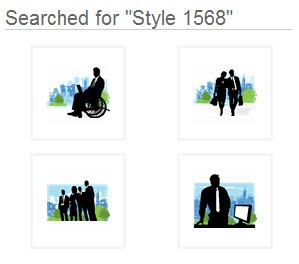
There are already quite a few silhouette characters available in the Microsoft Office clip art.  Do a search for: “style 1568” or “silhouettes” to get started.

The Rapid E-Learning Blog - PowerPoint style 1568

Some of them will be vector images that you can ungroup and manipulate.  You can learn more about that in this post on working with grouped clip art.  And some of the images are going to be bitmapped images where you can’t edit as easily.  In either case, there are quite a few to choose from.

There are also a lot of ideas on how to use the silhouette images.  So even if you don’t use the ones that are provided with the Microsoft package, you can still get some inspiration from the designs that are available and how they’re used.

Create Your Own from Clip Art

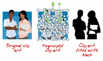
I’ve already covered how to ungroup and manipulate clip art in a number of posts.  If you can’t find the silhouette’s that you want, why not take a different clip art image and convert it to a silhouette image?  It’s easy to do.

The Rapid E-Learning Blog - create silhouettes with clip art

  • Find your clip art.
  • Ungroup it.
  • Select the clip art character and fill with black (in the demo above, I left the notebook white).
  • Regroup the character.

The Rapid E-Learning Blog - create various looks

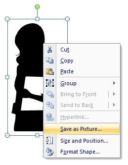
Tip: You’re not limited to black.  And you can make use of some of the graphic effects in PowerPoint to add variety.  You can also right click and save the silhouette as its own image rather than keep it a PowerPoint object.

The Rapid E-Learning Blog - save the images 

Create You Own from Photos

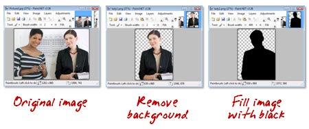
You can pull characters from stock photos or your own pictures.  All you do is separate the character from the background and then color the person with a solid color.  This approach is effective because you can shoot your own photos and not worry about lighting and getting the best image.  As long as it is clear and has the right pose, you’re fine.  Once it’s filled no one can tell what the original looked like.

The Rapid E-Learning Blog - paint images black

  • Open the photo in a graphics editor.
  • Pull the person out of the background.
  • Fill the character with black and save the image.

Tip: If you want a transparent background with the image make sure to save as .gif or .png.  You don’t need a fancy graphics application to do this.  In fact, I did this demo in Paint.net which is a free download.

Download Some Free Ones

I’m always amazed at the free resources available online.  Do a search for “free silhouettes” and you’ll come up with all sorts of resources.

The Rapid E-Learning Blog - free vector graphics

Tip: Before you use the images for a commercial project, you want to verify the rights that you have for the images.  Some are only available for personal use. Also, only download stuff from reputable sites.

There are a lot of interesting things you can do with silhouettes.  The trend today seems to be mixing them with very vibrant colors.  Using them is an easy solution to having enough images to use in your courses and creating something that is also visually compelling.  To learn more, search how silhouettes are used in advertising and print media.  The iPod ads are a good example.  You might get a lot of cool ideas.

How would you use them in your courses?  Share your ideas by clicking on the comments link.

Events

Free E-Learning Resources

Want to learn more? Check out these articles and free resources in the community.

Here’s a great job board for e-learning, instructional design, and training jobs

Participate in the weekly e-learning challenges to sharpen your skills

Get your free PowerPoint templates and free graphics & stock images.

Lots of cool e-learning examples to check out and find inspiration.

Getting Started? This e-learning 101 series and the free e-books will help.


Last week was a blur.  Monday started with Articulate Live ’09 and ended with the eLearning Guild’s Annual Gathering.  In between, I delivered three presentations, met hundreds of people, and we announced the winners of our Guru Awards 2009.

While it was an exhausting week, I love meeting you all and learning about what you do.  Thank you to all who came by and said hello.

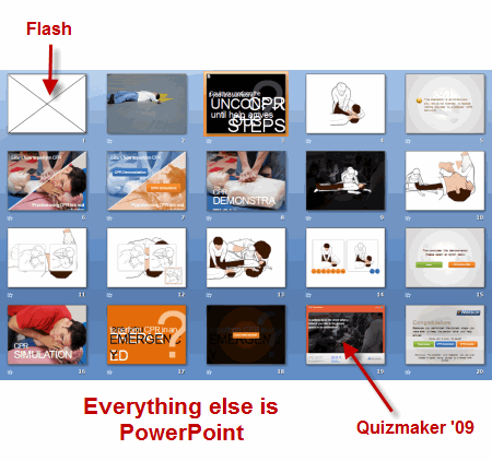
Speaking of the guru awards, I was looking at the source files for the CPR demo and was impressed to see that it only contained twenty PowerPoint slides.  Looking at it, I assumed that it had more slides and a few more bells and whistles.  But that’s not the case.  For the most part it’s all PowerPoint.

The first slide is a Flash animation and the CPR simulation was created in Quizmaker ’09.  Other than that, the rest of the course content was built in PowerPoint.  I think it’s a perfect example of how you can use PowerPoint to build effective and engaging elearning courses. 

The Rapid E-Learning Blog - slide view

That’s why I want to look at PowerPoint 2007 and how it can help you build better courses and save time building them.   But before we look at PowerPoint 2007, let’s do a quick review of what’s happening when you build rapid elearning courses with PowerPoint.

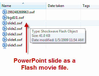
A lot of people confuse building a PowerPoint presentation with using PowerPoint to build an elearning course.  There’s a difference.  When you build a rapid elearning course, what you’re really doing is using PowerPoint’s easy authoring environment to build Flash movies without requiring you to learn Flash.  PowerPoint’s giving you a blank screen to create what you want.  When you publish the course, the slide with the audio, images, and animations is converted to a Flash movie file (.swf). 

The Rapid E-Learning Blog - slides converted to Flash

The secret to using PowerPoint to build your rapid elearning courses is getting the most out of PowerPoint.  That means knowing how to work with objects on the screen and using the animation feature.  As you figure this out, you’ll build better courses and you you’ll build them a lot faster.  And that’s why PowerPoint 2007 is going to give you a lot of value.

With PowerPoint 2007, you’ll be able to increase your productivity.

  • Built-in graphics and design features will speed up the production of many of your images and objects.
  • Layer controls makes it easier to work with layered objects.  That means you can add more complexity to your slides because you have better management of the objects on the screens.
  • Swap images on the screen.  This is one of the biggest time saves.  Now you can pre-build all sorts of animations and content using placeholder images.  Insert one of the pre-built elements onto a slide and then quickly swap the placeholder image with a real one.  And you’re all done.

Let’s take a close look at PowerPoint 2007 and what it has to offer.

Ribbon Toolbar

The ribbon’s not going to add a lot to your course development, but I thought I’d mention it because it’s one of those love/hate features.  And I know that once I talk about PowerPoint 2007 I’d hear complaints.  So this is to get those out of the way.

I’ll admit it.  When I first started working with the ribbon toolbar, like many of you, I couldn’t stand it.  But I’m a fan now.  While there are some things that still bug me a little, I do find it much more intuitive and I actually prefer it over the previous versions. 

The Rapid E-Learning Blog - PowerPoint ribbon toolbar

Graphics formatting & design themes

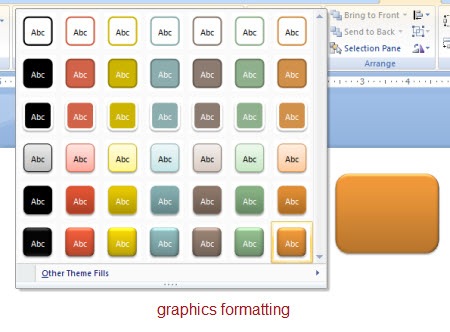
You get a lot of nice graphics formatting features that will speed up making some of the images you’ll need for your course.  There are a number of presets and customization options.  You can format shapes, pictures, and text.

I find that I spend less time in other graphics applications because PowerPoint gives me a lot of what I need.  That is where the time savings comes in, especially if you don’t have a graphics application to build buttons and other visual elements.

The Rapid E-Learning Blog - PowerPoint graphics formatting

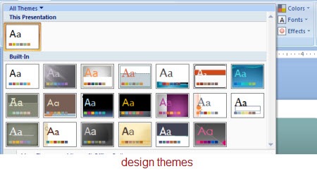
You can create design themes built around colors, fonts, and format effects.  Using the theme settings lets you quickly apply universal changes to your course content.  Gone are the days of changing individual objects on each slide.  Again, this is a very powerful feature and another time saver.

The Rapid E-Learning Blog - PowerPoint design themes

Layer control

PowerPoint’s animation feature lets you build some pretty complex animations.  However what usually holds people back is that managing the animations and the layers on the slides is a hassle.  It’s just not worth the time.

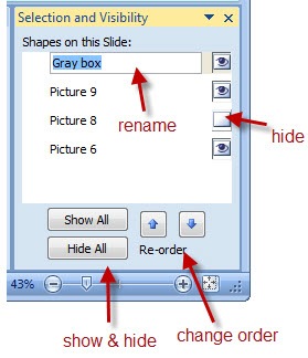
That’s all changed with PowerPoint 2007.  Now you have better control of your layers.  You can turn them on or off and change their order.  You can even rename them so it’s easy to identify what the different objects are.

The Rapid E-Learning Blog - PowerPoint layers control

Now that you have this layer control, you are free to do more with the objects on your slide.  Another benefit is that if you disable the layer, then it doesn’t show up when you publish the slide.

Swap pictures

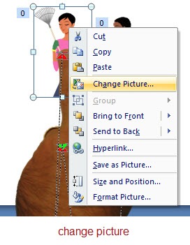
The most powerful feature in PowerPoint 2007 is the ability to swap out images.  All you do is right click on the picture and select “Change Picture.”  That’s it.  What makes it so powerful is what that lets you do.

The Rapid E-Learning Blog - PowerPoint swap objects

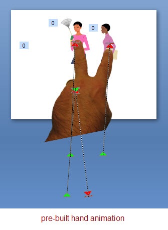
The reason you save all of that time is because the animated sequences stay intact.  The only thing that changes is the image.  In the previous versions of PowerPoint, you could build some nice animations, but if you wanted to edit the image or your client wanted a different looking shape, you had to break it apart and rebuild it.  That cost a lot of time.

The Rapid E-Learning Blog - PowerPoint pre-build animations

Here’s how I use this feature.  I pre-build a lot of my animations with placeholder images.  Then when I want to use that animation on a slide, I copy and paste it.  Right click and swap the image.  And then I’m done.  Easy as that. The first animation might take me some time to build, but reusing it only takes me a few seconds.

That means you can reuse a lot of your content which will save you hundreds of hours in development time.  A good strategy
would be to pre-build some animations and then you have them available to use when you need them.  In a future post, I’ll give away some pre-built animations.

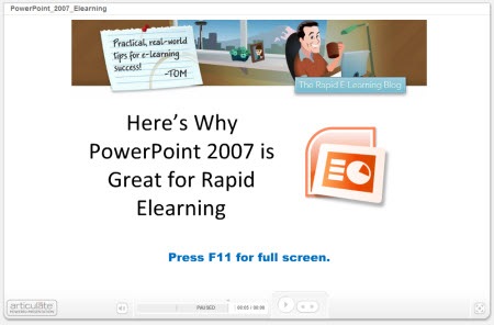
Here’s a quick demo that shows some of these ideas in action.  I broke them into chunks so that it’s easier to navigate.  If anything look at the last one where I demonstrate how easy it is to use a pre-built animation.

The Rapid E-Learning Blog - PowerPoint 2007 overview

Click here to view the demo.

As you can see, I can pre-build my content in PowerPoint and then easily modify it using the PowerPoint 2007 features that I described above.  By doing so, I save time and money and still have an opportunity to build effective elearning.

PowerPoint’s a great authoring platform for elearning because of it’s easy to use and many people already have the basic skills to get started.  It’s just a matter of learning to make the most of the tools.  The returned value is that you can commit more time to the course content and building better learning experiences.

PowerPoint is a very capable tool that can be used to deliver effective, engaging, and interactive elearning at an affordable cost and at the speed of business.  In this economy, that’s a winning solution.

Let me know what you think by clicking on the comments section.  If you have some PowerPoint 2007 tips and tricks, feel free to share those as well.

Events

Free E-Learning Resources

Want to learn more? Check out these articles and free resources in the community.

Here’s a great job board for e-learning, instructional design, and training jobs

Participate in the weekly e-learning challenges to sharpen your skills

Get your free PowerPoint templates and free graphics & stock images.

Lots of cool e-learning examples to check out and find inspiration.

Getting Started? This e-learning 101 series and the free e-books will help.


I’m in Orlando this week at the eLearning Guild’s Annual Gathering.  If you happen to be there swing by the Articulate booth and say hello.  On Wednesday, I’ll be facilitating a session on rapid elearning at the ID Zone.  In fact, here’s a link to a resource page for that session.  It has a bunch of examples of rapid elearning courses including our recent Articulate Guru Award winners.

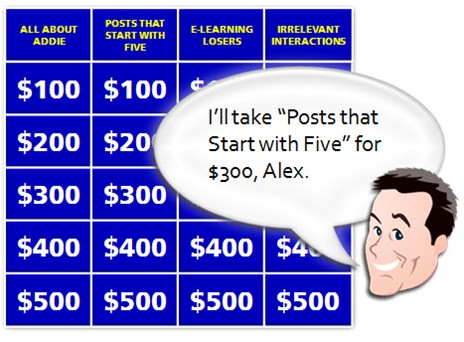
The Rapid E-Learning Blog - I'll take post that start with the numebr 5 for $300, Alex.

Many of the emails I get ask about information that I’ve gotten in previous posts.  So today’s post is going to review 10 posts that each offer 5 tips and tricks.  That gives you quick access to 50 rapid learning tips and tricks.  I’ve included some additional comments and links for those already familiar with the posts.

5 Ways to Jump Start Your Next E-Learning Project

The Rapid E-Learning Blog - Jump Start Your E-Learning

5 Ways to Jump Start Your Next E-learning Project (July 2, 2007)

If you’re like me you find that there are some things you seem to do over and over again in your elearning courses.  That can run the gamut from project management, meeting with subject matter experts, and building the same types of interactions.  This post discusses ways you can jump start that next project.

I think a missed opportunity for many rapid elearning developers is not pre-building content.  It’s easy enough to do and once you’ve made the investment, it pays off big time on future projects.

I have pre-built scenarios that I use for Quizmaker ’09 and something similar for scenarios I build with PowerPoint.  I even have a number of pre-built animated sequences.  They really speed up my production.  In fact, if I want to add an interactive scenario to my course, I can do so with just a few mouse clicks.  That will give me the infrastructure, and then all I need to do is add my content and swap out the graphics.

5 Myths About Rapid E-Learning

The Rapid E-Learning Blog - 5 Myths About Rapid E-Learning

5 Myths About Rapid E-Learning (July 31, 2007)

Rapid elearning is all about creating the tools for you to build effective courses without having to be a programmer.

When was the last time you took your resume to a typesetter?  It’s probably been a while, huh?  However, it used to be the norm when you were looking for a job and wanted to have the perfect resume.  Then the world changed.  Computers came on the scene and there were only a few experts who could build resumes using that fancy desktop publishing software.  Soon after, we got our own computers and now most of us build our own resumes; or we just use online sites like monster.com.

In many ways, the same is true for rapid elearning.  Years ago only the brainiacs had access to computers and they wowed us with their programming expertise.  That was when computers were the size of your fridge and had reel-to-reel players.  Building a computer-based training course was expensive and not very practical.  Then the personal computer arrived and so did the software to build elearning courses.  However, to build an effective course required access to a programmer or the money to outsource it.  Now, the rapid elearning software is filling the gaps.  The software automates a lot of the production process and allows you to deliver training that is effective and relatively inexpensive.  It’s also bringing elearning to industries and small businesses that a few years ago couldn’t afford it.

5 Ways Web 2.0 Can Make You a Better E-Learning Designer


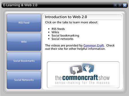
The Rapid E-Learning Blog - Web 2.0 Can Make You a Better E-Learning Developer

5 Ways Web 2.0 Can Make You a Better E-Learning Designer (November 6, 2007)

If there’s ever been a time to improve your skills, it’s today.  Considering our current economy and the fact that training groups are usually the first casualty of budget cuts, you want to do all you can to improve your skills and network with others in the industry.

This post examines ways to do that by using some of the new social media technologies to learn more about what’s going on in the industry and connect with others.

One of my favorite books is Kelley’s How to Be a Star at Work.  Check out Fast Company’s article, Are You a Star at Work?  It gives you a good overview of the book.   It was written in 1998, way before all of this social media stuff, and yet it fits right into what we see with the social media explosion.  It’s a worthwhile read if you want to demonstrate your value and be connected to the right people and activities.  It also makes what you do that much more meaningful.  Read the book and then use some of the new technologies to apply the principles.

5 Simple Ways to Get Started with E-Learning Development

The Rapid E-Learning Blog - Getting Started with E-Learning

5 Simple Ways to Get Started with E-Learning Development (December 11, 2007)

If you want to know how to get started with elearning and how to improve your skills, this post is worth revisiting.  This next statement is probably controversial, but if I had a choice between learning instructional design or storytelling, I’d go with storytelling.  Do you know why?  Because good storytellers engage learners.  This doesn’t mean that I’d opt out of learning instructional design.  I’d just consider learning to be a better story teller.  People remember good stories because they can relate to them and they can connect the course content to real life.  Can we say the same for a lot of the elearning we produce?

I’d add three more books to the list that aren’t in the original post because I think one of the biggest challenges people have is combining visual design with the course content.  I’m a big fan of these three authors and highly recommend what they do.  Their concepts applied to rapid elearning will take your courses up a notch because they combine good storytelling with visual impact. The links to Amazon produce a small commission.

5 Secret Tips from an E-Learning Pioneer

The Rapid E-Learning Blog - SMART Goalsetting with Werner Oppelbaumer

5 Secret Tips from an E-Learning Pioneer (April 1, 2008)

There are few who have been around the elearning industry as long as Dr. Werner Oppelbaumer.  He offers practical insights and isn’t afraid to tell it like it is.

In this interview he discusses everything from measuring that elusive return-on-investment (ROI) to the future of mobile learning and all things web 2.0.  He also gives you some tips on an inexpensive way to reward and motivate your learners.

5 Ways to Bring the Web Inside Your E-Learning Courses

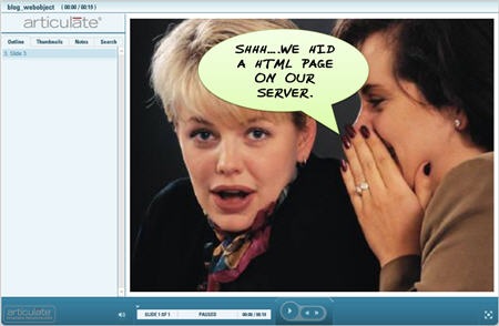
The Rapid E-Learning Blog - Bring the Web Inside Your E-Learning

5 Ways to Bring the Web Inside Your E-Learning Courses (May 27, 2008)

Social media and web 2.0 is all the buzz.  The good news is that there’s no reason why you can’t leverage many of those technologies in your rapid elearning courses.  In this post, I review some different online applications and ways to leverage the “web object” feature of your rapid elearning software.

Here are some additional examples that I am using at the conference this week.

  • Add a virtual world to your course.  You’ll be asked to download the virtual world player to view this.  You could use something like this to create a tour.  If you click on the people there are notes that can provide instructions.  I didn’t add much to the room yet, but I was thinking it would be a great way to create a crime scene and have the learner look for information and clues to solve the crime.
  • Add a chat feature to your course.  You could offer a day and time where the subject matter expert is available to answer questions.  You could have the chat linked to a help desk.  There are all sorts of possibilities.

5 Must-Know PowerPoint Tips That Will Save You Time

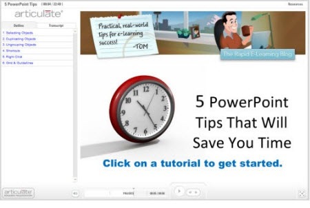
The Rapid E-Learning Blog - 5 PowerPoint Tips to Save Time

5 Must-Know PowerPoint Tips That Will Save You Time (September 16, 2008)

A lot of your success with rapid elearning hinges on getting the most out of PowerPoint’s great authoring environment.  You can never have too many shortcuts when it comes to working with PowerPoint.  In this post I cover some simple tips and tricks that I’ve learned over the years.  They help make working with PowerPoint more productive which translates to saving time and money and getting your projects done ahead of time.

5 Easy Tips to Whip Your Slides Into Shape

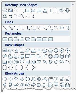
The Rapid E-Learning Blog - PowerPoint shapes

5 Easy Tips to Whip Your Slides Into Shape (October 7, 2008)

This post shows you some time-saving tips to use when working with PowerPoint shapes.  You’ll learn to apply various formatting features, make custom edits, and create the shapes you want.

5 Common Quiz Question Mistakes (And How to Avoid Them)

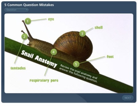
The Rapid E-Learning Blog - 5 Common Quiz Question Mistakes

5 Common Quiz Question Mistakes (And How to Avoid Them) (October 28, 2008)

Good overview of common quiz mistakes when assessing the learner.

Going back to the myths post above, this quiz I built is a good example of how the rapid elearning tools have advanced.  First, it’s a simple quiz, but media rich.  Once I had the assets, it took me about an hour or so to build it.  Many rapid elearning tools are formed based.  The software provides the framework for the course and you add your content into forms.

However, the forms are static so all of your content starts to and behave the same.  That’s not case with the quiz I made for this post.  Now I can break the form and build my own Flash animations quickly.  It’s another example of how rapid elearning is evolving and giving you more power and flexibility.  Soon, you’ll be able to build even more complex scenarios and interactions with what I like to call PowerPoint comfort.

5 Easy Ways to Add a Glossary to Your E-Learning Course

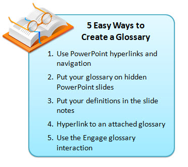
 The Rapid E-Learning Blog - 5 Easy Ways to Build a Glossary

5 Easy Ways to Add a Glossary to Your E-Learning Course (February 24, 2009)

Good tips and tricks to add a glossary.  Use them to define words, footnote information, or as a way to add additional content to your courses.  This helps keep your course content light and still gives you a way to share more with your learners.  It also gives your learners control to choose what additional information they want or need when they need it.  The tips also show the versatility of the rapid elearning tools.

I hope you enjoy revisiting some of the previous posts.  I look forward to your thoughts.  Feel free to share them by clicking on the comments link.

Also, if you happen to be in Orlando swing by the Articulate booth or attend one of my sessions.  I’d love to meet you.

Events

Free E-Learning Resources

Want to learn more? Check out these articles and free resources in the community.

Here’s a great job board for e-learning, instructional design, and training jobs

Participate in the weekly e-learning challenges to sharpen your skills

Get your free PowerPoint templates and free graphics & stock images.

Lots of cool e-learning examples to check out and find inspiration.

Getting Started? This e-learning 101 series and the free e-books will help.


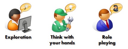
I like to download the TED videos and watch them when I travel.  On my recent flight to Atlanta, I watched IDEO’s Tim Brown talk about the powerful relationship between playing and creative thinking.  The essence of his presentation is how to design a better product and user experience.

He discussed three key elements: exploration, thinking with your hands, and role playing.  I jotted down some thoughts about how they might relate to those of us who build elearning courses.

The Rapid E-Learning Blog - exploration, think with your hands, and role playing

Exploration

Building an effective elearning course is more than just applying the mechanics of instructional design.  It also involves a creative approach to visual design and how you present the content to the learner.  This is as much art as it is science.  So it’s important to have fresh ideas and renewed perspective.

As Brown asserts, you can get this with “exploratory play.”   He talked about focusing on quantity and not quality of ideas.  You don’t want to self-edit.  Instead you want to push your creative thinking by generating ideas.

Teams I’ve worked with in the past have done this as a routine.  For example, in one session we tried to come up with 50 ways to guide a person through a course.  Some were kind of goofy, but we did end up having the foundation for quite a few future courses.  At another session, we designed 30 ways for the learner to advance through screens without using an obvious button or instructions to “click here or there.”  That was a challenge.

Most of our ideas didn’t make it into production.  But that’s OK.  The goal was quantity and not quality.  Because we ran out of obvious ideas quickly, we really had to stretch our creative thinking to produce more.

Even if you don’t have a team for this type of brainstorming, there are some things you can do on your own.  I have a folder on my computer where I collect ideas.  When I read something, view a course, or find an interesting graphic style, I save it to the folder.  I can go months without every looking at what’s in there.  But whenever I need inspiration, I go to the folder and do a scan of what I have.  It hasn’t failed me yet.

The Rapid E-Learning Blog - idea folder

If you do follow this approach to collect ideas, OneNote and Evernote are two good tools because you can easily do screen and text captures.  The captures preserve where you got the idea, and you can add your own notes and tags for quick reference and searching.

Think with Your Hands

Brown talked about “construction play” where you think with your hands.  He gave some examples of prototyping.  I see this as an extension to the exploratory play above.  In exploratory play you generate ideas.  And then you transition to making some of them real by thinking with your hands or attempting to actually build something.

A good place to start is by breaking down one of the ideas you’ve collected in your idea folder.  It doesn’t need to be anything fancy.  It’s just a working model or proof of concept.  For example, Brown showed how IDEO prototyped a surgical instrument with a marker, a clip, and an old film canister.

In previous posts, I’ve talked about deconstructing the work of others.  I showed you how to design your own templates and how deconstructing courses will help you develop the skills to build better courses.  I see deconstruction as part of the “playing with your hands” process.  You’re not trying to copy the work of others, but by pulling it apart and building your own versions you end up learning how to do things in a new way.  These are techniques you can apply to other projects.

The Rapid E-Learning Blog - prototype

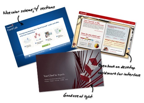
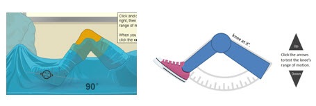
When I play with ideas, I don’t commit a lot of time to the details.  I use simple shapes and test them out first.  For example, one of my favorite elearning sites is Edheads*.  They have some great elearning courses that are very interactive.  Similar to the frog dissection demo, I’ve been playing with ways that I’d replicate some of the functionality of the virtual knee surgery course in PowerPoint without using Flash.

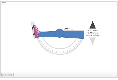
 The Rapid E-Learning Blog - prototype example

Click here to view the knee range of motion prototype.

As you can see, the prototype is nothing fancy.  The main point is to play around with an idea and make it something tangible.   You’ll learn new techniques which will help you be more creative and produce your courses faster.

The virtual knee prototype above only took a few minutes to build.  If a customer wanted an example of a rapid elearning course with some interactivity, I could create a prototype like this on-the-fly because I’ve made it a habit of building them as part of my professional development.

Role Play

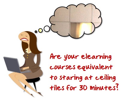
For me, one of the most striking parts of Brown’s presentation was when he showed the image from the emergency room video.  It was shot from the perspective of a patient.  When they reviewed the video, all they saw was 30 minutes of the acoustic tiles on the ceiling.  Immediately, I could empathize with the patient’s perspective.  And I could already think of ways to improve the service.  If I were trying to design a better experience for the patient, this type of role play would really help.

The Rapid E-Learning Blog - empathize with learners

So, how does this apply to elearning?  Glad you asked.  Ultimately, you want to design a product that serves the learner.

When you sit down and look at the courses you build, are they ones that you’d enjoy going through?

When I was at the conference in Atlanta, someone asked me for some ideas on how to get her instructional designers and subject matter experts on the same page.  She was struggling with how to get her subject matter experts to frame their expertise in a way that was relevant to learners.  And then have her instructional designers understand how to build the right type of learning experience.

I referenced the role play ideas from Brown’s video that I had watched on the flight over.  We talked about the need for the designers and subject matter experts to see the course from the perspective of the
learner and not the information.

The Rapid E-Learning Blog - role playing

The goal is to design an experience for the learner.  And in doing so, make the subject matter relevant.  Perhaps there was some sort of role play exercise that could put the subject matter expert and instructional designers in the position of the new learner.  Here are some ideas.

  • Become a new learner.  Sign up for an elearning course and then see what works for you and what doesn’t.  There are always things to learn about navigation, the user interface, and interactions that engage you.  Take what you learn and apply it to your own elearning course.
  • Meet with recent learners and get their perspectives on how to structure the content.  Ideally, you’d bring a recent learner into the process as part of your normal development cycle.  They’ll help you keep the course real.  If not, at least try to get their perspective at the beginning of the design process.
  • You could quickly prototype a course and then watch a learner go through it.  Find someone who has no vested interest in the course.  Watch how they interact with the content.  You might be surprised at what they do.  You might also be surprised at what they feel about the content.
  • For each piece of information you present, apply an expected action.  “If the learner knew this information, what would it look like if I saw it?”  Build your course around those expectations.

Role playing is about designing the best user experience.  The key in all of this is to put yourself in the position of the new learner.  And by doing this, you’ll make a course that is relevant and successful.

As you watch the video, you’ll probably get different insights.  These are three that came to mind and ones that I think can be applied in a practical way.  I’m interested in hearing your thoughts on the video or what I shared in this post.  Add you comments here.


  • If you liked Tim Brown’s video, you might want to check out the books on creativity by his IDEO partner, Tom Kelley.  I’ve enjoyed both The Ten Faces of Innovation and The Art of Innovation.  They’re both good books on creativity and innovation.
  • Edheads.org builds interactive elearning courses for kids and then makes them available for free.  I noticed that they’re looking for some donations.  If you have a few dollars to spare, they could use a donation to build another free course for kids to learn from and enjoy.

Events

Free E-Learning Resources

Want to learn more? Check out these articles and free resources in the community.

Here’s a great job board for e-learning, instructional design, and training jobs

Participate in the weekly e-learning challenges to sharpen your skills

Get your free PowerPoint templates and free graphics & stock images.

Lots of cool e-learning examples to check out and find inspiration.

Getting Started? This e-learning 101 series and the free e-books will help.


In today’s post, I’m going to show you five easy ways to build a glossary for your rapid elearning courses. You can use these tips to define words, footnote information, or as a way to add additional content to your courses.  This helps keep your course content light and still gives you a way to share more with your learners.  It also gives your learners control to choose what additional information they want or need when they need it.

 The Rapid E-Learning Blog: 5 Easy Ways to Create a Glossary

1.  Use PowerPoint hyperlinks and navigation

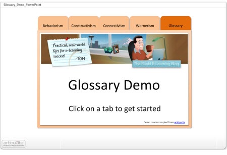
In the demo below, I disabled the default player navigation and created my own via the notebook tabs.  This approach is very easy to do and works well for a shorter course with limited navigation needs.

The Rapid E-Learning Blog: PowerPoint as a glossary

Click here to view the demo.

  • The tabs are built in PowerPoint and I use hyperlinks to get from one slide to the next.  I disabled the published player navigation so there’s no concern over the learner clicking back/forward buttons and ending up on the wrong slides.
  • The glossary tab contains links to all of the definitions that are on separate slides.
  • To make the definition slides, I duplicated the glossary tab slide and added the definitions.  When you click on the glossary, you get the main tab.  If you click on a word, you get a duplicate slide where I added the information specific to that word.

2.  Put Your Glossary on Hidden PowerPoint Slides

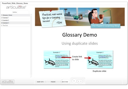
In this example, everything is still built with PowerPoint.  If you want to define a word, create a duplicate slide and then hyperlink from the word to the duplicate slide.  On the duplicate slide, you add additional content like the definition.  The demo shows three ways to approach this.

The Rapid E-Learning Blog: PowerPoint slide to hold definitions

Click here to view demo.

  • When you hide slides, you need to use the hide slides feature in the rapid elearning application and NOT the hidden slides in PowerPoint itself. Hidden slides in PowerPoint will not publish.
  • The secret here is to duplicate the slide with the defined word.  When the learner clicks on the word they link to the duplicate slide which gives the appearance of being on the same slide.
  • What you do on the duplicate slide is up to you.  You can add animations or just have the definitions appear on the slide.  So it can be as media rich as you want it.
  • Since you’re linking away from the actual slide, you need to find a clear way to get the learner back on track.  I used “close” buttons and made them prominent.  If you’re using Presenter ’09, you don’t need to do this because you can use the slide branching feature as well.

3.  Put Your Definitions in the Slide Notes

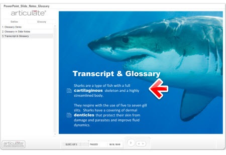
In an earlier post I discussed ways to get more out of your slide notes.  One of the tips was to use it as a glossary.  In the example below, you’ll notice that I changed the notes tab to read “glossary.”  Whenever there’s a term that is defined or footnoted, I can add that to the PowerPoint notes section and make it available to the learner.

The Rapid E-Learning Blog: Use PowerPoint slide notes for glossary

Click here to view the demo.

  • The previous techniques required a link away from the slide.  In this one, the learner stays on the slide and clicks the glossary tab.  So there’s no concern about the learner having to navigate away from the slide.
  • You do need to inform the learner when they can find more information in the glossary.  This is easily done by changing the font or adding some sort of visual clue like an icon.
  • I like this glossary technique because the glossary is slide-specific and not part of a larger glossary that I have to maintain.  I just add the content as I need it.

4.  Hyperlink to an Attached Glossary

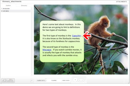
Here are three ways you can use the attachment feature to add a glossary.

  • Rename the attachments link to “glossary.”  Then add each term as a link via an attached document or URL.  This probably works better for short courses with just a few terms.

The Rapid E-Learning Blog: use attachment feature to add terms

  • Add a glossary as an attached document or URL.  You put all of the terms together in one document.  When the learner clicks on the link, they can access that document and look up terms.  This approach probably works well if you have a lot of extra information but don’t expect the learner to look up terms throughout the course.  Using the URL option is nice because you can update the web page without republishing the course.
  • Create a glossary and save as an html page.  Add named anchors that point to the text on the page.  You can learn more about doing that here under “name attribute.”  Attach the glossary.html and use PowerPoint hyperlinks to link words on the slide to anchored text on the html page. Check out the demo below.

The Rapid E-Learning Blog: Use attached glossary and anchored text

Click here to view demo.

5.  Use the Engage Glossary Interaction

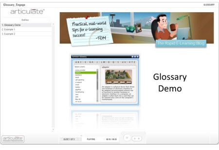
Not all of you have Engage, but if you do, there’s a really nice Glossary interaction.  I find it to be the easiest way since all of the programming is done and all I have to do is add the terms and definitions.  I also like that I am not limited to just text.  I can add audio, images, and all sorts of multimedia like video and Flash animations.

The Rapid E-Learning Blog: Use Articulate Engage glossary interaction

Click here to view demo.

  • You can insert the glossary on a slide, but I prefer to use it as a drop down tab.  If the learner wants to look up a term or definition, they can click on the glossary tab and when finished go right back to where they were.  This is good to help maintain the flow of the course.
  • Make sure to let the learner know when a term is defined so that they know what to expect in the glossary.

These are simple yet effective ways to add a glossary to your elearning course and they don’t require a lot of programming and maintenance.  If you have some ideas or suggestions, feel free to share them with the rest of us by clicking on the comments link.

*Demo content copied from Wikipedia.  Shark music is the theme to Jaws by John Williams.

Events

Free E-Learning Resources

Want to learn more? Check out these articles and free resources in the community.

Here’s a great job board for e-learning, instructional design, and training jobs

Participate in the weekly e-learning challenges to sharpen your skills

Get your free PowerPoint templates and free graphics & stock images.

Lots of cool e-learning examples to check out and find inspiration.

Getting Started? This e-learning 101 series and the free e-books will help.


Last week was great.  I was in Atlanta at the Training 2009 and got to meet many blog readers who presented me with some interesting elearning challenges.  I love it.  The problem solving is fun and a great learning opportunity. 

During the conversations, one of the things that really stood out was how tough the economy has made it for many in the learning industry.  The way it seems to work is that organizations restructure and somewhere in the process the training people are usually the first to go.  Even if you don’t get laid off, there’s always the concern that you will.  This creates a lot of stress.  I had a lot of people ask what they can do to avoid this. 

There are few guarantees in life.  However, when organizations do make tough decisions they always lean on those things that provide the most value.  So if I were to offer any advice, it would be to provide the most value that you can.  You don’t want to be seen as an expense to the organization.

The best way to bring value is to align your work to the organization’s core mission.  The further you get from meeting those goals, the less value you bring.  Unfortunately, training groups typically are reactive to the organization’s goals and not proactive.  That means they end up doing a lot of stuff to fix mistakes, rather than promoting ways to move things forward.

If there’s good news in all of this, it’s that rapid elearning brings a lot of opportunity in these tough economic times.  There’s a need to do more with less.  Rapid elearning fits that bill.  Switching from instructor led training to elearning makes sense.  And using rapid elearning tools as the starting point makes more sense than hiring costly multimedia developers.

The challenge in all of this is that rapid elearning has to bring real value and isn’t just a bunch of PowerPoint files converted to Flash and then put online.  In fact, during the conference, I participated in a Rapid Elearning Shootout with other vendors.  The goal was to take a linear PowerPoint file and convert it to engaging and interactive content using our tools.

Articulate won the shootout.  However, what I want to focus on is how I restructured the content, because it speaks to ways that you can offer more value to your organization using rapid elearning software.

Not Everything Needs to Have Bells & Whistles

Following is a link to the original version.  This type of course is typical of what many of you see in your organizations.  While it’s not necessarily the most engaging presentation, it is informative.  And believe it or not, a lot of learners like something like this where there are few animations and they can quickly scan the information. 

The Rapid E-Learning Blog: original PowerPoint course

View the original course here.

If this is all your organization wants, then it works.  It might not be the perfect course or highly interactive, but you can fight “the man” and argue your case for engaging elearning later when the economy is better.

I already know that some of you are rolling your eyes and saying that this is the worst of elearning.  That’s not true.  The worst of elearning is paying a Flash programmer to produce something like this for a lot more money.  Trust me.  I talk to people all the time.  I’m amazed at what they’re being charged for basic courses that they could do themselves for a lot less.

By creating rapid elearning courses, you bring value to your organization because you can drive down the cost of production. However, no software replaces the need for sound instructional design.

Convert a Linear Course to Be More Interactive

Now let’s take a look at my version of the same course.  I took a typical linear PowerPoint course and converted it to something that is more focused on helping the learner meet the organization’s goal, which is to sell the clock.

The Rapid E-Learning Blog: modified PowerPoint course 

View the updated course here.

As you review it, don’t get hung up on the content which is irrelevant.  Instead, focus on how I converted the linear information to something that is a more relevant learning experience.  You’ll notice that the approach is generally simple and easy to create.  And, you’re not really losing any content. 

People aren’t course-deficient.  Here’s the deal.  Your organization isn’t saying that they want people taking more courses.  What they want is that people meet goals.  The course is a means to meet those goals.  Focus on that outcome and not on just creating elearning courses. 

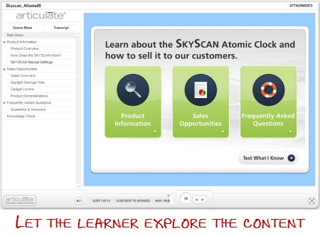
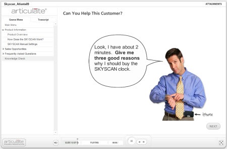
  • The goal of the course is that the learner is able to sell Skyscan clocks.  I restructured the info-centric slides to be more customer-focused.  I felt that the original file was too focused on the clock information and not enough on working with a customer to sell the clock.  So I broke the info into three sections focused on product information, sales opportunities, and customer FAQs.  I also made the assessment based on a customer interaction rather than a pure knowledge check.  You’ll notice that the content isn’t much different, it’s just restructured.

 The Rapid E-Learning Blog: open navigation

  • I freed up the navigation so that the course seemed more exploratory and less like a linear course.  That gives the learner the opportunity to go where they want rather than me forcing them all to go down the same path.  Clicking on slides in a linear order has nothing to do with them selling the clocks.  Ultimately, they pass or fail by selling product. 
  • I gave the learners immediate access to the assessment.  As I stated earlier, my concern is less about the learners “taking the course” and more about them being able to sell the product.  My measure of success is not slides viewed.  It’s that through the assessment they can demonstrate the level of understanding they need to be effective at selling clocks. 

Because you are limited to PowerPoint doesn’t mean you can’t build effective elearning.  I converted some of the slide content to Engage interactions, but for the most part the essence of this course is created in PowerPoint, including most of the graphics.  That’s a big time saver. 

Many of you are limited to PowerPoint and don’t have access to Flash programmers.  That’s OK because the rapid elearning tools fill the gap.  It just requires that you make the most of the tools you have.  You’ll save time and money, build better courses, and be an asset to your organization.

  • A large part of elearning is visual design.  If you want your learners engaged, make sure you start with an inviting design.  If the original was an orientatio
    n course for new members of the Illuminati, I might have kept the color scheme.  However, for my rework I opted for an open and inviting feel.  I used a larger font size, lighter colors, and a lot less text. 
  • The first interaction where you have to click on the Skyscan interface is built entirely in PowerPoint.  If you click on the wrong spot, you are bumped to a reject slide.  You can only advance forward by clicking on the correct part of the interface.  In this interaction, I wanted to show that you can build effective scenarios and interactivity without other tools.  I also didn’t bother explaining the display.  If I am telling the customer that the display is intuitive and easy to read, then I shouldn’t need a big long explanation of how to read it.

The Rapid E-Learning Blog: build interactions in PowerPoint

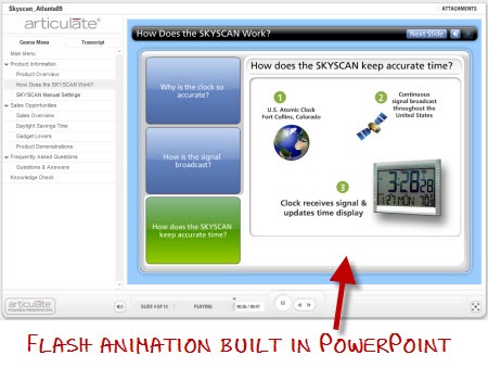
  • As a bonus, I even used PowerPoint to create Flash animations by publishing the slides in Articulate Presenter.  Then I pulled the slide’s flash file (.swf) from the data files and used them in my Engage interactions.  That’s another big time saver and effective use of the tools you have.

The Rapid E-Learning Blog: use PowerPoint to build Flash animations

Why are we training people to sell clocks to Alex Trebek?  I don’t want to disparage the other shootout entries (or those who use Jeopardy games) but it seems like any time you mention elearning and interactivity, someone pulls out a Jeopardy-style game.  What’s up with that?  What did the training industry do before Jeopardy?  I wish I had been working during the Gong Show era.  That would have made for some good elearning. 🙂

Games can have a place in the learning process.  However, you add more value to your organization if you design your learning interactions to match the desired outcome of the training.  Where do Jeopardy, crosswords, and matching puzzle pieces fit in the process?  Don’t just throw a game into your course because you can.  They can distract from your goals rather than enable them.

The Rapid E-Learning Blog: gong show

Assess your learners on what they need to do.  The original quiz questions are based on the product.  I changed the focus from the product to answering customer questions.  I still cover the same information, but am better off putting it in context to how the learner would use it.

The Rapid E-Learning Blog: assessment

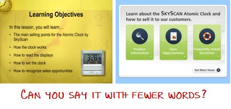
Streamline the objectives.  I replaced the bullet point objective list with a simple and clear statement.  By dividing the content into sections, the learner can figure out what’s covered in the sections. 

The Rapid E-Learning Blog: simplified objectives

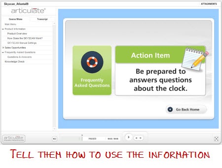
Summarize the course by what actions you want them to take.  I added a simple action items slide to help them focus on the essence of that section.  Many people zone out during the course and can lose sight of its purpose.  A simple summary built on what they should do with the information helps.

The Rapid E-Learning Blog: actionable summary

Provide additional resources to the learners.  One of the problems with elearning courses is that they are locked and tracked.  Many times, after the course the learner can’t revisit the content.  The irony is that one of the benefits of online learning is the asynchronous access to information and training.

In this case, I created an attachments section where I provided a link to a web site and owner’s manual for more information.  It’s available to those learners who want them.

The Rapid E-Learning Blog: attached resources

As you can see, there are simple things you can do to convert a linear course that is focused on information and convert it to something that is more focused on the outcome. 

The first rule of engagement is context and relevance.  You can get away with a simple linear course if the information means something to the learner.  However, you can’t mask irrelevance with games and gimmicky tricks.  If anything it is more a waste of the organization’s time and resources.  The course means nothing to the learner as a game if it means nothing to them in the real world. 

Focus on courses that bring value by aligning the objectives with the organization’s goals.  By doing so, you demonstrate your value and stand a better chance of retaining your position in these tough economic times.

What would you recommend to your peers to demonstrate value to the organization?  Click here to share your thoughts.

Events

Free E-Learning Resources

Want to learn more? Check out these articles and free resources in the community.

Here’s a great job board for e-learning, instructional design, and training jobs

Participate in the weekly e-learning challenges to sharpen your skills

Get your free PowerPoint templates and free graphics & stock images.

Lots of cool e-learning examples to check out and find inspiration.

Getting Started? This e-learning 101 series and the free e-books will help.


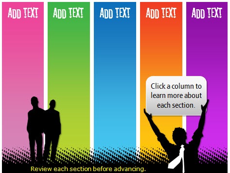
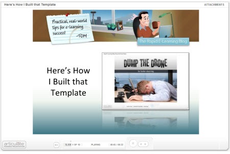
I’ve gotten a lot of emails about the template I used in the Dump the Drone demo.  So I’m going to show you how I built it (all inside PowerPoint) and then I’ll show you some tricks that will make it easier for you to build your own elearning courses.

The Rapid E-Learning Blog - Colored template

How Much Graphics Editing Do You Need?

Here’s a secret.  I have Photoshop, Fireworks, GIMP, and a few other graphics applications on my PC.  They’re great applications, but the reality is that for most of the graphics I built in my elearning courses I use PowerPoint 2007.  That’s even true for most of the images that I create for my blog posts.

Here’s why I end up using PowerPoint most of the time.  It’s fast and easy.  Now that PowerPoint 2007 has some better formatting options, I find that I hardly ever go into my other image editors.  To me, that’s a big plus.  Most of those applications are a lot harder to use and they tend to cost more.  I find that for much of what I do, I can do right inside of PowerPoint.

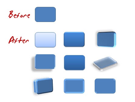
Here are some of the default effects in PowerPoint 2007.  As you can see, for simple graphics it can help speed up your production.

The Rapid E-Learning Blog - PowerPoint shapes

The Rapid E-Learning Blog - PowerPoint images

For many courses this is adequate and if you really learn to use your own styles and formats, you can do some pretty cool things.  Now keep in mind, I’m not saying that you can compare applications like Photoshop to PowerPoint, because you can’t.  Those are powerful applications.  What I am saying is that you might find that you can build most of what you need for your course right inside PowerPoint.  And that can be a big time saver, which kind of fits into the whole rapid part of rapid elearning.

So in the case of the template I built for that previous blog post, all of the graphics were built right inside PowerPoint.  They didn’t require a fancy graphics application.

Step-By-Step Instructions on Building the Branched Template

In the demo below, I do a quick walk through of the template from the Dump the Drone demo and then I show you how to build one from scratch.  I recorded the demo in real time so that you can see that it’s a fairly easy process and doesn’t take that long.

Even with all of the explanations, it still only took about 20 minutes or so to build it. The good thing is that once you build this template, you can reuse it and make changes pretty fast, especially if you use the PowerPoint color themes.

Don’t worry, I broke the tutorial into chunks so you don’t have to sit at the computer and listen to me for 20 minutes straight, something my wife can hardly do. 🙂  Just listen to the parts you’re interested in.  I’ve also attached the PowerPoint template for you to download and use.

The Rapid E-Learning Blog - PowerPoint template tutorial

Click here to view the tutorial.

Here’s a list of some of the steps I cover in tutorial:

  • Start with a blank slide and use an extra slide as your work space.
  • PowerPoint is a great way to make graphics.  Then save them to your hard drive.
  • For the titles, I used the Stereofidelic font, which Ray Larabie lets you have for free.
  • Use the design color schemes in PowerPoint 2007.
  • Create two menu slides.  One for animations and audio.  The other for clicking. 
  • Use master slides to save time.
  • In Presenter ’09, you can use the branching and locking features for navigation control.

Bonus tips:

  • Use a color schemer to help pick the right colors. There are plenty of them online.  Find a color you like and have the application pick the right colors to go with it.
  • When you share PowerPoint files, make sure others have the same fonts.  Keep in mind that most fonts are licensed, so you can’t just freely share them unless you own that license (or have permission).
  • On large projects I create two PowerPoint files.  One I use just to build my graphics and then I save those as images.  And the other I use to build my course.  This saves time in the long run and makes publishing a lot faster.

I hope you enjoy the template and the quick tutorial.  I look forward to your comments and any ideas you have to share.  Feel free to add them to the comments section.

Events

Free E-Learning Resources

Want to learn more? Check out these articles and free resources in the community.

Here’s a great job board for e-learning, instructional design, and training jobs

Participate in the weekly e-learning challenges to sharpen your skills

Get your free PowerPoint templates and free graphics & stock images.

Lots of cool e-learning examples to check out and find inspiration.

Getting Started? This e-learning 101 series and the free e-books will help.


A while back we looked at unlocking the player navigation to make better elearning courses.  It’s worth revisiting because it’s still one of the questions I’m most frequently asked.  There are various reasons that we give for locking navigation.  The two most common are that some sort of regulation requires it or we want to make sure that the learner doesn’t skip through the course.

As far as a regulation that requires locking the navigation, I’m not really convinced that’s entirely true.  While it is true that there are a lot of regulations that cover training, I haven’t ever actually seen a regulation that says “in order for your employees to be trained, it is required that the navigation in your elearning courses be locked.”  If anything there should be a regulation to protect employees who might get hurt falling asleep while viewing an elearning course like that.

Another rationale behind locking navigation is that “it’s the only way to ensure that the learner gets all of the information.”  On the surface that makes sense because so many of our learning experiences are based on information being dumped in our laps.  We see it in almost every learning environment.

As far as the regulatory stuff, I decided to take things into my own hands.  I wrote a letter to President Obama asking for his intervention.  This is the type of change we need.  

The Rapid E-Learning Blog - letter to the President

I’ll let you know if I hear anything.  In the mean time, what can be done about this navigation issue?

There are some of you who are stuck.  It doesn’t matter what you say or want to do, you will be forced to lock your course navigation because that’s what your client demands.  There are even some of you who think I’m a boob and that there’s nothing wrong with locking navigation.  That’s fine.  I probably am a boob. 🙂  For those of you who want out of the course navigation dilemma, here are a few ideas.

Think of your course as two parts.  One part of the course is about information that the learner needs.  The other is about assessing the learner’s ability to process that information.  The key is to focus less on delivery of information and more on collecting evidence of the learner’s understanding.

The Rapid E-Learning Blog - two parts to a course

Focus on understanding.  If the goal is to put a course online so that at the end of the year you can produce a report of people who’ve taken elearning courses, then locking the course makes sense.  You need that report to measure your success.

However, if you want to produce results, then locking the player is probably not the best solution.  I recommend focusing on the learner’s understanding of the content rather than whether or not they’ve been exposed to information.  You’ll build more effective elearning courses.

The Rapid E-Learning Blog - great training report

Unlock access to information.  Think of your course content like a supermarket.  The shelves are filled with all sorts of items.  Give the learners a shopping list (performance expectations) and let them do the shopping.

If you send them to the store and they come back in 10 minutes (because they already knew where everything was located) or an hour later (because they needed to orient themselves) it makes no difference.  You’re not assessing them on how they shopped.  You’re assessing them on buying the right products on the list.

The Rapid E-Learning Blog - give the shopper some freedom

Let the learners prove what they understand.  Whether the learner looks at a screen or not is irrelevant.  What’s relevant is that they know the information well enough to demonstrate understanding.

If they already know it, why force them to look at screen-after-screen of useless information.  If they don’t already know it, you can direct them to the place in the course where they will get the information they need. 

This is valuable because a more traditional elearning course treats each learner the same.  While an experienced learner might get too much information, you run the risk that a new learner doesn’t get enough or the right information.

Don’t make your course linear.  Learning is a complex process.  It requires more than just presentation of information.  By using a linear approach you hinder your options and possibly make the course less effective. Keep in mind that changing how you present the information doesn’t mean that you offer less or water down your course content. 

The Rapid E-Learning Blog - a typical linear course

I usually recommend placing the learner in a situation where they need to make decisions relevant to what you want the course to accomplish.  For example, if you’re teaching a new manager on sick day policies, don’t present five screens of policy information.  Instead, put the manager in a situation where he has to make a decision.  The decision shows his understanding of the policy and you’ll be able to give him the right level of feedback. 

The Rapid E-Learning Blog - which is the best approach for your course

This is more engaging and true to how the learner will use the information.  It also lets you assess the learner and direct them to the information they need.  Thus the course is a little different for each learner.

This doesn’t need to be a complex design process with elaborate scenarios.  It could be simple problem solving questions that guide them through the information.  Here’s an approach that’s worked for me in the past.

The Rapid E-Learning Blog - example screen

  • Managers don’t come to work and read policy manuals.  They do their jobs and then something happens where they have to make decisions. So instead of an information dump, place the learner in a situation to make decisions. 
  • I break the content into multiple tiers of information.  There’s a link to the company policy, a place to watch the linear course, and a personal contact.
  • The policy is the source content.  This is a great way to show the learners how to find the information if they need it after the course.  Many times the course content is readily available in other formats online.
  • The presentation is the original course content broken into smaller chunks.  I always add this to satisfy the clients need to have all of the information available.
  • The HR contact is a way to provide policy information specific to the current question.  I’ve used the Engage FAQ interactions for this type of link.  If you want, you can even create a quick web cam video to ma
    ke it seem more real, as if you’re really talking to a person.

The Rapid E-Learning Blog - three tiers of information

With this approach, the learner gets information from all angles.  They can click on the source content, they can watch a “traditional” elearning presentation, or they can ask for help to make the right decisions.  Even if they skipped all of the help links, you can still provide additional content in the feedback.  So they’d never miss critical pieces of information.

In addition, you are already assessing the learner’s level of understanding throughout the course.  By the time they get to the end, you probably don’t need to create a formal quiz.  That could save you some production time.

This type of approach can work in all sorts of settings from corporate training to academic subjects.  For example, in a civics class where I teach how legislation is passed, I create a course where they try to pass some legislation.  They’d encounter lobbyists, angry voters, and have to negotiate with the opposing party.  Through that process they’d get the same information I might normally present as some static slides or in a lecture.

As you can see, by reworking how you present your information you can create a more engaging learning process.  You’re not getting rid of critical information; you just offer it to the learners in a different way.   This type of structure lets you free up the course navigation and give more control to the learners.  It also helps you meet people at their current level of understanding.  This is especially helpful for new learners that might need more than what your original course was offering.

On the regulatory stuff, if I hear back from President Obama, I’ll let you know. 

I look forward to your thoughts.  If you agree or disagree, please share your comments by clicking on the comments link.

Events

Free E-Learning Resources

Want to learn more? Check out these articles and free resources in the community.

Here’s a great job board for e-learning, instructional design, and training jobs

Participate in the weekly e-learning challenges to sharpen your skills

Get your free PowerPoint templates and free graphics & stock images.

Lots of cool e-learning examples to check out and find inspiration.

Getting Started? This e-learning 101 series and the free e-books will help.