The Rapid Elearning Blog

Archive for the ‘Uncategorized’ Category


One of the most common scenarios for rapid elearning developers is to take an existing PowerPoint presentation and convert it to an “elearning course.”  Sometimes you get the luxury of meeting with the subject matter expert and then reworking the content to transform it from a presentation to an elearning course.  However, there are many times when you have to take the content “as is” and then put it online.  The subject matter expert’s not too interested in reworking the content much.

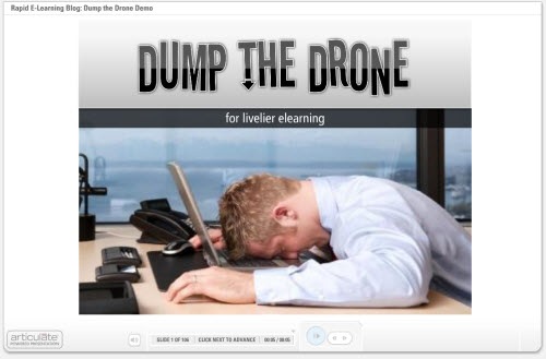
Cathy Moore’s Dump the Drone presentation is a good example of the type of presentation a client might ask you to convert and put online.   There’s really nothing wrong with Cathy’s version, but I asked her if I could use it for this post because as Elaine Bettis would say, “It’s blog-worthy.”  The content is great and I don’t have to come up with a fake presentation. 🙂

So here’s Cathy’s slide show that she gave as a conference presentation.


Click here to see the original slideshow.

Now, check out the demo I did using the Dump the Drone slides.  What I did was take Cathy’s  PowerPoint slides as if she were the subject matter expert and then applied different treatments to them. The idea here is not to convert Cathy’s slides verbatim. Instead I want to take you on a tour of different ways you can treat the slides that you get from your client. If this was a real course (and not a demo) I wouldn’t use all of these ideas together. I’d select a look and feel that was consistent throughout the course. This is just intended to give you some ideas to play with.

The Rapid E-Learning Blog - Dump the Drone Demo

Click here to view the elearning course.

There’s more than one way to create your slides.

Just because you get a bullet point slide show doesn’t mean it has to stay that way.  Feel free to change the look and feel of the slides.  Look at the images below, they represent the different looks used in the demo.
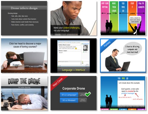
The Rapid E-Learning Blog - Various presentation styles

As you can see, there are all sorts of ways to present the content.  You have a lot of freedom in how you design the look of the slides.  Even if your client gives you a very bland PowerPoint file, you can dress it up and make the visuals more appealing.  That’s not the case with Cathy’s file, but it might be with your subject matter expert.

Make the navigation non-linear.  

Most presentations follow a linear process where you go from one slide to the next.  When you convert those into elearning courses, you can rework some of the content by creating groups and a branched menu. 

For example, in Cathy’s presentation, I broke a few of the sections down into groups.  For each group I created a main menu.  The learner can click on a section within the main menu.  When they’re done, they always return to the main menu.  
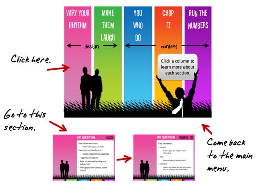
The Rapid E-Learning Blog - Change up the navigation 

To build the menu, I used PowerPoint’s hyperlinking.  That lets me branch to the slide of my choice.  Depending on your software, you can control the branching of your player.  For example, in Presenter ’09, you can set the slides to branch back and forth to the slide of your choice.  That makes this approach very effective.
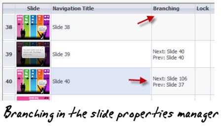
The Rapid E-Learning Blog - Branching in the slide properties manager

The benefit to this approach is that you can make the course seem more compressed and it gives the learner easier navigation.  They also have freedom to click where they want, which is a little more engaging than having to follow the path you direct.  So if they want to review all of the sections they can, or they can choose to go to the next section.  This works well if you have a mix of new and old learners who need different levels of information.

The Rapid E-Learning Blog - Tracking the user choice

If you notice on the first menu section on the “Corporate Drone,” I even built a little logic in the section.  When you select a path and come back, it’s checked off.  Go to the demo and try it out.  Click on the Mindset button first and see what happens.

Let your learners click on the screen to advance the presentation.

As you go through the demo, you’ll notice that there are some slides with just bullet points.  In some, the bullet points are all on the screen at the same time.  This makes it easy to read and move one.  However, on other slides, the bullet points progressively build. 

Even if you’re stuck with bullet points, there are a number of ways that you can present the information.  Progressively revealing your points is one way.  I think that switching to a handwritten text to highlight key pieces of information looks nice and draws the person’s attention to the screen.
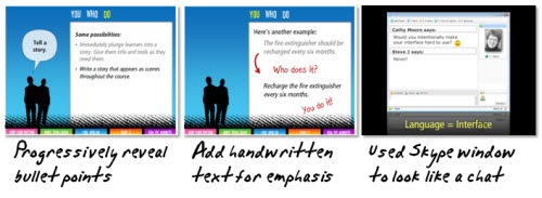
The Rapid E-Learning Blog - Different ways to present linear information

If you can, convert some of your text to graphics.  This works really well if you have audio narration with your slides.  In one of the slides, I took the bullet point info and made it look like a chat session.  Get creative.  Cathy also has some good tips on
how to make your linear navigation more interesting.

Shhh!  Here’s a secret.

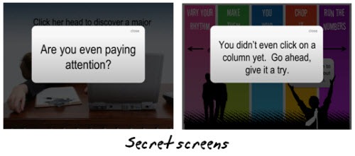
A lot of software applications have “Easter eggs.”  They’re secret buttons or steps you have to take to find additional information.  There’s no reason, you couldn’t do that in your courses.

For example, I routinely add secret navigation to my courses so that it’s easier for me to jump around when I test my demos.  I put one in this course, as well.  Click on the top left corner of the screen and you can quickly return home.
The Rapid E-Learning Blog - Secret screens

I also have some of those “Stop…you messed up!” screens, as you can see above.  The learner only sees them when they take a wrong turn.  There’s even a bonus Easter egg.  I’ll give you a hint.  My kids helped me add it and they were laughing the whole time, so it’s going to be juvenile.  Also, there’s a certain irony to the Easter egg. 🙂

I want to thank Cathy for letting me use her slides for this demo.  Aside, from my points, the content is spot on and very relevant to what rapid elearning is all about.

Speaking of Cathy, she’s also one of the presenters at the Articulate Live ’09 conference in Orlando.  She’s doing a session on action mapping that will be really good.  She does a great job teaching you to convert all of the subject matter content to create a great elearning course.  It’s all very practical information you’ll be able to apply to your projects right away.  In fact, if you register before February 20, you can win 2 hours of consulting time with Cathy Moore.  There’s more information below.

One last thing I’ll add because I hear so many negative things about PowerPoint. Outside of the images that came with Cathy’s presentation, everything else was built in PowerPoint 2007.

If you have any tips or tricks when converting your PowerPoint presentations to an elearning course, I’d love to hear them.  Feel free to share them with the community by going to the comments section at the end of this post.

Events

Free E-Learning Resources

Want to learn more? Check out these articles and free resources in the community.

Here’s a great job board for e-learning, instructional design, and training jobs

Participate in the weekly e-learning challenges to sharpen your skills

Get your free PowerPoint templates and free graphics & stock images.

Lots of cool e-learning examples to check out and find inspiration.

Getting Started? This e-learning 101 series and the free e-books will help.


A good elearning course always starts with good content.  However, content alone isn’t your only consideration when building elearning courses.  How your course LOOKS plays an important role.

One of the beefs people have with rapid elearning courses is that they tend to look like PowerPoint slide shows.  Even if the content is good and well presented, odds are that many of your learners will quickly tune out of your course.

There’s no reason that has to be the case because there are simple things you can do to make your courses look different and be more effective in teaching.

To get started, I highly recommend books like Beyond Bullet Points and Presentation Zen.  One that I’ve heard a lot about, but haven’t read yet, is Slide:ology.  These books help you think about how to present information in a new way.  You’ll learn to craft a better message and make screens that are more visually interesting.

If you have the budget, it’s always a good idea to bring on a graphic designer.  But the reality is that a budget and rapid elearning usually don’t go hand-in-hand.  In that case, you’re kind of left to fend for yourself.

In today’s post I’m going to talk about using blurred images.  Normally you don’t want a blurry image…like when you’re out walking and take a picture of a UFO hovering over the neighborhood.  However, when building your elearning course you can use blurry images to your advantage.

Direct Where Your Learner Looks

If you shoot a photo or video, you can change the focal depth. This allows you to blur the background and focus on the subject.  You do this; so that the eye is naturally drawn to the area that’s in focus.  It’s also a good way to take the focus off of background items that might interfere with the subject.

Suppose you’re presenting a scenario in your course.  Dave the accountant is on safari.  His driver was attacked by a baboon and carried off into the brush.  Dave’s stuck in the middle of nowhere by himself.  What’s he to do?  Compare the two images below.

blurry_dave1

There’s a lot going on in the screen above.  It might confuse your learners.  However, if you apply a simple blur to the image, you pull the focus away from less important information and transfer it to Dave where it belongs.

blurry_dave2

In the past I’ve used this to clean up images where there was a lot of noise in the background.  I even recall one project where there was an obvious safety violation in the picture and we couldn’t reshoot it.  So all I did was blur the background to hide it (and then prayed no one lost an eye).

Something that a lot of people don’t consider is that everything on your screen should be planned.  Whatever you put in front of your learners should contribute to the course.  You definitely don’t want irrelevant information competing with what you’re trying to convey.

Add Some Action to Your Image

Motion blurs are a good way to convey a sense of action without explaining a lot or having to spend the time to set a scene.  Look at the two images below.  If you saw them in a course, what do you think they say?

motion_blur3

motion_blur4

While the examples above are simple, the main point is that with some creativity, you can use the motion blur filter (or even a radial blur) to help set the tone for content in your elearning course.

You can get some good ideas of how to use a motion blur by looking at examples on some of the stock photo sites.  Just type in: motion blur.

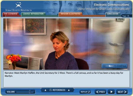
Here’s a screen shot of a course created by Enspire that I saw online a while back.  I did the screen grab because I thought it was a great example of how you can take a still image and give it a sense of action.  Add some busy office background noise and you can easily convey the sense of a lot going on…without having to explain it.

motion_blur5


Layer Images to Create Activity and Focus

Something that I like to do that doesn’t require a lot of work is to layer images that are out of focus.  By switch between them, I can direct the learner’s attention.  It’s kind of like the technique you might see in a movie.

For example, you focus on a flower, but then the focus shifts from the flower to something in the background.  You end up with the background in focus and the flower out of focus.  You can do something similar in your courses.

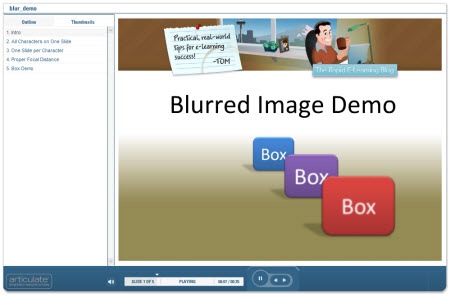
Check out the quick demo to give you some ideas and see it in action.

blur_demo

Click here to view the demo.

Here are a few points from the demo:

  • A blurred background can add visual interest to your course.  It adds some depth and helps pull your other content into focus.
  • You can mix and match clip art and photos.  Even if you don’t use the blur on your images, don’t be afraid to experiment.  The worst that can happen is that it doesn’t work.  In the demo, the background is a real photo and the characters are clip art.  I think if works on those slides.
  • You don’t need to put everything on one slide.  The first example is one slide.  The others are stretched over multiple slides.  I just hid them in the navigation panel.
  • As you can see, you can apply the effect to more than just your pictures.  It works great on text and shapes.

That’s a quick overview of how you can use blurred images in your elearning courses. You’ll have to learn how to do that with your graphics editor.  However, it’s usually a pretty easy process and the blur filter is standard.

Here’s a quick demo that I did to show you how to apply the blur effect with two free tools.  One is web-based.  The other is a desktop application.  Here are some links to free resources if you don’t have a graphics program.

I look forward to your comments and any ideas or tricks that you use.  Feel free to share them in the comments section.

Events

Free E-Learning Resources

Want to learn more? Check out these articles and free resources in the community.

Here’s a great job board for e-learning, instructional design, and training jobs

Participate in the weekly e-learning challenges to sharpen your skills

Get your free PowerPoint templates and free graphics & stock images.

Lots of cool e-learning examples to check out and find inspiration.

Getting Started? This e-learning 101 series and the free e-books will help.


If you want to learn to be a better elearning designer, look for good examples of what you’d like to do and then try to replicate them.  That’s what we discussed in the previous post Now You Can Design E-Learning Courses Like a Pro.  By doing this, you learn new production techniques, think through instructional design ideas, and gain confidence in your skills.

In today’s post, I’ll take you through the Froguts demo that I replicated and talk about some of the things I learned.  But first I want to cover two critical parts of successful rapid elearning design when working with PowerPoint.

Get over the PowerPoint stigma.  A screen’s a screen.  No one cares if what they see was built in PowerPoint or Flash.  All they care about is what it looks like and if it works.  Besides, when you build something in PowerPoint and you publish it with your rapid elearning software, it becomes Flash.  So instead of using Flash to build a SWF, you’re using PowerPoint to build a SWF.

Think in layers and not linear.  People are always asking me about how many slides a course should have.  This is the wrong approach when you’re building elearning courses.  Don’t think slides.  Think content.

You’re building an elearning course and not a presentation.  Even though you might be using PowerPoint to build both types of products, when you build an elearning course you need to think in a different way.

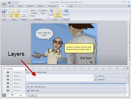
Think of slides as layers of information that you bring to the screen.  In other elearning applications, you have a screen with a layered play track.  Each object on the screen sits on its own layer. 

As an example, here’s a screen shot from Quizmaker ’09.  You see a single screen with layers for each object on the screen.

The Rapid E-Learning Blog: Quizmaker layers example

While PowerPoint’s interface is different, you want to think of each slide as a layer of information.  Some screens might consist of one slide of information and some might be ten slides of information.

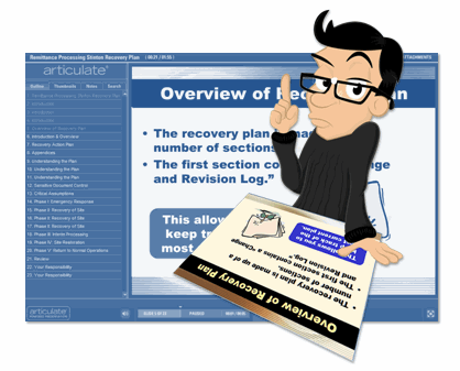
Here’s a demo from my post, 10 Sure-Fire Tips to Becoming a Rapid E-learning Pro…Rapidly!  It’s a good example of how you see a single screen that’s actually made up of more than one slide.  The learner doesn’t care about slide count.  She’s just focusing on the interaction.

The Rapid E-Learning Blog: nonlinear use of PowerPoint slides

Click here to view the demo.

Once you start to think in layers rather than linear, it really opens up what you can do in PowerPoint.  But most important, it gets you to think about what you can do in different ways.  It’s all just a matter of figuring out how to do it.  And that’s what learning’s all about.

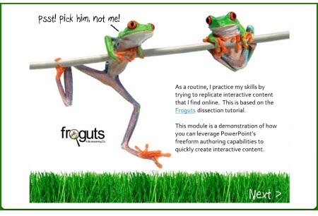
Here’s the Froguts demo.  Below that is a tutorial that is more show and tell.

The Rapid E-Learning Blog: Fruguts recreated in PowerPoint

Click here to view demo.

There are some things in the demo that I would have changed if it was a real project but I left them because I can talk about what I’d do different.  Here’s a quick rundown of what I cover in the tutorial.

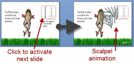
Duplicate slides that are linked can create interactivity.  One of the main challenges when working with PowerPoint was trying to replicate the drag and drop interaction.  Since you can’t build those in PowerPoint, what I did was duplicate the slides and use a combination of PowerPoint hyperlinks and custom animation.  When you click on a linked object it goes to the duplicate slide that starts the animation.

The Rapid E-Learning Blog: PowerPoint animation trigger 

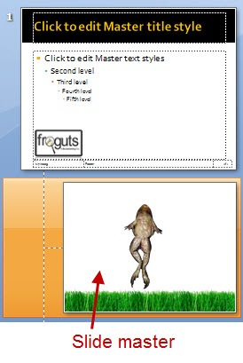
Use PowerPoint masters for images that you use a lot.  Originally, I had the frog images on all of the slides.  When I published the files, I ran into some alignment issues plus it took a little longer to publish because of all of the extra objects.

The Rapid E-Learning Blog: place images on the master slide

I fixed that by putting the main frog body on a master slide.  Then all I had to do was drop the dissection pieces on the slide.  The frog body was always in place and I didn’t need to worry about accidentally moving it.  It was also one less object on the screen to worry about during production.

PowerPoint slides can look like anything you want.  Since PowerPoint is a blank screen and you can move objects around freely, you can pretty much create or recreate any look you want.  PowerPoint 2007 has some nice graphic effects so all of the drop shadows and reflections you see in the demo were created with PowerPoint.

The Rapid E-Learning Blog: There's a lot you can do with the look of slides in PowerPoint

I like a more open feel, so I opted to change the darker spotlight effect of the original and went with more white space.  I also used a “fun” font.  I think the white screen with a little color from the grass is fresh.  That (and the font) gives the demo a lighter feel.

It’s important to consider the tone you set with your course.  The fonts, color schemes, and placement of objects on the screen all contribute to that. The tone you set for you course contributes to the impression people have of the course.  It gives you a chance to say something before you actually say something.

That’s a quick overview.  For more detail and to see some of the techniques in action, click on the tutorial below.  I’ve also included the PowerPoint file for you to download and deconstruct.

Here are some relevant tutorials from previous posts:

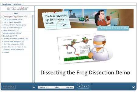
The Rapid E-Learning Blog: dissecting the course demo

Click here to view tutorial.

As you can see, there’s a lot to learn by deconstructing the elearning courses that you see.  And it doesn’t require that you replicate the entire course.  Perhaps it’s just a matter of figuring out how to get a certain type of interactivity or effect.  You’ll run into some challenges when you work with PowerPoint.  But by making a habit of doing this, you’ll learn new production techniques and you’ll come up with new ways to approach your own elearning courses.  And most of all, you’ll become more confident in your elearning skills.

I’ll be doing more of these types of posts this year.  Let me know what you think and feel free to share your own ideas and tips in the comments section.

Events

Free E-Learning Resources

Want to learn more? Check out these articles and free resources in the community.

Here’s a great job board for e-learning, instructional design, and training jobs

Participate in the weekly e-learning challenges to sharpen your skills

Get your free PowerPoint templates and free graphics & stock images.

Lots of cool e-learning examples to check out and find inspiration.

Getting Started? This e-learning 101 series and the free e-books will help.


The Rapid E-Learning Blog 2009

What happened to 2008?  It just flew by.  When I was a child each year took an eternity. Now it seems like everything is kind of blurred together.  And here we are, about 50 posts later reflecting on a year gone by.

Some Quick Thoughts About 2008

Thank you for all of the kind comments that I get each week after I post.  I also appreciate the great feedback and suggestions.  If you don’t regularly review the comments with the blog posts, I recommend you do.  Here’s a good example from a recent post on using virtual worlds to create characters for your courses.  The comments section is loaded with some great feedback and additional resources.

I love going to conferences and meeting you.  In fact, some of my best material and blog topics come from interacting with blog readers and trying to solve problems.  If you’re ever at any of the same conferences, please come by the Articulate booth and say, “Hello.”  The schedule for next year isn’t completely fleshed out, but I’ll be in Atlanta at Training ’09, in Orlando at Articulate Live ’09 and the eLearning Guild’s 2009 Annual Gathering

The Rapid E-Learning Blog: Tom with blog reader Ammar Al-Attiyat

Speaking of conferences, it seems that each trip to the conferences this year brought some surprises.  Here are a few travel tips for your next trip to an elearning conference:

  • Don’t lose your wallet in the airport.  It’s hard to go through security without being treated like a potential terrorist. 
  • Bring something to read.  If the cargo door on your plane is hit by one of those vehicles that moves your luggage around, it takes a few hours to repair.  You’ll want something to read while the repair is made.
  • Make sure to sit next to a doctor.  On my flight to Educause, someone on the plane fainted and fell down in the aisle.  Fortunately, there was a doctor seated nearby to treat him.  I provided some comfort by assuring him that this was better than losing his wallet in the airport.  I think my words encouraged him and helped him feel better.

Ripped off!!!  While 2008, has been a great year, I was a bit saddened to learn that I didn’t make Urlesque’s Twenty Bloggers We Want to See in a Bikini list.  Maybe I’ll be in the running next year when I’m in better shape.

Answers to Common Questions

While we’re doing an end of year post, I’ll take the opportunity to answer three of the most common questions I get throughout the year.

  • How do I get copies of your previous posts?  You can do a search for posts from the blog right above the book image.  Or you can scan the titles in the archives.  The archive link is always at the bottom of the page.
  • What books do you recommend to get started?  There are a lot of really good books out there.  In the post, 5 Simple Ways to Get Started with E-Learning Development, I offered a few solid recommendations.  If you have any you’d like to recommend, let me know.  I’ll be doing a post on this later. 
  • Does it cost money to subscribe to your blog?  No.  The blog is free.  You can subscribe one of two ways: email or RSS feed.  For email, click on the subscribe link on the right side of the blog and enter your email address.  For RSS, use the orange RSS button.  If you’re not familiar with RSS feeds, check out the Common Craft’s RSS in Plain English

…And Now for the Top 10 posts for 2008

  1. 5 Secret Tips from an E-Learning Pioneer
  2. Here’s Why Unlocking Your Course Navigation Will Create Better Learning
  3. When It Makes Sense to Pay for Professional Narration
  4. Create E-Learning Scenarios By Bringing the Virtual World into the Real World
  5. Create Custom Characters for Your E-Learning Scenarios
  6. What You Need to Know When Working with Grouped Clip Art
  7. What Everybody Ought to Know About Instructional Design
  8. How to Add Scenarios to Your Rapid E-Learning Courses…Rapidly!
  9. Is Google Making Our E-Learning Stupid?
  10. Change Your Presentation Template to an E-Learning Template

Looking Forward to 2009

I have some cool things planned for the blog and eager to write some of the posts and tutorials.  II think it’s easier to learn when we can deconstruct the examples so I want to share more of my assets and files.  Right now I’m working on a way to easily manage that.  Stay tuned for some exciting news.

I’m really looking forward to Articulate Live ’09.  Like this blog, it’s going to be structured so that you get practical tips and tricks that you’ll be able to take back and apply to your work immediately.  If you use the Articulate software, I highly recommend it.  It’ll be a great time.

I’m also looking forward to seeing many of you at other conferences and events.  Also, if you’re in the Seattle area, drop me a line.  I try to get out and meet people in the area as time permits.

Again, thanks for making the blog a success.  I hope you have a great new year!

Events

Free E-Learning Resources

Want to learn more? Check out these articles and free resources in the community.

Here’s a great job board for e-learning, instructional design, and training jobs

Participate in the weekly e-learning challenges to sharpen your skills

Get your free PowerPoint templates and free graphics & stock images.

Lots of cool e-learning examples to check out and find inspiration.

Getting Started? This e-learning 101 series and the free e-books will help.


Going to a stock image site and looking for just the right pictures can be very time-consuming and a drain on your limited resources.  Why not create your own stock images?  If rapid elearning software makes everyone an instructional designer, then surely a digital camera makes us all photographers. 🙂

Obviously, this approach doesn’t work for everyone and taking good photos is an art in itself.  However, it is a cost effective approach and with some practice very viable.

Here are a few basic tips to get started.

1. Flood the area with light.

A lot of images appear grainy because there’s not enough light.  A good rule of thumb is to flood the area with light.  You’ll want to use as much light as possible without actually vaporizing your subjects.  The more light you have, the better clarity you’ll get on the images.  You can control the stark shadows by diffusing the light which you can do by bouncing it off of the walls or ceiling.  Or just move the light source back a little.

The Rapid E-Learning Blog: subjects are vaporized by too much light

 2. Keep the image in focus.

The problem with a lot of digital cameras is that after you take the shot, it looks great on that tiny LCD screen.  However, when you get into the office to edit the photo you see that the image is a little out of focus.  Your best bet is to use a tripod (or at least rest the camera on a solid surface).

The Rapid E-Learning Blog: keep images crisp by using a tripod

3. Use the best quality settings you can to get the best image quality.

I had a friend who would always use the lowest settings on his digital camera because he wanted to have room for as many photos as possible.  That made no sense.  He had room for something like 5000 photos.  If he had used the highest quality settings, he would have still been able to put a few hundred photos on the camera.

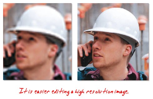
Here’s the deal.  You can’t make a bad image good (even if you send it to Sunday school).  So, you want the best quality possible from the get go.  You can always frame and resize the pictures later.  However, you won’t be able to make a low quality image better.

The Rapid E-Learning Blog: get the best resolution possible

4. Remember the “rule of thirds.” 

Divide your image in thirds.  The best pictures will have the subject intersect two perpendicular lines.  You can find a quick explanation of the rule of thirds here.  My digital camera even has a grid feature to make this easier.  Yours might, too.

The good thing with editing software is that you can always crop your photos to better frame your subjects and make the pictures more interesting.  This is also why you want the best quality and highest resolution as a starting point.

The Rapid E-Learning Blog: follow the rules of thirds


5. Don’t take just one shot.

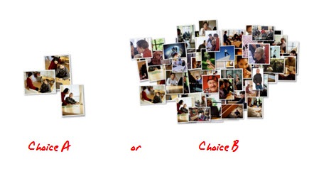
It used to annoy me when I’d send someone out to get a photo of a machine operator on the shop floor and he’d come back with just one picture.  It’s a digital camera, for crying out loud!  Take as many pictures as you possibly can.  It’s not film.  There are no development costs.  The more choices you have, the better off you’ll be.

The Rapid E-Learning Blog: take as many images as you need

6. Create visual interest.

Make the images interesting by shooting from multiple angles and distances.  Take one wide angle shot.  Get another that’s closer and tighter.  And, then do a close up, or even extreme close up.  Get down low.  Get up high.  Tilt the camera a little.  You don’t want all of your photos to look the same or be from the same angle.

Also, try to keep the people from looking at the camera.  You want things to look natural.

The Rapid E-Learning Blog: create visual interest

7. Use real employees to make the images authentic.

People like to see co-workers and themselves in the elearning courses.  Take advantage of this.  It’s also a way to build some interest in the course prior to roll out since the break room will be abuzz, eagerly anticipating the final product.

The Rapid E-Learning Blog: Jim the hero

8. Don’t use real employees because they could be losers.

There’s nothing worse than having John Doe (or your state’s governor) in your ethics course and then find out two weeks later that he was fired for lying about his sales quotas or worse.

The Rapid E-Learning Blog: Jim the loser

Depending on your project, it might even be worth your while to hire a few people for a day and take as many photos as you can.  For example, get a bunch of people in a business casual setting and then shoot images of all sorts of conversations.  You can use the extras for future projects.

To keep costs down, I’ve done projects where I’ve had friends come in and we shot some quick photos.  This works as long as they’re not fugitives or have warrants for their arrest.   

9. Get signed releases.

You want to get signed releases to make sure all of your bases are covered.  Here’s a link to learn more about releases.  You probably want one for adults and one for minors.

The Rapid E-Learning Blog: get a signed release

10. Share your photos.

Everywhere I’ve worked, having the right type of images has been an issue.  Sometimes all you need is a guy in a hard hat, or someone who’s not in a suit.  These aren’t always easy to find.  And, it’s not always cost effective to buy one, either.

Why not share your photos?

I have a friend that has shared his photos on stock.xchng.  You can also join a user group on a site like Flickr and share your pictures using a Creative Commons license.

If you’re not inclined to shoot your own images, you can always find inexpensive stock photo subscriptions.

Shooting your own photos can save you a lot of time and money.  With a little practice, there’s no reason why you can’t learn to do a good job.  What are some other tips to help get the best image quality possible?  Feel free to share them with us by clicking on the comments section.

Events

Free E-Learning Resources

Want to learn more? Check out these articles and free resources in the community.

Here’s a great job board for e-learning, instructional design, and training jobs

Participate in the weekly e-learning challenges to sharpen your skills

Get your free PowerPoint templates and free graphics & stock images.

Lots of cool e-learning examples to check out and find inspiration.

Getting Started? This e-learning 101 series and the free e-books will help.


PowerPoint’s notes section can be used as a way to capture knowledge, hold a transcript, or even as a glossary.  In today’s post, I’m going to throw out some ideas to help you get the most out of your notes.

Capture your subject matter expert’s expertise

Here’s a common scenario.  A subject matter expert gives you a PowerPoint that he’s used for classroom training and expects you to use that for your elearning course.  While the content may be good, it’s usually not complete.  Typically, there’s a lot of missing information trapped inside the expert’s brain.

To collect some of that information, I’ll ask the person to review the slides and then add whatever he can to the notes section.  It doesn’t need to be perfect or require a bunch of formatting.  Just review the slide and do a brain dump.  We can sort it out later.

The Rapid E-Learning Blog: subject matter expert

I find this approach works well because the slides serve as a great mental trigger and outline of what they need to share.  The informality of the notes section makes it stress free and doesn’t require that the expert hand in a polished report.  Later I’m able to use that information to pull the course content together.

Create a course transcript

Some learners will not be able to hear the audio in your course.  They might have hearing disabilities or be in a work environment where listening to audio isn’t practical.  Others just prefer to read a transcript and not listen to the audio.  In those cases, you can use the slide notes section to add a transcript to your course (which a lot of people already do).

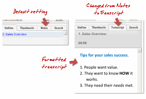
One of my favorite parts of our new software is the text formatting in slide notes.  In the past, the formatting was limited which made the transcript not as practical.  However, now you can add a lot more formatting.

The Rapid E-Learning Blog: notes formatting

If I do create a transcript, I’ll change the title of the notes tab section from “notes” to “transcript.” Depending on the type of course, I’ll also set the transcript tab to open by default.  This way the learner can see it right off the bat.

Create a glossary to define new terms on the page.

Sometimes you want to define a word or two on the slide, but you don’t want to build an entire glossary.  In those cases, use the notes section as a glossary.

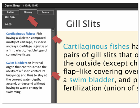
In the demo below I changed the defined word color to teal and then added the definitions to the notes section, which I changed to read “Glossary.”  If you have a transcript in the notes, just put the definitions at the end of the transcript.  It’s a quick way to define words without a lot of extra work.  The user can quickly look up a word or term and you don’t have to spend any extra time to build a glossary.

The Rapid E-Learning Blog: notes as a glossary

Working with Slide Notes

  • Use the slide notes master.   The slide notes master in PowerPoint lets you set the formatting for your slide notes that are applied across all of the slides.  This helps keep the notes consistent.  Here’s some information on how to format your slide notes in PowerPoint:
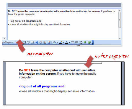
  • Format notes from notes view.  Most people seem to work in the default PowerPoint layout and access the notes that way.  One of the problems with this is that a lot of the formatting you do in the notes section isn’t evident in PowerPoint. 

    Look at the image below.  If you change the font color and style, you can’t see the changes in the default “normal” view.  However looking at the same text in “notes” view, you can see the formatting.  This is the same as what you’ll see in the published course. 

The Rapid E-Learning Blog: switch to notes view to make edits

  • Turn off the text’s auto fit feature which will scale your text to auto fit into the text box.  Doing this will save you some time and frustration.  You can learn to do so here.  There’s nothing worse than publishing a 45-slide course only to find out that the font size in the notes section is different because it was scaled to auto fit.

The Rapid E-Learning Blog: autofit text in notes view 


The secret to rapid elearning is getting the most out of the tools you use.  Today’s tips should help you make more use of the slide notes.  If you have any tips feel free to share them with us by clicking on the comments section.

Events

Free E-Learning Resources

Want to learn more? Check out these articles and free resources in the community.

Here’s a great job board for e-learning, instructional design, and training jobs

Participate in the weekly e-learning challenges to sharpen your skills

Get your free PowerPoint templates and free graphics & stock images.

Lots of cool e-learning examples to check out and find inspiration.

Getting Started? This e-learning 101 series and the free e-books will help.


I once worked on a project for new machine operators who were not able to meet their quotas within 90 days of being hired. I assumed that I would build a standard course that took them through the tasks.  Before starting, I wanted to get to know more about the learner’s environment, so I spent a few days with the machine operators.  Do you know what I discovered?

The new hires didn’t have a problem with the job.  Instead they were all intimidated by the machine.  Every day, they were told, “This is a million dollar machine, don’t break it.”  This created so much pressure to not mess up that it slowed down their work.

It caused me to change my approach to the course.  Most of the course focused on the machine and less on the details of the job.  They learned a lot more about the parts of the machine and how it worked.  We spend the entire first week doing preventive maintenance.  By the time they actually started doing real work, they were very comfortable working on the machine.

The Rapid E-Learning Blog: courses need to be matched with real world experiences

Initially, the client scoffed when we pitched our ideas.  They wanted us to focus more on the job tasks.  However, the results were that within the first two weeks, almost all of the new hires were performing at the desired level.  

I would never have known to focus less on the job and more on the machine’s intimidation had I not spent time with the learners and better understood their world and the pressures they face.

That event was one of my best learning experiences.  It reinforced the need to meet with learners and understand their world.  It also opened my eyes to think beyond the obvious.  A big pitfall is that we tend to rest in the familiar. Without the time on the floor, I would have built a functional course, but missed the opportunity to make real improvements on their performance.

The Rapid E-Learning Blog: Avoid these pitfalls

Here are some other pitfalls we can avoid if we spend some time with our learners.  

  • Screen after screen of information irrelevant to the learner’s needs.  This is the biggest problem with elearning.  We have a tendency to present information rather than have the learner process it.  A more engaging approach is to drop them into real-world situations where they have to make decisions that require the use of the course’s information.  You won’t know what the best use cases are if you don’t spend time with your learners.  They’ll give you insight in how they use the information.
  • Rely too much on your own intuition or experiences and end up building courses that don’t fit the learner’s needs.  This is especially common if you’re the subject matter expert.  Sometimes we lose sight of how much we know and the experience required to get there.  Hook up with new or recent learners to get a better feel for the course design. 
  • Create a big course and all they need is a cheat sheet.  I’ve worked on a project that took months to complete.  By the time we rolled it out, the employees had already created simple cheat sheets and they were off to the races.  They didn’t need what we built.  Keep it simple and give them what they need when they need it. 
  • Elearning doesn’t replace the need for legitimate performance support.  One of the biggest disconnects with elearning is that we tend to use it to replace the time a person needs to learn from others in a social context.  Sometime people don’t need training.  Instead they just need to be connected to others.  
  • Our learners have needs we’re not aware of.  This could mean that the learners have technological limitations, physical disabilities, or a work environment that’s not conducive to taking elearning courses.  Trust me on this one.  There’s nothing worse than rolling out a big elearning project and finding out that none of the computers have sound cards.
  • Miscalculate the motivations of the learner.  While we enjoy the elearning courses we produce, odds are that the learners are not quite as enthused.  Find ways to tap into the learner’s motivation.  A good starting point is to focus on performance and helping them to do something better.

To know your learners doesn’t mean that you have to canvas the floor with people in clipboards and lab coats.  At the very least, spend a few minutes talking to the people who will take the course.  If you can, talk to recent learners to get a sense of what worked for them and what insights they have to improve the process.

By getting you know your learners, you’ll avoid many pitfalls and build better courses.  Poorly designed training wastes time and potentially disrupts the work environment because it’s not really addressing the performance issues that typically instigate the training in the first place.

What pitfalls do you recommend that we avoid?  Share your ideas by clicking adding them to the comments section.

Events

Free E-Learning Resources

Want to learn more? Check out these articles and free resources in the community.

Here’s a great job board for e-learning, instructional design, and training jobs

Participate in the weekly e-learning challenges to sharpen your skills

Get your free PowerPoint templates and free graphics & stock images.

Lots of cool e-learning examples to check out and find inspiration.

Getting Started? This e-learning 101 series and the free e-books will help.


The Rapid E-Learning Blog: record audio

Your rapid elearning software makes it easy to record your narration.  Most of the time that works for you.  However, there are times when recording your own narration doesn’t make sense.  Today we’re going to look at when it makes sense to consider professional narration for some of your elearning courses.

A Good Voice Doesn’t Equal Good Results

“Why pay for professional narration?  Joe and Samantha have good voices.  Let’s get them to do it.”  On the surface, this sounds like a good plan.  But that might not be the case.

  • Joe and Samantha have good voices but they aren’t professional narrators.  It takes more than just a good speaking voice to get the inflections and tone right.  Because of this, using Joe and Samantha requires a lot more time and retakes to get it right. 
  • Your recording equipment consists of a headset microphone and a less-than-state-of-the-art laptop.  And your “recording studio” is a spare conference room.  There’s a lot of ambient office noise and a really loud air conditioner. 
  • Since you’re probably not an audio expert, you are less efficient when you record.  You can’t monitor the audio while you’re recording, so you only record a portion at a time.  Stop.  Listen to it.  Re-record.  Stop.  Listen to it.  Re-record.  And so forth.
  • You publish your course and send it out for review.  Despite mentioning the limitations of using in-house talent, you find that your client is not pleased with the quality of the audio.  It turns out that Joe suffers from the “popping P’s” and Samantha the snake hisses with her S’s.  On top of that, the air conditioner added a distracting hum throughout the entire audio track.  Your choice is to re-record or spend a lot of time trying to “edit it out.”

These are typical issues when recording your own narration.  Using in-house talent will usually cost you more time and produce lower quality.  For some projects, that’s OK and you can live with the results.  However, it’s not always the best course of action.

Here’s How Much Your Narration Costs

Sometimes your hands are tied and you have to work with what you have.  While your client or manager might think they’re saving money, the fact is that they probably don’t know for sure.  Many places don’t do a good job tracking the real costs of projects.  If you don’t know what you’re spending, how do you know if you’re saving money?

Rapid elearning development has a 33:1 ratio in development time.  For every finished hour, you’re probably spending about 33 hours of work in labor.  I’m just going to keep it simple and say that it takes you a week to do a project.  That’s 40 hours.  At $100* per hour, the company is spending about $4000 per project.  That’s just for your labor.

Now let’s look at the recording session.  Let’s say you get all of the recording done in two hours (a very low estimate).  It’s just you and your voiceover talent.  While you have two hours of recording time, you also have to factor in the time to prepare and some incidental time.  It’s not like you just stop your work and teleport to the conference room and then teleport right back.

We’ll say that the two hours of recording also includes an extra hour of prep time.  So, two people at three hours equals six hours of labor.  At $100 per hour, you’re looking at $600 just to do the recording.  This doesn’t include the lost productivity of using in-house talent.

Because you’re doing the recording yourself, you’ll have increased edit and review time.  If you run some quick estimates, I’m sure that you’ll find that you’re easily spending over $1000 for your free narration.   And you’re still making compromises on the quality.

How Do These Numbers Compare to Hiring a Pro?

It used to cost a lot more to get professional narration.  That’s no longer the case.  Today you can use a number of online services to post projects, screen the talent, and hire just the person you need.  And you can do so at a great cost.

In fact, most of the projects I’ve done recently have come in well under $500.  I found that not only am I getting good narration, I’ve eliminated a lot of labor because I don’t have to edit a bunch of audio files.

Most of the sites have a very simple and straightforward process.  You submit a project, set a budget, and request an audition.  I’ve had a lot of luck finding good vocal talent at very reasonable costs.  And the turnaround is very quick.

You can set a budget limit to make sure you don’t spend more than you can afford.  You’d be surprised.  I’ve submitted some projects that had a very low budget, but it seems there’s always someone willing to do the work.  Not only do I control my costs, most of the time I get the audio back within a day or two.

Of course the cost of your narration depends on how long it is and what you want.  I have submitted large projects and small projects.  Most of the smaller ones have been well below $500.  However, some of them have been much more.  Submit a script, give them your budget, and then see what happens.

When Do You Go with a Pro?

The main consideration is your project scope.  If it’s a short course with a limited audience (and the narration quality is not an issue), then it makes sense to keep it in-house.  Why spend money you don’t need to?  However, if it’s a course intended for a larger audience, then it makes sense to consider using professional narration.

If it’s a course that is going to reach your customers or go outside of the organization, I recommend getting the best narration you can afford.  An exception is if the narrator is a personality or authority that the audience expects to be part of the course.

Another benefit to working with a professional service is that it forces you to be more disciplined with your script.  You won’t have the luxury of doing multiple retakes because it will cost more.  And speaking of retakes, if you find you want to do audio edits down the road, having the pro audio makes it easier to seamlessly blend different recording sessions because the audio levels and quality is controlled.

Once you do a few projects, you’ll develop relationships with some regulars.  Because we know each other (and they know I will pay), I find that I get the projects faster and a little less expensive.  I can shoot off a quick email and get a bid in no time at all.  I trust them and know that I’ll get a quality product.  That saves me a lot of time.

It’s true that professional narration isn’t an option for everyone. Plus, some of you are quite capable and able to handle the audio recording yourselves.  However, I think you’d be surprised when you look at your real costs and compare it to what you can get with some of today’s services.  You might find that professional narration isn’t as expensive as you originally thought.  On top of that, you end up with a much higher quality product which probably lends itself to a better learning experience.

What do you think?  Do you agree?  Disagree?  Feel free to share your thoughts by clicking on the comments link.

Events

Free E-Learning Resources

Want to learn more? Check out these articles and free resources in the community.

Here’s a great job board for e-learning, instructional design, and training jobs

Participate in the weekly e-learning challenges to sharpen your skills

Get your free PowerPoint templates and free graphics & stock images.

Lots of cool e-learning examples to check out and find inspiration.

Getting Started? This e-learning 101 series and the free e-books will help.


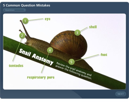
The Rapid E-Learning Blog: quiz question 

Assessing the learner’s progress is important.  How else can we provide the best feedback or certify that the learner’s met a certain level of understanding?  That’s why we need to ask the right questions.  Avoid the following mistakes and you’ll create a more effective learning experience.

Here’s a simple quiz that demonstrates some of the mistakes I discuss below.

The Rapid E-Learning Blog: common mistakes demo

Click here to view quiz demo.

The questions are either too easy or downright stupid.

We’ve all seen them.  You take a quiz and there’s one good answer choice and all of the rest are obviously not right (or plain silly).  It’s like the course designer just went through the motions.  This type of quiz question does nothing to measure the learner.  What’s the point of the quiz?  Why’s it even there?  Put some thought into the quiz and make it meaningful.

  • Get better wrong choices from your subject matter expert.  Sometimes the reason these types of questions exist is because you don’t get enough viable wrong answers from your subject matter expert.  So you make up stuff as filler.
  • Use fewer choices.  Instead of a four or five multiple choices, just use three.  Or better yet, make it a true or false.  That means a little less work and you’re less likely to have to come up with a wasted choice.
  • You don’t always need a quiz to end your course.  Not all courses require a quiz.  If you have no interest or reason to assess the learner, create an easier way to end the course.

    The questions are set up as "gotcha" questions. 

    I worked on a project once where the customer gave me a list of questions and half of them were trick questions.  His rationale for the trick questions was that if the learner really understood the content, they’d pick up on the nuances of the questions.  That’s nonsense!

    • Don’t be an elearning fascist.  The goal’s not to make your learners look stupid or to trick them.
    • Align your questions to your objectives.  Start with clear learning objectives.  Then determine how you will know that the learner has met them.  Now you can create quiz questions based on that criterion.
    • Sometimes a quiz question is not the right way to measure understanding.  Don’t assume that the learner can work through all of the nuances of the new content.  If you really want them to learn the nuances, use simple scenarios or case studies instead of quiz questions. 

    Questions ask about content that’s not covered in the course. 

    Sometimes there’s a tendency to pack more teaching into the question.  We figure that we only have access to the learner for a short period of time, why not just add more content as we ask a question.

    • Keep it simple and direct.  Use the question to assess where the learner is at that moment.  Don’t confuse the learner by adding more course content in the question.
    • If the content is important, put it in the course.  Going back to the first point, if the content is critical to the learner’s understanding, then put it into the course prior to the quiz.  If you can’t find a place for it, perhaps that’s a good indication of whether or not it should be in the course in the first place.
    • Use the answer feedback to build a little more understanding.  Based on the learner’s response, you’re in a position to provide more information.  If you want to give more to the learner, this is a better place than in the question.

    The questions are way too wordy and make it difficult to understand. 

    This is a common issue with policy training or courses that deal with regulations.  Questions that could be simple look like they were written for someone taking a bar exam.

    • Limit the question to one sentence.  Try to keep the questions simple and concise.  Avoid paragraphs and adding a bunch of fluff.
    • Use standard question prompts to start the question.  Who?  What?  Where?  When?  Why?  How?
    • Don’t try to show off your fancy vocabulary.  Your learners come to the course at various levels of expertise and understanding.  Unless you teach certain words or concepts in the course, understand that not all of the learners will know the "fancy words."  Your best bet is to use simple or common words when possible.

    The learner doesn’t know what to do to answer the question.

    This issue is less to do with the question and more about providing enough direction to the learner.  Think about what you put on the screen and the directions you give the users. 

    • Be consistent in how the learner interacts with the screen.  I’ve made the mistake in the past where some of my text boxes look exactly like my buttons.  This confused the learners.  Make sure that those parts of the screen used for navigation and buttons are distinct and easily recognized.
    • Get rid of the junk.  The rapid elearning software gives you a lot of options and features.  If you don’t need them, get rid of the noise.  For example, if there’s no need to have a drop down list of questions, then consider turning it off.  There’s no reason to have your learners clicking around the interface when you want them focused on the question.
    • Tell the learner what to do.  The user interface might seem obvious to you, but I’ve seen plenty of people get frustrated because they’re not sure what to do.  For example, if you have a drag and drop question, let the user know that they need to drag the answer to a specific location.

    The goal is to assess your learner’s understanding of the course content.  By avoiding some of these common mistakes, you’ll create better quiz questions.  What are some mistakes that you’ve seen in the quizzes you’ve had to take?  Share them with the rest of us by clicking on the comments sections.

    Events

    Free E-Learning Resources

    Want to learn more? Check out these articles and free resources in the community.

    Here’s a great job board for e-learning, instructional design, and training jobs

    Participate in the weekly e-learning challenges to sharpen your skills

    Get your free PowerPoint templates and free graphics & stock images.

    Lots of cool e-learning examples to check out and find inspiration.

    Getting Started? This e-learning 101 series and the free e-books will help.


    It never fails.  Fill a room with instructional designers and you’ll always have someone ask, ‘How do you measure your return on investment."  To which I respond, "What are you? An accountant?"  As the great elearning pioneer, Dr. Werner Oppelbaumer says, "If you want better ROI, hire smarter people who don’t need training." 

    Here’s the deal with return on investment (ROI).  It’s tricky.  I find that the concern is really less about ROI and more about how instructional designers can promote their value to the organization.  And considering our economic climate, that’s not a bad idea.

    Here are three easy ways to help you determine your ROI and promote the value you bring to your organization.

    Customer Satisfaction = Success 

    I hired a neighborhood boy to mow my lawn.  I didn’t hear the mower running, so I looked outside.  He was sitting on my porch with his laptop entering data into a spreadsheet.  I asked why he wasn’t mowing my lawn.  He told me that he was trying to figure out the ROI.

    "Look! I know the ROI.  I am paying you $20 to mow my lawn.  If you mow the lawn to my satisfaction, you’ll prove your value.  I don’t need you to create a bunch of charts and spreadsheets."

    The same goes for elearning. Assume that the customers know what they want.  If you do what you agree to do and the customer’s happy, you have your ROI.

    ACTION ITEMS

    • Make a detailed agreement on what you’ll deliver.  A common problem is that we use the same words but we don’t always mean the same thing.  When working with your clients, set clear expectations and measures of success. 
    • Establish a timeline that is realistic.  From my experience, this is an area that trips up a lot of projects.  The timeline is fuzzy and with that so are expectations.  Fuzzy expectations lead to a less than stellar end result, which ultimately leads to an unhappy customer.  Assume that when all is said and done, you’re to blame.  So it’s in your best interest to set a clear timeline and work to meet it or beat it.
    • Do a post project debrief with your client to measure their level of satisfaction.  If you wait until the end of the year, their enthusiasm will wane and they’ll be bombarded by other people looking for end-of-year feedback.  I make it a habit to follow up right after the project is complete.  I want to know what went well and where I can make improvements for the next project.

    Align the Course Outcome to a Measurable Goal 

    The challenge for a lot of courses is that they aren’t tied to real performance goals.  They might have value to the organization, but it’s not always clear how.  So you end up with a lot of information-dumping and no focused performance improvements.  Your job is to get the course focused on performance.

    How do you measure the ROI of a new hire training course?  If it’s an information dump, that’s hard.  However, if you tie the information to a performance goal then you have a metric to hang your hat on.  For example, new employees need more hand holding for initial IT support.  Suppose your course teaches them how to self-serve their IT issues. You can measure a drop in call frequency or IT help requests.  That is a measurable improvement and shows the impact of your course.

    Ideally your course is built around a real performance goal.  If you’re not quite sure what that is, help the customer sort through their expectations.  The key question here is, "How will you know you’re successful?"  You’re looking for some metric that they use as proof of success.  Then you want to build your course to change that number.

    ACTION ITEMS

    • Find a metric you can use.  There’s always something.  Even if it’s taking a 30 minute course down to 15 minutes. That’s a 50% decrease in time.  Multiply that over 10 people and you’ve saved 150 minutes. :) 
    • Make sure the metric is meaningful.  As you can see by the example above, percentages can be deceiving.  No one cares if you save 150 minutes.  Besides, you have to save a lot more than that if you want your CEO to get his bonus.
    • Learn to be a performance consultant so you’re better able to help your clients focus on the right things.  Robinson’s book, Performance Consulting, is a good place to start.

    Lower Your Production Costs 

    Sometimes you have no access to the metrics that measure success.  And even if you did, trying to prove your ROI becomes too costly.  Instead of focusing on what you can’t control, focus on what you can, such as your production time and the resources needed to create a course.

    I’ll benchmark my courses.  For example, a simple elearning course can cost anywhere from $5,000 to $15,000 depending on what you do.  I just split the difference and set my baseline cost at $8,000.  My goal is to bring my simple courses in under that cost.   It’s not a completely accurate number but it is a good place to start.  Your ultimate goal is to cost less than your competition.  In these tough economic times, you want to demonstrate that you are a cost-effective solution to meet the organization’s needs.

    ACTION ITEMS

    • Find out what your courses cost.  You don’t need to be an accountant.  Ball park the figures.  If someone challenges your numbers, let them do the math for you.  The main goal is to know what you cost the organization.  Without that number you won’t be able to prove your value.
    • Benchmark your courses.  Low-end courses are usually less than $10,000.  Many of the high-end courses can costs hundreds of thousands.  It makes sense to figure out where you fit in comparison.  In tough times, training is usually an early casualty.  You want to demonstrate that you are a cost-effective solution.
    • Cut production costs.  Make one of your performance goals to cut your production costs by 20%.  You’ll save money and probably find ways to become more efficient as a team.  In an earlier post, I outlined my production strategy.  I start with rapid elearning software and move up from there.  It saves time and money and frees up my more expensive multimedia programmers to do what the software can’t. 

    When it comes to return on investment, you have two goals.  You want to bring value to the organization and you want show that YOU bring value to the organization.  You can do this by meeting your customer’s expectations, aligning your projects to real measurable objectives, and controlling your production costs.

    I look forward to your feedback and comments.  Feel free to share them by clicking on the comments sections.

    Events

    Free E-Learning Resources

    Want to learn more? Check out these articles and free resources in the community.

    Here’s a great job board for e-learning, instructional design, and training jobs

    Participate in the weekly e-learning challenges to sharpen your skills

    Get your free PowerPoint templates and free graphics & stock images.

    Lots of cool e-learning examples to check out and find inspiration.

    Getting Started? This e-learning 101 series and the free e-books will help.


    At a recent conference, we were asked what typically held up the production process for elearning courses.  The number one response was working with the subject matter expert.  This makes sense since they play such a critical role in the course’s success.

    The subject matter experts know the content and understand the work environment.  Because of this, much of your project hinges on their time and the commitment they make to the project. The challenge is that our subject matter experts are like the rest of us and just don’t have a lot of time to spare.

    Since it is so critical to your success, now’s a good time to look at some ways to manage the relationship with your subject matter expert (SME).

    Don’t expect your SME to be an expert at learning theory.

    I’ve been in meetings where the elearning design team goes round and round with the SME about "real learning."  They’ll throw out names like Gagne and Bloom.  A brave one might even slip in learning theorist, Mihaly Csikszentmihalyi.  That’s not going to work.  We don’t want to come off as elitist know-it-alls.  Instead, we want to create great elearning.  Skip the name dropping.

    The Rapid E-Learning Blog: telling subject matter experts about learning theory

    Most likely your subject matter experts’ understanding of elearning is driven by two things:  their gut and a course structure they’re familiar with.

    The biggest issue isn’t their gut instincts.  They might not know all of the ins and outs of learning theory, but they’ll have a general sense of what works and what doesn’t.   The challenge for you is that most people copy what they’re familiar with.  So you’ll get a SME who probably wants a course that looks and feels like all of the other elearning courses they’ve taken. 

    Considering that a lot of elearning courses are basic click-and-read they might not be expecting more than that.  So the odds are that the course they envision is heavy on information and light on interaction.  The good thing is that most people don’t like that type of elearning, even the SME.  They just don’t know the difference.  That’s where you come in.

    Present some good examples of what you think will work.

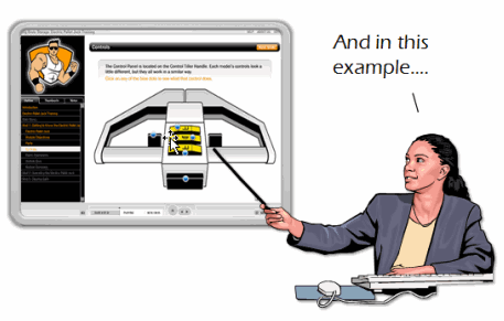
    Most likely what they know about elearning is based on the elearning they’ve taken.  By showing them examples of different types of elearning, you’ll be able to shape their understanding and help create expectations for a different approach.  If you want more than a click-and-read course, you have to show them an example of something different.

    The Rapid E-Learning Blog: showing subject matter experts examples of interactive learning

    Ideally you want them to focus less on the information and more on making the information meaningful.  So, don’t focus on the multimedia bells and whistles.  Instead focus on relevant interactivity.  Show them examples that demonstrate how the learner learns more through the interaction. 

    But don’t expect them to sit through a 30 minute course.  Instead, point them to what you like and why you think it will be good for their course.  Also, don’t bombard them with 20 things.  A good rule of thumb is to present three treatments so that they can get their heads around the ideas and not feel overwhelmed.

    Everyone is working for the organization’s success. 

    The organization defines success by reaching it’s goals in a cost effective and efficient manner.  You can contribute to this.

    Fundamentally, instructional design is about crafting a learning environment that produces successful results.    This means more than just converting a PowerPoint slideshow to Flash.  Success comes when you can connect the course content to the learner’s world so that the learner is able to do something new or better.

    One of the best ways to save time and money on your projects is to establish clear expectations.  Like you, the SME typically doesn’t have a lot of time.  Many times, they’re not even part of the project team; they’re just told to give you information.  So working with you is an excursion away from their normal responsibilities and a drain on their limited time.  You can control the time requirements by setting clear expectations that include agreed upon timelines and action items

    People like to be recognized.  A great way to get the SME attention and support is to send a glowing email to the person’s manager and CC the SME.  This has never failed me.  Doing this will help you when you need some of the extra time from the SME for reviews or follow up.  

           The Rapid E-Learning Blog: partnering with subject matter experts for success

    Make sure that your efforts make sense.  Early in my career I was working on a course in a production environment.  As I was wowing them on the production floor with all of my fancy ideas about learning, one of the senior technicians facetiously asked, "You’re one of those college educated people, huh?"

    I got it.  I over-engineered the elearning.  I tried too hard to make it "fancy" and not hard enough to make it a good course that met their needs.  Ultimately this impacts how people view your contribution.  Instead of being seen as a valued partner, you’re seen as someone they have to tolerate or worst case, a nuisance because you don’t bring real value and waste time.

    A critical facet in managing your elearning project is managing the relationships with people who support it.  If you want your project to be successful, you need to establish a good working relationship with your subject matter experts.  They play a key role in the content you need, how you design your course, and whether the course succeeds or not.

    What are some things you’ve done to help manage the relationship with your subject matter experts?  Leave a comment here.

    Events

    Free E-Learning Resources

    Want to learn more? Check out these articles and free resources in the community.

    Here’s a great job board for e-learning, instructional design, and training jobs

    Participate in the weekly e-learning challenges to sharpen your skills

    Get your free PowerPoint templates and free graphics & stock images.

    Lots of cool e-learning examples to check out and find inspiration.

    Getting Started? This e-learning 101 series and the free e-books will help.


    Tools like Articulate Presenter are great for creating elearning courses.  However, a lot of what you do depends less on the rapid elearning tool and more on your PowerPoint skills.  In fact, I get so many emails asking about how to do this or that in PowerPoint, I decided to do a quick series on some essential PowerPoint tips and tricks. 

    So far we’ve looked at:

    In today’s post, I am going to show some time-saving tips to use when working with PowerPoint shapes.  You’ll learn to apply various formatting features, make custom edits, and create the shapes you want.

    Sizing Shapes

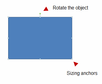
    When you click on a shape, you get anchor points on the sides and in the corners.  You can click and drag these anchors to resize your objects. 

    The Rapid E-Learning Blog: sizing shapes

    • Scale object: If you want to resize the image or object (and not mess up the aspect ratio), then press SHIFT and drag from the corners.  You’ll see that the shape resizes, but the aspect ratio stays the same.
    • Resize from all sides: Holding CTRL down and dragging the mouse, resizes the shape equally from the opposite side.  Go ahead, try it.
    • Perfect circle or square: If you want a perfect circle or square, select the oval/rectangle object, press SHIFT and then drag the object onto the screen.

    Moving Shapes

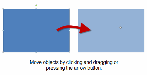
    You can move shapes on the screen with the mouse or keyboard. 

    The Rapid E-Learning Blog: moving shapes

    • Maintain alignment: What if you want to keep the shape in the same alignment?  Click and drag the shape while pressing SHIFT.  This allows you to move the shape up/down or left/right aligned to its current position. 
    • Copy and align shapes: I use this feature a lot when I make quick duplicates of a shape.  I press CTRL + SHIFT and drag the shape to make a copy that is already aligned to the current shape. 
    • Nudge objects: Instead of using your mouse, use the arrow keys.  Select your shape and then press the arrow key.  However, if you want to just nudge the shape a little, press CTRL and then the arrow.  To get more precise, zoom in and do your nudging.

    Format Painter

    There are a number of formatting options in PowerPoint.  For example, you can change the fill color, line color, and line style.  I won’t cover those because they’re fairly straightforward.  However, what I will cover is the format painter.

    The Rapid E-Learning Blog: use format painter

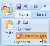
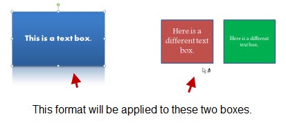
    The format painter is a handy tool because it allows you to copy the formatting of one object and apply it to another.  This will save a lot of time because you can create just the right formatting for one object and with a few clicks apply it to all of the others.

    The Rapid E-Learning Blog: format painter example

    format2 

    Filling Shapes

    When filling shapes you have a number of options.  You can fill with color, a texture, pattern, or picture.  In addition to filling the shape, you can change its level of transparency.  Today, I want to focus on two fill elements.

    • Use gradient fills to create depth and visual interest.  Instead of sticking with a solid color, use a gradient fill.  This can add depth to your screen which creates more visual interest.

    The Rapid E-Learning Blog: gradient fill example

    The image above is from a tutorial I did earlier this year.  I used a gradient fill on the brown background.  It’s a rectangle that goes from brown to white.  I also used a fill on the egg shape to give it some depth. 

    • Fill shapes with pictures.  Filling shapes with pictures opens up all sorts of possibilities.  Here are some before and after images.

    The Rapid E-Learning Blog: fill shapes with pictures 

    Create Custom Shapes

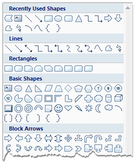
    PowerPoint gives you quite a few options when it comes to shapes.  Most of the time, those are plenty.  However, there are times when you want a certain type of shape and it’s just not available.

    The Rapid E-Learning Blog: PowerPoint shape feature

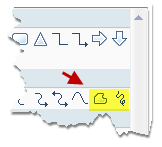
    If you want a custom shape, you can draw one using the freeform tools.  Just click on the tool and then start drawing.

    The Rapid E-Learning Blog: freeform tool

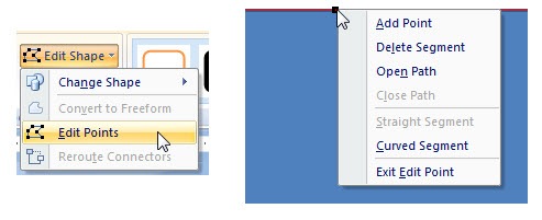
    Another option is to use the edit points.  It works a little different in PowerPoint 2003 than it does in 2007.  However, the basics are generally the same.  Create a shape and then modify the edit points.  You can create straight or curved edges and make as many points as you need.  It takes a little practice, but you’ll find that you’ll never lack for shapes again.

    The Rapid E-Learning Blog: custom edit paths

    Here’s a simple example to show how you could use a custom-made object.  In this case, I wanted to add a simple curved border.  So I just converted a rectangle to a freeform object and edited the points. 

    The Rapid E-Learning Blog: custom shape example 


    There are a lot of things you can do with the PowerPoint shapes.  The more you practice using some of these techniques the more creative you ca
    n be.  In addition, you’ll find that it speeds up your production time because you’ll be able to quickly make edits right inside of PowerPoint.

    If you have some tips and tricks feel free to share them in the comments section.

    Events

    Free E-Learning Resources

    Want to learn more? Check out these articles and free resources in the community.

    Here’s a great job board for e-learning, instructional design, and training jobs

    Participate in the weekly e-learning challenges to sharpen your skills

    Get your free PowerPoint templates and free graphics & stock images.

    Lots of cool e-learning examples to check out and find inspiration.

    Getting Started? This e-learning 101 series and the free e-books will help.