Rethinking E-Learning Templates
January 14th, 2020
E-learning templates can be a bit challenging. On one hand, they speed up production. And then on the other they may introduce constraints in the learning experience design.
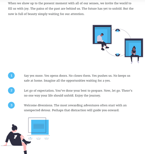
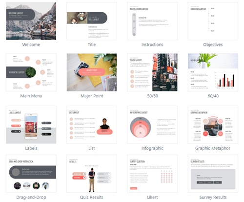
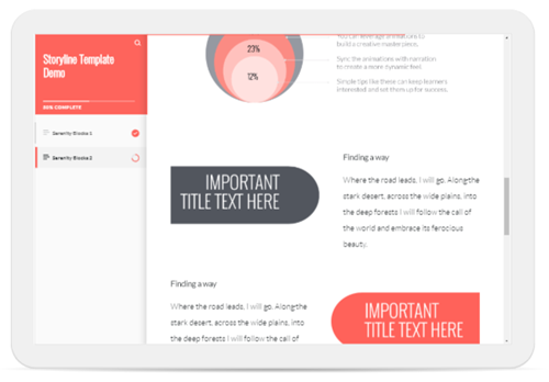
An e-learning course screen has a specific structure. It’s usually rectangular and contains text and imagery. The text and imagery are laid out on the screen and is constrained by up, down, left and right placement. Of course, the possibilities for layouts can be endless, but there are probably just a few dozen layouts that make sense for e-learning courses.
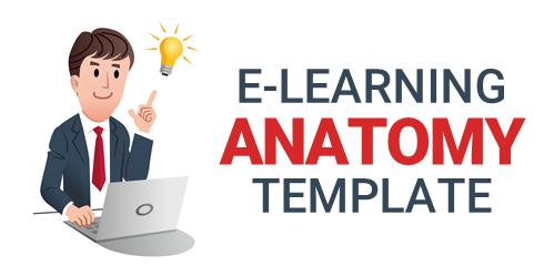
Here are a couple of recent posts where we discussed the anatomy of e-learning templates and how to get the most value out of templates.
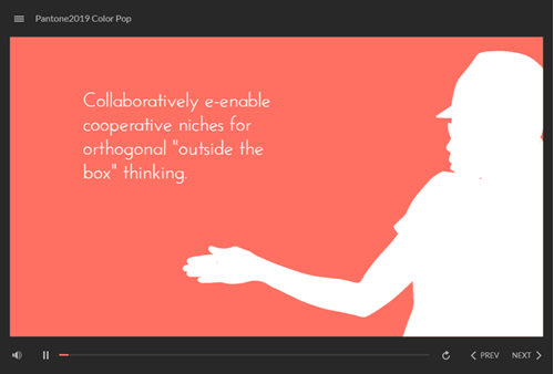
E-learning Template Value
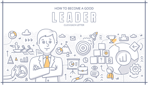
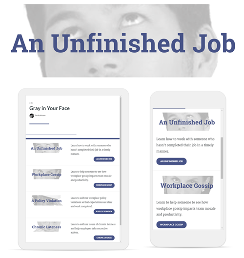
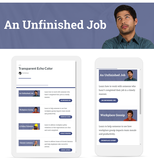
Templates work for repetitive processes because they can be used over and over again. For example, most courses have some sort of simple list of learning objectives. While the course content may change, those course screens are usually consistent.
E-learning Template Constraints
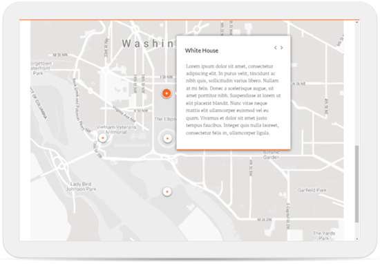
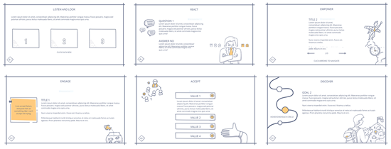
Courses consist of content that is contextual. And from a learning experience, that contextual content has specific teaching requirements. For example, if I teach how to use software, then the screens are dependent on screenshots. And if I teach how to interact with a customer, the visual context is best represented in a manner similar to how you may interact with the customer.
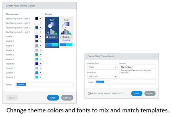
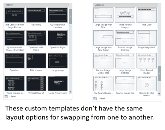
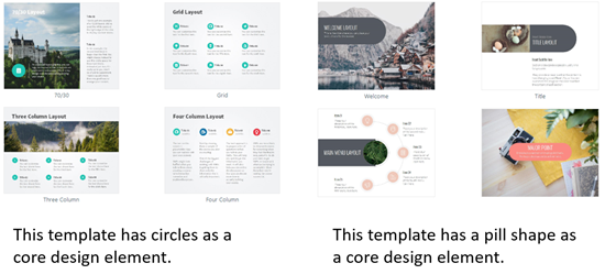
I may find some good general layouts for simple content, but as soon as I have to work with specific content, I find that there’s a lot of tweaking and adjustments made to the templates that may mean I save more time just starting from scratch.
E-Learning Template Hybrids
I like to separate my templates into three parts and find the most value in using templates in the first and third.
- Entering the course
- Course content
- Exiting the course
Most courses have the same or similar starting points with welcome screens, instructions, objectives, sections, etc. And they also have similar exit points such as summary screens, next steps, and exit instructions.
Those two parts, the entering and exiting of courses, are perfect for templates. The templates are easy to insert, update, and contextualize. The middle part that deals with the actual course content is different.
Course content templates are great for simple text layouts. They break down as the content design becomes more specific. That’s fine, just use templates for the beginning and end and for simple text. But don’t waste time trying to force content into a template. Or worse, don’t create a template and force the course authors to make the content comply with a template.
Templates are great for e-learning. However, they exist to save time. Keeping templates for easy-to-repeat screens makes sense. Forcing content to fit templates probably doesn’t. But that’s OK. Just use the template screens where you need them and start with blank screens where they need customization. Don’t waste time fitting a square peg into a round hole.
Events
- Everyday. Check out the weekly training webinars to learn more about Rise, Storyline, and instructional design.
Free E-Learning Resources
 |
 |
 |
|
Want to learn more? Check out these articles and free resources in the community. |
Here’s a great job board for e-learning, instructional design, and training jobs |
Participate in the weekly e-learning challenges to sharpen your skills |
 |
 |
 |
|
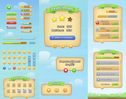
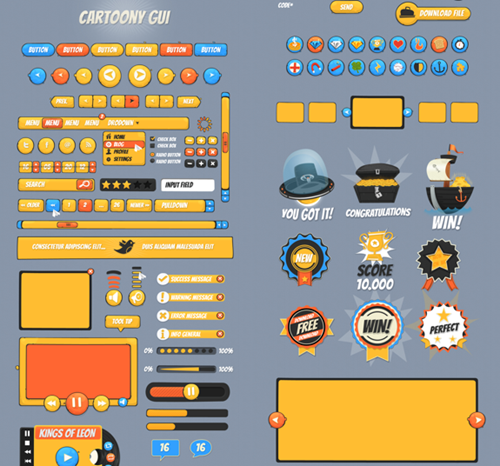
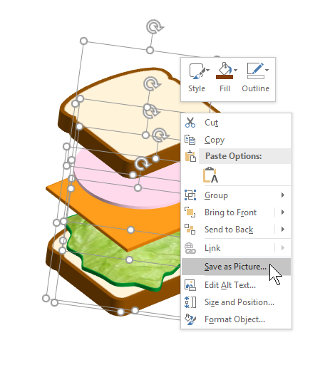
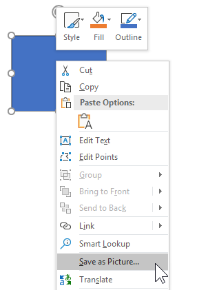
Get your free PowerPoint templates and free graphics & stock images. |
Lots of cool e-learning examples to check out and find inspiration. |
Getting Started? This e-learning 101 series and the free e-books will help. |


2
comments