


Thanks for sharing this, Tom. Visually interesting AND danceable.
Weekly Challenge: A Couple of Visual Design Tips for E-Learning
February 26th, 2019
As mentioned previously, I like to take part in the community’s e-learning challenges. They’re great to practice ideas and learn more about using the e-learning software.
In a recent e-learning challenge, we were asked to create a demo module and use the 2019 Pantone Color of the Year (which is Living Coral). This came at a good time, as I was pulling together some content for a workshop and wanted to show a few different ideas around color in a course’s visual design. The examples below go from subtle to “in your face.”
Visual Design Tip: Make Everything Greyscale & Use One Accent Color
One tip we share often is to make everything greyscale. And then select a single accent color. One benefit is that it tends to make the screen content look a bit more elegant. And the accent color really pops. And it gets rid of a lot of conflicting colors and helps direct the eye.
Click here to view the example.
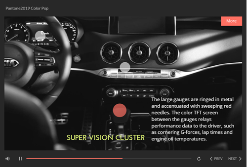
In the example above:
- Converted the car interior image to greyscale
- Used the Pantone color for the label markers
- Used a color schemer to create a second color to complement the Pantone accent color
Often less is more, and in this case getting rid of color in the image and working with one (or two accent) colors really makes them pop and it cleans up the visual design.
Visual Design Tip: Use Silhouettes and Bold Colors
This other example is a bit more bold and in your face and it’s create to draw attention. I’d use it sparingly, but it’s great for making key points or title screens. And it’s easy to do.
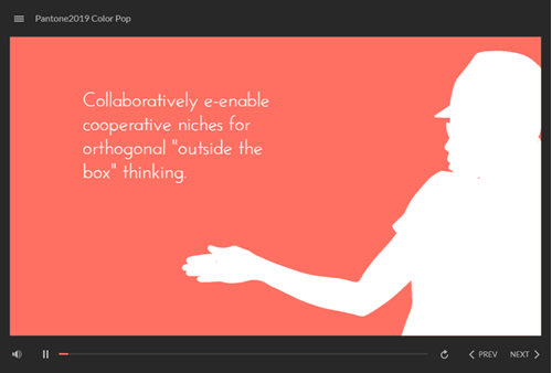
Click here to view the example.
Silhouettes are easy to create from people and objects. They work best with strong contrast. I like them because their ambiguous which comes in handy for people imagery.
- Create a bold background color
- Insert a character
- Adjust the brightness and contrast settings to create either a white or black silhouette.
Check out some of the other Pantone 2019 challenge entries. If you don’t participate in the e-learning challenges, you should. You’ll learn new things and be amazed at what others create and how different everyone is in approaching the same challenge.
If you do participate, write a post and share what you learned or a technique you used to build it.
Events
- Everyday. Check out the weekly training webinars to learn more about Rise, Storyline, and instructional design.
Free E-Learning Resources
 |
 |
 |
|
Want to learn more? Check out these articles and free resources in the community. |
Here’s a great job board for e-learning, instructional design, and training jobs |
Participate in the weekly e-learning challenges to sharpen your skills |
 |
 |
 |
|
Get your free PowerPoint templates and free graphics & stock images. |
Lots of cool e-learning examples to check out and find inspiration. |
Getting Started? This e-learning 101 series and the free e-books will help. |
You might also like:
3 responses to “Weekly Challenge: A Couple of Visual Design Tips for E-Learning”
Thanks for the great inspiration. I really like the effect when the background image is made greyscale and one accent colour is used.
Another tip when working with a background image would be to overlay a semi-transparent screen on top. This simplifies a rather busy background and makes text more visible.
Hi,
The points that you have mentioned are great. I will surely try to apply both the points in my future online class.
I was using a whiteboard with a dark colored pen on it.
I think I need to be little proactive as well
It would be great if you add a few more tips that I could use in my online class.


0
comments