I like this idea. We do something similar and this will help us create some templates.

Many elearning courses have some sort of welcome screen or a start screen where you can review module choices and select where to go. They let you set the stage for your elearning course by selecting a few key images that fit the context of the course’s content. And then use them to create a visually welcoming experience.
Think of it like a welcome mat. The visual start screen is not going to replace good content. But it does set the tone and initial perception of the course. Use it to capture the person’s attention and from there pull them into the course.

Fill In Your Design Gaps with Good Stock Images
Most course developers aren’t graphic designers. If you have a graphic designer, then you are set. But if you don’t then you’re on your own. So the challenge is how to get a nice look with limited experience and no resources.
One of the easiest ways to make up for lack of graphic design is to find a few really strong images that fit the context of your course. Here’s a good post on listening to your visual voice to figure out which images are the best fit.
- Action item: Find some good images that work for your content.
Create a Start Screen Layout
There are a number of ways to design the layout. I like a strong title image and then add some compartment images. They can link to other sections or slides.
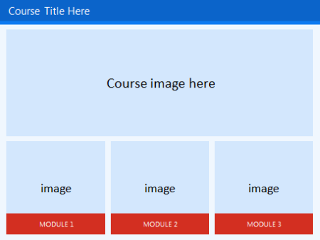
You may want to create an additional layout as the destination layout. This helps set some repetition and visual continuity.
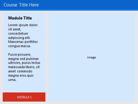
The examples are basic. But you can create as many layouts as you want. They can be simple like the ones above or much more sophisticated. In an earlier post we discussed ways to determine layouts prior to building your course. I’d create some layouts similar to the ones above.
Play around with the layouts. Make some horizontal and some vertical. And then maybe some that are more like a visual grid similar to what you’d see in Pinterest or on an iPad screen.
- Action item: Create a main layout and destination layout.
Add Images to the Start Screen Layout
Once you have layouts determined, it’s just a matter of adding the right images. As I stated earlier, I look for one image that sets the tone. It represents the essence of the module or section. It’s kind of like the title font. Then I look for additional images to represent the segment topics.
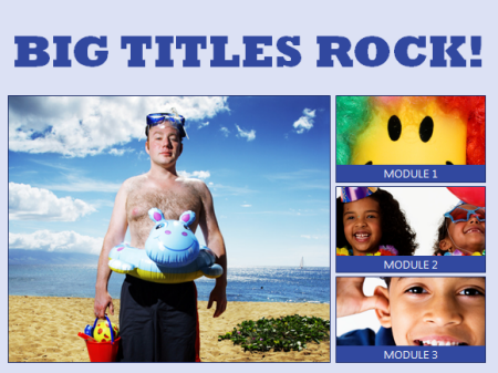
The key when working with the images is to use a consistent aspect ratio. You want all of the images to be the same and align properly. That will save you time. If you stick with a default aspect ratio, then you can crop to that aspect ratio and only worry about resizing the image.
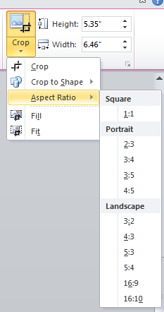
- Action item: Determine how you’ll quickly align the images to the layout.
To help you out, I created a quick tutorial of how to create a simple start screen layout and then show a simple way to crop the images to the layout so that the alignment is proper and consistent.
Click here to view the tutorial.
To save time or practice doing this, you can download the free template I used.
The initial screen sets the tone of the course. What do you want that screen to look like? Is it inviting? or does it tell the learner that this is yet one more boring elearning course? Hopefully by starting with some pre-established layouts and the right images, you’ll be able to capture the person’s attention.
Let me know what you think.
Events
- Everyday. Check out the weekly training webinars to learn more about Rise, Storyline, and instructional design.
Free E-Learning Resources
 |
 |
 |
|
Want to learn more? Check out these articles and free resources in the community. |
Here’s a great job board for e-learning, instructional design, and training jobs |
Participate in the weekly e-learning challenges to sharpen your skills |
 |
 |
 |
|
Get your free PowerPoint templates and free graphics & stock images. |
Lots of cool e-learning examples to check out and find inspiration. |
Getting Started? This e-learning 101 series and the free e-books will help. |
7 responses to “Create a Visually Stunning Start Screen for Your Next E-Learning Course”
Bravo. Appreciate your tips.
I like the idea but not quite sure how to size the images.
very helpfull. thanks!
This is a really well written article. I will make sure to bookmark it and return to read more of your useful information. Thanks for the post. I will certainly return.





0
comments