My pet peeve is badly written multiple choice questions where you can guess the answer by common sense or which test entirely the wrong thing. Or where the answer is ‘all of the above’.
Here’s My E-Learning Pet Peeve. What’s Yours?
August 26th, 2014
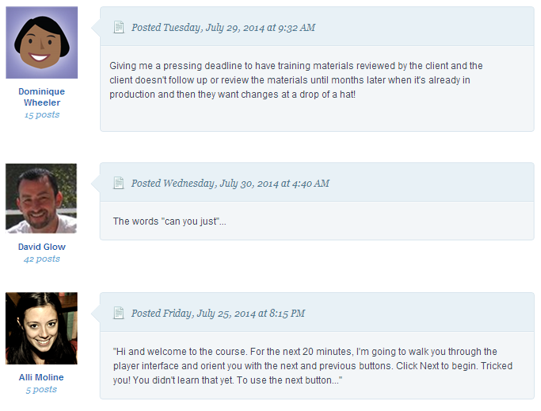
Recently there was a great discussion in the elearning community on pet peeves. As you review them, I’m sure you’ll be able to relate to quite a few. Here are a few that stood out to me:
My E-Learning Pet Peeve
There are a lot of things I’d like to improve with elearning but one of those things that bugs me most is when the client wants to lock the course navigation. And then when I ask why, it’s because they want to make sure that the person is getting all of the information.
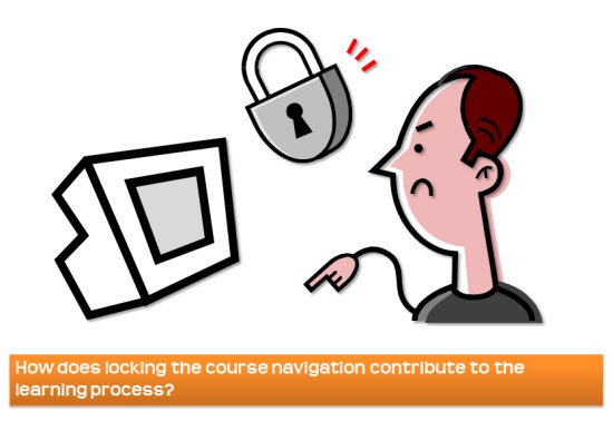
I addressed this issue in a previous post. Locking online courses so that the learner “gets the information” is ridiculous. The only thing they’re getting is a headache and repetitive stress disorders as they rapidly click on the next button. Of course the case could be made that adding a slow narrator to the locked course helps slow down the rapidly clicking and in turn decreasing repetitive stress injuries.
The only way you know they GET the information is by having them show you how they use it. I prefer some sort of contextual activity where they apply what they’re learning to demonstrate their understanding of what they know.
Of course, some clients will still want to lock the course. That’s OK. Lock it at the decision points and not through the navigation controls.
So that’s my elearning pet peeve. What’s yours? Share it here.
Events
- Everyday. Check out the weekly training webinars to learn more about Rise, Storyline, and instructional design.
Free E-Learning Resources
 |
 |
 |
|
Want to learn more? Check out these articles and free resources in the community. |
Here’s a great job board for e-learning, instructional design, and training jobs |
Participate in the weekly e-learning challenges to sharpen your skills |
 |
 |
 |
|
Get your free PowerPoint templates and free graphics & stock images. |
Lots of cool e-learning examples to check out and find inspiration. |
Getting Started? This e-learning 101 series and the free e-books will help. |
27 responses to “Here’s My E-Learning Pet Peeve. What’s Yours?”
Text in Elearning or any training document that’s full of incorrect grammar (e.g., “their” instead of “there”). You lose all credibility with me when you don’t know the proper rules of grammar!
Legal disclaimers in readable font and locked to ensure they are read (ha!) followed by content in incredibly small font and general misuse of visual space.
Assuming that technology will make bad teaching better or that technology can’t make good teaching better. Technology is just a tool that can help those who those who know how to do the job and are of no use to those who don’t know how to do the job. A hammer does not make a carpenter but a well designed nail gun can make a carpenter better or at least faster. A good teacher can select the technologies that will best improve the success of the students.
Educators send me photos they want me to use, but they don’t have permission to use them…they get them from the internet! Burns me up!!
Narration that reads the text on the screen verbatim.
Voice-over that reads the text that is already on the screen. I had to sit through one recently (not built by me, thankfully) that had the full text on the screen, the VO reading it to me and if I wanted to, I could click the button for the closed-captioning WHICH WAS THE SAME AS THE TEXT ON THE SCREEN! Grr…
Oh, and the next button only appeared after the VO was over. Fun times…fun times…
I totally agree with you, Tom! Locked navigation tops my list. I also agreed with Michele about narrating on-screen text! One of my pet peeves is over-engineering the solution: using complicated interactivity for what is essentially a knowledge transfer. Another peeve is using training to explain the history of the project that made the training necessary. Both waste a lot of time.
As an add-on to Tom’s, not allowing a pre-test that will let users skip portions in which they can show knowledge, especially for annual compliance training. I actually had an SME ask, “if the users don’t see every slide, how can we be assured they are trained?” UMMM, isn’t that why you asked my to come and give advice on adult learning…
Everyone was supposed to attend this class by Friday, but they can’t make the scheduled session. Can you turn this into an eLearning, so they can ‘sign off’ before Friday?
Requests for developing an elearning module for a system/website/software that is still IN DEVELOPMENT. Often, the project stakeholders want the Elearning to go live at the same time the system is ready! Most common setback: interface and systems features changing, buttons that used to be there have disappeared in the final version! *sigh*
I wish this blog had a “like” button because I agree with so many of the responses! I too get annoyed by multiple choice answers created by Capt. Obvious, verbatim narrations in PowerPoint presentations and copyright violations by faculty. Recently, I installed a SCORM package that was locked. I asked a salesperson why it was locked and, sure enough, it was so users wouldn’t miss any content. And this package included a pretty detailed quiz, presumably to catch those who slept through the video in the first place! I felt like the character in “A Clockwork Orange”, forced to watch with my eyes forced open.
At the moment, my biggest peeve is being asked to do really simple tasks – such as upload documents. Requesters claim the task is too complicated, however; I suspect they’re too lazy. I have begun creating and sending them instructions on carrying out rudimentary tasks. Hey, I didn’t get a Master’s in education for nuthin!
When I talk to a SME and they indicate that “the business is asking for” a requirement.
No way to make “the business” accountable or a way yp contact “the business.”
The client insisting on wordy introduction slides with extensive welcome, the benefits of the course and expressive hopes that the learners will enjoy the course.
Hate this especially when my design looks at jumping straight into a scenario setting 🙂
My pet peeve is that no one seems to know how to measure sucess for large scale projects (audience size of 1000+) so they default to completion hours. This makes a 40 classroom course seem better curriculum that incorporate a blended approach where the only tracked course is very short to introduce the content and the structure of the curriculum.
One peeve is when, after you’ve put together their e-learning, people ask, “is there any way we can print this out?”
Another is being asked to click inane things in a page-turning class (that should not have even been created) just so someone can say it was interactive. And not being able to get through the material by clicking the next button because the course is locked until you type in a correct zip code or some other content that is nothing more than sample content.
Easy: when the customer starts behaving like Instructional Designer.
They think they know what’s best for the learner and start demanding random things.
In a product company where product owners are the boss, the IDs are reduced to order takers.
I’m sure this was mentioned before, but it has to be the navigation orientation (i.e. this is the next button; this is the exit button, etc). Nearly all eLearning users browse the internet so they’ll be familiar with the navigation controls, but for some reason we think when they come to an eLearning course they’ll magically forget and need to re-orient them to the controls over again.
Great title for this post. Got me WANTING to click on the link. Current pet peeve: arrogant instructional designers (usually somewhat established). There’s so much know, none of us have that privilege. As Emerson said, everyone is our superior in some way. –Daniel
The use of ‘Objectives of this Course’ slides. They’re never objectives of the course but are always the objectives that the subject matter expert or ID wants included as a butt-covering exercise, as they are the requirements given to them by their managers.
Aimed-for outcomes should be communicated before launching the campaign by showing the possible errors, ommissions, accidents etc. that can occur without being fully aware of the content. Use them to build some interest in the coming module(s), then let the users explore the scenarios, make mistakes and hopefully learn something new or confirm what they thought they knew already.
If the users don’t know why they’re in a module by slide 3/4, then it’s already too late.
My pet peeve is more towards us, the Instructional Designers. Please do yourself a favor and google Robin Williams’ “Design for the non-Designers”. Know how to use contrast, repetition, alignment and proximity. A badly designed course distracts me and it takes merely seconds to apply these basic design rules.
Client SME wants “unique”, “engaging”, “fun”. Client LMS Manager requires “consistency”, “compliance”, “click through”. Arrrggg!
Peeve du jour: Too frequent comment from clients and colleagues that “instructional designers make courses look pretty.” Yep, reduce all our experience, countless hours, dedication to helping others learn to whether the course is “pretty”. Aargh!
We want some branding, but we don’t want the side menu. Can you put the logo on every slide?
I work in higher-ed. My pet-peeve is when instructors think e-learning is recording their 55min or 3 hr lecture of them standing in the front of the class “lecturing” and putting it online. Argh!
I agree with many and I am currently and continuously “trying” to get non ID persons, who are, of course, the decision makers to listen to the “expert” (which is what they refer to me as when something is needed). However, when I offer some of the “Best Practices” tips, then, all of a sudden, they become the experts. My other pet peeve is totally aligned with Lisa’s, where these same decision makers think that ID is only about making things “look pretty”….Aarghx2! Hopefully, as I build more meaningful courses, I will start to change their perception about some of these pet peeves. It’s going to be a long road.
The other issue that I have currently, is that another ID person does not follow “best practices” that we all read in these and many other blogs from the experts. And, I don’t think this other ID person will change ways anytime soon.
Okay, so this is my pet-peeve in regards to taking online courses. Being someone who designed a multitude of courses on various topics for the same company, I had to follow the same design principles every time. I have no problem with this, what drives me crazy is when the design of courses change from course to course within an organization. Play bar, sure, on these classes, but not on those. Complete course schedule, with links to assignments, quizes, etc. yep, well only in this class, not the others. Nothing bothers me more than to be on a company or university LMS and have the material within that LMS not be presented the same way… There I said it, I don’t even care if the standards are poor standards, just don’t change the functionality from module to module… Whew, okay, all done. Thanks Tom, that felt really good.



0
comments