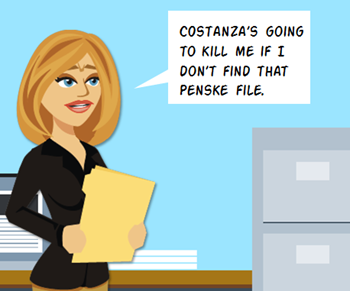
An essential ingredient for interactive and engaging elearning is to let the learner explore and collect information that assists in making decisions. A common design concept to facilitate exploration of content is the interactive desktop where the learner can select desktop objects to collect information.
Today I am offering a free elearning template designed that can be used to craft an interactive experience.
Design Ideas for the Free E-Learning Template
Here’s a flat desktop design I found a while back. It’s from the docTrackr site. I like the clean and simple design. It looks good and it’s really easy to build for someone with minimal design skills. They’ve changed their site since then but fortunately I kept a screen grab in my inspiration and ideas folder.
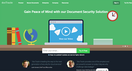
When I find a design I like, the first thing I do is try to replicate it. And then I try to add my own spin. This lets me learn to use the tools I have better and to think through the design structure and construction of the design elements.
Examples of the Free E-Learning Templates
As I mentioned above, the desktop illustration is a great way to present content collection. So I took the desktop idea and then made it interactive. Below are some examples of the templates in action.
The first one is made in PowerPoint and the second in Articulate Storyline.
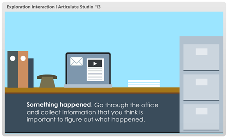
Click here to view the PowerPoint elearning example.
Here is the same interaction created in Articulate Storyline. Storyline offers more interactive capability so I included descriptions for each object, visited states, and a collection meter that triggers a completion response.
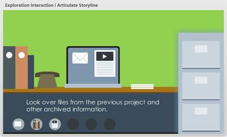
Click here to view the Storyline elearning example.
Download the Free E-Learning Templates
Here are links to the free elearning template downloads:
Production Tips When Creating Your Own E-Learning Template
You are free to use the templates in your courses. However, I encourage you to create your own desktop designs. It’s a good way to practice and get better using your elearning applications.
If you do create your own templates or add content to the free elearning templates then here are a few tips to help design the illustration and the interactivity.
- Keep it simple and don’t add too much detail to the objects. This makes production easy for you and the template will look clean.
- Avoid clutter and allow for lots of white space to give your eyes a break.
- Use clutter. So you want to ignore tip #2, that’s OK. Leverage clutter the same way you might for “I Spy” or one of those “Waldo” diagrams. This could work if it’s contextual but it could also be frustrating. Something to keep in mind.
- Why be flat? The desktop used the classic floor-wall-baseboard technique. That helps center the eye and maintain a clean design.
- After making a selection, where will the information show? You need a place to show the information. Another consideration is how will you show it? Will it be a click, drag, or hover?
If you create your own flat desktop, feel free to share it. I’d love to see what you do.
Events
Free E-Learning Resources






0
comments