Daily post would be fine! 😀
How to Practice Visual Thinking Skills & Apply Them to E-Learning
December 14th, 2021
In a previous post, we discussed visual thinking concepts and where they fit with e-learning design. Now, let’s look at ways to practice sketching your ideas so that you’re able to move past understanding the concepts and actually applying them to your course.
How to Practice Your Visual Thinking Skills
The first step is to get a handle on the basics:
-
Learn to capture concepts using Roam’s visual grammar or Gray’s approach to visualizing ideas.
-
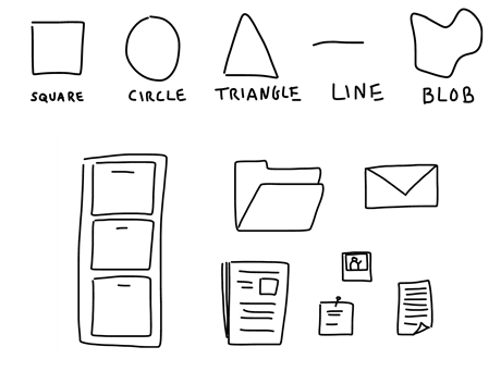
Become fluent with your visual alphabet and the basic shapes used as building blocks. This helps you see the basic shapes in the objects you want to create.
-
Practice using the basic shapes to create specific objects. The more you practice the better you’ll become at seeing the shapes and sketching something that looks like what it’s supposed to be.
Practice Activities for Visual Thinking Skills
Some people have innate skills and sketching isn’t too hard to start. But many don’t have those skills and feel like they can’t do it. But they can. A key point is to feel comfortable sketching.
Remember, this isn’t about becoming a graphics design professional. You want to get a feel for the flow of drawing with your pen, especially if you’re using a computer or tablet. Then develop some fluency and clarity. And that will take a little practice.
Here are some practice activities.
Activity 1: Create basic shapes over and over again.
Work on getting lines straight and completing the desired shape in less strokes. Can you create the shape in one movement and still have it look like it’s supposed to? For example, I notice that if I create a triangle really fast, then the sides start to bow in. However, if I am more deliberate my lines remain straight. The goal is to get straighter lines at a faster speed. A circle should like a circle and not a blob.
Activity 2: Creating common objects.
Look around your office and identify 10 random objects. Break them down by the basic shapes and then create them a few times. For example, here’s a quick sketch of my desk. It’s mostly rectangles and a few circles.

Another thing is to recognize what makes the shape unique and identifiable. For example, an elephant stands out because of the trunk and large ears. By focusing on the essential shapes you can convey the idea of an elephant without having to create the entire thing.
Activity 3: Convey concepts with your objects.
Start to practice sketching whole ideas. Identify three TED videos and capture the core concepts as sketches. It may be easier to just start with three main ideas from each video. Or if that is too much, just focus on a single point. The good thing about video is that you can pause it and rewind. Here are three to help you get started:
Activity 4: Improve your penmanship.
Sunni Brown has some good advice in her book Doodle Revolution where she says to trace over letters. Find a font type you like and type out the ABCs and save as an image. Then load the image into your drawing app and practice tracing over the letters. Eventually you’ll develop the muscle memory to create nice legible handwriting for your sketches.
When I was a Finance Specialist in the Army we were taught to use block letters so that our writing was more legible. To this day, I still do a lot of printing with block letters and it helps when I write, especially smaller text.
Examples of Visual Thinking Skills in E-Learning
Here are a three examples of people who do a great job sketching their ideas and are part of our industry. They also offer tips via twitter and their blogs.
-
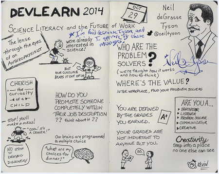
Kevin Thorn of NuggetHead Studioz. I ran into Kevin at a Devlearn conference. He showed me his sketch note of the Neil deGrasse Tyson keynote. Obviously we don’t all have Kevin’s innate drawing skills, but if you look past the drawings it’s mostly print and a few basic shapes.
-
Blair Rorani of Ever Learning. At a workshop I did in in Australia, Blair live sketched my presentation which I noted in this post on instructional design challenges.
-
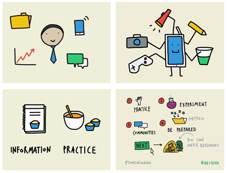
John Curran of Designed for Learning. I love John’s sketches. Again, they’re not overly complicated to create,
but they convey good information and the hand drawn style creates enough contrast to engage people visually.
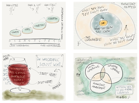
The key in all of this isn’t to become a pro graphic designer. Instead it’s learning to think visually. E-learning is a mostly visual medium and anything we can do to better communicate our ideas will only serve to make the courses we create better.
Events
- Everyday. Check out the weekly training webinars to learn more about Rise, Storyline, and instructional design.
Free E-Learning Resources
 |
 |
 |
|
Want to learn more? Check out these articles and free resources in the community. |
Here’s a great job board for e-learning, instructional design, and training jobs |
Participate in the weekly e-learning challenges to sharpen your skills |
 |
 |
 |
|
Get your free PowerPoint templates and free graphics & stock images. |
Lots of cool e-learning examples to check out and find inspiration. |
Getting Started? This e-learning 101 series and the free e-books will help. |
19 responses to “How to Practice Visual Thinking Skills & Apply Them to E-Learning”
I’ll take anything you have to offer as frequently as you’re prepared to offer it! You got me into this [eLearning] mess many years ago and you’re one of a select few that I have stuck with over the years. You demonstrate the power of sharing; long may you reign!!
Thank you for this information. Your articles are always very helpful and manage to come at the most timely times…. Thanks!!
Thank you for all of your practical contributions to the elearning community, Tom! I always find great value in your posts and am thrilled to receive them in my inbox…post away! 🙂
This is my favorite topic of all. I love teaching these concepts and see folks begins with “I can’t…” to “I had no idea I could do that…”
“Every object is first a shape; a shape occupies space; that space defines the object.”
I suppose there could be worse things to see when you Google your name than a Vampire Wrestler. 🙂
I enjoy reading your posts and find them to be educational and thought-provoking. A second posting per week would be great. Thanks
I always learn at least one new thing in every one of your posts, so just think how much more I will be able to do with 2 posts a week!
More, Tom! And Thank You!
I always learn form your posts. All of the tips and ideas you share are practical and have helped me greatly. I’d appreciate a second weekly post. Thanks for sharing “the good stuff” with us, you are one of the few elearning blogs I follow.
Tom thanks again for mentioning my work.
For everyone who wants to join in, today is day 2 of the Twitter draw-a-thon. It’s a fun, non-competitive way to practice and improve your drawing skills. Get started here: http://blair.rorani.com/twitter-drawathon
Yes please Tom! Twice a week would be terrific!
Hi Tom,
I love your newsletters – but if we had two emails a week, I think it would be too much to digest – information overload! I keep all your newsletters and glean over them from time to time; but currently, I love the once-a-week – it suits me, and enables me to put your ideas into practice.
A very appropriate post. I as an ID have seen my colleagues relying 100% on the graphic team for their pics. This restricts the creativity, modification on demand, and in many cases visual thinking – to only the pictures available in the catalogue.
I think having a draft ppt for the collaterals that u create, is highly beneficial. Especially when u need to make some quick changes. This rough work helps u as a template base for rest of your life.
Although this is the first time I am seeing my thoughts in words of TK.
Object deconstruction in PPT, and a basic knowledge of PS, along with some great sites like psdgraphics reduce the graphic dependency to minimum.
——————————————————-
As of posts on Thursdays, learning twice a week from the best, is always a good idea.
Regards.
Tom,
Absolutely I would like to read your posts on Thursday as well. I don’t know how you have the time to do that, but it works for me.
And for this topic of visual thinking, I get a flip chart and draw out my projects on that. First I create an outline in Word and then fill in some detail in a Word design document.
After that, I like to draw as much of the project as I can on flip chart paper to see the overall view of the project. I can make big squares for the slides, connect them with lines and it helps me visualize where the problems could be. Some slides I like to put in more detail as you mention in the article. Sometimes I just write notes.
It helps to do all of that before I sit with Storyline. I then lay out the project in storyline with blank slides and get all the connections to work. THEN I add the content because I know where it will go and how it will work.
Great article and lots of good tips.
Leggi la traduzione (autorizzata) in italiano di questo post qui: http://www.mosaicoelearning.it/blog/?p=3005
Tom,
Thank you for that great article! I nice way I like to handle the organization of e-learning content is through note cards. Many times, I draw shapes, arrows, and ideas on my note cards and pin them to a board. As I develop and grow my concept, I may remove cards and add new ones while shuffling their order, location, and relationship to each other. This great brainstorming idea helps get my thought out of my head and into a tangible and movable piece of content. It feels easier for me to deal with since I can rip a card off the wall or move it in an instant, without having to deal with the computer. Whit ideas on the wall you will also be surprised at the amount of curious co-workers who stop by to offer their opinions.
Tom Kuhlmann introduces a user friendly blog with available resources to assist instructional designers at different junctures of their work. This he evidences this in his blog in articles such as How to Practice Visual Thinking Skills & Apply Them to E-Learning. In his blog, he recognizes that the human mind does not function like a computer in the processes of retaining information within the long term memory and its retrieval for application (Laureate Education, n.d). Therefore he organizes material in chunks and applies categories of association for easier retrieval. In his design of his web blog articles he provides ample white space, while dividing articles according to topics, with available classes positioned on the side (Butler, & Sellbom, 2002). When users access his blog, they can easily recognize what they want, direct their attention to what they need and employ the desired tools and knowledge from his articles. In it he draws from his professional experience. However, he does not equate singular rules which match every individual. Instead, he displays declarative statements in reference to known functions of the operation of the brain, while allowing users flexibility in how and what they apply to their personal context for learning and developing teaching material (Ormrod, Schunk & Gredler, 2009). He presents practical applications for developing visual thinking skills with clear illustrations presented clearly and succinctly in the previous mentioned article. Tom Kuhlmann’s blog makes it easy to follow and to borrow ideas, adapted to the personal context of the user.
References
Butler, D. L., & Sellbom, M. (2002). Barriers to adopting technology for teaching and learning. Educause Quarterly, 2, 22–2 8
Laureate Education (Producer). (n.d.). Information processing and the brain [Video file]. Retrieved March 11, 2015 from https://class.waldenu.edu
Ormrod, J., Schunk, D., & Gredler, M. (2009). Learning theories and instruction (Laureate custom edition). New York: Pearson.
I subscribe to your site, as well as having an RSS Feed on my netvibes page. Although I don’t use Articulate Storyline (sorry!) I find your tutorials really good, and they don’t just apply to a particular product, which makes them even more valuable and versatile.
I will never say no to extra posts/tutorials and love to read them, but as long as it’s manageable for you.
Tom, As many before you’re one of the people that pulled me in and never let me go. Some more tutorials would be great. I’d love it if you could divide tutorials in Basic, intermediate and Advanced levels to facilitate all Articulate users starters and pro’s!
Tnx again for all you’ve shared with us!
Thanks a lot for providing such types of lesson. I am very much happy to inform you that anyone can acquire knowledge from that topics. I firmly believe that proper lesson can be a good store of knowledge. I hope such topic will be continued in future. Thank you once again.


0
comments