
The Learning Solutions Conference & Expo is only a couple of weeks away. And I can say that I am really excited! A few weeks ago, I wrote about how you can change the world by volunteering to build an elearning course for one of the LINGOs organizations.
Thanks to all of the blog readers who volunteered. From what I understand, they’ve filled all of the requests and have gotten hundreds of thousands of dollars in free course development. That’s what I call changing the world! I’m anxious to see all of the LINGOs courses.

David Anderson and I also took on the challenge and volunteered to help. Just like many of you, we had a short period of time to assemble the content and build an elearning course. It was interesting to collaborate with a client who was in a different country and we were both working from different locations. I can say we learned a lot on this project. You’ll hear more about that after the conference.
However, during the design process we had an interesting discussion about some course navigation and when to provide access to resources during a decision-making scenario. It’s a conversation that’s common to course design so I thought I’d share the gist of it.
The Set Up
Part of the course puts the learners in a situation where they have to make decisions. At this point they might not know all of the information to make the right choice. That’s OK because it’s kind of like real life. We’re always faced with decisions where we don’t have all of the information.
However, we did want to create a way for the learner to get information prior to making a decision. So we added a “learn more” feature. We liked the flexibility. A confident learner could skip the information and go right to making a decision. But if she wasn’t confident, she had resources available to make an informed choice.
Before deciding on our path, we wrestled with when and where to offer access to additional information.
Here’s the Dilemma
Suppose you create a similar type of interaction. You want the learner to make a decision. The decision will produce feedback that provides more detail. Here are your design choices:
- Give the learner access to “more information” prior to making the decision. But don’t provide it afterwards outside of the feedback.
- Don’t provide access to information prior to the choice. Force the learner to make an educated guess. Add a “review information” option after the decision.
- Offer access to additional information before and after the learner makes a choice.
Option 1: “More information” available prior to choice
In the image below, you are challenging the learner to make a decision. Some people already know what to do (or think they do) so they’ll just go ahead and make a decision. Others aren’t sure, so they’ll want to look up the organization’s policies and then make their decision.

What’s good about this approach is that the learner gets to assess her level of understanding first and then determines whether or not she needs additional information. And a more experienced learner isn’t required to go through a bunch of extra information prior to making a choice.
After the choice is made, you provide feedback with no offer for additional information. If the learner gets it wrong, you provide the right information in the feedback and encourage her to make “more informed decisions” on future decisions.
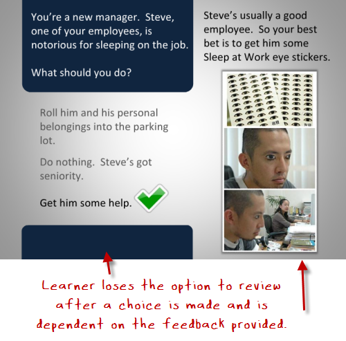
If you have the right type of scenario, you can use this approach to reinforce being certain of decisions prior to making them. My guess is that the learner would become more aware of her uncertainty and want to research her choices prior to making a decision. It allows her to assess what she knows and then build the level of understanding she needs to continue.
Option 2: Add a review option only after a choice is made
This next option is to not provide a “more information” feature prior to the choice. The learner has to make a decision based on her current level of understanding. If she’s not sure, she has to make an educated guess. This ambiguity creates some tension which you can leverage to encourage learning.
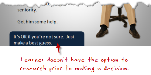
It’s not easy to make a choice like this because it puts the learner in a vulnerable position. No one likes the risk of being wrong. However, that risk is motivation to learn. And there’s nothing wrong with a little tension and uncertainty. You should have the freedom to fail in an elearning course.
Many elearning scenarios and choices are kind of lame; and the learner can quickly spot the correct answers. But if you created choices that are challenging and not easy to guess, it causes more reflection on the viability of the choices. This in itself is a great learning vehicle, regardless of whether or not the right choice is made initially.
Option 3: Provide information before and after the choice
This third option is the safest. You provide a feature to access additional information for the learner who wants to make an informed decision first. And after a decision is made, you provide access to additional information. Thus, the learner always
has access to the information and resources to help her learn. And that’s a real benefit.
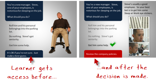
This approach definitely helps with navigating the course content. The truth is that many elearning courses can be tedious. In most cases, the learner’s not asking to take the course and just wants to complete it. So it makes sense to provide as much freedom to the learner as possible. And offering access to additional information at all stages in the course is valuable.
Personally, I like the ambiguity angle. Life isn’t tidy like the third option. And many of us just tend to make decisions and then learn from the consequences. Given the right type of scenarios and course content, I prefer a “throw them into the pool” approach, where they make decisions and learn through the consequences.
Which approach do you prefer? When would one be more valuable than another? Share your thoughts by clicking on the comments link.
Events
Free E-Learning Resources


0
comments