The Rapid Elearning Blog

Archive for the ‘E-learning’ Category


e-learning myths

I came into rapid e-learning from the world of Authorware and Flash where building courses took a lot of time and cost a lot more money. But I saw the light in the early 2000s when I started using Articulate Presenter. Initially, I only used it to storyboard my course content and interactions in PowerPoint. That made it easier to share my ideas with our Flash developers.

However, I quickly realized I could build most of what we needed in PowerPoint. So why were we wasting money on expensive Flash development?

As soon as I asked that question, I heard all of the bellyaching from our Flash developers and most of the custom e-learning vendors we hired. They felt threatened and raised all sorts of concerns about the future of the industry and the fate of e-learning.

This blog addressed their concerns a decade ago in the 5 Myths of Rapid E-Learning series. A lot has changed over the past ten years, so I think it’s a good time to revisit some of those issues and see where we stand.

Myth 1: Rapid E-Learning Is Crapid E-Learning!

This was the key point ten years ago, and it’s still true today: rapid doesn’t mean crapid! You are in control and can determine the quality of what you produce.

Ten years later, there’s still a lot of bad e-learning. A lot of it is pointless compliance training and the organizations choose to make the least investment possible.

In addition, e-learning will always be ineffective when there are no clear performance goals. Without those goals, it’s a challenge to create measurable objectives and build effective courses.

The original post: Myth 1: Rapid E-Learning Is Crapid E-Learning!

Myth 2: Rapid E-Learning Is A Second Class Product!

Today, most authoring solutions fall into the rapid e-learning bucket. That’s definitely a big change from ten years ago. I don’t know many people who still build custom-programmed courseware outside of a few specialty markets or emerging technologies like augmented and virtual reality.

So I’d say the authoring tools that were maligned ten years ago are now the tools of choice.

The argument used to be that the tools were too simple and because of that, they produced simple courses. I’m not sure that was ever the case. The tools are just tools and how they’re used is determined by the author. Of course some tools have more features and complexity than others, but with creativity, you can use most tools to build what you want. And if not, choose the right tool for the job. If you want gamified e-learning you’re not going to have much success with PowerPoint.

The original post: Myth 2: Rapid E-Learning Is A Second Class Product!

Myth 3: A Rapid E-Learning Tool In The Hands Of Subject Matter Experts Is Not Good!

I still hear this quite a bit. We act as if somehow our instructional design degrees have allowed us to corner the market on good course design. I’ll go out on the limb and say there is a lot more bad e-learning designed by us pros than subject matter experts with access to authoring software.

I’ve done hundreds of workshops and can tell you that there is no lack of creativity when it comes to designing good e-learning. If there’s something lacking, it’s usually that the organization doesn’t fully support what’s required to build good courses and many people are left to make do with what they have.

The tools have made building courses a lot easier than it was ten years ago. And there are so many more resources to learn to build good e-learning, not mention a generous and helpful community.

The original post: Myth 3: A Rapid E-Learning Tool In The Hands Of Subject Matter Experts Is Not Good!

Myth 4: Since Anybody Can Now Build Training, I Am Going To Lose My Job!

The reality is that over the past ten years, the industry prospered and with e-learning being accessible it created new opportunities for everyone. A lot of developers have gone on to better careers with many starting their own companies. E-learning vendors have reduced the cost of production and with so much more bad e-learning, they can leverage that to sell their expertise. The industry is hotter today than it was ten years ago. And that’s not going to change anytime soon.

With that said, since all it takes is a computer and the software to start a business, there is a lot of pressure to prove your skills. Learn as much as you can, stay on top of what’s emerging, and create a public profile.

The original post: Myth 4: Since Anybody Can Now Build Training, I Am Going To Lose My Job!

Myth 5: Rapid E-Learning Takes The Creativity Out Of The Learning Process!

This has always been completely wrong. If anything, having the ability to create without being a programmer opens the doors to opportunity and creativity. And in those circumstances where there are constraints, they force us to think outside of the box and learn new ways to work with the tools.

If you do run into a creative block, check out some of the weekly e-learning challenges. I’m always encouraged by the ideas people have and how they approach their challenges.

The authoring tools have definitely evolved over the years. And of course, they have different features where some work better than others. But the tools should never be a hindrance to instructional design.

Pick the right tool for the right type of training. If it’s a quick, information-based module, something like Rise is perfect. If it requires more complex scenarios with variables and adaptive learning paths, then choose Storyline. On top of that, equip the course author to succeed. The authoring tools are only part of the course design process. Knowing how to build good instruction is critical. So it’s important to ensure that those who can build courses with the software also learn to build effective courses.

The original post: Myth 5: Rapid E-Learning Takes The Creativity Out Of The Learning Process!

Events

Free E-Learning Resources

Want to learn more? Check out these articles and free resources in the community.

Here’s a great job board for e-learning, instructional design, and training jobs

Participate in the weekly e-learning challenges to sharpen your skills

Get your free PowerPoint templates and free graphics & stock images.

Lots of cool e-learning examples to check out and find inspiration.

Getting Started? This e-learning 101 series and the free e-books will help.


Google storage share courses online free

[UPDATE March 08, 2022: The essence of the post is still accurate, but you can find an updated tutorial and instructions here.]

I get a lot of questions about free ways to share courses and portfolios. In previous posts, I shared tips on managing an e-learning portfolio and I also shared a few ways to share courses online for free.

Another way to get free storage to share your courses and files is via Google’s Storage Platform. It’s pretty easy to set up.

Tutorials on How to Share Courses Online

I created a tutorial on YouTube so you can see the steps, which may be easier. You can upload the files via the browser.

Share Courses Online: Setting Up a Google Storage Account

  • You’ll need to sign up. Just follow the directions for adding your contact info.
  • You do need to provide a credit card number. However, the cost of storage is nominal and I believe Google gives you a 5 GB/month allowance for free. Odds are that anything you upload will be much smaller. Even if you do pay for storage, my guess is that it’ll only be a few dollars per year.
  • Once your account is established, you’ll create a bucket to hold your files. Inside the bucket, you can add other folders. All of that is covered in the video above.

Share Courses Online: Make Your Google Storage Files Public

  • Set the permissions for the bucket to allow public access to view.
  • Go to the bucket in the browser. To the right, you’ll see three dots. Click that and select “edit access.”
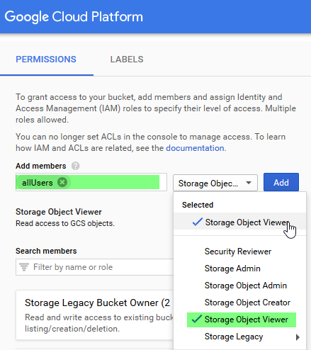
  • Select “Add Principal” and type in “allUsers” under New Principal.
  • Give them a role to be a “storage object viewer.” This allows them access to the files to view.

Google Storage share courses online free create permissions

Share Courses Online: Add Content to Your Google Storage Account

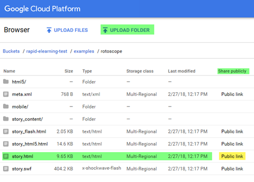
  • Adding content is easy. There’s an option to upload files and/or folders.
  • Once you’ve added the course folder, to the right of the index.html (or whatever you click on for the course) you’ll see a “public link.”
  • Share the public link.

Google Storage share courses online free share files and folders

The process is straightforward. Obviously, there’s a lot more to learn, but these simple steps will let you upload and share your e-learning courses and portfolio for free (or close to it).

Events

Free E-Learning Resources

Want to learn more? Check out these articles and free resources in the community.

Here’s a great job board for e-learning, instructional design, and training jobs

Participate in the weekly e-learning challenges to sharpen your skills

Get your free PowerPoint templates and free graphics & stock images.

Lots of cool e-learning examples to check out and find inspiration.

Getting Started? This e-learning 101 series and the free e-books will help.


Use PowerPoint to edit images

Over the years, I’ve posted hundreds of tutorials using PowerPoint. Some of them to be updated. Today I am going to cover five ways to use PowerPoint as an image editor. This is great for quick image editing or for those who don’t have other image editors on hand.

Save PowerPoint Content as an Image

Since we’re talking about PowerPoint as an image editor, the first tip is that whatever you create in PowerPoint can be saved as an image.

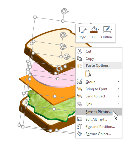
I usually group the objects so it’s one group. And then I right-click and save as picture. I like to save as a .PNG so that the transparent areas of the image are still transparent. If you save as .JPEG, the transparent areas will become white.

In the image below, I used PowerPoint to create the sandwich stack and then right-clicked to save as picture.

PowerPoint as illustrator

Create Custom-Sized PowerPoint Slides

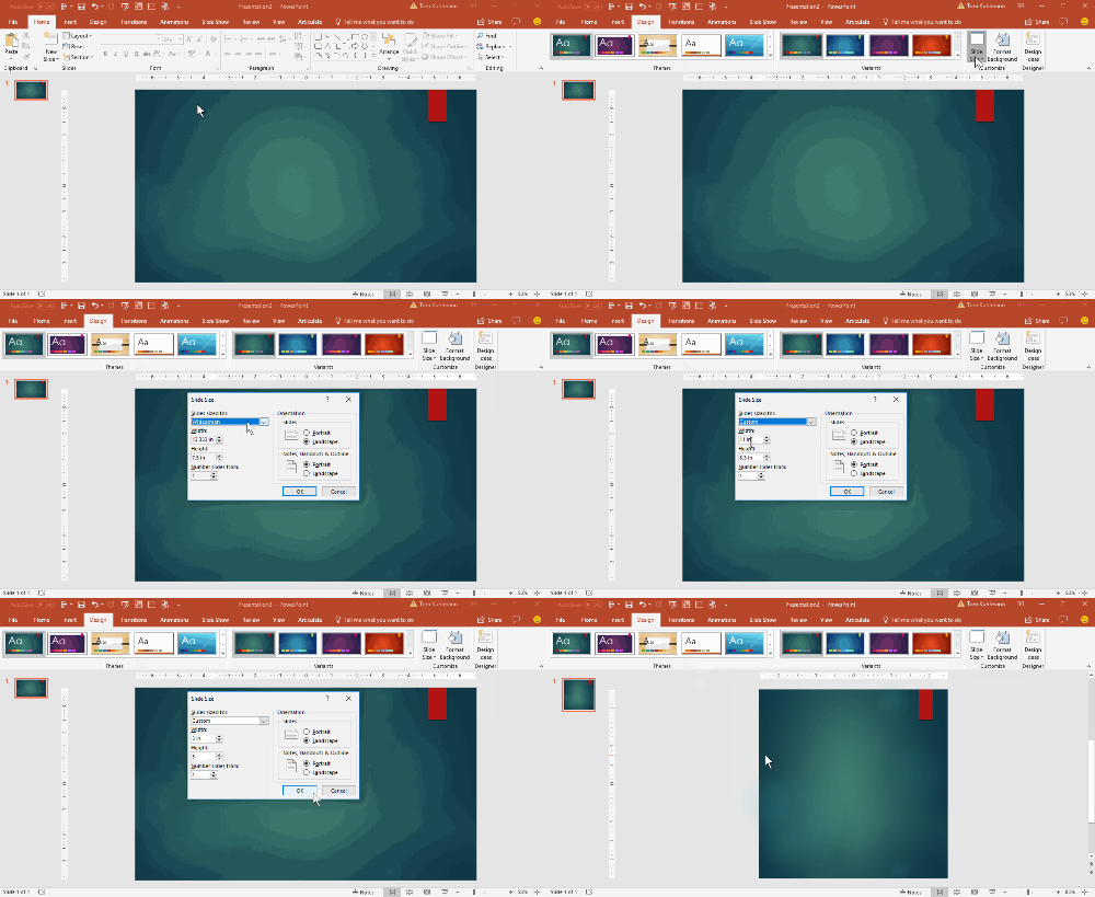
You can make a PowerPoint slide any size you want. By default, they’re 16:9. That and 4:3 are the most common aspect ratios. However, by going to the Design Tab you can set the slides to any size. That means they can be tall and skinny or short and wide.

PowerPoint as illustrator slide size

Why would someone want to do that? Check out the tip below.

Export PowerPoint Slides as Images

PowerPoint slides can be saved as images. That means you can add whatever you want to a slide, layer content, etc and then save that slide as an image. I do this quite a bit when I need to quickly build graphics for my e-learning courses.

For example, the flashcard interaction in Rise is a 1:1 aspect ratio. So I make a PowerPoint slide that is 1:1 and add my content to the slide. It’s a great way to add titles and images to the flashcards to make them visually richer.

Once I’ve completed the slide, I save the PowerPoint slides as images and insert them into the Rise interaction.

PowerPoint as illustrator

The images above were all created in PowerPoint as slides and inserted into the Rise course. You can see an example of the PowerPoint slide images in this demo course.

Using PowerPoint slides to create images is easy and it gives me more control over the images I use in my e-learning courses.

How to Extend a Photo’s Background

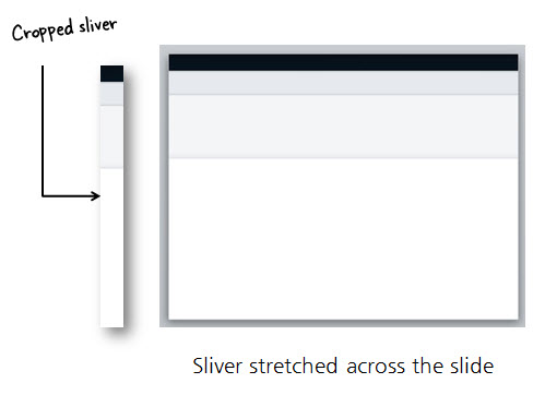
Sometimes you have images where the object is centered which makes it challenging to place other content on the screen. An easy way to fix this is to cut a slice from the image and stretch it. This lets you move the main object over and get some empty space for text or other content.

PowerPoint as illustrator to extend images

I also use this technique to quickly build slide layouts which I showed in this previous blog post on how to create a template from a single image.

Create PowerPoint or e-learning template from image

How to Remove the Backgrounds of Images in PowerPoint

Since PowerPoint 2010, you can use PowerPoint to remove backgrounds from your images. For the most part, it works well. Select your image and the remove background. You can select areas to keep and areas to remove. Once you’ve removed the background, you can play around with softening the edges to get rid of any obvious jaggedness.

How to remove background in PowerPoint

As you can see, PowerPoint is a great tool for building simple illustrations or using it for quick graphics editing.

Events

Free E-Learning Resources

Want to learn more? Check out these articles and free resources in the community.

Here’s a great job board for e-learning, instructional design, and training jobs

Participate in the weekly e-learning challenges to sharpen your skills

Get your free PowerPoint templates and free graphics & stock images.

Lots of cool e-learning examples to check out and find inspiration.

Getting Started? This e-learning 101 series and the free e-books will help.


next generation rapid e-learning

Ten years ago, the e-learning industry was still mostly Flash-based. That meant organizations either had to buy e-learning courses, have them custom-built, or hire a Flash programmer to build them. The cost for doing so meant most organizations didn’t have access to the world of online training.

That all changed when the PowerPoint-to-Flash tools like Articulate Studio, emerged. It democratized the world of online training because it put e-learning into the hands of anyone who wanted to build a course. If you came from that world where building Flash courses took more time and cost more, everything was rapid. Thus, the term, rapid e-learning.

The Evolution of Rapid E-learning

Flash required special skills which made authoring in PowerPoint so attractive. With some creativity, one could build engaging and interactive e-learning courses in PowerPoint. However, the reality is that PowerPoint has a ceiling and doesn’t offer all of the interactive capabilities required for many e-learning courses. I outlined that in this post on why PowerPoint isn’t the right choice for interactive e-learning.

PowerPoint isn't the best for interactive rapid e-learning

  • Interactivity is mostly limited to click-and-reveal.
  • It requires a lot of redundant production which gets exponentially more complex.
  • You can’t use variables to create adaptive training or branched interactions.

When Storyline came out in 2012 it really changed the rapid e-learning industry. For the first time, one could build highly interactive content with PowerPoint comfort and without a background in programming. That was an exciting time for first-generation rapid e-learning developers.

Second Generation Rapid E-Learning

I’m often asked where is the rapid part of rapid e-learning? For those who are entering the industry today, it’s a bit different.

Storyline is still a killer application. However, there is an opportunity for those who want a new type of authoring, or what could be called rapid(er) e-learning. Welcome to the world of Rise.

In a sense, Rise is to Storyline what PowerPoint was to Flash. It offers even easier authoring that allows for quick development and delivery. It’s fully responsive and works great on mobile devices.

Comparing Rise to Storyline

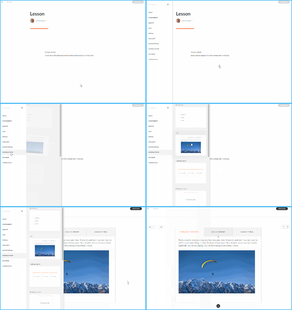
Rise courses are constructed using pre-determined blocks. Choose a block, add content, and publish. Whereas, Storyline is a freeform slide that requires a bit more work.

new rapid e-learning example insert tabs interaction Rise

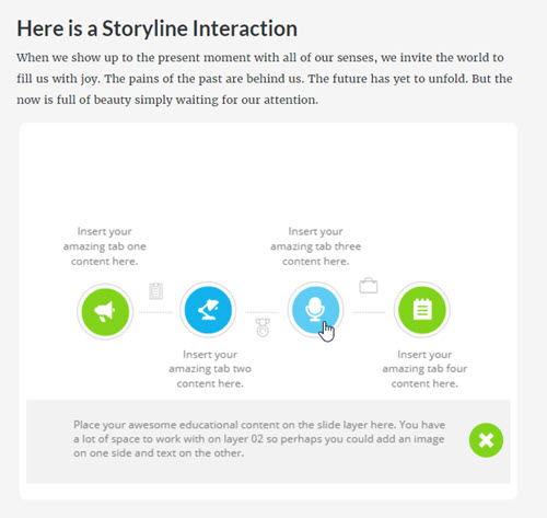
A great way to see the difference is by looking at how to insert a tabs interaction (one of the most common interaction types). In Rise, select a tabs interaction block and insert the content. That’s it.

In Storyline, it’s relatively easy to build a tabs interaction, but it requires more steps. Decide how it will look and work. And then from there build custom tabs, add layers, and then connect triggers.

As you can see, Rise is a whole lot faster and easier. It’s the new and improved rapid e-learning.

Combining Rise and Storyline for Powerful Rapid E-Learning

The cool thing is that when you want some custom interactions, build them in Storyline and add them to the Rise course. Thus you get the best of both worlds: fast, easy authoring in Rise combined with custom interactivity of Storyline.

rapid e-learning Articulate Rise example

Click here to view the Rise demo.

Above is a quick demo where I modified one of the Storyline templates in Content Library to work in Rise as a simple interaction.

Other Examples of Rapid E-Learning Courses in Rise

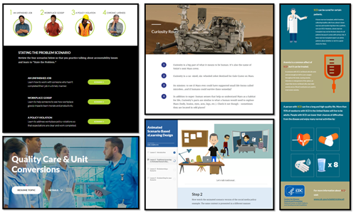
And for those wondering what you can do, here are few Rise demos:

other rapid e-learning examples in Rise

If you haven’t tried Rise, give it a go. Let me know what you think. Eventually, this e-learning stuff will get so easy we’ll just be sitting at home watching Netflix and eating bonbons.

Events

Free E-Learning Resources

Want to learn more? Check out these articles and free resources in the community.

Here’s a great job board for e-learning, instructional design, and training jobs

Participate in the weekly e-learning challenges to sharpen your skills

Get your free PowerPoint templates and free graphics & stock images.

Lots of cool e-learning examples to check out and find inspiration.

Getting Started? This e-learning 101 series and the free e-books will help.


edit SVG in PowerPoint

The good news is that now you can edit SVG images in PowerPoint. And that’s a big deal because we’re starting to see more SVG images every day.

In fact, one of the sites where I buy images has the option to download SVG images. This is great because they can be edited and customized. However, to edit them requires knowing how to do so with an illustration program. Unless of course, you know how to use PowerPoint.

Insert & Edit SVG Image in PowerPoint

This first step is really easy. Insert a picture by using Insert>Pictures on the toolbar. Locate your SVG image and insert it. Voila! I will add, that I’ve had a few SVG files that didn’t work, but for the most part it’s been smooth sailing.

SVG PowerPoint

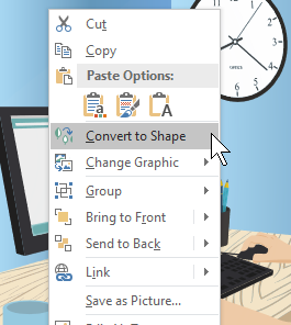
The next step is also very easy. What you’ll do is convert the SVG image into an object that can be edited in PowerPoint. The newest version of PowerPoint has a “Convert to Shape” feature. If you don’t see it in your version of PowerPoint, you’ll need to upgrade to the Office 365 version.

  • Select the image
  • In the format toolbar (or via right-click) select Convert to Shape. It will ask if you want to convert it.
  • Once it’s converted, you need to ungroup the image. Right-click, and select Ungroup.
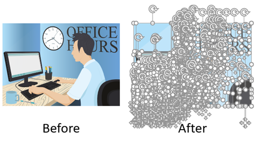
  • Now the image is broken into multiple shapes where you can edit them as you wish.

convert and edit SVG in PowerPoint

Once the image is ungrouped you can edit it. For example, I removed the background content and just isolated the guy on the computer. now I can insert it anywhere I want. You can regroup the object and right-click to save as an image. I like to save as a PNG file so that the transparent part of the image remains transparent.

edit SVG in PowerPoint computer man

How to Edit SVG in PowerPoint Video Tutorial

Here’s a video tutorial where I show how to convert and edit an SVG in PowerPoint.

Click here to watch the YouTube tutorial.

As you can see, it’s super easy to edit SVG files in PowerPoint. That should open the doors to all sorts of possibilities as you find free SVG files at those various sites that offer free stock images.

Events

Free E-Learning Resources

Want to learn more? Check out these articles and free resources in the community.

Here’s a great job board for e-learning, instructional design, and training jobs

Participate in the weekly e-learning challenges to sharpen your skills

Get your free PowerPoint templates and free graphics & stock images.

Lots of cool e-learning examples to check out and find inspiration.

Getting Started? This e-learning 101 series and the free e-books will help.


interactive video

This is part two of the series on working with 3D models and interactive video. In the previous post, we looked at how to create a video using 3D models in PowerPoint. Today, we’ll discover how to use them to create interactive videos in Storyline. And then of course, once you have an interaction you can also insert it into a Rise course, which is what I did in this Rise lesson.

Create the Interactive Videos in PowerPoint using 3D Models

If you want to create a different kind of interactive video, you can apply what you learn here. The process is similar. For this demo, make sure you understand how the video is created and how it plays all the way through because we’re going to add a trigger to pause it before it completes.

For this demo, I created a video where the object rotates in and then rotates back out. It was built using a three-slide PowerPoint file and exported as a video.

Tutorial: how to create a three-slide video using 3D models in PowerPoint.

A Teardown of the 3D Model Interactive Videos

There are a few nuanced steps in this process. Let’s review what happens and then we can look at how to create it in Storyline:

Interactive video in Storyline using 3D models in PowerPoint

  • User clicks on the side tab which shows a layer.
  • The layer plays the video we created in PowerPoint.
  • Since the 3D object in the video rotates in and out, we set the video to pause when the object is rotated in.
  • Then we add a trigger to resume the timeline (with a hotspot or button) which continues to play the video and shows the object rotate out as the video completes.
  • The completion of the media (the video) triggers the layer to hide which takes us back to the base slide with the side tabs.

Create the Interactive Videos in Storyline

The video I create in PowerPoint is the exact same aspect ratio as the Storyline file. For the most part, 16×9 is fine. But if you change the aspect ratio of your .story file make sure you do the same on the PowerPoint slide.

  • Go to slide 1 in PowerPoint and save it as a .PNG image. This image will be what the user sees on the base slide in Storyline and perfectly aligns with the videos that will be on the layers.
  • In the Storyline slide, insert the slide image from PowerPoint.
  • Create the appropriate number of layers based on how many interactive elements you have.
  • On each layer add the appropriate video. Each video should play automatically. I also recommend putting a hotspot over the video so the user can’t click on the video to start/stop it.
  • On the video layer, add a trigger to pause the video when it reaches either a certain time or cue point. I like to add cue points so I can nudge them without modifying the trigger. The video should pause at the apex of the object rotation.
  • Add a trigger to unpause the video. It could be a simple button or perhaps a hotspot.
  • Add a trigger to hide the layer when the media completes. This should take you back to the base slide.

Click here to view the tutorial on creating an interactive video.

That’s basically it. Of course, there’s a lot more you can do to decorate the layer or add additional content. It just depends on your needs. Practice the technique first and once you have it set, see what you can do.

If you do create something, please share it with us so we can see it.

Events

Free E-Learning Resources

Want to learn more? Check out these articles and free resources in the community.

Here’s a great job board for e-learning, instructional design, and training jobs

Participate in the weekly e-learning challenges to sharpen your skills

Get your free PowerPoint templates and free graphics & stock images.

Lots of cool e-learning examples to check out and find inspiration.

Getting Started? This e-learning 101 series and the free e-books will help.


3D models in PowerPoint

I shared a cool 3D interaction in a recent workshop demo and have had lots of people ask how I built it. You can check out the interaction in this Rise demo.

Creating the interaction is a two-step process:

  • The first step is creating a video of the 3D model as it rotates in and out.
  • The second step is to insert the video and add interactive elements in Storyline.
  • In the case of the Mars Rover module, there’s a third step because inserted the interactive Storyline module into Rise. This is pretty cool because it allows for really simple and fast authoring in Rise, and then when I need custom interactions, I just build them in Storyline. It’s a win-win.

Here’s a previous post where I detailed more of the construction of the Rise demo. For today’s post, I’ll show you how to create the 3D video you’ll use for a Storyline interaction. The tutorial below shows how to create the video using 3D models in PowerPoint.

Click here to view the tutorial on YouTube.

Insert 3D Models in PowerPoint

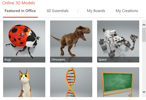
PowerPoint comes with a number of 3D models. It also supports inserting models shared by the community. You can also build your own 3D models and insert them using standard 3D formats

3D models in PowerPoint

Most likely you’ll want to insert your own 3D object. So it’s nice that PowerPoint supports the common 3D file formats. Here are the supported 3D formats for PowerPoint:

  • .FBX
  • .OBJ
  • .3MF
  • .PLY
  • .STL
  • .GLB

How to insert the 3D model in PowerPoint:

  • Create a slide and then select a 3D object.
  • Insert it just like you would a shape or picture.
  • Position the object on the screen.
  • Duplicate the slide (we’ll need this for the video).

Create the 3D Animation in PowerPoint

The first slide is the starting point from which the 3D object rotates. The second slide is the rotation point. You’ll need to rotate the object so that the position changes from slide 1 to slide 2. You can also move and scale it.

3D models in PowerPoint


  • Reposition the object by either scaling, rotating, or moving it on the slide.
  • Go to slide transitions and select a morph transition for slide 2.
  • Preview the slideshow.

3D models PowerPoint

On preview, you’ll see how the 3D object uses the morph transition to change positions. Pretty slick, huh?

Fine-tune Slide Transitions for 3D models in PowerPoint

That’s the essence of the 3D animation. Now it’s a matter of fine-tuning the animation by playing with the slide timings.

When all is done, the PowerPoint slides will be saved as a video file. That means the animations and transitions need to be automated.

3D models in PowerPoint 3D PowerPoint morph transition timing

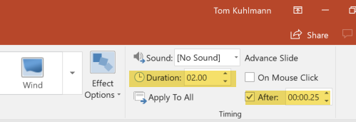
  • In the Transitions tab, go to Advance Slide and select to advance after X time. That means the slide will automatically advance at a certain time and doesn’t require you to do anything to trigger the slide movement.
  • Slide 1 is just the starting point so it needs to advance as quickly as possible. I usually set it to advance after .25 seconds.
  • Slide 2 will trigger the morph animation. On slide 2 you can change the speed of the 3D animation by changing the slide duration.
  • Slide 3 (optional) is great if you want to create the sense that the object rotated in and out like the Mars Rover demo.

Save the PowerPoint file as a Video

When all is done, save the PowerPoint file as a video. You have two options: .MP4 and .WMV.

The MP4 format works well but I did find that when I use it with Storyline, the last part of the .MP4 always seems jumpy. It probably has to do with how the .MP4 is encoded by PowerPoint. So if I am using the video to build an interactive file, I save it as a .WMV. Then I let Storyline do the conversion. That resolves any issues you may experience.

That’s basically it for the 3D model video in PowerPoint. You create the two or three slides and save as video. Once you have the video, you can insert it into Storyline or anywhere else you use video. To make it an interactive video like I did with the 3D rover, you’ll need to tune in next week where I show how to create an interactive video in Storyline.

Events

Free E-Learning Resources

Want to learn more? Check out these articles and free resources in the community.

Here’s a great job board for e-learning, instructional design, and training jobs

Participate in the weekly e-learning challenges to sharpen your skills

Get your free PowerPoint templates and free graphics & stock images.

Lots of cool e-learning examples to check out and find inspiration.

Getting Started? This e-learning 101 series and the free e-books will help.


insert emoji e-learning

In a previous post, we looked at when to use emojis in e-learning courses. There some good tips and comments in the post. Emojis add clever visual cues, but it is important to use them in a way that enhances the learning experience and doesn’t confuse it. So that’s always something to keep in mind.

The next question is how does one actually find and insert emojis. Today, I’ll show you three simple ways to add emojis to your e-learning courses.

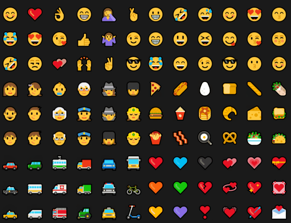
Insert Emojis Using Keyboard Shortcuts

insert emoji keyboard e-learning

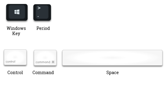
In Windows, you can add emojis using the keyboard shortcut [Windows Key + .]. And with a Mac, it’s [CTRL + CMD + Space]. I’m not sure what it is for Linux, but odds are you’re just sitting in a basement not communicating with people, so it’s probably not as critical.

I find that it can be a bit of a challenge when adding emojis via the Windows keyboard because I have to first activate the emoji screen and then start typing. But if nothing comes up while I type, I have to search; and it’s easy to accidentally add text and an emoji to what you’re typing on the screen.

Insert Emojis Using the Onscreen Windows Keyboard

insert emoji onscreen keyboard e-learning

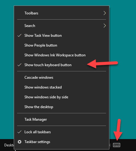
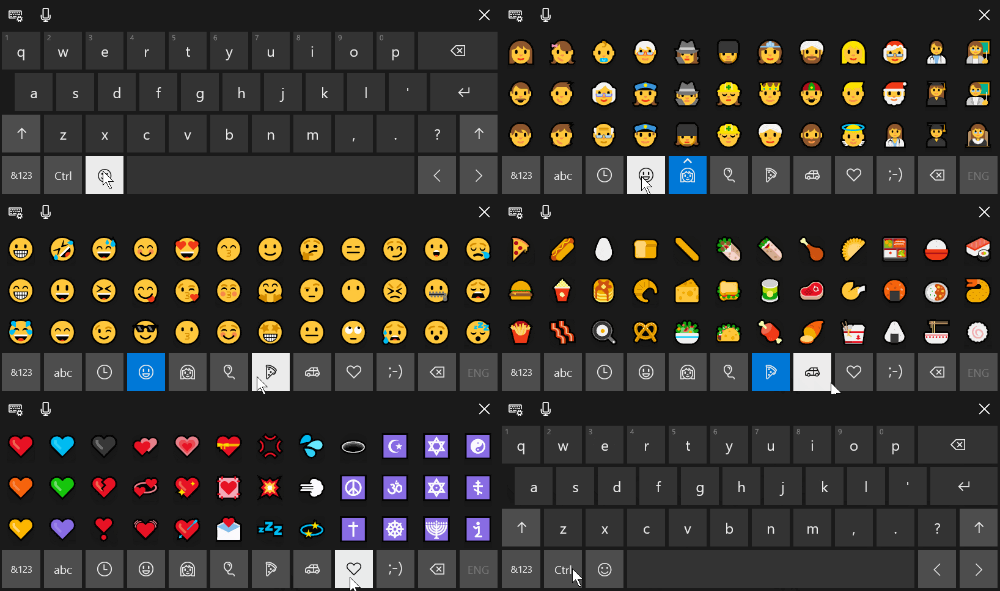
I believe the Windows shortcut above was added in a recent version of Windows 10. If it doesn’t work for you, try accessing the touch keyboard. That’s been part of Windows for a while now.You can add it to the taskbar and then just click the icon to open the onscreen keyboard.

insert emoji with keyboard

Insert Emojis Using a Browser Extension

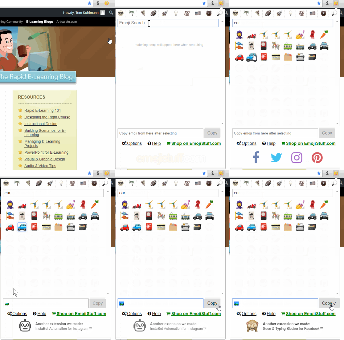
Each browser is going to work different (and have different options) so you’ll need to learn how to do this in a browser other than Chrome which is what I use. I added the “Emoji for Google Chrome” extension to my browser. Whenever I want to insert an emoji, I just have to click on the icon and search. I then select the emoji which gets added to the holding cell and from there I just copy and paste it.

insert emoji with Chrome browser extension e-learning

One thing to keep in mind is that the emojis will look different on different devices. For example, what you see in your browser may be different than what you see on a mobile device, which will look different than what you see in your document. They’ll still be emojis, but may not be as dynamic as the ones you inserted.

insert emojis look different

Do you have a different way of inserting emojis?

Events

Free E-Learning Resources

Want to learn more? Check out these articles and free resources in the community.

Here’s a great job board for e-learning, instructional design, and training jobs

Participate in the weekly e-learning challenges to sharpen your skills

Get your free PowerPoint templates and free graphics & stock images.

Lots of cool e-learning examples to check out and find inspiration.

Getting Started? This e-learning 101 series and the free e-books will help.


emoji for e-learning header

Emojis are the today’s hieroglyphics. I can imagine thousands of years from now as archaeologists try to reconstruct our culture. They’ll spend years collecting emoji messages and then additional years to decipher them. And after all of that time, they’ll come to learn that we worshiped the goddesses known as Kardashians.

It’s a frightening thought indeed, but one we can counteract in how we use emojis in our training programs.

What Are Emojis? 😕

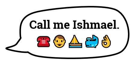
The first emojis started in Japan. It literally stands for picture character. They’re often used to add emotional context to messages. Although, often they’re combined to communicate more than quick emotional cues. There’s even an emoji version of Moby Dick.

emoji moby dick for e-learning

You can learn more about emojis here:

Emojis for E-Learning Require Context to Communicate 💬

The emoji is a tiny graphic that can be used to reinforce a point, add some emotional context, or a visual bookmark. Be careful when using them to communicate ideas because you may not communicate what you really intend.

Emojis are ambiguous and open to all sorts of misunderstanding and the emojis will appear different based on the device.

If you follow any of the heated discussions around emojis you’ll notice that they comfortably sit in a nest of political correctness. This is something to keep in mind when you deal with gender, skin tones, and cultural differences. You don’t want the emoji to distract from your message.

Emoji for E-Learning Examples 💻

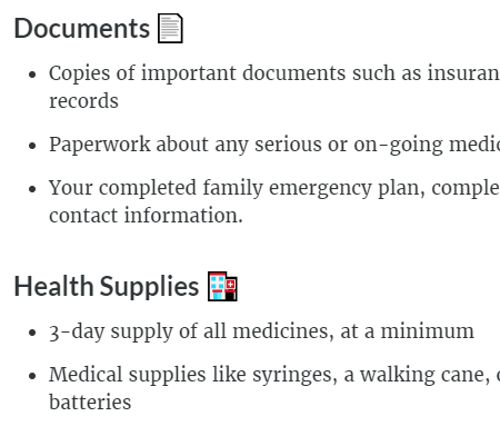
Here are a couple of examples of how I used emojis in a recent Rise training session. In the image below, I used the emoji as a visual cue to add some context to the title. It also makes scanning the screen easier because the emojis do add contrast. It’s a simple use where the emojis adds something to the screen but doesn’t conflict with the content and is less open to misinterpretation.

One challenge, though, is that there may not be an emoji that works for the topic at hand. Then you have to get creative. Which goes back to the warning about miscommunication and ensuring that your creative use of the emoji still communicates what you intend.

In the “Health Supplies” title, I couldn’t find a first aid kit emoji so I used the hospital. It’s not perfect but does work.

emoji e-learning

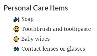
In the next example below, I used the emojis as bullet points. I like this as it adds a bit more visual interest and shows each point as distinct. But again, the same issue exists when it comes to finding the emojis that work with your content.

There was no emoji for soap or toothbrush. So I went with shower and smiley face with nice teeth (and I assume healthy gums). And there’s not a lot of options for baby wipes thus I selected the baby.

emoji e-learning

As you can see, given the right content and some thought, emojis can play a role in your e-learning course. I’m curious if you’ve used emojis in any of your courses. If so, how? And also, how was it received? Feel free to share in the comments.

Events

Free E-Learning Resources

Want to learn more? Check out these articles and free resources in the community.

Here’s a great job board for e-learning, instructional design, and training jobs

Participate in the weekly e-learning challenges to sharpen your skills

Get your free PowerPoint templates and free graphics & stock images.

Lots of cool e-learning examples to check out and find inspiration.

Getting Started? This e-learning 101 series and the free e-books will help.


e-learning instruction screen interactive start screen

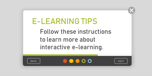
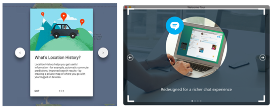
It’s common that when getting to a new web service or starting a new application you see some sort of instructions or start screen. Basically, the screen freezes your interaction with the site until you’re oriented and then lets you continue. Some force the interaction and others allow you to opt-out.

Those are not much different than the gate screens I’ve written about in the past (with free downloads). The gate screen sort of does the same thing. It stops your progress, provides instructions, and lets you continue.

Examples of Start Screens

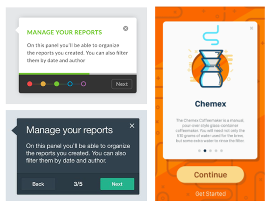
Here are some examples of different instruction screens I’ve seen online. I’m sure you’ve seen something similar.

instruction screen

examples of interactive start screen

How to Create an Interactive Start Screen

Today I’ll walk through the process of creating an interactive start screen. Below I highlight the main considerations and you can watch the video tutorial to get the details.

  • Is the screen mandatory or can the user click away at any time? I prefer the freedom to leave, however, there may be times where it’s important the person is exposed to all of the instructions. Sometimes people tend to skip out and they may benefit from not doing so, especially when it comes to matters of compliance training.
  • Does the instruction only move forward or does it go backward, as well? Probably more a matter of preference, but if they can go back make sure you build the navigation to work properly. You’ll also notice that one of the images above offers a single “continue” button thus limiting it to forward movement only.
  • Do you need the progress dots? Many of those instruction screens have dots. They’re good for progress indicators. You’ll notice that some of the screens display numbers or timelines. If you do use dots, are they clickable? Do they need to be?
  • How are the instructions displayed? Are they on cards, which seems to be the most common. Or are they displayed fullscreen? Fullscreen gives you more real estate. Cards are usually laid over the main screen with some sort of lightbox design.
  • Is the content animated? There are some nice effects you can create with entrance and exit animations. But sometimes when building these types of screens, the time it takes to make them look right, may not be worth the value you get.
  • How do the instructions end? Some disable the navigation buttons and others offer a “get started button.” The main consideration is what is the next step? If they need to continue, make that clear. Or if all they need is to close the screen, then make that clear, as well.

How-to Tutorial

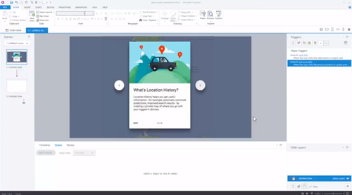
Here’s a tutorial where I build a quick prototype and discuss some of the considerations and approaches you can take building an interactive start screen.

instruction screen e-learning interactive start screen tutorial

Click here to view the tutorial.

There are a lot more considerations, but those are a good start. And when you actually start to build the screens for your course, you’ll find there are many different ways to do so.

Events

Free E-Learning Resources

Want to learn more? Check out these articles and free resources in the community.

Here’s a great job board for e-learning, instructional design, and training jobs

Participate in the weekly e-learning challenges to sharpen your skills

Get your free PowerPoint templates and free graphics & stock images.

Lots of cool e-learning examples to check out and find inspiration.

Getting Started? This e-learning 101 series and the free e-books will help.


expectations e-learning

We recently finished our E-learning Roadshows in Europe and the United Kingdom. One of the things I really enjoyed about the trip was riding trains. Where I live in the United States, there aren’t many opportunities for me to ride trains between cities.

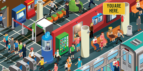
One thing that does make me a bit nervous when taking a train ride (especially in new places) is not knowing how to find my way around the station to ensure I don’t miss the train. And it doesn’t help when each station seems to have its own system to manage the schedule boards. I’m sure to the person who rides the train frequently, it all makes sense. But when it’s a new experience, it can be a bit nerve-wracking, especially when pressed for time.

Which gets me to some points that are relevant to e-learning course design.

Set Clear Expectations

Not knowing my way around the train station or even the local language means I’m a bit off balance. And since each station looks different, the experience is different. When I travel, I usually Google map the area and take a virtual walk. This helps me know more about the location and what to expect when I get there. However, this isn’t possible for most train stations around the world.

Thinking about your e-learning course: how is the experience for a new learner? Is there a comfort level when starting the course or is it all new and a bit unsteady? Let people know what they should expect in the course and what is expected of them.

What is going to happen? What are the requirements? What type of experience should be expected?

Provide an Orientation

Often it’s assumed that the user interface or experience is intuitive, but that may not be the case. A person who rides the train every day knows the way around the station and what the signs mean and probably doesn’t even need them. The person who rides a train once in a lifetime looks for signs and probably will need more time to figure them out and how to move around the station.

The same can be said for your e-learning course. Provide an orientation so that the user knows what’s there and when and how to use the resources. It doesn’t mean you need a course on how to take the course but you need to make things familiar and provide a means for people to figure out how things work.

Create a Consistent Experience

Each train station I visited had different types of reader boards and most had their own layouts with icons and not means to discern what they were. It was all a bit confusing and it took more time to find what I needed. At one station, I think it required having an engineering degree to ride the train.

Review your e-learning courses and ensure that how you present content and interactive experiences are consistent. This is especially true if you change the flow of content such as going from a screen of text to an interactive decison-making activity.

The more consistent, the less time you need to explain the course and the more time the learner can spend on the actual learning.

Familiarity is a Key Part of Learning

The goal of the course is generally to teach something. To teach means we need an environment that is conducive to learning. One consideration is how familiar the learning process is to the learner. Do they know what’s going on and what to do?

Familiarity can exist in how the content is structured to the user interface that displays it. For the learner, it’s important to have a level of understanding and know where things fit contextually. Once that’s in place, it’s easier to learn.

As a course developer, I used to complain about not being able to customize my course player. I always wanted to create something new for each course. However, over time I came to realize that there’s a lot of value in a consistent and familiar player. The same can be said for how you structure interactions like tabs and more complex ones like scenarios.

The more uniformity you can add, the better. But I will say that it’s also based on the context of what you’re doing. Not all courses need to look the same or behave the same. However, whatever you choose to do should be consistent and as intuitive as possible. The goal is to help people learn and the method to do that shouldn’t get in the way of learning.

Look at your courses with fresh eyes and try to experience them from the learner’s perspective. Are there any things you’d change?


Events

Free E-Learning Resources

Want to learn more? Check out these articles and free resources in the community.

Here’s a great job board for e-learning, instructional design, and training jobs

Participate in the weekly e-learning challenges to sharpen your skills

Get your free PowerPoint templates and free graphics & stock images.

Lots of cool e-learning examples to check out and find inspiration.

Getting Started? This e-learning 101 series and the free e-books will help.


At a bookstore, you’ll see all sorts of books covering all sorts of content. But one thing you’ll notice is that while they may have different content and even look different they mostly share a similar structure.

What’s in a Book?

What do books have in common?

  • Cover images
  • Title Page
  • Author Information
  • Table Contents
  • Version
  • Chapters
  • Index
  • Appendix

Despite the topic, at some point, the publisher assembles the book and puts it into a structure similar to what’s listed above.

What’s in an E-Learning Course?

E-learning courses are very similar to books. While they cover a range of topics, there are elements that are common to most courses. What are they?

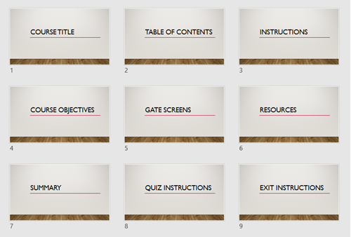
e-learning templates common structure

  • Course Title Screen
  • Table of Contents (as a menu)
  • Instructions Screen
  • Course Objectives Screen
  • Section Title Screen
  • Gate Screens
  • Resource Screen
  • Summary Screens
  • Quiz Instructions Screen
  • Exit Instruction Screens

Since you know those screens are in most courses, why not pre-build them and make them part of your starter template? It’s also a great way to work in the company brand without messing with the content screens.

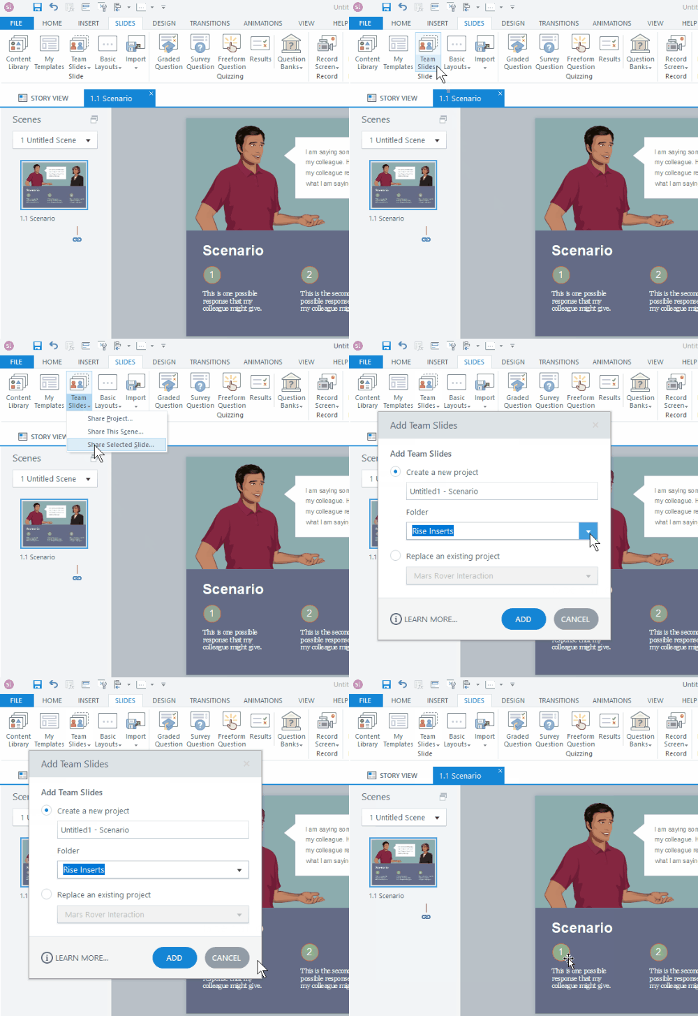
e-learning templates teams in Articulate 360

Also, if you’re using Articulate 360, you already have a bunch of templates that have a lot of that structure. So it’s a great starting point and big time-saver. And as an added bonus, if you’re using Articulate 360 Teams you can add those slides to your Teams account and everyone on your organization’s team can access those slides. This is a big time saver and lets you maintain the quality and consistency many organizations require.

What pre-built screens would you add to the list?

Events

Free E-Learning Resources

Want to learn more? Check out these articles and free resources in the community.

Here’s a great job board for e-learning, instructional design, and training jobs

Participate in the weekly e-learning challenges to sharpen your skills

Get your free PowerPoint templates and free graphics & stock images.

Lots of cool e-learning examples to check out and find inspiration.

Getting Started? This e-learning 101 series and the free e-books will help.