The Rapid Elearning Blog

Archive for the ‘E-learning’ Category


instructional design for a new generation

Ok…I’m not sure that’s the right title. I’m working on a presentation that covers instructional design challenges and wanted to share a few points to consider about course design and how we need to move past the way many of today’s courses are constructed.

Technology has changed the landscape for today’s course designers

instructional design content owners

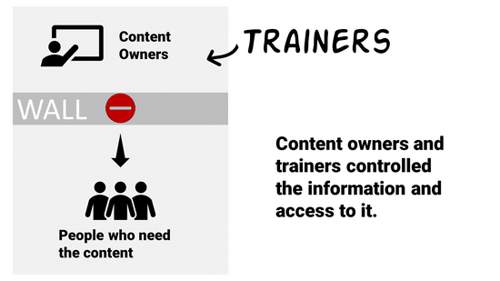
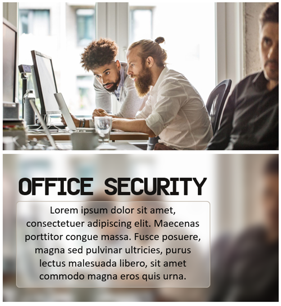
Years ago, someone other than the learner controlled access to content. We were all beholden to the subject matter experts and their walled gardens. We saw this in universities. We saw this in organizations. Subject matter experts owned content and they determined how it was packaged and delivered. Organizations created their learning management systems and determined who had access to what and when. Their quizzes determined who was smart enough.

But a lot of that has changed.

instructional design learners

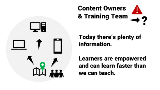
The internet and mobile devices give us access to everything we need to know, and mostly at a point when we need to know it. It doesn’t make us deep experts, but it makes us experts enough.

Need to repair sheetrock gone bad? Find a YouTube video. I won’t be quitting my job to build sheetrock walls, but I can learn to do what I need to do when I need to do it.

If I know something and want to share it. I’ll join a community. I can create a video (or some other asset) and make that available for others who want to learn what I know. The people who want to learn can find what they need when they need it. And they can find some comfort in the personal connection to an expert. They won’t feel sold to or manipulated. It’s a community and not a place worried about optics and spinning the meaning of every word.

instructional design today's learner

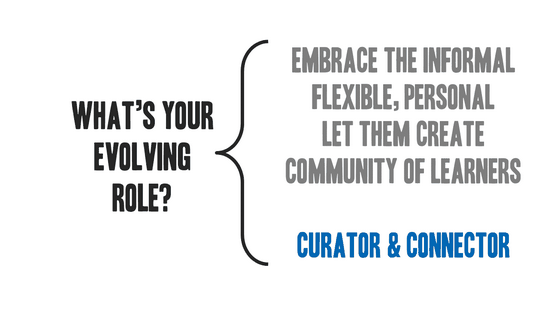
Course designers need to embrace a new role

It’s not enough to build a course and upload to a learning management system. This forces all of the content behind a wall. We should start to see our role evolve.

Today’s learner has access to what they need. They can get it when it makes the most sense to them. It’s usually in context. And it’s not overwhelming.

However, they may not always know what they need or how much of it. And they may not know what’s most critical or what’s best for meeting objectives. They may also waste a lot of time on irrelevant content.

traditional instructional designer

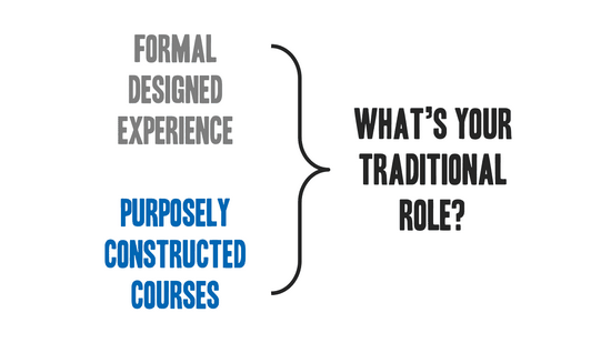
This is where we step in. Instead of just being traditional course creators, we should become both curator and connector.

Curating resources helps sort through the noise and package what’s most important to meeting objectives.

Connecting is all about facilitating a learning community and connecting experts with novices. It allows the content to live and breathe. The community has a knack for sorting value.

evolving instructional design

There will always be a place for formal course design and delivery. Government regulations and the fear of lawsuits will ensure that. However, if learning is really the goal, then how we make content available and help people succeed must be more than just putting together a bunch of online presentations and quizzes. Look at the way you learn things today and where you go to learn them. Find ways to make that part of your instructional design, too.

Events

Free E-Learning Resources

Want to learn more? Check out these articles and free resources in the community.

Here’s a great job board for e-learning, instructional design, and training jobs

Participate in the weekly e-learning challenges to sharpen your skills

Get your free PowerPoint templates and free graphics & stock images.

Lots of cool e-learning examples to check out and find inspiration.

Getting Started? This e-learning 101 series and the free e-books will help.


accessible e-learning retrofit

A guest post by Elizabeth Pawlicki, Training Program Manager, Articulate.

Many e-learning designers are challenged because they don’t often build accessible e-learning courses. So, they’re not sure what accessibility means and how it impacts course design.

In a recent webinar, we discussed general ideas around accessible e-learning, common design challenges, and some ways to overcome them. One of the tips was to plan for accessibility from the start because it’s not a good idea to retrofit 508 or WCAG compliance into existing e-learning courses.

An attendee asked, “What’s wrong with retrofitting a course?”

Good question.

Understanding Accessible E-Learning

Imagine a city that already exists full of apartment buildings, skyscrapers, and transit systems. And then the city council implements a law that says there must be a half-acre of park every two square miles.

How will you accomplish that?

You either must tear down what you’ve already built or try to squeeze the bare minimum of acceptable “parkland” into your existing space. Since the parks weren’t an initial consideration, you do what you can to meet minimum guidelines, but you may not meet the aspirational goals of the intent of more parks.

And that’s often the case with e-learning courses that weren’t built with accessibility in mind. The retrofitted courses may appear to meet the minimum requirements but may not offer the best user experience; and they may not actually meet the requirements if all you did after-the-fact was apply accessible features to the original content.  And of course, all of that retrofitting costs a lot of extra time and money.

Challenges Retrofitting Accessible E-Learning

There’s a lot that goes into creating an e-learning course like consulting with subject matter experts, writing scripts, developing prototypes, presenting content to stakeholders, and iterating on the prototypes you have created. In the end, you have a published output that everyone has agreed upon.

When you try to retrofit a completed course, it may seem easy and straightforward. But once you begin to uncover how much needs to be undone, redone, and how many people could and should be involved in that process, you’ll find it’s more costly, time-consuming, and downright difficult. This is especially true when you consider the interactive nature of e-learning and how different users access the content.

Therefore, it’s important to consider accessibility as part of the initial production process so that you understand what’s required and build a course that meets everyone’s needs. If you start with accessibility in mind, you’re considering everyone. Everyone will feel included because they are.

Want to learn more:


Events

Free E-Learning Resources

Want to learn more? Check out these articles and free resources in the community.

Here’s a great job board for e-learning, instructional design, and training jobs

Participate in the weekly e-learning challenges to sharpen your skills

Get your free PowerPoint templates and free graphics & stock images.

Lots of cool e-learning examples to check out and find inspiration.

Getting Started? This e-learning 101 series and the free e-books will help.


3 ways to use theme colors for e-learning

One way to speed up production in your e-learning course design is to use themed slides. You can create robust and visually varied templates like the ones you get in Content Library. The templates are a combination of layouts and two themed elements: fonts and colors. However, you don’t need to have a complex template to leverage theme colors.

Theme colors allow you to pre-determine the colors you’ll use in your course’s slides. There are several benefits and reasons when using theme colors.

Make Easy Updates to Theme Colors for E-Learning

Here’s a common scenario: insert an image and then do a color pick of the image to pull a color to use for outlines or shapes in the course. Later someone suggest changing the color. The challenge is going through every slide and making changes where that color was used.

Use theme colors to quickly modify all the objects with that same theme color. This doesn’t require a lot of consistency in terms of how you use the colors. It just means that if you do a color pick, for example, you add that to one of the accent colors so you can apply that accent color through the course.

If you have red shapes and they need to be blue, if you used a theme color to fill the shape all you need to do is change the theme color.

theme colors for e-learning templates

Create a Loaded Palette of Theme Colors for E-Learning

You get six accent colors, and each has five derivatives. You don’t need to have a real strategy when using theme colors. You get six slots. Figure out what six colors you need in your course and then create a palette, so you always have those six available to you.

You can use the colors willy nilly with no consideration to any real structure. The key advantage is having a palette of desired colors on hand.

theme colors for e-learning templates to have a palette

Develop a Strategy for Theme Colors for E-Learning

Assuming you build a lot of templates and you re-use them, then it makes sense to be strategic about how you use the theme colors. You get six slots. Use them the same way every time you create a theme color. That makes it easy to create a new theme and re-use templates because you know that the theme colors are applied the same way to the same objects.

Determine how you want to use the color slots and then use them that way consistently. This allows you to quickly apply new color themes knowing that the entire template will change, and the colors will make universal changes to the entire course.

theme colors for e-learning templates for universal changes

Some people are very strategic an organized in how they use theme colors. And some just use them with no sense of structure. They just want a place to load some colors and have quick access. That’s fine, too.

What you want to avoid is using single colors outside the theme that can’t easily or quickly be updated later. Theme colors help prevent that and save time when building courses whether your strategic or just using a palette.

Events

Free E-Learning Resources

Want to learn more? Check out these articles and free resources in the community.

Here’s a great job board for e-learning, instructional design, and training jobs

Participate in the weekly e-learning challenges to sharpen your skills

Get your free PowerPoint templates and free graphics & stock images.

Lots of cool e-learning examples to check out and find inspiration.

Getting Started? This e-learning 101 series and the free e-books will help.


e-learning template

Templates offer a lot of value and power in your e-learning course design. They help keep things consistent, provide a good starting structure, and they make it easy to swap and replace theme elements.

The main benefit of a template is saving time. But templates come with constraints and when attempting to customize them you may be robbed of the time saved. This is something I see all the time when working with e-learning developers.

To keep things simple, I like to consider templates from two perspectives.

Option 1: The E-Learning Template is Plug and Play

Use a template where the layout and all its features are pre-determined. The goal here is to select a templated screen and expect to make minimal changes. The value of the template is that everything is there and all you need to do is add your content.

e-learning template

All you want is a slide with a specific look and swap out the placeholders for your course content. You don’t want to change layouts, redesign the slide, add new elements, or customize colors.

The core value is that the template is pre-designed and all you do is add content. This is great for quick authoring and for the person who has limited graphic design experience.

Option 2: The E-Learning Template is Customizable

Use a template where all the features are themed. This usually consists of layouts, colors, and fonts. The value of this type of template is that you can easily modify it by making universal changes to the theme elements. And those changes are applied across all the slides in the course.

e-learning template themes

This second perspective requires a bit more forethought and restraint in using the features. For example, all the text and colors on the slide need to use theme text and colors. Also, all layouts need to be mapped to the same placeholders, otherwise, they’re not interchangeable.

Avoid the Mushy Middle

Think of these two perspectives as two ends of a spectrum. On one end you have the convenience of a pre-built screen that only requires content. Select it and add the content.

On the other is a screen that is built to be modified. It’s not tied to content but the theme elements.

e-learning template spectrum

Realistically, you can do both by making a designed slide with themed elements. But…and this is a big but (cue Pee Wee Herman) most of the issues I see when people work with templates is that they want the convenience of plug and play and then they want to customize, too. Inevitably this leads to a lot of time wasted trying to make things work.

So, I usually recommend this: if you use a template you didn’t create, accept the fact that what you select is what you get and all you need to do is add your content. Don’t expect to import it and then begin to make too many edits. At that point you lose the power of what the template gives you.

Or…

Create your own templates. Design specific layouts and multiple versions of them. For example, if you build a tabs interaction, design a 3-tab, 4-tab, and 5-tab version. Don’t just design a 3-tab and expect to modify it.

When you build the slide template, only use theme elements.

  • That means you use create placeholder layouts and use them consistently on the various slides.
  • Determine your theme colors and only use colors from your theme. And use them consistently.
  • Set your theme fonts (usually a heading and body). And all text on the screen uses the theme font. You don’t insert that one cute curly font to make your course engaging. One, it isn’t engaging. And two, it’s not a theme font.
  • Before using a template like that, you determine a new theme font and color scheme. And then insert the slide and apply the new theme elements.

Notice how the first option is just plug and play and the second requires a lot more intention and more production? That’s the big consideration. The template should provide some time-saving guidance. If you need to make a bunch of tweaks or mess things up because you didn’t plan on the theme elements, have you really saved any time? Did the template offer real value?

There you have it: two perspectives on when to use a template. Use it as is for quick authoring with minimal changes. Or use templates where you can make universal changes to the themes and quickly create new looks.

Events

Free E-Learning Resources

Want to learn more? Check out these articles and free resources in the community.

Here’s a great job board for e-learning, instructional design, and training jobs

Participate in the weekly e-learning challenges to sharpen your skills

Get your free PowerPoint templates and free graphics & stock images.

Lots of cool e-learning examples to check out and find inspiration.

Getting Started? This e-learning 101 series and the free e-books will help.


In an ideal world, you create an e-learning course, publish it, and put it online. And everything works perfectly.

The reality is that there are many variables between the technology and the individual users and how they access the courses. And these variables can create issues which make it a challenge to troubleshoot e-learning courses when problems arise.

In a previous post, we looked at the HTML5Test site as a way to check the browser and how it’s current support for HTML5 which is important to know when adding interactivity and multimedia to projects.

browser details

To go with that post, here’s another good site. It’s a simple site that allows you to collect information about the user’s computer, such as:

  • Which operating system are you using?
  • Which browser and version?
  • Screen size?
  • Browser window size?

All of the information above is key when trying to troubleshoot because many of the people who run into technical issues can’t easily find and share that information about their systems. So if you need to troubleshoot why a course isn’t working, send them the link above. It’ll capture info about their system and browser which they can easily share with you. That’ll save a few back and forth questions.

As a bonus, here’s a previous post where I share Ten Tips for Troubleshooting and Technical Support. One of them is to share your system info.

Events

Free E-Learning Resources

Want to learn more? Check out these articles and free resources in the community.

Here’s a great job board for e-learning, instructional design, and training jobs

Participate in the weekly e-learning challenges to sharpen your skills

Get your free PowerPoint templates and free graphics & stock images.

Lots of cool e-learning examples to check out and find inspiration.

Getting Started? This e-learning 101 series and the free e-books will help.


html5

Before we get started: Flash is going away soon. And if you have a lot of older e-learning courses, it’s something that you should be dealing with now before it’s too late. Start pulling together the original source files because you’ll have to republish or maybe rebuild a few of the older courses. If you don’t have the sources files, a couple of the resources below should help.

What made Flash work is that everyone had the same player and, for the most part, things kind of worked the way they were supposed to. Without the Flash player, courses run through the browser. Thus the demand for HTML5 courses.

The challenge however is that you don’t have control over the browsers and devices people use to consume e-learning courses. Ten years ago, almost all courses were Flash-based and ran on a personal computer. Today, courses are accessed via computers and mobile devices (which could mean a tablet or smart phone).

There are thousands of different devices between personal computers, Android, and Apple. Each device has its own technical constraints such as memory, processor, and screen size. They can run on different operating systems and different versions of those systems.

Also, how many different browsers are there for these mobile devices and computers? And really, why is any organization still using Internet Explorer 11?

And here’s the main point in all of this: the browsers that have to display the e-learning courses are not all the same or created equal.

What that means for you is the course you build may not work as intended when accessed by someone on a different device using a different browser. That’s why it’s so important to test, test, and test.

As I mentioned in an earlier post, create a demo course with media, interactivity, and animations. And use that to test the user’s learning environment. You also want to test on multiple devices to make sure things work the they way you want.

Despite all of the testing, you’ll still have customers who have expectations that are outside your control. Some customers and clients just don’t know enough about this stuff so their expectations may not be aligned with reality. They may want a lot of media or animations, that may not work for their users.

In those cases, I recommend referring them to this site: HTML5 Test

What I like about the site is that it’s a great way to SHOW the differences in browsers and devices and use that as a way to discuss what needs they have, what can be be built, and how the courses may respond.

html5

You don’t need to go into some long-winded technical explanation about HTML5. Use the site as a means to expose them to potential issues or constraints and ways to work around them. The last thing you want is a fancy product that doesn’t work in the end-user’s browser.

So, make sure you get prepared for the end of Flash and know how to set expectations for the courses you do build. The good news is that the technology is changing, the devices are getting better, and expectations and what you can deliver are converging.

Events

Free E-Learning Resources

Want to learn more? Check out these articles and free resources in the community.

Here’s a great job board for e-learning, instructional design, and training jobs

Participate in the weekly e-learning challenges to sharpen your skills

Get your free PowerPoint templates and free graphics & stock images.

Lots of cool e-learning examples to check out and find inspiration.

Getting Started? This e-learning 101 series and the free e-books will help.


e-learning course

The other day, I had a service technician from Xfinity come by to troubleshoot an issue with my cable connection. While we were waiting for the cable box to reboot, I asked about how he gets trained and what types of training he has to take.

He does most of the same types of compliance training we all do. And then as expected, there’s also a lot of technical training. Part of his training is blended with some face-to-face, peer guidance, and online modules. Much of it is delivered via his mobile phone.

I’m in the e-learning community every day helping people troubleshoot their e-learning courses. Sometimes I help them think through what they need to do to build a certain type of interaction. Often, it’s a matter of troubleshooting how the course is constructed.

In the community, there’s usually some conversation about instructional design. One thing that is often missing (but will easily derail an e-learning project) is not understanding the environment in which a person takes the course. So we invest a lot in building it, but often not as much in how it’s delivered.

Like the Xfinity technician, people take courses on a variety of devices and in various environments. The learning environment needs to be a factor when developing and delivering online training.

How Much Bandwidth is Available?

What are the bandwidth limitations of the learner? We can be tricked into the comfort of our own bandwidth and think the experience may be the same for the end user. Or, all we do is publish on our local machines and never test the course on other networks.

derail elearning bottleneck

Build a test course that is made up of some videos, audio, and various interactions (with some animations, to boot). An easy way to build one is download all of the slides of a Content Library template, add some large videos, and then publish.

Test the course performance on the client network. How does it perform at different locations or on different devices? This may not be an issue, but what happens if you roll out the course and 10,000 people click the link at the same time?

What About the End User’s Access to Technology?

Years ago, I built a course for a client that wanted a lot of audio narration. It was for an internal training group so I just assumed they had the same computer set up that I had. Well, I was mistaken.

The courses were delivered to a number of remote locations in various production environments (of which I was not made aware). The computers had no speakers or headsets, which made the narration a bit pointless. Also, some sites had one computer for everyone to share. Even if they did have speakers, it didn’t matter because the training environment was too loud.

derail e-learning technology

If you can, meet with the learners and get to know where they work and how they’ll consume the content. Are they on a computer, tablet, or mobile device? Will they be able to hear the audio and watch the video? Are they in a separate room or in a production environment? Are they sitting in a vehicle?

Also, not all devices are created equal. What works on a desktop and laptop computer may not work on a smart phone. Be sure to test those things before building a course.

Same advice as above, create a media heavy test course and test it on multiple devices and in different environments. No one likes sitting around waiting for a course to download. If things in the course bog down, you may want to loosen the load: get rid of some media and make smaller, more digestible courses.

There’s obviously a lot that goes into building a great learning experience. But if the end user has technological or environmental constraints, all of your hard work is for naught.

Test. Test. Test.

Events

Free E-Learning Resources

Want to learn more? Check out these articles and free resources in the community.

Here’s a great job board for e-learning, instructional design, and training jobs

Participate in the weekly e-learning challenges to sharpen your skills

Get your free PowerPoint templates and free graphics & stock images.

Lots of cool e-learning examples to check out and find inspiration.

Getting Started? This e-learning 101 series and the free e-books will help.


convert Storyline PowerPoint

It never fails that after building an e-learning course in Storyline, someone asks if they can get a PowerPoint version of the course. There are many reasons for this request, such as using the content for face-to-face training, wanting a slide deck for subject matter experts, or creating a PDF handout out of the slides.

Today, we’ll look at a simple way to convert what you created in Storyline and make it a PowerPoint file.

PowerPoint and Storyline are Different Applications

Before we get started, let’s review a few key points when working with PowerPoint and Storyline.

  • PowerPoint and Storyline may look similar, but they are two different applications made by two different companies so they’re not interchangeable files.
  • PowerPoint is designed mostly for linear presentations. Storyline is designed for interactive e-learning.
  • PowerPoint has some interactive features and things one can do to hack a certain level of interactivity, but it doesn’t have a lot of sophistication with things such as mouseovers, drag/drops, variables, etc. Thus going from Storyline to PowerPoint is a bit challenging if the original Storyline content is interactive.
  • Storyline has an import PowerPoint feature to convert the PowerPoint slides to Storyline slides. PowerPoint doesn’t have an import Storyline feature.

The above seems obvious, but I bring this up because many people start with PowerPoint content, import it into Storyline, and then later want to export the Storyline content back into PowerPoint as if they are interchangeable applications and file types. They aren’t.

While there is no feature in PowerPoint to import Storyline, there are some simple things you can do to get your Storyline content into a PowerPoint file.

Tip #1: Start All Course Development in PowerPoint

My first tip assumes you know that you’ll need a PowerPoint version of the course.

If you know you need your content to be in both PowerPoint and Storyline, then plan your projects accordingly. PowerPoint doesn’t support all of the interactive features of Storyline, but in terms of what’s visible on the screen, it’s mostly the same: text, shapes, pictures, etc. With some planning, you can have your course content in both formats.

Here’s what I’d do:

  • Build all your content in PowerPoint first (with forethought as to what you want to be interactive and specific to Storyline).
  • Get final sign-off on the PowerPoint content since the content should be the same. The Storyline specific content is most likely more interactive.
  • Import the approved content into Storyline.
  • Make your interactive edits.
  • Publish your Storyline course.

Using this approach, you end up with a PowerPoint file and interactive Storyline file. If you need to make edits, it should be for interactive features only since you got sign-off on the content while it was in PowerPoint.

Of course, this approach does requires that you plan it all up front, which doesn’t always happen (or the client makes last minute changes). I’d tell the client upfront that this is the production process and that edits after sign-off are outside the scope of the project.

Tip #2: Publish to Word & Extract Screenshots

Let’s suppose you already built a course in Storyline and now you need a PowerPoint version of the course. Like I mentioned above, PowerPoint can’t support the layers and interactions, however, most of what’s in the course is a screen with content that’s made up of text, pictures, and shapes.

The following tip lets you capture all of the content that displays onscreen. It is not going to capture your state changes and other interactivity. But it works for most cases and captures all of the slides and layers.

Click here to view the tutorial on YouTube.

Below are the basic steps, but watch the tutorial above for more detail:

  • Once the course is complete, publish the Storyline course in Word. Select to publish layers and large images. This creates a Word doc with all of the slides and layers exposed.
  • By default, Storyline saves to an older version of Word with the .doc extension. This is so people with older versions can open the file.
  • Open the Word .doc and save as .docx. This will allow you to unzip the file and extract the images.
  • Unzip the .docx file to extract the images. I use 7zip (a free application).
  • Insert the images into a new PowerPoint album.
  • Save the file and you’re all done.

The output using this method is a series of PowerPoint slides with each Storyline slide and layer captured. From there you can make simple edits or save as a PowerPoint or PDF file. In any case, you have your Storyline content in PowerPoint format.

Events

Free E-Learning Resources

Want to learn more? Check out these articles and free resources in the community.

Here’s a great job board for e-learning, instructional design, and training jobs

Participate in the weekly e-learning challenges to sharpen your skills

Get your free PowerPoint templates and free graphics & stock images.

Lots of cool e-learning examples to check out and find inspiration.

Getting Started? This e-learning 101 series and the free e-books will help.


course design activities

Here are a couple of fun activities around visual design. They’re not “e-learning” course design activities but they are relevant because e-learning courses have to be constructed using common design concepts and skills.

Go through the activities and see what you learn.

What Kind of Course Designer Are You?

course design activities designer

Click here to view the design activity.

Here are a few things that come to mind after the activity:

  • There’s a tension between being too organized and not being organized enough. I find that I am probably less organized than I should be and then I have to go back and fix things. A good example is naming objects as I go along rather than waiting to troubleshoot and find that not naming makes it harder to figure out what’s there. On the other hand, sometimes being too organized does constrain the creative process.
  • What inspires my designs? I like to use Dribbble and some other design sites to get ideas around layouts and using colors.
  • From a course design perspective, reflective questions are a great way to get people to process information. Generally, we push bullet point after bullet point. Perhaps there’s a way to reframe your slide content so that the information is delivered via reflective questions.

Course Design: What’s Your Font Style?

font style course design activities

Click here to view the font activity.

  • I like this type of activity for e-learning. Make decisions and move on without hitting a submit button. And then at the end get some sort of consolidated feedback.
  • My font was Ariata. I’m not sure how the activity is graded, but I played around with the quiz and often came up with Ariata. Which goes to how this type of activity could work in e-learning: you can show whatever you want at the end. So get your learner’s to read stuff during the selection process and then show them whatever you want at the end. The card selection is how you present what may have been bullet points or slides. And the end is your summary. Easy peasy.

What did you learn?

Events

Free E-Learning Resources

Want to learn more? Check out these articles and free resources in the community.

Here’s a great job board for e-learning, instructional design, and training jobs

Participate in the weekly e-learning challenges to sharpen your skills

Get your free PowerPoint templates and free graphics & stock images.

Lots of cool e-learning examples to check out and find inspiration.

Getting Started? This e-learning 101 series and the free e-books will help.


visual context e-learning

When it comes to the visual design of you course, there’s on thing you can do to add context. And it doesn’t require a graphics design degree.

Replace the bland default template with a single background image. Find the one image that best establishes the context of the course. Once you have an image, there are things you can do.

Here are a few simple tips.

Determine the Course Context

I like to focus on industry. And then within an industry you may have specific environments like meeting rooms and offices. A corporate business course will have a different image than one on training medical staff. What single image quickly establishes context?

e-learning course context

Keep the Design Simple

Images communicate a lot of information. You want context without a lot of distraction. This is especially true when the background image contains people. We tend to look towards the face. If you do find an image to be distracting, you could add a blur to it (or other design element). This shows the visual context but with the applied blur effect the person is drawn to the course content and not distracted by decorative elements in the image.

visual context e-learning course

You Need Placeholders for Course Content

If you’re using a single image, you need to consider where the content goes. I like to look for images with obvious content spaces. That means less for me to edit or design. A common one is the file folder. It looks business-y and it gives me a place to put content.

The images below have good empty areas that can hold the course content.

visual context e-learning course

Vary the Imagery

Since you’ll be working over a series of screens, try to find more than one image that meets the context requirements. You can use the different images to establish different types of content or sections. If you can’t find images that look like they came from the same place, you can add color filters or other effects to make them seem more cohesive and as if the belong together.

In the example below, the images were from different sources. But the visual context (fire department) and the color overlay tie them together.

visual context e-learning course

The tips above don’t replace solid graphic design. But it does help the person who has limited time or skills step away from the default layouts that may be a bit bland. And it helps make those screens visually rich and contextual.

Events

Free E-Learning Resources

Want to learn more? Check out these articles and free resources in the community.

Here’s a great job board for e-learning, instructional design, and training jobs

Participate in the weekly e-learning challenges to sharpen your skills

Get your free PowerPoint templates and free graphics & stock images.

Lots of cool e-learning examples to check out and find inspiration.

Getting Started? This e-learning 101 series and the free e-books will help.


subject matter expert e-learning course

You’re building an e-learning course and your subject matter expert needs to review and make edits to the course. But they don’t have access to your e-learning software.

So how do you get them to make those edits? Here are some time-saving tips.

What Should Happen

Before you start building the e-learning course, you should have a signed and approved script. And then you work from that. Obviously, there will be a final review and there’s always some editing to be done. But there shouldn’t be a ton, or not enough that requires someone else make significant edits.

Of course, that’s not how it always works.

I’ve been on projects where it seems things are done and then marketing steps in and throws a wrench in the process. So you end up making a bunch of edits to fit the organization’s brand.

Another common issue is when training that involves the legal team. I have nothing against lawyers, but I swear, they can really create a lot of extra work, especially with compliance training where every word means something.

To combat this issue, you should bring all those teams to the table when you develop the content and prior to sign-off before you start assembling the course.

That’s how it should work in an ideal world: the project and content is reviewed and you get final sign-off.  But that’s just not how it ends up working for a lot of people.

How to Get the Subject Matter Expert to Make the Edits

Storyline has a feature to export the course text for translation. It gets exported to a Word doc. From there, someone can review and make text edits. When done, the Word doc is saved and imported back into Storyline. Why not use that feature for your subject matter experts?

Here’s what I’d do:

  • Publish the course to Review 360. They can see the course in action. Of course, they can add comments, but you don’t need them since they’ll be making edits in the doc.

subject matter expert reviews edits course

  • Export the course for translation.
  • Forward the Word doc to the subject matter expert with instructions on what to do.
  • The subject matter expert reviews the course and makes text edits in the Word doc.
  • The subject matter expert forwards the Word doc.
  • Import the edited doc into Storyline.


Watch the tutorial on YouTube.

That’s a pretty easy process. It allows your subject matter expert to review a published course. And where they want to make changes, they do so in the Word doc. Super easy and it doesn’t require that they have access to your e-learning application.

Events

Free E-Learning Resources

Want to learn more? Check out these articles and free resources in the community.

Here’s a great job board for e-learning, instructional design, and training jobs

Participate in the weekly e-learning challenges to sharpen your skills

Get your free PowerPoint templates and free graphics & stock images.

Lots of cool e-learning examples to check out and find inspiration.

Getting Started? This e-learning 101 series and the free e-books will help.


free illustrations for e-learning

Who doesn’t like free?

Recently, I shared these free resources: free animated gifs, free medical images, and free open doodles illustrations.

Today, I’m sharing more because you can never have enough of the free stuff.

One challenge with stock imagery is that it’s stock which means it’s mostly generic and doesn’t meet all needs. Another challenge unfortunately is that most stock imagery lacks diversity. Here’s a good start to fixing that problem.

The designers at blackillustrations.com provide a starter pack of illustrations that are free to use for commercial and personal projects.

free illustrations SVG

What’s included?

  • 50+ illustrations
  • Business images
  • Medical images
  • Multiple formats including PNG, SVG, and AI

They also have a really nice education pack available for $38 that could come in handy for your online training programs. But of course, that isn’t free.

free illustrations diversity

The pack is free, but as always, if you find them valuable you’re able to pay something for the developer’s time. And even though they don’t ask for attribution, it’s a nice gesture. Here’s a post on how to provide attribution in your courses.

Hope these help. If so, thank the developers and pass it on.

Events

Free E-Learning Resources

Want to learn more? Check out these articles and free resources in the community.

Here’s a great job board for e-learning, instructional design, and training jobs

Participate in the weekly e-learning challenges to sharpen your skills

Get your free PowerPoint templates and free graphics & stock images.

Lots of cool e-learning examples to check out and find inspiration.

Getting Started? This e-learning 101 series and the free e-books will help.