The Rapid Elearning Blog

Archive for the ‘Online Course Design’ Category


e-learning tips

One of the e-learning tips I give at workshops is to be intentional about your e-learning course design and production. Many course developers start with the default settings and then make changes later. However, that could impact the course and cost time and money.

So today, I’m sharing three things you should do before you start working on your e-learning course.

E-Learning Tip: Determine Your Course Size

It’s important to determine your course size before you start working on the slide. If you do some work and then change it later, you may skew things on the slides and have to do a lot of adjustments. Also, popular screen sizes today aren’t what they were a few years ago. Computer screens are wider, more pixel dense, and a lot of course developers like to step away from the default player.
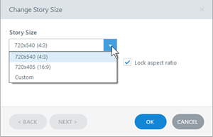
e-learning course size settings e-learning tips

Here are a few considerations:

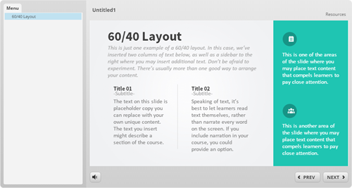
  • By default the course size is a 4:3 aspect ratio set at 720×540 pixels. This is a good aspect ratio and the course can be set to scale with the browser, so pixel width isn’t as big of an issue.  The image below shows the 4:3 aspect ratio with a sidebar menu.
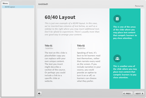
e-learning tips 4x3 aspect ratio

  • You may want to go with 16×9 since most screens are widescreen. And that looks nice on mobile devices in landscape mode. Although newer phones are going to 18:9. The image below shows the 16:9 aspect ratio with a sidebar menu.
e-learning tips 16x9 aspect ration

  • Are you using a sidebar menu? If yes, I like the 4:3 aspect ratio. The more squared slide fits nicely with the sidebar. However, if you go with a 16×9 aspect ratio, having the sidebar makes the course look wide. In that case, get rid of the menu, or set it as a drop down from the top. And that’s what I show in the image below. You can see the menu drop down on the player. It’s there, but doesn’t consume screen space.
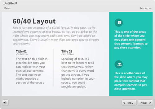
e-learning tips drop down menu

E-Learning Tip: Determine the Color Scheme & Create Theme Colors

Before you start working on your course make sure to determine the colors you are going to use. There are a few ways to get the right colors for the course:

  • Company brand: many companies have branded colors. Even if you don’t have the official colors, you can go to the website and do a color pick of the main colors used.
  • Single color: find one color and use a color schemer to create other colors.
  • Color picker: I like to pick colors from images inserted on the screen. Or I’ll use the main company color from a logo or official image and then build out my color scheme from there. Here’s a link the color picker I like to use.

Once you have determined the colors, build a color theme and only use the theme colors in your course. Generally, you have black and white and the six accent colors. There’s no pre-defined use for the accent colors. Basically you get six options. I’d use them consistently, though. For example, accent 1 is the main color. Accent 2 may be the secondary or complimentary color. And you don’t need to have six colors. Some people just use two.
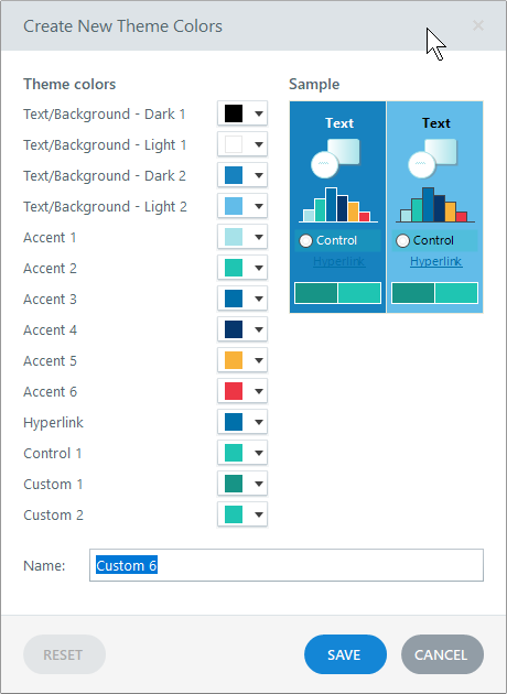
theme colors e-learning tips

If you stick with theme colors you can always change themes and all of the theme colors will change with it. If you don’t, then you have to go through the course slide-by-slide to make color corrections.

E-Learning Tip: Determine the Font Pairs & Create Theme Fonts

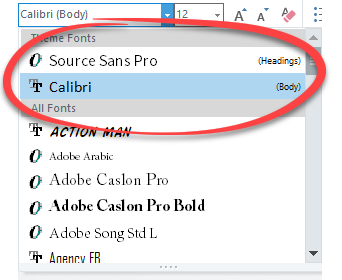
Same as the theme colors, determine your font pair prior to building your course. And then create theme fonts. You’ll have a title font and body font.

When you insert text on the screen, stick with the theme fonts only. Don’t go digging through the font list to find that one cool font. I’ll state it again, when you insert text on the screen, stick with the theme fonts only.
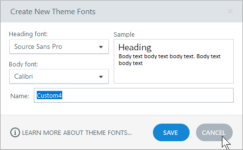
theme fonts e-learning tips

If you need to make changes to your fonts, all you need to do is apply a new theme and the text that uses theme fonts changes in the entire course and on the master slides. However, if you insert text from the font dropdown list, you’ll need to change those fonts individually. That’s why you want to stick with theme fonts.
theme font selection e-learning tips

So there you go, three e-learning tips before you start building your e-learning courses:

  • determine the size of the course
  • create theme colors
  • create theme fonts

Doing those three things up front will save you lots of production time while building your e-learning course.

Events

Free E-Learning Resources

Want to learn more? Check out these articles and free resources in the community.

Here’s a great job board for e-learning, instructional design, and training jobs

Participate in the weekly e-learning challenges to sharpen your skills

Get your free PowerPoint templates and free graphics & stock images.

Lots of cool e-learning examples to check out and find inspiration.

Getting Started? This e-learning 101 series and the free e-books will help.


e-learning tools

Over the weekend, I was supposed to paint the house but was watching TV instead. My wife asked why I wasn’t painting and I told her I couldn’t because I lost the paint lid opener and couldn’t open the paint can. She handed me a screwdriver.

“No dice,” I said. “That’s for screws. I can only use a paint lid opener.”

Ridiculous, right?

E-Learning Tools from a Different Perspective

Here’s the deal, e-learning vendors make products and those products have a purpose. However, the products often do more than they’re designed to do. It’s just a matter of looking at the tools from a different perspective. I always tell people to look at the e-learning applications as a means to create multimedia content and not just to create e-learning courses.

For example, Articulate’s Quizmaker obviously is great for building quizzes. That’s why it’s called Quizmaker. However, if you step away from its title, the features allow it to create simple decision-making scenarios or pop-up videos. All of these are more than the quizzes promised by the software’s title.

The same with PowerPoint. It’s a great tool for presentations…and illustrations…and video production…and much more. In fact, years ago, I used to use PowerPoint to create posters that I’d print on large format printers. You just have to step away from PowerPoint as a presentation tool and see it as a means to create multimedia. And once you do that, you’ll get more out of the investment you’ve made in the software.

Here are few tips to help you get there:

  • Learn to use the tools. The more fluent you are, the more you’ll be able to leverage the features. We always promote the weekly e-learning challenges so that you can learn to see and use the tools in different ways. They’re also intended to push you a bit out of what you may do at work, especially since most work projects are the same ones over and over and over.
  • Understand the features and then think outside the box on how to use them. For example, years ago I came up with a simple formula for building interactive scenarios: the 3Cs…challenge, choice, and consequences. If there’s a place in the software where I can interact and expose content, there’s a place to create an interactive scenario. Common click and reveal interactions like tabs, accordions, markers, etc. become simple interactive scenarios. Are they labeled as interactive scenario features? No. But that’s what you can create with them.
  • Look at what other people build with the same tools. There are all sorts of great examples in the community, in the weekly round-ups, and in the challenge activities. Review what they did, deconstruct them, and try to build the same.
  • Find ideas outside of e-learning. Looks for any type of interactive content and ask if you can do the same with your software. You may not always be able to replicate what you find, but often you can and worst case, you still build something neat and learn a few new production tips that will help on your next e-learning project.

What do you do with your software that it wasn’t designed to do?

Events

Free E-Learning Resources

Want to learn more? Check out these articles and free resources in the community.

Here’s a great job board for e-learning, instructional design, and training jobs

Participate in the weekly e-learning challenges to sharpen your skills

Get your free PowerPoint templates and free graphics & stock images.

Lots of cool e-learning examples to check out and find inspiration.

Getting Started? This e-learning 101 series and the free e-books will help.


e-learning mars rover demo

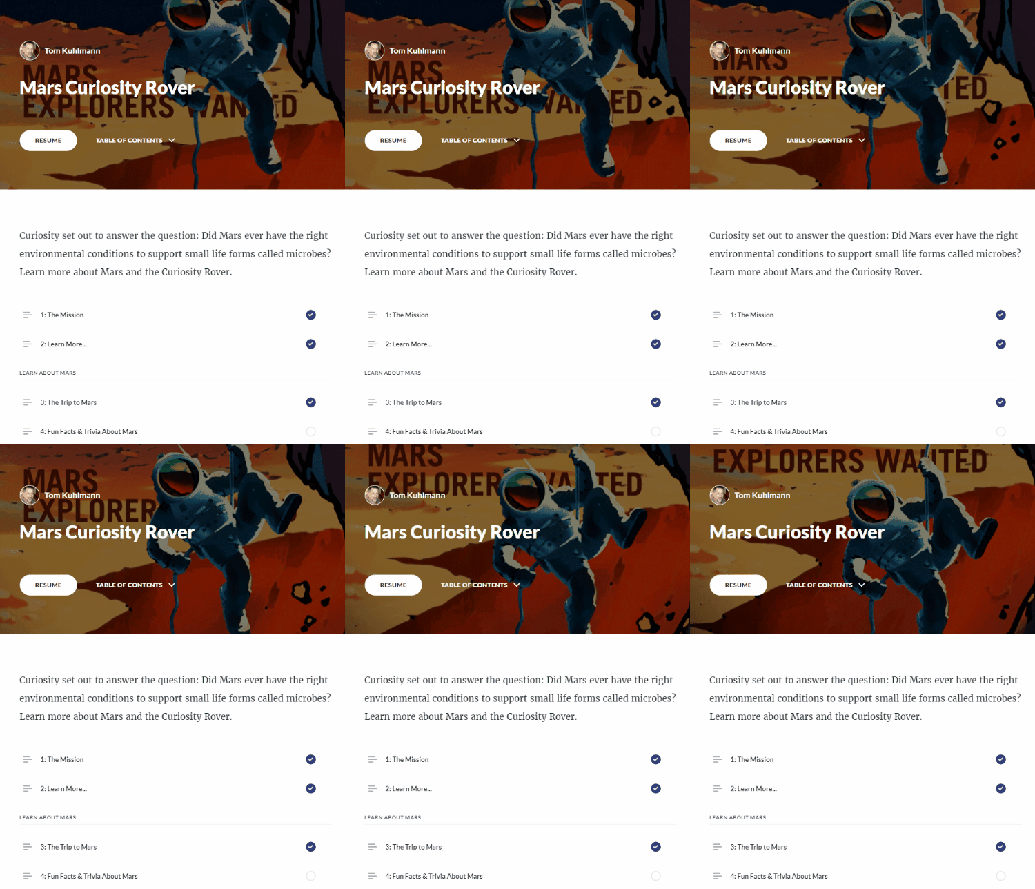
I created a demo course in Rise for a workshop. One of my goals with the demo was to show off different ways to add content and how the various blocks work and look in a real-ish project. This produced a lot of questions in the community on how I built it.  So I’ll try to answer them here.

First, I’ll have to admit that I didn’t really do all that much because Rise did all of the heavy-lifting. There is one custom piece in lesson 6 where I inserted a Storyline interaction. But for the most part, I just opened Rise and added my content. Then Rise did the rest.

Of course, some of the assets are colorful and eye-catching, but I didn’t create those. I used the information from the NASA site (which by the way is pretty darn cool). Check out what’s in the works for Mars 2020.

[If you haven’t worked with Rise, here’s a good overview video.]

Visual Design

Like I mentioned earlier, the actual assets in this demo module are from NASA, so they get all of the credit. However, I will add that when you create e-learning projects, it is important to have consistency in image quality and the assets used in your courses.

Just because you can add content easily into the Rise courses, doesn’t mean you need to. Like any e-learning module, you want to be intentional and avoid the Frankencourse.

One thing that does really catch your eye in this particular demo is the animated .gif cover screen. I think it looks cool and gives the module some personality. That’s a key first step in engaging learners. You’ll also notice animated .gifs in some of the other lessons.

Lesson 1: The Mission

For this lesson, I opted for a full-width image. I think it anchors the content well. This works best with higher resolution images. By not having margins, it kind of forces your eyes down the page.

I also added a hyperlink to the text body.

Lesson 2: Learn More…

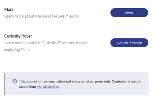
I wanted to show a way to create an easy branching structure to direct people to specific lessons. This feature could also be used for simple branched scenario interactions.

e-learning branching interaction

I also added a disclaimer using the Notes block. It’s a great way to draw attention to important points.

Lessons 1 and 2 are the pre-content. The lessons after those are broken into three distinct groups and you’ll notice I used Section Titles to show those groups.

Lesson 3: The Trip to Mars

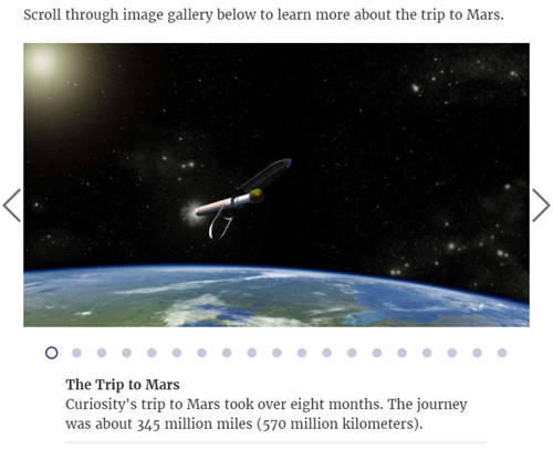
I leveraged the image carousel and the captions to provide more information about the trip to Mars. This content could be presented in a number of ways, but I like to give the user a way to touch the screen and this is a good interaction type for that. I also increased the size of the caption text.

e-learning image carousel interaction

Lesson 4: Fun Facts & Trivia about Mars

This lesson includes a lot of features. There’s a clickable image gallery. Again, the animated .gifs look nice and pull you in. Click on the thumbnail to zoom in and see the entire image.

I attached some additional content and you can download a PDF.

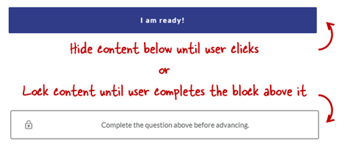
The Mars Trivia section includes a couple of dividers. One just holds back information until the user is ready and clicks. And the other forces the user to complete the interaction before advancing.

e-learning lock navigation

The trivia section includes two different types of knowledge checks: traditional quiz question and one that requires watching a video before answering.

Lesson 5: Did You Know?

There are a few different ways to insert videos into a Rise lesson. This is the pre-built lesson block which is full width and contains no additional content.

If you want to add additional content like text to the video block, you’ll need to create a custom block and insert the video that way. That’s what I did in lesson 8.

Lesson 6: Explore the Rover

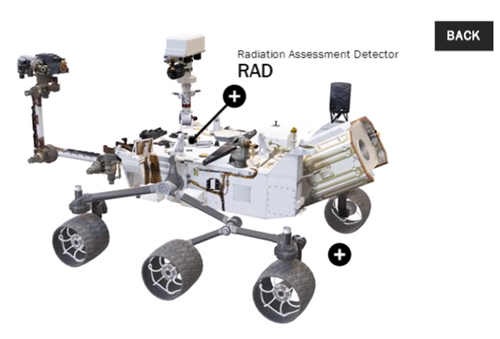
This is the lesson that generated the most questions (and will require an additional blog post and tutorial). One of my favorite features is the Storyline block in Rise. In this lesson, I create a single slide interaction in Storyline, the 3D Rover, and inserted it into Rise.

For the Storyline module, I created a transparent player and got rid of the player features so it sits in the block and looks like it’s part of the Rise lesson and not something inserted into it.

e-learning interactive Mars Rover

This block gives me the best of both worlds: fast and easy production in Rise coupled with custom interactivity from Storyline. I’ll do a more detailed write up on how I created the 3D Storyline interaction in an upcoming post.

Lesson 7: Access Mars – Virtual Reality

This only works in the Chrome browser.

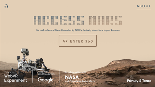
This is a webpage inserted into Storyline as a web object. And then the Storyline slide is inserted into Rise. It lets you navigate Mars in virtual reality.

e-learning Mars rover virtual reality 360

For course developers, this means you can insert all sorts of interactive web content into your Rise courses using web objects and the Storyline block.

Pretty cool, huh?

Lesson 8: Rover POV – Five Years on Mars

This is a different way to insert a video. In lesson 5, I inserted the video as a video block. In this lesson, I inserted it using custom blocks. The advantage of the custom blocks is being able to combine more blocks with additional content, interactions, and knowledge checks.

Lesson 9: 3D Ride Along with Rover

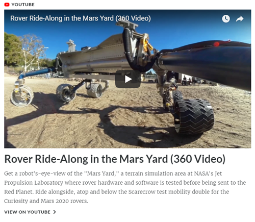
This is yet another way to insert a video. In this case, the video comes from YouTube and it’s also 360 so you can move around the screen. This really opens up what you can do with your videos, especially as the 360 video production is becoming more affordable. Look at how inexpensive the cameras are currently.

e-learning insert Youtube Mars rover 360

I did notice that the 3D doesn’t work on my smartphone iPhone 6 (it did work on my Android Pixel 2XL), which is something to keep in mind when adding media content to your courses: be sure to test different devices.

Lessons 10: Free Posters

Just another image gallery. Secretly I just wanted to point to the free posters. They’re pretty cool. I did use an animated .gif for the title image.

Again, those animated .gifs just add a lot of pop to the course content.

Lessons 11-13: Inserted Web Sites

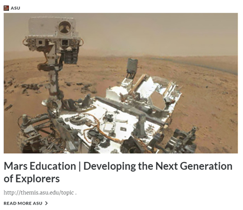
Adding resource links is pretty common. These lessons are are the URL/embed blocks. As you can see Rise pulls in the metadata from the site to make the link more interesting. You can turn that off if you want.

e-learning Mars training program ASU

So there you have it, a really quick run through of the Rise Rover demo module. From the Rise perspective, it’s super easy to build. It’s just a matter of collecting your content, determining the lesson structure, and then dropping it in. Just don’t tell your boss how easy it is.

What I think really wowed people was how nice the content looks. Part of that is the way Rise handles lessons and makes everything nice and clean. And the other part is that I had great assets from which to work.

I’ll do a followup post on the 3D rover interaction in Storyline. Let me know if you have any more questions about this module and go check out all of that great content on the Mars site.

Events

Free E-Learning Resources

Want to learn more? Check out these articles and free resources in the community.

Here’s a great job board for e-learning, instructional design, and training jobs

Participate in the weekly e-learning challenges to sharpen your skills

Get your free PowerPoint templates and free graphics & stock images.

Lots of cool e-learning examples to check out and find inspiration.

Getting Started? This e-learning 101 series and the free e-books will help.


kickstart e-learning career

I once had a manager who told me everything I report to him should be presented as five things on a notecard. He didn’t want all of the detail or nitty gritty. He just wanted a quick overview of the five most essentials points.

I get a lot of emails from people who want to transition from their current jobs into e-learning development. They want to know what they need to do (or know) to get moving in that direction. So here are my five things if you want to start a career in e-learning.

Learn About Learning

Sure, a formal instructional design degree helps, maybe. But today it’s not as critical, assuming you can prove that you really know what you learned. There are all sorts of ways to learn:

  • Go to school and get a degree. Another less costly way is to get a certificate (especially if you already have a formal degree). Certificate programs take less time, seem to be more project-focused, and are a bit more pragmatic when it comes to applying what you’re learning. Here’s a list of programs recommended by the community.
  • Read and learn on your own. There are plenty of good books and I’ve written about the few I’d start with. We also have a great e-learning 101 series to learn more. You can sign up here and get it delivered via email. We also offer a ton of free e-books that cover a broad range of e-learning topics.

Build These Types of Courses

You’ll need practical experience. There are all sorts of things you can do to get it. Volunteer to build courses for NGOs, churches, hospitals, or anywhere else that has limited funds and would welcome some free training.

You don’t want to build the same course over and over again. Instead get experience building diverse modules and types of training. Here’s a good list to get started:

  • Assessments. Create a few different types of assessments. The default, blocky type quizzes are fine, but the more custom you can make them, the better.
  • Scenarios. They are always popular and they show how to build situational training that closely mirrors real-world interactions.
  • Interactions. There are three main ways to interact with the screen: click, hover, and drag. Build some modules that demonstrate your skills creating different types of interactions. Lean more on dragging than clicking.
  • Software Training. Most organizations do some sort of software training. Show your skills with screencasts and software simulations.
  • Make it interesting. Most e-learning isn’t very good and usually very boring. Convert one of those types of courses into something interesting. Make it look good and make it interactive.

Learn to Use E-Learning Software

Your success hinges less on your academic credentials and more on demonstrable skills and fluency with e-learning software. There’s a lot of e-learning software out there. You can’t learn everything. I’ll give my plug for the Articulate tools for two main reasons:

  • Do a job search and most organizations are looking for Articulate course developers. You can’t go wrong getting the skills that potential employers desire.
  • All of the demo modules I mentioned above can be quickly built in both Storyline and Rise. You’ll be able to build a professional portfolio using those tools especially if you take advantage of the community resources and the Content Library that comes with Articulate 360.

Build an E-Learning Portfolio

Whenever I hire an instructional designer, I’m more inclined to review their portfolio rather than a resume that documents their experience and education. An instructional design degree is great but to me, the proof is in the pudding. And without a portfolio how can you SHOW your work and skills?

The portfolio highlights your skills and experience.

  • Keep it short. Find a few interesting (and interactive) parts of the course and show those. Or build some modules from the weekly e-learning challenges. They’re short and relatively easy to build. And perfect for a portfolio project.
  • Looks matter more than instructional design. It is a visual medium so make your visuals strong. Stay away from defaults and add some custom elements. Add some novel interactivity to catch their attention.
  • Identify common types of courses (as noted above) and build some modules for your portfolio. This will give you a diversity of projects and showcase different skills.

Learn More About These Topics

There’s a lot that goes into building an effective e-learning course. Here are some additional topics and skills you’ll need to understand to be a good course designer. You don’t need to be a pro at everything but you should be able to speak to them when needed.

There’s obviously a lot more you need to know to be successful transitioning into an e-learning job. What are the five things you’d recommend to that person? Feel free to share them in the comments.

Events

Free E-Learning Resources

Want to learn more? Check out these articles and free resources in the community.

Here’s a great job board for e-learning, instructional design, and training jobs

Participate in the weekly e-learning challenges to sharpen your skills

Get your free PowerPoint templates and free graphics & stock images.

Lots of cool e-learning examples to check out and find inspiration.

Getting Started? This e-learning 101 series and the free e-books will help.


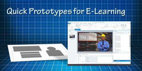
e-learning prototypes

Many e-learning developers spend too much time building courses that are almost complete before they solicit feedback about the course. This could be a waste of resources because by that time, they’ve invested a lot of resources and it’s a real challenge to get things changed that late in the game, especially if the changes are significant.

A better solution is to quickly prototype the course, get some feedback and make adjustments. This is even more critical if you have a lot of interactive content. The good thing is that this is really easy to do in Storyline (or event PowerPoint).

Here are a few tips on how to approach the prototyping.

E-Learning Prototype: Start Backwards

What is the objective of the course and what does the client expect the learner to do? Slapping a bunch of information together over a series of screens is probably not going to meet your objectives. 

It’s all about the action, boss.

It doesn’t take much effort to prototype a bullet point screen. That’s not where you want to put your effort when you prototype. Instead, focus on the actions and prototype the activities that let the learners practice and demonstrate understanding.

What do they need to do and what interaction can you build that allows them to do that?

E-Learning Prototype: Build Something that Works

One of the many things I like about Storyline is how easy it is to prototype all sorts of interactions. In fact, someone told me that she was in a meeting with a potential client who shared their course requirements and what they hoped to get out of the course.

While the potential client was talking, the e-learning developer opened Storyline and built a quick mock-up of how the course could work with some simple interactions and decision-making scenarios. The client intended to send her away to build something to pitch later. Instead, the e-learning developer showed her the interactive prototype right there in the meeting and got the job on the spot. All because she was able to focus on the desired activity and build a working model. 

E-Learning Prototype: Don’t Worry About Looks

At our workshops, we like to present a few challenge activities. This lets people workout ideas and build quick interactive modules. However, there are always a few attendees who end up spending all their time on the visual design and never end up building a working interactive prototype.

It’s an easy trap to fall into because we tend to lean on the visuals first. They help us think about the project. However, it’s a trap that wastes time. Don’t worry about the way the module looks, worry about the functionality and the desired output. 

Of course, you do want it to be visually organized. If not, the customer will still focus on the way it looks. But you don’t need to make it visually rich. A good cheat though, is to start with the content library templates and then work from there.

To sum it all up, building quick prototypes is a better option for course development than building almost complete courses and then soliciting feedback, especially since you’ll probably have to make a bunch of changes anyway.

How do you build your prototypes? Do you start with a storyboard? Or do you jump right into the software and start building?

Events

Free E-Learning Resources

Want to learn more? Check out these articles and free resources in the community.

Here’s a great job board for e-learning, instructional design, and training jobs

Participate in the weekly e-learning challenges to sharpen your skills

Get your free PowerPoint templates and free graphics & stock images.

Lots of cool e-learning examples to check out and find inspiration.

Getting Started? This e-learning 101 series and the free e-books will help.


e-learning checklist

On a recent flight, I watched the flight crew go through a pre-flight checklist. This is a series of things that need to happen prior to taking off. While watching them I wondered what we’d consider being part of an e-learning pre-flight checklist. 

  • Information vs Performance. I like to put courses in one of two buckets: performance or information. Performance-based courses seek to change behaviors and have people learn and do something new or different. Information-based courses are more about awareness of certification. Knowing which bucket to place the course,, helps me know what type of resources to commit to it.
  • What are the objectives of the course? Some objectives are to change performance or teach new skills. And some objectives are more like certification and awareness. Knowing the objectives helps you determine the proper metrics to evaluate success.
  • Who is the final approver of the project? This is one of the first questions I ask. It’s important to know who the final decision-maker is. Often you’ll work on a course and then right before launch someone higher up in the food chain gets involved and wants to make changes. Find out who this person is before you get too involved in the project and be sure to keep them in the loop throughout. And most of all, make sure you get approval at various milestones in the project. As David likes to say, “When things go right, the managers take credit. But when things go wrong, it’s all on the trainers.”
  • Is there a budget? I’ve worked for larger organizations with large projects and rarely did we get a budget to build the courses. I was always told I was the budget. It’s a good idea to initiate the conversation about having a budget. Perhaps you start small and say you need $500-$1000. Even if you don’t need the money, it’s a good idea to build the expectation that you need a budget to go with your training project.
  • What expectations does the client have? This goes back up to understanding the type of course that is being commissioned and determining the objectives. Often, the client has a default position that their goals or problems are solved by training. This isn’t a good starting point. It’s important to do some performance consulting to better understand the client’s needs and if training will help. Doing that sets clear expectations.
  • What expectations do the learners have? Let’s face it, the bulk of most e-learning courses are compliance training or annual updates with little impact on the person’s day-to-day responsibilities. Thus, for many, the expectations are very low. We can’t always control the content and client objectives, but there are things we can do to make the experience better and more interactive.
  • What do you know about the audience? Ideally, the course is designed in a real-world context. To do that requires an understanding of the audience’s real world.
  • What resources are available? The most important resource is access to the subject matter experts. Other resources are existing content, technology, media, and the numerous assets required to build good courses. Of course, with services like Content Library, some of that is mitigated and not as big of an issue as in the past.
  • How will you evaluate it? If you define clear objectives you can define metrics to determine if they’ve been met. Thus one part of the evaluation is having measurable objectives. The other part is knowing how you’ll collect and process them. That’s not as easy and probably why most organizations don’t bother evaluating their training properly.
  • What’s the implementation plan? Once the course is loaded into the learning management system, what’s next? How do the learners know there’s a course for them to take? How do managers know? What marketing strategies do you have for the course launch?
  • Does it need to be mobile? Personally, this is somewhat moot. Modern e-learning courses work on mobile devices. However, there are some considerations when it comes to mobile and how you construct the course. Ideally, you use something like Rise where all of the design considerations are already made. If you use Storyline, you’ll need to think about the interface and how things are laid out and how they work on the smaller screens.

This isn’t an exhaustive list, but it’s a good start. What would you add to your e-learning pre-flight checklist? Share your thoughts in the comments.

Events

Free E-Learning Resources

Want to learn more? Check out these articles and free resources in the community.

Here’s a great job board for e-learning, instructional design, and training jobs

Participate in the weekly e-learning challenges to sharpen your skills

Get your free PowerPoint templates and free graphics & stock images.

Lots of cool e-learning examples to check out and find inspiration.

Getting Started? This e-learning 101 series and the free e-books will help.


closed captions

We’ve discussed closed captions in a previous post. We looked at how to create them with free software or online tools. And we also explored how to build closed captions using a single text variable.

Today, we’ll look at how the closed captions feature works in Articulate Storyline 360. You’ll find it a lot easier to use. Here are three video tutorials that go into more detail regarding the steps below.

TUTORIALS

How to Create & Edit Closed Caption Text

Here’s how to add captions to audio narration or videos in your course. You can do it right inside of the authoring tool.

  • Insert the video (or audio) file.
  • From the toolbar, select Add Captions.
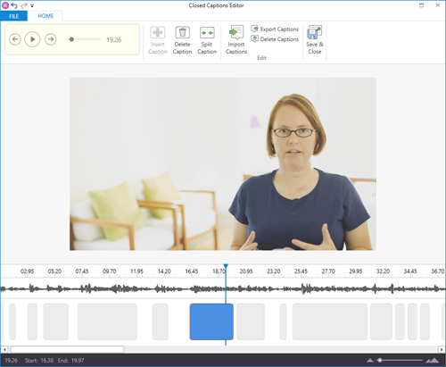
  • Storyline opens a caption editor where it analyzes the audio track and creates several placeholder caption boxes for you to insert text.
  • Select a caption box and start typing. Hit the return key to restart the caption box until you’re done. Hit the tab key to move to the next box.
  • Easy as that.

closed captions editor

TUTORIAL: Learn about creating and editing closed captions in Storyline 360.

Editing your captions is fairly straightforward. When you open the Closed Captions Editor, you see a timeline with the audio track and caption boxes.

  • You can extend or decrease the time of the caption.
  • Edit text.
  • Click and move the caption boxes.
  • Export the closed captions as a .VTT file, which is standard.

How to Import Closed Caption Text

Many people like to create their closed caption text in separate applications, export the .VTT (or another format), and import the text file into the authoring tool. That makes sense, especially if you have really long audio or video tracks.

Personally, I like to use Youtube to create my captions for long videos. I upload the video to Youtube and make sure it’s not public. Then, I take my text script and paste it into the field. Youtube does the rest. When it’s done, I can download a .VTT file to use in my e-learning course.

Here’s how it works in Storyline 360.

  • Insert a video or audio file into the slide.
  • Click on the video and in the ribbon, select Import to access your .VTT file.
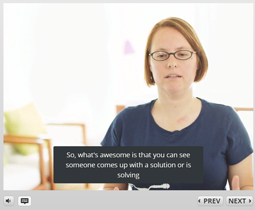
  • Preview the slide and select the Captions button on the player.

closed captions example

TUTORIAL: Learn about importing closed captions.

How to Create a Closed Captions Button

By default, the course player has a captions button. To view captions during the course, click the captions button. That works great if you have the player and captions button enabled. However, some people prefer to diminish the player and want their own captions button on the slide to control when the captions display.

Here’s how to create a custom captions button:

  • Insert a button.
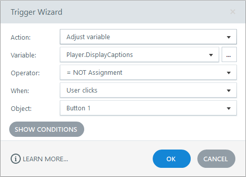
  • Add a trigger to the button to adjust the Player.Display.Captions variable.
  • The variable is like a True/False variable that can be either one or the other when clicked. Set the operator to =NOT Assignment.
  • When the button is clicked it toggles the variable value to what is not assigned to. Thus, clicking the button turns the captions or off.

closed captions variable

TUTORIAL: Learn about creating a custom closed captions button.

And that’s how you add closed captions to your e-learning courses. Pretty simple, huh?

Events

Free E-Learning Resources

Want to learn more? Check out these articles and free resources in the community.

Here’s a great job board for e-learning, instructional design, and training jobs

Participate in the weekly e-learning challenges to sharpen your skills

Get your free PowerPoint templates and free graphics & stock images.

Lots of cool e-learning examples to check out and find inspiration.

Getting Started? This e-learning 101 series and the free e-books will help.


subject matter experts

Subject matter experts play a key role in the success of your e-learning courses. The challenge is learning to use their skills and knowledge in a way that works best. Today’s post is a curated list of free resources with essential tips and tricks so that you are successful building your courses.

Free Downloads

Here is a list of free downloads available to you.

Rapid E-Learning Blog Resources

Here is a list of relevant blog posts.

E-Learning Heroes Community Resources

Here is a list of community discussions, tips, and resources.

Events

Free E-Learning Resources

Want to learn more? Check out these articles and free resources in the community.

Here’s a great job board for e-learning, instructional design, and training jobs

Participate in the weekly e-learning challenges to sharpen your skills

Get your free PowerPoint templates and free graphics & stock images.

Lots of cool e-learning examples to check out and find inspiration.

Getting Started? This e-learning 101 series and the free e-books will help.


drag and drop interaction essentials

There are three main ways to interact with the course: click, mouseover, and drag. While click-based interactions are the most prominent, a good drag and drop interaction is usually more engaging. In fact, anytime I feature a drag-based interaction in a blog post, I’m always asked how it was created.

Drag and drops are engaging, they let the user “touch the screen” or lean into the course a bit, and they’re novel because they’re not used as often as the other types. With that said, here is everything you need to know about drag & drop interactions from previous posts:

essentials of drag and drop interaction

So there you have it, everything you need to know to get started building effective and engaging drag and drop interactions for e-learning. And if you want to learn to build them, check out these tutorials and take part in these drag and drop challenge activities: challenge #16 and challenge #21.

Is there anything you’d suggest when building drag and drop interactions?

Events

Free E-Learning Resources

Want to learn more? Check out these articles and free resources in the community.

Here’s a great job board for e-learning, instructional design, and training jobs

Participate in the weekly e-learning challenges to sharpen your skills

Get your free PowerPoint templates and free graphics & stock images.

Lots of cool e-learning examples to check out and find inspiration.

Getting Started? This e-learning 101 series and the free e-books will help.


e-learning portfolio

Recently, I’ve seen dozens of portfolios and work samples that are verbatim copies of the work of others. This isn’t a good thing, especially if you represent it as your own work. There’s a difference between being inspired by others and plagiarism. And not knowing this can hurt your career.

To protect the innocent I won’t mention the names of individuals (or companies) that have ripped off the work of others and represented it as their own. I’m sure some of it is intentional, but I suspect that most are just not aware that what they’re doing isn’t in their best interests.

Today I’ll share a few ways to find inspiration from others and use it build YOUR skills the right way. And then use those skills to show off what you can do. The end point should not be an exact copy of the source material. Instead, it should be a derivative work inspired by the source.

Step 1: Find a source of inspiration

Look for ways to be inspired. I focus on visuals and interactivity. E-learning is mostly visual, so it’s always good to learn more about graphics and UX design. And another main point of focus is learning to transition from static content to engaging interactions.

Keep an ideas folder or bookmarks for later reference. Here are some places I like to look for ideas:

  • Design sites like Dribbble where you can see what people are doing. Many will even share free assets.
  • Presentation sites like Slideshare where you can see how people are presenting their content. They also have an easy way to do screengrabs.
  • Mobile apps are a good source of inspiration. I regularly download different apps just to look at how they work and how users interact with them to get content. This gives me ideas for course design. Especially when I want some novel ideas on how to navigate a course.
  • Multimedia presentations are also valuable. News sites tend to build simple interactive multimedia demos for the hot news. Unfortunately, today it seems they spend more on the interactions and less on real journalism, but that’s a blog post for another day.
  • Template sites like Template Monster and Theme Forest are great to see different types of layouts and get ideas for screens and colors.

What are some sources of inspiration for you?

Step 2: Deconstruct your source of inspiration

One of the best ways to learn is by deconstructing things that interest you. Since I work mostly with Storyline, my initial thought is whether or not I can create what I see in Storyline.  Sometimes I can and sometimes I can’t. The goal is to play around with the idea as well as the software.

  • I deconstruct the source of inspiration and try to figure out what’s happening and why the creator may have chosen that approach versus something else. I make notes of what I like and what I may change.
  • I try to build a functional prototype. Sometimes the source content is an interaction I like and sometimes it may be a visual design idea. In either case, I try to replicate it in the software to learn what I can do. One side benefit is that I often discover some new production techniques.

At this point, the concern isn’t a final showcase product. It’s more about building a matching prototype.

Step 3: Apply what you learned to something original

Inspiration should lead to iteration. The goal isn’t to build copycat modules. It’s a small industry and people know when you cribbed an idea from another developer. Instead, the goal is practice and then apply what you learned to something original.

If there’s an animation you found interesting, how would you apply it to your own content? Are there layouts you can build into reusable templates? Can you make the interaction work the same way but in a different context?

A few things to keep in mind:

  • If you do borrow an idea from someone else and share it publicly, give them props. It’s good form and builds goodwill. It also alleviates any accusations when your work looks similar to someone else’s.
  • Share what you build. If you’re going to show off what you built (and it’s not proprietary) it’s a good idea to give something away. Share the source file, a how-to tutorial, or maybe a free template. This helps build your personal brand and expertise.
  • If you see something that looks like your work, understand that people will steal your work. Consider it a form of flattery. Also, people often have similar ideas at the same time. There have been few times I’ve had a blog post in the queue only to have someone in the industry release a similar post before mine’s been released. It shows that a lot of common ideas percolate and often we come to them at similar times. It’s just the way it is.

The end goal in this step is to use the deconstruction as a source of inspiration. And then create a derivative work that is uniquely yours.

Continue to practice and learn your craft. Find sources of inspiration and then apply what you learn to your own projects. And then show off what you can do in your portfolio.

Events

Free E-Learning Resources

Want to learn more? Check out these articles and free resources in the community.

Here’s a great job board for e-learning, instructional design, and training jobs

Participate in the weekly e-learning challenges to sharpen your skills

Get your free PowerPoint templates and free graphics & stock images.

Lots of cool e-learning examples to check out and find inspiration.

Getting Started? This e-learning 101 series and the free e-books will help.


A lot of e-learning content starts with existing PowerPoint slides. And a common challenge is converting all of that PowerPoint training into interactive and engaging e-learning. Today we’ll look at a few considerations that will help make the conversion to interactive e-learning successful.

Understand Why the E-Learning Course Needs to Be Interactive

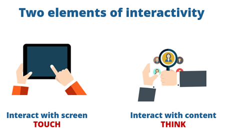
Generally speaking, there are two components to interactive content. We’ve covered this in a previous post, but here’s a quick overview:

interactive e-learning

  • Interact with the screen. The goal is to get them to lean in and have them do things onscreen like dragging objects and opening and closing various elements. Create novel onscreen interactions. The focus isn’t on the learning as much as it is the experience of “touching” the screen.
  • Interact with the content. As far as interacting with the content, the general idea is getting them to access the content in a manner consistent with real-world activities and making the types of decisions they need to make after they exit the course.

Understand How We Interact with the E-Learning Course

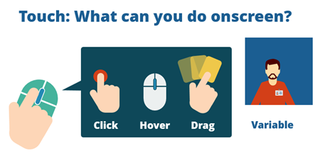
There are three main ways to interact with the screen: click, hover, or drag. Most interactions tend to be click-based. A good practice activity is to convert what would have been a click-based interaction into something else. How would it work if it was changed to a drag and drop for example?

interactive e-learning

Understand Why We Interact with the E-Learning Course

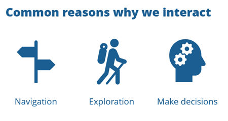
While going through the course, most interactions happen because of one of three reasons:

interactive e-learning

  • Course Navigation: the user navigates around the course and the course content.
  • Content Exploration: the user explores what’s available in the course.
  • Decision Making: the user makes decisions and gets feedback.

These usually overlap. For example, as a user is challenged to make a decision, she may have to explore the content and determine what she needs to make the best decision.

Combine Building Blocks to Create Interactive E-Learning

There are a few core building blocks that help convert static information into interactive e-learning.

The 3C Model is a Simple Way to Understand Interactive Scenarios

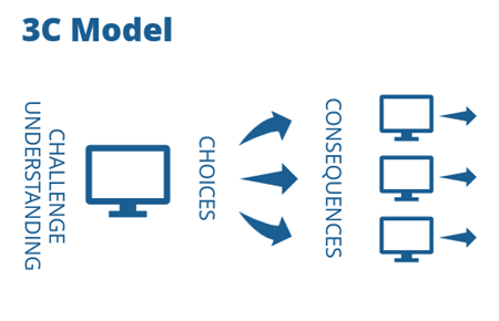
Assuming the content and activities are framed in a meaningful context, here’s a simple way to structure interactive scenarios:

3C model interactive e-learning

  • Challenge. You want to expose their level of understanding. Get them to make decisions.
  • Choices. Provide choices based on the decision-making challenges.
  • Consequences. Each choice produces a consequence. It can be immediate feedback, another challenge, or compounded feedback presented at one time.

This is a simple way to remember the interactive process. What types of decisions does the learner need to make? What choices will you present? And then what are the consequences of those choices?

When you review your static content or existing PowerPoint slides, look for ways to make it interactive. Understnad how they’ll use the content in the real world and build decisions around that. Then find ways for them to lean-in and interactive with the screen.

What do you do to convert your PowerPoint training into interactive e-learning?

Events

Free E-Learning Resources

Want to learn more? Check out these articles and free resources in the community.

Here’s a great job board for e-learning, instructional design, and training jobs

Participate in the weekly e-learning challenges to sharpen your skills

Get your free PowerPoint templates and free graphics & stock images.

Lots of cool e-learning examples to check out and find inspiration.

Getting Started? This e-learning 101 series and the free e-books will help.


essentials of interactive e-learning

At a recent workshop, we reviewed some of the essentials of interactive e-learning. Here are some of the highlights from the presentation. They focus on what the course participant should DO and not what information they need to SEE.

Basic Course Design

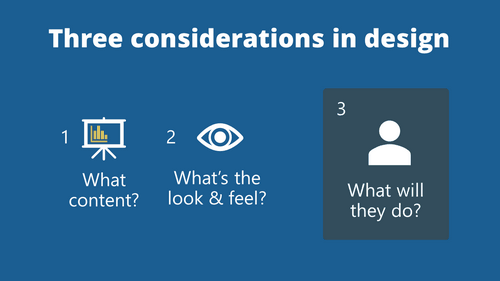
We discussed this in the post on what every new instructional designer should know. When building courses there are three main considerations:

  • What content needs to be in the course?
  • What’s the right look and feel for the course?
  • What will the users do in the course?

essentials of interactive e-learning 3 considerations

This last point is where we consider how the user interacts in the course. One of the challenges many e-learning developers have is that they don’t properly identify the performance objectives for the course and without that, they can’t build meaningful interactions.

The first thing is to understand the performance expectations and then from there build the interactions and activities that teach how to meet those expectations.

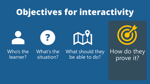
Objectives for Interactive E-Learning

It’s important to step away from info-centric design and step towards learner-centric design. A course focused on the learner frames the content so that it’s relevant to the learner’s needs and meaningful to the types of decisions they need to make in the real world.

essentials of interactive e-learning how to

  • Identify who’s taking the course.
  • In what situations would they need the course content?
  • After the course, what should they be able to do?
  • How do they prove they can do it during the course?

Use a Backward Design Strategy to Focus On Meaningful Interactions

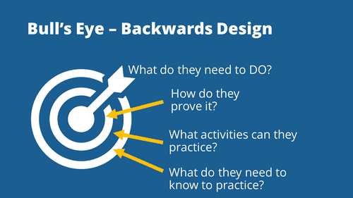
Training specialists always fret over the return-on-investment (ROI) for e-learning. That’s usually the case when they’re not properly aligned to the organization’s goals and end up building a lot of information-based e-learning with very little focus on real performance improvement. It’s like they shoot a bunch of arrows during the year; then at the end of the year draw bull’s eyes around them to show the organization how well they’ve done.

essentials of interactive e-learning backward bull's eye design

  • The real bull’s eye is identifying what the learner needs to do.
  • Then determine how they can prove that they can do it.
  • Training is built around how to prove their understanding.
  • Focus on the activities. What do they need to do and what do they need to know to do it.

If you focus on the activities and not the information, you’ll most likely built more effective, engaging, and interactive e-learning.

Good books to learn more:

The links to Amazon books may produce a slight commission.

When it all comes down to it, effective interactive e-learning is built around meaningful activities that are relevant to the learner and aligned with the organization’s goals. The mistake a lot of course designers make is to not properly define the performance objectives and from there build meaningless or no interactivity.

Events

Free E-Learning Resources

Want to learn more? Check out these articles and free resources in the community.

Here’s a great job board for e-learning, instructional design, and training jobs

Participate in the weekly e-learning challenges to sharpen your skills

Get your free PowerPoint templates and free graphics & stock images.

Lots of cool e-learning examples to check out and find inspiration.

Getting Started? This e-learning 101 series and the free e-books will help.