The Rapid Elearning Blog

Archive for the ‘Uncategorized’ Category


Articulate Rapid E-Learning Blog - How to create your own graphics and illustrations in PowerPoint

Despite all of the whining about PowerPoint, I find it an effective application for much of my online training and graphic design work. There aren’t many applications more diverse. And it’s what I highlighted in this post on why PowerPoint doesn’t suck.

In that post I shared how I use PowerPoint to create my own illustrations and used the deconstructed sandwich graphic below as an example.

Articulate Rapid E-Learning Blog - create custom graphics in PowerPoint for online traininig

I had a few people email and ask how I created the image. So today’s post is a tutorial on creating illustrations for your online training courses.

How to Build Illustrations in PowerPoint

In my elearning workshops I share ideas on creating a starting template for your online courses. I like to use the sandwich graphic as we discuss deconstructing the core parts of a course. I saw a similar graphic online and decided to try my hand at creating it myself in PowerPoint.

Below is a tutorial that shows how I built the sandwich illustration. Here are the general steps:

  • To create the bread shape, I combined two shapes in PowerPoint. I filled it with a bread-like color and made the outline color brown for the crust.
  • The meat and cheese are just regular shapes filled with the appropriate color.
  • The lettuce is a hand-drawn shape. It didn’t look right filled with green, so I filled it with an image of lettuce.
  • Then I applied a rotation effect to all of the shapes to give them that 3D look.

You can get more detail from the tutorial below.

Articulate Rapid E-Learning Blog - how to create custom illustrations and graphics in PowerPoint for elearning design

Click here to view the tutorial.

Forget the Sandwich! These Tips Are Meant to Teach You More About PowerPoint

When I share these PowerPoint illustration tips I don’t expect that every blog reader is going to go out and find ways to use the sandwich graphic for elearning. Instead, my goal is to get you to rethink PowerPoint and see it’s capabilities in a new light. And I hope to inspire you to practice some of these tutorials in order to learn more about PowerPoint’s features.

You may never need to build a sandwich illustration, but you’ll definitely benefit from practicing the techniques so that when you need a custom graphic you have the skill to try building one yourself.

Articulate Rapid E-Learning Blog - how people learn

It’s a point that Julie Dirksen makes in her excellent book, Design for How People Learn. She referenced the blog post where I share how to create the envelope illustration in PowerPoint. In the book she says that just following the tutorial to learn to build the illustration isn’t enough because the goal isn’t to build that particular illustration. Instead it’s to learn to build illustrations using PowerPoint. And that won’t happen when you build a single icon. It requires more than step-by-step instructions.

Articulate Rapid E-Learning Blog - example of a graphic created for a practice elearning tutorial

The same goes for the sandwich illustration. The goal isn’t to build the sandwich illustration. Hopefully you’ll learn to appreciate the capabilities of PowerPoint, see the illustrations as distinct shapes, and then practice building your own as you need them.

With enough practice you’ll feel confident to build (or at least attempt it) the illustrations and graphics you need. If you do create a custom illustration, be sure to share it with us. I’d love to see what you create.

Events

Free E-Learning Resources

Want to learn more? Check out these articles and free resources in the community.

Here’s a great job board for e-learning, instructional design, and training jobs

Participate in the weekly e-learning challenges to sharpen your skills

Get your free PowerPoint templates and free graphics & stock images.

Lots of cool e-learning examples to check out and find inspiration.

Getting Started? This e-learning 101 series and the free e-books will help.


Articulate Rapid E-Learning Blog - free PowerPoint template for online training

Below is a PowerPoint template that you can use for your elearning courses or other online training.

Example of Free PowerPoint Template

Here is a published example of the PowerPoint template with the download link.

Articulate Rapid E-Learning Blog - example of free PowerPoint template for online training

Click here to view the demo.

Example of the Free Storyline Template

I also created a Storyline version of the template if you’re a Storyline user.

Articulate Rapid E-Learning Blog - example of free Storyline template for online training

Click here to view the Storyline demo.

Customize the Free Templates

Both templates are designed so that you can quickly create and apply custom color schemes. The module tabs use accent color boxes one through five.

Articulate Rapid E-Learning Blog - use PowerPoint and Storyline design schemes to create custom templates

Keep in mind that you can also apply your own font scheme so you’re not limited to the default fonts. This template may be a good way to practice creating some font pairs.

I hope you enjoy the templates. If you use them, send me a link. I’d like to see what it looks like.

Events

Free E-Learning Resources

Want to learn more? Check out these articles and free resources in the community.

Here’s a great job board for e-learning, instructional design, and training jobs

Participate in the weekly e-learning challenges to sharpen your skills

Get your free PowerPoint templates and free graphics & stock images.

Lots of cool e-learning examples to check out and find inspiration.

Getting Started? This e-learning 101 series and the free e-books will help.


Articulate Rapid E-Learning Blog - select the right font pairs

Are the fonts you select for your elearning courses equivalent to your older uncle’s leisure suit? Sure, it’s clothing. But is it what you want to be seen in?

In a previous post, we explored how to create a style guide for your online course design. The style guide helps with consistency, but it doesn’t dictate which font styles to select.

In today’s post we’ll review some simple rules when selecting and pairing fonts.

Rule #1: Select contrasting fonts.

As a simple rule of thumb, I look for fonts that contrast by weight or serif with san serif.

Articulate Rapid E-Learning Blog - three rules when pairing fonts for online courses

However there are other ways the fonts can contrast such as style or form. Changing size or color is another way to create contrast. When using informal or script-like fonts, those typically work better as heading fonts rather than body text because they’re not as easy to read.

Rule #2: Use the same font family.

Many fonts are part of a font family. And those families tend to have enough diversity and variety to make appropriate parings.

Articulate Rapid E-Learning Blog - examples of fonts in the same family

The benefit of the same font family is that they’re designed to work together. If you look through the fonts on your system, odds are that you’ll find a few families already.

Articulate Rapid E-Learning Blog - using fonts in the same family for online training

Rule #3: Avoid fonts that look the same.

The last rule is to avoid pairing fonts that look the same or very similar. Fonts have a lot of subtle differences. By selecting contrasting fonts, you can play off of the differences. However, if you select fonts that look too much alike, then you introduce a discordant look.

Articulate Rapid E-Learning Blog - avoid fonts that look too similar

Usually people select similar fonts because they want one that’s specifically a certain size, bold, or italicized. If that’s the case, then stick with a single font and use the bold and italics to make it a little different. It’ll look more elegant that way.

Bonus Rule: If You’re Not Sure, Go with What Looks Right

You may not be a trained fontologist but you probably can tell when something looks right or wrong. So go with your gut. Unless you’re the one building the Frankencourses. In that case, go with rule #2.

Articulate Rapid E-Learning Blog - create a simple font pairing template for your online courses

To practice pairing fonts, build a simple PowerPoint slide. And then assign different font types to see what they look like. When you find a font pair you like, make note of it so the next time you’ll spend less time trying to match pairs.

Another option is to practice pairing fonts with this typographic dating game.

Use the right font type and your course is refined. Use the wrong one and things won’t look right. Take some time to learn how to pair fonts and then make a list of font pairs so that you’re ready for the next course.

Events

Free E-Learning Resources

Want to learn more? Check out these articles and free resources in the community.

Here’s a great job board for e-learning, instructional design, and training jobs

Participate in the weekly e-learning challenges to sharpen your skills

Get your free PowerPoint templates and free graphics & stock images.

Lots of cool e-learning examples to check out and find inspiration.

Getting Started? This e-learning 101 series and the free e-books will help.


Articulate Rapid E-Learning Blog - it's time to break out elearning's curly fonts

I was reviewing an elearning course recently. About twenty screens into the course, I noticed that the developer changed the title font from a solid bold type to one that was curly and much more informal.

There was so much contrast to the two titles that I asked why she changed fonts from bold to curly. She responded that the course seemed a little dull at that point, so she decided to add the curly font to liven it up.

Imagine the elearner almost asleep but then jolted to consciousness with the appearance of the curly font on slide 20. Apparently curly fonts stimulate the adrenal glands and can transform the most mundane elearning courses into ones that rival Jurassic Park for heart-pounding action. They’re our industry’s equivalent to smelling salts.

Intentional Course Design

There’s a lot that goes into building an effective elearning course. One thing you can do to guarantee success is to be intentional about how the course is designed. There’s nothing on the screen that’s there by accident. That goes for the way the course looks as well as how the learner interacts with it. It also goes for the choice of fonts used in the course.

Many course designers tend to work from existing content like PowerPoint slides used for classroom delivery. What tends to happen is the existing content dictates how the course is designed. And because of that there’s not much thought put into things like the choice of font. That means we go from one slide to the next and make decisions on-the-fly rather than based on a plan.

Limit the Course to Two or Three Fonts

A good rule of thumb (especially for those getting started) is to limit the course to 2-3 font types. Generally courses have similar layouts. The font styles may vary based on the course context, but the fact is they’ll be used in mostly the same ways.

Here are a few common uses of font types:

  • Title: Titles tend to be bolder and stronger. They set the stage for the content and provide a strong visual connection to course content and context.
  • Subtitle: Subtitles or sub-headings are used to segment content and help make the screen more scannable.
  • Body: The body text is less visual design and more about legibility. The more text on the screen, the more we need to be aware of how readable it is; and then choose the appropriate font.
  • Emphasis: Courses tend to have places where we need to emphasize the text such as bolding and italics to draw focus or captions to highlight additional information. If the need for emphasis exists, what will it look like?

Intentional course design means that we determine what the font types are prior to building the course and how we’ll use them. This becomes the simple style guide.

The consequence of not determining this prior to starting the design of the course is that a lot of time is wasted as we search for and change fonts to match what we’re trying to do at the moment. Then we end up with the Frankencourse where things kind of look cobbled together rather than cohesive.

Create a Simple Style Guide

We have identified four common uses above. You can come up with more if needed. From there we create a simple style guide that visually represents the various uses of the fonts. It may look a little like the image below that David shares in some of our workshops.

Articulate Rapid E-Learning Blog - style guide for elearning course design and fonts

In this image, we visually represent the various headings and body text. We also identify the fonts used, their colors, and provide an example. This style guide can be saved as a document or added to one of the course screens and then copied.

Depending on the software used, the fonts and their styling can be built into the templates and layouts. This will save a lot of time and mean you won’t have to constantly dig through the font list to find just the “right” font. It definitely keeps you away from the curly font, unless of course it’s appropriate to the course design.

This approach also comes in handy when you’re sharing project files and want to make sure that others are on the same page.

The main point in this is that you are intentional in your course design. This means determining the fonts required and how they’ll be used. You’ll save time and your course will have a more polished look.

Do you use a style guide for your courses? If so, how is it determined? Share your thoughts here.

Events

Free E-Learning Resources

Want to learn more? Check out these articles and free resources in the community.

Here’s a great job board for e-learning, instructional design, and training jobs

Participate in the weekly e-learning challenges to sharpen your skills

Get your free PowerPoint templates and free graphics & stock images.

Lots of cool e-learning examples to check out and find inspiration.

Getting Started? This e-learning 101 series and the free e-books will help.


Articulate Rapid E-Learning Blog - Government creates bad PowerPoint via Edward Tufte

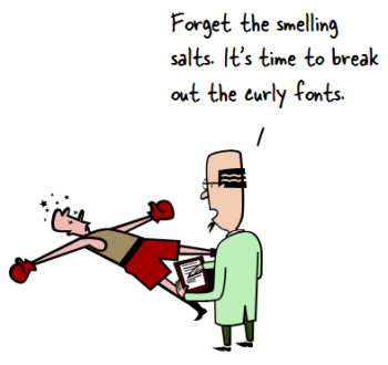
It may come as a surprise to you, but there are many people who think that PowerPoint sucks. I know; I know. I was surprised, as well.

The other day Mashable featured some Edward Tufte tweets where he blasted the slides from a secret government surveillance program. Of course, his criticism of the slides is spot on. In fact, many of the issues he raises in the tweets and in his books are similar to the issues we face when building elearning courses.

Articulate Rapid E-Learning Blog - powerpoint sucks is what the critics say

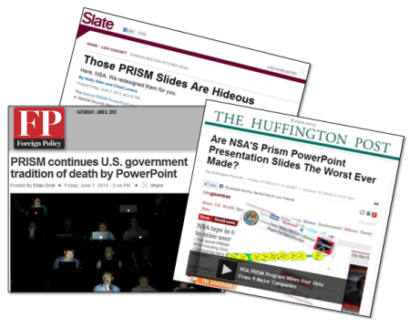
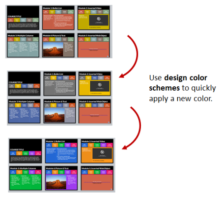
However, as if on cue out came the horde of conformist PowerPoint critics. Above is a sampling of some titles. While I don’t disagree with the criticism of the government’s PowerPoint slides, the fact is that PowerPoint is only an application. And the criticism is really about the way the presenters organized and presented their content. As a side note, there used to be a day when journalists were actually dedicated to exposing government tyranny rather than merely exposing how they presented it in meetings. But that’s a different blog post.

While it’s true that PowerPoint has been used to create horrific presentations, it’s getting a bad rap. Personally I find PowerPoint to be one of the most powerful and diverse applications I use. So with that said, I’d like to offer seven reasons why PowerPoint doesn’t suck and may be one of the best applications you own.

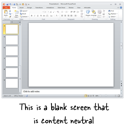
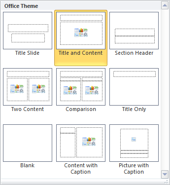
PowerPoint’s a Blank Screen

PowerPoint is a blank screen. So what you have on it is determined by you. That’s why I always advocate being intentional with your design. There’s nothing on the screen that’s there by accident.

One simple tip is to refrain from using the default templates. If you need a template, create one yourself that meets the needs of your project and don’t rely on a template that has no context.

Articulate Rapid E-Learning Blog - a blank PowerPoint slide

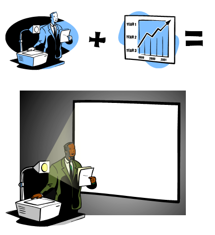
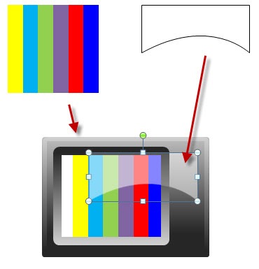
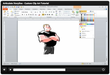
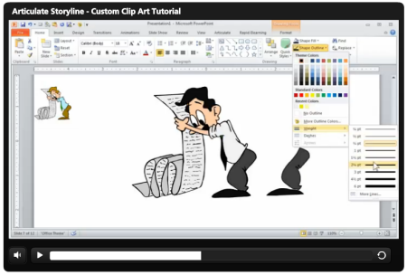
Use PowerPoint to Create & Edit Your Graphics

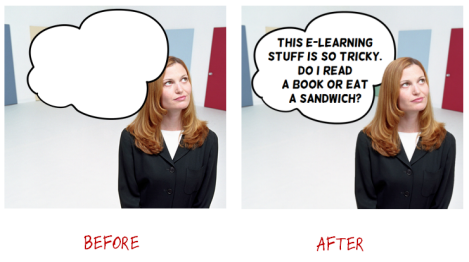
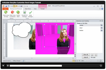
PowerPoint has a lot of features that when combined allows you to create your own graphics. And since it starts with a blank slide, you’re not constrained by any templates or pre-determined schemes.

Articulate Rapid E-Learning Blog - how to create your own graphics in PowerPoint

Once you create your own graphics, right-click on the object and save as an image. I prefer to use .png because this maintains the image quality and any background transparency. Once you’ve save the object as an image, you can use it anywhere.

Related posts:

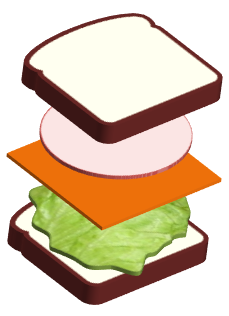
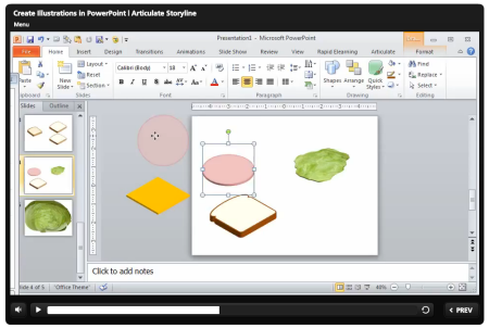
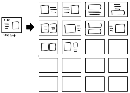
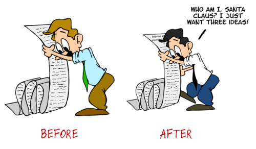
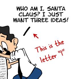
Use PowerPoint to Create Illustrations

PowerPoint has many of the types of features you’d find in advanced illustration tools like Illustrator or the open source Inkscape. To be successful you have to think of PowerPoint not as a presentation tool, but instead a blank canvas. And then learn to use the features that allow you to manipulate and create your own shapes.

Articulate Rapid E-Learning Blog - use PowerPoint to create simple illustrations

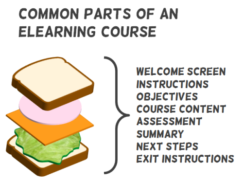
I look for illustration tutorials and see what it takes to recreate them in PowerPoint. In fact, for a recent workshop file, I needed an illustration that looked like a stacked sandwich. So I created this in PowerPoint. It only took a few minutes.

Articulate Rapid E-Learning Blog - use PowerPoint to create custom illustrations

Related posts:

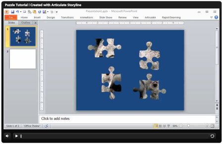
Use PowerPoint to Create Videos

Starting with PowerPoint 2010, whatever you create in PowerPoint can be saved as video. PowerPoint 2010 saves as .wmv and needs to be converted to .mp4 for playback on most devices. I usually use Handbrake for the conversion because it’s free. But the newer versions of PowerPoint can save to .wmv or .mp4. Now you don’t need to do the conversion in a separate application.

Articulate Rapid E-Learning Blog - how to use PowerPoint to create videos

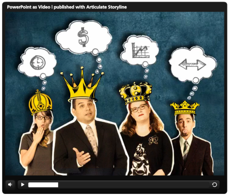
Click to view the PowerPoint converted to video demo.

To show you how good it can look, above is the Duarte sample presentation template that comes with PowerPoint 2010. I saved it as a .wmv and then inserted the video into Articulate Storyline so I had a custom player. As you can see, it looks really nice and all of the transitions and timed animations work. In fact, if I saw this without knowing it was done in PowerPoint, I’d assume it was created in something like Flash or a more sophisticated video application. By the way, by converting the video in Storyline from .wmv to .mp4, the file size went from 165 MB to about 11 MB.

Here’s an example of how we created some videos in PowerPoint and then inserted them into our rapid elearning courses.

  • Video sidebar to introduce course: In this video, we used the sidebar to introduce the course topics. The video was created in PowerPoint and then inserted into the presenter panel.
  • Video inserted on slide and in the sidebar: This is a demo we used to show that once you’ve created the videos in PowerPoint, you can insert them into your rapid elearning cour
    ses. Both videos (sidebar and main slide) were created in PowerPoint.

Articulate Rapid E-Learning Blog - example of a PowerPoint video in rapid elearning course

Click here to view the PowerPoint video demo.

Considering how easy it is to use the features in PowerPoint and with it’s advanced animations, I find it to be a pretty powerful application for creating video content. It’s definitely a lot more powerful than most of the simple video editors.

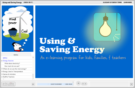
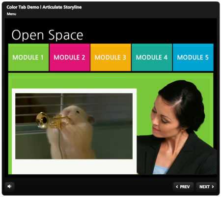
Use PowerPoint to Create Online Training

A few years back, building interactive elearning was a challenge because it required some advanced programming skill and expertise. However, that changed with the advent of rapid elearning. Essentially those applications like Articulate Presenter converted the PowerPoint slides into Flash files. Thus, you were able to create your own Flash content without requiring Flash programming skills.

Articulate Rapid E-Learning Blog - elearning examples created in PowerPoint

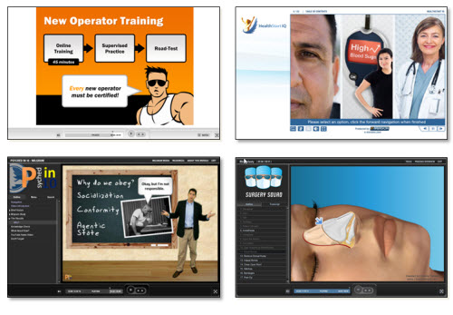
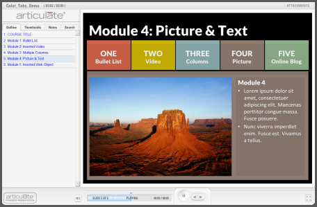
Examples of PowerPoint-based Online Training

Now that we’re entering the second phase of rapid development we see tools like Storyline that import the PowerPoint content. They retain many of its features and allow for much more sophisticated interactivity—something that PowerPoint-based elearning always lacked. However, in either case PowerPoint plays a key role in the development of online training.

I will add that using PowerPoint to create elearning doesn’t mean that the course created with PowerPoint is good. Good course design still requires sound instructional design. However, if you do need to create online content then PowerPoint is a viable solution. And that’s the main point.

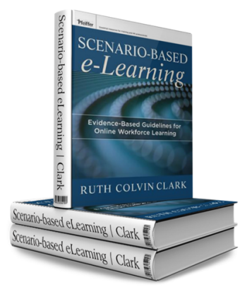
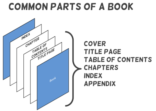
Use PowerPoint to Create Print Books and eBooks

Whatever you create in PowerPoint can be exported to a .PDF and subsequently converted to an ebook format if needed. That’s easy enough to do. However, you can also use PowerPoint in a way similar to what you’d do in an application designed to create real books. Because of the blank canvas and freeform environment, content can be placed anywhere you like. That means you can use PowerPoint to create your book’s layouts and pages.

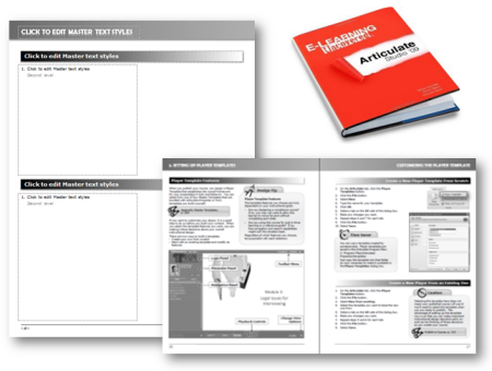
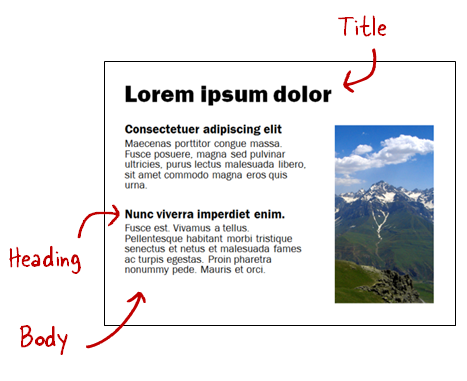
In fact, the book E-Learning Uncovered: Articulate Studio was initially created in PowerPoint. As you can see in the image below, they created some layouts and a template to produce the book; from there they sent it to the printer. It’s probably not ideal to print a book using PowerPoint, but if you don’t have the skills to use InDesign or some other book publishing application, then it is a viable solution. And it goes back to my main point about PowerPoint’s diversity.

Articulate Rapid E-Learning Blog - books created in PowerPoint


Use PowerPoint to Create Mobile Learning

I was at a mobile learning conference recently and almost all of the content-providers who were selling mobile training had some sort of video-based solution.  This makes sense because video is a lot easier than HTML5, especially since HTML5 is still somewhat of a moving target. And in a lot of ways video for mobile learning is probably a better solution than more traditional, interactive elearning.

  • Video-based mobile learning: As I noted above, you can create videos with PowerPoint. In fact, here’s a direct link of the Duarte video. Access the link from your tablet or smart phone and see how it looks.
  • Print-based mobile learning: Because PowerPoint exports to PDF and PDF can be somewhat interactive, you can create interactive PDFs that work for your mobile devices. Here’s an example of a PDF for the iPhone and one for the iPad. All you need to do is modify the slide size to get the right aspect ratio. Paul Clothier shows how to do it for the iPhone demo.

Learn More About PowerPoint

Check out these tutorials if you want to learn more about PowerPoint and how get the most out of it:

Going back to the original argument, PowerPoint is a powerful application. The trick is learning to use it effectively. The tutorials and free resources above should help. But’s definitely worth learning to build better presentations. Below are some books and recommended resources to help you get started.

Articulate Rapid E-Learning Blog - recommended PowerPoint books

  • Non-Designer’s Design Book: If there is only one book to buy, it’s this one.  You’ll learn all of the basics about typography and visual design.
  • Beyond Bullet Points: Great tips to help organize your content whether presentation or rapid elearning.
  • Better the Bullet Points. Practical tips on using PowerPoint.
  • Slide:ology: Great book on visual design concepts and how to craft better presentations.  They have some good examples of branded templates that do work.
  • Presentation Zen: This book is very similar to slide:ology and will help you learn to communicate better with your slides.  I haven’t read it yet, but his new book is supposed to be good.
  • Back of the Napkin: Great book on organizing ideas and visual communication.
  • Various PowerPoint books: Tufte is a critic of the poor use of PowerPoint.  He offers a lot of good information on how to present complex data.  There are also all sorts of good how-to PowerPoint books.

The links to Amazon books may produce a slight commission.

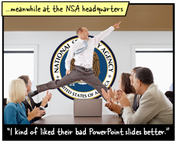
So there you have it. For all of the criticism and belly aching about PowerPoint, it is still a very powerful and easy to use application. It just depends on how it’s used. And of course, if you spend all your time monitoring innocent citizens then odds are you won’t have time to build good presentations.

What tips would you offer the government to get better use of PowerPoint?

Events

Free E-Learning Resources

Want to learn more? Check out these articles and free resources in the community.

Here’s a great job board for e-learning, instructional design, and training jobs

Participate in the weekly e-learning challenges to sharpen your skills

Get your free PowerPoint templates and free graphics & stock images.

Lots of cool e-learning examples to check out and find inspiration.

Getting Started? This e-learning 101 series and the free e-books will help.


Articulate Rapid E-Learning Blog - how to work with subject matter experts when building online training

A large part of your success hinges on the relationship you have with the course’s subject matter experts. They play a critical role by providing guidance, expertise, and context for much of your course’s content. However, the subject matter experts can also be a source of frustration. Many times they won’t budge when it comes to getting rid of extra information. Or they have their own ideas on how the course should be designed which conflicts with yours.

In today’s post we’ll review some challenges when working subject matter experts and how to overcome them.

Five Challenges Working with a Subject Matter Expert

Here are some common challenges when working with your subject matter expert.

  • They know everything. Their expertise comes from years of experience. Often they lose sight of this when trying to teach new people. Because of this, they tend to over emphasize the value of some content or think everything is equally important.
  • They’ve invested time in existing content. Much of the material you get comes from existing classroom content. And often this content has been created by the subject matter experts. That means they’ve already invested time in building the course just the right way. They’ve also spent time selecting color schemes, fonts, and clip art.
  • Their expectations are based on experience. One reason there are so many linear, click-and-read courses is because that’s what people think elearning should be. It’s what they’ve experienced so it must be right. Plus, a linear course is a systematic way to ensure that all of the important information is presented.
  • They don’t want the fancy schmancy bells and whistles. Interactive content seems like extra work with a bunch of bells and whistles. Why do you need more than a few slides of information and a multiple choice quiz? Seems like a waste of money to build interactive scenarios. Also, who has time to create all of those branches? It’s hard enough to come up with ten good quiz questions.
  • They’re not part of the project team. I’ve worked on plenty of projects where I need to do research and the client directs me to a subject matter expert. Often the experts don’t know anything about the project and they can get a bit territorial when a non-expert steps onto their turf. Because of this, they aren’t always committed to the success of the course. To them, you’re an intrusion on their productivity and possibly even a threat to what they do.

Five Ways to Work with Subject Matter Experts

While it can be challenging working with subject matter experts, they do a place an important role in the construction of your online training program. Because of this, you need to mitigate some of these challenges.

  • Bring in multiple perspectives. Subject matter experts are the experts of the content. But they’re not necessarily the experts when it comes to teaching the content. Their perspective is just one part of the equation. To get a different perspective recruit recent learners of the content. Have them go through your objectives and provide some insight on what worked and what didn’t as they were learning.
  • Step away from your pre-existing content. Don’t allow the existing content to dictate what you need in your course and how it needs to be designed. It’s just a resource as you research the right content for your course. One challenge is when the existing content is in PowerPoint and you use a PowerPoint-based authoring tool like Articulate Presenter to create the elearning. Once the expert knows you’re using PowerPoint, he tends to become less flexible. That’s why I like to start with a blank screen in a starter template. It forces the project to be started from scratch. I also prefer not to tell the experts that I am working with PowerPoint. That diffuses many of those issues.
  • Show examples of good elearning. We’ve all had to take the standard linear elearning, where all we’re required to do is click the next button. If you build elearning courses, you’ve probably seen enough diverse examples to know that there’s more to interactive elearning than the next button. But most subject matter experts only know what they know or have experienced. So if you want them to build a different type of course be prepared to show examples of good courses that are similar to what you’d like to build. Once they see it, they get it. Also, the biggest question will be how to ensure that the learners see all of the content (which drives a lot of linear elearning). Be prepared to answer that question.
  • Pay now or pay later. It’s true that a lot of interactive content is novel and may be classified as bells and whistles. But the reality is that you’re making an investment when you build an elearning course. And the organization wants to make sure that the investment pays off. If not, it’s a waste of time and money and requires making an additional investment down the road. So why not do it right the first time? Going with the tip above, show them good examples of effective interactive elearning. Also, instead of starting with a linear, sequential design (which is standard) use a backwards design where you start from the final assessment and work backwards. This way the course is focused on assessing the desired behaviors rather than the novelty of interactions.
  • Honor the subject matter experts’ contributions. Just like you and everyone else, the subject matter expert is pressed for time. So having to spend time on a project they’re not part of is low on their priority list. The easiest thing is to get them on the project and have the client make your project a priority. But if that’s not possible, then find ways to honor their contributions. Send emails that rave about what they’ve done and CC their managers. This is good to do right before their annual review. Give them an occasional gift card from Starbucks or Amazon. Be committed to do anything to build good will and positive regard. Also, don’t waste their time. Set clear expectations and make sure to follow through.

Subject matter experts play a key role when developing your course content. Because of this you’ll want to develop a good working relationship that is respectful. Often I find that our industry complains a lot about the subject matter experts. They’re not our adversaries. They’re partners in the organization’s success. By following some of the tips above you’ll build a good relationship and shape the perspective to build effective and meaningful online courses.

What challenges do you face when working with subject matter experts and how have you resolved them? Share your tips here.

Events

Free E-Learning Resources

Want to learn more? Check out these articles and free resources in the community.

Here’s a great job board for e-learning, instructional design, and training jobs

Participate in the weekly e-learning challenges to sharpen your skills

Get your free PowerPoint templates and free graphics & stock images.

Lots of cool e-learning examples to check out and find inspiration.

Getting Started? This e-learning 101 series and the free e-books will help.


Articulate Rapid E-Learning Blog - elearning and online training is cool

Here are some answers to questions I get from blog readers. Many of the ideas for my blog posts come from these questions. However, sometimes there are questions that don’t warrant a full post, but may be of interest.

So today’s an FAQ post where we look at answers to a few common questions I’ve gotten recently.

How to Create an Animated Puzzle in PowerPoint

Apparently animated puzzles are the Justin Bieber of online training. They’re popular, but no one wants to admit liking them. I’ve gotten a lot of questions about them recently. So here are answers to help you build a puzzle-themed elearning module.

Where can I find that puzzle piece you used in your rapid elearning blog post?

Answer: The puzzle piece I used in the post on how to create an animated puzzle image should be easy to find by searching for “puzzle” from the clip art search in PowerPoint. However, you won’t find it on the Microsoft office online site. Not sure why, but that’s OK because it does show up if you look for it from the clip art search feature inside of PowerPoint.

Once you put it on the slide, you can ungroup it and break it into individual pieces.

How can I chnage my picture into an animated puzzle using PowerPoint

Answer: There are a few ways to convert the image into a puzzle using PowerPoint.

  • Use the shape fill in PowerPoint. Since the puzzle piece is a vector shape you can fill the piece with an image. That works great for single pieces but not for an entire puzzle image.
  • Do a progressive reveal by subtracting the image. Put the image in the background and then put all of the puzzle pieces on top of the image. Then fill them all so they are solid color. Remove the puzzle piece to reveal the image. That’s what I did in this tutorial on how to create an animated picture puzzle.
  • Fill the puzzle piece with the slide background. This technique gives you the most freedom and options. Make the slide background the image. Then add a solid shape on top to hide it. Fill the puzzle piece with the background image. It will pick up the background wherever it’s placed. Save the image so you now have custom puzzle pieces.

How do I create an animted puzzle

Answer: There are a couple of easy ways to create an animated puzzle. Do a progressive reveal where you subtract pieces that sit on top of the image. It will look like the puzzle pieces are being added.

The other option is to fill the puzzle piece with the slides background. Make the image your slide background and then fill the puzzle piece with the backgrounds. Then save the piece as an image. This second choice gives you the most freedom because each piece is a unique shape. At that point you can apply an animation to the piece.

Here is a tutorial that walks through the tips above.

Click here to watch the PowerPoint tutorial.

Animated GIFs for Online Training Courses


What do you think about animated .gifs

Answer: I don’t.

Should I use animated .gifs in my elearning courses

Answer: Truth be told, I’m not a fan of animated .gifs. I think they look kind of cheesy, especially most of the ones you find in the PowerPoint clip art. For the most part they serve little purpose other than having some decorative animation. So if you’re feeling nostalgic for the 1990s then use them. But otherwise, I say no.

With that said, animated .gifs are making a comeback. So there may be a way to work them into your content. They could work if you’re showing a series of steps or procedures like the demos below that show how to make pencils or ice cream sandwiches.

how to make pencils animated gif

how to make ice cream sandwich animated gif

In addition, people love optical illusions. If you distract them enough they may not even realize that they’re taking a compliance course.

optical illusion animated gif

Favorite PowerPoint Clip Art Style?

what is your favority clip art style

I’m not sure I have a favorite clip art style. But I do like the ones that let me do the most editing.

  • Style 647 is a good one. That’s how I made the image tags above.
  • Style 599 has a sleek b/w look that could come in handy.
  • Style 1285 has nice hand-drawn lines.
  • Style 629 has kind of a retro comic look.
  • Style 43 works if you get rid of the colors and just need heads.

The key thing when using clip art is to look at the lines and other elements within the image that you can use. For example, many of the clip art images aren’t usable out of the box. But when ungrouped, there may be pieces of the clip art that have value.

Those are answers to some common questions. If you have any of your own elearning questions, feel free to contact me and I’ll try to point you in the right direction.

Events

Free E-Learning Resources

Want to learn more? Check out these articles and free resources in the community.

Here’s a great job board for e-learning, instructional design, and training jobs

Participate in the weekly e-learning challenges to sharpen your skills

Get your free PowerPoint templates and free graphics & stock images.

Lots of cool e-learning examples to check out and find inspiration.

Getting Started? This e-learning 101 series and the free e-books will help.


Articulate Rapid E-Learning Blog - how to use PowerPoint to create custom stock images

Many of the blog’s readers are forced to work with limited resources especially when it comes to building the assets for their elearning courses. As many of you have discovered, when working with limited resources we have to MacGyver much of our production.

In a recent post on how to create templates for online training, I used the image below. While the image is simple, it is a combination of three graphics and all of the editing was done in PowerPoint.

Articulate Rapid E-learning Blog - example of a customized image built in PowerPoint


Today I’ll show you how to use PowerPoint to modify your stock images.

Free Stock Images from Microsoft Office

Microsoft Online has all sorts of great stock images. In fact, many of the for-pay services provide images through the Microsoft site. They’re not the high-quality choices you’d find on their own sites. But I’ve found that for most of the elearning courses I design, the free images work fine.

Articulate Rapid E-learning Blog - Microsoft office online

Of course you can use any image for the tips I am going to show below, but if you’re using PowerPoint and you have limited resources, then taking advantage of the free resources that Microsoft provides is a no-brainer.

How to Modify Free Stock Images

In the example below, I have an image of a woman thinking. I wanted to add a thought bubble to the image. But to add a bit more depth, I wanted the thought bubble to be slightly behind the woman.

Articulate Rapid E-learning Blog - before and after versions of images customized in PowerPoint

Here’s how I created the image using PowerPoint:

  • The final image is layered. I duplicated the woman thinking image. One sits on top and one on the bottom. In between the two images is the thought cloud graphic.
  • To get the thought cloud behind the woman’s head requires that we remove the background of the top woman image. Use PowerPoint’s remove background feature to isolate the woman. Don’t worry about it being perfect. There’s a duplicate image on the bottom that will hide the imperfections.
  • Add the thought bubble and text. And then place the thought bubble behind the top image and above the bottom image.

Tutorial: Use PowerPoint for Basic Graphic Design

Here’s a tutorial that walks through the steps that I outlined above.

Articulate Rapid E-learning Blog - tutorial of how to create your own stock images in PowerPoint

Click here to view the tutorial.

As you can see, PowerPoint’s valuable for more than presentations and rapid elearning courses. It’s a great tool to meet some of your basic graphic design needs, too.

How are you using PowerPoint to create your own images? Share your thoughts here.

Events

Free E-Learning Resources

Want to learn more? Check out these articles and free resources in the community.

Here’s a great job board for e-learning, instructional design, and training jobs

Participate in the weekly e-learning challenges to sharpen your skills

Get your free PowerPoint templates and free graphics & stock images.

Lots of cool e-learning examples to check out and find inspiration.

Getting Started? This e-learning 101 series and the free e-books will help.


Articulate Rapid E-Learning Blog - elearning hero that rocks the world

Okay, if an elearning template’s going to rock your world you need to get out of your cubicle and go take a walk outside. Enjoy the life around you. Then come back and finish reading this blog post. I’ll be waiting.

Ready?

Now that things are in perspective let’s drop the hyperbole and look at what it takes to build the world’s best elearning template.

Create a Starter Template

Earlier we looked at how to create an elearning template that works. In that post we discussed how to build a starter template for your online training courses by identifying the major parts or elements of an elearning course that are common to most courses. Then we create a placeholder slide for each part.

Articulate Rapid E-Learning Blog - starter template for online training and rapid elearning courses

This serves two purposes. The first is that it becomes the framework for a course template. The other is that this starter template serves as a simple project guide. It helps those just getting started consider all of the major elements. Often some of these elements are an afterthought in the development process. By starting with a starter template, you ensure that all of the major parts of the course are considered.

A key point here is that there is no graphic design or visual treatment to the screens. They’re just blank placeholders to remind you that these common elements need to be considered during the production process.

What Goes onto the E-Learning Course Screen?

Unless you take a constructivist approach where the learner is expected to construct the course content from blank screens, odds are the screens in your course will have content on them. And when it comes down to it, there are really only so many things you can put on the screen. I like to keep it simple and group all of those things into two buckets—text and media.

  • Text is all of the written text that is meant to be read. That can include things like titles, headings, captions, and body text.
  • Media is basically everything else like videos, pictures, charts, tables, illustrations and graphics.

Where Can You Place Onscreen Elements?

Considering those two onscreen elements, the next question is where can they be placed? There really are only so many ways you can layout your onscreen content. For example, body text, where can it go? Up, down, left, or right. The same goes for media. Where can you put the pictures on your screen?

In some of our workshops we have people brainstorm different layouts. I keep it simple. Squiggly lines are text and boxes represent media. Then I create a bunch of boxes and play around with potential layouts as you can see in the example below.

Articulate Rapid E-Learning Blog - brainstorm some template ideas for your online training and rapid elearning courses

Dubberly Design Office has an interesting post where they show 892 unique ways to design a 4×3 screen. That’s a lot of screens and should give you some ideas. I usually just look for about 15-20 or so to get started. Too many choices make it hard to move forward.

Articulate Rapid E-Learning Blog - 892 layout ideas for a 4x3 screen

Create Common Screen Layouts

Now that you know what goes on the screen, the goal is to develop some layouts that you can use. In the exercise above you brainstormed a bunch of different layout ideas. Now you want to select a few for your starter template.

Create a number of layouts that you can quickly use in your screen design. Of course you can create as many layouts as you’d like, but the goal isn’t to create 5 million layouts. Instead it’s to create a number of common starter layouts to go with your starter template. You want enough variety to keep it interesting and flexible, but not so many that it’s a pain trying to work with them.

Articulate Rapid E-Learning Blog - create your layouts in PowerPoint or Articulate Storyline

Once you’ve decided on the layouts, add them to your starter template. In PowerPoint and Storyline, you can add the layouts via the master slide template. That makes it really easy to select a starter slide and then apply a layout from one of the many prebuilt choices.

When you’re all done you should have a starter template with a number of content placeholder screens. And then within the template you have 20 or so good layouts that can be applied to any of the screens. That gives you a great place to start when building your rapid elearning courses.

Articulate Rapid E-Learning Blog - combine starter templates with pre-built layouts for simple elearning design

And again as a reminder, there is still no look applied to the screens. So the visual design of your course is still open-ended. But what you’ve done is make sure that you have considered most of the common screens required in a course and have set up a number of usable layouts.  This will speed up a lot of your production.

Which screen layouts do you like best?

Events

Free E-Learning Resources

Want to learn more? Check out these articles and free resources in the community.

Here’s a great job board for e-learning, instructional design, and training jobs

Participate in the weekly e-learning challenges to sharpen your skills

Get your free PowerPoint templates and free graphics & stock images.

Lots of cool e-learning examples to check out and find inspiration.

Getting Started? This e-learning 101 series and the free e-books will help.


Articulate Rapid E-Learning Blog - how to create your own graphics with free clip art

At a recent workshop I was showing someone how I make some of the graphics I use for the blog. As I was showing her an idea, she said that while she already knew the basic steps what she really found valuable was watching me do it and then explain why I did what I did.

I think she’s right. It is helpful to not only know how to do something, but to also know what the person’s thinking while doing it. So in today’s post, I’ll show you how I created some graphics for a few recent blog posts. You’ll learn some production tips and gain some perspective on the choices I make.

Modify Existing Clip Art to Get What You Need

I’m not the biggest fan of clip art because some of the images tend to look cheap and dated.  Another problem is that while there’s a lot of clip art to use, there’s not a lot of usable clip art.

While I’m not a fan of clip art, I am a fan of inexpensive assets that I can customize. And that’s where clip art wins the day. There are quite a few things you can do to make it work for your courses.

And the reality is that many elearning developers are limited to the free clip art images they get with Microsoft Office. So if that’s the constraint you work with, today’s post will give you some ideas on how to customize your existing clip art graphics.

Example 1: How to Customize Clip Art for E-Learning

In the post titled, Sometimes It’s Good to Stop Your Learners Before They Get Started, I wanted an image of a locked gate. But I couldn’t quite find what I wanted so I decided on a bouncer image.

Articulate Rapid E-Learning Blog - before and after versions of customized free clip art

I liked the look of the art work I found, but I didn’t really want the background or the original clothes colors. I wanted something a bit more menacing. So I opted for a dark shirt and then added the glasses.

View the tutorial below to see how I modified the clip art and learn more about some of the decisions I made in the process.

Articulate Rapid E-Learning Blog - how to customize free clip art

Click here to view the tutorial.

Free assets:

Example 2: How to Customize Clip Art for E-Learning

Here’s a slightly different type of modification. In the post titled, 3 Ways to Improve Your E-Learning Design Skills, I wanted an image of someone holding a list. The options were a little slim so I went with the image below.

Truth be told, I’m not really fond of this clip art style. But if it’s all I have then what can I do to make it work better for me?

Articulate Rapid E-Learning Blog - before and after versions of customized free clip art for elearning

I can’t fix the art style, but I can tone down the colors. I made his clothes color a bit more conservative—dark tie, light shirt, and darker pants. I also made his hair a bit darker. In this image it looks like he’s missing an arm and leg. So I added a bit of depth to the image by adding an arm and leg.

Now here’s a trade secret, you can’t share this with others. You’ll also notice that in lieu of a chat cloud I just went with a line that connects the text to the character. The font is kind of a cartoony font and a bit organic. So it doesn’t have straight lines. If I used a regular line for the callout, it wouldn’t look quite right because it would be too straight.

Articulate Rapid E-Learning Blog - how to create a callout

So to get the line I need, I used a letter “i” from the same font and increased the size a bit. Now I have an organic line that matches the style of the font.

Here’s a tutorial that show how I modified the clip art and added the extra leg and arms.

Articulate Rapid E-Learning Blog - how to customize free clip art for online training

Click here to view the tutorial.

So there you have it—a few simple ways to create your own graphics using existing clip art images. This really comes in handy if all you have is clip art. You may not always like the starting image, but with a little practice you can virtually build any image you need.

To learn more about working with clip art, check out some of the tutorials below. One of my favorites is how to create an elearning template using a single clip art style.

Events

Free E-Learning Resources

Want to learn more? Check out these articles and free resources in the community.

Here’s a great job board for e-learning, instructional design, and training jobs

Participate in the weekly e-learning challenges to sharpen your skills

Get your free PowerPoint templates and free graphics & stock images.

Lots of cool e-learning examples to check out and find inspiration.

Getting Started? This e-learning 101 series and the free e-books will help.


Articulate Rapid E-Learning Blog - 3 ways to improve your elearning design skills

I get lots of questions about improving skills and becoming better at elearning. Usually people ask about good school programs and book recommendations.

Going to school is an option and it may be a good one. However, it’s not always the best option if you really want to learn to build better courses. We debated whether or not you need an instructional design degree to be successful in elearning. Be sure to read through the comments. There are some good pro and con opinions.

If you’re interested in getting a formal education, Tess Farley compiled a list of schools that offer degrees and certificates. I can’t speak to which ones are the best, but if you did attend one of the programs listed feel free to add your two cents in that thread’s comments section.

Reading books is another way to learn about elearning. And there are plenty that will help. In fact, here’s a good list of elearning and training books we compiled in the elearning community. And you’re not limited to reading books; there are plenty of blogs and websites that offer good help, too.

However, just like in an interactive elearning course, the best opportunity to learn is when you get to reflect on and apply all of this new information. So the key question is how can I apply the things I am learning?

Apply what you’re learning to your elearning courses.

Suppose you read Ruth Clark’s new book on scenario-based elearning (an Amazon referral link). It’s a good book that covers a lot of ground on building scenario-based elearning. Reading the book is the first step. For the next step apply what you’ve learned from the book to one of your courses.

Articulate Rapid E-Learning Blog - Ruth Clark Scenarion-based elearning

Look over one of your existing courses and then reframe it in the context of what you’ve learned. How would you change that old course? Is it static? What would it take to convert a linear course to one that’s more interactive and incorporates ideas from the book? Even if you don’t get to change the course, the process of reading and reflecting will help.

Practice, practice, and when you have more time, add some practice.

Being good at something means you have to commit the time to practice. If you don’t commit time to practice when it comes time to execute you won’t know how to do what you want to do.

Practice helps you think through ideas and then learn to actually build them with the tools. If you don’t practice building out the ideas, when it comes time to work on the project you may not have time to practice the techniques and process to actually make it work.

Also, some of our ideas are often ill-conceived or not ready for prime time. Practice lets you get the ideas out and the refine them so that they are viable. No client wants to hear about your whacky scenario idea, especially if you haven’t thought it through. Practice lets you think it through.

Articulate Rapid E-learning Blog - practice building interactive online training courses

When you do commit time to practice, don’t build out big demos. Just play around with bite-sized ideas. This way you get them done and feel successful. It’s also easier to iterate on smaller elearning modules.

Focus on diverse demos and activities.

I look over lots of demos and portfolios. A common element is that the person will show twenty courses, but all twenty look exactly the same. All that I know from the person is that they can assemble the same type of course. What I don’t know is the diversity or breadth of skills.

So when you practice building your online training courses, focus on different things. For example, make a list of ten types of tab interactions. Then build them out. When it comes time to use that type of interaction in your courses, you’ll have the technical skills and some ideas. Or if you’re like Montse Anderson, you may even have used the practice to build some good starter elearning templates.

Articulate Rapid E-Learning Blog - three ways to build elearning interactions

Here’s an idea. In an earlier post we looked at the three core screen interactions. They are click, mouseover, and drag. Build a simple module. Make all interactions on the module click-based. Then rework it. Instead of clicking, you’re limited to drag interactivity. This will help you learn to use your elearning software and by reframing the interaction, make you think about some things in a new way.

There are a lot more ways to improve your elearning design skills. But these three are a good start. Find a book, read it and apply the new ideas. Commit some time to practicing your craft. And then build a portfolio of diverse demos and activities.

If you do those things you’ll increase your skills and find that your courses become more interactive and engaging.

What do you do to build your skills?

Events

Free E-Learning Resources

Want to learn more? Check out these articles and free resources in the community.

Here’s a great job board for e-learning, instructional design, and training jobs

Participate in the weekly e-learning challenges to sharpen your skills

Get your free PowerPoint templates and free graphics & stock images.

Lots of cool e-learning examples to check out and find inspiration.

Getting Started? This e-learning 101 series and the free e-books will help.


Articulate Rapid E-learning Blog - make decisions about course design and templates for online training

Templates are great because they provide some structure to the design of your online training. But many times templates become so rigid that instead of helping the training design, they inhibit it.

In today’s post we’ll look at ways to build an elearning template that will guide the course design, but leave enough flexibility to create a course that best meets your needs.

How are Books and E-Learning Courses Similar?

Go to a bookstore and you’ll find thousands of books. They look different and cover different topics. Yet, most books follow a similar structure. They have an attention-getting jacket, a cover, title page, table of contents, chapter sections, and an index.

Articulate Rapid E-learning Blog - parts of a book an dhow it relates to online training

So while the topics of the books may be different, the structure of the books is very similar. And so it is with elearning.

Identify the Core Structure of an E-learning Course

Elearning courses may look different and may cover different topics, but most courses have a similar structure. They include a title screen, a menu, instructions, objectives, content, assessments, and exit instructions.

Think of it like a sandwich. There’s the top (welcome) and bottom (exit) with a bunch of stuff in-between.

Articulate Rapid E-learning Blog - common parts of an elearning course and how to build templates for elearning and online training

Since the structure of most courses is similar, create an elearning template that defines that common structure. Include all of the major parts of the course. Don’t worry about the details like content, layouts, or the way the screens will look. That’s not important at this step.

The main point is to identify the major parts of an elearning course. From there you’ll be able to build a good starter template that helps guide the course structure without defining the specific look.

Create a Default E-Learning Template

Once you’ve identified the generic structure of an elearning course, you can build a starter template. Each software application is going to be a bit different in how it works. But if you use PowerPoint or Articulate Storyline, then you can follow a similar process which is to create a master template that has a placeholder for each core element.

Articulate Rapid E-learning Blog - example of a good starter template for elearning and online training

When you’re ready to build a course, start with the default template. At this point, you’re not trying to fit all of your content to match the template. That’s what causes some problems. Instead, you’re using the template to guide your initial development.

Here’s how the placeholder screens help:

  • Placeholder screens make sure no major parts fall through the cracks during your project design. Often courses are designed and then during the pilot testing other screens (like instructions) are added. With the starter template, you know that they need to be a consideration.
  • Your course design is intentional when you step away from pre-existing content. And the starter template helps you do that. Many times we’re working with existing classroom material and we let that dictate how to build the course. By starting with a blank screen, we’re forced to be more intentional about our design.
  • Placeholder screens help us think through the user experience. Many elearning courses are very info-centric. So we easily get caught up in how to display the information. But often we neglect the experience from the user’s perspective. By crafting a starter template, you build a sold framework for your content and consider how the user will go through it. A good example is what to do at the end of the course. What are the next steps? What’s the learner to do? A starter template brings those questions out.

By thinking through the main parts of a course you’ll be able to design a good starter template. The template provides structure for the course design to make sure key parts are considered and don’t fall through the cracks. It also provides enough flexibility so that you’re not forced to a specific design.

Events

Free E-Learning Resources

Want to learn more? Check out these articles and free resources in the community.

Here’s a great job board for e-learning, instructional design, and training jobs

Participate in the weekly e-learning challenges to sharpen your skills

Get your free PowerPoint templates and free graphics & stock images.

Lots of cool e-learning examples to check out and find inspiration.

Getting Started? This e-learning 101 series and the free e-books will help.