The Rapid Elearning Blog

PowerPoint is an important part of the rapid elearning world.  If you want to build good elearning courses, you really have to learn to use PowerPoint and it’s many features.

The challenge for many rapid elearning developers is that you have limited time to learn the tools because the expectation is that since you have rapid elearning software you’ll be able to get your work done rapidly.

A great way to learn to use PowerPoint and to get better at building your courses is to look for other work that inspires you and then try to replicate it.  The process of replicating the work teaches you new techniques that you’ll have for the rest of your rapid elearning career.

I regularly scan the Internet for interesting Flash animations or web sites.  When I find one I like, I’ll see what I can replicate in PowerPoint.  Sometimes I can and sometimes I can’t.  It doesn’t always matter.  The real value is in the process of trying.  That’s where the learning happens. 

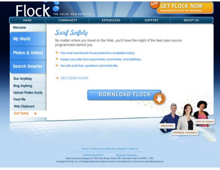
The other day, I was moving some files around and found an old screenshot I took of a web site.  I liked the colors and layout.  I thought it might make an interesting PowerPoint slide show, so I saved it to play around with at a later date.  Well, today is the later date.

Today, I will show you how to create a PowerPoint elearning template.  We’re going to use the screen shot as a starting point, but this isn’t about copying the image.  Instead, it’s about the process you go through as you copy it.  The idea is to grow in your visual design skills, learn some techniques, and then learn to build it in PowerPoint.  The production process in PowerPoint helps you become more efficient and faster when building courses.

Original Screen Capture

Here’s our starting screen shot.  It’s from the web site for the  Flock browser (which is pretty cool by the way).  I liked the blue color.  I also like the transition from light to dark in the background.  It gives the image depth and it helps the main part of the screen pop out.  I also like the orange accent.  It’s a great way to draw attention to key points.
The Rapid E-Learning Blog - inspiring design from Flock

PowerPoint Template

Here’s the PowerPoint version of the Flock design.  You can see that it’s not an exact duplicate.  Instead, I brought in the elements that I liked, which was mainly the colors.  Also, I had two main goals with this.  I wanted to build it all in PowerPoint and I wanted to keep it simple so that I can make it quickly.
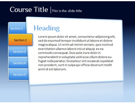
The Rapid E-Learning Blog - PowerPoint template design

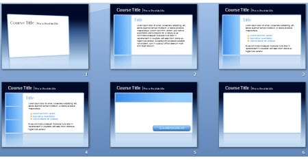
The Rapid E-Learning Blog - iterations for elearning PowerPoint template 

When I built templates for elearning courses, I usually build variations of the screen.  What I want is a few iterations of the general look and feel so that I can accommodate different kinds of content.  For example, the first image I’d use for a title or section screen.  However, the last image might be what I use for a screen where I insert multimedia like a video or Flash file.

For this demo, I built everything inside the PowerPoint file and saved it as a .ppt. However, your best bet is to build it as a master file and then save as a PowerPoint template (.pot).

I put together a demo that shows you how I built it in PowerPoint.  I also attached the file and made some images out of the PowerPoint objects so you can use them as you wish.
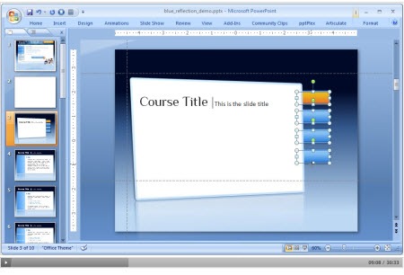
The Rapid E-Learning Blog - tutorial on how to desing PowerPoint templates for elearning

Click here to view the tutorial (30 min).

Feel free to fast forward through the tutorial.  Here’s what’s covered:

  • Analyze the visual design and determine what you like and why
  • Build the template graphics in PowerPoint
  • Save what you build as graphic files
  • Create a few iterations of the design to accommodate different needs
  • Build accent pieces and boxes
  • Use design color schemes in PowerPoint 2007
  • Share with others and they’ll share with you…hopefully.

Click here to download the PowerPoint template and images

As promised, here’s a link to download the files I created.  The folder contains .ppt and .pptx files and some graphics.  I used the Philosopher font which is free and you can download it here.

Got any tips and tricks you’d like to share when building rapid elearning courses in PowerPoint?  Share them by clicking on the comments link.

Here’s another post about building PowerPoint templates:

Events

Free E-Learning Resources

Want to learn more? Check out these articles and free resources in the community.

Here’s a great job board for e-learning, instructional design, and training jobs

Participate in the weekly e-learning challenges to sharpen your skills

Get your free PowerPoint templates and free graphics & stock images.

Lots of cool e-learning examples to check out and find inspiration.

Getting Started? This e-learning 101 series and the free e-books will help.


101 responses to “Here's a Free PowerPoint Template & How I Made It”

Hi Tom,

Great post.

Replicating others work in your own unique way is a learning experience in itself. Powerpoint is a great tool, its upto you how and how much you utilise it. I have been trying to workaround and build templates which look innovative. In my templates the focus is not only limited to visual look and feel, but also to ther elements like animation,links,autoshapes etc.

In fact I have written couple of posts focusing on how you can create innovate templates and using autoshapes. I hope they are useful 🙂

http://kapilpoojari.wordpress.com/2008/12/04/creating-innovative-and-amazing-templates/

It always a pleasure to read your posts. Thanks

What a fantastic post! Thank you for all of this effort which, as a learning tech for a community college in NC, will make a terrific addition to the learning materials we make available to our faculty. It’s amazing how blog entries like these, from fields different from our own can have such an important impact on our own work. Thanks again, and more importantly, our students thank you for the opportunity to add a different look and feel to a learning experience.

July 28th, 2009

Thanks Tom,
This is really helpful.

Tom,

Great tutorial. What screencasting tool did you use? The player was clean and very “Articulate” like.

I could see something like this embedded in a Presenter window or as a standalone page like you used.

Thanks for your insight.

Scott

Nice template, thanks for sharing!

July 28th, 2009

Tom, thanks so much for this. As my non-profit moves forward in eLearning, it’s been very helpful to refer people on my team to examples like this so that they can see there are no limits to the way our modules can look, that we can break a little out of our branding box.

July 28th, 2009

Thanks for this – great tutorial.

I disagree, however, with your basic premise: “PowerPoint is an important part of the rapid elearning world. If you want to build good elearning courses, you really have to learn to use PowerPoint and it’s many features.”

Why?

I’ve encountered many good elearning courses most of which don’t resort to a single drop of powerpoint.

Tom, the Rapid e-Learning blog is the most useful, interesting, practical and fun tool I have ever come across on the web! Thank you for helping me to continually increase my knowlege and improve my skills as a trainer and instructional designer!

July 28th, 2009

Maybe I missed this in the demo, but why do you save each of the powerpoint elements as an image instead of just keep them as the shapes in ppt? Do you get better quality? Smaller size? What’s the benefit? I never do that because it’s more of a pain to make a change since they won’t scale well anymore. Just curious if I’m missing something big here. 🙂

Excellent tutorial, and very helpful. Thanks for sharing.

Tom,

as usual great post. You did say in the post “to feel free to fast forward through the tuitorial however I could not fast forward or click on other slides all I could do was pause and play. Is it my system?

Nice template. Really easy on the eyes. Just one comment though, too much of the useable space has been lost. But with such a beautiful template, I could live with that.

Tom – nice! You know how I love watching you do PPT stuff. Better than Star Wars. I’ve been going crazy with PPT too — building so many of my elearning assets in PPT ’07: making back and continue buttons or arrows, framing pics, and creating backgrounds too.

I am, like Scott, interested in how you make your screencast tutorials — got a tutorial for that?

Best,
Eric

@cellodav: You’re right that many elearning courses aren’t built with PowerPoint, but in the rapid elearning world, PowerPoint is one of the key tools since most rapid elearning courses are built with PowerPoint-to-Flash authoring tools. Thus, to build the best courses with PowerPoint, you really need to leverage all of its features.

On my screencasts: I’m not at liberty to discuss the tool I use (you’ll hear soon enough). However, most people ask about the screencasts because of the clarity. Here’s the secret:

Capture your screen so you don’t have to compress the SWF. For example, this demo was captured at 960×600 and it’s locked into the player at 960×600.

Many people will do a full screen capture at 1024×768. Then they want to put it on the slide which is 720×540. So the SWF gets published down which causes degradation.

The next secret is to lock your player so that the image quality remains. Many people will allow the player to scale which causes degradation.

Tip: to do a full screen capture, bring your monitor resolution down (it will look fuzzy). Then when you’re done, bring the resolution back up and it will look crisp.

I am on a 30″ monitor with a 2560×1600 resolution, but I can bring it down to 960×600 and still get a decent full screen capture. That’s how I did all of the Articulate product tutorials.

I’ll do a blog post on some screencasting tips.

Just gotta say ‘thanks’ for all the great ideas. It’s one thing to be truly creative, but for whatever cosmic reasons, each post just seems to ‘hit the spot’ I’m trying to address each week.

Great stuff; just wanted to distance myself from the silent majority.

I did something similar; Web sites are always great inspiration!

Visit:
http://ridgeviewmedia.com/blog/2009/03/powerpoint-2007-designs-for-e-learning/

@Tom: If you haven’t yet, could you address Master Slides in rapid development using PPT (2003/2007)? I know there are some tips and tricks to make sure the course loads quickly in an LMS. Do you have time to add that topic to your blogging schedule?

Thanks! Beautiful work, BTW.

@Heather: I always save assets as .png pics. The PNG pics do scale pretty well. I use the pics in PPT and can also paste them or import them into other programs.

I think of PPT as the bakery/cafe: some of what you make in the PPT bakery can be used right in the PPT cafe; but the goodies from the PPT bakery can also be sold at other stores, coffee shops and restaurants (elearning software, blogs, newsletters — even other PPT presentations that “talk” about the original PPT template)!

Hey Tom,

Thanks for the hints. That’s exactly the same idea I used when training our two new instructional designers here. First, they were not accepting the fact that to be rapid elearning developers they should be PPT experts.

Guilherme

(Sigh. Tom has a 30″ monitor. Dear Santa….)

Thanks. You created a very great article.
Congratulation.

July 28th, 2009

*drooling over PowerPoint 2007* Thanks for the great ideas!

@Heather: It’s a habit. I routinely save my graphics as separate image files.

In this case, you have them as a single object versus multiple objects. I’ve built screens that have 200 elements. When you convert those objects to SWF, it takes longer and with that many elements the risk of misalignment or other rendering issues increases.

If you save the elements as a graphic file and re-import it, the file size will be smaller and the rendering time decreases, which can be significant based on what you have on the screen.

It’s also a good habit for PPT 2007 because you can switch out images but you can’t objects.

I have a post where I show how to manage two PPTs for each course. One to create the assets and the other to build the course with the assets. That is coming soon. I’ll also give you some more templates and images to go with it.

THIS WAS very helpful – thanks.

I am a huge fan of your newsletter/blog. Your blogs have definitely helped me get the most out of Articulate and helped me to impress my peers. Thanks for all you do!

July 28th, 2009

I literally said out loud just now, “Ah HA!” as I always do when I read this blog. Thanks for helping out a fledgling instructional designer 🙂

July 28th, 2009

Hi Tom:

As usual, this is an excellent post. I just interviewed for an opportunity where they wanted me to create an interface. This was in the aerospace industry. They hadn’t heard of Articulate and rapid development. One major question they had was, how long would it take to build an interface. When I told them how fast it is to build a template/interface in PPT, they were impressed. I think I got the job.

And also thanks for the referral to the Pixie tool. how cool is that?

A big thanks for all that you do.

Elizabeth Creger

[…] Here’s a Free PowerPoint Template & How I Made It – The Rapid eLearning Blog (tags: eduapps elearning template powerpoint) […]

July 29th, 2009

AIt was very effective elearning course, Tom. I have not only learned the tricks but also downloaded the files. What else we can ask for? Very many thanks Tom.
Diwakar

Just have to say – your blog is such an inspiration! I did not know that you could do so much with PowerPoint. Thanks for the great tips!

Hi Tom,

I am long time reader. This is the first time I comment. Just want to let you know that I have learned more about design from reading your blog than from any other source. My design skills have improved so much thanks to the constant inspiration you provide. Thanks for freely sharing your knowledge with all of us. I can’t thank you enough!

[…] Here’s a Free PowerPoint Template & How I Made It – The Rapid eLearning Blog […]

Tom,

You always have great information on your eLearning Blog. Many times we share your information on our company’s Twitter account @DigitalChalk. Thank you for all that you do and for your great resources!

Thank you all for the kind comments. I’m glad that you find the blog posts valuable. I’ll be sure to tell my boss come review time. 🙂

[…] Here’s a Free PowerPoint Template & How I Made It – The Rapid eLearning Blog – Powerpoint templates are actually useful for some things. Don't throw the baby out with the bath water ;^) […]

July 30th, 2009

I really liked this post, and am inspired to go and try it out right away. I’ve been working on a PPT template for my current project and though I cannot change it much, it sure feels that if I want I can follow your tips and learn a lot in the process.

Tell me, why do we need to save the pictures in the png format only? I usually use jpg…

I will try and create a template and post it here soon. Thanks again!

@Sudeshna: JPG doesn’t preserve the transparency. Test it out. Create a circle shape. Save it as a jpg and then save it as a png. Then insert them on a slide with colored background. You’ll notice that the jpg will have white around the outside of the circle and the png will remain transparent.

Another tip is to save the PPT objects as .emf and that will keep them vector based which means they can scale and not lose clarity. You’ll have to play around a little to see how it looks with gradient fills, though.

Dear Tom,
the font you are using is very nice. However, it is not suitable for us Europeans, since it is missing a lot of characters, e.g. the umlauts. I just noticed that when producing a course along your great ideas. Thanks for sharing those!
Christian

@Christian: good point. I think you should petition the European Union to get rid of the umlauts. 🙂

Hi Tom, Great information about powerpoint presentation. I have one doubts, Can we upload some new templates to prepare unique design slide for our company.

Thanks for sharing information..

@Abdul: each organization is different in how they handle their branding. However, you can apply the same principles and ideas, but just incorporate the organization’s colors and branding. That’s where the color themes in PowerPoint 2007 come in handy.

I am brand new to this arena & am working on my very first online course! I am so lucky to have come across your blog — it has been a huge help to me already! This post was awesome, but I have gotten a lot of value out of many of your posts!

Thank you so much for the wonderful tips & techniques you provide! To us newbies, you are a fantastic resource!!!

Thank, you, thank you, thank you Tom. Making the world a better place on blog at a time 🙂

Thank you. It really is very informative and useful.

[…] For today, I am going to give you the best of both worlds.  I’m going to show you an easy trick to add some umpf to your rapid elearning course and I’ll give you the free files so that you can use them in your own course.  They’re also designed to match the template I gave you in this post on building your own PowerPoint templates. […]

Hi Tom,

I am a late comer to elearning and to powerpoint also. Besides books and my own mistakes one of the major source of knowledge for me is your blog. I am one of the thousands of silent admirers of your writing.

May I request you to give latecomers like me, the best practices in powerpoint ( like the one of storing objects as images). I know i may be demanding too much but I strongly believe in seek and you shall get 😉

Hi Tom,

great work. Thanks for sharing. I’ve learn a lot with you.

Thanks a lot,it would be great if there will be more sharing,but unfortunatly,the second template is sticked in section2,it would be better if it was possible to jump from a section to another one!
Great job,congratulation!

[…] Here’s a Free PowerPoint Template & How I Made It – The Rapid eLearning Blog […]

[…] Here’s a Free PowerPoint Template & How I Made It – The Rapid eLearning Blog (tags: powerpoint elearning templates design presentation) […]

Hi Tom,

Thank you so much for the tutorial. It would be of great help if you can add more tutorials on how to add other features like flyout etc in a power point. Always wanted to do great interactive ppts but worried about the effort.

Thanks,
Sudipta

Hi, i’m from malaysia. i’m very sure we will get the benefit of having this ppt. Thank you for sharing, Tom!

@Asura: Welcome to the blog. I hope you find the site useful.

[…] view the tutorial and download the free template, go to Here’s a Free PowerPoint Template & How I Made It via the Rapid E-Learning […]

very nice and useful
Thanks

Wow,it’s always a good feeling to refresh and get back to being so articulate and creative once you visited a site like this. Kudos Tom! More tips and techniques please…Thanks!

Pls allow me to share this tips with link to your site to my Facebook buddies 🙂 Cheers!

A good job and useful! Thank you !

Hi!

Thanks for this useful ressource.

nice website also!

Regards,
Jenny

[…] we are linking to an external article Here’s a Free PowerPoint Template & How I Made It from Articulate blog that explains how to create free PowerPoint templates easily using a webpage […]

July 3rd, 2010

your blog is so cute!

thanks aloooooooooottttt
its great

Great Job!!!

October 8th, 2010

Excellent Resource! Thanks for the tutorial and the files. You’re teaching people to fish, and feeding them while they learn. Great idea!

Thanks. Good sense of colors and art!

Hi Tom,

Thank you so much for the wonderful tutorial, what a insperation you have brought to me. I no longer need to shop around for the template that fits my need. I can’t wait to make one on my own now. Thank you very much.

It’s great. Thank you.

May 31st, 2011

Thank you very much, it’s realy beautiful and practical. Now I can make my own template too.

thank a lot, really useful 🙂

June 21st, 2011

This is an awesome tutorial. I have PPT 2003 and will try to purchase 2007.

Do you teach about webinars? I am searching for a webinar provider who supports videos. GoToWebinar does not.

I will be using your tutorial extensively.

Thank you, Mark

@Mark: thanks…I don’t teach about webinars. Try the elearning guild, I think they’ve had some sessions in the past.

awesome post. Learned a lot about powerpoint.

[…] E porque não fazer os seus? Fica aqui este tutorial. […]

December 11th, 2011

Really nice one….

i want to use it in my presentation :). .thank you

[…] Free Template with a blog post describing howto […]

that great for my ppt.thank you.

March 9th, 2012

This post really made my day! Thanks for sharing.

God Bless You …

You are the MAN, Tom!

Will keep coming back here as this is fast becoming one of my favorite web sites.

Hi,
great template, what are the license terms? I understand it is free but can we distribute? Hope to hear from you soon.

@Helen: the templates are under the creative commons agreement which you can find here. We make allowance for commercial use when people use templates to build their elearning courses. Your site seems to be a commercial site that uses the free templates to push ads. Thus it goes against the spirit of the Creative Commons agreement.

July 17th, 2012

Dear Tom,

YOU ARE THE GEM!!! Always fascinating stuff! Thank you for sharing so much information:)

Hi Tom, thanks so much for showing how this is put together; I love the ideas your free downloads give me, and use them all the time for inspiration! thanks again.

@Jane: glad to help

July 18th, 2012

its nice

July 18th, 2012

u r the best man tom,u have bright future

July 18th, 2012

Hi Tom,
Thanks for making this easy to understand!

Have you looked at the Flock site lately? The opening screen is fantastic, still using blues but in a more subtle artistic format.

They appear to have been offline for a while (I know you created this example in 2009), but still are alive.

Thanks again — I really appreciate the tips I get each week.

Judith

July 27th, 2012

Tom,

Very informative posts. In the ‘Free Template’ that I downloaded, I find the right click not working and in the Design ribbon, all options are disabled. Is this some settings of yours or is my PP not behaving the way it should?

Thanks
Radha

@Rahda: most likely when you downloaded it, the ability to edit has been disabled. There’s usually an option to switch from read-only.

July 30th, 2012

Thanks Tom, you are right. Today I checked the template again and I am able to click on different shapes and objects. Thanks for your time.

Thank you so much 🙂

This is great… Really great tutorial and I’ll be happy to see you among our authors

hey…its great…tried the tutorial…never ought of making the templates myself but it was really helpful…
i have one question…u added tabs in one of the slide…is there a way to switch among tabs?
it would be great help.

@Huma: duplicate the slides and add hyperlinks to the appropriate tabs. You can put it all on the master slide which makes it easier to edit

March 6th, 2013

It is possible to show the presentations in right way if the template is unique and well designed.

Tnx

April 5th, 2013

Nice template, thanks for sharing!

July 12th, 2013

Great template! Thank you so much.