[…] Traduzione autorizzata tratta dal post originale di Tom Kuhlmann sul “Rapid E-Learning Blog”. Il post originale è disponibile qui […]
Want a Great Looking E-Learning Course? Here’s a Simple Way to Get It.
December 20th, 2011
There are three core questions that help guide the development of an elearning course. I discussed this a bit in the post on building a roadmap for elearning.
- What is the look and feel of the course?
- What information needs to be in the course?
- What will the learner do with the information?
For many rapid elearning developers the most challenging part is the first question because it requires a skill set different than training or instructional design. So what typically happens is that we create elearning courses that either all look the same or have a discordant look where the images and typography are a hodgepodge of whatever we have available.
In today’s post I’ll share a simple way to get a nice look for your course that will give it a rich feel. It’s not a substitute for good instructional design, but it is a simple way to make your course look good and take the pressure off of the rapid elearning developer who has limited access to graphic designers.
In a recent post I shared some ideas on how to craft more engaging objectives. For the demo, I wanted my earthquake intro to feature a family huddled in the dark. And as the information was shared a family member would disappear.
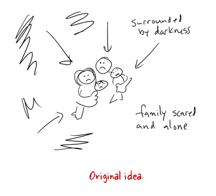
Like most of you, I am pressed for time. Since I had no time to build the graphics I wanted, I decided to change the huddled family image to a framed photo of a family. This would be a lot easier to do since all I needed was an image of a picture frame and a family.
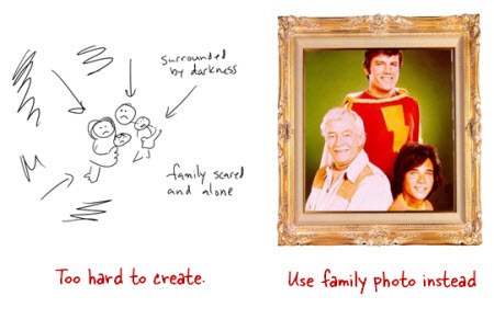
As I was looking for picture frames on iStockphoto I saw a few Polaroid-like images. So I decided to switch from a single picture frame to Polaroid photos of each family member. Doing a search for “Polaroid” revealed a lot of cool layouts. What I like about them is that they offer some structure that I could easily use in my elearning course.
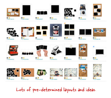
Searching through the Polaroid images lead me to an artist who had a series of images that I could use. The artist provided a background, title and section screens, and then various layout options. The added bonus is that since they came from the same artist they all looked like they belonged together.
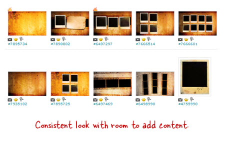
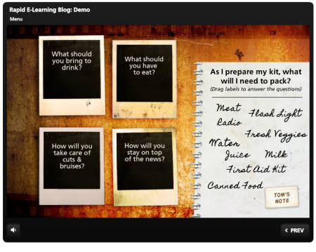
Here’s a quick demo of these images used in an elearning course. As you can see, I didn’t have to do much work because I used the default layouts for my slide backgrounds.
I look for images that come from the same style so I can get a consistent look and avoid a discordant style. And then I look for “buckets” where I can add content. In this case the Polaroid images are perfect. I can use them to add pictures, as menu choices, or even as a way to display text that may have previously been a bullet point.
The secret is to find an artist who provides a lot of images that come from the same style. This way you have a lot to work with. Here are a few sets that I think would work well in an elearning course:
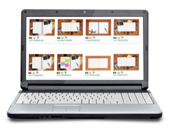
- Grungy Photos (set used in this demo)
- Education theme
Desktop themes (same artist):
This isn’t a replacement for good instructional design. You’ll still need to do that. But for the elearning developer who has no graphic design background and wants to create a visually appealing course, it’s an easy and simple solution.
Are there any similar styles in the stock image sites that you like? Feel free to share them in the comments link.
Events
- Everyday. Check out the weekly training webinars to learn more about Rise, Storyline, and instructional design.
Free E-Learning Resources
 |
 |
 |
|
Want to learn more? Check out these articles and free resources in the community. |
Here’s a great job board for e-learning, instructional design, and training jobs |
Participate in the weekly e-learning challenges to sharpen your skills |
 |
 |
 |
|
Get your free PowerPoint templates and free graphics & stock images. |
Lots of cool e-learning examples to check out and find inspiration. |
Getting Started? This e-learning 101 series and the free e-books will help. |
34 responses to “Want a Great Looking E-Learning Course? Here’s a Simple Way to Get It.”
Leggi la traduzione autorizzata in italiano del post qui:
That looks great Tom – which player/skin are you using?
Hey Tom,
Thanks for the share and great ideas! I always look forward to reading your info when it comes in.
BTW….I see a ‘future’ date for the U.K. That is EPIC! I am so fired up about this. I will look forward to seeing this firmed up with a time/location.
See you soon!
-Dave
Excellent post Tom. I’ve been on a hunt for “common collections” (as I call them) for a long time. Does anyone know where we can find common themed graphics on the interweb?
Tom, thanks so much for this glimpse into how your mind works. You always make it look easy and this shows us that even you don’t always go with the first idea, so it’s ok if we don’t either! Thanks for the reassurance AND the great visual idea!
I believe the demo is in Storyline, correct?
Always interesting and helpful to see examples like this. I’m curious how you did that drag and drop?
I echo Rebecca’s comment – so the drag and drop was created using Storyline? If so, I would def. be interesting in participating with beta testing …
Great example! How do you manage to create such nice navigation buttons for the videos? I hope you can give me some tips and tricks.
I’m curious about the drag and drop as well.
Hi Tom,
How to do hover and create hyperlink over the images at power point?
Thanks.
[…] Want a Great Looking E-Learning Course? Here’s a Simple Way to Get It. » The Rapid eLearning Blog […]
Cool Demo Tom, Thanks Phil
Tom, as always a great demo. I never cease to be impressed with your innovative designs and impressive use of resources. I’m so anxious for Storyline to be released, I feel like a kid waiting for Santa! Any chance we can speed up its availability if the user community sends copious amounts of holiday treats to the Articulate offices? 🙂
[…] or instructional design. So what typically happens is that we create elearning courses that …Via http://www.articulate.com Bookmark on Delicious Recommend on Facebook Share on Linkedin Share on technorati Tweet about it […]
This is a good post for creating innovating and engaging courses. There is a huge amount of images, Polaroids and other content freely available on the internet that can be used to livening up the e-courses. Good writing!
i want to know, drag and drop how to do, may i have the file?
Please show us the beta release of that product, then we can make it better!
So, this was done in storyline. I’ve been using Articulate for a few years, but have yet to really see how far I could take it. Having seen the ‘frog demo’ in the past, could this example be built in Articulate instead of Storyline?
[…] Want a Great Looking E-Learning Course? Here’s a Simple Way to Get It […]
There are some good image sets at the stock.xchng free stock images site, http://www.sxc.hu.
Thanks for this post!
[…] the bullet list of learning objectives that we often see in courses. I then did a follow up post on how to quickly find images for your elearning courses. The tips in that post are good, but they set up an issue we commonly run into when building […]
This idea really helps me as I’m developing an eLearning module about the Health Care Reform law right now…I’m struggling with the look and feel more than anything else, so I’ll follow your lead and see if I can find an appropriate image set for the project.
One question: is there a general name or phrase to use when searching for image sets that are suitable for this type of use (background images, templates, etc)? For example, I’ll search for images related to health care, hospitals, legislation, politics, etc, but what keywords would help narrow the results to sets that contain the ‘buckets’ you mentioned?
Thanks again, this is the most helpful blog post I’ve read in a while!
I don’t know what I’m missing, but how did you find the image sets in istockphoto? The only way I can figure out is to find one image, click the artist’s name,a nd look through his/her whole portfolio – takes me forever. Is there a better way to do it?
I agree Sheila – this info would be great. Hopefully someone offers us some tips.
[…] Want a Great Looking E-Learning Course? Here’s a Simple Way to Get It. Jeanette's Blog E_learning e-Learning Blogs Articulate Development articulate [+] e-Learning industry Technique storytelling eguilbeault expérience Tutoriels enregistrée outils web 2 nierie Tutoriels didacticiels bienvenue Exerciseur RapidLearning capture converter Interaktives Lernen arbeitsblätter games interaktive FreeWare im Internet openstreetmap kostenlose Ecole éducatives raisons nationale présentations concevoir changer diaporama Générateurs d'activités services Applications en ligne tous cycles écritures petits livres epn technicien Généralistes vidéos modules Outils Apps web 2.0 reloaded marta Logiciels et applications générateur interactive nuages iPad köper guardian Pédagogie banque détail outils de conception pédagogie Transversales informatique rococo web modules premier outils A0 A1 kleurplaten vermassen oefensite Outils Web 2.0 reconnaissance iPad et Android online serious tablette créations numériques images Quizz LMS tests Outils pour fabriquer préparation interaktive application instagram google facebook création de contenus multi générateur outils tice numérique créer Création d'activités study tesol boite à outils travailleur Tablettes numériques expérimentations objet education Exerciseurs croisés manuel Apps Ipad designers primaire liste TICE nationale Sites éducatifs pédagogiques Outils TICE numérique créer des tests, quizzes mémorisation makers create TUIC modules lettres besançon Articulate Studio et Storyline e-learning jocegermain David Anderson Jeanette's Blog Le blog Distrisoft Tom Kuhlmann Screenr home • contact • blog • fb • twitter to experience pearltrees activate javascript. […]
Great layout. May be an older post, but got some good pointers as a newbie to storyline. thanks




0
comments