The Rapid Elearning Blog

Archive for the ‘Online Course Design’ Category


effective online training

A lot of online training starts with pre-existing content, usually some policies, manuals, and PowerPoint presentations. The key is figuring out how to convert a lot of this content into an effective e-learning course. Most of it starts with the objectives of the course. Here are a few things to consider.

Effective Online Training Has Clear Objectives

You can’t build a good course without clear objectives. This seems obvious, but based on what I see, it isn’t. Many organizations confuse content with objectives. Content is just that: content. It may be valuable, but it’s a means to an end. The course objective is never to consume content. Otherwise you’re just wasting time.

Effective Online Training Has Actionable Objectives

At the end of the course, the learner will be able to do _______. That’s basically it.

The online training is a solution to meet an objective such as installing a new part, closing a sale, or inputting data. If the course is only focused on content, they may learn a lot of about something, but they may not know what they’re supposed to do with what they learned.

A course with actionable objectives is focused on what the person will do.

Effective Online Training Has Measurable Objectives

The two points above are obvious to most course developers. However, the reality is that a lot of training we’re asked to build isn’t actionable because the managers or customers tend to think that the issue is a lack of information. Which may be true on the surface. So when I build courses, I like to put them into one of two buckets: information or performance.

With an information-based course, the objective may be to present the information and the measure of that is tracking whether a course was completed or not. This is true for a lot of annual refresher training. This isn’t ideal, but some organizations have information they want to present, but they may not have fully formed ideas around what that information should produce.

A performance-based course is different. It’s tied to a desired action. And that action is measurable. For example, if the training is on how to install a product. I know you’re trained if I can observe you install the product correctly. Or if you’re a manager and you’re learning to give feedback, I can build training that puts you in a situation where you give the desired feedback. Those are things that I can observe or measure.

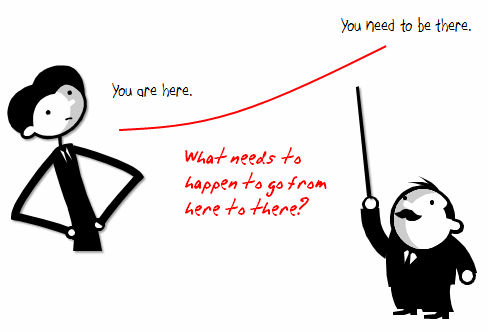
In an ideal world, training has clear actionable and measurable objectives. Without those, why are you building the course?

Events

Free E-Learning Resources

Want to learn more? Check out these articles and free resources in the community.

Here’s a great job board for e-learning, instructional design, and training jobs

Participate in the weekly e-learning challenges to sharpen your skills

Get your free PowerPoint templates and free graphics & stock images.

Lots of cool e-learning examples to check out and find inspiration.

Getting Started? This e-learning 101 series and the free e-books will help.


e-learning-art-deco-header

I ran across two articles recently that made me wonder about the state of today’s e-learning courses.

The first article was on how websites are all starting to look the same. They did a study to confirm it. In the second article, the author makes some good points on how a lot of this new design is sterile and lacks personality.

While the two articles dealt with website design, there are a lot of parallels to e-learning course design.

Why Does Everything Look the Same?

There are a number of reasons why things look the same.

  • There’s a commonality to design because of trends, but they come and go. A few years ago everything had bevels, then glossy buttons, then reflections, then skeuomorphic, then anti-skeuomorphic, then neuomorphism, and on and on. People design based on trends to look fresh and modern.
  • A lot of design follows a templated structure with layouts, grids, and common understanding of user interface (UX) design. There’s all sorts of new understanding and rules for UX design based on research and an evolving industry. In addition, courses have technical requirements and need to be designed to accommodate mobile and accessibility needs.
  • The technology is changing. If you want a nice-looking website, you don’t need to be a programmer. Just sign up for Wix or Squarespace. Same thing with e-learning courses. Gone are the days of specialized course developers. I addressed that in this post on the next generation e-learning tools.  The tools like Rise 360 and Rise.com are becoming more prevalent. They offer easy, form-based construction. And with that is a consistent look and feel of the courses. You don’t need to know design, you assemble your learning content and pretty much plug and play.

Looking the Same Isn’t Bad Is It?

As noted above, there are a lot of legitimate reasons why things look the same. And those aren’t bad. And the reality is that things will evolve as the industry evolves and develops new norms. Plus, people will get tired of the way things look.

David Anderson shares a funny observation on how to be a consultant. If everything your client has is square, you tell them, what they need is a circle. And if all they have is circles, you tell them what they need is a square. There you go, consulting 101: if your design is skeuomorphic, you need flat. If your design is flat, try skeuomorphic.

Things change and what’s big today won’t be tomorrow.

Legitimate Concerns

“We are emotional and sentimental beings; we survive on self-expression.” – Tobias Van Schneider

I’ve met plenty of clients or “experts” on user experience design who follow a bunch of rules and won’t budge from them. Or marketing people with some ridiculous branding requirements for their courses. What happens is that the objective of learning is lost in the rules and requirements dictated by other objectives from people not concerned about teaching. Because of this, courses become boring and sterile. They lack life and are not very engaging for the learner. And it’s just as bad for the person tasked to build them.

An e-learning course is about teaching PEOPLE (at least in an ideal world). Regardless of current design trends, we should build learning experiences that are relevant and human. And for the course author, we yearn to be creative and want jobs that are more than just copying and pasting content from one medium to the next.

We have to work within the context of what we have. The person who possesses custom programming skills, has more options. But that’s not where most of us are at. However,  just because we have constraints doesn’t mean we can’t be creative. In fact, I often find that constraints force more creativity than having none.

My big question for e-learning today: what is the Art Deco of e-learning design? Or better yet, what can we do to get away from sterile courses and make them more human-centered? How can we can exercise our creative skills and build courses that are both engaging and successful? Interested in your thoughts.

Events

Free E-Learning Resources

Want to learn more? Check out these articles and free resources in the community.

Here’s a great job board for e-learning, instructional design, and training jobs

Participate in the weekly e-learning challenges to sharpen your skills

Get your free PowerPoint templates and free graphics & stock images.

Lots of cool e-learning examples to check out and find inspiration.

Getting Started? This e-learning 101 series and the free e-books will help.


production tips e-learning

Many e-learning developers are usually on a small team. But most I know, are a team of one. This means lots of projects, many hats to wear in the process, no budget, and almost no time.

Here are three production tips and shortcuts from previous posts to help save time (and sanity) when building e-learning courses and online training.

A Simple Way to Build E-learning Templates

e-learning templates made easy

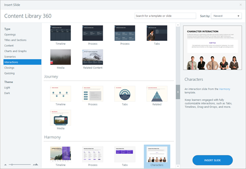
First, if you’re using Storyline 360, then you have a ton of templates and slides to use for your e-learning courses. And they’re easy enough to modify to meet your needs.

However, if you want to create some simple templates and e-learning screens, then here are 3 Super Easy Ways to Build E-Learning Templates.

Save Time Managing Your Project Emails

Generally when building online training courses, we send emails back and forth, which can be a pain to manage and cause a lot of extra work and confusion trying to clarify what’s being communicated.

With Review 360, most of that is resolved because you can manage the course review process in one place, eliminating all of those back and forth emails.

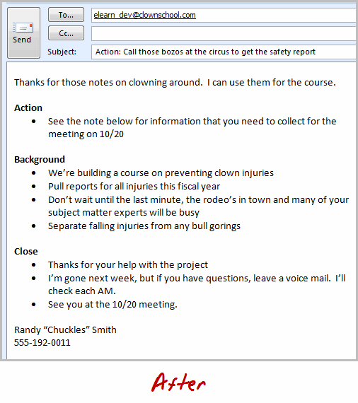
However, we still send emails. Here are some good production tips on managing the process so that when emailing others, the message is clear, and all action items are identified.

save time with this project management tip

Build Courses Around Real Learning Objectives to Save Time & Money

how to create learning objectives

There are many reasons why we build e-learning courses. Generally, they fall into one of two buckets: information or performance. An effective course is focused on performance-centered (and tangible) objectives.

If you don’t build courses around real learning objectives, you’ll waste time; and odds are no one will be happy with the course. Check out this blog post to get production tip on setting learning objectives for your e-learning courses.

Hopefully, these quick tips help you build the courses you need. Feel free to add some of your own in the comments.

Events

Free E-Learning Resources

Want to learn more? Check out these articles and free resources in the community.

Here’s a great job board for e-learning, instructional design, and training jobs

Participate in the weekly e-learning challenges to sharpen your skills

Get your free PowerPoint templates and free graphics & stock images.

Lots of cool e-learning examples to check out and find inspiration.

Getting Started? This e-learning 101 series and the free e-books will help.


overview of the communication process

Effective e-learning is more than putting together screens of information and presenting them to learners. Instead it’s a process of curating content and then communicating it in a way that the learner understands and ultimately can apply.

The challenge sometimes rests in how the content is communicated, which then determines the level of understanding for proper application.

In a previous post, we did a quick overview of some of the challenges with communication and how to overcome them. Today, I’d like to take a quick look at the basic communication process and how that impacts what we do with our online course design.

Overview of the Communication Process

communication process basics

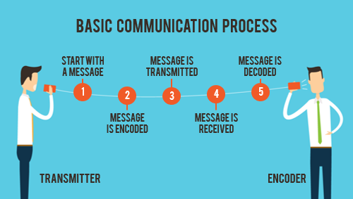
Here is the basic communication process.

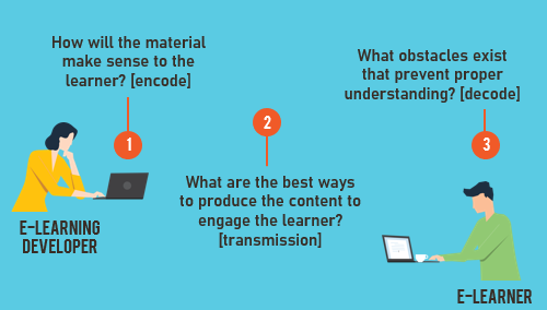
  • Generally, there’s a message and this has to go from one person to the other.
  • The first person encodes the message into something that the other person can receive.
  • The message is transmitted via some medium.
  • The message is received and decoded.
  • And the process flips and repeats itself between encoding, transmission, and decoding.

Hopefully what’s communicated is clear. If not, the process of going back and forth establishes clarity.

How Does the Communication Process Impact E-Learning

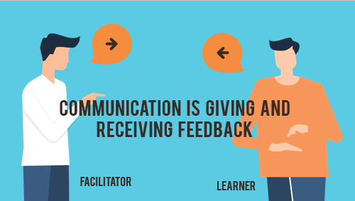
In a facilitated learning environment, the facilitator presents content. The learner receives it. If there’s some dissonance between the encoding and decoding, it’s easy enough to reconcile it.

Generally the facilitator can tell if there’s some confusion and the learner has plenty of opportunity to ask for clarification when things aren’t understood. There’s a lot of give and take.

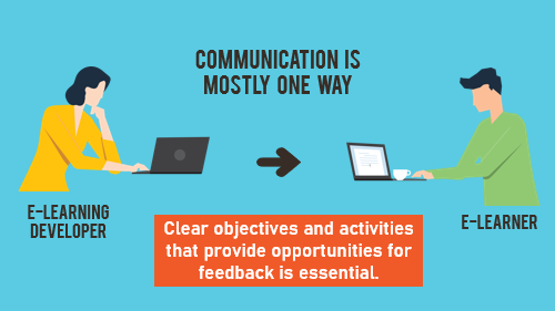
This becomes a problem with most e-learning courses since they tend to be pushed out to the learner, usually with no opportunity to seek clarification. Because of this, it’s important to consider the content and how to assess the learner’s understanding through the course so that you can provide the appropriate feedback.

basic communication process

This is the point where many courses fail. Many organizations build courses heavy on information delivery and light on true assessment. And I don’t mean end-of-course quiz assessments. I mean continual assessment throughout the course to gauge the learner’s understanding of the content and with the right type of feedback.

Opportunities to Enhance the Communication Process for E-Learning

Here are a few quick thoughts on how to enhance the communication of the content and make up for places where there’s no back and forth.

  • Content needs to be meaningful. Review the course content and structure it so it makes sense to the learner. This can happen with clear objectives and placing the content in a relevant, real-world context.
  • Create meaningful activities. Step away from just content delivery and focus on meaningful and relevant learning activities. I like a backwards design approach. What does the learner need to do? Then design activities for them to prove they can do it. They may need to practice first; so design practice activities where you can assess their understanding and provide feedback. And then somewhere in that process, you construct the right content. This is better than a massive information dump.
  • Account for barriers to effective communication and learning. Determine what obstacles exist between delivering and receiving the content. Many courses are text heavy and miss the opportunity to provide more memorable experiences with good visual support. And as noted above, many courses also lack relevance to the learner. This is often the case with compliance training, which drives a lot of e-learning. Find ways to engage them with meaningful activities where they get to practice using the content and acquire the right feedback.

E-learning often has the challenge of mostly one-way communication, so it’s important to build the right mechanisms in the course to ensure the learner is learning and has ample opportunity for feedback.

What are some things you do?

Events

Free E-Learning Resources

Want to learn more? Check out these articles and free resources in the community.

Here’s a great job board for e-learning, instructional design, and training jobs

Participate in the weekly e-learning challenges to sharpen your skills

Get your free PowerPoint templates and free graphics & stock images.

Lots of cool e-learning examples to check out and find inspiration.

Getting Started? This e-learning 101 series and the free e-books will help.


three ideas for effective communication in e-learning

We often build a single course to suit all learners. This presents possible challenges to the learning process. Let’s take a look at why and discuss a few options to help remedy some it them.

Effective Communication Involves Common Understanding

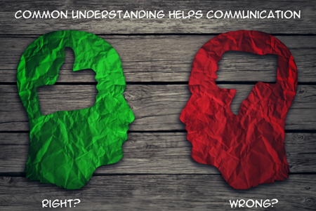
We use words all the time that have loaded meaning and often don’t mean the same things to people. For example, even a word like e-learning can be a bit confusing. First, we don’t even have agreement on how to spell it. Is it eLearning, elearning, or e-learning?
In my world, e-learning involves the authoring of online courses with a rapid e-learning product like Articulate 360. For others, it’s any learning content in digital format. Thus, a PDF is e-learning just as much as a course authored in Storyline.

effective communication and common understanding

There’s even more confusion as we look at different industries. The corporate version of e-learning is a lot different than what you’d find in higher education or at the K-12 level.

It’s important to recognize this and ensure you have appropriate context when using words and phrases that may have different meaning. The best thing is to build context and clarity in the communication process.

Experience and Skill Level Impact Effective Communication

People don’t come to the e-learning course at the same level. We have different personal experiences impacted by things like our worldview, culture, and ethnicity. We also have different professional experiences (and some may even conflict with the course content). On top of that, we have different skill levels. For one the course may be too easy, and for the other, too difficult.

effective communication and skill level

You can’t control those things about the learner. However, there are things you can do in your course design that may help resolve some issues. For example, a pre-assessment helps determine how much someone already knows and what they need to learn. From there you can opt out the experienced person, or create an adaptive process to accommodate different needs.

Personal Motivation Impacts Effective Communication

A lot of e-learning is pointless to the learner and most of those types of courses also tend to be boring and mind-numbing information dumps. On top of that, people are at various levels of motivation when it comes to engaging with the e-learning content.

There are many things that motivate people. And a lot of it is outside the realms of the course and not something you as a course creator can control. However, there are a lot of things that you can do to help motivate the learner.

effective communication and personal motivation

If the course is relevant and meaningful, then it is received better than one disconnected from the person’s real world. No one complains, when they actually learn something.

Many courses are overly focused on content and not on application. Focus on what the person needs to do, and then build the course backwards from there.

Interactive engagement is also important. I try to do two things: get the person doing stuff on screen to pull them into the course. And most importantly, get them interacting with the content. This is usually built around decision-making activities similar to what they’d do in the real world.

People are complex and they come to the e-learning content with different experiences, skill levels, and attitudes. Effective communication in the e-learning process is built on understanding this and applying the right strategies.

What do you find to be some of the challenges during course development and communicating the content to those who take the e-learning courses?

Events

Free E-Learning Resources

Want to learn more? Check out these articles and free resources in the community.

Here’s a great job board for e-learning, instructional design, and training jobs

Participate in the weekly e-learning challenges to sharpen your skills

Get your free PowerPoint templates and free graphics & stock images.

Lots of cool e-learning examples to check out and find inspiration.

Getting Started? This e-learning 101 series and the free e-books will help.


learning objectives for effective e-learning

Most e-learning courses have some sort of stated learning objective. Ideally, the course is designed to meet the objective. From my experience, many of the objectives in e-learning courses aren’t very actionable. They lack clarity and most importantly, they lack measurement. And those are the two things you can do to ensure your e-learning courses are effective.

Create Clear Learning Objectives for Effective E-Learning

Many times we’ll see learning objectives like this: understand company policies or learn how to give feedback. These types of objectives are fuzzy. What does “understand” or “learn” mean?

Objectives should be more specific, such as, a new manager applies X policy in Y situation. The objective identifies the learner, what will be covered, and when it will be used.

Measure Understanding of Objectives for Effective E-Learning

When crafting learning objectives, you should at the same time think about how they are measured. If the goal is for the manager to understand company policies, then there has to be a way to prove understanding. Going back to the point above, the manager applies the correct policy in a given situation.

Thus, if you want to determine how well the manager understands a given policy, you craft a situation in which she has to apply it correctly. At this point, you have a way to measure understanding.

When outlining course objectives, step away from the fuzzy terms and focus on actionable words that also guide you towards a means of measurement. This helps you craft the right objectives, pull in the right content and activities, and build a way to properly assess understanding.

Events

Free E-Learning Resources

Want to learn more? Check out these articles and free resources in the community.

Here’s a great job board for e-learning, instructional design, and training jobs

Participate in the weekly e-learning challenges to sharpen your skills

Get your free PowerPoint templates and free graphics & stock images.

Lots of cool e-learning examples to check out and find inspiration.

Getting Started? This e-learning 101 series and the free e-books will help.


performance-based e-learning

E-learning courses generally fall into one of two buckets: tell people something or show them how to do something. One is all about the information and the other about performance. Both approaches have value.

The reality is that a lot of e-learning is information-based and mostly driven by compliance requirements. Outside of certification of completion, there’s little performance requirement other than compliance to the policies or directives.

For example, generally you don’t have an organization full of sexual harassers and then present a course on sexual harassment and all of a sudden they’re no longer harassing. Instead, the course informs about sexual harassment and the organization’s standard. And the expectation is compliance to that standard. In that sense, the course is information-based because other than compliance, there’s not a performance expectation.

Performance-based E-Learning

On the other side are performance-based courses where the goal is to change behaviors or teach new skills. Those are courses that make a difference (in the sense that one goes from A to B). So how do you know those courses will make a difference?

Here are a few key thoughts to help get there.

  • What are the business objectives?
  • Why aren’t they meeting those goals today?
  • What training do they currently receive (if any)? Why hasn’t it worked?
  • How is the course linked to meeting the objectives?
  • What do you expect the learners to do after the course that they’re not doing today?
  • How will you measure the success of the course?

Performance-based courses are tied to the performance requirements: what are they supposed to do to meet X objective?

Focus on the performance requirement and the actions associated with it. Then build your training around that. In a sense, I like the course to “throw people into the pool.” This gets them to make the types of decisions they’ll make in the real world. If the course is performance-based, design it around those decisions rather than pages of content and policies. All of that content is important, but you can tease it out in the decision-making process and subsequent consequences.

Courses make a difference when they make things different. If you course doesn’t change behaviors or teach new skills, then it’s probably not performance-based. And how you approach the design of it is different than just pushing out information.

Events

Free E-Learning Resources

Want to learn more? Check out these articles and free resources in the community.

Here’s a great job board for e-learning, instructional design, and training jobs

Participate in the weekly e-learning challenges to sharpen your skills

Get your free PowerPoint templates and free graphics & stock images.

Lots of cool e-learning examples to check out and find inspiration.

Getting Started? This e-learning 101 series and the free e-books will help.


e-learning template

E-learning templates can be a bit challenging. On one hand, they speed up production. And then on the other they may introduce constraints in the learning experience design.

An e-learning course screen has a specific structure. It’s usually rectangular and contains text and imagery. The text and imagery are laid out on the screen and is constrained by up, down, left and right placement. Of course, the possibilities for layouts can be endless, but there are probably just a few dozen layouts that make sense for e-learning courses.

Here are a couple of recent posts where we discussed the anatomy of e-learning templates and how to get the most value out of templates.

E-learning Template Value

Templates work for repetitive processes because they can be used over and over again. For example, most courses have some sort of simple list of learning objectives. While the course content may change, those course screens are usually consistent.

E-learning Template Constraints

Courses consist of content that is contextual. And from a learning experience, that contextual content has specific teaching requirements. For example, if I teach how to use software, then the screens are dependent on screenshots. And if I teach how to interact with a customer, the visual context is best represented in a manner similar to how you may interact with the customer.

I may find some good general layouts for simple content, but as soon as I have to work with specific content, I find that there’s a lot of tweaking and adjustments made to the templates that may mean I save more time just starting from scratch.

E-Learning Template Hybrids

I like to separate my templates into three parts and find the most value in using templates in the first and third.

  • Entering the course
  • Course content
  • Exiting the course

Most courses have the same or similar starting points with welcome screens, instructions, objectives, sections, etc. And they also have similar exit points such as summary screens, next steps, and exit instructions.

Those two parts, the entering and exiting of courses, are perfect for templates. The templates are easy to insert, update, and contextualize. The middle part that deals with the actual course content is different.

Course content templates are great for simple text layouts. They break down as the content design becomes more specific. That’s fine, just use templates for the beginning and end and for simple text. But don’t waste time trying to force content into a template. Or worse, don’t create a template and force the course authors to make the content comply with a template.

Templates are great for e-learning. However, they exist to save time. Keeping templates for easy-to-repeat screens makes sense. Forcing content to fit templates probably doesn’t. But that’s OK. Just use the template screens where you need them and start with blank screens where they need customization. Don’t waste time fitting a square peg into a round hole.

Events

Free E-Learning Resources

Want to learn more? Check out these articles and free resources in the community.

Here’s a great job board for e-learning, instructional design, and training jobs

Participate in the weekly e-learning challenges to sharpen your skills

Get your free PowerPoint templates and free graphics & stock images.

Lots of cool e-learning examples to check out and find inspiration.

Getting Started? This e-learning 101 series and the free e-books will help.


unlock navigation

“We have to lock the course. If we don’t, the people will just skip all of the content until they get to the end.”

If you build e-learning courses, you probably hear this all the time. But here’s why you need to unlock your course.

Being Exposed to Information Isn’t the Same as Learning

Just because people are forced into the content doesn’t mean they’re learning from it. Reading, seeing, or hearing information is just a small part of the learning experience.

Locking the course navigation can only measure a person’s access to the content. It can’t measure their attention span or their understanding of the content.

People See the Content Based on Previous Experience

Experience and bias cloud our understanding of what we learn. A new learner may struggle to figure out what goes where and when. And a more experience learner is plugging information into predefined boxes and categories.

Locking course navigation assumes everyone approaches the content the same way and at the same speed. A new person may need more time, whereas a more tenured person can quickly skim and move on. Trying to control the navigation creates a frustrating experience.

Some People Need Context

Personally before I learn something new, I like to gain a big picture understanding. For example, if I get a new resource book, I skim in, look over the chapters, check out illustrations, and perhaps glance in the back and references. This helps me get a sense of what’s in there and where things will go.

I like the same when I take online training. I want to build some context which helps me know how everything fits together. It throws me off, if I am forced to go through the content A to Z with no ability to jump around and peek a bit.

Odds are you have a lot of learners who feel the same way. Some want to review everything. Some need a lot of information. Some want to touch and play around a bit.

Open the course up and let those who want to jump to activities to go there and vice versa.

Focus on Understanding

The ultimate objective is that the person learns. The key is getting them to demonstrate their level of understanding. Instead of focusing on screen after screen of content and locking the navigation, create the locks around activities where they can demonstrate their understanding.

For example, let them skip reading company policies. Instead, have them apply the policy to a relevant situation. You can lock the course at that point. They need to complete X activity to demonstrate that they understand the policy. Give them freedom to move around to learn and collect what they need. But lock the course based on the activity that measures their understanding.

Events

Free E-Learning Resources

Want to learn more? Check out these articles and free resources in the community.

Here’s a great job board for e-learning, instructional design, and training jobs

Participate in the weekly e-learning challenges to sharpen your skills

Get your free PowerPoint templates and free graphics & stock images.

Lots of cool e-learning examples to check out and find inspiration.

Getting Started? This e-learning 101 series and the free e-books will help.


e-learning storyboards

A couple of weeks ago, David posted a challenge where community members were asked to share their storyboard templates. As you can see, there were quite a few different storyboard templates shared for downloads. There are also additional free storyboards in the community downloads section.

What I found interesting was some of the conversation about storyboards. There are quite a few who don’t use formal storyboards. Instead they just build everything from inside their authoring tool.

Why There’s No Need for a Storyboard

Years ago when I first started working with e-learning, storyboards were really important. That’s mostly because it wasn’t just me working on the course.

The storyboard was how we determined how to construct the screen layouts and user interface. We determined where things were placed, how they animated, and what supporting media was required. Because more than one person worked on the course, the storyboard was really critical to communicate on the project design.

On top of that, working with customers and getting them to “see” what we were building was a challenge because it wasn’t as easy and quick to prototype the courses back then. Thus, we used the storyboard to walk through the course design with out clients.

This helped them understand what we were going to produce and get their agreement. It was also an easy way to show what other assets were required and the extra production required to deliver the course.

Rapid E-Learning Changed Things

A lot of this changed when we shifted from custom development in Flash and Authorware to Articulate Studio and PowerPoint. PowerPoint let me add all of the assets (or placeholders) and build animations quickly. Because I could prototype quickly in PowerPoint, I found I spent a lot less time working with formal storyboards. I suspect that’s common for many of you as well.

And it’s only easier with Storyline because there’s so much more interactive capability and one could build a quick prototype faster than it probably takes to complete a formal storyboard.

If you’re a team of one doing most of the production yourself, then a formal storyboard is less likely. Essentially, the prototype course really is a storyboard. It’s just in the authoring tool and not a separate document.

When a Storyboard Makes Sense

Throwing a bunch of slides and quiz together and calling it a course is one thing. In that world, what does a storyboard solve? However, when you start to build more complex learning experiences, you need to be more intentional about what you design. That requires a lot more planning. And most likely there’s a lot more media production.

In those cases, working with a storyboard helps you properly plan the course structure as well as the required content and media.

Also, when working with a clients (especially paying clients) it’s important to show them you’re organized. And a storyboard helps you walk through the project requirements before spending a lot of time prototyping and working on more time-consuming interactions.

There’s obviously a lot more that can be said about storyboarding. I find that people who’ve been in the industry a while, use storyboards more often than not. But people who’ve joined the industry over the past three years or so, don’t rely on them as much. Which makes sense, because the tools are so much easier to use.

I’m curious. Do you storyboard your courses? If so, how are you doing it? If not, why not?

Events

Free E-Learning Resources

Want to learn more? Check out these articles and free resources in the community.

Here’s a great job board for e-learning, instructional design, and training jobs

Participate in the weekly e-learning challenges to sharpen your skills

Get your free PowerPoint templates and free graphics & stock images.

Lots of cool e-learning examples to check out and find inspiration.

Getting Started? This e-learning 101 series and the free e-books will help.


e-learning tips before starting a course

Here are three time-saving tips to consider before building your e-learning course.

Determine the Story Size

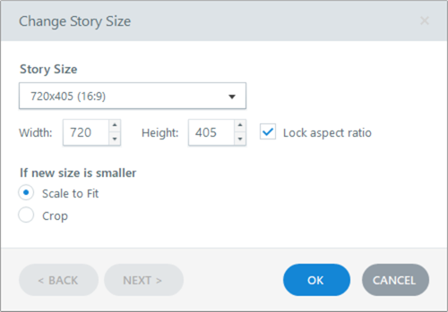
Many e-learning courses are 4:3 aspect ratio. The other common aspect ratio is 16:9. However, you’re not confined to either one of those aspect ratios. What if you want something more like a book? Or perhaps square?

e-learning course size

Determine the story size and resolution before you start working on the course.

What we often see is that someone opens the e-learning software and starts working on the course using the default settings. And then somewhere in the process wants to change the size and resolution of the course. This can be problematic because when you modify the aspect ratio of the slide, it means the existing content may get skewed or require a bunch of tweaking to get it re-aligned. Thus you want to determine the course’s aspect ratio before adding content to the slides.

Choose a Template Before Building the Course

Another common process is that the course author starts to build content and then later wants to apply a template. However, templates are made up of specific layouts and theme elements. If the content the author builds doesn’t start mapped to a layout and the theme features, applying a new template to it somewhere in the process can cause issues and require a lot of extra work.

e-learning templates

The point of a template is to guide the design and speed up production.

Before you start working on the course, curate your content and then pick a template appropriate to the context of your course and the type of content it has. From there, add your content to the template and then make some simple modifications to the theme colors and fonts. Choosing the template first will definitely save time.

Set the Theme Colors and Fonts

e-learning theme fonts

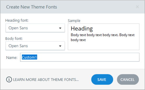
Generally, most e-learning courses have two core fonts: headers and body. You really don’t need 8 million fonts in your course, two is usually fine. On top of that, many fonts are part of a font family with different variations so you could get by with one font family. Then just determine which font is used and when.

After choosing your fonts, set one as the header font in your theme and one as the body. This way if you want to apply a different theme you can do that easily. If you don’t use the theme fonts it requires slide-by-slide editing to make changes.

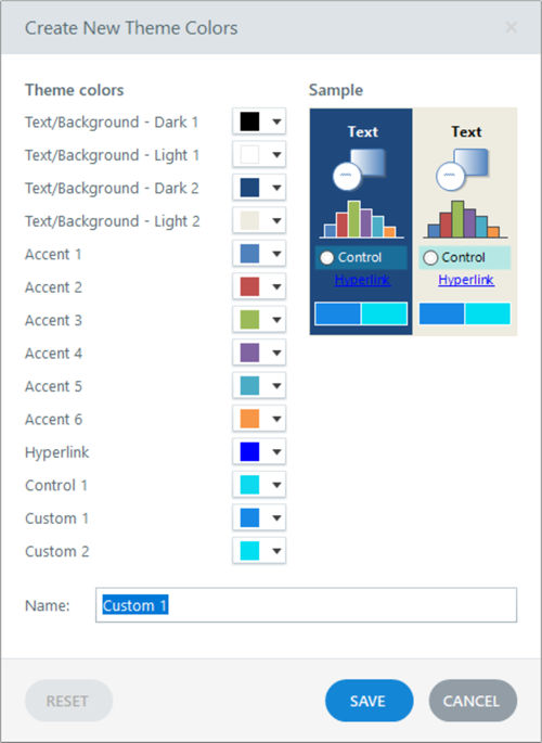
The same thing can be said about theme colors. Determine the colors you want to use in your course and then set those colors in your theme. This way every object you insert will have the same theme colors. And like the fonts, can be swapped instantly.

e-learning theme colors

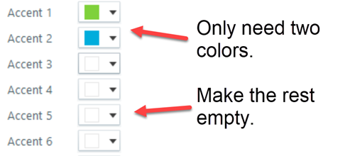
When you create theme colors, remain consistent in how you use them, You get six accent colors. There’s no rhyme or reason to how they should be used. They’re just six color options. However, I like to use accent 1 as my main color. And I use accent 2 (and sometimes accent 3) as complimentary colors. I don’t use all six colors so I don’t worry about coming up with six colors to fill out the accent color options.

custom theme colors for e-learning

The main point is that regardless of how you use accent colors options, be consistent in how they’re used. This makes it easy to swap the theme colors.

Do those three things above before you invest time building out the content. It will save you a lot of production time. And it forces you to be a bit more intentional in how you are building your courses.

Do you have any other quick production tips before starting the course construction?

Events

Free E-Learning Resources

Want to learn more? Check out these articles and free resources in the community.

Here’s a great job board for e-learning, instructional design, and training jobs

Participate in the weekly e-learning challenges to sharpen your skills

Get your free PowerPoint templates and free graphics & stock images.

Lots of cool e-learning examples to check out and find inspiration.

Getting Started? This e-learning 101 series and the free e-books will help.


powerpoint e-learning tips

Technically converting a PowerPoint file to an “e-learning course” is fairly easy. You can import the slides into Storyline or just publish them from inside of PowerPoint with Articulate Studio 360.

But is that really a course? Maybe, but probably not because it’s not about just putting content in front of learners.

Here are three things to consider when converting a PowerPoint file into an e-learning course.

Presentation content isn’t the same as an e-learning course. Sure, presenting content in your course is part of the process, but it’s a passive form of learning. The solution is to find a way to make delivery of the content more active.

PowerPoint presentations used in face-to-face training tend to have a PowerPointy look. An e-learning course doesn’t need to look like a PowerPoint slideshow. Use some of the Content Library templates to get away from the presentation look. You can even customize them to fit your organizational brand.

However, there is a look that fits the content and objectives of your course, and that’s where you want to put your energy.

Convert bullet points to interactive content. Instead of showing screen after screen of bullet points, why not convert them to micro interactions? For example, three bullet points could be three interactive tabs.

Those are three real quick tips when converting PowerPoint to an e-learning course. Of course, there’s more to it.

Events

Free E-Learning Resources

Want to learn more? Check out these articles and free resources in the community.

Here’s a great job board for e-learning, instructional design, and training jobs

Participate in the weekly e-learning challenges to sharpen your skills

Get your free PowerPoint templates and free graphics & stock images.

Lots of cool e-learning examples to check out and find inspiration.

Getting Started? This e-learning 101 series and the free e-books will help.