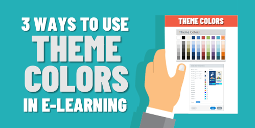
Why Do E-Learning Courses Need a Company Brand?
May 18th, 2021
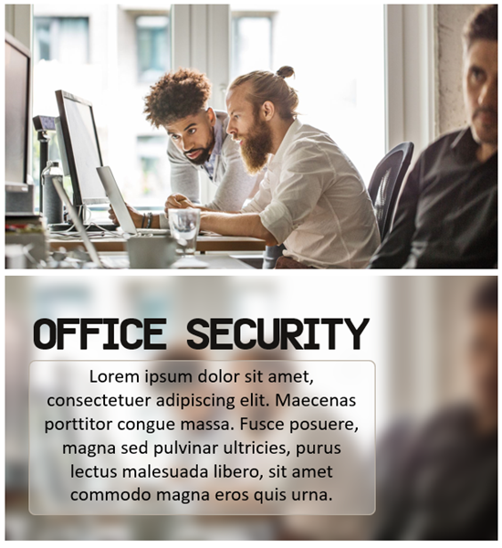
When I worked at this one place, we could only use a single PowerPoint slide for any presentation or anytime we created content in PowerPoint. There was nothing particularly special about the slide other than the fact it was the approved slide because it had the company logo and colors plastered all over it.
This became an issue when we transitioned to one of the early rapid e-learning applications. Since the courses started in PowerPoint, the branding was on every slide and took up limited screen space that we needed to actually teach people.
However, what we lacked in a great learning experience was made up covered by the fact that all employees knew where they worked.
A constant challenge with courses is how to deal with the organization’s visual identity and various branding requirements which usually have little to do with learning.
So, here are a few questions I’d like to pose for discussion:
- Do you really need to brand your courses?
- How does it contribute to the learning experience?
- Does it help meet any learning objectives?
- If there was no branding requirement, how would it change the course?
- Should it be a requirement that even in live training sessions, the marketing team inserts a sign twirler who screams out the name of the company every few minutes?
I’ve built plenty of courses over the years and have spent more than enough hours with clients and marketing team. So, I know many of the reasons we have for adding the brand content to our courses. I just wonder if it really matters and what value it adds.
What do you think?
Events
- Everyday. Check out the weekly training webinars to learn more about Rise, Storyline, and instructional design.
Free E-Learning Resources
 |
 |
 |
|
Want to learn more? Check out these articles and free resources in the community. |
Here’s a great job board for e-learning, instructional design, and training jobs |
Participate in the weekly e-learning challenges to sharpen your skills |
 |
 |
 |
|
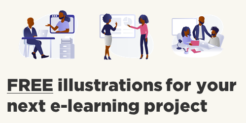
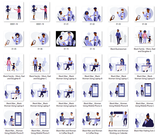
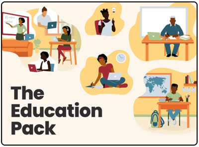
Get your free PowerPoint templates and free graphics & stock images. |
Lots of cool e-learning examples to check out and find inspiration. |
Getting Started? This e-learning 101 series and the free e-books will help. |


16
comments