The Rapid Elearning Blog

Archive for the ‘E-learning’ Category


interactive e-learning and learning experience design idea

I was wasting time with this activity where you create the next iPhone. Playing with the site reminded me of a few core principles that are often neglected when building interactive e-learning; so here are a few brief thoughts.

Traditional e-learning is basically boring.

I know there are some good courses out there. But I’ve seen thousands of courses from large and small organizations and they’re mostly bland and uninteresting. There are all sorts of reasons why, but the core problem is that these courses are created oblivious to the needs of those who take them (or are forced to take them).

I suspect, if the end-user had to pay for the courses (and the organizations needed that money) the courses would be made better. But until the organization sees the end-user as a consumer in the same way they see their customers, most e-learning is still going to be what it is today.

How to design good interactivity.

I always see interactive e-learning as two considerations: touch the screen and apply the content. How to pull the person into the course? The content should be constructed into a meaningful narrative that engages the person. But there’s also a place to get the person to “touch the screen” where they can interact with things onscreen. Turn the three bullet points into three tabs. Get rid of the next button and find a different way to navigate the course. There are all sorts of ways to do this, but the key point is to get them to interact with the course.

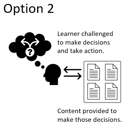
The second part, which is more than the novelty of the first, is to get the user to interact with the content. Most courses fail because the user only consumes content without being required to do anything with it or apply it in some meaningful way. Build real-world decision-making activities where they not only get content, but they use it.

What can I learn from the time-wasting activity?

Obviously something like the iPhone builder isn’t easy to build as an e-learning course. And the goal of a real course isn’t to waste time (unless it’s one of those time-based compliance courses). However, there are things happening on that site that we can glean that do relate to an online learning experience.

learning experience design idea based on an online interaction

  • There’s fun in constructing the phone.  There’s value in construction. It allows a person to explore and play with ideas. Look at the last course you built. What type of meaningful play-around activity can be built in the course? This is probably tough for a lot of e-learning content, but may be more possible than you think. If you need ideas, ask in the e-learning community.
  • Identify the “what ifs.” One challenge with most courses is that we have to quiz and assess for the purpose of grading rather than understanding how the person is learning. If things in the course were open, we could let people play around with the “what ifs” during the learning. “What if I choose this option?” “What happens if I add too much of this, or respond with this type of answer?” Give people options to test other answers or make bad decisions to see what happens.
  • Don’t give them all the answers. Instead, present a challenge and let them figure it out. Give them resources. Give them tips. Give them prompts. But let them figure out what they need to figure out. Obviously, somewhere in the process you have a check-in to see what’s going on and what they’ve learned. But what if the course was more an exploration with an expectation of a certain result and you just give them the tools to get there?

I know that’s a lot to think about for many e-learning courses. Some of it is a bit novel. Some of it is probably too radical. But if we don’t push things a bit, we’ll be where we are now, which is pretty much where we were thirty years ago.

Events

Free E-Learning Resources

Want to learn more? Check out these articles and free resources in the community.

Here’s a great job board for e-learning, instructional design, and training jobs

Participate in the weekly e-learning challenges to sharpen your skills

Get your free PowerPoint templates and free graphics & stock images.

Lots of cool e-learning examples to check out and find inspiration.

Getting Started? This e-learning 101 series and the free e-books will help.


downside-e-learning content

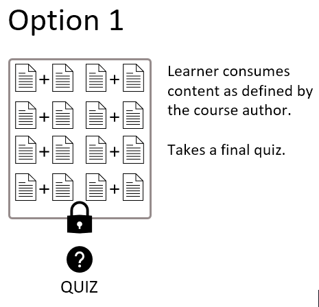
When I first learned to build e-learning courses, the general instruction for building e-learning content was to craft some learning objectives, organize and present the content, and then assess the learners using some sort of simple quiz. I think that’s how a lot of people learned to build courses with many of them following a similar structure.

Back in those days, the course authoring tools weren’t easily available and building something overly sophisticated required a lot more resources. Thus, many courses were relatively simple in terms of the instructional design and the e-learning content. Nowadays, there are much more sophisticated authoring tools available, so you can build e-learning courses that are more creative and engaging.

While the tools are easier to use and there is more information available on how to build a better e-learning course, most courses still follow the same general structure: objectives, content, and quiz.

typical e-learning course

This makes sense because it’s organized, seems logical, and most e-learning course expectations probably lean more into the explainer-type content than performance. So it’s more about presenting content and a simple assessment than it is a robust learning experience.

This approach is very similar to how we’d build products on an assembly line in a factory. Design something that generally meets the needs for most people and push it out to everyone. There’s nothing wrong with this approach per se. If your content is well-designed and engaging, it can work just fine. This is especially true if all you need is tracked completion and there are no real performance requirements for the course.

However, it does have its downsides. For one, it assumes that all of the information is equally relevant to the learners and meets their learning needs. And in a world where learners are used to getting what they want when they want it, the one-size-fits-all approach to e-learning just doesn’t cut it anymore.

So what’s the solution?

Here are three general ideas to stimulate your thinking when it comes to e-learning content:

  • Stay in the right lane. This may sound a bit cynical, but many courses may be important to the organization and annual compliance, but not relevant to the end user. Assembly line courses are fine for that. Don’t overbuild them and get the learners in and out and back to something more productive.
  • As note above, keep the content-heavy courses simple and build the right decision-making activities in the courses that are more meaningful and tied to performance metrics.
  • The key to successful learning is meaningful content and activities. Ultimately, the courses should be relevant to the learners and mirror how they’d use the content in real life. Create situations that simulate the decisions they need to make and present your content through those simulations rather than as a a series of bullet-point screens.

That’s enough to get you thinking. What would you add?

Events

Free E-Learning Resources

Want to learn more? Check out these articles and free resources in the community.

Here’s a great job board for e-learning, instructional design, and training jobs

Participate in the weekly e-learning challenges to sharpen your skills

Get your free PowerPoint templates and free graphics & stock images.

Lots of cool e-learning examples to check out and find inspiration.

Getting Started? This e-learning 101 series and the free e-books will help.


unlock course e-learning

“Step away from the solution.”

I say this all the time when building courses. It helps me and my clients focus on the training program’s core objective. The course we’re building exists to help meet the performance objective; but the course itself is not the objective.

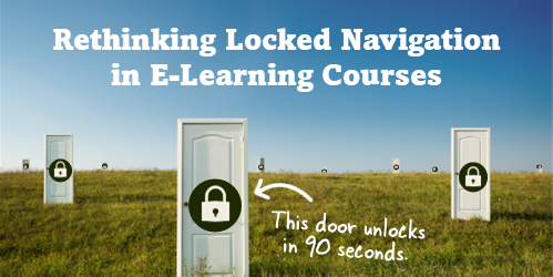
This takes us back to what we discussed earlier: the problem of locking the course navigation. Usually the rationale is that all of the content needs to be viewed. Or, learners will skip past everything to get in and out of the course as fast as they can. Or how do we know they are learning?

The course exists for a purpose and the objective of the course isn’t the course itself. The course is a means to get to the objective. When framed from that perspective, the concern shouldn’t be “how do I guarantee that they don’t skip anything?” Instead, it should be “how do I know that they learned what they need to learn?”

The challenge is to get your client to see this. In the past, I’ve used the following illustration to help clients and subject matter experts see this.

Suppose you have a course where the learner gets a list and needs to buy some items. That’s the performance expectation. And think of your course content like the supermarket. The shelves are filled with all sorts of items.

While there are lots of goodies on the shelves, walking up and down the aisle and looking at everything is irrelevant to their learning expectations.

The learners, armed with the list and instructions, do their shopping. You’re not assessing them on how they shopped – you’re assessing them on whether they bought the right products on the list.

Now some people know how the supermarket is laid out, can find their items, and check out in record time. They’re pros!

Some people like me, need to orient to what’s there. They need to go up and down the aisles. They need to compare products. They want more context. It doesn’t matter if they take 10 minutes or an hour to do it. The performance expectation is to complete the shopping list. That’s what you assess. How well they did shows their level of understanding. Looking at the items in the store or spending a specified amount of time is mostly irrelevant.

Going back to e-elearning…

unlock course e-learning

The learner’s understanding is more important than whether they are looking at a screen or not. You don’t need to make learners sit through information they already know. Instead create a way to assess the learner’s level of understanding. If they don’t know the material, you would know that through the assessment and can direct them in the course to learn what they need.

unlock course e-learning

Ultimately, you establish performance expectations and in the course set a way to assess the learner’s level of understanding. If they can prove they understand, then wasting time in the course is moot. If they can’t, then they go through the content until they can. This way, you don’t have to worry about course navigation or whether a person is skipping the content or not. You can test if they skipped it by testing their understanding. That’s a better measure of success and a better learning experience.

Events

Free E-Learning Resources

Want to learn more? Check out these articles and free resources in the community.

Here’s a great job board for e-learning, instructional design, and training jobs

Participate in the weekly e-learning challenges to sharpen your skills

Get your free PowerPoint templates and free graphics & stock images.

Lots of cool e-learning examples to check out and find inspiration.

Getting Started? This e-learning 101 series and the free e-books will help.


locked e-learning courses

I often see community members asking how to lock down a course. In fact, it is one of the most common questions. The reason for this is that people want to make sure learners see everything in the course. This is especially important in compliance training, where the goal is to ensure that everyone takes the course and is exposed to all the material. Thus, many clients ask that all of the course is locked so that people can’t “skip” any of the important information.

If the goal is to create an online course so that you can report that it was completed by the end of the year and everyone who participated saw everything in it, then locking the course probably makes sense.

Skip Locked E-Learning & Measure Success a Different Way

But, if you want to achieve real results, then locking the course is not the best solution. Instead, focus on the learner’s understanding of the content. You’ll create more effective e-learning courses this way.

Think of it this way; there are two parts to every course: the information the learners need and assessing their ability to process it (which can happen through various means).

Focus less on delivering the information, and more on collecting evidence of the learner’s understanding.

If you do need to lock the course down a bit, lock it at key decision points where you can assess the person’s ability to process the information you shared and make the types of decisions they need to make using it. And at those points, you can also provide the appropriate level of feedback.

Locking the course down may seem like a great solution, but it’s misguided because the course usually exists for reasons other than sharing content.

Events

Free E-Learning Resources

Want to learn more? Check out these articles and free resources in the community.

Here’s a great job board for e-learning, instructional design, and training jobs

Participate in the weekly e-learning challenges to sharpen your skills

Get your free PowerPoint templates and free graphics & stock images.

Lots of cool e-learning examples to check out and find inspiration.

Getting Started? This e-learning 101 series and the free e-books will help.


effective online training starts with an activity

As we’ve mentioned throughout this blog, the default for many e-learning courses is to focus exclusively (or mostly) on content presentation. This is fine for some courses, but effective online training requires that the content is wrapped around some performance expectations and corresponding activity where the learner can practice and demonstrate competency.

In previous posts we looked at two approaches to the Tell, Show, and Do model:

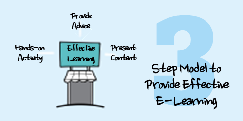
In today’s post, we’re going to kind of flip the process and present an activity first and then build from there. I call this the HAT model (because training people like acronyms).

  • Hands-on activity: Before you dive too deep into the details of the instruction, create an activity. It’s a great way to assess where they’re at. Even if you don’t use it as a formal assessment, it helps the learner see where they’re at. It also assists in clarifying objectives as they work through an activity to solve some problem. If you want to create an adaptive process, you can use the activity as a way to filter beginners from tenured learners.
  • Advice: During the activity you provide advice in response to the decisions the learner makes. You can also collate the decisions and results of the activity and then provide advice as an option to progress. For example: do the activity, offer advice, review the activity, and then final decisions. The advice is a way to fill in the gaps that may be exposed during the activity since they haven’t gotten all of the content upfront.
  • Tell: Complete the activity. Provide feedback as required during a debrief and then go into tell mode where you can present more structured content and add additional detail.

I like this approach because it engages the learner at the front end. It does require more forethought in the analysis and design phase than just slapping together screen after screen of content. And sometimes it can be a hard sell to customers because they expect more linear type presentation where every possible bullet point is exposed.

Regardless of the model or technique you using in constructing courses, the most important part is getting the learner to apply and practice doing what they need to do. This provides opportunities for feedback and a means to evaluate their understanding of the content. It also helps you move the courses away from linear presentations to something more dynamic and effective.

Events

Free E-Learning Resources

Want to learn more? Check out these articles and free resources in the community.

Here’s a great job board for e-learning, instructional design, and training jobs

Participate in the weekly e-learning challenges to sharpen your skills

Get your free PowerPoint templates and free graphics & stock images.

Lots of cool e-learning examples to check out and find inspiration.

Getting Started? This e-learning 101 series and the free e-books will help.


tell show do practice review instructional design model

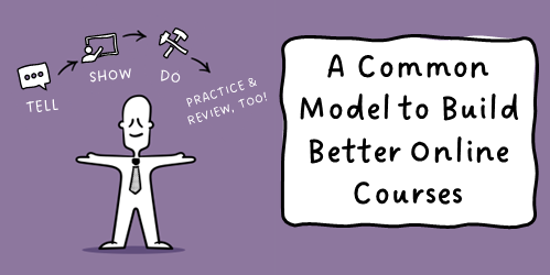
“Tell, Show, Do” is a common instructional design model. We featured that in a previous post. The model is a simple reminder that steers the course design away from the common content dump and focuses on the action in the learning, mainly the doing part.

But I like to add, “Tell, show, do! Then practice and review!” It rhymes and is another easy thing to remember about course design. I like discussing this with clients and subject matter experts who tend to focus too much on content.

Here’s a quick recap:

  • Tell them what they’ll learn. This communicates the expectations and goals. It also provides context which allows the learner to see how the course is relevant and fits into their world and expectations.
  • Show them what they will “do” so they can see it in action. Seeing it before practicing allows people to build some familiarity with the process and helps eliminate some of that “just getting started” anxiety.
  • Do the task. At this point, the learner should do the task that they’ve been exposed to and seen in action. In an online course, the task is usually some sort of simulated decision-making. That can be something like a role-play activity or even software simulation where the user inputs data.
  • Practice the task. This is a subset of the “doing” however, the key point here is the repetition that comes with practice. E-learning courses often are weak on practicing the task more than once or twice. And when the people are outside of the course, there should be some support to practice the task in a real-world setting. The more touches they get the more opportunities to learn.
  • Review what they did. This is also a subset of “doing” and goes with the process of practice, feedback, practice, feedback…At the end of the day you need to assess their level of understanding and proficiency and provide next steps, such as certification of skill or perhaps some sort of remedial process to get more practice. One challenge in the e-learning and training space is that the manager or team leads tend to abdicate the learning to the course or training program. However, there’s a lot of opportunity to enhance the training with a consistent and thorough review process outside of the e-learning course.

This is a more fleshed out Tell, Show, Do model that considers more of the practice and feedback part of the learning process. I like this technique better than the first one because it includes the review and debriefing which includes the social part of learning where new learners get a sense of where they fit and how they’re doing.

Events

Free E-Learning Resources

Want to learn more? Check out these articles and free resources in the community.

Here’s a great job board for e-learning, instructional design, and training jobs

Participate in the weekly e-learning challenges to sharpen your skills

Get your free PowerPoint templates and free graphics & stock images.

Lots of cool e-learning examples to check out and find inspiration.

Getting Started? This e-learning 101 series and the free e-books will help.


tell show do instructional design

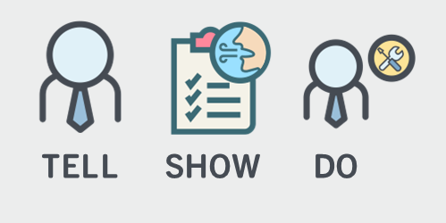
From an ideal perspective, when we build courses, we’re trying to change performance and not just share a bunch of information. That means we need a course design model that goes beyond content-sharing. One common approach for online course design is the Tell, Show, and Do model.

It makes sense because it’s simple, covers the basics, and steers us towards the course’s performance expectations.

Tell People What They Need to Know

What do they need to know and why?

The goal is to establish expectations and clarity around objectives. This helps create a framework for learning. It also establishes context. Instructionally, “telling” allows us to curate content, package, and present it in a manner that saves time compared to self-discovery (which is in its own way an effective strategy).

Show People What They’re Supposed to Do

Knowing and doing aren’t the same. The next step in the process is to move beyond content and towards application. What are they to do with all of the content you shared? Avoid showing what happens if they do something wrong and instead focus on the positive action.

Document the process, steps required, and where to find the content to make the decisions they need to make.

Do the Activity to Practice What They Need to Do

Unfortunately, most e-learning stops at the Telling and Showing part of the process. As a younger instructional designer, I learned that the instructor does the telling and showing and the learner does the doing. If the end goal is for the learner to do something specific (and measurable) then the training needs to integrate the activity and decision-making required to do what’s learned.

Build into the course the application of what’s learned so that the learner can practice and get feedback, and ultimately demonstrate understanding. Keep in mind that not all of those types of activities can be built into the e-learning course. In those cases, design some sort of offline learning component where the learner can do the “doing.”

The Tell, Show, and Do model is a simple and common instructional technique because it lets you build context and demonstrate the desired performance while the learner gets to practice applying what they learned. In addition, by focusing on the “doing” it moves your course design away from the all too familiar linear, click and read model.

Events

Free E-Learning Resources

Want to learn more? Check out these articles and free resources in the community.

Here’s a great job board for e-learning, instructional design, and training jobs

Participate in the weekly e-learning challenges to sharpen your skills

Get your free PowerPoint templates and free graphics & stock images.

Lots of cool e-learning examples to check out and find inspiration.

Getting Started? This e-learning 101 series and the free e-books will help.


e-learning locked course navigation

I haven’t taken a survey, but my guess is that most people will tell you they can’t stand when an e-learning course’s navigation is locked. And to compound the frustration, many of those courses are narrated by the world’s slowest talkers.

If a locked course is a frustrating experience, why do so many exist?

There are usually a few reasons. I’ll cover three common ones and some ideas on how to get around them.

Reason 1: Courses need to be locked so that all of the content is viewed.

The last thing we want is someone to continuously click the next button looking for an exit. If they do that, they’ll never get all of the important information.

In some ways that makes sense. My guess is that many people will try to click through the course as quickly as they can. And in doing so, they may miss critical information.

But locking the navigation isn’t the best solution because exposing them to a screen after screen of contents with bullet points doesn’t mean they’ll learn. It didn’t work in A Clockwork Orange and it won’t work for your e-learning courses.

Reason 2: That’s what my client wants.

Clients want all sorts of things that don’t always make sense. Locking the navigation is just one of them. They usually give the same rationale as the first point above—they want to ensure that people have gotten the information.

Is that really the goal? Getting information?

This is when we need to put on our performance consulting hats. E-learning courses are a solution to meeting an objective. They are not the objective. No organization says, “We need more e-learning!” What they want is people who are able to perform and meet the organization’s objectives. And the e-learning course is one of the ways they get there.

Reason 3: Regulations say we need one hour of training, so we set the course to last exactly an hour.

This has nothing to do with real learning so I have little advice to offer. However, one solution might be to get an enterprise Netflix account and insert that on the last slide using a web object. Let them take the unlocked course and if they finish early, they can watch something on Netflix for the remainder of the hour.

Joking aside, I’ve run into this a few times and here’s what I’ve done.

The mantra “the regulation states…” is repeated so often that we aren’t always sure what the regulation actually states. Review the regulations that dictate your course development. And then work within those constraints. You may find that you have a lot more freedom than you think. And there’s probably more creative ways to consume the time allotment than locking the slide navigation.

Simple Solutions to Locked Navigation

Here are a few simple solutions to help work through this issue.

  • Make it meaningful. The reason people click through the course content is because it doesn’t matter to them. They’re doing the bare minimum to get through the material. One way to fix the issue is to frame the course in a context relevant to their needs. If it’s relevant, they’ll be engaged and see the connection between what they do and the course material. This should slow down the clickfest.
  • Let them test out. If they already know the material, let them demonstrate it upfront. Give them a scenario or quiz to assess their understanding. If they can prove they know the material, then you don’t need to waste their time with the course. If they can’t prove it, then the pre-test failure has demonstrated their need to pay attention. This is also a great way to customize the learning experience and create a more adaptive process because you can direct them to the appropriate content based on how they performed in the initial assessment. An experienced person who makes good decisions gets one type of training and one who needs more support or remedial information gets another.
  • Design specific prove-it activities. Most likely the client commissions the e-learning course so the person can learn to do something. If the client desires specific actions from the learners, then design the course for the person to acquire and practice those actions. Instead of locking the navigation, put them in situations where they have to make decisions. And if you do need to lock it, use the prove-it activity as a way to navigate through the course rather than locked next buttons.  In that sense, the course is still locked. But instead of locking the navigation it’s locked based on the person’s ability to demonstrate understanding.

Those are a few simple tips to help alleviate locked course navigation. What tips do you have for those who want to move past this issue?

Events

Free E-Learning Resources

Want to learn more? Check out these articles and free resources in the community.

Here’s a great job board for e-learning, instructional design, and training jobs

Participate in the weekly e-learning challenges to sharpen your skills

Get your free PowerPoint templates and free graphics & stock images.

Lots of cool e-learning examples to check out and find inspiration.

Getting Started? This e-learning 101 series and the free e-books will help.


types of e-learning courses

The objective of an effective e-learning program is to create the best courses possible with the resources at hand. From what I see, most e-learning courses are simple, explainer-type content. This is fine in the right context. However, many of those courses tend to be overbuilt with superfluous interactivity.

One way to build the right type of course is to understand the types of courses typically created and where they fit in your e-learning ecosystem.

First Step: Focus on the Right Objectives

We don’t always have control over the course requests we get. If you’re a consultant who is getting paid by a company to build a course, odds are they’re expecting some sort of measurable impact. However, that’s not always the case if you’re an internal training team where the decision to build training is already made and you’re just there to make sure it gets created.

In an ideal world you get your client to identify clear, measurable objectives and you build the right course for them to meet those objectives. This helps prevent the information dumps that many courses become.

Next Step: Understand the Type of Course

types of e-learning courses

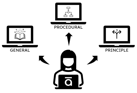
In a simple sense, e-learning courses generally focus on sharing information or changing performance. And there are three basic course types:

  • General information. These courses are designed to share general information with no expectation of performance improvement. Think of them like reading an owner’s manual. Good information to support learning, but not a real learning experience.
  • Procedural information. A lot of training is specific to products or processes. This is true when teaching step-by-step instructions that don’t allow for a lot of interpretation. Most software training falls into this bucket. Or perhaps a procedure like how to process a returned item.
  • Principled information. There are many types of courses where there are no clear procedural steps. For example, dealing with employee issues. In those cases, it’s about learning guiding principles on which to base decisions.

While the list above is relatively simple, it doesn’t mean the courses that are built have to be simple. They can be as simple or complex as the subject and budget allow. However, in most cases, principle-based courses require more nuanced decision-making and thus building that type of course will take more time than one where it’s only organized content.

The first step in all of this is to know if the course has performance expectation or not. And then identify and build the right type of course.

Events

Free E-Learning Resources

Want to learn more? Check out these articles and free resources in the community.

Here’s a great job board for e-learning, instructional design, and training jobs

Participate in the weekly e-learning challenges to sharpen your skills

Get your free PowerPoint templates and free graphics & stock images.

Lots of cool e-learning examples to check out and find inspiration.

Getting Started? This e-learning 101 series and the free e-books will help.


free QR code

With Covid-19, QR codes made a comeback. They’re all over the place and scanning them with a phone is so easy. For a recent conference, we created a QR code to access the handouts and examples. They’re worth considering as one more way to share resources in your e-learning courses. Here’s a simple tip on how to create them for your training.

Why Create a Free QR Code for Training

Some training resources have really long links and make it difficult to share. I know that when presenting in a classroom, it’s not always easy seeing the URL on the projection screen. A QR removes this obstacle.

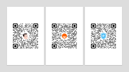
It’s also easy to put multiple QR codes together as a nice resource document. Check out the ones below.

QR codes

How to Create Free QR Codes

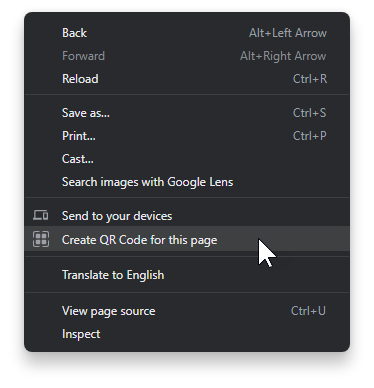
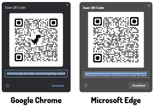
I haven’t checked every browser, but in the Chrome and Edge browsers you can create the code quickly. The easiest way to create a QR code is to open the page in your browser, right click and select Create QR code.

create QR code

The images below show the difference between the Chrome and Edge versions. I like the Chrome QR codes best because I can remove the dinosaur image and replace it with my own and easily create a branded QR code by adding a logo or other custom image.

compare free QR code

As you can see, it’s pretty easy to create and download a free QR code. And then it’s just a matter of making the code available.

While I have your attention, here’s a warning about QR codes and how some people are being scammed.

Events

Free E-Learning Resources

Want to learn more? Check out these articles and free resources in the community.

Here’s a great job board for e-learning, instructional design, and training jobs

Participate in the weekly e-learning challenges to sharpen your skills

Get your free PowerPoint templates and free graphics & stock images.

Lots of cool e-learning examples to check out and find inspiration.

Getting Started? This e-learning 101 series and the free e-books will help.


content dump e-learning

I’ve been at this e-learning game for close to 30 years. While the technology has changed over the years, I still see a lot of the same problems e-learning (and training for that matter) had 30 years ago.

The main problem is that pushing content passes for training. Thus a lot of what we call e-learning courses are mostly content dumps. Because the technology has made it easier to build “courses” the content looks better than it did 30 years ago; but courses like that are both ineffective training and a subpar learning experience.

This is when your instructional design skills should prevail. This is where you have an opportunity to exert some influence and craft a better learning experience.

Good E-Learning Goes Beyond E-Reading

A lot of courses (perhaps most) are content heavy with lots of text and videos. Maybe there’s some simple interactivity like a tabs interaction or one of those fancy images with labels and markers, but that’s just a different way to expose content.

There’s nothing wrong with content. Outside of e-learning, we still read text books and watch videos to learn. However, being exposed to content isn’t the same as learning which requires a few additional things: content WITH practice and feedback in some meaningful manner.

Want to move past the content dump? How are you building practice and feedback into your courses?

Good E-Learning Helps Demonstrates Understanding

Instructional design is about crafting an experience where people acquire information (content) and learn to use it (learning) in a meaningful way. In that process they are able to demonstrate their understanding of the content and how to apply it in a real-world context.

Here’s a real challenge, though.

I’ve worked in enough places where the organization didn’t really care about learning. All they wanted was a “course” with a final quiz so they can certify completion (and compliance) and say they provided training. In that environment, it’s really easy to copy and paste content into a “course” and call it good.

However, that’s not good e-learning. And it’s not effective training. It’s instructional laziness when we substitute content dumping for learning experience. And if that’s all we’re doing, there’s no need for an instructional design industry.

A course should be more than screen after screen of information. Ultimately, when a person takes a course they should be able to demonstrate a level of understanding that goes beyond simple quiz questions. It’s time to take the content dump to the dump.

As instructional designers and course builders, we should be able to push back. It helps our industry and it helps our organizations not waste time and money.

What do you think?

Events

Free E-Learning Resources

Want to learn more? Check out these articles and free resources in the community.

Here’s a great job board for e-learning, instructional design, and training jobs

Participate in the weekly e-learning challenges to sharpen your skills

Get your free PowerPoint templates and free graphics & stock images.

Lots of cool e-learning examples to check out and find inspiration.

Getting Started? This e-learning 101 series and the free e-books will help.


e-learning tips

I am a simple person and usually try to explain things in three steps. They’re easy to remember and share. Here is a round up of all previous posts that share three steps to do something to improve your course design and development.

General E-Learning Course Design Tips

Production Tips for E-Learning Course Design

PowerPoint Tips for E-Learning

Professional Development

Events

Free E-Learning Resources

Want to learn more? Check out these articles and free resources in the community.

Here’s a great job board for e-learning, instructional design, and training jobs

Participate in the weekly e-learning challenges to sharpen your skills

Get your free PowerPoint templates and free graphics & stock images.

Lots of cool e-learning examples to check out and find inspiration.

Getting Started? This e-learning 101 series and the free e-books will help.